the darnedest thing Awakening to Self. Body Shamanics. Healing. Thoughts and images. Technology and interfaces. http://thedarnedestthing.com/atom.xml 2024-04-25T05:08:46-04:00 Copyright © 2013, Steven Hum grokking koreaderhttp://thedarnedestthing.com/grokking%20koreader2024-04-16T10:55:30-04:002024-04-16T08:37:40-04:00Steven Humhttp://thedarnedestthing.com/

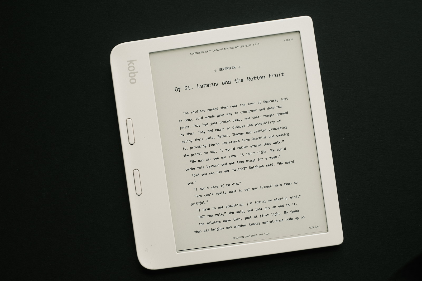
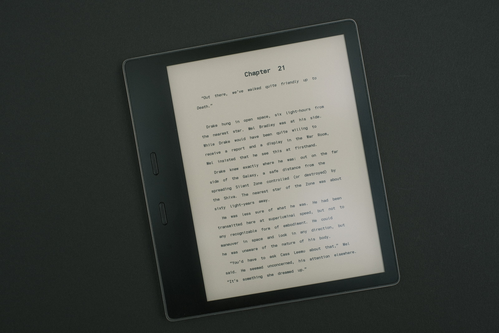
i have sung the praises about the Kobo Libra 2 since purchasing it almost two years ago, shortly after its release—replacing my Kindle Oasis as my daily driver for consuming digital content.

Both ereaders use a 7” eink display but it is Rakuten’s Nickel software that elevates the Kobo past the Kindle IMO—its intuitive UX, more granular control of page layout and font control, and Calibre integration vastly distancing itself from its Kindle competition (for those interested in more than simply being served up books from Amazon’s store).

As someone obsessed with typography and readability—if not apparent from this site’s obsession with mono-dyslexic fontskobopatches completed the refinement of the Kobo Nickle UX for me. Until..


TL;DR Kobo Nickel provides a very polished ereader UX. For the ultimate control of econtent on the Kobo, however, KOReader can handle publisher corner cases that elude even kobopatches’ capabilities whilst providing more connectivity options and gesture controls to create an even mone fluid ereading experience—or depending on one’s point of view, deeper, if one savours delving into reading progress statistics and charts.


UPDATE: to gesture assignments (as personal reading habits dictate).

fast forward

and today i am firmly in the KOReader camp now. KOReader is often only cited for PDF content consumption on the Kobo—improving upon Kobo’s inbuilt PDF viewer—because its price of entry (learning curve, due not so much to difficulty as to breadth) seems unwarranted given Kobo Nickel’s already robust and intuitive UX.

What prompted this change was time (on my hands), Calibre integration with KOReader and the desire to add swipe control of the warm light (in addition to the stock front light control)—swipe control of the backlighting being a killer feature of the Kobo IMO, finding the automatic brightness control of the Kindle Oasis unusable. Time would later reveal a plethora of publishing control tweaks for the odd ebook which defied my preferred layout theme settings.

All it took was giving myself a day to wrap my head around KOReader’s organization. Yes, it took me a day to grok KOReader—to become familiar with the nested organization of menus to set the global defaults to achieve the “look” and workflow i desired. What took a lot of time going back and forth through menus until i had everything set up the way i wanted—with more refinement to be made, no doubt, as i log in the reading hours—has now produced an ereader UX that is ultimately transparent in use and even more streamlined than Kobo Nickel, nimbler (with Calibre too) and more powerful.

why

For the casual ereader user, this sort of investment is probably too steep to warrant the effort. But there is an audience for which KOReader can enhance both the delivery and consumption of digital content. In short, anyone reading this far might do well to consider KOReader, especially if you, like me, enjoy multiple books in your reading rotation.

This write-up’s length is not intended to emphasize KOReader’s complexity—it just sort of grew (as i returned to update it)—but it is easy to see how its breadth would test the impatient (myself included). As i hadn’t come across any single source covering a KOReader configuration use case, i figured i would do well just for my own reference—much of the length simply being tabular descriptions of the various settings that, once configured, produce an ereader transparent for my use case.

This document will be a useful reference (for me) for any future KOReader updates/installs.

the top menu system

after KOReader is installed and first launched from NickelMenu a quick guide will be presented illustrating the basic functionality of the app. Opening the file browser and selecting a book is straightforward enough but delving into the menu system to utilize KOReader’s full potential is daunting—mainly because, unlike the stock UI of a Kindle or even a Kobo, KOReader’s breadth is exhaustive.

What this requires is patience and a willingness to familiarize oneself with its menu structure—and not be distracted by all the functionality and extended capabilities it provides. It is laid out logically enough—just overwhelming in its granularity—the topmost icons (when opened while reading a document**) covering..

  • current document**
  • document settings**
  • KOReader settings
  • tools
  • search settings
  • file browser
  • system

**The document related menus only show if the menu system is accessed from within a document. Logical but initially confusing until one is familiar with KOReader’s context oriented functionality.

Getting used to KOReader’s menu organization is key. It is the depth of these menu lists that challenges familiarity. If not for gestures, navigating KOReader would otherwise be repetitively painful but if one is willing to persist and slowly set KOReader up, it can become even more streamlined in operation than the much more limited Kindle or even stock Kobo device.

theme profiles

one of the features i missed on the Kobo was Kindle’s themes—document layout templates that could be applied to a document on the fly to change various fonts/size/contrast, header/footer content and margins/line spacing. Useful for switching between favourite setups for varying content.

From the bottom menu the document’s layout can be set..

  • orientation
  • margins
  • rendering (line spacing)
  • font size/spacing***
  • font contrast (weight/kerning)
  • publisher settings/optimizations

***The font typeface is selected from the top menu document settings. Custom fonts sideloaded to the Kobo fonts folder are available.

KOReader returns user themes to the Kobo platform. After tweaking the bottom menu font/layout settings, from the top menu tools, the current settings may be saved as named themes—useful for switching the “look” of a document simply by applying (“executing”) a theme.

global defaults

for many of the settings may be set with a long press of the menu item setting. These settings are applied to any newly opened document—each document retaining its own settings and adjustments separate from others on subsequent opens. This is a hugely useful persistent state when one has many books in one’s reading rotation.

As someone who has a particular “look” (font, margins, etc.) applied to all reading material, global defaults generally format the document as desired. When needed, top menu document settings may be applied to override publisher settings to “force” the desired look.

There are simple overrides for font sizes and line heights, as well as the ability to apply custom epub CSS formatting for even finer control—i have only had to resort to the simple overrides when the need arises. These simple overrides are a godsend for the pixel peeper, sparing much time that otherwise would be spent tweaking the font and line spacing to override publisher settings to match one’s default theme settings.

gestures

the left side Kobo brightness swipe control is one of my favourite features of the Libra 2. i was always curious why Rakuten did not implement a right sideswipe feature for controlling the warm light. Seemed logical to me.

Luckily, by default, KOReader adds warm light control just as one would expect. To those defaults i have added..

one finger swipe (dialogues - actions)..

swipe from left corner right corner
Top Skim document Metadata search
Side (swipe up/down) Warmlight control Backlight control
Bottom Toggle page turn direction Back to previous location
Diagonal swipe Screen refresh Screen refresh

The KOReader defaults for left/right side up/down swipe to adjust the frontlight/warmlight intensity have been kept—logical, convenient and one of the compelling reasons for using KOReader (in Kobo’s case for the warmlight control and in jailbroken Kindle’s for both). Similarly, the diagonal swipe across the screen in any direction to (default) refresh the screen of any ghosting artefacts has also been kept—a very handy shortcut (though, i will say that KOReader appears less prone to ghosting than the stock Nickel firmware).

All gestures can be configured/overwritten as one pleases to suit one’s use case—and easily tuned to meet one’s workflow. Gestures i have currently set (subject to change :)..

tap (actions)..

side left right
Top Toggle night mode Toggle bookmark (KOReader default)
Bottom Toggle frontlight (KOReader default) Set default font, font size**** and height

****Finger pinching/spreading allow on the fly (default) font resizing—useful for in book font changes. Restoring the default font size is much less frustrating to do with taps than the reverse finger action :) Note that multiple actions may be triggered by a single gesture.

long press (dialogues)..

side left right
Top Book map History
Bottom Frontlight dialogue Bookmarks

Kobo implemented quick access to the last three books opened for multi-book readers. With one press into my book history, i can cycle through my usual rotation of three dozen books with just three finger presses (two if i didn’t read so many books at a time! :) Similarly, i can search for a book from my current book with just one finger swipe (see one finger swipe—it doesn’t get more streamlined than this.

two finger tap (dialogues / actions)..

location left right
Top Table of contents Book description
Bottom Turn off WiFi Exit KOReader

i happen to prefer taps and presses versus finger swipes but there are many gesture methods available—double tap, two finger swipe, spread and pinch and multi-swipe. For power users with better memories and more complex use cases, one could probably eliminate navigating the menu system altogether!


NOTE: these assignments were previously double tap gestures but i found the timing somewhat tricky to get used to—the timing interval is user definable—often inadvertently triggering the single tap corner action instead. That said, the general population may find the default (or custom) interval settings work perfectly for them :)

double tap (dialogues / actions)..

location left right
Side Vocabulary builder Reading progress

Gesture shortcuts are absolute game changers. No more messing with multiple taps to start the next book, clear eink ghosting, etc. This available nimbleness just adds immeasurable delight to the e-reading experience and, ironically, hides the initial impediment of KOReader’s deep menu system.


NOTE: double tap gestures must be “enabled” from the settings -> taps and gestures menu.

dictionaries

are not by default installed so must be downloaded. A number of common stardict formatted dictionaries are available from KOReader’s top menu search for downloading.

While this may seem a step back from the Kindle and Kobo built-in dictionaries, it is in fact a boon. KOReader’s dictionary handling is superlative—allowing not only multiple dictionaries to be easily added (and side loaded) but displaying the search results across multiple dictionaries (versus the single dictionary allowance of the native ereaders). Useful for concurrent language handling and etymology buffs!

Furthermore, highlight searches of words within the dictionary search results allow endless lexical exploration.

status bars

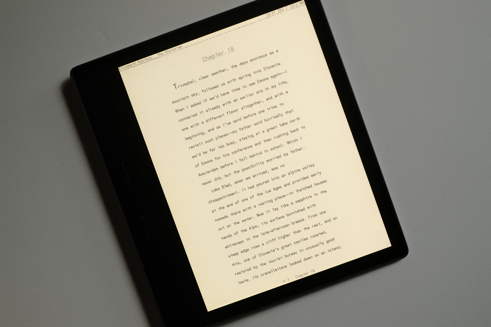
KOReader provides extensive customization of the top and bottom status bars. They can be filled with numerous data fields (and disabled altogether) but i prefer a more minimalist look..
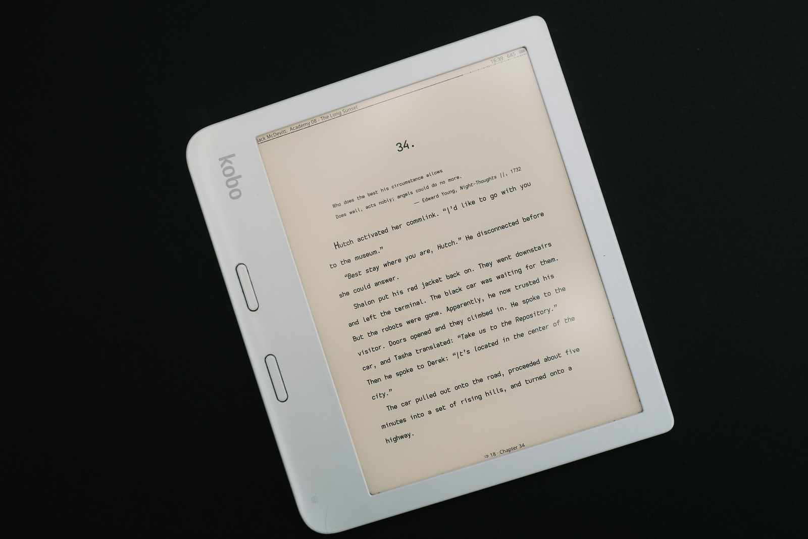
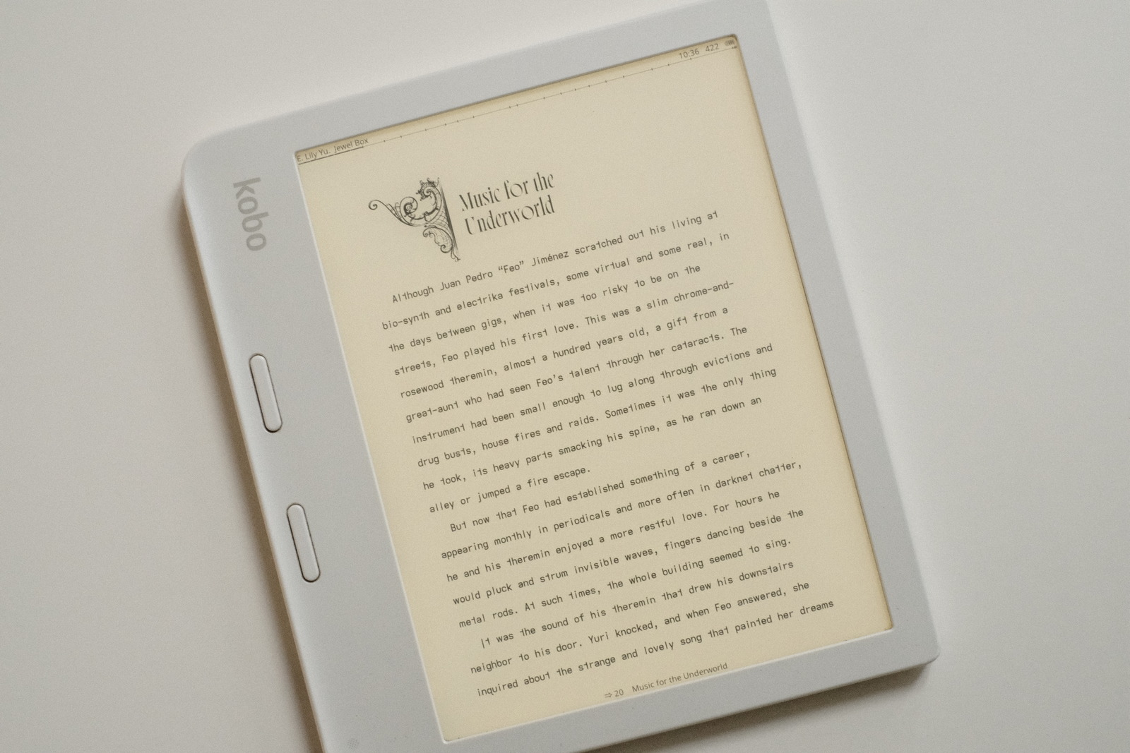
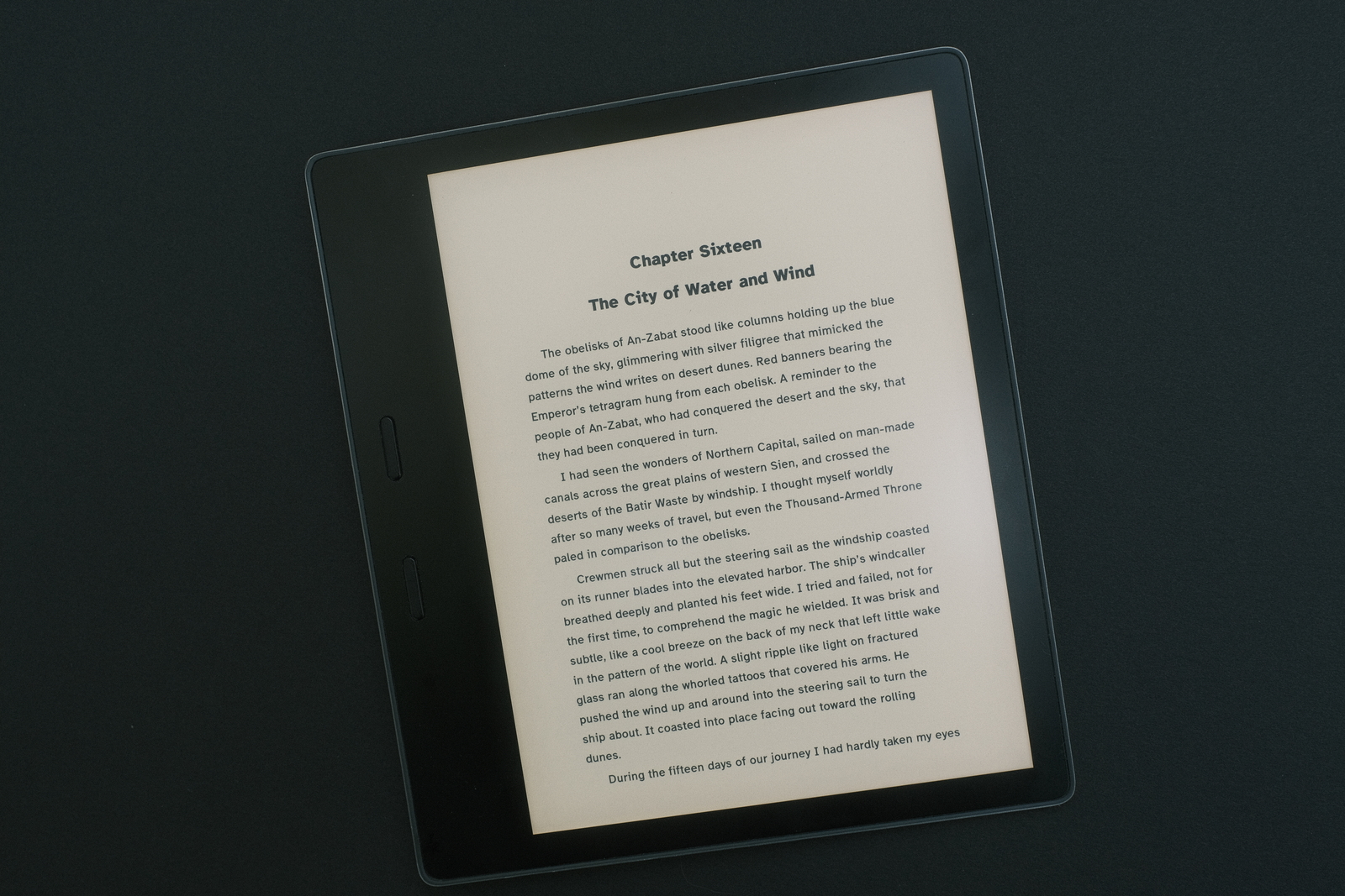
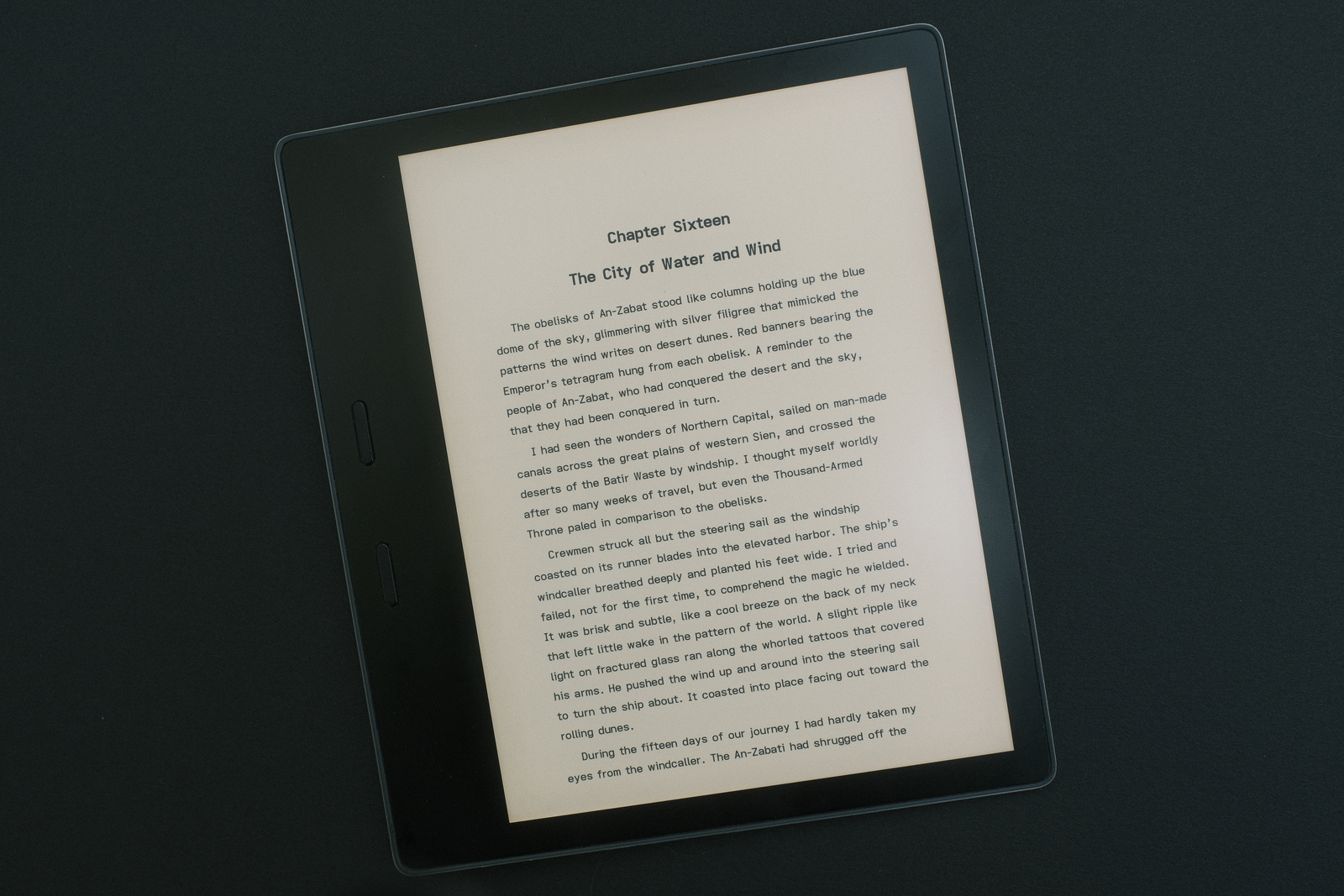
KOReader on Libra 2

top bar (left / right)..

  • author and book title
  • time
  • book page count
  • battery
  • progress bar with chapter ticks

bottom bar (centered)..

  • chapter pages left
  • wifi icon (displayed only if connected)
  • chapter title

A customizable progress bar can be presented in the bottom status bar instead—i prefer the top bar’s pencil thin marker.

While the informational content i have chosen may look like a lot, it is, in fact, only a small selection of the information elements available. As minimalistic as what i had set up under Kobo Nickel/Clock but with a more reductionist presentation.

user customization

as KOReader is written in lua script, one may further customize its behaviour by modifying its installed source code. While this may sound daunting, pretty much the worst one can do is render KOReader inoperable, requiring a hard reboot into Nickel and reinstall of the application (though, i have not attempted to bork my device this way!).

To date i have changed (from the .apps/koreader/frontend directory)..

  • both buttons to act as page forward in portrait orientation (independent of button side). This is a feature of kobopatches to the Nickel UX that i have become fond of for flexible single-handed ereader operation (preferring to use a screen tap for the rare occasion to page back)
source file function line edit
device/input.lua Input:init UPRIGHT RPgBack = “RPgFwd”
UPSIDE_DOWN RPgFwd = “RPgFwd”
  • the highlight display duration of words—from 0.5 to 1.5 seconds—after the dictionary window (which often covers the word) is closed to relax the time available to spot my last reading position on the page
source file function line edit
ui/widget/
dictquicklookup.lua
DictQuickLookup:onClose scheduleIn() 1.5
  • change status bar “no separator” to double space for a more relaxed visual separation of information elements (versus distracting separator glyphs :)
source file function line edit
apps/reader/modules/
readerfooter.lua
ReaderFooter:get_separator_symbol return “  ”
  • lower font size range minimum from 12pt to 11pt
  • increase line height range maximum from 200% to 300%
source file function line edit
apps/reader/modules/
readerfont.lua
ReaderFont:onSetFontSize
ReaderFont:onSetLineSpace
new_size 11
min() 300

As can be seen, i tend to tweak around the extremes—small font sizes with a touch of extra line spacing. My initial defaults started at 12.5pt font size with 200% line spacing—exhibit above—but has since been tweaked to 11.5pt at 205% for monospaced dyslexic fonts (for ease of highlighting).


Note: Editing the settings.reader.lua or profiles.lua file directly is an alternate way (and simpler for a single set of fixed values)—to set global/profile defaults outside the default ranges (which will persist as long as the settings are not subsequently altered via the bottom menu and saved as theme and/or set as global defaults).
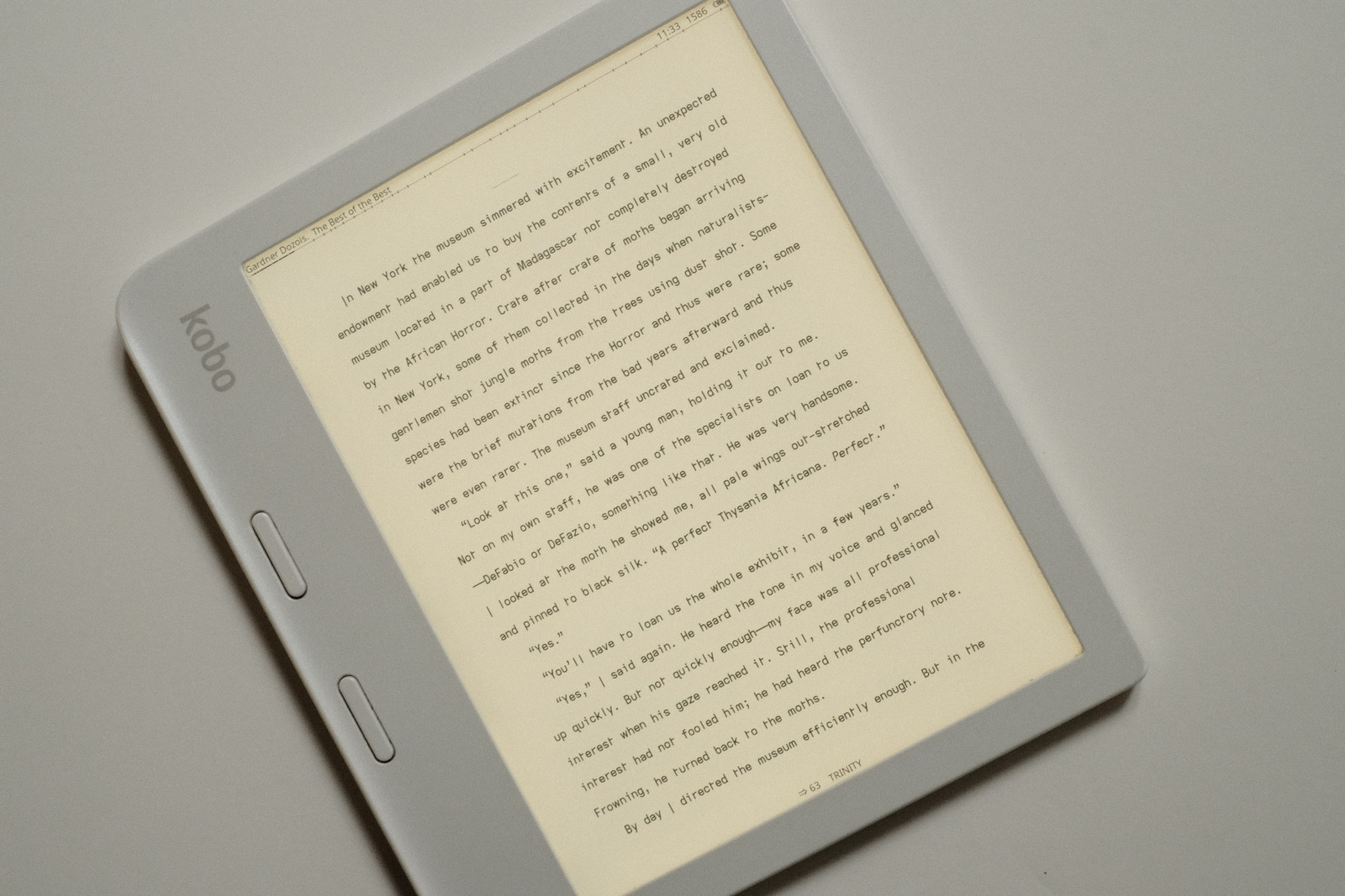
KOReader 11.5pt font size

Update: Line height from the above image has since been increased to 210% to further ease eye movement to the beginning of the next line (from the end of the previous). It is a highly personal setting but having been focused on typeface readability and reading effort, noticed a reduction in line hunting (which may be purely be an age related issue :)

This is just a sample of what can be done to tailor one’s ereading experience—thanks to the responsive KOReader community i was able to dig under the hood and locate the relevant lua scripts to modify. These changes only required editing a few lines of code with a text editor.


Note: These changes will require re-applying if/when KOReader is updated on the device—the application scripts being subsequently overwritten. There is a mechanism to apply “user” patches from a “patches” folder—which is not affected—but i have not yet invested the time clone to the relevant lines of code into functions for such a purpose. Regardless, for the few lines changed, it is still much less effort than the previous maintenance cycle required with my kobopatches customizations and each Kobo firmware update cycle.

history

the history view lists books that have been opened for reading. i remove books from the list on completion—a simple long press on the entry to pull up its action menu is all it takes—yielding a list of books in my reading rotation.

Whereas Kobo Nickel has a drop down of your last three books opened, i now with a swipe gesture can access my rotation of dozens of ebooks. It is a rotating list, the last book opened appearing at the top of the list. A single tap takes me to the last page of my list and i am good to go to select my next book. Easy peasy but bears mentioning for those who read multiple books or switch between multiple references.

Again, an example of how you can integrate the various views into your particular reading workflow.

calibre

When KOReader is first launched, books are accessed via the file browser by filename. But books sideloaded via Calibre can be accessed via their Metadata—by author, title, series and collections (tags).

Under Nickel the Calibre plugin KoboUtilities syncs the metadata and reading progress (if set up) automatically—the downside being the reading progress data taking a minute or so of time to upload if one’s on device catalogue is large (every book being scanned over usb). With KOReader, syncing is much faster due to reading progress stats of only “opened” unfinished books needing to be manually resynced.

Newly added books under Nickel are automatically added to Nickel’s UI—books, authors, series and collections—upon usb disconnect from Calibre*****. With KOReader, however, the Calibre database on the device must be updated after adding/updating books/metadate from Calibre’s device/update cached metadata action—KOReader access to the metadata must be setup once, via the top menu tools/calibre/search/manage/scan action.

The Calibre plugin KOReader Sync must be manually triggered to transfer the reading progress stats to Calibre’s database. There is a sync to the device—which i have not had need to test as of yet (waiting for the next gen Kobo Sage to be released where the library will be copied to :)


*****If books are added from Calibre from KOReader’s usb connection, Nickel’s catalogue must be manually updated via the books/import action—just to keep it synchronized (otherwise, the side loaded books, while visible to KOReader, will not show as having been sideloaded to the device the next time Calibre is launched).

screensaver

there are many different types of screensavers available to KOReader—book covers, image files, reading statistics..

But it stands worth pointing out one hugely beneficial and easily configured setting..

  • personalized screensaver message

This allows you to place contact information on your screensaver should your precious device ever be lost, heaven forbid! Why this is not available on every ereader (not to mention portable electronic) device is puzzling. Just one more way KOReader focuses on the user.


Note: Nickel allows custom screensaver images placed in its screensaver folder—KOReader has its own screensaver folder. KOReader’s custom screensaver message is a great timesaver but i highly recommend one edit a screensaver image with contact information for Nickel so this image is available upon device reboot.

stability

Kobo users have reported on occasion, random device freezes/reboots with the Nickel UI related to sideloaded epub content. i have experienced this as well with some firmware releases seeming to be more stable than others—this has always been difficult to ascertain with ever changing epub/kepub reading material.

KOReader’s epub engine appears to be much more robust and immune to internal ebook CSS violations. Rock solid in fact. While only weeks since installation, i have not experienced a single hiccup with the software—and that is reading 3 to 5 hours daily with a rotation of 30 ebooks.

The added benefit is no longer needing to convert epubs to kepubs to obtain advanced ebook statistics (under Kobo Nickel)—keeping on device file sizes to a minimum and saving computer conversion time. Win win all around.

android

anticipating Ratta Supernote adding KOReader to their Android enote platform (at some point), i installed KOReader onto my Pixel 7 Android phone..
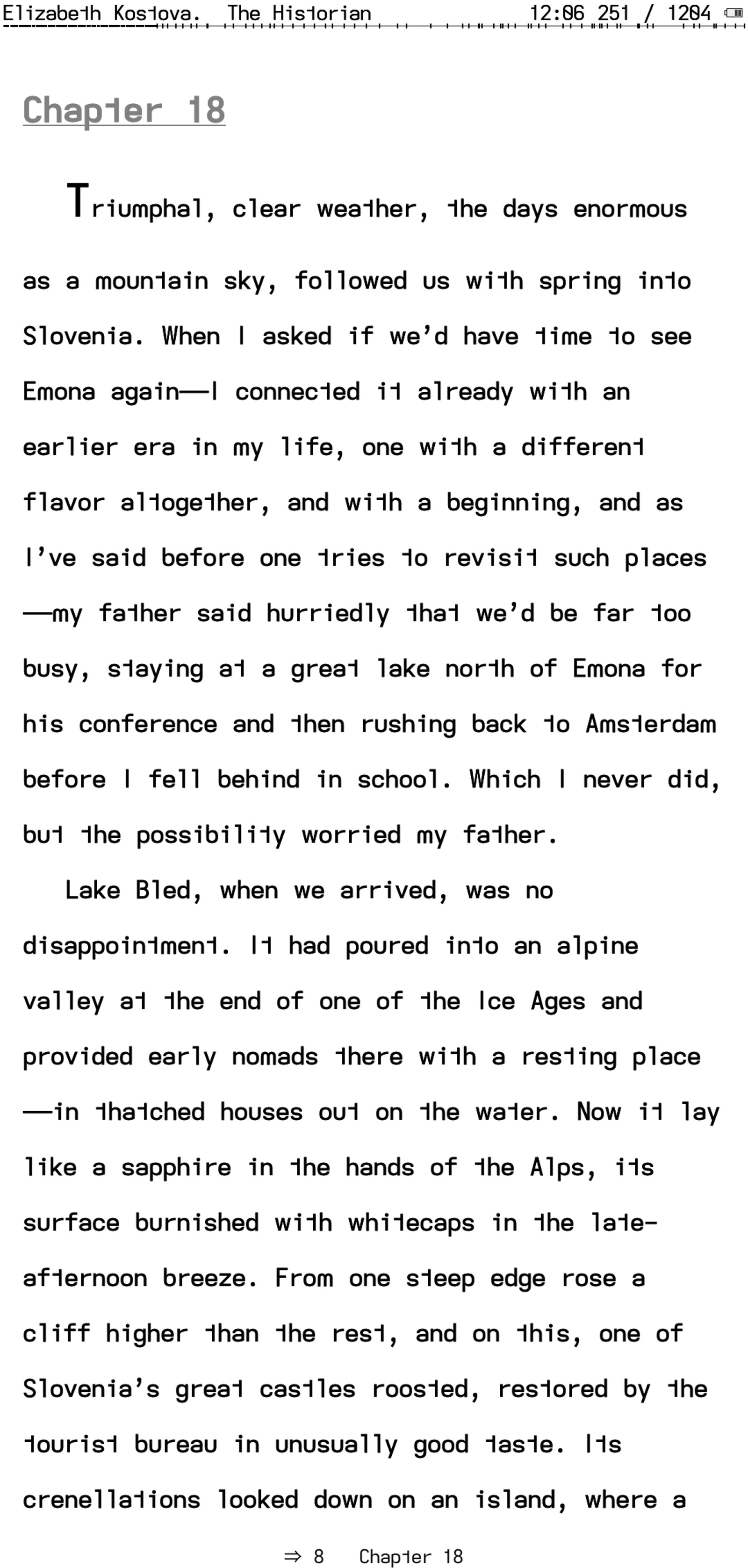
KOReader Android

Custom fonts, dictionaries.. everything worked as expected. The customizations described for the Kobo are a bit more involved for the Android platform—the APK file needs to be unpacked (unzip), the appropriate files edited or added, then the directory tree repacked and the resultant APK installed.

i did this stock install and layout setup just to see how KOReader would look, and it looked exactly as expected. i did not attempt to implement my source code customizations simply because i would not personally use my phone for reading—despite its form factor, the smartphone with Corning Glass, metal body and protective case weighs significantly more than my Kobo Libra 2 ereader making single handed usage more awkward and less ergonomic. YMMV. But it can be done!

There are eink devices with this form factor but they currently cost significantly more than even the Kobo Sage (which also can be used as an enote device) so only meet a very specific use case. Now, if Rakuten were to issue a Kobo ereader in this form factor with better ergonomics and priced accordingly within their product offerings.. :)

early closing thoughts

After just a few weeks i can honestly say KOReader has elevated my ereading enjoyment beyond my wildest dreams. And this off-the-cuff write-up only scratches the surface of what is possible with KOReader. i have not touched upon the various views KOReader provides into reading progress statistics, document skimming, vocabulary review, bookmarks, epub CSS formatting, connectivity features (wireless Calibre, news feeds, ssh), etc. i doubt very much there is any feature missing for even the most hard core reader (though, obviously, ongoing development reflects ever expanding user functionality and refinement).

The beauty of the application is that one only needs to start using it—as initially daunting as it may be—and gradually discover the useful power one simply never had available on any other stock ereader.

And then there is the dev community and the frequent updates to refine and optimize the application—i can’t say enough about how “open” this software truly is. If you’ve ever thought that the promise of eink was in becoming your own epublisher—consuming econtent to your own layout design preferences and UX—then KOReader just may fit your bill.

i highly recommend it.

kindle oasis

since the initial draft of this post, i was able to jailbreak my Kindle Oasis—if one can avoid updating their recent Kindle’s firmware, eventually means are published to jailbreak the device before Amazon pushes out yet another firmware update patching such a security hole. It is an involved but straight forward process and, for anyone wishing more control over the UI, well worth the effort (although, one does give up direct device integration to their Amazon account).

KOReader functionality for Kindle hardware is slowly getting there. It is not as well integrated as on Kobo devices—for example, USB access requires exiting KOReader altogether and gesture control of the backlight/warmlight feels less responsive. (i am uncertain about some of the more “advanced” features of KOReader as the Kobo Libra is my primary ereader).

Launching KOReader on the Kindle requires navigating to the “Library” and opening (launching) the KUAL document. From there, one selects the “KOReader” and, voila, you now can enjoy the best ereading software.

The folder structure of KOReader remains identical, so fonts and patches can be applied similarly.

]]>
current configurationhttp://thedarnedestthing.com/current%20configuration2024-04-13T13:50:56-04:002024-03-20T10:48:59-04:00Steven Humhttp://thedarnedestthing.com/

production environment

platform

the darnedest thing

comments processing

  • Ruby Mail library
  • Gmail spam filtering

web server

hosting services

development environment

platform

mail processing

writing tools


**Transitioning to the helix modal editor as my daily driver with its object/action editing model (versus vim’s action/object approach). It’s good to exercise the neural pathways :)

walk about journalware

tools

thoughtware

]]>
koreader user patcheshttp://thedarnedestthing.com/koreader%20user%20patches2024-04-13T13:50:56-04:002024-03-13T17:42:53-04:00Steven Humhttp://thedarnedestthing.com/

koreader is a comprehensive ereader app. There is very little to want for it. The degree of end user control it provides is so vast, many who install KOReader are quickly overwhelmed by the plethora of menu options, only to return to their device’s much simpler and familiar native ereader platform. (i can be counted in as one myself, having installed and uninstalled it many times before affording it a deeper look).

Before KOReader, i merrily updated my kobopatches customizations with every Kobo Libra 2 firmware update—kudos to the devs who manage to roll out the updated kobopatches the same day the firmware updates roll out. KOReader changed all that because the margin, font and line spacing tweaks i made with kobopatches were unnecessary with KOReader.

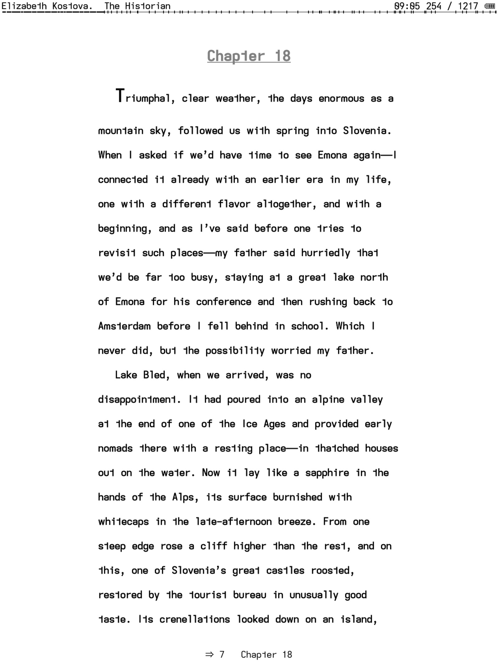
If i could do nothing with KOReader, i would not feel my ereading experience lacking. It exceeds all the expectations one can have of an ereader application (certainly for me—there are many features i have yet to use. The screenshot below is a first time use)! But its LUA code foundation does allow one to look under the hood. So the inevitable happened..

lua changes

there were several items i wanted to tweak to further refine my personal ereading experience with KOReader..

  • Often times, the highlighted word for a dictionary lookup is hidden by the dictionary popup window. i wanted to increase the highlight delay so that after the popup clears, these senior eyes have sufficient time to relocate the highlighted word.

  • i like both my page turn buttons to page forward. This allows changing hand positions over the course of long reading sessions and using either button for advancing the page no matter which hand is being used or how the device is being held. The odd time i need to go back a page, i leave to tapping the screen.

  • i like to read at small font sizes with suitable line spacing for maximum readability, so needed to extend the ranges available to tweak the “proofing” layout i prefer to read with—from 12pt to 10pt for fonts and from 200% to 300% for line spacing.

  • And from a UI perspective, i wanted to apply my reading font to the statusbar and alt-statusbar for visual uniformity. i also prefer the statusbar separator to be spaces (versus glyphs for minimal visual noise) and wanted to control its width to clearly separate the information elements.

After poking around the code (with some help from the devs and others more intimate with the code) i was able to identify and modify the following source files..

feature lua file location
dictionary highlight
delay timer
dictquicklookup.lua frontend/ui/widget
page forward
(all buttons)
input.lua frontend/device
fontsize &
line spacing
creoptions.lua
readerfont.lua
frontend/ui/data
frontend/apps/reader/modules
statusbar font font.lua frontend/ui
alt-statusbar font credocument.lua frontend/document
statusbar separator readerfooter.lua frontend/apps/reader/modules

The bulk of the effort spent was actually consumed in locating the relevant source code files—tools like ack, ag (the silver searcher), etc. for doing string searches through folders of source code are your friend. The code changes themselves were trivial :)—the changes are more self-evident in the user patch explanations below.

Kobo screenshot

drift font book and statusbars

As before with kobopatches, i found myself updating the requisite source code files after each KOReader update. Updating KOReader was not as pressing since the application was already fulfilling everything i could have asked of it. But just to keep current and take advantage of any performance improvements..

It became quickly apparent that my customizations touched only stable areas of code which remained unchanged after subsequent updates (save for one syntax change in the latest update). Enter..

user patches

which provide a mechanism to override or add even, functionality to KOReader and are not overwritten by software updates. Anything that breaks is apparent at KOReader relaunch identifying the patch in question—i still check the updated sources and, so far, have come across only one syntactic change which i could have ignored.

The biggest challenge i found was identifying the lua “requires” modules (sources) that define the KOReader functions called within the patch. Most often, these references are easily pulled from the original source whose function is being modified. Sometimes, though, culling the source code base with a string search engine for a function or data element keyword is necessary to identify the possible candidates. (It gets easier with each additional user patch one is inspired to create)!

It is initially daunting, the code base being so large. But soon the branch of code relevant to one’s needs becomes apparent. In my case, with everything being UI related, all the changes resided in the “frontend” branch. The only head scratcher that tripped me up was a reference to a “settings.reader.lua” file. Search as i might on the KOReader git source, this file could not be found! Turned out, it is created on the device on launch. Doh!

Some patches merely required overriding a data element. KOReader would take care of the rest. Other patches required bundling the whole function that had a single hard coded setting i wished to override.

The following user patches may look complicated but very few statements are modified or added by me. Note the “requires” statments and the functions they reference. The numeric source code prefix designates triggering after the KOReader UIManager is ready—see the wiki.

2-dictionary-close-highlight-delay.lua

a simple copy of the original KOReader function with the hard coded delay increased from 0.5 seconds..

local Event = require("ui/event") local UIManager = require("ui/uimanager") local DictQuickLookup = require("ui/widget/dictquicklookup") DictQuickLookup.onClose = function(self) for menu, _ in pairs(self.menu_opened) do UIManager:close(menu) end self.menu_opened = {} UIManager:close(self) if self.update_wiki_languages_on_close then if not self.results.no_result then self.ui:handleEvent(Event:new(“UpdateWikiLanguages”, self.wiki_languages)) end end if self.highlight and not no_clear then local clear_id = self.highlight:getClearId() UIManager:scheduleIn(1.5, function() <– from 0.5 seconds delay self.highlight:clear(clear_id) end) end return true end

The patch may appear disproportionate to the single hard coded value that could otherwise be edited directly in the original source code. But it is a one time effort and well worth it IMO. It is the same for all the other user patches.

2-fontsize-linespacing.lua

two sources are referenced in this user patch wrapper. The first part sets the new fontsize and linespacing ranges..

local min_fontsize = 10 <-- point size local max_linespacing = 300 <-- percent local CreOptions = require("ui/data/creoptions") CreOptions[3].options[4].more_options_param.value_max = max_linespacing CreOptions[4].options[2].more_options_param.value_min = min_fontsize The second part updates the corresponding UI popups and their allowable input values to the new ranges.. local Screen = require("device").screen local Event = require("ui/event") local Notification = require("ui/widget/notification") local T = require("ffi/util").template local _ = require("gettext") local ReaderFont = require("apps/reader/modules/readerfont") function ReaderFont:onSetFontSize(size) size = math.max(min_fontsize, math.min(size, 255)) <– from 12pt min self.configurable.font_size = size self.ui.document:setFontSize(Screen:scaleBySize(size)) self.ui:handleEvent(Event:new(“UpdatePos”)) Notification:notify(T(_(“Font size set to: %1.”), size)) return true end function ReaderFont:onSetLineSpace(space) space = math.max(50, math.min(space, max_linespacing)) <– from 200% max self.configurable.line_spacing = space self.ui.document:setInterlineSpacePercent(space) self.ui:handleEvent(Event:new(“UpdatePos”)) Notification:notify(T(_(“Line spacing set to: %1%.”), space)) return true end

2-page-forward-buttons.lua

this user patch simply redefines the mapping table for button actions in their corresponding 360 degree portrait/landscape device orientations..

local logger = require("logger") local Device = require("device") Device.input.rotation_map = { [0] = { RPgBack = “RPgFwd” }, <– from {} [1] = { Up = “Right”, Right = “Down”, Down = “Left”, Left = “Up”, LPgBack = “LPgFwd”, LPgFwd = “LPgBack”, RPgBack = “RPgFwd”, RPgFwd = “RPgFwd” }, <– from RPgFwd = “RPgBack” [2] = { Up = “Down”, Right = “Left”, Down = “Up”, Left = “Right”, LPgFwd = “LPgBack”, LPgBack = “LPgFwd”, RPgFwd = “RPgFwd”, RPgBack = “RPgFwd” }, <– from RPgFwd = “RPgBack” [3] = { Up = “Left”, Right = “Up”, Down = “Right”, Left = “Down”, RPgBack = “RPgFwd” }, <– from default RPgBack = “RPgBack” } logger.info("Hardware button rotation disabled by user patch")

2-statusbar-font.lua

this patch sets the statusbar and alt-statusbar font to the document’s default font..

local DataStorage = require("datastorage") local G_reader_settings = require("luasettings"):open(DataStorage:getDataDir() .. "/settings.reader.lua") local fontface = G_reader_settings:readSetting("cre_font") The alt-statusbar requires just the font family name be set.. local CreDocument = require("document/credocument") CreDocument.header_font = fontface <-- alt-statusbar font The statusbar requires the corresponding font source and locates the matching filename from KOReader’s fonts folder.. local Font = require("ui/font") names = { "-book.ttf", "-book.otf", "-regular.ttf", "-regular.otf" } for _, n in pairs(names) do local f = io.open(DataStorage:getDataDir() .. “/fonts/” .. fontface .. n, “r”) if f ~= nil then <– font source exists io.close(f) local fontsource = fontface .. n <– statusbar font filename for k, _ in pairs(Font.fontmap) do if k == “ffont” then Font.fontmap[k] = fontsource elseif k == “smallffont” then Font.fontmap[k] = fontsource elseif k == “largeffont” then Font.fontmap[k] = fontsource end end break end end

NOTE: KOReader’s .sdr file for the opened document contains the current font settings for the document. The alt-statusbar font may require a reset of the document settings (from the top menu) to re-initialize the settings to the desired font.

2-statusbar-separator.lua

this final patch simply bypasses KOReader’s function and returns the desired separator, in this case, a single space—this pads KOReader’s default spacing for “no separator”. It could easily be modified to return any glyph string..

local ReaderFooter = require("apps/reader/modules/readerfooter") ReaderFooter.get_separator_symbol = function(self) return “ “ end

NOTE: This patch overrides any glyph choices made with the statusbar separator UI dialogue.

The result of all this..

Kindle Oasis with KOReader user patches

Examined closely, the statusbars reflect the document’s reading font. (i admit, one has to be, perhaps, more than a touch anal to object to a contrasting header/footer font.. :)

koreader portability

Is this effort worth it? i feel so. KOReader continues to be enhanced and updated regularly. But there is more!

On tha Kobo and jail broken Kindle, KOReader’s lua source code is accessible for direct modification—useful for testing before deciding whether or not to create a user patch. On Android devices, however, user patches are the only means for implementing such customizations, short of rebuilding the Android apk altogether.

With the exact same user patches in Android’s KOReader patches folder..

Android phone with KOReader user patches

Voila!

You might have noticed the wide left/right margins used on the Oasis. As a result of trying out a similar line width as might be expected on a candy bar shaped device (looking at you, Boox Palma) i went to a 50 character line width for acclimatization—at the lower end of the 45-75 character width spectrum for optimal reading consumption—and discovered i quite like that newspaper like column format (remember when news was leisurely consumed over a morning coffee and a folded paper?).

This opens the door to exploring reading on other platforms exactly the way i want. KOReader never ceases to impress. And i, for one, am truly indebted to those involved who have created this application for dedicated ereaders eveywhere.

repos

the above user patches may be found in my dotfiles under the koreader folder.

]]>
hidinghttp://thedarnedestthing.com/hiding2024-04-13T13:50:56-04:002024-02-22T08:51:23-05:00Steven Humhttp://thedarnedestthing.com/ ]]>adrift fonthttp://thedarnedestthing.com/adrift%20font2024-04-13T13:50:56-04:002024-02-21T17:31:10-05:00Steven Humhttp://thedarnedestthing.com/

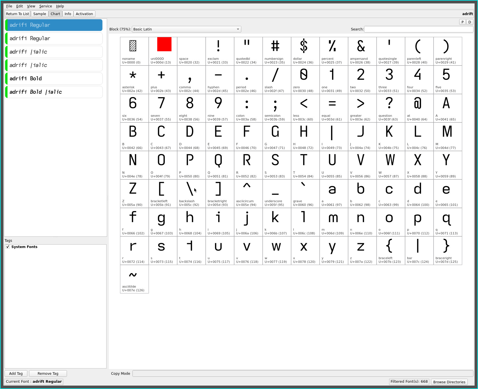
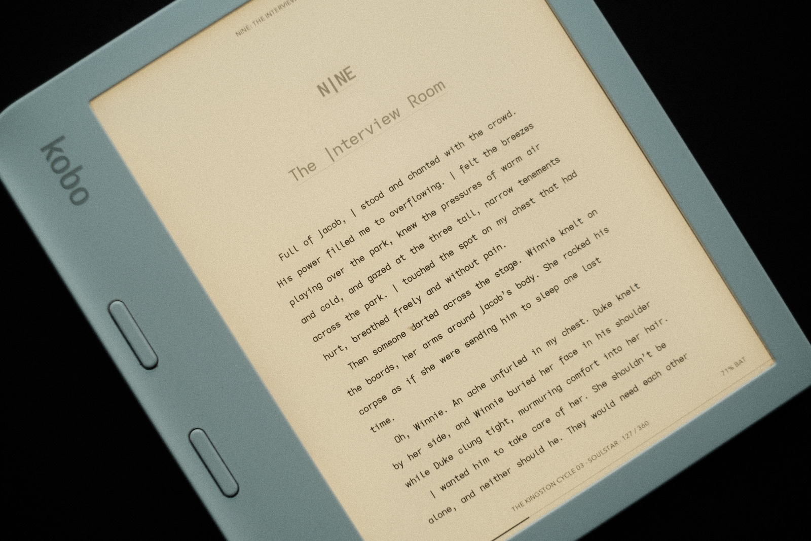
following hot on the recent cell width tunings for the serifless capital I and lower case l, comes the adrift font with cell width adjustments for the lower case hooked glyphs..

adrift font

adrift is essentially the drift font with the descending capital I unique to the typefaces produced on this site—its name at six characters to differentiate it from the regular I cap height of the other fonts in my rotation.

The descending capital I adds an anchor point to the font and makes the letter stand out even more, especially in first person narratives. In headings it takes some getting used to—but each to their own.

More importantly..

cell widths

as an advocate of monospaced fonts for the uniform visual cadence they provide for reading, glyph set combinations have largely settled down in this exploration of high readability fonts using non-mirrored asymmetric glyph shapes.

This culminated in the base set of fonts drift, draft, stria and patio. With glyph sets combinations having possibly come to an end(!), attention has returned to the visual density of these (largely) monospaced fonts.

With the subtle refinement offered by the extended width upper and lower case M W and the narrowed width of serifless capital I and serifless lower case l, serifless and hooked glyph spacing for combinations of the lower case i and l began to stand out more. Thus, the following cell width adjustment for the above fonts..

font 0.85x 0.925x (new) 1.25x
adrift descending capital I hooked i j l M m W w
adrift**   hooked i j l M m W w
drift serifless capital I hooked i j l M m W w
draft serifless l hooked i j M m W w
stria serifless capital I hooked i j tailed l M m W w
patio serifless l hooked i j M m W w

**See adrift below

These subtle cell width adjustments render a more uniform visual density while maintaining the overall visual cadence afforded monospaced fonts (perhaps marking the conclusion of this font journey! :)

The proportions are derived purely from visual experimentation at the very small font sizes i happen to read at. Future eye sight requirements for reading at larger font sizes may necessitate revisiting the values applied.

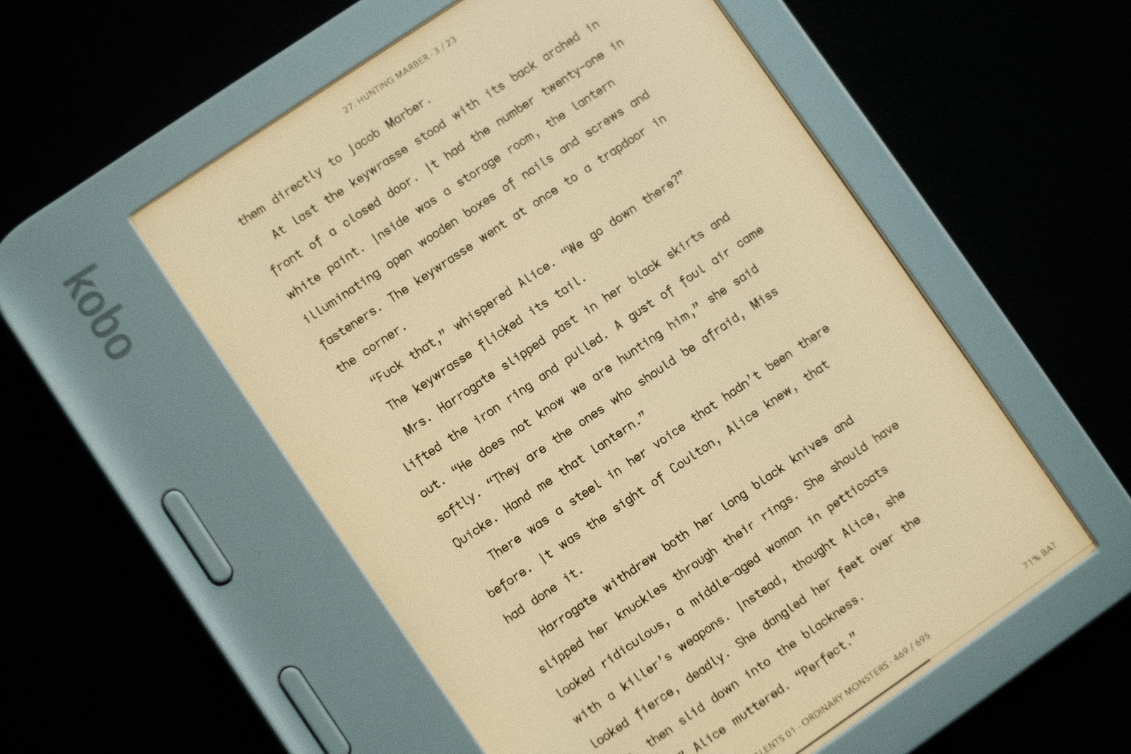
drift font on Oasis

repos

These cell width adjusted fonts may be found on OneDrive.

The previous font sets have been moved to the “archive” folder.

Kindle specific fonts with wider line spacing adjustments (to accommodate Kindle’s limited layout control) are no longer generated—finally jail broke my Oasis and installed KOReader. These fonts may still be used on Kindles, just limited to the devices’ line spacing options.

adrift

is offered in the repos with the more common serifed capital I as well (rather than differentiating this glyph set from the descending capital I variant with yet another font name—the rationale being that preferences will be for one glyph set or the other and, most likely, the more familial serifed flavour).

adrift serifed

In a way, from a nomenclature perspective, adrift derives itself more directly from the drift and draft fonts, adding the serifed capital I from draft to drift :)

]]>
drift font duohttp://thedarnedestthing.com/drift%20font%20duo2024-04-13T13:50:56-04:002024-02-10T08:49:57-05:00Steven Humhttp://thedarnedestthing.com/

tired eyes are an effective test of typeface readability. Even a favourite font gets more closely scrutinized under less than ideal reading conditions in the wee hours of the night.

And so it was with the licht. i favour this font for its clean geometric simplicity and optimal air between letters. It is a monospaced font (for the most part) with slightly tuned side bearing for its vertical stroke i l glyphs to yield a very unforced typeface.

However, at the very small font sizes i read at, and under less than ideal lighting conditions, the serifless lower case i often looks less distinct. Context, of course, is never a problem comprehending words but the visual impact causes visual jitter.. like a double take. It is for the most part unnoticeable but there—at least, i perceive it to be.

The remedy: to tweak the font, of course! Now, the grote font addresses this very effectively but i have developed a fondness for the radically unique reversed asymmetric t of the licht font. So enter the..

lucid font

which is simply the grote font with a reversed asymmetric t..

lucid font

The change from the serifless lower case i back to the serifed glyph which has been present in all the fonts created (until licht) is sufficient to restore its legibility in i l letter combinations—the forest for the trees—when small font sizes challenge visual acuity. There is no denying the dot separation afforded by the glyph’s hook.

This simple fix led to another, in this case, influenced by recent changes to my coding font. The..

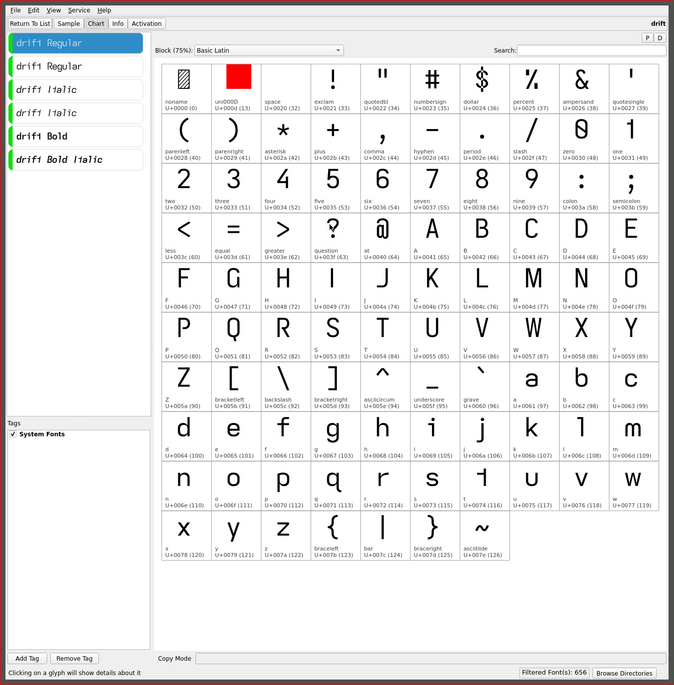
drift font

breaks my recent predilection towards the unique descending capital I with a standard height serifless I and the addition of the serifed hook lower case l..

drift font

similar to the serifed hook of the lower case i. The upper hook of the l adds air to its base and adjacent letters (unlike the lower tail used with prior fonts). With the reversed asymmetric t, these three glyphs all “point” in the same direction, imparting a sense of flow or direction and movement to the printed text. Hence, its name :)

The serifed l also allows the re-introduction of the standard height serifless capital I (a big bonus for those all caps headings and those who find the unique descending capital too radical). Despite my general aversion to serifed glyphs, this combination works surprisingly well, providing maximum visual separation from the serifless capital I.

This font is highly readable—i would rank it the equal of stria (or even a hair above it with the added air of the glyph set. YMMV)—with its additional distinctive serifs. My current source code font differs little from this glyph set—adding a serifed capital I, vertical-crossing Q and serifed 1 (one) for the maximum legibility required of coding fonts.

Its high readability may very well elevate it to the top of my font list for the palm readers i am considering, on which i would use even smaller font sizes.

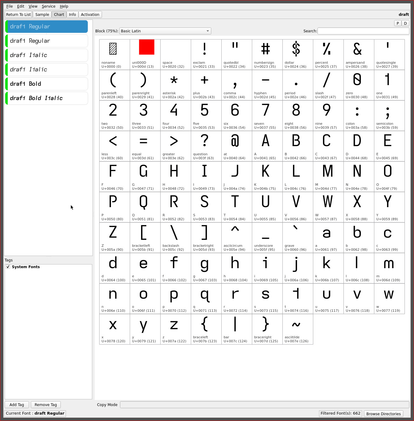
draft font

it didn’t take long and after less than two weeks another capital I lower case l combination emerged..

draft font

The draft font with its serifed capital I and the serifless lower case l (el). This font is the static counterpart to drift and yet another typeface with a standard height capital I.

Its “look” feels almost transparent in character as essentially the lucid font without the distinctive descending capital I. Perhaps it is the change up after such a long period of descending caps that i find this font quite refreshing. It has a very neutral character yet retains all the subtle non-mirrored glyph tweaks and is effortless to read with.

Then it was apparent: these two fonts come full circle back to the Atkinson Hyperlegible Font which began this exploration of typefaces and readability. Okay.. maybe a stretch when one considers all the changes since the elimination of mirrored glyph shapes for enhanced readability—the few personal minimalist (stroke) capital glyph choices and the reversed asymmetric t—but the “spirit” is there, even if my personal aesthetic is firmly stamped on these fonts.

It is apropos that its name should be “draft”. Emphasizing the line spacing format that promotes proofing :)

On the readability scale, both fonts score very evenly, though the hooked l of the drift font edges out draft (IMO. Though aesthetics may lean towards the serifless l of draft. YMMV). On KOReader i currently use draft for the header/footer and either for content—though, i am certain the descending I will find its was back into the rotation as well. For now it is a change up to standard height fonts :)

~   ~   ~

upper case licht lucid drift draft
(eye) I descending-
serifless
descending-
serifless
serifless serifed
lower case licht lucid drift draft
i serifless serifed serifed serifed
(el) l serifless serifless serifed serifless

repos

These asymmetric font variants may be found on OneDrive. The licht font and similarly serifless tweaked fonts may be found in its separate folder for both the Kindle and Kobo ereaders.

The Kobo set applies a line height spacing of 1x for a more universal application—such as for KOReader. The Kindle set applies a 1.9x line height to achieve an appropriate line spacing for optimal readability.

]]>
mirrored asymmetric fonthttp://thedarnedestthing.com/mirrored%20asymmetric%20font2024-04-13T13:50:56-04:002023-12-27T19:17:27-05:00Steven Humhttp://thedarnedestthing.com/

the visual geometric minimalism and “flow” of the asymmetric lower case t propelled the grote font to the default ereading font with KOReader.

Its geometric form invited experimentation with its orientation—counter to the convention for the glyph—well.. just because i could. The original glyph shape expressed an outward (right direction) flow, especially as the last letter of words, but has a somewhat abrupt edge as the leading letter of words.

Flipping the glyph along its vertical axis reverses this creating a distinct terminator but with a more geometrically satisfying (IMO) lead in character with its x-height horizontal arm (which most lower case letters end in glyph height).

As the second most frequent letter and most frequent bigram and trigram—with th and the—with the added pleasing rise to the lower case h, this single mirrored glyph shape alters the character of the grote font dramatically. Enter the..

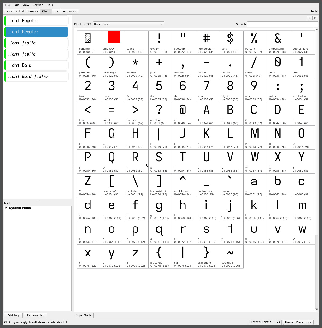
licht font

formerly named “lythe” when originally released but since renamed (just because.. fickle) once it became my default reading font..

licht font

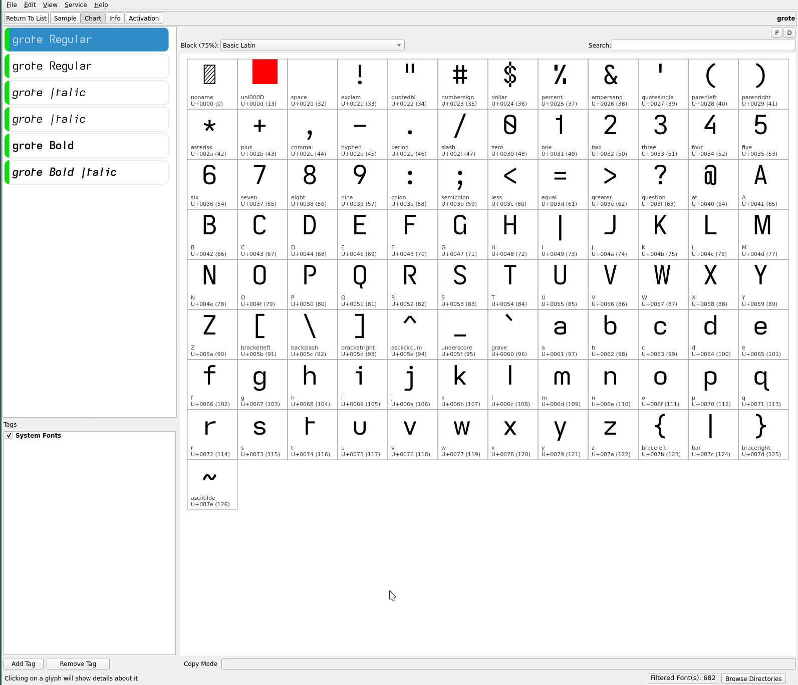
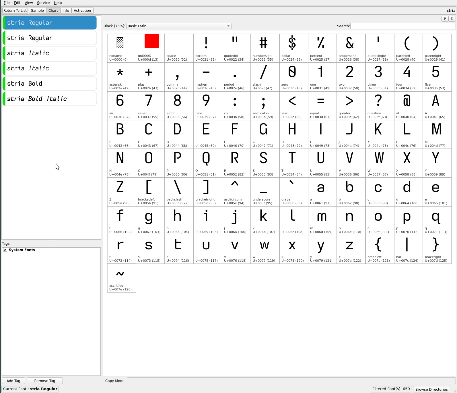
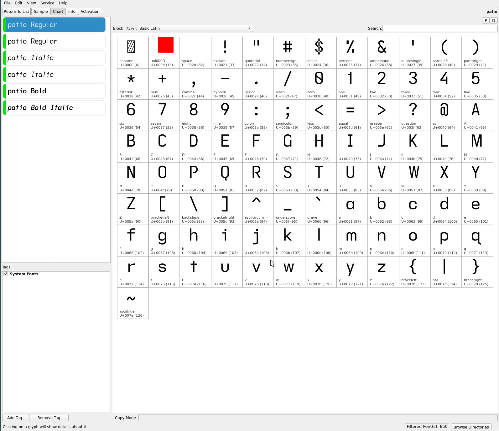
upper case licht grote stria patio
(eye) I descending-
serifless
descending-
serifless
serifless serifed
lower case licht grote stria patio
a double-storey double-storey double-storey single-storey
i *serifless* serifed serifed serifed
j *serifless* serifed serifed serifed
(el) l serifless serifless flat-tailed serifless
(tee) t *reversed*
hookless-
asymmetric
hookless-
asymmetric
hooked-
asymmetric
cross
y straight straight straight-turn straight

The lower case i j lose their serifs to increase visual separation from the “flipped” asymmetric t. This bumps the legibility of the font down a notch from the grote font—but in return, creates a geometric dyslexic font with a full sans serif glyph set.

The font suffers on lower resolution displays such as typical computer monitors—with the serifless lower case i j—but excels on 300 PPI ereaders and smartphone displays. Despite this, elements of this font have made their way into the webfonts for this site—licht having become ubiquitous on my desktop system.

NOTE: subsequent releases of these fonts have all moved to a serifless lower case j, its shape being distinct from its flat hook capital.

serifless cell width

the serifless descending capital I and lower case i l show significant side bearing (visual space) due to the letter frequency and especially in combination—being essentially single vertical stroke glyphs within fixed monospaced cell widths.

The licht font marks a departure from its predecessors with a modest 0.85x** cell width applied to these three glyphs in order to render a slightly more uniform visual density which also aids in word separation recognition—with the added benefit of increased page content.

licht font

This minor adjustment largely masks the monospaced nature of the font whilst retaining all of its reading benefit. (Variants of the grote, stria and patio fonts have since been created with the appropriate serifless cell widths applied).


**A tighter cell width more in line with the side bearing of the o (oh) glyph was not applied in keeping with the general monospaced character of the font, to maintain the uniform visual cadence of (and illusion of) monospaced fonts.

readability

dyslexic ranking is not determined by measurable metrics—dyslexia itself being a highly personal condition. So.. this ranking of the fonts now in rotation is purely rationalized with a measure of “feel” or experience staring countless hours—cumulative days—at these fonts.

All the fonts sport the baseline of asymmetric glyphs and differ in embellishments to yield their differing “character”..

typeface rank readability aid readability penalty
stria 1 double-storey a,
serifed i,
flat-tailed l
 
grote 2 double-storey a,
serifed i
descending I,
serifless l
licht 3 double-storey a descending I,
serifless i l
patio 4 serifed I (eye) i single-storey a
lathe*** 5   descending I,
serifless i l,
single-storey a

stria as the first font to introduce the asymmetric t holds the first position with its lower case serifed i j and, hooked and tailed l t y. The hooks and tails, in particular, aid in anchoring their letters to the character floor. The serifed letters emphasize the “dot” and add sufficient width to the glyph to fill out its cell width so as not appear isolated from adjacent glyphs.

grote introduces the descending capital I and the serifless lower case l. To my eyes, there is no issue distinguishing between the two letters. YMMV. The geometric asymmetric t further distinguishes the font.

licht with its serifless glyph set will be the domain for those with the visual acuity to distinguish the “dot” of the i j in particular. But i love this font for its utter simplicity of glyph shapes. The modestly tightened side bearing of the serifless capital I and lower case i l maintain the font’s monospaced feel while increasing page word density a smidgen—a win win!

patio has a very early “school” feel to it with its serifed capital I and crossed t. The single storey a loses out to its more common double storey glyph but this yields an otherwise very classic typeface.


***lathe is a recent addition being essentially the licht font with the single storey a. It was created purely for the single storey a—to satisfy a Bauhaus typeface urge—and not for readability :-) The single storey a loses marks for its “o” like glyph shape but its openness is also compelling at times. Not a font for tired eyes but i often enjoy it for the minimalist shape, particularly with many common bigram combinations.

~   ~   ~

As the original asymmetric fonts took some time to adjust to, so does the licht font again, due to its unfamiliar glyph shape—more so, in fact. It took me a good day of reading to get used to reversed asymmetric t—its lead in shape, though, more than compensates and feels almost like a kerned glyph.

i like this font a lot. As a sans serif and geometric font. And for the distinctiveness of the font. The “normal” asymmetric t of the stria and grote fonts feel more natural—and i am certain most will gravitate towards stria, in particular—but i am not certain how much of that is a pattern of familiarity.

With each day, the reversed asymmetric t feels less unusual and it sits well if not better, most everywhere else (IMO). Between the descending capital I and the reversed asymmetric t, there is no font like it. Unique in its glyph set while at the same time being highly readable (and pleasing, to these eyes).

As always, YMMV.

final notes

i hesitate to use the word final but these last changes, especially with the tightened cell width for the serifless I i l glyphs, feel like the end of the font journey is nigh. i say this because i am pleased with these last four fonts and am quite prepared to read with them exclusively for some time to come.

One thing has come to light as these fonts have been shared for feedback: the latter fonts, in particular, have been driven—the asymmetric t especially and the caps selections—by my personal aesthetic versus pure glyph shape readability for the visually impaired. Serifs, hooks, tails and corners can add distinguishing features to a glyph as well as anchoring its orientation—and that my drive towards glyph shape minimalism and a particular aesthetic is not necessarily beneficial towards this readability which was the drive for the earlier font explorations.

It is quite likely, that some of the earliest fonts created—those more closely based on the initial Atkinson Hyperlegible Font glyph set with dyslexic adjustments—are the most readable from a pure glyph shape perspective. In other words, the evolution of fonts on this site has probably been more beneficial for me alone versus the population at large. Certainly, the ever tightening word spacing over time reflects this.

Towards that end, i really do encourage one to play with creating fonts for one’s reading needs. You understand your visual needs best.

repos

These asymmetric font variants may be found on OneDrive. The licht font and similarly serifless tweaked fonts may be found in its separate folder for both the Kindle and Kobo ereaders.

The Kobo set applies a line height spacing of 1x for a more universal application—such as for KOReader. The Kindle set applies a 1.9x line height to achieve an appropriate line spacing for optimal readability.

]]>
asymmetric font triohttp://thedarnedestthing.com/asymmetric%20font%20trio2024-04-13T13:50:56-04:002023-11-06T08:57:33-05:00Steven Humhttp://thedarnedestthing.com/

“flat” fonts and the asymmetric lower case t have become my main focus of late—the increased air between lines taking precedence over earlier typefaces using extended/descending glyphs. A different feel that i have settled on for small font sizes on ereaders.

tl;dr Typeface differences..

letter grote stria patio
(eye) I descending-serifless serifless serifed
a toothless-double-storey toothless-double-storey single-storey
(el) l serifless flat-tailed serifless
(tee) t hookless-asymmetric hooked-asymmetric hookless-cross
y straight straight-turn straight

KOReader 11.5pt

asymmetry

The typefaces created on this site applied increasingly, dyslexic glyph choices to eliminate mirrored glyph shapes to enhance readability, culminating in..

For the lower case b d p q..

glyph shape
b toothless-rounded
d toothed
p earless-corner
q hook-tailed

For the lower case m n u..

glyph shape
m earless-rounded
n straight
u toothless-rounded

For the lower case f t..

glyph shape
f serifless
t hookless-asymmetric

The asymmetric lower case t is a glyph choice i would not have made a year ago—it being a radical departure from the ubiquitous cross, so much so, the flat-tailed shape evaded comparison to the lower case f (and probably why, for a time, several font variations favoured the extended f). Its minimalist geometry and air appear to be even easier—to my eyes, at least—to identify. Word recognition feels faster and more effortless. It has a sense of “velocity” versus the more anchored static look of the cross—a preference which is highly personal.

The benefit of non-mirrored glyph shapes not only for dyslexia but for visual processing in general, is most apparent in words containing combinations of what would otherwise be mirrored glyphs shapes. Non-mirrored glyphs do not tax our visual cortex which our mind constantly seeks to find patterns with—fewer neural cycles are consumed to separate their shapes and meaning, subtly relaxing the visual effort and quickening word recognition.

air

For visual air to adjacent letters..

glyph shape
a double-storey-toothless-corner

The toothless lower case a was a late discovery—the toothed glyph shape being universally imprinted. The touch of added air to the base of the letter is noticeable when preceding the left vertical stroke of the lower case letters h k m n p r t—especially at small font sizes—lessening the visual density to the eye. (From a dyslexic perspective, the loss of the tooth as an anchor point may be a negative for some—for which case, the earlier typefaces may be preferable).

All told, these dyslexic glyph choices comprise roughly 40% of both the English alphabet and usage by words and letters for a substantial impact to the reading effort and legibility.

Monospaced cell width promotes an even visual cadence for the eyes—the M W glyphs being an exception with their 1.25x cell width to render more appealing proportions (versus their commonly “squished” representations with strict monospaced coding fonts).

Increasing word separation also enhances readability. Starting at double (cell width) Space, the word spacing of subsequent font variations has slowly tightened to 1.15x cell width—the reduction more a matter of aesthetic page density whilst maintaining adequate word separation.

Adequate line height—a minimum of 1.5x line height—is also recommended for maximum readability.

grote font

the grote font with its toothed-hookless capital G, open capitals B P R and 4, and distinctive descending serifless capital I is a nod to sans serif geometric typefaces..

grote font

The descender adds presence to the singular glyph stroke of the capital I to easily distinguish it from the serifless lower case l (for these eyes). The downside being the descender in all caps titles, phrases and Roman Numerals—some may find it difficult to get used to (whereas, i find it a unique flair. YMMV).

stria font

stria returns with its flat-tailed lower case l, flat-hook-asymmetric lower case t and straight-turn lower case y and its heritage from earlier fonts, influenced by the embellishments of the Atkinson Hyperlegible Font. The former serifed capital I (which was “unnecessarily distinct” with this glyph set—not a bad thing when it comes to dyslexia) is replaced with the serifless capital as the complement to the flat-tailed lower case l..

stria font

This font is easy on the eyes with its graceful hooks and tails—and, i suspect, the most accessible of the font trio (even with its asymmetric t).

patio font

a complement to the asymmetric duet is the patio font with its single-storey lower case a. With three simple glyph changes (from grote), this typeface has a very classic feel with its serifed capital I and familiar hookless-cross lower case t and scholastic single-storey a..

patio font

The elementary font with its single-storey a was, during its time, one of my favourite fonts for reading. Against the earlier typefaces, it stood out for its airier lines of text, the lower case a letter combinations benefitting from the glyph’s open shape.

While a fan of the asymmetric lower case t, the hookless-cross and serifed capital I with their more anchored presence better balance the static shape of the single-storey a—at least, to these eyes.

All told, the high legibility of this font trio provides a broad typeface style range to choose from. Previous font sets (for me) tended to have a visually dominant font—this trio feels more even, with each font expressing a unique character. YMMV.

~   ~   ~

The capital I glyph shape has always been the difficult design choice—the serifless glyph with its clean geometry, always challenged by the lower case l (and 1) for legibility. Finally, i think! i may have found glyph sets that mate best visually and aesthetically (pour moi, at least) each of the descending-serifless, serifless and serifed expressions of this letter.

Add to that, after exclusive use of the Atkinson Hyperlegible font’s flat-hooked lower case t over many generations of fonts, this font trio further separates itself with the glyph in cross, hooked- and hookless-asymmetric shapes—making these fonts feel very different from their early predecessors.

i’ve stated far too many times that i have reached the end of this dyslexic font exploration. Barring a complete glyph set direction, however, i may “finally finally!” have found a font trio that will remain untouched on my ereaders for the months to come (though, my kids always roll their eyes when i ship my latest font releases to them for their ereaders :).

As always, YMMV.

repos

These asymmetric font variants may be found on OneDrive.

]]>
2023-10-16http://thedarnedestthing.com/thedarnedestthing/2023-10-162024-04-16T10:55:42-04:002023-10-16T00:00:00-04:00Steven Humhttp://thedarnedestthing.com/

still more font changes. Though, it feels like the journey has finally reached an end, near full circle to a geometric sans serif font.

While the Atkinson Hyperlegible Font played a large role in the various typefaces created here, it is the abandonment of the various hooks towards starker strokes—of the grote font—that now find favour with my ereading.

A return to the Bauhaus geometric tradition. Some glyph anchoring provided by hooked strokes is lost but added air is gained in the monospaced cells. The asymmetrical lower case t completes this minimalist expression. (Only the serifed lower case i j remain, the top serif more clearly emphasizing the glyphs’ dot).

While a somewhat stark font, i have found it to be a highly legible font, seemingly easier to read at speed—due to its air and minimalist glyph shapes which lessen the visual effort. (The web font here differs with the vertical crossing capital Q due to the lower resolution of computer monitors).

It has been a year of changes under this visual surface. A move to Alpine Linux for the server and development platforms. And to Helix from the Vim editor—this may not seem like much, but for someone who has written with Vim forever for everything, it is a huge shift (welcome in the change it brings with its unfamiliarity and new tricks to learn). A good year of changes.

]]>
word spacinghttp://thedarnedestthing.com/word%20spacing2024-04-13T13:50:56-04:002023-10-09T07:46:27-04:00Steven Humhttp://thedarnedestthing.com/

this topic will be short—a strong indicator that the dyslexic font variants presented on this site is coming to an end :)

When the dyslexic font exploration began, a word spacing of Space 2x was used for maximum word separation. This spacing in subsequent font generations narrowed to 1.667x 1.5x 1.333x and finally Space M with the introduction of the quasi-extended monospace fonts. This site currently uses Space M word spacing.

Introducing..

space 1.15x

which is tighter still than Space M (which is the equivalent of Space 1.25x). To my eyes on 300 PPI ereaders, this feels a more natural word spacing whilst keeping a measure of dyslexic word separation—the visual line scan has a more even cadence with less of a jump to the next word. This appears to be resolution dependent, as i still find Space M on the site comfortable.

This works for me and presents a more “normal” page density. But depending on individual dyslexia, the wider word spacings may be preferable.

The repos now carry a set of fonts with Space 1.15x. The Emdash and Ellipsis have also been tightened to Space 2.15x widths for these fonts.

font names

with the recent introduction of the groot font, i have for the Space 1.15x fonts, renamed the umu and upsilon fonts to mudra and tundra respectively—the lower case a for these two fonts is clealy distinguished in the font menu facsimiles.

These three fonts along with the mu font comprise my ereader font rotation. groot is the “flattened” typeface with only** the traditional lower case descenders g j p q y. mudra and tundra are the descending typefaces with their descending caps I J T Y and extended lower case f—differing only in their toothless double-storey and single-storey lower case a. The mu font sits between with its descending caps I J and extended lower case f. These four fonts all use the unique hookless capital G and straight Q.

Sometimes i like the clean line spacing emphasis the groot font presents. More often than not, it’s the more distinctive serifless descending capital I of the mu font. Other times, the flourish of the descending caps of the mudra and tundra fonts. As always, YMMV.


**After extended reading with the original groot typeface, the serifless capital I was replaced with the much more distinct and legible descending capital glyph.

repos

The current ereader fonts may be found on OneDrive.

space 1.125x

tightening the word spacing still further are the latest duet of grote and stria fonts with their distinctive asymmetric lower case t glyphs—stria with its hooked glyph and Atkinson Hyperlegible origins and grote with its angular hookless glyph as a departure towards a purer geometric serifless font (sans hooks and other glyph embellishments for a more open and minimalist typeface).

Optimal word separation is highly dependent on the individual reader—some still find the earlier fonts with 2x spacing works best for them. Meanwhile, font development on this site has gravitated towards narrower spacings coinciding with the adoption of quasi-proportional cell widths for the M W glyphs.

As the fonts represented here have evolved towards maximum air between adjacent glyphs and more geometric shapes, tightening of word spacing produces a more familiar page word density whilst still maintaining the needed cognitive separation—for these eyes, at least.

As always, YMMV.

]]>
grote fonthttp://thedarnedestthing.com/grote%20font2024-04-13T13:50:56-04:002023-10-03T15:53:28-04:00Steven Humhttp://thedarnedestthing.com/

The asymmetrical lower case t of the groot and related fonts is, quite possibly, the final glyph substitution (available from the Iosevka project) to aid dyslexic readability. groot IMO is both a beautiful and highly legible font with its dyslexic glyph choices (though, some may prefer earlier glyph choice combinations that have been created :).

Up until now, all the fonts described here have all been derived from the Atkinson Hyperlegible font, with problematic glyph shapes tweaked for dyslexia. Ever passionate about the early Bauhaus period of font design, in particular, with the Futura font and its contemporary, the Jost font, i decided to create the grote font which edges ever more towards these sans serif fonts with maximal openness and geometric simplicity. Notably, the character cell filling “hook” of the lower case l and t are replaced with serifless glyph shapes to reflect a more grotesque heritage..

grote font

Similarly, the straight-turn of the lower case y simply becomes straight—aligning with the Bauhaus flavor of the font, further distancing from its Atkinson Hyperlegible origins. The lower case q does continue to retain its hook as part of the b d p q dyslexic glyph set—dyslexic readability still a focus of the font.

The serifless lower case l which is indistinguishable with the serifless capital I of the Futura font is clearly avoided by the grote font’s unique descending capital I. Strikingly, the familiar serifless crossed lower case t (of Futura) is replaced with the asymmetrical hookless glyph—which is less “dense” than the traditional crossed t, creating an even more open typeface (when combined with the serifless lower case l)—albeit, at the expense of familiarity (though, arguably more distinct).

It is stark with its geometric emphasis and has a completely different feel to the groot font. The added air emphasizes the sans serif sensation (even if the lower case i j are not—these remain serifed for maximum readability at small font sizes, the serif distinguishing their dot)..

Kobo with grote font

The hookless asymmetric t takes a bit of reading time to get used to, being an uncommon glyph shape. But the increased openness produced with its utter geometric simplicity and the visual motion of its shape impart a heightened sans serif look. The loss of the glyph hooks, turns and crossing strokes which are present in the Atkinson Hyperlegible font—the capital G, lower case l t y and 4—open up the grote font significantly (even compared to the groot font), strengthening its geometric cast—this does come with a somewhat reduced legibility for the visually impaired. The open capitals B P R and 4 complete the modern flair of the typeface.

It is not a typeface for everyone, unlike groot or stria—which is a lovely complement to the grote—which i am certain will have broader appeal. Before these font explorations, Futura was my go to typeface on my ereader. Now it feels like i have come full circle and then some. i’ve been reading with it for several days now nonstop and find it completely interchangeable with groot for ease on the eyes—it is a serendipitous geometric complement to the fonts created to date. If you’ve ever loved Futura and similar open geometric fonts, then this monospaced dyslexia tweaked font may appeal :)

repos

The current ereader fonts—including the asymmetric t variants—may be found on OneDrive.

]]>
the holy graalhttp://thedarnedestthing.com/the%20holy%20graal2024-04-13T13:50:56-04:002023-09-27T07:51:20-04:00Steven Humhttp://thedarnedestthing.com/

the groot font has recently found favour as my go to ereading font with its singular descending caps I flair—the signature glyph that dominates my reading and writing typefaces. It was only a matter of time before the single storey lower case a would find its way into this “flat” glyph set. Enter the graal** font..

graal font

**Archaic spelling :)

asymmetric t

variants of both the groot and graal fonts now inherit the asymmetric lower case t. This glyph escaped me during the elimination of symmetric glyph shapes—the lower case t being similar (though not as evident as the lower case b d p q and n u glyph shapes) to the lower case f glyph shape (rotated and flipped). Differing x height positioning of the crossing strokes is distinctive but the asymmetric t should hold the edge for impaired vision dyslexia (where the non-descending lower case f is concerned).

It is an uncommon glyph but i have personally taken a liking to it—its non-crossing stroke aligning with my drive for ever cleaner and more minimalist glyph shapes. groot remains my current default ereading font. As always, YMMV.

the stria

variant of the groot font completes the “flattened” trio of lower case asymmetric t fonts—with its short parallel striations—adding the classic serifed serifless capital I to complete the font set for a range of printed materials..

stria font

repos

The current ereader fonts—including the asymmetric t variants—may be found on OneDrive.

]]>
groot fonthttp://thedarnedestthing.com/groot%20font2024-04-13T13:50:56-04:002023-08-11T18:48:20-04:00Steven Humhttp://thedarnedestthing.com/

with the addition of the toothless double-storey lower case a to the descending caps typefaces, i realized i lacked a font with non-descending caps.

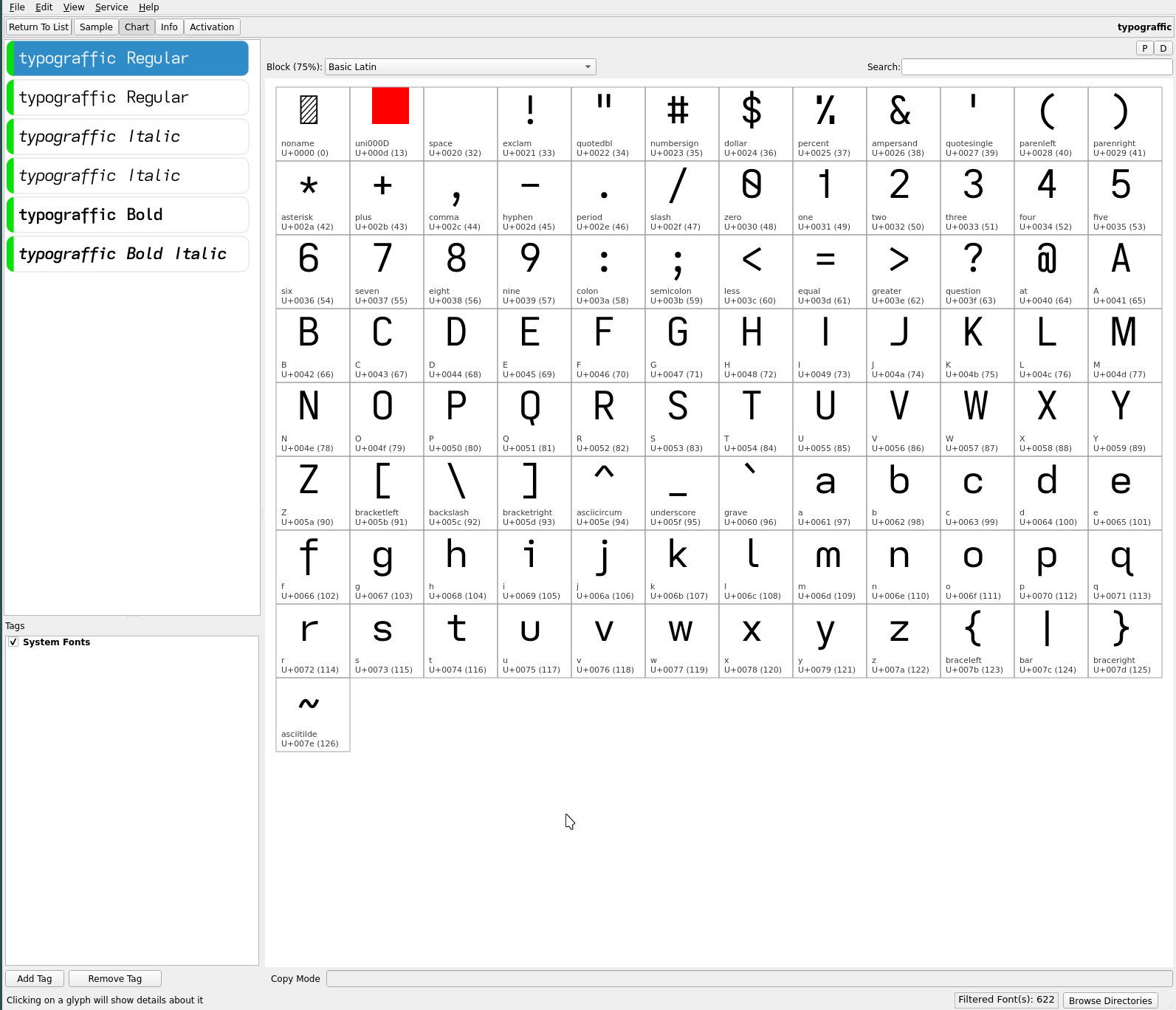
Enter the typograffic font variant..

groot font

the groot font with the toothless a and a number of other glyph embellishments inherited from the mu/umu typefaces..

groot font

It differs from the typograffic font..

upper case typograffic groot
B P R closed open
G toothless-rounded-serifless-hooked toothed-serifless-hookless
I serifless descending serifless
lower case typograffic groot
a double-storey-serifless double-storey-toothless-corner
f flat-hook-extended flat-hook-serifless
j flat-hook-serifless flat-hook-serifed
numeric typograffic groot
4 closed open non-crossing

This produces, for lack of a better term, a “flatter” font with a minimal number of glyphs with descenders. Line spacing looks more pronounced without the descending caps and extended lower case f. The one exception, the distinctive descending capital I, IMO attains the readability of its serifed counterpart whilst retaining the “clean” lines of a sans serif font. YMMV.

This now returns me to a working font trio of mu, umu and now groot.

repos

The current ereader fonts may be found on OneDrive.

]]>
umu fonthttp://thedarnedestthing.com/umu%20font2024-04-13T13:50:56-04:002023-08-10T11:15:53-04:00Steven Humhttp://thedarnedestthing.com/

a grail font perhaps? As always, just when i think i am finally done..

umu font

The toothless double-storey lower case a of the mu font font and the single-storey a of the upsilon font produce two very distinctive fonts, the latter being the visually more “open” or less dense of the two—especially at small font sizes with its very open single-storey a.

While i generally gravitate towards lean open sans serif typefaces—settling on the descending caps fonts, Iota and Ypsilon, with their single-storey a—i found with this last generation of typefaces, a growing preference for the mu font with its toothless double-storey a—visually adding air to text (when contrasted with the common toothed a) on top of its added readability. So much so, much to my surprise, i found myself more often than not, returning to it after starting reading with the upsilon font.

The symmetry of the descending capitals I T Y (complementing the J) have turned out to be more than a novelty. So, adding the toothless double-storey a of the mu font to the upsilon glyph set merges these two distinct typefaces to create the umu font—its name an intentional (symmetrical) amalgam of the two..

umu font

The descending capitals of umu add a subtle flare to fiction material (which i find pleasing). It takes a bit of getting used to but its added readability—now equal to mu’s ranking—with the toothless double-storey a eases the transition.

As always, YMMV.

repos

The current ereader fonts may be found on OneDrive.

]]>
font reposhttp://thedarnedestthing.com/font%20repos2024-04-13T13:50:56-04:002023-07-30T10:30:57-04:00Steven Humhttp://thedarnedestthing.com/

this page was created to centralize OneDrive shared links (which i seem to be able to break periodically)..

OneDrive Fonts


Earlier font typefaces and variants can be found in the archive folder.. though i admit their organization may not relate in an obvious manner to their originating site references (never imagined this font journey would be so extensive!)..

]]>
mu fonthttp://thedarnedestthing.com/mu%20font2024-04-13T13:50:56-04:002023-07-20T15:23:32-04:00Steven Humhttp://thedarnedestthing.com/

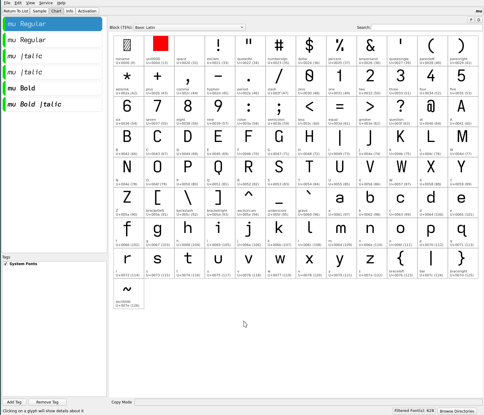
descending caps, since becoming enamoured with the descending serifless I variant of the typograffic font (with Iota), had become the focus of the latest font development. The expressiveness rendered to the typefaces by these unique descenders combined with dyslexic readability instantly made these my favourite reading fonts.

Much of the effort has been spent on tweaking the fontforge descender scripts to better render the contrast of the strokes (for the Linux desktop), and position and shape of their italics and, importantly, correct the hinting (position) at small font sizes (to eliminate the need for font size specific font files). Once completed, the family of monospaced fonts in rotation appeared finalized :)

~   ~   ~

After extensive reading usage, two other glyph options have come to light to further refine this set of dyslexic fonts—for better or worse, YMMV—and produce a true “quad” of fonts (the past “trio” of four(!) typefaces included two descending caps fonts which were almost identical).

These two revelations are lower case glyphs which add air to their adjacent characters..

letter from to fonts
m serifless toothless-rounded *
a double-storey-serifless double-storey-toothless-corner mu

rounded m

a change so obvious that familiarity bias is the only explanation for its omission during the selection of non-mirroring asymmetric lower case glyphs..

lower case from hyperlegible to dyslexic
b toothed toothless-rounded
d toothed-serifless  
p eared earless-corner
q hook-tailed  
     
n straight  
u toothed toothless-rounded
->  m eared earless-rounded

Just as the toothless-rounded lower case u replaced its familiar toothed glyph in these fontsets, the earless-rounded lower case m replaces its universally familiar eared-serifless shape.

While the toothless-rounded u is chosen for its asymmetry to the straight lower case n, the earless-rounded m is chosen for its dyslexic distinction from the n (and bigram “nn”)—as well as, reflecting the symmetry of its upper case glyph.

The increased air and distinction between adjacent letters is immediately apparent, especially at small font sizes with bigrams mm mn nm (and words containing both characters in any position, for that matter) and am dm gm um—asymmetrically opening the adjacent vertical strokes, and more so with other glyphs as a result of its earless corner.

The readability this glyph adds i feel warrants applying it to the dyslexic collection of monospaced typefaces.

articulate font

this Atkinson Hyperlegible inspired font is the base font this dyslexic collection. It remains largely unchanged, with its dyslexic adjustments (above), adding the earless-rounded lower case m..

articulate font

typograffic font

the Universal Grotesk twist on the articulate font similarly remains largely unchanged, save for the addition of the earless-rounded lower case m..

typograffic font

It differs from the articulate font..

upper case articulate typograffic
G toothed-serifless-hooked toothless-rounded-serifless-hooked
I serifed serifless
J serifless flat-hooked-serifless
Q crossing straight
lower case articulate typograffic
f flat-hook-serifless flat-hook-extended

toothless-corner a

The toothless-corner double-storey lower case a is perhaps more radical than the rounded m glyph change. The regular tooth arguably “anchors” the letter from a dyslexic perspective and, as such, remains with the articulate and typograffic typefaces.

The toothless-corner glyph is subtly distinct from the standard double-storey a, adding a touch of air between the ah ak am an ap bigrams with their left side vertical strokes and a general air to adjacent letters.

mu font

Kobo with mu</span> font

becomes the most unique addition to the “current” in use (4) font sets, in place of the former iota typeface by adding, in addition to the aforementioned earless-rounded lower case m, the toothless-corner double-storey lower case a and semi-open 4 (much like the usage of the open amphersand)..

mu font

It differs from the articulate font..

upper case articulate mu
G toothed-serifless-hooked toothed-serifless-hookless
I serifed descending serifless
J serifless descending-flat-hook-serifless
Q crossing straight
lower case articulate mu
a double-storey-serifless double-storey-toothless-corner
f flat-hook-serifless flat-hook-extended
j flat-hook-serifless flat-hook-serifed
numeric articulate mu
4 closed semi-open

mu sits nicely between typograffic and upsilon (below) in terms of distinctiveness from the articulate typeface.

The font name “mu” reflects its unique use of these two symmetric lower case letters (in these font sets)—continuing this site’s tradition of naming fonts containing descending capitals after Greek letters.

upsilon font

supplants the Ypsilon font adding the earless-rounded lower case m and open non-crossing numeric 4..

upsilon font

It differs from the articulate font..

upper case articulate upsilon
B P R closed open
G toothed-serifless-hooked toothed-serifless-hookless
I serifed descending serifless
J serifless descending-flat-hook-serifless
Q crossing straight
T Y serifless descending serifless
lower case articulate upsilon
a double-storey-serifless single-storey
f flat-hook-serifless flat-hook-extended
j flat-hook-serifless flat-hook-serifed
numeric articulate upsilon
4 closed open non-crossing

Save for the single-storey lower case a and open non-crossing 4, upsilon is largely the mu font transformed with additional descending and open caps. Still, those descenders and the lower case a are significant and make for a completely different feeling typeface.

dyslexic ranking

in terms of dyslexic readability ranking, (Iota successor) mu with its double-storey lower case a enhances its ranking..

typeface rank dyslexic penalty
articulate 1  
typograffic 2 straight Q
mu** 2 straight Q
upsilon 3 straight Q, single-storey a

The addition of the double-storey lower case a to the mu font separates it nicely from the upsilon font (more so than their Iota and Ypsilon predecessors)—there is a reason for the prevalence of the double-storey lower case a—providing now a distinctive quad of fonts. The font’s side bearing plays a role in the choice of this toothless-corner glyph—looking more pleasing (air) with the tighter ereader side bearing applied.

**Arguably, the mu font might be considered ranked a smidgen higher than typograffic with its more open and airier toothless double-storey A (the counter argument being the tooth anchors the glyph).

~   ~   ~

If you haven’t noticed already, the earless-rounded lower case m has already made it to this site’s webfont.

Whereas before, i had gravitated to the Ypsilon font for its unique character (Iota differing minimally), the distinctiveness of the mu font now has added attraction with its toothless-corner lower case a when paired with the upsilon font.

As always, YMMV—i suspect most will continue to prefer the more classic articulate and typograffic typefaces (if they haven’t found these latest changes already too radical for their tastes)!

repos

The latest ereader font trio quad may be found on OneDrive, along with the earlier typefaces discussed on this site.

For those who prefer the eared lower case m, the former font trios remain available—though these fonts have not inherited the latest fontforge tweaks..

history tweak
emdash adjust with to “M + Space”
ellipsis adjust with to “M + Space”
hinting fix descending caps irregularities at small font sizes**
side bearing match side bearing rendered between Kindle and Kobo

** No longer require separate font files for small or normal/large font size usage on ereaders.

]]>
ypsilonhttp://thedarnedestthing.com/ypsilon2024-04-13T13:50:56-04:002023-06-22T22:12:18-04:00Steven Humhttp://thedarnedestthing.com/

from the Iota font springs the Ypsilon font..

Iota with serifed "j"

which is its fraternal twin (or complement) with descenders applied to the vertical center strokes of the upper case T and Y—more easily discerned with fontmatrix**..

Ypsilon

**The Iosevka font web page does not display the glyphs which are modified with fontforge for these ereader typefaces (not having access to Ypsilon generated typeface. The capital T and Y in the fontmatrix screenshot outline masks where the descending strokes are applied and do not affect the actual font rendering.

Except for these two glyph changes, the remainder of the font is identical to its progenitor. With the added glyphs with descenders—upper case I J Q T Y and lower case f j p q y—the font becomes more visually balanced in the vertical plane (if not, uniquely so).

The descending capitals I J T Y—especially the frequent T—alter the character of the printed page, rendering a less formal but punctuated or rhythmic voice to the text*** (at least, when it comes to familiarity).

Kobo with Ypsilon font

A bit of a toss for me personally between the Ypsilon and Iota typefaces, but i have been reading with Ypsilon exclusively for a couple weeks now.. and really like it (so much so, this site’s body text currently uses it) for its unique flair.


***Experiments with descenders applied to the upper case F and P, surprisingly—since their lower case glyphs have descenders—feel disproportionate (to my eyes) with their off center descenders emphasizing their asymmetry.

repos

The Ypsilon font may be found on OneDrive under the font-trio + Ypsilon folder within the Kindle and Kobo folders. The other minor font changes to the emdash and ellipsis are also to be found in this folder.

]]>
font trio revisitedhttp://thedarnedestthing.com/font%20trio%20revisited2024-04-13T13:50:56-04:002023-05-24T08:37:26-04:00Steven Humhttp://thedarnedestthing.com/

Iota rapidly established itself as the default font on my ereader. It is a very unique yet highly readable font and sported the single-storey lower case a which i am drawn to for the added openness it renders to the page—further emphasized by the “open” glyph choices of the Iota font.

articulate and typograffic fell into a bit of disuse simply because they were historical points in the progression to Iota—their differences from the font somewhat nuanced.

In this endless exploration of fonts i decided to revisit them—all of them as it would turn out with the return to the serifless lower case j. At 300PPI the serifless glyph is still quite legible and harkens back to its earlier usage, so i revisited the fonts to see what could be done to render them more distinct from each other while retaining the overall dyslexic character of the trio.

dyslexic tunings

the asymmetric glyphs common to all three typefaces remains..

lower case from hyperlegible shape to dyslexic shape
b toothed toothless-rounded
d toothed-serifless  
p eared earless-corner
q hook-tailed (mapped glyph*)  
     
n straight  
u toothed toothless-rounded

To achieve the “character” differences i was seeking, i decided to revisit the font heritage which influenced the glyph choices to begin with..

atkinson hyperlegible

remains the most influential font, providing the base glyph set that was tweaked for dyslexia. Along the way several of the upper case glyphs were changed, notably the crossed capital Q—my being decidedly biased against dense glyphs.

At 300PPI, however, this is not a legibility issue, so the articulate font returns to..

articulate

with..

upper case from prior shape to hyperlegible shape
G toothed-serifless-hookless toothed-serifless-hooked
J descending-flat-hook-serifless serifless
Q straight crossing
lower case from prior shape to hyperlegible shape
j flat-hook-serifed flat-hook-serifless

This is a decidedly highly legible font very closely matching the Atkinson Hyperlegible Font.

univers grotesk

with the serifless capital I and double-storey lower case a, typograffic gets a similar face lift to complement its descending lower case f..

typograffic

with..

upper case from prior shape to grotesk shape
G toothed-serifless-hookless toothless-rounded-serifless-hooked
I serifed serifless
J descending-flat-hook-serifless flat-hooked-serifless
Q straight (unchanged)
lower case from prior shape to grotesk shape
a single-storey double-storey
f flat-hook-extended-crossbar-at-x-height (unchanged)
j flat-hook-serifed flat-hook-serifless

Save for the dyslexic tuned glyphs, typograffic now more closely resembles its Grotesk roots.

Iota

has just a minor change..

Iota

with..

upper case from prior shape to Iota shape
B standard-interrupted-serifless (unchanged)
G toothed-serifless-hookless (unchanged)
I descending-serifless (unchanged)
J descending-flat-hook-serifless (unchanged)
P open (unchanged)
Q straight (unchanged)
R straight-open (unchanged)
lower case from prior shape to Iota shape
a single-storey-serifless (unchanged)
f flat-hook-extended-crossbar-at-x-height (unchanged)
j flat-hook-serifed flat-hook-serifless

Note: The capital I in the exhibit is the serifless glyph from the Iosevka web page—and not the glyph created for the font. Similarly, the lower case q for the three fonts is replaced by the unicode hook-tailed glyph.

All told though, typograffic differs from articulate by 5 glyphs and Iota from typograffic and articulate by 7 glyphs and 9 glyphs respectively. See if you can spot them :)
Note: iota has the descending capital I which is not represented in the screenshot.

i expect to be an outlier in my fondness for the iota typeface. But with the changes made to its predecessor fonts, the articulate and typograffic fonts should find a wider audience with their more familiar glyph sets.


Edit: Recently, i’ve been reading with the previous version of Iota with the serifed lower case j. It just feels more “right” with this typeface (to my eyes) despite my Grotesk leanings—aligning with my non-mirrored dyslexic rule, even though it still is a J. In this instance, the serifed separation of the dot distinguishes the lower case glyph from its descending-serifless upper case counterpart, especially at small font sizes. i am no neuroscientist but i surmise this reflects a visual cortex pattern (memory) expectation of glyph shapes while reading with a specific typeface, hence, the benefit of the contrasting outline—the distinction lessening the visual effort to determine the case of the word and the context it implies.


Edit: Further to the above remark, i have been switching between the sans serif and serifed lower case j versions of the articulate and typograffic fonts. On the one hand is the clean sans serif glyph vs the slightly more legible serifed glyph (despite the distinctive upper and lower case glyph shapes) . Not that it in any way is ugly. One is airier, the other ever a touch more balanced (in relation to its side bearing to leading characters)—a very personal visual bias. It is a tough call—and i am glad that both versions are available in the repos :)

Iota with serifed "j"

readability

ranking order tightens up between the articulate and typograffic fonts with these changes. Before it was distinctly articulate first and a toss between typograffic and Iota. Now articulate and typograffic are a very very close one two with Iota remaining third on the podium—still a lovely typeface.

The crossing capital Q for the articulate font returns the familiar and distinct glyph. Similarly, the serifless lower case j is restored—albeit its dot loses a bit of separation with the loss of the serif at small font sizes.

The typograffic font gains the most in the readability scale with the return of the double-storey lower case a and the rounded-hooked capital G. The serifless capital I, often a readability issue with geometric fonts, differentiates itself against typograffic’s remaining glyph set.

Iota doesn’t make any gains in readability. Its descending capital I is highly distinct but the thrust of the font with its open hookless capital G and single-storey lower case a for a more open font loses a few points for those with impaired vision—especially at small font sizes—whilst gaining a few (IMO) with its clean minimalist geometry and unique yet understated flair. i adore this font.

For everyone else, the articulate and typograffic fonts offer two highly readable fonts with slightly different grotesk flavourings. (But you still might do well to give Iota a glance—i find it enticingly seductive :)

Note: This web font is a hybrid of the font trio—augmented with vertical-crossing capital Q and serifed lower case j for better readability with the lower resolution of desktop screens in general.

repos

The new ereader fonts may be found on OneDrive under the font-trio folders within the Kindle and Kobo folders.

The j-serifless subfolder contains the fonts described above. The j-serifed subfolder retains the serifed lower case j for those who prefer its extra degree of legibility. The original trio of fonts remain available

As always, YMMV.

acknowledgement

while it has been referenced multiple times in prior font articles on this site, it goes without saying that none of this font exploration would have been possible without the generosity of the creator of Iosevka—both the font generation itself and the glyph screenshot exhibits taken from its home/customization page—and those involved with the opensource FontForge project.

]]>
2023-03-04http://thedarnedestthing.com/shadowsandlight/2023-03-042024-04-16T10:55:42-04:002023-03-04T00:00:00-05:00Steven Humhttp://thedarnedestthing.com/

it’s rare to have an entry here. But 2023 appears to be a year of changes.

This all started innocently in 2022 with the acquisition of a Supernote A5X.. the intent, to delve deeper into digital journaling—eink reading being a primary driver for that thought. After a lifetime in technology i find myself gravitating towards the analogue despite my involvement with keyboards and optimizing their layouts for typing. And strangely, digital handwriting has rekindled my love of using fountain pens—i’ve never strayed from them for note taking, but journaling feels more complete with a “real” pen and paper or note book (as amazing as the eink technology of the Supernote represents—more on that later and how it will integrate into this site’s workflow.)

Recent software updates reminded me of the need to upgrade the VPS this site rests on.. an so a migration from a long unsupported Debian Linux release to Alpine Linux—here as well as the home base where Void Linux had previously served me well. Finally one distro to rule them all—the computers i dally with. More on that radical switch later.

Then there is the reorganization of a lot of the material posted that originally resided in colophon—it must have been strange for people perusing this site for information on keyboards and typography to be situated in that corner of the site normally reserved for a basic description of a site’s construction (even if fonts have played an important role in this site’s evolution). But honestly, the road traveled was never planned—these interests just morphed into deeper explorations at the time.

colophon articles were becoming a substantial portion of the site and with the slow personal transition to all things analogue, it feels appropriate to move the interest in eink usage of which the past years have been focused on dyslexic fonts to this corner of the site. So colophon will remain more hardware and technically oriented.

The changes are exciting.. though, in all honesty, they may result in even more diminished activity on this site! Reading and writing are satisfyingly complete activities. A sign perhaps of my age..

]]>
iotahttp://thedarnedestthing.com/iota2024-04-13T13:50:56-04:002023-01-12T09:09:55-05:00Steven Humhttp://thedarnedestthing.com/

Kobo iota

typograffic has been my favourite font of late.. the culmination of two years of font experimentation—beginning innocently with a monospaced facsimile of the Atkinson Hyperlegible Font (for coding) and expanding into (too) numerous variants as an ereader font with a dyslexic focus—arriving at a very unique and satisfying contemporary ereader font (in my humble opinion).

Save for the short-serifed capital I (inherited from the Atkinson font), typograffic is a clean sans serif typeface. Highly readable at small font sizes on ereaders.

typograffic—with its glyph choices to create a unique and contemporary signature—appeared to be my grail font, there being no other Iosevka glyph variations to increase dyslexic readability and general legibility (IMO). Arriving at a final pair of typefaces—articulate and typograffic—all that was missing (from a personal preference) was a typeface variant with a serifless capital I.

Most of the typefaces produced on this site for distribution have been produced with both the serifed and serifless capital I. Its omission in typograffic (and articulate) was determined by the serifed glyph’s superior legibility. The serifless capital I—at small font sizes in particular—lacks visual distinctiveness in words also containing the lower case l and a few other all caps instances, its readability muddied without inline context.

Enter the..

descending capital i

to uniquely distinguish the glyph from adjacent letters—especially the lower case L—by extending its stroke length.

With fontforge..

# descending serifless capital I Open(<iota.ttf>); Select(0u007c); Copy(); Select(0u0049); Paste(); Transform(100,0,0,105.75,0,0); Move(0,-55); Generate(<iota.ttf>);

..replace the capital I with Bar, lengthening it (to match the vertical length of the descending capital J) and then adjusting its vertical position downwards to align with the tops of capital letters. (The Bar glyph remains distinct with its shorter stroke length and centered position, though, should not be encountered with most ebooks in general).


Note: the vertical positioning is set to render the desired alignment of the glyph by the font rendering engine for small body text (and not for large capitalized headings). Edit: this has been corrected with the latest iterations of these fonts—see mu font.

iota

The new iota variant of typograffic with a serifless capital I..

iota

Note: the capital I in the font file is the length of the descending capital J (and lower case f) as seen below..

eink iota

Serendipity would have the font name reflect the seemingly trivial change (from typograffic) with this distinctly unique(?) glyph. For many ebooks one might be hard pressed to note the difference between the two fonts but for first person narratives it can be striking.

i don’t expect everyone to find themselves being drawn to this new font, the serifed capital I being the most familiar and comfortable for the vast majority. And it can look odd—unfamiliar—initially within all caps headings—though i quite like the effect in the example at the top of the page.

i am not aware of any other font (within my font space) using a descending glyph shape for the upper case I. But i like it (perhaps for that and) for the added air it imparts to the typeface—yet without appearing isolated from adjacent glyphs—and its distinctiveness as the leading capital in words and sentences.

typograffic, articulate and now iota—three very striking yet highly legible typefaces to satisfy one’s ereading mood and visual needs. As always, YMMV.

repos

iota may be found in the opencaps folders of the quasi mono repos.

]]>
quasimonohttp://thedarnedestthing.com/quasimono2024-04-13T13:50:56-04:002022-11-12T17:26:47-05:00Steven Humhttp://thedarnedestthing.com/

the Iosevka font is the source from which all monospaced fonts on this site have been created from. It is one of the most actively maintained fonts available today, whose source code origins have been further expanded to cover a variety of applications beyond coding.


Update: The elementary font has been restored to the more conventional glyph set (without the open upper case letters which now define the new eloquence typeface).
Update: The articulate font has been added as a serif complement to the geometric eloquence font.
Update: The typograffic font has been added to the repos, adopting grotesk’s extended lower case f, elementary’s single storey a, eloquence’s open capitals and articulate’s toothed/serifed flourishes.
Update: To further differentiate the articulate font from typograffic, the single-storey lower case a has been reverted back to double-storey.

catching up

up until now, all Monolexic fonts have been created with Iosevka version 10.x. This was due to minor, albeit visible, changes in subsequent releases which altered the overall proportion of the font—a compression of the character xHeight and ascenders/descenders, in particular. Obviously, i remained an outlier with regards to these evolving changes.

Iosevka has undergone several major releases—currently at version 16.x! In order to stay abreast with Iosevka’s ongoing development to capitalize on its expanding feature set, it was necessary to replicate the output of version 10.x. After many iterations, the following private-build-plans.toml parameters produced the desired results..

... [buildPlans.<family>.widths.normal] shape = 600 ... [buildPlans.<family>.metric-override] # metric-override adjustments leading = '1250' sb = 'default_sb * 0.7500' cap = 'default_cap + 40' xHeight = '530' ascender = '775' ...

From a pure monospaced perspective, there is little to be gained with the latest Iosevka releases for the Monolexic fonts—aside from some new glyphs—but..

quasi-proportional

release 11.x saw the introduction of a quasi-proportional width for the M W glyphs whilst retaining the monospaced cell width for all other characters including the narrow lower case i j and l, effectively maintaining the overall monospaced feel and air of the typeface.

The subtle relaxing (widening) of the cell width for the M and W characters adds much needed separation to the letters’ vertical strokes eliminating their “squished” and darkened appearance. While affecting only four glyphs—two upper and lower case—the overall effect renders a uniform “air” and character contrast whilst preserving the even visual cadence of a monospaced font.

It is IMO a major upgrade to the pure monospaced fonts—so much so, these changes have been promoted to this site’s Monolexic web font variants.

The differences can be seen when compared to the fixed cell width (source code) character exhibits below..

M and m W and w hence "quasimono"

common glyphs

the Monolexic fonts tweak the glyph shapes of the Atkinson Hyperlegible Font..

Atkinson Hyperlegible Font (mono)

adding a few capital letter flourishes and removing identically shaped lower case characters, notably..

upper case from hyperlegible shape to dyslexic shape
J serifless descending-flat-hook-serifless
lower case from hyperlegible shape to dyslexic shape
b toothed toothless-rounded
d toothed-serifless  
p eared earless-corner
q hook-tailed (mapped glyph*)  
     
n straight  
u toothed toothless-rounded

The descending upper case J is an aesthetic choice—complementing its descending lower case letter. This technically violates the “avoid similar shapes” dyslexic rule but.. a J is a j—descenders (and dyslexic adjustments!) a signature of these fonts.

The Atkinson Hyperlegible Font is unique in its use of the hook-tailed lower case q. Most sans serif fonts use identically shaped glyphs for the lower case b d p q. The increased legibility is apparent with words containing multiples of these letters or n u—the visual cortex is not “triggered” by similarly shaped letters.

Atkinson dyslexic (base set)

*Note: hook-tailed glyph U+024b—the glyph shape used by the Atkinson Hyperlegible Font—is mapped to lower case q (supplanting the diagonal-tailed q shown in the exhibits).

unique glyphs

the following typefaces—each with their own “character”—are built upon the dyslexia tuned hyperlegible glyph base set above. Each typeface reflects a progressive “improvement”—personal aesthetic.. or mood—upon the hyperlegible glyphs, driving towards letter “openness” and clarity with modernist flourishes.

The dyslexic font—quasi-proportional of Monolexic—differs with..

idyslexic

upper case from hyperlegible shape to dyslexic shape
G toothed-serifless-hooked toothless-rounded-serifless-hooked
Q crossing detached-bend-tailed

the grotesk font—quasi-proportional of Unolexic—differs with..

igrotesk

upper case from hyperlegible shape to dyslexic shape
G toothed-serifless-hooked toothless-rounded-serifless-hooked
Q crossing vertical-crossing
lower case from hyperlegible shape to dyslexic shape
f flat-hook-crossbar-at-x-height flat-hook-extended-crossbar-at-x-height

the elementary font—quasi-proportional of Geolexic—differs with..

elementary

upper case from hyperlegible shape to dyslexic shape
G toothed-serifless-hooked toothless-corner-serifless-hooked
Q crossing straight
lower case from hyperlegible shape to dyslexic shape
a double-storey-serifless single-storey-serifless

the eloquence font—quasi-proportional of Geolexic (elementary variant)—differs with..

eloquence

upper case from hyperlegible shape to dyslexic shape
B standard-serifless standard-interrupted-serifless
G toothed-serifless-hooked toothless-corner-serifless-hookless
J descending-flat-hook-serifless descending-serifless
P closed open
Q crossing straight
R straight straight-open
lower case from hyperlegible shape to dyslexic shape
a double-storey-serifless single-storey-serifless

The eloquence font differs from the base glyph set—which mirrors upper and lower case glyphs where possible—with a rounded descending-serifless capital J, further accentuating its geometric character and distinguishing it from its lower case glyph.

the articulate font—quasi-proportional of Geolexic (elementary variant)—differs with..

articulate

upper case from hyperlegible shape to dyslexic shape
G toothed-serifless-hooked toothed-serifless-hookless
Q crossing straight
lower case from hyperlegible shape to dyslexic shape
a double-storey-serifless single-storey-serifless
j flat-hook-serifless flat-hook-serifed

The articulate font is essentially the ielementary font (with the serifed capital I) adding a toothed-hookless capital G—acknowledging my “open” glyph leanings—and serifed lower case j to “fill” in its side bearing from adjacent letters and further distinguish it from its upper case glyph—whose striking economy i still quite like.

With these subtle glyph differences from the eloquence font—notably, the toothed capital G, flat-hook capital J, and the serifed capital I and lower case j—the articulate font presents a distinctly different feel to its geometric counterpart with an increased legibility as a bonus.


Update: The single-storey lower case a has been replaced with the double-storey glyph to more visibly differentiate the typeface from typograffic—these are now my two default typefaces on my ereaders.

typograffic

fuses the most unique “character” attributes of its progenitors (above) to yield an open typeface rooted in grotesque yet, with its dyslexic focus, built upon a unique set of asymmetric lower case glyph shapes (atypical of grotesque)!

typograffic differs from the base dyslexic glyph set with..

typograffic

upper case from hyperlegible shape to dyslexic shape
B standard-serifless standard-interrupted-serifless
G toothed-serifless-hooked toothed-serifless-hookless
P closed open
Q crossing straight
R straight straight-open
lower case from hyperlegible shape to dyslexic shape
a double-storey-serifless single-storey-serifless
f flat-hook-crossbar-at-x-height flat-hook-extended-crossbar-at-x-height
j flat-hook-serifless flat-hook-serifed

As its namesake (phonetically) infers, the lyrical expressiveness of this unique font with its modernist flourishes holds true to its dyslexic foundation for visual character and word clarity.

space character

the distinctly named non-*lexic quasi-proportional font families all apply a 1.3333x cell width to the Space character, yielding a relaxed visual word density whilst still providing a distinct word separation emphasis.

Setting the Space character to the cell width of the quasi-proportional capital M yields a more familiar visual page density—this has little to no impact on the ebook page count but may appeal to those who prefer tighter text. The 1.3333x spacing makes words “pop” more with its marginally wider cell width. YMMV.

For maximum dyslexic word separation, the more popular glyph set of the dyslexic font is also available with the 2x spacing of the Monolexic fonts, hence..

font* space
dyslexic 2x, 1.3333x, M
grotesk 1.3333x, M
elementary 1.3333x, M
eloquence 1.3333x, M

*An “i” prefix to the font names designate font sets with a serifed capital I. It’s confusing, i know.. but hopefully those following these fonts will find the repo organisation abundantly clear :)

line spacing

for the two dominant ereader platforms on the market—Kindle and Kobo—two sets of fonts have been generated with differing leading (line height).

1250 leading is the default but due to Kindle’s limited three line spacing choices—which i find too tight even at maximum—a set of fonts has been generated with 1875 leading to obtain the line spacing i prefer to read by on my Kindle Oasis. (The FONT_RAMP file in the repos also is needed to overcome Kindle’s coarse font control and obtain the small font size i read at.)

The Kobo has a very wide and granular line spacing control. However, i further customized it via kobopatch with a line spacing range heavily favouring large spacing for the small font sizes i read at—this makes for much easier finger highlighting accuracy as well as providing the visual air between lines.

Which leading font set you use is dependent on your personal preferences—either may be used with any device. (If i didn’t own a Kindle, the default 1250 leading would have been the only choice!)

repos

The new ereader fonts may be found on OneDrive. As always, YMMV.

update

in order to get the Kindle to render the quasimono fonts identically (as far a pixel peeping allows) to the Kobo which has been my daily driver and whose versions of the fonts look better (to these eyes), the following private-build-plans.toml parameters were adjusted to..

... [buildPlans.<family>.widths.normal] shape = 576 ... [buildPlans.<family>.metric-override] # metric-override adjustments leading = '1250 * 1.5' sb = 'default_sb * 0.6450' cap = 'default_cap + 40' xHeight = '530' ascender = '775' ...

Oddly, the shape (cell width) needed to be reduced to produce the desired results, illustrating just how differently the font rendering engines of the two platforms are—at least, with regards to these generated fonts. (i have not examined other typefaces.)

The FONT_RAMP file was also adjusted accordingly to be able to render the small font sizes i read at..

5.435 5.706 5.978 6.250 6.576 6.902 7.282 7.609 7.989 8.424 8.804 9.293 9.728 10.217

As for the Kobo.. i have been reading with the eloquence font of late. Blessed thus far with acute vision, the single-storey lower case a and straight capital Q render an airy typeface, further stylized with its toothless capital G and open capitals B P R—the beauty of being able to roll your own font :)

]]>
extreme beakl wihttp://thedarnedestthing.com/extreme%20beakl%20wi2024-04-13T13:50:56-04:002022-10-21T13:44:42-04:00Steven Humhttp://thedarnedestthing.com/

if BEAKL Wi-v is a variant of BEAKL Wi, then..

beakl wi-x

Corne BEAKL Wi</span> extreme

is the logical extension of it to the extreme, moving the Z to the pinkie home row and the X to the ring finger reach of the pinkie top row. The Stagger key on this layout cycles through the two pinkie staggered variants and the familiar home row BEAKL Wi layout.

It is the logical conclusion of BEAKL pinkie finger avoidance, penalizing the home row as a pinkie reach—from the pinkie stagger position of BEAKL Wi-v—in deference to the ring finger reach to the corner X. This is a layout designed specifically for elbows to side, arms extended, palms down (resting) lap top typing.

This is not to be confused with “laptop” keyboard (computer) typing which would place the keyboard section much closer to the hips when resting on one’s lap, thus, changing the hand position and reach of the pinkies—extending—considerably. BEAKL Wi would be the layout of choice here, illustrating how the slightest changes in hand positioning affect the optimal layout.

metrics

using the same keyboard evaluator, the former pinkie top row penalties are swapped with the variant’s home row weighting assignments..

[weights] 10.0 7.0 2.0 1.0 1.0 4.0 4.0 1.0 1.0 2.0 7.0 10.0 16.0 12.0 1.0 0.5 0.5 1.5 1.5 0.5 0.5 1.0 12.0 16.0 9.0 5.0 2.5 2.0 1.5 5.0 5.0 1.5 2.0 2.5 5.0 9.0 // rest pinkie on lower row of corne! 0.5 0.5 0.5 0.5 0.5 0.5 0.5 0.5 0.5 0.5 0.5 0.5

and correspondingly mapping the thumb to pinkie row penalties..

[penalties] ,same_row,row_jump1,row_jump2,row_jump3 ii, 2.5, 3.5, 4.5, 0.0 // same finger im, 0.5, 1.0, 2.0, 0.0 ir, 0.5, 1.0, 1.5, 0.0 ip, 0.5, 1.0, 1.5, 0.0 mi, -1.5, -0.5, 1.5, 0.0 // inward roll mm, 2.5, 3.5, 4.5, 0.0 // same finger mr, 0.5, 1.0, 2.0, 0.0 mp, 1.0, 1.5, 2.5, 0.0 ri, -1.5, -0.5, 1.5, 0.0 // inward roll rm, 1.0, 1.5, 2.5, 0.0 // inward roll rr, 3.0, 4.0, 5.0, 0.0 // same finger rp, 3.0, 4.5, 7.0, 0.0 pi, -1.0, 0.0, 1.0, 0.0 // inward roll pm, 1.0, 2.0, 3.0, 0.0 // inward roll pr, 4.0, 5.0, 6.5, 0.0 // inward roll pp, 5.0, 6.0, 8.0, 0.0 // same finger it, 0.5, 1.5, 0.5, 1.0 ti, 0.5, 1.5, 0.5, 1.0 mt, 0.5, 1.5, 0.5, 1.0 tm, 0.5, 1.5, 0.5, 1.0 rt, 0.5, 1.5, 0.5, 1.0 tr, 0.5, 1.5, 0.5, 1.0 pt, 0.5, 0.5, 1.5, 1.0 // lazy pinkie position tp, 0.5, 0.5, 1.5, 1.0 // lazy pinkie position tt, 2.0, 3.0, 2.0, 2.5 // same finger

yielding the following comparison..

With lazy pinkie position ring finger preference

  en fr es de
BEAKL Wi-x 38.95 39.85 40.48 43.19
BEAKL Wi-v 39.12 40.33 40.10 41.39
BEAKL Wi 41.06 42.00 41.85 43.29
BEAKL Zi 43.74 39.40 39.98 45.88
BEAKL 15 52.82 55.98 47.03 52.49
BEAKL 19bis 65.90 56.76 51.12 61.70
BEAKL 19 66.85 64.31 52.50 58.01
BEAKL 19 Opt French 67.66 48.18 45.38 67.22
qgmlwyfub 70.78 69.24 60.08 71.78
Carpalx 71.03 70.03 60.71 73.94
Neo 72.19 91.77 76.81 72.08
Minimak-8key 76.06 90.39 93.77 68.93
Oneproduct 89.08 86.94 73.59 94.57
Norman 89.48 90.54 93.95 80.42
Hands down 90.52 110.54 110.59 85.33
MTGAP “shortcuts” 90.55 102.43 85.87 94.17
Kaehi 92.21 100.52 87.22 102.13
MTGAP “ergonomic” 92.76 96.40 92.95 77.66
MTGAP 93.14 104.93 88.30 99.14
Three 93.32 105.30 99.34 78.14
Colemak DHm 94.47 99.44 113.78 72.14
ASSET 94.56 107.07 109.78 93.58
Colemak DHm mod 94.79 91.42 113.78 72.14
Notarize 95.09 107.66 112.59 91.35
Colemak 95.12 99.35 114.00 74.14
MTGAP “standard” 95.40 98.55 95.60 78.86
Soul mod 95.54 100.80 115.17 70.43
MTGAP 2.0 96.17 99.14 94.59 75.86
Workman 96.48 111.28 113.52 91.63
Colemak DH 96.74 102.60 117.00 73.76
Azerty 97.90 106.25 104.91 91.18
Niro mod 98.24 104.50 119.55 75.25
MTGAP “Easy” 98.88 110.64 113.08 88.62
Dvorak 99.71 119.29 120.94 95.38
Qwerty 100.00 112.45 111.78 92.29
Qwertz 100.87 110.90 114.28 91.14
White 101.23 113.65 112.86 92.62
Bépo 40% 114.55 105.86 120.00 122.90
Qwpr 115.32 136.45 135.54 124.31
Bépo keyberon 117.34 105.15 120.07 125.61
Coeur 120.27 100.73 112.57 122.80

Penalizing the home row pinkie severely alters the rankings considerably. The core BEAKL weightings maintain the rankings for layouts that avoid pinkie finger usage, while several other layouts end up placing lower than the QWERTY layouts—again emphasizing the extreme constraints of this layout design.

The keyboard layout evaluator always sets QWERTY as the baseline at 100.00 and all other layouts relative to this. It is interesting that each of the BEAKL Wi iterations further separate themselves from the pack, the scores improving successively—from 45.43 to 42.88 to 38.95. This is due, of course, to the unique weighting and penalty scheme applied for each iteration to reflect the objectives of the layout—but interesting nonetheless. There may, after all, be a correlation to the “comfort” level of the layout.

q roll

in theory, with the above pinkie finger weightings, the Q should have benefited with a move to the upper corner as the X—this does in fact bear out with the even better keyboard evaluator ranking!

However, in practice, the QU pinkie-index finger roll avoids the more awkward ring-index finger roll extension. Hence, the Q remains on the home row for the pinkie finger—an example of biomechanics over calculated numbers. YMMV.

stagger

while there are six possible Z V X character combinations, only Z V X (BEAKL Wi), Z X V (BEAKL Wi-v) and X Z V are suitable layout candidates with the V as the pinkie home position on the home row or stagger (bottom) row.

A simple modification to the keymap file and associated layouts allows toggling all three pinkie finger combinations with keycodes..

enum keyboard_keycodes { BASE = SAFE_RANGE ... ,STAGGER // cycle pinkie home row stagger 0 -> 1 -> 2 ,HOME3 // <pinkie> ,HOME2 // pseudo GUI_T(<pinkie>) ,HOME1 // <pinkie> ,KEY3 // <pinkie> ,KEY2 // <pinkie> ,KEY1 // <pinkie> ,SHIFT3 // SFT(<pinkie>) ,SHIFT2 // SFT(<pinkie>) ,SHIFT1 // SFT(<pinkie>) ...

referencing a keycode array..

static uint16_t pinkies[][3] = { {KC_X, KC_V, KC_Z}, // ZVX beakl wi (row 3 -> 1) {KC_V, KC_X, KC_Z}, // ZXV beakl wi-v {KC_V, KC_Z, KC_X} }; // XZV beakl wi-x static uint8_t stagger = PINKIE_STAGGER; #define PINKIE(r) pinkies[stagger][r - 1] bool process_record_user(uint16_t keycode, keyrecord_t *record) { switch (keycode) { ... case HOME3: mod_roll(record, 0, PINKIE(3), 9); return false; case HOME2: mod_roll(record, KC_RGUI, PINKIE(2), 9); break; case HOME1: mod_roll(record, 0, PINKIE(1), 9); return false; case KEY3: send(record, NOSHIFT, PINKIE(3)); break; case KEY2: send(record, NOSHIFT, PINKIE(2)); break; case KEY1: send(record, NOSHIFT, PINKIE(1)); break; case SHIFT3: send(record, SHIFT, PINKIE(3)); break; case SHIFT2: send(record, SHIFT, PINKIE(2)); break; case SHIFT1: send(record, SHIFT, PINKIE(1)); break; ...

whose letter combinations can be cycled from the Stagger key..

case STAGGER: if (KEY_DOWN) { stagger = stagger == 0 ? 1 : (stagger == 1 ? 2 : 0); } break; ...

with an initial config.h setting..

// initial pinkie stagger position (0) beakl wi home row (1) wi-v stagger (2) wi-x stagger #define PINKIE_STAGGER 2

Cycling through the three pinkie letter combinations allows tuning the layout dependent on one’s hand positioning for typing. The left hand pinkie column remains fixed—the J already in the stagger position (bottom row) and the QU bigram roll favouring the Q on the home row.

final thoughts

the Z on the home row is strikingly unusual. While the path to this layout long ago placed the Q on the opposite hand pinkie home row, there is a pleasing unintentional symmetry to this arrangement of the two least used letters.

It is an interesting experiment. And if anything, illustrates how many variables there are to keyboard layout design when one considers keyboard placement, single or split, column stagger (angle and tenting), hand separation and individual biomechanics. Not to mention the “feel” keyboard hardware components—keyswitch design, spring resistance, keycap material and profiles—impart.

Quite obviously, this layout only works for hands which find the ring finger corner reach for X preferable to a pinkie finger reach to the home row for the letter—with palms down typing i find the ring finger reach avoids the subtle upward hand position shift required for the pinkie reach, as well as, being the naturally stronger finger. YMMV as to whether this layout feels better than BEAKL Wi or its variant BEAKL Wi-v.

This layout is growing on me but given the frequency of the X and Z letters it is hardly an obvious choice—which is also reflected in the metrics above—though, for this set of hands, the increased comfort level is unmistakable. A typing corpus emphasizing these letters renders the distinction. Of the small set of words containing Z, there are a number containing ZZ which clearly illustrate how much weaker the pinkie is to the other fingers. The X by comparison does not suffer such words (in English) unless one is in the habit of typing Roman numerals.

i am using this layout now. It capitalizes on the finger memory instilled by BEAKL Zi, so feels strongly familiar.. only better this second time around. Barring further tweaks to this layout (who am i kidding :-), i may finally have found a layout for all seasons..

todo

migrate sources for BEAKL Wi-x to BEAKL Wi-v and BEAKL Wi. All that is required is to set the STAGGER in the config.h accordingly for each.

]]>
monolexic timelinehttp://thedarnedestthing.com/monolexic%20timeline2024-04-13T13:50:56-04:002022-09-06T18:17:06-04:00Steven Humhttp://thedarnedestthing.com/

for anyone who has stumbled upon this site’s discourse on fonts and readability, this page attempts to graphically summarize the evolution of these monolexic fonts.

See also quasimono for the quasi-proportional variants.

monospaced atkinson hyperlegible

this whole journey began with the discovery of the Atkinson Hyperlegible Font developed by the Braille Institute. After settling on it as my ereader font of choice for its superior readability attributes, i then began the search for a monospaced version of this font.

Finding none, i customized the Iosevka font i used for programming to create this facsimile..

Monospaced Atkinson Hyperlegible

While the original intent was purely to create a better source code font, this font eventually found its place on my ereader. And, much to my surprise, displaced the original Atkinson Hyperlegible Font which inspired it as my favourite font to read with—which, i surmise, was due to the uniform visual cadence of its monospaced cell width.

Kerning facilitates beautifully tight character spacing, maximizing line word density. However, this also places an additional onus on the visual cortex and language facilities to uncompress this information—insignificant as it may seem—which may explain why monospaced fonts appear to be easier to read in general*.

*Data is very sparse regarding the readability of monospaced versus proportional fonts. In the end, one can only determine one’s personal predilection which will also be heavily influenced by one’s aesthetic. The uniform air around individual letters, though, does appear to benefit dyslexia.

dyslexia

as a result of ereader usage, further investigation into font legibility—and the inherent compromise a fix cell width imposes on a character set—led to an exploration of dyslexia and readability..

..namely, the issue of dyslexic mirroring and/or rotating glyph shapes. The OpenDyslexic font addresses this by weighting (thickening) the base of its glyphs to “anchor” the letters horizontally—and for some dyslexics, this may be the optimal solution (albeit, the font loses the clean geometric glyph shapes we are accustomed to).

For the Monolexic fonts described on this site, a less radical but more aesthetic approach (IMO) is taken by eliminating the mirrored glyph shapes used in almost all typefaces for the lower case b d p q and n u glyphs.

The Atkinson Hyperlegible Font already has a unique hook-tailed lower case q, so taking this into account (along with a few more “open” glyph choices) the base Hyperlegible glyph set becomes..

Hyperlegible base

..and the unique (and more open) glyph shape substitutions..

Common dyslexic

These two glyph sets together form the Monolexic font set—with its unique 2x cell width word spacing to further improve dyslexic readability—which became my default ereader font for several months.

grotesk glyphs

adding the descending lower case f to Monolexic creates the Unolexic font set, reminiscent of Univers Grotesk. Adding the vertical-crossing capital Q (and alternate word spacings) create the grotesk variants for a maximum legibility typeface..

grotesk glyphs

elementary glyphs

adding the single-storey lower case a to Monolexic creates the Geolexic font set, reminiscent of our elementary school alphabet. Adding the straight (angled) capital Q and open capital B P and R (and alternate word spacings) create the elementary variants for a distinctly more open typeface..

elementary glyphs

fonts

a variety of font sets with capital Q G and open glyphs, and alternate word spacings are available in the repos. Specific permutations may created from source. As always, YMMV.

The font files may be found here.

]]>
dyslexic variationshttp://thedarnedestthing.com/dyslexic%20variations2024-04-13T13:50:56-04:002022-08-13T12:19:16-04:00Steven Humhttp://thedarnedestthing.com/

among other things, this is an attempt to normalize the various MonoLexic fonts created on this site, removing redundant alias font naming and, instead, assigning custom Space cell widths to those font names—i still harbour a fondness for those names :)

geolexic

is now assigned to the former elementary font in honour of geometric fonts such as Futura with their distinctive single storey lower case a. The *Lexic postfix name now consistently represents dyslexic fonts with a double cell width Space separator for maximal word separation. And Grotesk is no longer an alias for Unolexic, yielding..

font* b-d-p-q f a space
Monolexic round-serifless-corner-hook flat double 2x
Unolexic round-serifless-corner-hook extended double 2x
grotesk round-serifless-corner-hook extended double 1.6667x
Geolexic round-serifless-corner-hook flat single 2x
elementary round-serifless-corner-hook flat single 1.6667x

*An “i” prefix to the font names designate font sets with a serifed capital I (see fonts).

word separation

Why the new elementary and grotesk fonts?

After considerable time on my ereaders with the 2x Space cell width dyslexic fonts, i found for myself, that a slightly narrower cell width spacing maintained adequate word separation with a slight increase in reading (scan) speed—along with a visually appealing page density.

The full page columnar alignment is lost by the partial word spacing reduction—the visual benefit of which, appears to be dependent on one’s spatial predisposition.

i originally thought it beneficial to have a columnar—vertical letter alignment—layout for the visual cortex to absorb in full but now i am uncertain whether unaligned “noise”—non-vertical letter alignment—may be less distracting to the visual center. No doubt, people will be found in both camps.

Responses from the community who have found the original dyslexic spacing beneficial, still appear to prefer the 2x spacing—the neural parameters being very individual. i may be the outlier here :)

single storey a

Interestingly, while the double storey lower case a is the more legible of its lower case representations, i have been finding myself drawn to elementary as my default ereader font. At 300PPI, it renders clearly and distinctly (for my eye sight) and i like the increased air the open glyph presents on the printed line.

For web browsers and computer monitors, the double storey glyph still looks more legible to my eyes. This is largely a function of PPI and current browser font rendering—this opinion may change tomorrow.

It is these personal aesthetics that create the beautiful typeface variations available to us. Whatever works for you :)

even tighter

after acclimating to the 1.6667x cell width Space character and finding it quite agreeable, i revisited a 1.5x cell width which i previously discarded at the time—finding the jump too jarring after a lengthy tenure with the default 2x Space character.

To my surprise, this no longer seemed out of place (for me—i still recommend the default 2x Space character for maximal dyslexic benefit). This cell width staggers the columnar format of the page with a high degree of vertical character alignment along with increased page density.

Taking this further, a 1.3333x cell width provides an even more familiar visual page density while still retaining a wider Space cell width than other fonts. For those seeking maximum legibility and word density who do not require the extra dyslexic word separation, this setting may fit the bill.

So there are now several word spacing options available in the repos..

font b-d-p-q f a space
Unolexic round-serifless-corner-hook extended double 2x
grotesk round-serifless-corner-hook extended double 1.6667x, 1.5x, 1.3333x
Geolexic round-serifless-corner-hook flat single 2x
elementary round-serifless-corner-hook flat single 1.6667x, 1.5x, 1.3333x

capital q’s

two more capital Q glyph variants have been added to the elementary and grotesk font families..

  • a capital Q with a vertical-crossing stroke—the crossing stroke closing the glyph somewhat (making it appear narrower and longer) and imparting a symmetric profile to the glyph
  • a straight (angle tail) capital Q which more closely aligns with the Univers Grotesk font character

Convention would dictate the straight capital Q be matched with the grotesk font but its minimalist glyph shape complements the openness of the single storey lower case a and d of the elementary font, while the tall vertical-crossing Q complements the descending lower case f of the grotesk font, hence, the contrary pairing!

igrotesk**

The MonoLexic fonts remain with the open and highly legible detached-bend-tailed Q along with their 2x word spacing.

open capitals

the trajectory of the elementary font as a more visually open typeface, adds the following stylized glyph variants..

  • a toothless-corner-serifless-hookless capital G minus the universally applied horizontal hook stroke found in other typefaces
  • open capitals B P and R add a hint of air to the closing strokes of the glyphs

The default toothless-rounded-serifless-hooked G remains the more legible and familiar of the two glyphs but at small font sizes the hookless glyph is much more open (albeit, does look unusual at first glance—this is very much a YMMV glyph choice which further distinguishes the elementary font variants)..

ielementary**

**Note: the lower case diagonal-tailed q (displayed in the screenshots) is merely a placeholder for the curly-tailed q (UTF-8 glyph U+024b) used in the actual font files.

fonts

a variety of font sets with alternate word spacing and capital Q G and open glyphs—but not all possible permutations—are available in the repos. As always, YMMV.

The font files may be found here.

]]>
gotchashttp://thedarnedestthing.com/gotchas2024-04-13T13:50:56-04:002022-08-11T17:07:05-04:00Steven Humhttp://thedarnedestthing.com/

a random collection of code fragments used to solve various *nix installation problems encountered over time, after upgrades, etc.

I have been meaning to keep a journal of little fixes but, up until now, never have had the discipline to do so. That’s because most of these little fixes are that: little. Either a quick command line action or an enhancement to a script. They seem trivial at the time of resolution but often required pulling up a manpage or a little digging to resolve.

My analogue memory is porous, as is evidenced by the fact that I am certain there are plenty of anecdotal gems but can remember naught. So, without further adieu, time to start recording these maintenance forays as I (re)stumble across them..

warning

a word of warning: some gotchas may be dated (read, as in, no longer relevant or work with the latest release of software). i have not made any effort to update notes for tools i no longer use. The same can be said for much of the colophon content.

404

when the Archlinux repository databases do not match the actual packages residing on the servers, pacman errors out with..

error: failed retrieving file '<package>.pkg.tar.xz' from <url> : The requested URL returned error: 404

This can result from having a stale dated pacman database installed which can be updated with..

pacman -Syy

While infrequent, it is also not uncommon for..

pacman -Syu

to fail because, while the database may be up to date, the packages themselves have not yet finished being updated on the servers. Patience is a virtue. Try again later.

authentication errors

google has a nasty habit of turning off access by third party applications. It is a measure intended to prevent account breaches, something that plagues the internet ever increasingly. It is a double edged sword and can cause disruptions to legitimate server setups.

When authentication connection errors suddenly appear on unchanged setups, the first thing to check is whether google has disabled the account’s “less secure app access” option. Turn ON “Allow less secure apps”.

btrfs

RAID 10 scrubs sometimes report space cache does not match inode errors.

To correct, unmount the RAID and run for each drive in the RAID..

sudo btrfs check /dev/sd<device>

Then, mount and rerun scrub of RAID.

calibre

by default, calibre creates device folders by author_sort by title (sort) and authors. From the ereader device UI, it is of little consequence as the sorting—by author surname and title (ignoring leading “A” and “The”)—does not affect the book author and title listing itself.

A strict alphabetical naming convention can be imposed on the side loaded files by changing the Preferences -> Tweaks to..

title_series_sorting = 'strictly_alphabetic' save_template_title_series_sorting = 'strictly_alphabetic'

The first tweak merely applies the same strict alphabetical order to the calibre UI.

Pro-tip: for the Kobo ereader, configure the following plugin KoboUtilities -> Driver -> KoboTouchExended template..

books/{authors}/{title} - {authors}

to place all side loaded kepubs in the books (any path name) folder for a less cluttered root folder—makes locating the fonts (for adding custom fonts) and .kobo folder (for applying kobopatches) much easier.

chrome

css float:right does not render in the “Gravity Well” custom TT-RSS theme. Current fix is to disable

Enable LayoutNG

in chrome://flags.

cups remote

to access a printer on the local network, from the cups browser http://localhost:631 add an ipps printer referencing..

ipps://ip-address-or-hostname/printers/name

where, name is the cups name given the printer on the hostname computer.

Continue configuring the printer with the appropriate drivers. This new printer may be assigned the same printer name so that its printer destination value remains the same for lp commands on either computer.

curl

allows you to pull down the URL content of a website which is useful for scraping information. If nothing appears to be downloaded, most likely, the webpage has been relocated. This can be verified with..

curl -silent -v http://..

which will list the message “.. Moved Permanently”.

To have curl follow the link to the webpage’s new location..

curl -silent -L http://..

dash

shell is my scripting shell of choice. I used to write bash and zsh scripts for their syntactical richness but now script in dash because of that. Without all of the syntactical shortcuts, dash runs circles around bash and zsh. Its usage for window management was the reason for switching back to this streamlined shell.

Aside from the POSIX language restrictions, using eval to simulate the occasional array, printf for enhanced echo commands, and enclosing variables within double quotes for tests (to handle embedded Spaces) are the most common differences. As an added benefit, POSIX conformity ensures platform portability and keeps your shell scripting skills honed.

dbus

does not inherit the DISPLAY environment on window manager startup. This will cause daemon notifications such as that issued from udiskie to fail. For Arch Linux, in .xinitrc source..

. /etc/X11/xinit/xinitrc.d/50-systemd-user.sh

fish

shell is a non-POSIX interactive shell which has been my daily terminal driver despite the fact that I code all shell scripts for POSIX compliant dash. A benign startup test index error message occurred after a recent update which curiously affected only one computer! This was ultimately caused by a file which had an errant keybind function reference whose cause remains unknown. Its recurrence was cleared by..

rm $HOME/.config/fish/fishd.(hostname)

fontmatrix

if the font family list is corrupted—missing or unlisted fonts, including blank entries, showing deleted fonts, crashes when fonts are selected, etc.—purge the fontmatrix database and restart..

rm -rf $HOME/.Fontmatrix

Be patient.. it takes a moment for fontmatrix to rebuild its font database.

freetype2

to approximate infinality like font rendering, enable the following configurations..

sudo ln -s /etc/fonts/conf.avail/10-sub-pixel-rgb.conf /etc/fonts/conf.d sudo ln -s /etc/fonts/conf.avail/11-lcdfilter-default.conf /etc/fonts/conf.d

goyo

clears the statusline by default for a distraction free presentation of the page. Even if you set the statusline in a call to your own initialization function..

autocmd User GoyoEnter nested call <SID>GoyoEnter()

To prevent Goyo from overwriting your attempts to set a minimal statusline (why would you be using Goyo otherwise!), edit the plugin autoload/goyo.vim file..

function! s:hide_statusline() let &l:statusline = &statusline endfunction

group and passwd

systemd boot message: “Failed to start Verify integrity of password and group files”.

A package removal can orphan group and passwd file settings. Check and correct with..

sudo grpck sudo pwck

gtk pixbuf

the error message..

Gtk-WARNING **: ..: Could not load a pixbuf from icon theme. This may indicate that pixbuf loaders or the mime database could not be found.

may indicate /usr/share/icons/ permission or mime errors. But can also be an indicator of an incomplete icon set causing the current GTK application to throw the warning for a needed icon e.g. the Paper icons is missing the down arrow menu button (at the time of this reporting).

Installing a more complete icon set resolves the issue.

html

shell scripting allows for unquoted string (single word) assignments. A questionable practice.

This is fatal with HTML. Class and identifier names must be “quoted”. Or, like me, you will spend lots of head scratching time wondering why your CSS template doesn’t work!

infinality

freetype2 is slowly integrating the subpixel hinting of the infinality patches bringing it closer to the rendering provided by infinality. Switching back and forth between these font rendering packages, depending on the platform, can result in the replacement of an installed video card specific mesa library with the generic xorg mesa-libgl. This can cause the X desktop environment to appear broken with infinality—with conky graphics not displaying, fonts not appearing, text input not registering, etc.

The solution is to reinstall the necessary video card specific mesa library, such as nvidia-libgl. The caveat is to always pay attention to what libraries are replaced when switching back and forth between packages.

Note: deprecated, no longer supported in favour of freetype2.

inotify watches

if inotify watches become exhausted, applications such as pulseaudio can fail to load completely and Xorg can appear stalled (while waiting for subprocesses which are hampered by inotify resources). Messages in related logs and the systemd journal will identify that the inotify resources are exhausted.

To verify the current maximum number of inotify watches and set a new session limit..

cat /proc/sys/fs/inotify/max_user_watches sudo sysctl fs.inotify.max_user_watches=32768

To increase the value to a suitably large number..

echo fs.inotify.max_user_watches=32768 | sudo tee /etc/sysctl.d/99-sysctl.conf

on Archlinux..

echo fs.inotify.max_user_watches=32768 | sudo tee /usr/lib/sysctl.d/90-override.conf

lg g8x

not a linux issue but an Android device issue. My phone got laggy taking a second or more to respond to a screen gestures (typically, launching an app). A quick fix to recover some available RAM is to remove an LG tracking app. With Android developer options enabled, from Linux station..

adb devices # list devices adb shell # open session pm uninstall -k --user 0 com.lge.mlt

lightline

has useful colour schemes matching available vim color theme plugins, such as solarized. To get a bit more contrast with the light solarized theme command mode field, edit the plugin colorsheme/solarized_light.vim file..

let s:p.normal.left = [ [ s:base02, s:blue ], [ s:base3, s:base01 ] ] let s:p.insert.left = [ [ s:base02, s:green ], [ s:base3, s:base01 ] ] let s:p.replace.left = [ [ s:base02, s:red ], [ s:base3, s:base01 ] ] let s:p.visual.left = [ [ s:base02, s:magenta ], [ s:base3, s:base01 ] ]

offlineimap

a recent openssl update (version 1.1.1) may cause subsequent SSL errors connecting to gmail.com due to SNI (Server Name Indication) and certificate authentication failure with TLS 1.3. Add to .offlineimaprc to force TLS 1.2..

ssl_version = tls1_2

pacman

the latest major upgrade to pacman 5.0 broke package-query which is a dependency of many Arch Linux package management utilities. The option for my package management workflow was to either wait for upstream to correct the problem or rebuild the packages to use the new libalpm library..

pacaur -S --rebuild cower pacaur -S --rebuild yaourt package-query

On rare occasions, a keyring update can hang on a deadly embrace with itself. This can be rectified with..

pacman -S archlinux-keyring

or failing that..

pacman-key --populate

before continuing with the remaining package updates.

pacaur

can be fooled into thinking a development git-latest package needs updating even though the –devel flag is not enabled. It is actually a cower related issue which can be identified with..

cower -u

There is not much that can be done with the offending package other than –ignore‘ing it until a new github release of the package is available.

pango

controls Gvim’s double width UTF-8 font rendering of glyphs on the statusline. pango-1.44.x breaks this and rendering of vertical extenders. Until fixed, downgrade to pango-1.42.x.

passenger

major ruby 2.x language updates will break the nginx passenger application—namely, this website. Updating the ruby environment requires updating the ruby gems, including passenger, and rebuilding the nginx server and passenger client with..

gem update $[HOME/.gem/ruby/2.x.0/gems/passenger-x.x.x/bin/passenger-config](http://thedarnedestthing.com/HOME/.gem/ruby/2.x.0/gems/passenger-x.x.x/bin/passenger-config) compile-agent $HOME/.gem/ruby/2.x.0/gems/passenger-x.x.x/bin/passenger-install-nginx-module

Update the nginx.conf passenger root reference with..

passenger_root ~/.gem/ruby/2.x.0/gems/passenger-x.x.x;

qt

themes are defined in the .config/Trolltech.conf file. If this file is removed, QT will regenerate it.

However, if the file is regenerated, the QT application Amphetype will not recognized any Gtk theme changes. Restoring the original file from backups solves the problem. So..

Do not delete this file, unless you are running a QT desktop environment(?)—possibly a limitation of window manager environments.

raspberry pi

media playback can suffer from audio stuttering over NFS. To solve this, adjust the buffering in /etc/fstab..

luna:/net /net nfs4 rw,noatime,rsize=32768,wsize=32768,nolock,_netdev 0 0

sed

allows modifying file content with the –in-place flag. However, if the file referenced is symlinked, the symbolic link will be broken and a file by that name created. To update the linked file instead..

sed -i --follow-symlinks ..

vim

some plugins and colorscheme themes alter the statusline fillchars resulting in the expected Space characters of the statusline being filled with a non-blank character such as a Caret or Period. Yuck!

To set spaces on the statusline, add to the fillchars..

set fillchars+=stl:\ ,stlnc:\ "

Note: a Space character follows each Backslash character. The DoubleQuote is simply a comment insertion to highlight the trailing blank.

A more reliable method, in case multiple specifications are defined in the string for the same character, is to explicitly redefine (reset) the fillchars with..

set fillchars=stl:\ ,stlnc:\ "

or remove the conflicting specification with (for example)..

set fillchars-=stl:.

vimscript

user defined commands which accept an argument and allow a bar ‘|’ separator, must escape the bar, e.g…

command! -nargs=? -bar WaitFor call <SID>waitFor(<f-args>) autocmd ui VimEnter,VimResized,FocusGained * WaitFor | Background command! RedrawGui silent! ToggleGui | WaitFor 50m \| ToggleGui

Setting the syntax for an ftdetect’ed file setting its filetype cannot be easily done within ftplugin due to vim’s runtime Syntax autocmd which overrides any attempt to set the syntax—the source of years of head scratching and overly complex workarounds. A generic fix is possible for common filetypes within the .vimrc configuration file, post ftplugin..

autocmd Syntax <buffer> execute 'set syntax=' . &filetype

vimwiki

in order to be able to use the Tab key for snipmate expansion, remap vimwiki’s use of the key for tables in the plugin ftplugin/vimwiki.vim file..

if g:vimwiki_table_mappings inoremap vimwiki#tbl#kbd_tab()\ inoremap vimwiki#tbl#kbd_shift_tab()\ endif

void

ran into on an attempted system update..

Transaction aborted due to unresolved shlibs.

Resolved with

sudo xbps-remove void-repo-nonfree sudo xbps-install void-repo-nonfree sudo xbps-remove -Oo # beware.. this removes /var/cache/xbps packages sudo xbps-install -Su

xorg

the message upon exiting a X11 session (stopping X)..

X server lost bad font path element.. Directory does not exist or has wrong permissions

is a benign warning and most likely results from user fonts in $HOME/.fonts. This warning can be corrected with..

cd $HOME mkfontdir mkfontscale

Similarly, the message..

couldn't access control socket: /run/user/1000/keyring/control: No such file or directory

is a benign gnome-keyring-daemon warning and can be corrected with..

sudo sed -i '$asession optional pam_gnome_keyring.so auto_start \ auth optional pam_gnome_keyring.so' /etd/pam.d/login sudo sed -i '$apassword optional pam_gnome_keyring.so' /etc/pam.d/passwd

After making these changes, restart the X server.

]]>
groteskhttp://thedarnedestthing.com/grotesk2024-04-13T13:50:56-04:002022-07-05T07:24:44-04:00Steven Humhttp://thedarnedestthing.com/

completes the evolution of the monospaced dyslexic fonts and their unique set of asymmetric glyphs and double cell width characters—adding a tweaked cap height to the Unolexic font.

By increasing the cap (capital) height—a very small amount without significantly affecting the monospaced character cell proportions—at small font sizes, with a line spacing of 1.4 or more (YMMV), font legibility is enhanced and the typeface edges more closely to the vertical stroke proportions of Grotesque fonts—hence, the adoption of the Grotesk family name from the Universal Grotesk influenced Unolexic font.

Characters stand out with the taller ascenders (and extended descenders) and improved gaps (noticeably with the hook of the lower case f and g). Capital letters look less compressed with the added cap height, as well—the J gaining a touch of authority, the P loop more air (height-wise) and the D a fuller proportion.

build settings

Differences between the font rendering engines of the Kindle and Kobo platforms also become more evident, calling for..

cap = 'default_cap * 1.055' sb = 'default_sb * 0.7150' # for Kobo sb = 'default_sb * 0.6150' # for Kindle

As can be seen, only a very subtle increase to the default cap height is applied to the Iosevka configuration file.

The side bearing differences between the two platforms, however, illustrate just how different these two ereaders are “under the hood” (which comes as somewhat of a surprise considering how both are built on the Linux platform).

typeface character

the hallmark of the monospaced dyslexic fonts developed on this site are the asymmetric glyphs and judiciously applied double width characters (notably the Space). Doing so, offers a different approach to the more familiar dyslexic font design with their heavy irregular anchoring strokes—which some Dyslexia conditions may require.

Grotesk presents an alternate approach applying asymmetric glyphs (to counter dyslexic mirroring of the commonly symmetric lower case b d p q and n u characters, thereby, increasing legibility with the aesthetically pleasing strokes of a geometric typeface) along with some upper case embellishments (to improve the “air” within the monospaced cell restrictions) and monospaced cell width for uniform visual separation and cadence..

letter glyph attribute origin
lower case b toothless-rounded asymmetry Universal Grotesk
lower case d toothless-serifless asymmetry  
lower case f flat-hook-extended descender Universal Grotesk
lower case n straight asymmetry  
lower case p earless-corner asymmetry  
lower case q hook-tailed asymmetry Atkinson Hyperlegible
lower case u toothless-rounded asymmetry Futura
capital J descending-flat-hook-serifless descender  
capital Q detached-bend-tailed open descender  

The lower case b f u and capital J Q emphasize a modern geometric heritage, while the remaining asymmetric glyph choices maximize side bearing “air” (character separation)—for dyslexic identification and legibility.

Altogether, a distinctive yet seductively beautiful (IMO) typeface results with a strong modern feel—despite the asymmetric glyphs. i am biased, of course. YMMV (but to these eyes Grotesk offers a very clean maximum legibility font for 300PPI eink screens).

files

This has worked out so well for the small font sizes i use on my ereaders, that i have similarly applied this cap height adjustment to the Monolexic and elementary typefaces (Unolexic is identical to Grotesk)—at larger font sizes, the standard issue of Unolexic, Monolexic and elementary may suffice.

Dyslexic ranking remains the same: first is Grotesk, followed by Monolexic, then elementary. Serifed (“i” family name prefix) for maximum legibility, as well as, serifless capital I typefaces have been created.

The font files may be found here.

]]>
life listhttp://thedarnedestthing.com/life%20list2024-04-13T13:50:56-04:002022-06-23T09:47:09-04:00Steven Humhttp://thedarnedestthing.com/

birders are a broad community, captivated by the flight and fancy of feathered creatures and enchanted by their complex song. The number of bird varieties is endless yet we rarely are aware of their presence and beauty in the city. And often take them for granted in the countryside.

I have come to birding late—which is probably not all that uncommon given my superficial observation of the average age of the demographic. It differs greatly from the temptation to capture images of these winged apparitions on digital film. Instead, you are called to observe this family of creatures and observe their nuanced behaviour and features. It challenges the power of observation.

Sometimes you can observe the intimate parenting of juveniles or the love shared between lifelong mates. Sometimes, it is a fleeting glance of a silhouette passing out of view.

Here is my local backyard list—both literally and the surrounding area which includes jaunts to the local parks in the city with Kali, mere kilometres from our home. Save for the waterfowl, most of the birds listed were feeding, perching or spotted from my backyard which has been groomed to be as bird-friendly as possible. Started arbitrarily but a reminder of the wonder of wonders that awaits us, if we take the time..

tuesday, 20 february 2024

monday, 12 june 2023

thursday, 16 june 2022

tuesday, 10 may 2022

wednesday, 01 december 2021

thursday, 07 january 2021

tuesday, 05 january 2021

monday, 24 august 2020

thursday, 23 july 2020

thursday, 20 june 2019

saturday, 25 may 2019

friday, 26 april 2019

wednesday, 3 october 2018

wednesday, 21 june 2017

tuesday, 11 october 2016

saturday, 1 october 2016

sunday, 17 april 2016

thursday, 7 april 2016

sunday, 30 august 2015

thursday, 4 june 2015

friday, 8 may 2015

wednesday, 6 may 2015

wednesday, 15 april 2015

thursday, 19 march 2015

monday, 8 december 2014

wednesday, 22 october 2014

monday, 20 october 2014

tuesday, 14 october 2014

tuesday, 7 october 2014

friday, 3 october 2014

thursday, 2 october 2014

sunday, 28 september 2014

friday, 26 september 2014

thursday, 25 september 2014

wednesday, 24 september 2014

thursday, 11 september 2014

wednesday, 10 september 2014

tuesday, 9 september 2014

monday, 8 september 2014

sunday, 7 september 2014

saturday, 30 august 2014

sunday, 17 august 2014

saturday, 9 august 2014

friday, 8 august 2014

tuesday, 5 august 2014

monday, 4 august 2014

saturday, 2 august 2014

wednesday, 30 july 2014

friday, 25 july 2014

wednesday, 23 july 2014

thursday, 17 july 2014

monday, 14 july 2014

friday, 11 july 2014

sunday, 6 july 2014

thursday, 3 july 2014

monday, 30 june 2014

sunday, 29 june 2014

saturday, 28 june 2014

friday, 27 june 2014

thursday, 26 june 2014

wednesday, 25 june 2014

monday, 23 june 2014

sunday, 22 june 2014

saturday, 21 june 2014

]]>
typo' asymmetryhttp://thedarnedestthing.com/typo'%20asymmetry2024-04-13T13:50:56-04:002022-04-12T08:42:55-04:00Steven Humhttp://thedarnedestthing.com/

for the interested, this entry encapsulates the machinations and rationalizations that accompanied the development of the dyslexic fonts for ereaders (and my reading enjoyment in particular) as described on this site.

design

Typefaces such as OpenDyslexic address dyslexia by anchoring glyphs (with weighted strokes) to resist dyslexic rotation and reversal of the letter, along with unique shapes to reduce letter confusion. While effective, these specialized typefaces arguably lack the visual aesthetic we generally associate with typography.

Enter Unolexic (and Monolexic), a font based on the coding font Iosevka which approaches dyslexia and reading legibility from a different approach with..

  • monospaced cell width
  • legibility
  • double width characters
  • asymmetrical glyphs

albeit, with perhaps less effectiveness for certain dyslexic conditions—who benefit from the odd thickened strokes to anchor the letters. For the remainder of us and those even without a hint of dyslexia, Mono/Unolexic may be the ticket to a more legible and readable font—which also happens to be a beautiful typeface with hints of Grotesk heritage.

monospace

cell width avoids the letter density of proportional fonts. Proportional letter spacing and kerning produce beautifully dense letter sequences which can be difficult for the visually impaired and dyslexic.

Monospaced fonts provide a uniform reading/visual cadence and when used with 1 1/2 (or more) line spacing promote ease of horizontal tracking.

The vertical columnar alignment of monospaced text also renders a page more visually organized at a glance—echoing a simple pattern to our visual cortex.

legibility

outside of dyslexic adjustments—and a few distinctive deviations, see unique to—the bulk of the Mono/Unolexic character set relies on the glyph shapes of the Atkinson Hyperlegible Font—a font designed to maximize character recognition and readability—capitalizing on its modern Grotesk sans serif forms for the visually impaired.

Dyslexic fonts need not lack the appeal of clean geometric strokes.

double width glyphs

are unique to Mono/Unolexic, made to improve character recognition and word legibility. In particular..

  • the Space character for distinct (and uniform) word separation
  • the Emdash (made more distinct from Dash) and Ellipsis for clarity and emphasis
  • ligatures for readability (which are otherwise overly compressed within a single monospaced cell)

asymmetric glyphs

mirroring of the lower case glyph sets b d p q and n u are common properties of beautiful typefaces, especially the classic Grotesk fonts.

Unfortunately, dyslexia can misread the multiple use of common shapes—perceiving a glyph in a rotated or reversed orientation and mistaken for another letter. Choosing distinctly different shapes for these commonly mirrored glyphs improve word recognition, especially when these letters are combined within the same word—it is a subtle but noticeable benefit.

the road

from monolexic to Unolexic saw several asymmetric glyph set iterations—while a visual improvement for the author, may be less so for a particular dyslexic condition (hence, the trail of available Monolexic font sets).

n u

The lower case n u glyph set with the..

  • familiar straight n
  • highly uncommon but symmetric toothless-rounded u

remains common to all the Mono/Unolexic font sets.

Its obvious clarity and beauty in the common “un” pairing surprises me that this is not a more frequent glyph shape pairing amongst typographic designers. (The toothed u arguably has the visual toothed anchor point—though, i feel the toothless-rounded shape’s beautiful distinctiveness more than compensates.)

b d p q

the lower case b d p q glyph set has a more storied history—with the distinctly unique lower case hook-tailed q of the Atkinson Hyperlegible Font being the only permanent fixture, avoiding the dyslexic pitfall of most other typefaces.

The progression of lower case glyph choices precluded (with one exception) the use of serifed variants and evolved as visual familiarity with each typeface invited further exploration of alternate asymmetric glyph combinations..

  • the toothless-corner b which retains a similar shape to its more familiar toothed variant anchored the early glyph set combinations
  • the tailed d harboured a pleasing repetition of the vertical stroke of the lower case l—paired with the eared (serifless) p
  • subsequent return to the toothed-serifless d was paired with the serifed p
  • finally, adopting the toothless-rounded b allowed the (serifless) earless-corner p for maximal font set air (eliminating serifed corner bumps)

producing the following font set combinations..

iteration b d p q
Monolexic toothless-corner tailed eared hook-tailed
Monolexic toothless-corner toothed-serifless serifed hook-tailed
Monolexic
Unolexic
toothless-rounded toothed-serifless earless-corner hook-tailed

The tailed d and serifed p ultimately were replaced for the increased adjacent character air of the toothed-serifless d and earless-corner p. The return to the toothed-serifless d for the high frequency letter re-aligned itself with the Atkinson Hyperlegible Font.

The toothless-rounded b was inspired by the Universal Grotesk font and worked out (IMO) surprising well, much like the toothless-rounded u. Despite the radical departure from its more familiar toothed glyph shape, it adds a unique geometric flair further distinguishing the typeface. YMMV.

unique to

several other deviations from the Atkinson Hyperlegible Font set distinguish the Mono/Unolexic fonts. Notably the capital letters I J Q and the descending lower case f.

capital i j q

First and foremost, these fonts are available in either serifed or serifless capital I. Many will prefer the serifed capital I for its distinct recognition. (i am biased towards serifless as a matter of my geometric leanings.)

The descending capital J and detached bent-tail capital Q further distinguish these fonts. Along with their uniquely added flair, these glyphs stand out better within the monospaced cell width with a cleaner and more open presentation.

descending f

is unique to Unolexic—uncommon for a non-italic glyph—and adds the final flair to the font. Its descender aids in legibility but perhaps as importantly, adds an informal “look” to the font—not obtrusively (more like an accent) as the letter is a low frequency letter.

Like many things, familiarity breeds acceptance. A former aversion to descenders has now become an aesthetically pleasing alternative. Monolexic remains the more formal typeface. Unolexic its more relaxed cousin.

YMMV. Beauty is in the eye of the beholder.

elementary

moral of the story: never say you’re done. Enter elementary.

elementary doesn’t inherit the lexic family postfix as its single-storey lower case a is less distinct (from o and to a lesser extent the g and d for the visually impaired) from its more universally recognizable double-storey variant—which the Atkinson Hyperlegible and dyslexic fonts adopt for maximum legibility. Its name instead is derived from the primary or elementary school font which introduces the single-storey lower case a and g glyphs as easier to print letters in introductory reading and writing curriculums.

Why this typeface variant? It is counter-intuitive but at small font sizes it actually (to my eyes) works, albeit in a different manner than expected. The high frequency letters a e and s with their crossing mid-x-height stroke make certain words (and page) look ever so subtly denser—due to the frequency of these bisected x-height cells. The single-storey glyph lessens this—countering the e’s frequency—with its open outer cell width outline. What is lost perhaps in glyph distinctiveness is gained in more “airiness”.

Hence, the trio of fonts at the bottom of the list are now in my rotation based on my preferred lower case b d p (with hook-tailed q) dyslexic glyph set for maximal side bearing air..

iteration b d p f a
Monolexic corner tailed eared flat double
Monolexic corner serifless serifed flat double
Monolexic rounded serifless corner flat double
Unolexic rounded serifless corner extended double
elementary rounded serifless corner flat single

As such, fonts enhance the character of the material being read or displayed. elementary adds its playful voice to the formal and informal tone of Monolexic and Unolexic—providing a good font selection for the material i consume.

In the end, it comes down to aesthetic and vision. Dyslexic conditions may mandate the more distinctive double-storey glyph—some may continue to prefer the earlier b d p glyph variant combinations. With my eyesight (despite needing reading glasses) and 300PPI eink displays, i have been finding elementary a very nice font to read with—made all the more familiar, perhaps, by those critical formative years learning to read and print with those single-storey glyphs. As always, YMMV.

dyslexic ranking

in terms of dyslexic ranking or readability from best to less we now have..

iteration b d p f a
Unolexic rounded serifless corner extended double
Monolexic rounded serifless corner flat double
elementary rounded serifless corner flat single

Those with mild or no dyslexia have the luxury of choosing a font which suits the material they are reading, including earlier typeface variants.

~   ~   ~

the font files may be found here.

]]>
unolexichttp://thedarnedestthing.com/unolexic2024-04-13T13:50:56-04:002022-04-09T08:24:31-04:00Steven Humhttp://thedarnedestthing.com/

is an homage to the Universal Grotesk font—possibly the first geometric sans font. With Uno constucted from its name to echo its firm relationship to Monolexic. :)

Monolexic, having long morphed from its original Atkinson Hyperlegible monospaced heritage—Iosevka Hyperlegible—coincidentally shares Universal Grotesk’s spurless lower case b and u (albeit in reversal, using the toothless-corner versus -rounded b and toothless-rounded versus -corner u—see unolexic adjustments note).

Monolexic’s latest changes incorporated the descending capital J, leaving just one obvious untested descender, Universal Grotesk’s lower case..

descending f

up until now, i have exercised a general aversion towards the descending f, even for italics where it is quite commonly applied—an aesthetic bias from decades of source code font preferences.

Ereaders have changed this stance. Instead, i have quickly become a convert of the descending f for reading with Unolexic—the informal flair it imparts adds a typeface with a distinctly different “feel”.

This is due to a combination of its increased legibility (even if uncommon descender) and the accent it adds to the overall page (complementing the more dominant ascenders)—much like the descending capital J, further adding to the distinctiveness of the typeface. Both of these infrequent descenders together soften Monolexic’s more formal presentation and add a pleasing script like flair to the text. YMMV.. fonts being such a personal aesthetic.

i have been reading exclusively with the *Monolexic fonts using the toothed-serifless lower case d set of dyslexic b d p q glyphs. So only two Unolexic typefaces distinguished by the serifless and short-serifed capital I have currently been produced (see dyslexic rankings below).

atkinson hyperlegible

font provides the base character variant glyph set for the Unolexic (similar to the Monolexic) font..

A B C D E F G H I ◌ K L M N O P ◌ R S T U V W X Y Z a ◌ c d e ◌ g h i j k l m n o ◌ q r s t ◌ v w x y z 0 1 2 3 4 5 6 7 8 9 ) ! ◌ ◌ $ ◌ ^ ◌ * ( , . / ; ' [ ] \ ` - = < > ? : " { } | ~ _ +

with “◌” denoting the characters differing from the Atkinson Hyperlegible glyphs.

unolexic adjustments

add the asymmetric lower case character variants and distinct alternate capital letter glyph choices (better suited to their monospaced cell width)..

◌ ◌ ◌ ◌ ◌ ◌ ◌ ◌ ◌ J ◌ ◌ ◌ ◌ ◌ ◌ Q ◌ ◌ ◌ ◌ ◌ ◌ ◌ ◌ ◌ ◌ b ◌ d ◌ f ◌ ◌ ◌ ◌ ◌ ◌ ◌ n ◌ p q ◌ ◌ ◌ u ◌ ◌ ◌ ◌ ◌ ◌ ◌ ◌ ◌ ◌ ◌ ◌ ◌ ◌ ◌ ◌ ◌ @ # ◌ % ◌ & ◌ ◌

The lower case d q and n are shown to illustrate the dyslexic asymmetry—which contrasts much more clearly on 300PPi eink screens.


Note: Unolexic is now available in an alternate asymmetric lower case b d p q glyph set, adding Universal Grotesk’s toothless-rounded b and replacing the serifed with earless-corner p. This improves the adjacent character air of the p, particularly noticeable at small font sizes whose serif could bump up to the preceding letter.

dyslexic ranking

of the Monolexic and Unolexic typefaces for dyslexia readability from best to less (there is no bad—says bias :) is..

font name capital I lower case d lower case p lower case f
eUnolexic short-serifed toothed-serifless corner** extended
Unolexic serifless toothed-serifless corner** extended
eUnolexic short-serifed toothed-serifless serifed extended
Unolexic serifless toothed-serifless serifed extended
eMonolexic short-serifed toothed-serifless serifed  
Monolexic serifless toothed-serifless serifed  
e_Monolexic short-serifed tailed-serifless serifless  
_Monolexic serifless tailed-serifless serifless  

based on..

  • serifed capital I (distinctiveness) over serifless
  • toothed lower case d (maximal adjacent character air for a high frequency letter) over tailed
  • lower case corner** p (adjacent character air) over serifed
  • extended lower case f (higher legibility, especially at small font sizes)

**Newly added alternate Unolexic asymmetric lower case b d p q glyph set


Historically it all started with e_Monolexic—originally named eMonolexic before this latest re-organization of the font families—which quickly established itself as my default ereader font (until my “making things better” compulsion asserted itself :). The serifless capital I typeface variant subsequently addressed my predilection towards sans serif fonts.. followed by alternate asymmetrical glyph combinations.

While ranked above, individual dyslexia conditions may find one typeface more effective than another, not to mention personal preferences for a particular glyph variant over another.

From a dyslexia perspective there is little to choose between the Unolexic and Monolexic fonts—the vertical stroke length of the lower case f not altering the general glyph shape itself. Choosing between the two will ultimately be a matter of personal aesthetic.

There is no deficiency in Monolexic that needed addressing AFAIAC. Unolexic instead is its complement. i expect most to lean towards the more familiar and formal Monolexic typeface. Either way, both fonts provide different “feels” for the content one is consuming. YMMV.

So there you have it. Monolexic. Unolexic.

Done! :)

~   ~   ~

this site has also been migrated to Unolexic to illustrate it—though, the best results are to be had on a 300PPI ereader and their dedicated font engine. Quite honestly, i am of two minds about the font in this browser application. Monolexic feels appropriately formal for the more technical colophon topics, Unolexic for the remainder of the website.

Though, perhaps the more informal flair of Unolexic is a good reminder in this age of uncensored web consumption that the content of this site is the personal perspective of this author only. Nothing more.

files

the font files and associated build files may be found at..

Kindle Users: Unless you are setting very small font sizes, i suggest you install the Kobo fonts (Monolexic or Unolexic) first for the higher legibility of the lower case hook-tailed q (which matches the Atkinson Hyperlegible glyph). If the glyph’s x-height does not render to one’s liking (it can render a smidge lower at small font sizes), then you can choose to install the Kindle fonts with the more subtle “tailed-q”.

]]>
monolexic typehttp://thedarnedestthing.com/monolexic%20type2024-04-13T13:50:56-04:002022-03-24T11:42:39-04:00Steven Humhttp://thedarnedestthing.com/

along the way, the consolidated write-up on the Monolexic font accumulated more revisions than i had anticipated as the original Hyperlegible Font was iteratively tweaked to address dyslexia.

Having “arrived” at this final release of Monolexic (famous last words.. see unolexic and typo’ asymmetry), a less daunting and easier to comprehend description of the font is in order for those uninterested in the technical history of the font and the rationale for the glyph choices.

Quite simply the..

atkinson hyperlegible

font provides the main character variant glyphs for the Monolexic font..

A B C D E F G H I ◌ K L M N O P ◌ R S T U V W X Y Z a ◌ c d e f g h i j k l m n o ◌ q r s t ◌ v w x y z 0 1 2 3 4 5 6 7 8 9 ) ! ◌ ◌ $ ◌ ^ ◌ * ( , . / ; ' [ ] \ ` - = < > ? : " { } | ~ _ +

with “◌” representing a differing alpha character glyph for the purposes of dyslexic legibility. Symbol substitutions largely follow the principle of minimal strokes and maximal stroke separation.


Note: Monolexic is also available with a short-serifed capital I and tailed lower case d.

dyslexic adjustments

eliminate mirrored lower case glyphs (in all orientations) to minimize dyslexic confusion..

◌ ◌ ◌ ◌ ◌ ◌ ◌ ◌ ◌ J ◌ ◌ ◌ ◌ ◌ ◌ Q ◌ ◌ ◌ ◌ ◌ ◌ ◌ ◌ ◌ ◌ b ◌ d ◌ ◌ ◌ ◌ ◌ ◌ ◌ ◌ ◌ n ◌ p q ◌ ◌ ◌ u ◌ ◌ ◌ ◌ ◌ ◌ ◌ ◌ ◌ ◌ ◌ ◌ ◌ ◌ ◌ ◌ ◌ @ # ◌ % ◌ & ◌ ◌

between the b d p q and n u characters—especially when found in combinations within single words.

The capital descending J and detached-bend-tailed Q (also available as detached-tailed) are chosen as more legible and aesthetic monospaced glyphs, a reflection of my preference for minimal stroke maximal “air” glyphs—the monospaced crossing capital Q feels more compressed and lacks the “air” the Atkinson font’s geometric width provides. Like the upper/lower case U, the J echoes a distinctive symmetry to its lower case glyph.


Note: There are now a total of 8 typeface variants to chose from whose combinations are:

Capital I (serifed/serifless) x capital Q (tailed/bend-tailed) x lower case d p pairs (d-toothed p-serifed/d-tailed p-serifless) or 2x2x2 typeface families.

~   ~   ~

the Atkinson Hyperlegible character variants already provide high legibility for the visually impaired. The dyslexic character variant substitutions, while losing some of the Atkinson Hyperlegible glyph symmetry, improve the font’s dyslexic legibility—which is particularly noticeable with words containing combinations of b d p q or n u.

Additionally, Monolexic provides..

  • monospace cell width for an even visual (eye movement) cadence
  • double width Space character for enhanced word separation
  • fontforge tweaks for contrast balancing and double width ligatures
  • and when configured with 1.5 line height spacing, a relaxed open draft like reading presentaton

creating a uniquely beautiful font for the mildly dyslexic (in contrast to the heavier stylistic OpenDyslexic which is commonly found on ereaders). YMMV.

files

monolexic font family distinctions..

font name capital I lower case d lower case p  
Monolexic serifless toothed-serifless motion-serifed used on this web site
_Monolexic serifless tailed-serifless eared (serifless)  
eMonolexic short-serifed toothed-serifless motion-serifed  
e_Monolexic short-serifed tailed-serifless eared (serifless)  

The font files are organized into two folders based on their lower case d p character glyph pairs—hence, the use of two font family names for the two capital I variants within each folder.

Historically, the popular short-serifed capital I of e_/eMonolexic was the first foray as an ereader font, with the serifless i_/iMonolexic added later (to satisfy my Neo-Grotesque leanings). For those wishing to preview the distinquishing lower case d p glyph variants without installing multiple *Monolexic fonts, these glyphs can be viewed on the Iosevka customize page (by “clicking” on the d p letters to display the available glyph variants).

~   ~   ~

The font files and associated build files may be found at..


Note: the Monolexic fonts at small font sizes render much better on ereaders at 300 PPI, than on most computer displays (which are commonly in the 80-100 PPI range).

]]>
2022-03-19http://thedarnedestthing.com/thedarnedestthing/2022-03-192024-04-16T10:55:42-04:002022-03-19T00:00:00-04:00Steven Humhttp://thedarnedestthing.com/

font creep. completion.

It took awhile but, save for the title font (which is safe for now), all the other fonts used on this site originate from the work done on the Monolexic font and the font families subsequently derived from that for coding and writing.

Of course, none of this would have been possible without the Iosevka font upon which these font families are generated from with their own selection of character variants and metric overrides.

i am not a font designer nor an expert on dyslexia. But i am pleased with the font i have created for ereaders and its resultant legibility—it looks much much better at 300PPI on eink screens. That other lovely font families have not been able to displace Monolexic speaks to its legibility.. for my eyes, at least.

Hopefully, this site will yield the same visual ease and seduction for those stumbling onto these pages.

]]>
arriving at the libra 2http://thedarnedestthing.com/arriving%20at%20the%20libra%2022024-04-13T13:50:56-04:002022-02-24T19:49:13-05:00Steven Humhttp://thedarnedestthing.com/

i have sung the praises of the Amazon Kindle Oasis. It is still the flagship ereader in the Amazon line-up despite the recent update to the Kindle Paperwhite.

At the same time, Rakuten Kobo released the new Sage and the updated Libra 2. i jumped on the Sage—having always wanted to give the Kobo a closer look—for its 8” eink screen. But alas, its ergonomics and display were not compelling enough for me to keep it (see hardware).

Fast forward a few months with no update to the Kindle Oasis in the offing, i decided to revisit Rakuten Kobo, this time with the 7” Libra 2. While the same screen size as the Oasis, i was impressed enough with the Nickel UI of the Kobo Sage to want to give it a deeper look.

Libra 2

Caveats: i do not consume mangas, pdf’s or audiobooks.

But first, the..

hardware

for many, the build quality of the Kindle line up has always appeared better in comparison to the Kobo. More solid feeling, higher quality, less “plasticky”, with the Oasis standing above them all, including its cousin, the Paperwhite.

build

first off, i would just like to say the build quality of the Libra 2 compares favourably to the Kindles i have had if the number of times it has survived unscathed from having been accidentally knocked across the room (and not just dropped liked my Kindles) is any indication.

These mishaps occurred on my way to learning how to hold this new device single handedly (coming from the Oasis)—my preferred way of reading—accidentally batting it with the back of my hand after fumbling it, in an unsuccessful attempt to catch it! Many people complain that the metal bodied Oasis is difficult to hold and is slippery. i find it the opposite with the plastic body of the Libra 2 feeling much more slippery (see ergonomics). There are reports that the black version of the Libra 2 is made of a different material whose backing feels more “grippy”—regardless, i prefer the white body for the look of its page like border.

There have also been the odd reports of case cracks and creaks with the Libra 2. Despite the inadvertent abuse from my accidental tosses against tables and hardwood floors, my ereader has not suffered any of these complaints. In fact, the device remains looking brand new. i surmise the sealing required to achieve the IPX8 water resistant rating aids the structural integrity of the device and its components.

buttons

the buttons on the Oasis are undoubtedly of higher quality—both the power and page turn buttons have a silky refined feel, the page turn buttons with a soft shallow but definitive tactile feel. Their thin shape reflects these quality switches.

The power button on the Libra 2 is good (and from what i have read, much improved)—the round suitably large indented button requires slightly more pressure than the Oasis to engage, but is tactile and easily done. Not an issue.

The page turn buttons of the Libra 2 feel more like rocker switches and, depending on the manner one is able to hold the device, may or may not be problematic. The button ends towards the center of the device are very stiff. But if one’s thumb can rest fully on the “top” button (with it assigned as “next” page), it has a very nice soft tactile feel on pressing. (On the Sage, the button placement was just a stretch too far for single handed usage—for me).

On the Oasis, it is not difficult to roll the thumb downwards to go to the “previous” page, the two buttons being suitably close together and togglable from any contact point. This is not possible with the Libra 2—instead, with kobopatch i have assigned both buttons as “next” page, using left screen tap (i hold with the left hand while reading) as the “previous” page when needed.

display

coming from the flush screen of the Oasis to the raised bezel of the Libra 2 feels a bit retro but it is well worth it!

Don’t get me wrong, the display on the Oasis is wonderful. And from what i can tell, its thin glass layer still manages to present text comparable to the latest gen Paperwhite (which has the latest Carta 1200 eink screen under a thicker flush plastic layer).

But the Libra 2 with the bezel minus the unnecessary layer over the eink screen is, in side-by-side comparison, noticeably crisper with blacker blacks—both in regular and dark mode—the blacks a development of the Carta 1200 eink tech. i have never owned a Kindle Voyage, but i can now appreciate the enthusiasm for its display clarity.

The front light evenness is superb on the Libra 2 and matches the Oasis from that regard. Its dark mode is much better, the Oasis background being a more dark gray. And with the latest eink Carta 1200 technology, the Libra 2 does not suffer the ghosting that can occur on the Oasis.

(The Libra 2 also bests the flush screen Sage in front light evenness and text clarity—again, because of the degradation caused by the Sage’s extra layer over the eink screen).

speed

the Oasis has a 1Ghz dual core ARM processor. i am not sure what ARM(?) processor the Libra 2 uses which, reputedly is unchanged from the previous gen Libra.

Regardless, overall performance between the two devices is similar—perhaps the benefit of the Libra 2’s Carta 1200 eink screen. Importantly, page turn refresh times are equally nimble for both devices. Dictionary lookup response times are again identical, although, the Libra 2 has a fractionally longer lag time for the word to actually highlight—this presents more an acclimation issue for me coming from the Oasis, than anything.

Sleep recovery is faster on the Libra 2, the Oasis seeming to do some start up “housekeeping” when turned on from sleep mode. By the same token, the Oasis disconnects from the USB connection and starts up faster. Six of one, half dozen of another as they say.

battery

i haven’t used the Libra 2 long enough to determine how much longer the battery life is over the Oasis (if at all, for the brightness levels and settings i use). And in all honesty, for all the hand wringing that has been directed at the Oasis, its battery life has never been an issue for me despite reading several hours a day/night with varying brightness levels.

i just charge as needed, approximately once a week it feels, and if more, not a big deal. On trips i carry a battery pack for my phone so can always top up the ereader if needed.. which i have never had to. Charging is not something i stress over as long as it does not interrupt reading.

ergonomics

without a doubt, the unique—and controversial—ledge design of the Oasis is a brilliant industrial design, centering the weight of the device over the palm of the hand for single handed usage. The Oasis feels much lighter than the one ounce (lighter) difference should portray because of this. The heavier and less well balanced (evenly weight distributed) Libra 2 is still easily held single handed but the Oasis still remains the premiere ereader in this regard with its button side weight bearing.

Apart from the weight and balance advantage of the Oasis, the ledge also provides a degree of “passive” grip with one’s fingers along the ledge. Attempting to “grip” hold the Oasis (or Libra 2, for that matter) can be fatiguing. Learning to hold the ereader as lightly as possible by balancing the device in one’s hand is the way to enjoy relaxed extended single handed reading sessions.

The button placement for both devices, while different, is ideal for each form factor. The more central (inward) button placement of the Oasis allows access to both page turn buttons with the full pad of the thumb (with fingers along the underside ledge and the corner resting in the cup of the palm). The Libra 2’s button placement towards the curved raised edge aids counter balancing the device’s more evenly distributed weight (torque) against the top thumb button (with fingers loosely flared in the back and the corner of the device resting in the cup of the palm).

(Here, the Sage faired poorly, the added weight (torque) being quite noticeable and overall form factor forcing more of a grip.)

~   ~   ~

hardware wise it is a bit of a wash between these two ereaders—the Oasis with its outstanding ergonomic design and the Libra 2 with its stunning display contrast and clarity. Flat screen versus bezel design is a personal preference—aesthetics aside, some find cleaning a bezelled surface more irksome along the edges. And then there is the choice of colour—or black only, in the case of the Oasis.

And so onto the UI and..

software

it was the positive impression the Kobo Sage left me with of the Rakuten Kobo UI, that prompted me to reconsider what would appear to be a redundant acquisition—the 7” eink display and overall dimension of the Libra 2 being similar to the Oasis.

The months spent after my brief time with the Sage allowed me to investigate kobopatch and determine this was far less daunting than rooting an Android smartphone, and begin exploring Calibre’s Kobo specific plugins.

Both eco-systems are very extensive and having access to both just broadens one’s access. The libra 2 also adds access to the public library here in Canada, which the Oasis does not.

appliance

for the most part, ereaders are used by the majority as reading appliances. i doubt many even side load custom fonts, choosing instead to use a pleasing font from the choices available (of which there are a good selection on both platforms), download a book, open it, adjust display settings (margins, font size, line spacing, footer content, etc.) and simply read.

Nothing wrong with that. In fact, that is the beauty of ereaders. They are barely more complicated than opening a book.

The Oasis is effectively a closed platform with one configuration setting available—the FONT_RAMP file for font size settings—the Libra 2 more open.

The Oasis is, therefore, more stable in this regard (compared to a “patched” Libra 2) but lacks the customizations available to the Libra 2. There is more work entailed to maintain a patched Kobo configuration—which might also introduce “bugs”—but doing so only requires minimal file editing and command line skills.

i am here because of Kobo’s more open design.

without a doubt, the UI of the Libra 2 feels much more refined IMO and this is why i wanted to give the Kobo another look.

While being an exclusive Kindle user until now, transitioning to the Kobo has been effortless—a testament to the UI’s design. i have not had to hunt for settings in random menus, the layout and menu structures being very well organized—compared to the Kindle whose UI at times feels more like a work in progress.

My only current complaints concern the Libra 2’s “dark mode”..

  • the “dark mode” toggle should be on the brightness settings menu IMO instead of general settings. This saves one tap—not a real show stopper.
  • “dark mode”, which is a relatively new feature, does not extend to the menus and dictionary. This was also true for the Oasis and has since been rectified, so there is little reason to not expect this to be corrected in a future firmware update.

The series and collections organizations are nicely configurable via (see..) calibre—the only way to sanely update this content, IMO—otherwise, the eink keyboard can be used for the masochist—this is the reason i never assigned categories on the Kindle because of the tedium to maintain and reorganize.

fonts

i am a professed font nutter. And much of this site has recently been focused on my Monolexic font development for dyslexia.

Custom fonts are added similarly on the Oasis and Libra 2 by copying the ttf or otf font files to the fonts folder of the ereader’s root directory.

The Oasis recognizes the fonts on disconnect with all font sizing and weighting available. The Libra 2 differs in that the ereader must be reboot (with kobopatch installed and configured to enable the advanced font management features—without which, font weights are not available and added fonts will most likely be too light or thin).

Curiously, the Oasis font engine does not render the lower case hook-tailed q of my Monolexic font properly (at small font sizes for pixel peepers)—altering its x-height—so a version of the Monolexic fonts have been generated specifically for the Kindle with a more subtle tailed lower case q. The Kobo font rendering engine does not suffer this quirk.

In addition, the Kobo font rendering engine has much wider and granular settings for font size, weight (boldness) and line spacing.

themes

the Oasis allows the creation of themes which apply font settings (size, weight and spacing), margins, footers and orientation. This is useful for those who like to quickly switch styles dependent on their reading content e.g. sans serif for non-fiction, serif for fiction, etc.

The Libra 2 has effectively only one theme (current) setting—which is not a problem for me as i read all material with my Monolexic font. The Libra 2 additionally has a more granular margin setting for that perfect tweaking of the display page, along with auto orientation (versus Oasis’ static portrait or landscape orientation).

A bit of a toss depending on one’s reading preferences.

shortcuts

There are two Kobo shortcuts that stand out for me..

  • the single tap at the top corner of a page to bookmark it. While the Oasis only requires a second tap to bookmark a page, the extra tap for this function feels glaringly unnecessary. Plus the Kobo bookmark is dog-eared for that extra bit of visual polish (sometimes, features, as in this case for the Oasis, feel like they have been implemented by developers who don’t actually use the device to read on!)
  • the sliding brightness level along the left edge of the Kobo display. Auto brightness is available for both devices but i have found this feature unreliable in all but the most evenly lit environments. Being able to simply slide a finger along the edge of the display is so much more accessible than pulling down a menu and moving a slider, then returning to the page at hand. This is a killer feature IMO.

The Oasis autoconnects to the USB port (of a computer), whereas, the Libra 2 presents a prompt. i prefer the prompt in this case for times i wish to read while charging—the Oasis would require disconnecting from the computer’s file manager, diverting one’s attention.

dictionaries

the Oasis wins hands down for ease of adding supplementary dictionaries for roll-over word lookup, accepting all the most common dictionary file formats. Plus, there are many supplementary English dictionaries available.

The Libra 2 requires a special zip file format and has a limited number of supplementary English dictionaries available. That being said, its standard Oxford Dictionary is more current and richer in content than the Oasis’ Oxford Dictionary. Additionally, Kobo allows highlight lookup of words in the dictionary itself—a quite useful feature—which the Oasis does not.

While i miss being able to add the range of supplementary English dictionaries i have on my Oasis, i much prefer Kobo’s dictionary implementation and presentation.

kobopatch

the kobopatch firmware releases maintained by dedicated Kobo users is what further separates the Libra 2 from the Oasis—beyond just making custom fonts usable.

Its installation is straight forward and can be reverted at any time. Also of note, this allows the firmware on the Libra 2 to be rolled back—something that is unavailable on the Kindle platform for users who discover they do not like the changes implemented by the latest firmware update.

By simply..

  • installing the downloaded firmware (clean) and rebooting (disconnecting)
  • then enabling (editing) the desired features in the yaml patch library
  • then building the firmware update
  • and finally, installing the new firmware and rebooting (disconnecting)

a personalized Kobo ereader is created. Detailed instructions for the current release at the time of this writing may be found here.

i have enabled and customized..

  • custom font sizes
  • custom navigation menu page number text
  • both page turn buttons go next
  • custom header/footer page number text
  • enable advanced settings for all fonts
  • custom header/footer captions

to further customize the display page format and its header/footer content to satisfy my minimalist aesthetic.

My kobopatch configuration files may be found here.

~   ~   ~

The UI of the Libra 2 differs from the Oasis as is to be expected. And while it feels more refined at the menu level, both in use as readers are very very similar operationally for the main functions of page control and dictionary lookup—the Libra 2 having some shortcut niceties.

Page display appearance and granularity of its control is a personal thing and is probably linked to eyesight as much as preferences—visually impaired readers requiring larger font sizes are probably adequately served by coarser adjustments and may even find the Libra 2’s finer adjustments annoying to discern.

As a small font user with a page layout obsession, i fully appreciate being able to tweak the content and font size of the page header and footer with Kobopatch—and love the unobtrusive progress bar of the naive UI.

calibre

if kobopatch were not enough, the Libra 2 further distinguishes itself with its Calibre (the library manager i use to side load ebooks to the Oasis and Libra 2) integration via plugins using..

  • KoboTouchExtended, for automatic kepub generation (and the UI benefits of that format—page and reading stats, estimates and graphs)
  • Kobo Utlities, for metadata syncing (in particular, Series, Collections and Read Status) and a host of other utilities

As mentioned above, Series and Collection tags can be mass edited within Calibre and then updated on the Kobo device. Similarly, the ebook read status can be captured in Calibre for restoring on Kobo devices—useful for syncing multiple Kobo ereaders or restoring a library.

This added Calibre functionality is immensely useful for maintaining large libraries on the ereader. Of course, coming from the Oasis meant spending several hours within Calibre to update all the additional columns of information required but once done, maintenance is quite minimal ongoing.

Lazy as i am, the Oasis lacking this update facility is managed with just a few dozen ebooks loaded at a time—manual creation of categories on the Oasis is just too labour intensive for me to warrant the effort.

Calibre integration has changed my opinion about holding a large library of ebooks on the ereader.. not that it appears there will ever be enough time to reread books!

final thoughts

So, if it is not apparent, yes i am a Kobo enthusiast now. i could not be happier with the look of the “printed” page on the Libra 2—tweaked to my minimalist sensibilities, with my favourite font and formatting.

There are numerous other differences between these two devices, notably the (kepub) reading statistics and progress screens—with the Libra 2 winning handily in these areas. i haven’t commented on this because i “just” read and rarely divert my attention to them—the graphical presentation, however, is beautifully executed. The “chapter page/pages” header and “progress bar” footer are sufficient for me and as much reading distraction as i care to tolerate! :)

The Oasis? i still like to pick it up and appreciate its superlative ergonomic design. It’s possible the next gen Oasis, should there be one with an 8” eink screen, may be compelling enough—that is, insanely light—to overcome the software’s shortcomings. For now, it will have to be my backup ereader as i enjoy my Libra 2.

The reason it took so long to put this lengthy write-up together? Well.. i could not break away from the enjoyment of reading on this near perfect ereader that does everything i want and more :)

files

]]>
2022-02-22http://thedarnedestthing.com/thedarnedestthing/2022-02-222024-04-16T10:55:42-04:002022-02-22T00:00:00-05:00Steven Humhttp://thedarnedestthing.com/

it was inevitable.. from the development of..

that these cumulative enhancements to advance font legibility and readability, would be merged with my coding and system fonts for the computer desktop and applications.. and ultimately, find their way to this web site.

Spending so much time reading these days during Covid on my new Kobo Libra 2, this font has ingrained itself as my de facto standard of fonts. Every other font now looks too tight—needing more air—and oddly, vulnerable to varying degrees to dyslexia.

For first time readers, the Space character may seem oddly wide and the use of a monospaced font for text, unconventional. These are two distinguishing characteristics to the Monolexic fonts (differentiating them from other dyslexic fonts)..

  • to improve word separation
  • and present a uniform (horizontal) visual cadence
  • line spacing is also increased, much like draft copy to further reduce (vertical) content smearing.

Closer inspection of the Monolexic variants will reveal dyslexic specific tuned glyphs—notably the lower case b d p q and n u—to avoid mirrored glyph shapes and the visual (mental) confusion (mapping) they can produce.

One need not suffer from dyslexia to appreciate this font. At least, that is my experience—note words containing combinations of b d p q or n u.

No doubt, this site will continue to be tweaked for legibility (with a sprinkle of my ever tweaking personal aesthetic). i hope your experience of these changes is a positive one.

]]>
hyperlegible dyslexichttp://thedarnedestthing.com/hyperlegible%20dyslexic2024-04-13T13:50:56-04:002021-11-11T11:53:59-05:00Steven Humhttp://thedarnedestthing.com/

this page consolidates the various font customizations applied to the Iosevka font used on this site, my Kindle and computers. Essentially, the configuration customizations elucidated in the various articles are relisted here in this single source for ease of reference and currency. tl;dr: see monolexic type

Three major influences occurred to my original Iosevka font settings over a matter of months after years of usage with my Futura like character variant configuration on my computers for coding..

  • discovery of the Atkinson Hyperlegible Font. This font’s character variants, save for a few characters—notably the substituted “tailed” capital Q and some more “open” symbols—was adopted for its increased “legibility” for the visually impaired and outright elegance.
  • usage on my Kindle Oasis as an ereader font. i am an exclusive consumer of books on the ereader. It is all about personalization of content format, fonts playing an important part of that. The Monolegible emulation of the Atkinson font further enhanced legibility (IMO) as a monospaced font.
  • investigation of dyslexic fonts. A subreddit thread invited me to investigate dyslexic fonts more closely and prompted adoption of further changes to the Atkinson font character variants—notably the lower case b d p and u—to create the Monolexic font.

The end result of these cumulative changes have been so effective in maximizing legibility, i have incorporated them into my daily source code and desktop font.. and now this website :)

final version

barring the future addition of character variants to the Iosevka library which may further the dyslexic legibility of these created font sets, i am pleased to announce that my work on the fonts and their supporting build scripts is done.

The only pending change at the moment would be the correction of the x-height for the lower case hook-tailed q—its overlapping tail causing the Kindle font rendering engine to slightly misalign the glyph on the line, hence, reverting to the more subtle cell width tailed q for the Kindle generated fonts.

Some of the geometric symmetry of the Atkinson font is lost with the dyslexia adjustments made to some of its lower case characters, notably the b d and p—the q already differing—and u. But what remains, is a uniquely elegant and charming typeface with high readability; a worthy trade-off for eking out that last bit of legibility—though, in my biased opinion, it is even more seductive visually.

i hope some of you may find these fonts of use.

exhibit

Monolexic

A B C D E F G H I J K L M N O P Q R S T U V W X Y Z a b c d e f g h i j k l m n o p q r s t u v w x y z 0 1 2 3 4 5 6 7 8 9 ) ! @ # $ % ^ & * ( , . / ; ' [ ] \ ` - = < > ? : " { } | ~ _ +

The above font is the serifed p iMonolexic or Monolexic (my default of the four variants available) font and that now used as the body text of this site.

~   ~   ~

the Atkinson lower case hook-tailed q renders with a slightly lower x-height at very small font sizes. The frequency of the letter is such that it should go largely unnoticed—but it can be discerned on 300 PPI eink and other high resolution displays if one looks for it—or is an obsessive pixel peeper (guilty as charged).

The build script default replaces the hook-tailed q (now a command line option) with the less exaggerated tailed q whose descender does not overlap into the adjacent character cell. It is uncertain whether this is a specific OS font rendering or font specification issue—but it does occur on Linux based platforms.

Update: The hook-tailed lower case q is rendered properly by the Kobo font rendering engine :)

dyslexic considerations

the font set adopts the character variants of the Atkinson Hyperlegible Font with character variant deviations where necessary to enhance dyslexic character recognition, notably..

  • the toothed lower case b and d are replaced with the toothless-corner b and tailed-serifless d to avoid mirroring each other and the lower case p;
  • the toothed lower case u is replaced with the toothless-rounded u to avoid mirroring the lower case n. This change is surprisingly effective in opening up words containing it;
  • the crossed capital Q is replaced with the detached-tailed Q to be more clearly defined within its rectangular monospaced cell.

Additionally, some symbols are replaced with more open glyphs drawn with fewer strokes, notably the..

  • ampersand
  • at
  • dollar
  • percent

Dyslexic reading comprehension is further enhanced with..

  • the uniform visual cadence of monospaced characters;
  • increased word separation by expanding the Space character width;
  • the high x-height of Iosevka which improves lower case recognition;
  • added line height (leading) to ease visual scanning of text.

~   ~   ~

the character variant deviations from the Atkinson Hyperlegible Font not only aid dyslexic character recognition but impart a unique and beautiful look to the font set..

  • the toothless lower case b with its rounded script like form and more open side space;
  • the tailed lower case d echoing the rhythmic right sided vertical stroke and tail of the l and t;
  • the toothless lower case u echoing the symmetry of its capital with more open side space;
  • the detached-tailed capital Q with its distinctive openness within its narrower monospaced cell width (compared to the Atkinson font).

Overall, the lower case characters hold their geometric shape in contrast to the more vertical cell shape of the capitals—a pleasing contrast that maintains a visual monospaced cadence without sacrificing legibility—or too much content density to its proportional counterpart.

The result is a unique dyslexic focused font housed in a clean geometric sans serif design. Not as radical as some typefaces specifically targeting dyslexia.. but perhaps more accessible for a wider audience. And certainly more beautiful to my eyes. YMMV.

~   ~   ~

in contrast to the Atkinson font, the OpenDyslexic font uses the serifless capital I—which for most IMO, is less distinctive than its serifed variant. However, employing this serifless character variant aligns nicely with my bias towards minimal stroke glyphs—echoes of two iconic fonts, Helvetica and Futura— adding a more linear emphasis to the typeface with a subtly different visual “feel”.

Combined with the symmetry and air of the toothless lower case u, it creates a font with a uniquely balanced look—feeling both geometric and warm—whilst retaining high legibility and dyslexic focus. Beauty in the eye of the beholder—two typefaces for varying visual tastes and moods.

configuration

The toml file configuration to generate the hyperlegible and dyslexic character font variants..

[buildPlans.iosevka.variants] # inherits = "" # defaults [buildplans.iosevka.variants.design] capital-d = "more-rounded-serifless" # D capital-g = "toothless-rounded-serifless-hooked" # G capital-i = 'short-serifed' # I capital-j = "descending-flat-hook-serifless" # J capital-k = "straight-serifless" # K capital-m = "flat-bottom" # M capital-q = "detached-bend-tailed" # Q or "detached-tailed" capital-w = "straight-flat-top" # W a = "double-storey-serifless" b = 'toothless-corner' d = "tailed-serifless" e = "flat-crossbar" f = "flat-hook-crossbar-at-x-height" i = "hooky" j = "flat-hook-serifless" k = "straight-serifless" l = "flat-tailed" p = "eared" q = "tailed" # see fontforge mod r = "compact" t = "flat-hook-short-neck2" u = 'toothless-rounded' w = "straight-flat-top" y = "straight-turn" zero = "reverse-slashed" # 0 one = "nobase-flat-top-serif" # 1 two = "straight-neck" # 2 four = "closed" # 4 five = "oblique-upper-left-bar" # 5 six = "closed-contour" # 6 eight = "two-circles" # 8 brace = "straight" # {} ampersand = "upper-open" # & asterisk = "penta-high" # * at = "short" # @ dollar = "through" # $ number-sign = "upright" paragraph-sign = "low" # ¶ paren = "normal" # () percent = "dots" # % question = "smooth" # ? ...

settings

configuration settings for the various source code and ereader fonts defined in the build script are..

font spacing shape sb leading space
source code term 600 0.85 1.25
markdown text term 600 0.8 2
monolegible term 576 0.7 1.4185 2x
quasilegible quasi-proportional 576 0.75 1.25 2x
monolexic term 600 0.715 1.4185 2x

The big change is the application of the expanded shape cell width to the source code font—common source code programming fonts define condensed or half cell width characters to maximize the monospaced character density or content on displays. Beauty over form in this instance—a luxury afforded by today’s wider computer displays where content density is a non-issue. In practice, my experience has been that the added breathing room between characters plus their more geometric shapes produces a clarity which allows working one font size smaller, ultimately recovering the lost content density with a more pleasing font set rendering—a biased opinion, of course. YMMV.

Side bearing (sb) is a matter of personal preference and has been fine tuned over time. The tighter the side bearing, the more geometric the circular letters, the less air between adjacent characters—so it is a balance of personal aesthetics and readability. Line height (leading) alters the visual impact of side bearing allowing tighter spacing (at least pour moi, hence, the different settings for monospaced source code and markdown text).

Resolution also affects the choice of side bearing. The greater font clarity of ereaders allows tighter side bearing, the space between adjacent characters being so much clearer—looking airier in comparison to computer monitor displays. Source code’s often heavy use of acronyms appears to benefit from a more relaxed side bearing to aid absorbing its more abstract content density—again, a personal preference.

The word focus gained by the enhanced spacing of the Monolexic font has been applied to the other ereader fonts. A slightly tighter shape cell width is used for the Monolegible font with 1.5x spacing—to maintain overall visual columnar alignment. The Quasilegible font applies a similar cell shape with 1.66x spacing—taking into account the visual density of the proportional character cell widths.

geometric variant

the initial Iosevka typeface variant strove to produce a monospaced facsimile of the Atkinson Hyperlegible Font for programming and text editing. Tailoring the font for ereaders led to adjusting the character variants for dyslexia—avoiding mirrored glyphs and increasing word spacing (the latter being a unique feature of the generated fonts).

Having a personal affinity towards geometric typefaces—Futura and Jost* in particular—the addition of the serifless capital I and the toothless-rounded-serifless-hooked (since changed to a toothless-corner-serifless-hooked) capital G were added to create an iFamily set of fonts.

All told, the adjustment of the Atkinson character variants with..

capital-g = "toothless-corner-serifless-hooked" capital-i = "serifless" capital-q = "detached-tailed" b = 'toothless-corner' d = "tailed-serifless" q = "tailed" u = 'toothless-rounded'

create a unique geometric flavoured hyperlegible font.

The eFamily typefaces have the most legible capital I with their short serifed variant but the iFamily typefaces adds a subtle geometric flair rendering a different “feel”—both are the only fonts i use on my ereader now. YMMV.

~   ~   ~

because the letter D has a significantly higher frequency in the English language than the letters B P Q combined, a fontset build variant to the above replaces the lower case tailed-serifless d and the (common serifless) eared p with..

d = "toothed-serifless" p = "motion-serifed"

effectively, swapping glyph strokes between the letters—the objective, to replace the lower case tailed d with the more common toothed-serifless d to maximize right side character spacing and shifting the penalty to the much less frequent lower case p with a miniscule left side upper corner serif, whilst retaining dyslexic distinction between the set of similarly shaped lower case letters b d p q.

Adding this to the serifless capital I fontset further distinguishes the imonolexic typeface from the original emonolexic typeface. The impact is immediate with the visual flow created by the tailed verticals now limited to the lower case l and t—but its increased openess quickly establishes itself as an unique complement to emonolexic for the Kindle. As always, YMMV.

(A variant of emonolexic containing these d p character variants has also been generated and is available in the onedrive repository—there now being two variants of each typeface.)

ebook specific

for ebook typefaces the Asterisk is positioned mid line height as this glyph is commonly used in a paragraph separating line, with..

asterisk = 'penta-low'

Interestingly, the Kobo font engine is able to render the hook-tailed lower case q (unlike the Kindle) with proper x-height and so has been used in the fonts generated for the recently acquired Kobo Libra 2 ereader :)

language ligatures

the monospaced double character ligatures are quite compressed as is. Previously, these glyphs were transformed in fontforge to double width, then the weight of the glyph reduced to adjust the resultant fattened stroke thicknesses. This worked best for the proportional font—still not perfect but close enough for the rare occurrence.

For the monospaced ebook font sets, the double character ligature is now exploded into two concatenated letters with any accent glyph centered between the two characters. Voila, a perfect double character glyph :)

fontforge

is used to complete the fonts..

  • to add a hook-tailed lower case q (a build option for larger font size usage more closely replicating the Atkinson character variant);
  • for ereader fonts, to widen the word spacing (by lengthening the Space character cell width);
  • for ereader fonts, doubling the cell width of the Emdash and Ellipsis monospaced characters—retaining the monospaced cell grid of the displayed page.
  • for ereader fonts, replace double character language ligatures with concatenated letter pairs, creating a double cell width glyph.

Refer to the above referenced site links to review the fontforge scripting gymnastics.

history

Changes to fonts since this and original article postings..

  • 1.66x space width to quasi-proportional font
  • differentiation of the cyrillic Ka character from K (affects source code font)
  • widen ereader monospaced and proportional Space character
  • open side bearing on monospaced ereader fonts
  • lower Asterisk to mid line height as paragraph separator (versus mathematical operator)
  • add serifless capital I to Monolegible, Quasilegible and Monolexic font variants—build script defaults family name as ifamily
  • standardize ereader fonts to 2x space width
  • at very small point sizes the lower case hook-tailed q renders with a diminished x-height. The tailed q is now the default for this use case.
  • add OpenDyslexic toothless-corner-serifless-hooked capital G to ifamily ereader fonts
  • add source code variants with serifless capital I and toothless-corner-serifless-hooked G—most will prefer the serifed characters (but i have been won over by the ereader variants.. spending more time reading than coding :)
  • change toothless-corner-serifless-hooked capital G to toothless-rounded-serifless-hooked
  • add exploded (character) double width ligatures to ereader fonts replacing the highly compressed monospaced ligatures
  • add Quasilexic font sets with expanded shape (cell width)
  • add Emdash cell width option to build script for monospaced ebook fonts—with the adjustable Space cell width, the visual balance between these two glyphs can now be adjusted to suit one’s personal preference. The default for both glyphs is 2x the monospaced cell width.
  • change toothless-rounded-serifless-hooked capital G to toothless-corner-serifless-hooked. A subtle dyslexic nod from the previous geometric rounded towards the toothed Atkinson variant
  • add lower case toothed-serifless d and motion-serifed p fontset variant (build option)
  • add flat-arc Parentheses build option
  • generate Kobo specific fonts with hook-tailed lower case q
  • adjust book weight contrast of W and capital M with regular weight (to correct ereader optical illusion). See fontforge script
  • increase side bearing for ereader dyslexic fonts a hair for better serifed p and tailed d separation from adjacent characters at small font sizes
  • create wMonolexic (medium weight) font for this site :)
  • change capital G from toothless-corner-serifless-hooked to toothless-rounded-serifless-hooked (for maximum air between characters)
  • change capital J from serifless to descending-flat-hook-serifless (following OpenDyslexic)
  • add unique family names for the lower case tailed d fonts (to allow installation of all the tailed d and serifed p Monolexic font variants)
  • add detached-bend-tailed capital Q font family variant—for 300PPI ereaders and other high resolution displays (computer monitors will be font size dependent). The detached-tailed Q remains the cleaner (airier) of the two variants with its shorter tail but the lengthened bent stroke lends a serifed hint for an otherwise more classic feel. YMMV—this is my new default Monolexic font.
  • the Kobo font rendering engine does not require the regular weight adjustment applied to the capital MW and lower case w. This is a benefit eliminating the miniscule height reduction of the two letters—this is only discernible in all caps words so rarely, if ever, noticed.
  • add flat-hook-extended lower case f to build script for Unolexic font family :)
  • add single-storey lower case a to build script for elementary typeface

files

Of course, you are encouraged to further tweak these fonts to suit your own pair of “eyes”. The provided scripts should be modifiable to work on most computers by paying attention to and altering the relevant path references. Depending on one’s font configuration, npm, nerd-fonts, fontforge and, of course, iosevka need to be installed.

Check out the *Iosevka customization page—a complete build configuration file sample can be produced interactively!


Note: While the build scripts continue to be updated, changes to the repo “defaults_”—notably, default_leading in release 15.x appears to have been reduced to 1000 emu from 1250—have produced rendering differences for the generated fonts in some applications. For now, the public fonts remain based on release 10.x—the added glyph variants of subsequent releases being unimportant for Monolexic.

]]>
kustom watch facehttp://thedarnedestthing.com/kustom%20watch%20face2024-04-13T13:50:56-04:002021-09-28T08:56:04-04:00Steven Humhttp://thedarnedestthing.com/

klwp allows for endless customization of the android interface. More amazingly, once one becomes familiar with the tool, it is easy to trial changes in an iterative fashion.

With the blank background of my particular wallpaper, it didn’t take long to decide to put a new face to the big black void.

Enter..

gearbox

which adds a watch face to the segments of the analogue clock..

Gearbox

The geometry of the wallpaper remains the same with minor tweaks to the minute hand—width matched to the hour hand—and the second pointer—arrowhead changed to a bar slightly longer than the “tick” marks.

The effect is discrete yet balances the minute and hour hands which previously hung out on the blank background with a varying visual impact. The overall effect is a more classical watch face, though, without the traditional long hands.

orbital

separates the minute hand from the tick marks. But instead of placing it in the orbit of the hour hand, moves it further out onto its own..

Orbital

Further refinements to the font for the day of the week and the city, make the watch face stand out more clearly—whose hour hand previously competed visually with the bold text at the 10 and 2 o’clock positions and to a lesser degree at the 6. As a Canadian forever obsessed with our changing and extreme weather conditions, the current temperature retains it bold status—adding a hint of visual dynamic to an otherwise symmetric design.

It feels a touch more elegant—the power of the font—and i, today, prefer the “read” of the minute hand orbiting the tick marks. There is an added symmetry when the minute hand is opposite the hour hand.

“Today” is the operative word. i suspect that it is not unusual for klwp users to be constantly refining their Android wallpapers.. or giving their phone a complete make over from time to time in search of that elusive end game. Or just because. :)

planetary

well, tomorrow came and went. With it, substantive changes to the positioning calculations of the clock components so the clock scales properly while adjusting the custom KLWP global clock variable values. Once done and Orbital was tweaked to satisfaction and saved.. it was time to play some more and be creative.

With some simple adjustments—calculation simplifications in this case—and shape changes to Orbital..

Planetary

Planetary abandons the traditional clock hands completely with circular shapes yielding a pleasing animated abstract design.. that happens to also be a clock, completing the rounded emphasis of the wallpaper.

It was just a playful experiment that grew on me immediately, so is today’s face on my Android phone. No doubt, with further orbit variations to come..

2001

2001

..Homage to Kubrick’s 2001, by adding a togglable clock face with bright, dim and invisible modes and smooth clock movement for that pure faux orbital sim :)

2010

2010

Colours were dominant in the sequel to Kubrick’s iconic movie. In keeping with the celestial theme, the battery percent has been replaced with an orbiting coloured (to separate it from the clock orbits) gauge. 0 percent at the 10 o’clock, 50 percent at the 12 o’clock and 100 percent at the 2 o’clock positions, moving counter clockwise—albeit, imperceptibly.

As a further visual aid, the orbit dims as the battery drains. A global switch sets whether the orbit brightens on charging or is replaced with the previous battery charging information panel.

files

]]>
monolexichttp://thedarnedestthing.com/monolexic2024-04-13T13:50:56-04:002021-09-21T15:52:38-04:00Steven Humhttp://thedarnedestthing.com/

a recent thread on reddit piqued my interest and made me ponder how the Monolegible font might be improved for the ereader.

The Kindle already comes bundled with the OpenDyslexlic font which, like many so-called dyslexic fonts, is not a font i could ever see myself using. In fact, i personally find the font yields the opposite effect for me—and not being dyslexic i can’t speak to its efficacy for the condition. This largely stems from the irregular strokes (thickness) and character shapes which rub up against my personal aesthetic for elegant geometric shapes.

Part of my reading pleasure is derived from the inviting nature beautiful fonts impart on the printed page. This affliction is not owned singularly by me as can be seen by the recurring requests for favourite fonts on the Kindle subreddit. Underlying the choices i surmise are the legibility and readability a font imparts to the content being consumed.

Using the Monolegible font as the starting point, enter..

monolexic

Monolexic

a more relaxed monospaced font, with a wider cell width (shape) and more breathing room between letters (side bearing), and increased line height (leading—retaining that previously added to Monolegible to provide double spacing at Kindle’s maximum line space setting).

The font retains the Atkinson Hyperlegible Font character variants with three minor changes..

  • The lower case d inherits a “tail” to not mirror the b or rotated p—at huge font sizes, the Atkinson font displays a hint of an outward arc at the bottom of the right stroke but looks straight otherwise.
  • The lower case b loses the “tooth” of the left stroke to not mirror the p—this change also improves separation from leading characters.
  • The lower case u loses the “tooth” of the right stroke to not mirror a rotated n—similar to above, this change improves separation from trailing characters.

The Iosevka configuration file..

[buildPlans.eMonolexic] ... [buildPlans.eMonolexic.variants] b = 'toothless-corner' d = 'tailed-serifless' u = 'toothless-rounded' capital-i = 'short-serifed' # ** ... [buildPlans.eMonolexic.widths.normal] shape=600 ... [buildPlans.eMonolexic.metric-override] leading = 'default_leading * 1.4185' sb = 'default_sb * 0.6500' ...

Finally, and importantly IMO, word separation is increased by lengthening the Space character using fontforge..

Select(0u0020); Transform(200,0,0,100,0,0);

Doubling the width of the Space character retains the columnar alignment of a monospaced character set. i personally find this exaggerated word separation beneficial which, while odd at first glance and would seem to counter reading cadence, disappears upon actual reading.

~   ~   ~

**The capital I has been changed from the common wide serif of coding fonts to a more polished short-serif. This aligns more closely with the Atkinson Hyperlegible font.

usage

i like this font.. a lot. The added breathing room of the text and increased word separation render effortless reading.

For maximum legibility and readability, line spacing should likely be increased on the ereader—maximum Kindle setting yields double space. Text must be left justified to maintain fixed character and word spacing. If your device supports it, a touch of warm light to ease eye strain wouldn’t hurt either—pro tip: reading with blue-light cancelling glasses achieves a similar effect.

For myself, i use my own FONT_RAMP (font size) settings that allow a suitably small font for my usage. Dyslexia probably demands larger font sizes which the default Kindle settings should suffice.

The font retains the visual cadence that monospaced fonts possess which i surmise is a reason that “draft” copy format is traditionally double spaced monospaced text.

i have tested the font as a night time “tired” eyes reading font and it is quite agreeable. So much so, i haven’t at the moment gone back to my previous go to Monolegible font. YMMV.

~   ~   ~

It has been a good exercise to examine the shape relationships between characters. Several of the changes have been so visually effective, especially for narrower side bearing, that they have been incorporated in my other Iosevka font sets to further improve their legibility.

files

]]>
monolegiblehttp://thedarnedestthing.com/monolegible2024-04-13T13:50:56-04:002021-09-11T21:39:31-04:00Steven Humhttp://thedarnedestthing.com/

i have been living with my mock up of a monospaced Atkinson Hyperlegible font now for some weeks. First, by simply substituting the Iosevka character variants that most closely matched their Hyperlegible counterparts, then a much lengthier concerted effort to tailor their individual shapes as closely as possible—the ascenders and descenders, their heights and roundness.

The end result has been quite satisfying and has exceeded all my expectations and, until an official monospaced font variant is released, if ever, will remain the default font for my development and writing environment for the foreseeable future. It’s that delicious—okay, i am a font nutter.

But it did not remain solely on my Linux desktops for long..

kindle

Monolegible

Portrait, font size 3, bold 3

i had tried previous versions of Iosevka on my Kindle Oasis but found the half cell width density of my coding oriented fonts.. well, flatly technical looking and not engaging for immersive reading. What a change this font presents with its extended width!

Tiempos Text and the Atkinson Hyperlegible fonts still remain my all time favourite serif and sans serif fonts on the Kindle. But these past weeks i have found myself continually returning to this monospaced font.

There is no doubt the Atkinson font is the easiest on the eyes. It imparts the sensation that it is making one read faster (whether you intend to or not!), like running down an incline effortlessly. But this monospaced variant has a charm that is very visually pleasing to my eyes—the fixed cell width giving the letters a uniform geometric presentation.

With a monospaced font one would expect to lose significant word density on the page but this is easily rectified with its incredible legibility at even the smallest font sizes, a trait it holds in common with the Atkinson font. Of course, if you prefer your reading material fully justified, then proportional fonts are the way to go.

But if you have a fondness for typewriters and old manuscripts—i am dating myself here—and left justification, or simply are drawn to fonts that breathe on a page with a subtle airiness around the characters and words, then this may be right up your alley. And with the right line spacing and margins, it feels very much like reading the “draft” of a novel—part of the allure, no doubt, that keeps me returning to it.

font weight

after some time with “Monolegible” on the Kindle, i decided i preferred the “book” weight of the font. It was possible to more closely match the contrast level of the Atkinson Hyperlegible font, the original “regular” font being either a shade lighter or darker on my Oasis—yes, i am that anal, but it also just felt a touch better which should be no surprise from its heritage. Unfortunately there is no means to customize the boldness increments as there is the font sizes to get a match.

Copying over the “book” weights of the font are easy enough, however, their font names effectively disable the “bold” fonts—their being associated with the “regular” and “italic” font names. Enter ttx to convert fonts to XML and back..

fonts='*-book *-bookitalic *-bold *-bolditalic' for i in $fonts ;do file=$i.ttf ttx $file done sed -i -e 's/iosevka Book Version/iosevka Regular Version/' \ -e 's/iosevka[ -]Book/iosevka/' \ -e 's/Book/Regular/' \ *-book.ttx sed -i -e 's/iosevka Book Italic Version/iosevka Italic Version/' \ -e 's/iosevka[ -]Book/iosevka/' \ -e 's/Book Italic/Italic/' \ *-bookitalic.ttx for i in $fonts ;do file=$i.ttx ttx $file done

and rename the “book” fonts as “regular” and “italic” to inherit the “bold” font references.

character tweaks

the capital M of the book weight appears heavier (to my eyes at least) than the remaining character set—this is purely an optical illusion particular to the flat-bottom M and its narrow spacing between the vertical and angled strokes, despite having the same stroke width as the other characters.

Replacing the book weighted character with its “regular” weighted version—and its ever so slightly thinner stroke width—gives its strokes more breathing room to create the balanced contrast (illusion) on the eink page..

echo " Open(\$2); Select(0u004d); Copy(); Open(\$1); Select(0u004d); Paste(); Generate(\$1); " >/tmp/fontforge.script for i in *book*#1.ttf ;do ditto M $i case $i in *italic*) file=*-italic.ttf ;; * ) file=*regular.ttf ;; esac fontforge --script /tmp/fontforge.script $i $file done

Did i mention anal somewhere?

The final adjustment replaces the standard Em dash which closely resembles the Dash due to the fixed width constraint of the monospaced font with the broken or (single character faux) 2 Em dash..

echo " Open(\$1); Select(0u268b); Copy(); Select(0u2014); Paste(); Generate(\$1); " >/tmp/fontforge.script for i in *#1.ttf ;do ditto emdash $i fontforge --script /tmp/fontforge.script $i done

And voila! A font i find myself reading with more and more.

During the hunt for a matching lower case tailed q to match the Atkinson Hyperlegible font, the author of Iosevka stated that “Iosevka is NOT a typeface targeting dyslexia, low-vision legibility, or anti-tampering”. Despite that claim and Iosevka’s focus as perhaps the most powerful coding font platform there is, i think Iosevka manages to address those issues as well as any monospaced font can with the character variants it provides..

Producing IMO a most beautiful monospaced font for both coding, writing and.. reading.

finishing touches

after some time with the above changes, two characters in particular begged for adjustment: the Em dash and the Ellipsis, both which felt too compressed with their single cell width. Breaking the monospaced rule..

The monospaced broken Em dash has been replaced with a double cell width Dash. This is far more legible, providing greater separation of the following clause as well as a longer stroke to differentiate it from the Hyphen. The Dash is used in place of lengthening the Em dash to provide more side bearing spacing to its adjacent characters.

Similarly, the Ellipsis is also enlarged to a double cell width to give the “dots” more breathing room (and match the size of the Period). This transformation requires adjusting the dots’ resultant weight (size) and position..

echo " Open(\$1); Select(0u2012); Copy(); Select(0u2014); Paste(); Transform(200,0,0,100,100,0); Select(0u2026); Transform(200,0,0,200,100,0); ChangeWeight(-100); Move(0,-40); Generate(\$1); " >/tmp/fontforge.script for i in *#1.ttf ;do ditto emdash $i fontforge --script /tmp/fontforge.script $i done

Lastly, an alternate capital Q variant breaks with the Atkinson Hyperlegible font character matching. The “crossing” Q while legible feels similarly compressed (especially at small font sizes) with its crossing diagonal stroke—due to the monospaced cell width preventing a circular shape. In its place, the “detached-tailed” Q feels more rounded (and open), despite the enclosing shapes being identical for both—purely a personal aesthetic choice..

[buildPlans.iosevka-custom.variants.design] capital_q = "detached-tailed" ...

..see Iosevka Hyperlegible.

These last few modifications have firmly established this font as my favourite font to read by. If you are a fan of monospaced fonts—though, technically this font is no longer a monospaced font with its double width character substitutions—and eink readers, this highly legible sans serif font may be worth your look. And those with dyslexia may find its monospaced “spacing” particularly appealing..

font size

Monolegible landscape

Landscape, font size 4, bold 3

not needing the range of font sizes the Kindle defaults set (with no FONT_RAMP defined), i apply these FONT_RAMP values for a more granular font size control (with setting 6 equivalent to the default setting 1)..

5.46 5.72 5.98 6.29 6.60 6.96 7.28 7.64 8.06 8.42 8.89 9.30 9.77 10.24

i like small fonts!

The legibility and appeal of the extended width characters beckoned trialing as a coding font (omitting the double width character and font weight tweaks). It works staggeringly well.. to these eyes. Who knew code could look so good!

epilogue

i have been living with this monospaced font now for several months. The FONT_RAMP settings have proved optimal (for my extra small font size preferences). The only change to my Kindle setup is the addition of a font family containing the crossing capital Q i originally started with—i select it occasionally when the mood dictates, though, my aesthetic still leans towards the more open presentation of the detached tailed Q.

The Atkinson Hyperlegible and Tiempos Text fonts still reside on my device but switching to them always prompts quickly switching back, despite the beauty of these fonts. There is something additionally easing to the way i process text that is particular to monospaced “spacing”—perhaps from years of staring at code or akin to reading draft.

Programmers may prefer the serif variants of some letters common to their favourite coding fonts, notably the lower case l—whose the extra stroke i find diminishes the “air” surrounding the letter. Personal aesthetics and those of the Atkinson font again trump these variant choices. The balance of classic geometric and subtle serif character variants (in line with the Atkinson Hyperlegible font objectives) renders an exceedingly clean typeface that i don’t foresee being displaced on my Kindle (or desktop for that matter) anytime soon.

~   ~   ~

to further heighten the “draft” look, leading has been increased to 1.5x (tweaked below, see note) to achieve something akin to double spacing at the maximum line space setting of the Kindle. This shifts the line spacing for the font effectively from 1 2 3 (the three settings minimum, middle and maximum) to 2 3 4 providing three usable settings—at 1.25x leading the minimum line space setting was too tight for my tastes.

One benefit of double line spacing is wrong word highlighting is now a thing of the past. This was seldom an issue with the former maximum line space setting but now provides an even more generous touch zone above and below words for more relaxed finger placement—tapping for dictionary lookup and dragging for highlighting passages.

Note: Kindle font names are normally listed in their own typeface as a visual aid for font selection. Fonts with a line spacing greater than 1.4185x (for Iosevka) are listed in the default Kindle Bookerly font rather than their own typeface—something that took a bit of hand wringing to figure out! Otherwise, the font displays properly for the book content. (The font in use has ultimately been generated at this setting to preserve its font name typeface—while satisfying the double spacing effect. YMMV.)

files

]]>
quasilegiblehttp://thedarnedestthing.com/quasilegible2024-04-13T13:50:56-04:002021-09-07T08:00:20-04:00Steven Humhttp://thedarnedestthing.com/

a quasi-proportional spaced Iosevka typeface. This option has been available for the last several major versions of the font but i did not get the impression that all character variants were available—possibly due to an incomplete or incorrect configuration on my part with earlier attempts.

With version 10.x all the character variants used with my Monolegible font work simply by configuring..

[buildPlans.iosevka-custom] family = 'iosevka-custom' spacing = 'quasi-proportional' ...

Compared to the Atkinson Hyperlegible Font, the differences between these typefaces are apparent (more so directly with the eink device than these images can convey)..

atkinson hyperlegible

Atkinson Hyperlegible

is a beautiful grotesque sans serif font with a slightly thicker stroke, more rounded geometric shapes—especially the (square character cell) capitals—proportional character cell widths and kerning—which maintains a very uniform spacing between the character strokes of adjacent letters.

The characters of words themselves have a bit more breathing space between each letter but the displayed page overall appears denser—a function of stroke thickness, word and line spacing.

quasilegible

Quasilegible

has an overall appearance between the Monolegible—retaining its character variant shapes—and the Atkinson Hyperlegible fonts with its quasi-proportional (side bearing) spacing. Save for the M and W whose cell widths are increased, cell widths are noticeably narrowed for the lower case i and l, and to a lesser extent the f, j, r and t—whose hooks and tails are reduced. Lack of kerning can be seen on close inspection but it is not as obvious as Monolegible’s with its monospace cell width.

The thin stroke remains but the “draft” like quality is somewhat lessened due to the loss of the columnar spacing—increasing the line spacing restores it somewhat—and the diminished blockiness of the narrower character shapes. Interestingly, the font size displays smaller than its Monolegible counterpart at the same Kindle font size setting.

comparing

the two fonts one notices immediately the rounder more geometric shapes of the Atkinson Hyperlegible Font, especially with the capitals, and the heavier stroke (at its configured font setting)—unfortunately, the font scaling of Kindle’s rendering engine does not facilitate comparison of fonts by point size. The Quasilegible font’s monospaced heritage shows clearly with its more upright fixed rectangular cell width capitals (save for the I, M and W).

With the Atkinson Hyperlegible Font’s kerned proportional characters, Quasilegible requires a slightly smaller font size to achieve the same word density per page—lacking kerning and a limited set of proportional characters.

This particular customization of Iosevkashape (cell width), side bearing and leading (line height)—yields a slightly flatter (x-height) looking font with tighter character spacing yet greater spacing between words and lines. The overall effect is a very pleasing legibility. YMMV.

~   ~   ~

Font preferences are a very personal aesthetic.

If i were to summarize the major difference between these two fonts (for me), i would say the Quasilegible font produces a different reading cadence to the Atkinson Hyperlegible Font. This i attribute to the slightly more pronounced visual word spacing which makes each word stand out—a result of the tighter side bearing spacing (despite the lack of kerning) and fixed extended cell width Space character. It is a strange perception (and perhaps only exists with my particular vision!) but i quite like it.

For the past four months i have been using the Monolegible font exclusively, preferring the very readable proof or draft like quality it imparts. This hybrid font the past few days has been getting a good look. For those finding monospaced fonts too radical for daily reading, this font may hit the sweet spot.

final thoughts

i like to set up my Kindle Oasis with small font sizes—probably smaller than what most users would consider but doing so allows for maximized content combined with page margins to produce that printed page look.

Playing with various settings to widen character cells and side bearing spacing, i find i always return to Monolegible’s ebook configuration settings to retain that “word” emphasis and separation.

What is clear (albeit untested) is that at very small font settings, eink resolutions below 300 PPI are probably less than optimal (grainy) to resolve the current narrow side bearing spacing between characters to maintain clearly defined letter separation—the shapes of the (Atkinson variant) characters requiring some degree of breathing room to maintain their designed legibility.

i surmise Quasilegible would look even better on a higher resolution eink screen should the technology ever evolve so—and am definitely looking forward to the next generation of ereaders using E Ink’s 300 PPI On-Cell Touch ePaper with its claim of a 30% increase in the contrast ratio.

As for the moniker Quasilegible.. not perhaps the best word blend :o

~   ~   ~

It was easy to set the Quasilegible font as the default font for the past several weeks on my Kindle. It is a beautiful sans serif font and a good complement to the Monolegible font, presenting at a glance the familiar polish of the printed page. It retains much of the elegance of the Atkinson Hyperlegible Font while having its own distinct character—due to its narrower overall cell width (and side bearing) and wider word spacing. i like it a lot.

As stated elsewhere, font selection is very much a personal aesthetic. Reading mood plays very much into this (for me).

At the same (middle) line spacing i tend to prefer Quasilegible. To further distinguish the draft quality Monolegible imparts, i now set it to maximum line spacing—which emphasizes its unassuming simplicity and the focus it renders to content.

Two font settings, two reading feels—not unsurprisingly, having worked so closely with both these two fonts. YMMV.

files

**The FONT_RAMP file has been adjusted to provide a better step selection for the smaller font sizes. Default Kindle font size 1 is now font size 6!—the above images were produced with Atkinson Hyperlegible at font size 6 (maximum line spacing) and Quasilegible at font size 4 (middle line spacing).

]]>
chorded bigramshttp://thedarnedestthing.com/chorded%20bigrams2024-04-13T13:50:56-04:002021-08-15T15:25:35-04:00Steven Humhttp://thedarnedestthing.com/

a recent thread on reddit raised an interesting topic regarding same finger bigrams. While constituting only a small percentage of common bigrams—two letter combinations—the problem is exacerbated when the letter requires a weak finger double tap, notably the pinkie and to a lesser extent the adjacent ring finger.

Normally this could be addressed with various QMK solutions but with my current usage of DennyTom’s..

chording engine

this is a simple matter of defining a chord sequence for the common character pairs. My first impulse was to designate an easy to reach key on each hand for chording with the opposite hand—the bottom row under the index finger as the quickest non-home row modifier key.

Even better, further examination of the problem domain and the current configuration of the keyboard, found no reason for excluding the home row modifiers, allowing use of the most accessible key on the Georgi’s BEAKL Wi layout—the index finger Shift key..

{ "name": "BEAKL", "chords": [ ... { "type": "visual_array", "keys": ["TOP5", "BOT5", "TOP7", "BOT7", "TOP8", "BOT8", "TOP9", "BOT9", "TOP10", "BOT10", "TOP11", "BOT11"], "dictionary": [ ["X", "X", "X", " ", " ", " ", " ", " ", " ", " ", " ", " ", "STR('gg')"], ["X", "X", "X", "X", " ", " ", " ", " ", " ", " ", " ", " ", "STR('cc')"], ["X", "X", " ", "X", " ", " ", " ", " ", " ", " ", " ", " ", "STR('bb')"], ["X", "X", " ", " ", "X", " ", " ", " ", " ", " ", " ", " ", "STR('dd')"], ["X", "X", " ", " ", "X", "X", " ", " ", " ", " ", " ", " ", "STR('tt')"], ["X", "X", " ", " ", " ", "X", " ", " ", " ", " ", " ", " ", "STR('pp')"], ["X", "X", " ", " ", " ", " ", "X", " ", " ", " ", " ", " ", "STR('nn')"], ["X", "X", " ", " ", " ", " ", "X", "X", " ", " ", " ", " ", "STR('rr')"], ["X", "X", " ", " ", " ", " ", " ", "X", " ", " ", " ", " ", "STR('ll')"], ["X", "X", " ", " ", " ", " ", " ", " ", "X", " ", " ", " ", "STR('mm')"], ["X", "X", " ", " ", " ", " ", " ", " ", "X", "X", " ", " ", "STR('ss')"], ["X", "X", " ", " ", " ", " ", " ", " ", " ", "X", " ", " ", "STR('ff')"], ["X", "X", " ", " ", " ", " ", " ", " ", " ", " ", "X", "X", "STR('zz')"] ] }, { "type": "visual_array", "keys": ["TOP4", "BOT4", "TOP8", "BOT8"], "dictionary": [ ["X", " ", "X", "X", "STR('oo')"], ["X", "X", "X", "X", "STR('ee')"] ] }, ...

Voila! Left and right hand Shift-<keycode> chording for the common same letter bigrams.

This works remarkably well with only a bit of finger memory habit needing to be “unlearned” for the stronger fingers. But the benefit to the weak finger same finger bigrams is unmistakable.

sloppy bigram

an unexpected use case came about as a result of this which otherwise would have gone unnoticed. And that is the weak finger bigram pair QU on the BEAKL Wi layout—the Q under the home row pinkie and the U under the top row index of the same hand.

The pinkie being the weakest finger is subject to hand positioning, whether in proper touch type hovering or palms down (on typing surface) lazy positioning. In the latter posture, the finger action for the QU bigram can result in the letters being reversed due to sloppy pinkie finger timing even though it precedes the U—the index finger easily outperforming the pinkie, releasing its key beforehand. (The sequence UQ does not suffer this unintentional reversal.)

Chording again to the rescue..

... { "type": "visual_array", "_comment": "sloppy pinkie bigram", "keys": ["TOP2", "BOT2", "TOP5"], "dictionary": [ ["X", "X", "X", "STR('qu')"] ] }

fixes this timing issue beautifully!

..which raises the valid question whether sloppy fingering should be corrected thusly or with proper technique? i am, well, not the person to answer that question! :)

]]>
minimal kustomhttp://thedarnedestthing.com/minimal%20kustom2024-04-13T13:50:56-04:002021-08-12T17:00:03-04:00Steven Humhttp://thedarnedestthing.com/

smartphones have become ubiquitous, penetrating the lives of everyone within the reach of cell towers. At least, eventually as i am probably one of the last hold outs to finally catch up with this century. i did not even own a lowly brick or flip phone for communication.

Covid changed all that, it becoming necessary to be reachable by cell for admittance to what were previously waiting rooms for various services.

i was not completely unfamiliar with smartphone technology. i used my daughter’s passed-down smartphone while traveling for tethering my laptop. Yes, it could have served in its place but.. Linux :) It did not even have a SIM.

So, with my shiny new Covid upgrade, it wasn’t long before i began exploring Android and how to make the device’s UI fit my workflow.

kustom

third party android launchers were the easiest entry into UI customizations beyond the scrolling display of application icons that typically fill the home screen. The immensely popular Nova Launcher was what i settled on.

After iterations of tweaking i was down to a single digital clock widget and a single row of line drawn icons for my most commonly accessed applications and services. Gestures and a set of application folders on a second screen rounded out this easily configured setup. The home screen was my definition of minimal—all black with minimal content and display, text and line graphics.

This setup was “okay” to the extent i was able to utilize the feature set of the launcher itself. Being ever the tinkerer, several months later, i acquired Kustom’s KWGT widget building app and merrily built my first clock/date oriented application whose display content regions also launched related applications.

Adding (blank) widgets to create other trigger zones further extended the scope of the home screen whilst maintaining the uncluttered display.

Then i heard about Kustom’s KLWP live wallpaper maker on subreddits. While i didn’t envision the need for animation capabilities (at the time)—still the minimalist—the thought of a more seamlessly integrated full screen configuration versus disparate widgets seemed like the obvious framework for my purposes in terms of development and backup recovery.

A quick note to Kustom’s offices to transfer my KWGT licence to KLWP was responded to promptly with great generosity and a request to share my KLWP creations. And so, to return in kind..

monochrome

minimal is probably an overused term when it comes to Android home screens. i’m not sure what it precisely means either. Some feel minimal, others don’t (to me)—but obviously to their authors, that “felt” sense must persist.

Monochrome is a first attempt at a minimal home screen, though, minimalism was not a goal. Rather, as a person whose day revolves around daily hikes, i use my phone for date and time, location and weather—or three zones of information..

Monochrome minimal

The touch zones cycle via KLWP switches additional display content and launch related applications..

zone toggle information launch application
below battery %   camera
hour   clock
minute seconds  
day   tasks
date current / next calendar event**  
below calendar event   calendar
city   map
country gps coordinates
gps altitude
 
below gps info   compass
temperature   weather
weather conditions 3 hour forecast
6, 12, 24, 48 hour forecast
 
if notification   notifications
dot invert colorscheme***  
semicircles menu icons***  

**Current calendar event will always display regardless of its switch setting (and can be toggled off after display)
***Animations. See below.

As the above table illustrates, these touch zones provide ready access to several applications without the need for separate application icons. Whether all these trigger zones still constitute minimalism is up for debate.

Monochrome with all information elements toggled on..

Monochrome maximal

In practice, i usually enable seconds, gps coordinates and the 3 hour forecast—the day’s current calendar event will always automatically display.

This digital clock home screen satisfied me for several months (constantly cleaning and refining its “code” in the KLWP builder while pixel tweaking the layout) until the itch for..

monologue

an analogue variant of monochrome, discards the digital clock face for simple bars and an animated seconds dot—in a complementary colour to accent to the monochromatic theme. With my usual toggled switch settings..

Monologue

With a sparse stylized analogue watch face, the only difference operationally is the second hand pointer is always shown and the clock application is launched by tapping the zone below the current/next calendar event (not toggled on, below the date). Otherwise, all zones operate identically as with monochrome.

animations

a picture in this case is not quite a thousand words, as the snapshots do not illustrate the expanding white dot (on a black background or contracting white background on toggling the black dot) to invert the colorscheme of the home page..

Monologue Invert Colours

nor the upward sliding inverted colour semicircle and its menu icon applications..

Monologue Menu

Using KLWP’s available text based icon packs easily facilitates the switchable colour inversion of the display (and menus). Note the tasteful contrasting seconds dot :)

Note: the black status bar at the top is dependent on Android’s default background setting which, in this case, is set to black (my default background for AMOLED power savings). Alas, immersive mode to hide the status bar region does not appear possible on my particular device to my knowledge (short of rooting) :(

resources

klwp is an immensely powerful graphical live wallpaper builder. As such, many things a novitiate might wish to implement may not be apparent. i relied heavily on web resources (and poking around available KLWP wallpapers) to quickly become familiar with KLWP’s features and adopt best practices for using the tool, notably..

Once the basics of KLWP are grasped, endless iterative content and pixel tweaking are easily tested out. A quite enjoyable process actually, to fashion a UI that addresses one’s own particular workflow and information needs.

finishing touches

completing the live wallpaper are a few applications / settings..

application configuration
Settings gestures on
Nova Launcher swipe gesture actions
Sesame Universal Search nova integration for search
adb shell hide gesture “pill”
gesturePlus long press “screen lock”
Takan Launcher (on Nova swipe gesture)

Sesame Universal Search integration with Nova Launcher eliminates the need for a search bar, as well as, shortcut access to applications.

adb shell is a one time configuration set from a computer to attached Android phone..

adb shell wm overscan 0,0,0,-<integer> # hide pill adb shell wm overscan 0,0,0,0 # restore pill

Takan launcher attached to a Nova swipe gesture may seem odd but its minimalist text (keyboard) overlay presents a clean (highly configurable one column) list of all applications by first letter—useful for hunting down those seldom used and difficult to remember application names—without the visual clutter of the more traditional array of scrolling application icons.

~   ~   ~

i’m pretty pleased with the results thus far. It remains to be seen whether my workflow will change sufficiently to warrant a new approach to my home screen (no doubt, someone on the web will provide the inspiration and a way of seeing a solution differently).

Whether this qualifies as “minimal” or not is up for debate, not being the arbiter of such things. i like to think of it, at least, as being “elegant”. Black tie and all :)

analogue

adds a dynamic flare to monologue by substituting an angled seconds pointer—the outer edge of the inward facing pointer tracing its circumference—and an outer ring minute sweep, along with subtle colour highlight animations for an even more open look..

Analogue

As with the other static images, the effect of these simple shape changes is lost. In motion, it imparts a dynamic focus to the analogue clock face, creating a circular illusion as it traces the time. This accentuates the geometric form of the upper half of the wallpaper against the rounded objects of the lower half creating a balanced but visual tension.

~   ~   ~

As can be seen from the above, wallpapers under KLWP are quite malleable with very fine control down to the pixel level. Wholesale changes can be easily tested out, discarded or refined. The tool encourages such.

Given all the wallpaper tweaks i have made along the way i don’t expect analogue to be my last KLWP configuration on the road to my wallpaper endgame, if such a thing even exists..

files

sundial further refines analogue by flashing the minute hand on the “fives” and the hour hand on the hour with the second pointer color. Pixel tweaks add a touch of separation between the minute and hour hands—when aligned, the hour hand is coloured for that minute.

Almost done..

]]>
the lookhttp://thedarnedestthing.com/the%20look2024-04-13T13:50:56-04:002021-08-10T13:08:59-04:00Steven Humhttp://thedarnedestthing.com/

for this site was originally inspired by a wiki based web app called Nanoki written in Lua, a scripting language I had been investigating at the time. The clean monochromatic layout of its original example site “Sputnik” (no longer hosted) aligned with my deference towards clean content focused layouts.

This site retains the simple header / content page, text only presentation format of Nanoki minus its revision history recall—of which, articles on this site, including this one, are re-edited and updated accordingly.

Unlike most sites, the darnedest thing has undergone many incremental and substantive changes, as it sought to find its visual “voice”. And much of that influence has been derived from the distraction free editing environment that feeds it.

fonts

spacing and layout all impart a visual “feeling” to a site. But more than anything, fonts express its character. Serifs with their romanticism and sans-serifs with their more clinical expression.

The original site used possibly the most recognizable of fonts, Helvetica throughout—not uncommon and for good reason due to its readability. From that simple beginning, text objects have become differentiated, refining the site’s “look”..

text object typeface  
title Monolexic (caps)
Major Mono Display
AdventPro
Jost*
Roboto
Helvetica
monospace grotesque
sans-serif**
subtitle
table heading

Iosevka
Unica One
AdventPro
Roboto
Jost*
Helvetica
monospace grotesque
sans-serif**
header
footer
Quasilexic
Roboto
Helvetica
quasi-proportional
grotesque sans-serif**
body
table content
Monolexic
Atkinson Hyperlegible
Jost*
Montserrat
Verdana
Helvetica
monospace grotesque
sans-serif**
quotation
excerpt
Monolegible
Sanchez
Courier
monospace grotesque
sans-serif**
code Iosevka
DejaVu Sans Mono
monospace grotesque
sans-serif**

**Slender monospace slab-serif typeface customized as an expanded width grotesque (variant) sans-serif font. subtitle / heading incorporates additional side bearing spacing.

The tabular updates of this article more graphically illustrate the progression of the look from recognizable fonts to the final incarnation based solely on Iosevka generated fonts incorporating the dyslexic font principles used for my ereader fonts.


Note: these web fonts have been further tuned specifically for web browsers—losing the open caps and using the vertical capital Q and double-storey lower case a for better legibility on the lower DPI monitors (compared to eink screens).

embellishments

The thin light headings are rendered in a reddish accent to the otherwise monochromatic layout on a soft paper (vim-duochrome) hued background. The use of light title and heading font weights reflects the distraction free design emphasis.. perhaps to the extreme for those with compromised visual acuity (a bit contrarian in lieu of my ever increasing focus on readability).

bold and italics are now rendered in x-height caps (as well as the three word lead in). This refined embellishment came about as a result of the limited weight selection available with the Atkinson Hyperlegible Font—the bold being far too heavy (for my tastes) and the italic visually looking larger by virtue of the elongated slanted strokes.

A matter of personal aesthetic, this feels much more aligned with the distraction free goals, albeit unconventional (but so is the use of the lower case first person “i”).

~   ~   ~

Not perhaps a web designer’s choice of font groupings, weights and colours, the design hopefully expresses a clean, yet readable, minimalistic distraction free layout with a pinch of style and nimble page refreshes.

]]>
2021-07-25http://thedarnedestthing.com/thedarnedestthing/2021-07-252024-04-16T10:55:42-04:002021-07-25T00:00:00-04:00Steven Humhttp://thedarnedestthing.com/

with the focus on font type legibility satisfied (on my desktops, ereaders and web site), it was time to address the resultant aesthetic of this site.

So, with some further CSS tweaking and server side magic.. a big face lift!

First and foremost, the former outdented lower case lead in word following all headings—a quirky distinction this site has had from its inception as a stylistic signature—becomes paragraph indented with the leading three first words text transformed to X height upper case courtesy of the site’s Passenger/Nginx application <span></span> insertion and corresponding CSS, producing a less formal presentation—softening in my old age i guess. Paragraph spacing has also been tightened a smidgen in the direction of formatting convention—but not quite.

Next, the glaring bold width and extreme (default) contrast of bold highlights—there being only the regular and bold font weights available with the Atkinson Hyperlegible Font—has been replaced again with an X height all caps rendering and a lower contrast font colour. The X height reduces the stroke width and the font color localizes the emphasis where it belongs (imo), in the content.

Finally, italic highlights—which always look larger with their oblique elongated strokes (correctable with a CSS font size adjustment), to my eyes, just seem visually out of place embedded between words (which i suppose is the highlight intent.. not a big fan of italics obviously!)—get a similar treatment, sans the font weight and color. Not to be confused with but the same as the capitalized lead in words.

All of this serves to soften the default emphasis of HTML character highlighting on the content so one’s eyes are not distracted by visual “shouting”. (But really, only serves my aesthetic.. which is quite possibly very contrary)! In other words, easy on the eyes, hopefully friendlier and more welcoming.. but unexciting. No one has ever accused me of being too colourful. :)

]]>
2021-07-08http://thedarnedestthing.com/thedarnedestthing/2021-07-082024-04-16T10:55:42-04:002021-07-08T00:00:00-04:00Steven Humhttp://thedarnedestthing.com/

my descent into all things fonts continues..

Unica One, a condensed unicase sans serif typeface which this site has used for awhile for subtitle headings, while adding a unique contrast to the Major Mono Display titles, lacked high legibility which had become the focus of recent musings on my use of the Iosevka font.

Enter Unica One’s natural successor with a custom variant of my monolegible font which is the perfect complement to the Atkinson Hyperlegible font upon which it is based—subtly standing out in its monospaced glory.

Other refinements under the hood also improve the legibility of the sites’ pages—notably, the spaced En dash is now replaced with an Em dash proper and title links for search and article summaries are now displayed in small caps monolegible. Little things that i hope improve readability as well as move the aesthetics bar a little further forward.

The thought had occurred to me to replace the body font with my monolegible font but that would give the site a completely different look entirely. Who knows.. :)

]]>
split chordshttp://thedarnedestthing.com/split%20chords2024-04-13T13:50:56-04:002021-05-10T10:27:33-04:00Steven Humhttp://thedarnedestthing.com/

waiting on 15g springs for the Splitography, porting the chorded home row layout to it was inevitable as i further explore this minimal finger travel layout approach and the power of DennyTom’s chording engine.

While my own QMK libraries have been refactored over time to facilitate usage across the several keyboard types i use, i can say unequivocally that the json file parsing approach taken by DennyTom is vastly preferred with its table driven specification eliminating almost all of the keyboard layer and custom keycode C language code whilst improving the readability of the layout design and rendering much easier maintenance. Simply brilliant.

In this particular configuration, the Splitography’s steno number row has been relegated to just that function—those keys are available for a myriad of applications, i just don’t have a use case need for them outside of steno. So the bottom two rows, just like in steno (and the Georgi), it is.

The primary difference lies in the four steno thumb keys (to the Georgi’s six), requiring chording of the keys to allow the same number of thumb layers—a minor change that retains the overall BEAKL Wi layout of the Georgi and is a snap to define in the json file for the parser to do the rest! The other difference is the assignment of the inner (versus outer) columns for the toggle layer keys—this is a function of the keyboard’s different physical design, and thumb and at rest finger key positions..

beakl wi

Splitography BEAKL
WI

chord output
: Y ” :: “
Shift Esc Enter
Shift I Space
Space Backspace Enter
Shift Backspace Backspace (autorepeat)

shift chords

Splitography BEAKL Wi</span> Shift
Chords

chord output
Shift : ;
Shift , ?
Shift . !
Shift - _
Shift ‘

leader capitalization

Splitography BEAKL WI</span> Leader Capitalization

chord output
: Space ”: “ + one_shot_shift
, Space ”, “ + one_shot_shift
. Space ”. “ + one_shot_shift
Shift : Space ”; “ + one_shot_shift
Shift , Space ”? “ + one_shot_shift
Shift . Space ”! “ + one_shot_shift
Shift Space ” “ + one_shot_shift
: Space Backspace : <enter> + one_shot_shift
, Space Backspace , <enter> + one_shot_shift
. Space Backspace . <enter> + one_shot_shift
Shift : Space Backspace ; <enter> + one_shot_shift
Shift , Space Backspace ? <enter> + one_shot_shift
Shift . Space Backspace ! <enter> + one_shot_shift
Shift Space Backspace <enter> + one_shot_shift

symbols and regex

Splitography BEAKL Wi</span> Symbols

chord output
J < ” <- “
> % ” -> “
Esc = !=
* & ~/

Splitography BEAKL Wi Regex

chord output
* [ .*

Splitography BEAKL Wi Symbols Regex

numbers and fn keys

Splitography BEAKL Wi</span> Number Pad

chord output
/ 4 :
, 8 ;
Postfix G or “ “
Postfix 0 0x
toggle action
Postfix G -> “ “
Caps Upper case HEX (retoggle to disable CapsLock on exiting layer)
Brkt Square -> Round -> Curly brackets

Splitography BEAKL Wi Fn Keys

shortcuts and cursor

Splitography BEAKL Wi</span> Cursor
Navigation

chord output
XPaste Private Compile time string
Paste Public Compile time stringString

steno

Splitography BEAKL Wi</span> Steno

rules.mk

the only gotchas during this port were the NKRO and mouse key configuration options. While enabled for the non-chorded Splitography configuration, these needed to be disabled with the chording engine—at present**.

Not doing so causes a dfu-programmer “Bootloader and code overlap” error. This is a good reminder to always initially turn off ALL configuration options when configuring new keyboards.

Other than that, configuring the Splitography with the DennyTom chording engine could not have been simpler.

**Memory requirements are dependent on the keyboard and its MCU. Future chording engine code optimizations may free up the necessary memory. This use case has no need for these options, the parsing/chording paradigm far outweighing any negatives AFAIAC.

]]>
chording engine macroshttp://thedarnedestthing.com/chording%20engine%20macros2024-04-13T13:50:56-04:002021-04-20T05:33:33-04:00Steven Humhttp://thedarnedestthing.com/

in case anyone else gets the chording engine bug, this is another example of the M() macro for DennyTom’s chording engine adding some dynamic features to the left hand hexpad of the..

number layer

Georgi BEAKL Wi</span> Number Pad

toggle action
Postfix G -> “ “
Caps Upper case HEX (retoggle to disable CapsLock on exiting layer)
Brkt Square -> Round -> Curly brackets

m() macro

the M() macro accepts 3 mandatory parameters of type const..

M ( function, value1, value2 )

where function is the name of the function supplied in the extra_code section of the json file and value are uint16_t const values, typically keycodes or layer references.

This structure works for the leader capitalization, passing the leader characters to the cap function which completes the action with a one shot layer to capitalize the next character.

But for dynamic keycode assignments, static variables must be buried inside the M() macro as they cannot be passed as parameters. For example, for the postfix action to toggle between a G and Space with macros M(toggle, 0, 0) and M(hexpad, 0, 0)..

static uint16_t postfix = KC_G; void toggle(const struct Chord* self) { switch (*self->state) { case ACTIVATED: postfix = postfix == KC_G ? KC_SPC : KC_G; default: break; } } void hexpad(const struct Chord* self) { switch (*self->state) { case ACTIVATED: key_in(KC_LSFT); tap_key(postfix); key_out(KC_LSFT); default: break; } }

code space

each function declaration generates code for parameter passing. By using the value parameters of the M() macro call, a single macro can be used to toggle the dynamic hexpad states and output keycodes..

  value1 value2 action command
toggle 0 1 G -> “ “ M(hexpad, 0, 1)
  0 2 Square -> Round -> Curly brackets M(hexpad, 0, 2)
  0 3 Upper case HEX M(hexpad, 0, 3)
output 1 0 G or “ “ M(hexpad, 1, 0)
  2 1 Left bracket M(hexpad, 2, 1)
  2 2 Right bracket M(hexpad, 2, 2)

saving precious EPROM space and the need to declare 6 unique macros, whilst rendering more obvious functional keycode relationships in the Number Layout..

"type": "chord_set", "set": "rows", "keycodes": [ " ", " ", "A", "B", "C", " ", "/" , "4", "5", "9", "*", "M(hexpad, 0, 1)", " ", "LGUI", "KM(D, LCTL)", "KM(E, LALT)", "KM(F, LSFT)", " ", "." , "1", "2", "3", "-", "M(hexpad, 0, 3)", " ", " ", "M(hexpad, 2, 1)", "M(hexpad, 2, 2)", "M(hexpad, 1, 0)", " ", "," , "8", "6", "7", "+", "M(hexpad, 0, 2)", "DF(BEAKL)", " ", " ", "\\", "0", "=" ]

Using switch statements for the above..

static uint16_t postfix = KC_G; static uint8_t postcap = 0; static uint16_t pairs[][3] = { {KC_NO, KC_LBRC, KC_RBRC}, {KC_LSFT, KC_9, KC_0}, {KC_LSFT, KC_LCBR, KC_RCBR} }; static uint8_t bracket = 0; void output(int16_t modifier, int16_t keycode) { key_in(modifier); tap_key(keycode); key_out(modifier); } void hexpad(const struct Chord* self) { switch (*self->state) { case ACTIVATED: switch (self->value1) { case 0: switch (self->value2) { case 1: postfix = postfix == KC_G ? KC_SPC : KC_G; break; case 2: bracket = (bracket == 0) ? 1 : ((bracket == 1) ? 2 : 0); break; case 3: tap_key(KC_CAPS); postcap = !postcap; } break; case 1: output(postcap ? KC_NO : KC_LSFT, postfix); break; case 2: output(pairs[bracket][0], pairs[bracket][self->value2]); } } }

Note: M(hexpad, 0, 3) is defined instead of simply using KC_CAPS alone, in order to produce the upper case postfix G regardless of the CapsLock state.

extra code

combined with the leader capitalization function then, newlines represented with “\n” in the json file..

"extra_code": "void cap(const struct Chord* self) {\n switch (*self->state) {\n case ACTIVATED:\n tap_key(self->value1);\n tap_key(self->value2);\n break;\n case DEACTIVATED:\n current_pseudolayer = CAPS;\n *self->state = IN_ONE_SHOT;\n break;\n case FINISHED:\n case PRESS_FROM_ACTIVE:\n current_pseudolayer = CAPS;\n a_key_went_through = false;\n break;\n case RESTART:\n if (a_key_went_through) {\n current_pseudolayer = self->pseudolayer;\n } else {\n *self->state = IN_ONE_SHOT;\n }\n }\n}\n\nstatic uint16_t postfix = KC_G;\nstatic uint8_t postcap = 0;\nstatic uint16_t pairs[](http://thedarnedestthing.com/3) = { {KC_NO, KC_LBRC, KC_RBRC}, {KC_LSFT, KC_9, KC_0}, {KC_LSFT, KC_LCBR, KC_RCBR} };\nstatic uint8_t bracket = 0;\n\nvoid output(int16_t modifier, int16_t keycode) {\n key_in(modifier);\n tap_key(keycode);\n key_out(modifier);\n}\n\nvoid hexpad(const struct Chord* self) {\n switch (*self->state) {\n case ACTIVATED:\n switch (self->value1) {\n case 0:\n switch (self->value2) {\n case 1:\n postfix = postfix == KC_G ? KC_SPC : KC_G;\n break;\n case 2:\n bracket = (bracket == 0) ? 1 : ((bracket == 1) ? 2 : 0);\n break;\n case 3:\n tap_key(KC_CAPS);\n postcap = !postcap;\n }\n break;\n case 1:\n output(postcap ? KC_NO : KC_LSFT, postfix);\n break;\n case 2:\n output(pairs[bracket](http://thedarnedestthing.com/0), pairs[bracket](http://thedarnedestthing.com/self->value2));\n }\n }\n}\n",

See Json Source

]]>
georgi wihttp://thedarnedestthing.com/georgi%20wi2024-04-13T13:50:56-04:002021-04-18T05:29:24-04:00Steven Humhttp://thedarnedestthing.com/

this layout uses the Georgi keyboard and a (firmware) chording engine..

Edit: Added QUIKEY shortcut editing overlay layer

Edit: Added Ctrl-Left and Ctrl-Right keys to Cursor layer

Edit: Added Comma Period chord

Edit: Swapped GUI (Super) and Alt key positions

Note: Chording engine updated (see georgi dotfiles)

beakl wi

Georgi BEAKL WI

chord output
, . ;
Shift : Y ” :: “
Shift I Space
Shift Tab Enter
Shift Backspace Backspace (autorepeat)
Space Backspace Del (autorepeat)

shift chords

Georgi BEAKL Wi</span> Shift
Chords

chord output
Shift : ;
Shift , ?
Shift . !
Shift - _
Shift ‘

leader capitalization

Georgi BEAKL WI</span> Leader Capitalization

chord output
: Space ”: “ + one_shot_shift
, Space ”, “ + one_shot_shift
. Space ”. “ + one_shot_shift
Shift : Space ”; “ + one_shot_shift
Shift , Space ”? “ + one_shot_shift
Shift . Space ”! “ + one_shot_shift
Shift Space ” “ + one_shot_shift
: Enter : <enter> + one_shot_shift
, Enter , <enter> + one_shot_shift
. Enter . <enter> + one_shot_shift
Shift : Enter ; <enter> + one_shot_shift
Shift , Enter ? <enter> + one_shot_shift
Shift . Enter ! <enter> + one_shot_shift
Shift Enter <enter> + one_shot_shift

symbols and regex

Georgi BEAKL Wi</span> Symbols

chord output
J < <-
> % ->
Esc = !=
* & ~/

Georgi BEAKL Wi Regex

chord output
* [ .*

Georgi BEAKL Wi Symbols Regex

numbers and fn keys

Georgi BEAKL Wi</span> Number Pad

chord output
/ 4 :
, 8 ;
Postfix G or “ “
Postfix 0 0x
toggle action
Postfix G -> “ “
Caps Upper case HEX (retoggle to disable CapsLock on exiting layer)
Brkt Square -> Round -> Curly brackets

Georgi BEAKL Wi Fn Keys

quikey layer

QUIKEY raises access to a quick editing layer overlay..

Georgi BEAKL Wi Quikey Layer

chord output
Space Backspace Del

shortcuts and cursor / mouse

Georgi BEAKL Wi</span> Cursor
Navigation

chord output
XPaste Private Compile time string
Paste Public Compile time stringString

Georgi BEAKL Wi Mouse

steno

Georgi BEAKL Wi</span> Steno

]]>
chording enginehttp://thedarnedestthing.com/chording%20engine2024-04-13T13:50:56-04:002021-04-17T21:19:08-04:00Steven Humhttp://thedarnedestthing.com/

and how i have been won over by a 30% keyboard.

The Georgi keyboard for steno is flashed with QMK software but with a divergent approach from most supported keyboards. Namely, it uses a “chording” engine associating actions to a chord of one or more keys versus the traditional serial key processing method whereby each key is tied to a single action or function.

Thus, a chord can replicate any serial key action with a single key chord but the converse cannot be said for multi-key chords—at least without a lot of code wrangling in the process_record_user() section of one’s keymap.c file.

macros

the default layout for the Georgi is defined using g Heavy Industries supported chording engine with essentially a single macro..

uint32_t processQwerty(bool lookup) { P ( chord, action;* ) ... }

where, chord is one or more keys chained together with the Pipe symbol, and action is any number of chained chording engine function calls—most commonly SEND() or SEND_STRING().

A layer can be effectively created with a common chord key prefix. How simple is that!

For a simple layout, this coding approach can be adequate but the chording engine’s behaviour is tailored specifically to satisfy stenography chording needs which the Georgi is primarily designed for. Plus, the chording specification, while powerful, does not lend itself syntactically to visually grasping the intended layout.

Enter Reddit user..

u/Denny Tom’s

chording engine which implements numerous counterparts to the QMK platform such as one shot modifiers and layers, tap hold modifiers (for home row modifiers), external macro definition, etc.

If that wasn’t powerful enough, all this is facilitated with a json file to define the layers and chords in a visual self-explanatory way. This edited file is parsed by a custom python app to generate the necessary keymap.c file.

One’s specification is largely entered as a series of tables or arrays, representing key columns, rows and resultant actions. Judicious formatting creates a self documenting json configuration file. The parser does the rest!

The whole result is brilliant. Changes to one’s json file can be made incrementally and flashed for instant feedback. Did i mention brilliant?

All of this was the impetus for purchasing the Georgi keyboard sooner rather than later—with g Heavy Industries’ endorsement of DennyTom’s work for my intentions taken into account. And what this allowed me to do was rethink..

beakl wi

my 40% layout implementations of BEAKL Wi use my own QMK library extensions for rolling tap hold modifiers, pseudo-chording behaviour, tap dances and one shot layers. DennyTom’s chording engine paradigm does away with all that!

What this promoted is a complete rethink of the layout’s special keys as chords, replacing all tap dance keys as such. Home row modifiers are even supported..

"type": "chord_set", "set": "rows", "keycodes": [ "DF(FNC)" , ":", "Y", "O", "U", "-", "G", "D", "N", "M", "X", "DF(SYMBOL)", "DF(PLOVER)" , "KM(Q, LGUI)", "KK(H, LCTL)", "KK(E, LALT)", "KM(A, LSFT)", "W", "C", "KM(T, RSFT)", "KK(R, RALT)", "KK(S, RCTL)", "KM(Z, RGUI)", "DF(NAV)", "M(hexpad, 0, 3)", "J", ",", ".", "K", "'", "B", "P", "L", "F", "V", "DF(NUM)", " ", " ", " ", " ", " ", " " ]

Georgi BEAKL WI

chord output
: Y ” :: “
Shift I Space
Shift Tab Enter
Shift Backspace Backspace (autorepeat)
Space Backspace Del (autorepeat)

On the base layer, the Colon double tap becomes chord Colon Y. Other double taps similarly partner with an adjacent key. Easy peasy.

shift chords

function similarly, only these are real chords with no key order timing dependencies..

"type": "visual_array", "keys": ["TOP2", "TOP3", "BOT3", "BOT4", "BOT5", "TOP6", "BOT6", "TOP8", "BOT8"], "dictionary": [ ["X", " ", " ", " ", " ", " ", " ", "X", "X", ";"], ["X", "X", " ", " ", " ", " ", " ", " ", " ", "STR(' :: ')"], [" ", " ", "X", " ", " ", " ", " ", "X", "X", "?"], [" ", " ", " ", "X", " ", " ", " ", "X", "X", "!"], [" ", " ", " ", " ", " ", "X", " ", "X", "X", "_"], [" ", " ", " ", " ", " ", " ", "X", "X", "X", "\""] ]

Georgi BEAKL Wi Shift
Chords

chord output
Shift : ;
Shift , ?
Shift . !
Shift - _
Shift ‘

Some chords may appear redundant but are defined merely for typing convenience :)—this facility is a hugely powerful aspect of chording.

As a result of chording, some small changes have been made to BEAKL Wi, notably with punctuation. The Question and Exclamation marks become shift chords moving from the Symbol Layer (for a smoother implementation of leader capitalization)—and on the Georgi, their former home row positions do not feel sacrificed.

leader capitalization

is facilitated with an external macro call based on DennyTom’s chording engine one_shot_layer() function. A one shot CAPS layer is defined as a layer similar to the chord_set above as all upper case characters, minus the modifiers..

void cap(const struct Chord* self) { switch (*self->state) { case ACTIVATED: tap_key(self->value1); tap_key(self->value2); break; case DEACTIVATED: current_pseudolayer = CAPS; *self->state = IN_ONE_SHOT; break; case FINISHED: case PRESS_FROM_ACTIVE: current_pseudolayer = CAPS; a_key_went_through = false; break; case RESTART: if (a_key_went_through) { current_pseudolayer = self->pseudolayer; } else { *self->state = IN_ONE_SHOT; } default: break; } }

"type": "visual_array", "keys": ["TOP2", "BOT3", "BOT4", "TOP5", "BOT5", "TOP8", "BOT8", "THU4", "THU5"], "dictionary": [ ["X", " ", " ", " ", " ", " ", " ", "X", " ", "M(cap, KC_COLN, KC_ENTER)"], ["X", " ", " ", " ", " ", "X", "X", "X", " ", "M(cap, KC_SCLN, KC_ENTER)"], [" ", "X", " ", " ", " ", " ", " ", "X", " ", "M(cap, KC_COMM, KC_ENTER)"], [" ", "X", " ", " ", " ", "X", "X", "X", " ", "M(cap, KC_QUES, KC_ENTER)"], [" ", " ", "X", " ", " ", " ", " ", "X", " ", "M(cap, KC_DOT, KC_ENTER)"], [" ", " ", "X", " ", " ", "X", "X", "X", " ", "M(cap, KC_EXLM, KC_ENTER)"], [" ", " ", " ", "X", "X", " ", " ", "X", " ", "M(cap, KC_NO, KC_ENTER)"], ["X", " ", " ", " ", " ", " ", " ", " ", "X", "M(cap, KC_COLN, KC_SPC)"], ["X", " ", " ", " ", " ", "X", "X", " ", "X", "M(cap, KC_SCLN, KC_SPC)"], [" ", "X", " ", " ", " ", " ", " ", " ", "X", "M(cap, KC_COMM, KC_SPC)"], [" ", "X", " ", " ", " ", "X", "X", " ", "X", "M(cap, KC_QUES, KC_SPC)"], [" ", " ", "X", " ", " ", " ", " ", " ", "X", "M(cap, KC_DOT, KC_SPC)"], [" ", " ", "X", " ", " ", "X", "X", " ", "X", "M(cap, KC_EXLM, KC_SPC)"], [" ", " ", " ", "X", "X", " ", " ", " ", "X", "M(cap, KC_NO, KC_SPC)"] ]

Georgi BEAKL WI Leader Capitalization

chord output
: Space ”: “ + one_shot_shift
, Space ”, “ + one_shot_shift
. Space ”. “ + one_shot_shift
Shift : Space ”; “ + one_shot_shift
Shift , Space ”? “ + one_shot_shift
Shift . Space ”! “ + one_shot_shift
Shift Space ” “ + one_shot_shift
: Enter : <enter> + one_shot_shift
, Enter , <enter> + one_shot_shift
. Enter . <enter> + one_shot_shift
Shift : Enter ; <enter> + one_shot_shift
Shift , Enter ? <enter> + one_shot_shift
Shift . Enter ! <enter> + one_shot_shift
Shift Enter <enter> + one_shot_shift

Note: Opposite hand shift is used in the chording sequences.

The beauty here, like elsewhere, is that these again are real chords without any key order timing dependencies. The remaining layers contain similarly straight forward chording assignments..

symbols and regex

"type": "visual_array", "keys": ["BOT2", "BOT3", "TOP4", "BOT4", "TOP5", "BOT5"], "dictionary": [ ["X", "X", " ", " ", " ", " ", "STR(' <- ')"], [" ", " ", " ", "X", " ", "X", "STR(' -> ')"], [" ", " ", "X", " ", "X", " ", "STR(~/)"] ]

"type": "visual_array", "keys": ["THU1", "THU2"], "dictionary": [ ["X", "X", "STR(!=)"] ]

Georgi BEAKL Wi Symbols

chord output
J < ” <- “
> % ” -> “
Esc = !=
* & ~/

"type": "visual_array", "keys": ["TOP7", "TOP8"], "dictionary": [ ["X", "X", "STR(.*)"] ]

Georgi BEAKL Wi Regex

chord output
* [ .*

Togglable symbol layer..

Georgi BEAKL Wi Symbols Regex

numbers and fn keys

"type": "visual_array", "keys": ["TOP7", "BOT7", "TOP8", "BOT8"], "dictionary": [ ["X", " ", "X", " ", ":"], [" ", "X", " ", "X", ";"] ]

"type": "visual_array", "keys": ["BOT5", "THU5"], "dictionary": [ ["X", "X", "STR(0x)"] ]

Georgi BEAKL Wi Number Pad

chord output
/ 4 :
, 8 ;
G 0 0x

Georgi BEAKL Wi Fn Keys

shortcuts and cursor / mouse

Georgi BEAKL Wi</span> Cursor
Navigation

chord output
XPaste Private Compile time string
Paste Public Compile time stringString

Georgi BEAKL Wi Mouse

steno

Georgi BEAKL Wi</span> Steno

chording paradigm

when i purchased the Georgi i anticipated that it would take some amount of effort to migrate the bulk of the BEAKL Wi feature set to the Georgi with whichever chording engine i chose to use.

DennyTom’s chording engine facilitated the transition in short order.

Using DennyTom’s Georgi json file a template, the base layer took little time to define after which the remaining layers rapidly followed suit. Only the leader capitalization took a bit of time—the bulk of that exchanging messages with DennyTom for guidance. DennyTom’s reddit presence made for a quick one day turn around, after which, cloning and modifying the chording engine function he pointed me to was rote.

Some of the dynamic configurability of the 40% keyboard BEAKL Wi implementation remains to be done. These may be added via the external macro programming interface (see Georgi Wi).

rolling modifiers

a major difference between the chording engine and my 40% keyboard library is the handling of rolling tap hold modifiers, a problem which exists with the standard QMK library. The rules that should be applied on the activation of a tap hold modifier before the deactivation of the preceding key are complex, my particular use case being as much a function of typing technique.

It is early in the burn in cycle for this chorded BEAKL Wi layout and even earlier still for my finger familiarity with the Georgi keyboard. The significantly shorter travel and activation point of the Georgi’s Kailh Low Profile Choc keyswitches mitigate this issue somewhat—though typing technique can also make it worse due to the sensitivity of the keyswitches. By limiting the more responsive KM() macro** to the Shift (and slower pinkie modifier) and KK() to the remaining modifiers—compromising modifier responsiveness for better rolling home row keypresses—the unwanted rolling modifier can be limited to the Shift keys. By doing so, the remainder of the issue should be addressable with a minor adjustment to my rolling home row shifting technique (timing).

**Currently have reverted to the KK() macro and reducing the “chord_timeout” and “dance_timeout” intervals.

in closing

i like DennyTom’s chording engine. A LOT. And i am certain there are unexplored macros that will inspire some new keyboard tricks.

The chording paradigm is IMO a much more elegant mechanism than tap dance—and there is even a rudimentary tap dance macro available with this engine for those that must. Chording simply avoids the timing issues associated with such traditional QMK macros and allows for a much smoother and rhythmic typing experience IMO—not to mention all the easy to implement shortcuts it facilitates.

There are many macros available for the engine to meet a variety of use cases. Yet i have only needed the most common macros—a testament to the power of this chording engine. It is a very robust platform—and DennyTom is continuing to refine it.

When i finally source some 15g springs for my Splitography, i will implement a BEAKL layer identical to the Georgi, even though it can support a physically separate home row! to further explore chorded home rows.

But this chording engine need not be restricted to steno keyboards. It should be compatible with any QMK supported hardware. i highly recommend it even if only for defining a standard keyboard layout. You don’t need to know C language programming—though you do need to install a QMK environment for compiling and flashing your keyboard. All it takes is a bit of json file editing whose structure is fairly flat and a glance at DennyTom’s lucid documentation.

You’ll end up finding chording use cases creeping into your layout—their being so easy to add. i guarantee it :)

sources

]]>
georgi'oushttp://thedarnedestthing.com/georgi'ous2024-04-13T13:50:56-04:002021-04-17T14:30:55-04:00Steven Humhttp://thedarnedestthing.com/

keyboard and how i have become a chording engine convert.

A couple years ago, g Heavy Industries introduced the Georgi for steno advocates using Plover. It is one of the few dedicated split steno keyboards and i am writing this review with it now..

Georgi

i had been eyeing this diminutive keyboard since being made aware of it on Mirabai Knight’s Plover blog, to acquire it as a complement to my Splitography keyboards. What made me finally purchase this keyboard was discovering during this prolonged Covid isolation, Reddit user u/DennyTom’s chording engine which intrigued me with the possibility of implementing BEAKL Wi as well on this 30% keyboard!

out of the box

it took several weeks for my order to be fulfilled, g Heavy Industries being a cottage industry serving a small demographic, the likes of which i am a part of.

When the parcel arrived, it came packaged in a small tight bubble wrap envelope. i wasn’t sure what the package contained at first, it was that nondescript. Opening it, the two halves of the keyboard were wrapped together forming a sandwich which could easily be popped without difficulty into a shirt pocket, keycaps attached! This is definitely, for this alone, going to be my travel keyboard.. (when that day comes when we can do so again).

Small vinyl bumpers adorn the bottom of the PCB to minimize sliding on whatever typing surface you are using. A TRRS cable connects the keyboard halves, a MiniUSB connects to the computer—cables must be provided separately.

choc low profile

the key to the Georgi is the Kailh Low Profile Choc Linear Red keyswitches with custom installed 12g ultralight springs. Yes, that’s 12g’s! (i have built Planck’s with Gateron Linear Clear keyswitches rated at 35g operating force and they felt a touch too light even for me!)

But this works! With the home row being between the top and bottom keycaps (steno position), the effective home row spring force is doubled. Still incredibly light— desirable for steno chording—by conventional keyswitch standards but sufficient to prevent accidental actuations, allowing the fingers to rest between the key rows.

The Low Profile Choc keyswitches differ mechanically from the Cherry MX switches i am so fond of, as well, with their actuation point and total travel almost half the distance. Add to that, the almost imperceptible vertical (column) travel from home position to the top and bottom keycode rows and you have an incredibly responsive keyboard that is effortless to type on.

i chose the optional scooped MBK keycaps from g Heavy Industries to round off the build. Others may prefer the traditional flat keycaps.

beakl wi

while steno is the target audience for the Georgi, it does not lend itself easily to programming with its syntax and use of mnemonics (though some persist and create powerful personal programming dictionaries for use with Plover).

Enter BEAKL Wi..

Georgi BEAKL WI

BEAKL layouts work out particularly well IMO with the Georgi chording scheme because the pinkies, being the most problematic finger, not only in the matter of strength but in terms of dexterity and finger accuracy, benefit from BEAKL’s pinkie avoidance.

feelings

it always comes down to this.

i did not have any prior experience with Kailh Low Profile Choc keyswitches and certainly nothing even remotely approaching the sensitivity of 12g springs.

The keyswitches do not have the tactile silkiness of the Cherry Silent Red MX switches with Gateron Yellow springs and the deeply sculpted SA keycaps. That is, in part, a benefit of the longer keystroke travel. (Keyswitch, keycap profile and spring—and lubing!—preferences are as diverse as the community is opinionated about them.)

But by golly, this keyboard is addictive to type on! In only the week’s time i have had the Georgi, my fingers have gotten so used to the mechanical effortlessness of this keyboard that everything else on switching, initially feel more strenuous to type on. (Of course, a round with the old standards becomes familiar quickly enough but..)

i find the typing action for my fingers almost more of a sliding action than a distinct tapping action—the movements required being so shallow. The home row presents the usual resistance but the upper and lower chord rows with the 12g springs almost trigger the moment the fingers move in their direction. Total columnar travel is really only one keycap, top to bottom row.. and not even that, for the entire layout! It is difficult to describe the sensation as there is no other keyboard like it (that i have typed on).

In the metric of keyboard layout performance, the finger travel champ is definitely the Georgi in all axes. This drastic reduction in finger travel takes quite a bit of getting used to—typists used to keyboards with strong springs might find the Georgi frustratingly sensitive—but the payback is a result of that very same effortlessness.

It is not a keyboard for everyone without the tactile feedback of physically separate rows of keys with their distinct activation zones. i still find it a bit jarring first thing in the morning getting used to the partial finger movements required to switch chording rows. But once warmed up, it’s a delight to type on.. and if speed is your game, steno is a toggle away.

The Low Profile Choc keyswitches are definitely well matched for chording. i don’t know that i would find them satisfying on a larger traditional keyboard even with stock springs. Their sensitivity works with chording, much less so IMO for traditional typing—the linears, at least. i have no experience with the tactile or clicky versions of the keyswitches. That being said, there is huge fan base for these keyswitches.

Having been raised on manual typewriters, it is no wonder i prefer highly tactile keyboards, making the Georgi all the more exceptional in overcoming my biases.

caveats

a week is not really sufficient time to review a keyboard, especially one as unique as the Georgi. That being said, there really is not much not to like about the Georgi—unless a chorded home row is just too radical to consider.

If your intent is to use the Georgi as more than a steno keyboard, then it behooves you to take the time to configure and install a non-QWERTY keyboard layout with the appropriate layers to address your use case—that is where DennyTom’s chording engine comes in.

If anything, i wish there were a more deluxe build. Not so much because the existing build is lacking. But because it’s so darn light! (Mirabai Knight’s “heavy” review model appears to sport acrylic plates sandwiching the PCB suggesting an earlier design using Kailh “Box” Choc keyswitches versus the current Low Profile keyswitches.)

A coloured LED on the board that can be controlled by the firmware would be nice. It is so easy to inadvertently switch layers—dependent on one’s particular key assignment for layers—a visual indicator would be helpful. For now, whenever i find the Georgi in an unfamiliar or unintended state, i simply toggle back to the default layer.

A case of sorts—perhaps a bottom plate under the PCB—could add a touch of mass (and elegance) to the unit to make it less prone to shifting—this is very typing surface dependent and how grippy the vinyl bumpers are on them—and maybe some travel protection (but if it’s in my shirt pocket i’ll probably be in worse shape if it comes to that!).. But not too much! A great deal of its charm is from the low profile of the keyboard.

Tenting of said case options would also be nice. And, of course, being able to simply drop the Georgi’s PCB into the appropriate case befitting the occasion would be even better! Sign me up :)

]]>
iosevka hyperlegiblehttp://thedarnedestthing.com/iosevka%20hyperlegible2024-04-13T13:50:56-04:002021-04-03T09:53:18-04:00Steven Humhttp://thedarnedestthing.com/

iosevka is hands down my favourite monospaced font for programming, writing, desktop.. everything in my day to day computer workflow. It can be installed in many pre-built typeface flavours.

But what i love most about Iosevka is its how you can make it your own, choosing the character embellishments that suit your personal aesthetic. i am a font nutter and for the longest time had Iosevka configured to look like my favourite geometric typeface, Jost*, a Futura like font.

geometric sans-serif

was easily configured in Iosevka with..

[buildPlans.iosevka$family.variants] # inherits = "" # defaults [buildPlans.iosevka-custom.variants.design] capital-d = "more-rounded-serifless" capital_g = "toothless-rounded-serifless-hooked" capital-i = "serifless" capital-j = "serifless" capital-k = "symmetric-touching" capital-m = "flat-bottom" capital-q = "crossing" capital-w = "straight-flat-top" d = "toothed-serifless" f = "serifless-crossbar-at-x-height" i = "serifless" j = "serifless" # j = "straight-line" ** k = "symmetric-touching" l = "serifless" q = "straight" r = "compact" t = "cross" w = "straight-flat-top" y = "straight" [buildplans.iosevka.variants.italic] a = "double-storey" d = "toothed" e = "flat-crossbar" f = "serifless-crossbar-at-x-height" k = "symmetric-touching" u = "toothed" y = "straight" ... [buildPlans.iosevka-custom.metric-override] cap = 800 # increase ascender height ...

Note: i went even further and used a “straight-line” lower case j for a more radical geometric typeface.. not exactly maximizing readability with simply a lower descender than the lower case i—but being intimately familiar with this geometric typeface everywhere, it never presented any reading difficulty for me, even when working with source code at small point sizes.

That was before i discovered the..

atkinson hyperlegible

sans-serif font in the Kindle reddit forum, a grotesque font developed by the Braille Institute for maximum character recognition. Trying it out on my Kindle verified that it is highly readable even at insanely small font sizes. While such a goal might suggest something less than in terms of aesthetic, i found it actually to be the opposite. No doubt, its readability is in part due to its pleasing rendering to the eyes—which it had to be in order to displace my favourite font for ebook reading, the serif typeface Tiempos Text—i still love its “book” typeset feel.

From complete immersion with this font as my go to Kindle setting, the Atkinson Hyperlegible font has made its way to the body text of this site to capitalize on its readability—admittedly, a difficult to measure improvement over the highly legible Jost* geometric font it replaces.

My conversion to this typeface beckoned the creation of a monospaced version and so this Iosevka emulation..

[buildPlans.iosevka.variants] # inherits = "" # defaults [buildplans.iosevka.variants.design] capital-d = "more-rounded-serifless" # D capital-g = "toothed-serifless-hooked" # G capital-i = "serifed" # I capital-j = "serifless" # J capital-k = "straight" # K capital-m = "flat-bottom" # M capital-q = "crossing" # Q capital-w = "straight-flat-top" # W d = "toothed-serifless" # d = "tailed-serifless" exaggerated f = "flat-hook-crossbar-at-x-height" i = "hooky" j = "flat-hook-serifless" k = "straight" l = "flat-tailed" q = "diagonal-tailed" # fontforge mod ** r = "compact" t = "flat-hook-short-neck2" w = "straight-flat-top" y = "straight-turn" zero = "reverse-slashed" # 0 one = "nobase-flat-top-serif" # 1 two = "straight-neck" # 2 four = "closed" # 4 five = "oblique-upper-left-bar" # 5 six = "closed-contour" # 6 eight = "two-circles" # 8 brace = "straight" # {} ampersand = "upper-open" # & # at = "fourfold" at = "short" # @ *** cyrl-ka = "symmetric-touching" # к lower-iota = "flat-tailed" # ι lower-lambda = "straight-turn" # λ number-sign = "upright" # # *** paragraph-sign = "low" # ¶ # percent = "rings-continuous-slash" percent = "dots" # % *** [buildplans.iosevka.variants.italic] a = "double-storey" d = "toothed" e = "flat-crossbar" f = "flat-hook-crossbar-at-x-height" k = "straight" u = "toothed" y = "straight-turn" eszet = "sulzbacher" # ß ...

**Use fontforge to replace the “diagonal-tailed” utf-8 char 0071 with utf-8 char 024b for an even closer match to the Atkinson Hyperlegible lower case q.
***Some minor deviations for improved monospaced readability (IMO) and simply personal aesthetic. YMMV.

font families

custom line height and “extended width” settings in the private-build-plans.toml** configuration file create individual font families for..

[buildPlans.iosevka-custom] # <iosevka-custom> is your plan name family = "Iosevka" # Font menu family name ** spacing = "term" serifs = "sans" ... [buildPlans.iosevka-custom.metric-override] leading = 1450 ...

coding with a slightly enhanced line spacing (leading) and..

[buildPlans.iosevka-custom] # <iosevka-custom> is your plan name family = "Iosevka-proof" # Font menu family name ** spacing = "term" serifs = "sans" ... [buildPlans.iosevka-custom.widths.normal] shape = 576 # Unit Width ... [buildPlans.iosevka-custom.metric-override] leading = 2250 ...

writing in my workflow. For writing i chose to increase the line spacing significantly for proofing and increase the character width (shape) for more relaxed readability (versus the default density for coding).

You gotta love the customization possibilities of the Iosevka font!

**Note: configuration files are required per font family, each a separate font generation step.

comparison

monospaced fonts are challenged by their rigid fixed character width. Multi-stroke letters like the M and W can feel cramped while single-stroke letters like the lower case i and l can feel detached.

Without kerning the gaps surrounding my former geometric font’s “straight” lower case i j and l, produce a subtle tension with their heightened visual spacing in comparison to the grotesque font with its hooks and tails which subtly fill in more of their visual character width—even though the fixed width character density remains identical.

By the same token, matching Iosevka’s lower case character variants to those of the Hyperlegible font—notably the f j q r t—renders a uniquely pleasing modern monospaced typeface for general writing and coding. This monospaced Hyperlegible emulation is further enhanced with the addition of an extended width font family for general writing to give multi-stroke characters even more breathing room.

Iosevka. It is an amazing font library which can create unique font sets or be tailored to mimic almost any other monospaced font.

fine tuning

while Iosevka’s character flares can be matched to the Atkinson Hyperlegible font, the fixed monospaced cell width imposes its own constraints on the rendering of the “closed” characters producing more oval shapes in comparison to their proportional counterparts. This is most apparent with the default (non-extended) settings.

This oval shaping of the default (width) font can be softened by reducing the metric-override sb side bearing value..

[buildPlans.iosevka-custom.metric-override] sb = 50 # down from 60 ...

to narrow the visual character spacing while widening the character stroke.

The extended width Iosevka-proof font also exhibits this oval shape constraint, though to a much lesser degree with its wider width. But it too can be further rounded by reducing its side bearing value..

[buildPlans.iosevka-custom.metric-override] sb = 70 # down from 80 (estimated extended setting) ...

These adjustments subtly open the lower case characters, rendering the strokes of the lower case b c d e g o p and q more circular shapes similar to their proportional counterparts. The character density remains identical whilst retaining good separation (IMO) between the characters. The multi-stroke M and W characters also benefit from the added stroke width for better delineation (in both upper and lower case).

The difference in character separation is, in practice, only discernible in a side by side comparison with the default font settings. It is otherwise unnoticeable, the appearance gaining an almost faux kerning*** effect with the more rounded strokes and subtle visual tightening of the characters. Some may prefer the slightly wider visual separation of the default font settings for the readability it produces. YMMV.

With or without the added rounding of the characters, this is now my go to font for coding and writing.

***Note: Iosevka remarkably supports a “quasi-proportional” serif and sans serif font family with actual kerning adjustments specifically for the purpose of writing (versus coding). Beautiful as they are, i do not use either, much preferring my monospaced Hyperlegible font emulation—for markdown composition—whose chosen character designs are not available for proportional font generation.

extended width coding

the natural coding font width of Iosevka is half a character cell. This renders a compact font with a slightly narrow width for coding, even with the side bearing adjustment above to round the characters somewhat.

Applying the extended width value of 576 opens up the character spacing and works nicely in larger font sizes for prose writing. But for the smaller coding font sizes the font, however the spacing information is encoded, looks too “spacey” with gaps between the characters, even with the minor side bearing adjustment above.

Decreasing the side bearing even more resolves this with an unintended optical illusion: the characters more closely match their proportional counterparts (from the side bearing adjustment) and the font size appears larger (because of the font width increase, not in actuality)!

So, by setting the shape width to 576 and applying a reduced side bearing value of 60, displaying the resultant font one fontsize less than what is normally used for coding renders a font very close to what one would imagine a monospaced Atkinson Hyperlegible font would look like without too much loss in character density nor perceived reduction in font size.

This works for me at fontsize 9 (replacing the standard Iosevka font at fontsize 10). YMMV.

fontforge

as mentioned earlier, Iosevka does not have a lower case q that quite matches the Atkinson font. The “diagonally-tailed” character option, though, does present a similar flare with its reverse tail, and at small display sizes, is a good facsimile.

But there is a solution for achieving an even better character match. Iosevka has in its extended character set the q character with a curved tail: character 0u024b. The following fontforge script file allows us to copy and paste this character to replace the lower case q or character 0u0071..

Open($1); Select(0u024b); Copy(); Select(0u0071); Paste(); Generate($1);

with..

fontforge --script <script> <font.ttf>

Voila! A font that passes the litmus test for its inspiration IMO (as can be seen in the code snippets on this and other pages of this site)! i like this font so much i even have it on my Kindle!

sources

**Above EM “metric-override” parameters changed to “metric-override.multiplies” (scaling values).

]]>
2021-03-19http://thedarnedestthing.com/thedarnedestthing/2021-03-192024-04-16T10:55:42-04:002021-03-19T00:00:00-04:00Steven Humhttp://thedarnedestthing.com/

the last entry was about fonts. Fonts for this site’s look.

Covid continues to be a time in which reading books (when not immersed in the web) fills the day. More so i have found than media. Whereas streaming media content is largely at the mercy of social trends limiting one’s choices, the written word waits for the inquiring mind.

And as a UI obsessed nutter, i am always in the hunt for the ultimate font and settings for my Kindle that would add to my enjoyment of reading and the device. Enter the Atkinson Hyperlegible font, a grotesque sans-serif font i’ve become increasingly fond of for its readability.

To that end, it has become the body font of this site with additional CSS font adjustments to improve (hopefully) the visual readability of this site’s content. Aging eyes no doubt have played a part in my appreciation of this.

It is an elegant font. And even looks amazing (i think) in the monospaced font that it inspired which i use for all my writing, coding and desktop environment. Once the Atkinson Hyperlegible font can be licensed for Google Fonts (fingers crossed), it will surely find its way onto my Android phone.

]]>
an oasishttp://thedarnedestthing.com/an%20oasis2024-04-13T13:50:56-04:002021-03-16T08:39:38-04:00Steven Humhttp://thedarnedestthing.com/

in the time of Covid-19, there has been a lot of time for contemplation and reading. Towards that, ereaders have been indispensable with the closure of public libraries, allowing access to a wealth of digital material from the comfort of our self isolating homes.

from touch

i was not an early adopter of ereaders being a hard cover book snob. While there remains an appreciation for the tactile aspect and smell of a new book, when i finally made the dive with the Kindle Touch in 2011, there was no turning back. The convenience of a device you could slip into your cargo pants without a thought as to what reading material to bring along on the road—no need to when it already packs your current reading list!—is enough to seduce any avid reader.

From that simple device which required external lighting for nighttime reading, i upgraded to the Kindle Paperwhite in 2013 with its backlight introduction for convenient nighttime reading (and more paper like daytime presentation). Enter 2020 and Covid and even more reading: an opportunity to check out latest iteration of the Paperwhite with its inverted dark mode (white text on dark background) for easier nighttime reading.

i probably would have kept that (2018) Paperwhite device had it not been for the very narrow brightness control of that particular unit—the backlight was effectively off in daylight at the 18 (out of 20) mark which made night time adjustment unacceptable. Loved the weight of the unit which was substantially lighter than the 2nd gen Paperwhite (yes, Amazon’s device naming is confusing when it comes to model identification!).

to oasis

so.. i decided on a whim to try out the Kindle Oasis rather than replace the Paperwhite—Amazon customer service indicated that there had been some complaints about the brightness control on the latest Paperwhite (quality control?).

In my mind, the Oasis seemed a bit of an oddity. The Paperwhite was the perfect device, screen size just right. The Oasis on the other hand is more squarish and the increased cost, seemingly difficult to justify for just an extra inch of reading real estate. But upon receipt of the Oasis and a brief usage, all i could say was “wow!”.

There are plenty of web comparisons showing the Oasis side by side with the Paperwhite but it really needs to be seen and held to appreciate the bigger screen in a form factor that is only moderately wider than the Paperwhite (to accommodate the page turn buttons) and is even a touch less tall. And it is just as light.

The screen: crystal clear (not that the Paperwhite is bad) with noticeably more even backlighting, edge to edge—unsurprisingly with 25 LEDs (5x more than the Paperwhite). Finer brightness gradient control across the range. Soothing comfort light for night time reading in the dark. The inverted mode is also bettered with comfort lighting IMO (i didn’t like it with the Paperwhite in the brief time i had it but that may also have been partly due to the limited brightness control of that particular unit).

i already read with (side loaded) fonts set to their smallest size . But still, having the 7” screen just makes the whole reading experience more enjoyable.. like reading a real book (i like maximum content on a page), and one that you can theme (with regards to margins and line spacing).

design

the asymmetrical design of the Oasis placing the thicker battery compartment under the page turn buttons countered by a thinner display thickness—hence, weighted towards the hand—is a brilliant execution of function over form whilst still resulting in an elegant device.

The unique industrial design of the Oasis is not without its critics, though, with internet contention centering upon the incorporation of the smooth metal case and the resultant cold slippery surface.

When i first received the Oasis, i found its cool (to touch) polished metal body difficult to grip compared to the rubberized backing of the Paperwhite—which many users are put off by. The smooth metal surface makes you want to clutch it even harder but that just makes it more tiring to hold.

The solution? Relax. After some experimentation, i found i could hold the Oasis easily with one hand using gravity and the Oasis’ unique weight distribution. With the middle, ring and pinkie fingers resting along the back raised ledge of the asymmetrical case, the Oasis balances itself with its corner sitting in the cup of the palm. The thumb floats freely above the page turn buttons and is not even required to rest on them for normal reading. The key being balancing the device in a relaxed fashion versus holding or gripping it. This is where the design, placing the weight of the device towards the button edge, excels. Reading with it naked—coverless for less weight!—then becomes effortless.

fonts

one of the great features of ereaders is the ability to alter the presentation of your ebook with adjustable line height, margin and font settings (along with backlight brightness and dark mode). Side loading custom fonts allows you to add to the default font set already part of the device.

Fonts are a very personal preference and the default Kindle fonts available are satisfactory for most. But using your favourite fonts can add to your ereading pleasure (and do your eyes a favour), so why not! i currently use the following fonts..

typeface purpose
tiempos text a modern Times serif font for prose
sanchez slab a modern Rockwell egyptian font for poetry
jost* a modern Futura geometric font for dark mode
arsenal a semi-grotesque font for landscape mode

Tiempos Text is a gorgeous serif font for general reading and my most used font. Looks good in dark mode too. Sanchez Slab has a subtle typewriter like look to it which brings back fond memories of the manual typewriters i used to do so much writing on. Jost* is a crisp and exceedingly legible geometric font, good for tired eyes and, hence, also for dark mode. Lastly, Arsenal packs a lot of content in landscape mode, good for presenting technical oriented materials.

The Kindle font size settings are very coarse to accommodate the needs of the general populace. Most will find a size they like and settle on that. To obtain a personally more usable font size range, i created a FONT_RAMP file containing..

6.22 6.46 6.71 6.96 7.21 7.52 7.83 8.14 8.45 8.83 9.20 9.51 9.95 10.32

Place this file in the root directory of your Kindle and reboot the device to provide very granular control of the font sizes. Three smaller font sizes** are defined for those with high visual acuity! This is particularly useful for side loaded fonts to obtain your preferred reading font size. YMMV.

**The Kindle default FONT_RAMP range is 14 values from 6.96 through 29.28. The upper range yields few words per page and is defined for the visually impaired. The numbers are not point sizes so do not necessarily display the same sized font per typeface. This is where a more granular FONT_RAMP range comes in handy, to allow adjusting individual fonts to effectively display equivalent sized fonts (which the coarse default scaling does not provide). This scale is a linear progression with each position increased by a factor of 1.04. It is arbitrarily hand tuned to produce 6.96 as the fourth “size”.

conclusion

everything about the Oasis defines it as a premium device. There is a slight penalty in battery life (unsurprisingly with the larger screen and 5x the LEDs) but it still accommodates several days of heavy reading. To compensate, it recharges very quickly.

The Paperwhite is easily the best bang for buck. But for the avid reader in pursuit of a more refined reading experience, the cost of an Oasis is not all that outrageous when amortized over its life for the daily hours of pleasure it can offer. Only the reader can decide!

usage history

over the course of the year after this article was originally written, various custom themes (font settings) sorted themselves out, largely as a matter of the content i was reading. This past Covid year has been dominated by speculative fiction with the odd non-fiction historical book.

The following table outlines in chronological order the refinement of my default theme setting..

font orientation size** bold margins spacing
tiempos portrait 4 3 wide wide
tiempos landscape 6 3 middle wide
hyperlegible portrait 5 2 middle wide
hyperlegible landscape 6 2 middle wide

**Note that size 4 is equivalent to the factory size 1 setting and factory size 2 lies between 7 and 8 of my custom FONT_RAMP settings!

For a good part of the year i read in portrait orientation with Tiempos Text. Then i discovered i liked book-like page margins represented on the eink page. A subtle visual indulgence that made reading more, well.. book-like! That also came with a slightly larger font size so as not to create excessively long lines (again, just a visual tuning) which coincidentally made night reading even easier.

Recently i discovered the sans-serif Atkinson Hyperlegible font and have been enjoying its subtle increased readability. Tiempos Text remains my favourite serif font—it is a gorgeously readable font, even at small font sizes as can be seen by my setting history above. But for now, i have found myself using the Hyperlegible font which is as its namesake, readable at the tiniest font sizes. For anyone who is visually impaired i highly recommend this font.

It renders with a touch wider line spacing, aiding in visual tracking of line content. At the same font size settings it also renders smaller than Tiempos Text so allows my visual preference for portrait orientation reading with a wider page margin setting. Thus, i currently switch between portrait and landscape orientation depending on how i wish to hold the device.

]]>
beakl wi'dhttp://thedarnedestthing.com/beakl%20wi'd2024-04-13T13:50:56-04:002021-01-29T06:52:33-05:00Steven Humhttp://thedarnedestthing.com/

the main BEAKL development test bed platform for the past two years has been the Chimera Ergo 42 and Corne 42 key keyboards. They both share the same codebase including all the layers with only a single configuration file directive required to distinguish the keyboards for ROM flashing.

The Planck and Splitography keyboards on the other hand have required separate updates of their codebase to incorporate the evolving functionality of BEAKL Wi—the Splitography more so than the Planck because it is designed primarily for use as a steno keyboard.

With the recent addition of togglable hexadecimal case, number pad brackets, pinkie finger stagger and smart delimiters, and refactoring of the BEAKL Wi codebase, an effort was made to more fully establish a common codebase across all these keyboards for ease of maintainability—the only difference being the specification of the keyboard layers unique to each keyboard.

planck

the Planck’s extra 6 bottom row keys are the distinguishable feature (from a software perspective), hence, it was integrated in a straightforward manner without difficulty. These extra keys are designated as one shot modifiers—for lack of any real use for the keys! The toggle layer keys are moved to the innermost columns to maximize the hand spread ergonomics..

Planck BEAKL Wi

Other than the seldom used one shot modifiers, everything else performs identically to the split keyboards, albeit with a more cramped feel.

splitography

the finger cluster for the Splitography, like the others, is the same but the 4 steno thumb keys require the addition of dual key press and dual thumb combinations to raise all the possible layers..

Splitography BEAKL Wi

layer left left left thumb right thumb right right
number X      
regex   X    
symbol     X  
cursor       X
fn X X    
mouse   X X  
capslock     X X

Similar to the Planck, the layer toggle keys are placed on the inside so the finger clusters rest on the outer columns. This provides the most comfortable thumb placement position. The light Matais keyswitches plus the flat steno keycaps make pressing both thumb keys simultaneously—a common steno action—easy to accomplish without effort.

For those unfamiliar with my Splitography development, Enter is facilitated with Shift Space—a surprisingly efficient chord. Because of that, the Splitography loses the paragraph or new line leader capitalization but retains all the other punctuation and Space leader capitalization shortcuts.

One change made different from previous Splitography BEAKL iterations is the duplication of the cursor keys on the Symbol Layer..

Splitography Symbol / Cursor Layer

This provides for quicker access as well as improved comfort. The original Cursor / Edit Layer remains and provides additional modifier chords in combination with the cursor keys (for Vim editing).

under the hood

the new consolidated codebase has been changed substantially from previous BEAKL layouts—even from the prior BEAKL Wi iterations (so code followers beware)!

The function library has actually been reduced with many keycode “primitives” replaced by inline macros. This has not been done to save CPU cycles—as the fastest typing possible does not come close to taxing the processor—but is a somewhat arbitrary decision to trade up some stack processing for an equivalent few extra bytes of space.

In other instances, statement macros have been defined to provide increased code readability whilst hiding unnecessary details. At least, that is the intent!

Macros have been used extensively in the keymap.c mainline to increase code density whilst reducing the code noise (of previously expanded statements) of common blocks of keycode processing. The hexadecimal keypad is a good example..

static bool hexcase = HEXADECIMAL_CASE; #define HEX(m, k, c) mod_roll(record, m, hexcase, k, c); break bool process_record_user(uint16_t keycode, keyrecord_t *record) { switch (keycode) { ... case HEX_A: HEX(0, KC_A, 1); case HEX_B: HEX(MOD_LALT | MOD_LCTL, KC_B, 2); //** case HEX_C: HEX(0, KC_C, 3); case HEX_D: HEX(KC_LCTL, KC_D, 1); case HEX_E: HEX(KC_LALT, KC_E, 2); case HEX_F: HEX(KC_LSFT, KC_F, 3); ...

**An example of deeper changes, functions previously accepting multiple modifier parameters to define modifier chords now accept a single modifier keycode or a modifier chord bitcode. This was inspired by earlier coding efforts to utilize a single modifier bitcode in place of multiple modifier keycodes but this ended up costing more CPU cycles (with additional code) to manage the active “mods” state—which this approach avoids with a simple localized modifier test..

static uint8_t mods = 0; #define MOD_BITS(k) if (KEY_DOWN) { mods |= MOD_BIT(k); } else { mods &= ~(MOD_BIT(k)); } #define MOD(k) register_code (k); MOD_BITS(k) #define UNMOD(k) unregister_code(k); MOD_BITS(k) // smart chording (0) none (KC_*) modifier keycode (MOD_* | ..) compound modifier bitcode #define CHORD(k) if (k) { if (IS_MOD(k)) { MOD(k); } else { register_mods((uint8_t) k); } } #define UNCHORD(k) if (k) { if (IS_MOD(k)) { UNMOD(k); } else { unregister_mods((uint8_t) k); } }

]]>
hex keypad revisitedhttp://thedarnedestthing.com/hex%20keypad%20revisited2024-04-13T13:50:56-04:002021-01-16T10:02:51-05:00Steven Humhttp://thedarnedestthing.com/

it has just been a couple days since completing a facelift to the Number Layer to facilitate upper and lower case hexadecimal and Square, Round and Curly Bracket input. Fixing the rolling modifier key issues led to further examination of the hex keypad, the brackets and the Vim “goto” G in particular.

The hexadecimal F falls under the home row index finger as the most (likely) common hexadecimal character. The bottom row ordering for the brackets and G is less obvious. And the Vim “goto” G raised questions as a very specialized workflow delimiter for a limited audience.

On sober second thought, for list creation, a Space character is likely for most, more useful than a dedicated G key. So the obvious solution then is to provide both means.. Ha! But why stop there? What about the common hexadecimal 0x prefix!..

postfix

lists of numbers are separated by a non-blank delimiter, typically a Comma. The 0x is a very special construction. And the Vim “goto” is an integer value postfixed with the upper case G. These rules can thus be applied to the Delim key to determine its context value..

#define KEY_DOWN (record->event.pressed) #define LT_TAB LT(_NUMBER, KC_TAB) static uint16_t postfix = KC_SPC; static bool numerating = 0; static bool smart = 1; static bool leadercap = 0; bool process_record_user(uint16_t keycode, keyrecord_t *record) { if (numerating) { switch (keycode && smart) { case KC_0: leadercap = KEY_DOWN ? 1 : 0; // if down DELIM issues 0x case KC_1: case KC_2: case KC_3: case KC_4: case KC_5: case KC_6: case KC_7: case KC_8: case KC_9: postfix = KC_G; // preceding digit for Vim goto break; case GOTO: break; default: postfix = KC_SPC; } } else { postfix = KC_SPC; } ... switch (keycode) { case LT_TAB: numerating = KEY_DOWN ? 1 : 0; // hexpad raised ... #define POSTCASE (postfix == KC_G ? UPPER : LOWER) case DELIM: if (leadercap) { mod_roll(record, 0, 0, LOWER, KC_X, 3); } // 0x else { mod_roll(record, 0, 0, POSTCASE, postfix, 3); } // smart vim goto break; ... case SMART: if (KEY_DOWN) { smart = !smart; } // smart off only issue spaces break; ...

Thus, the Vim “goto” only occurs when the last key is a digit, otherwise, it is a Space, and the 0x is inserted when the 0 is held down while the Delim is tapped, conveniently reducing the need to switch layers. If the Smart feature is turned off, the Delim always issues a Space.

ordering

the Delim key has been moved to the bottom row index finger by virtue of expected frequency of use. This changes the brackets placement from the prior ring index finger positions, to an inward finger roll, mapping to the Lessor and Greater Than sign positions of the Symbol Layer—a happy coincidence..

Corne BEAKL Wi Numbers Fnkeys Goto

Tap key actions for..

keycode single tap double tap
Dot   Colon
Comma   Semicolon
Delim Postfix Space or G or 0x**  
Smart Toggle smart Delim postfix  
Caps Hex lower -> UPPER case  
Brkt Square -> Round -> Curly brackets  

The smart action* of the Delim key combined with the recent Number Layer enhancements is like having your cake and eating it too. Layer switching is reduced, yet BEAKL pinkie finger avoidance is maintained. Pretty sweet.

*The Smart feature is a compile time config.h option.
**On tap Delim while 0 is held down.

]]>
daily beaklhttp://thedarnedestthing.com/daily%20beakl2024-04-13T13:50:56-04:002021-01-16T07:20:15-05:00Steven Humhttp://thedarnedestthing.com/

the current keyboard layout daily driver is BEAKL Wi**.

This page consolidates information which may be ommited from the layout write-up, with inherited layers or features described elsewhere. It is presented so one doesn’t have to search the site for the remaining pieces of layout information. Newer layouts being evaluated will likely also inherit most of the layers and features on this page.

This page will be updated whenever a new layout in the rotation achieves the status as the main daily driver.

**See BEAKL Wi-v variant.
**See BEAKL Wi-x extreme variant.
**See Georgi BEAKL Wi chording variant.

Legend

beakl wi

Corne BEAKL Wi

Tap key actions for..

keycode double tap
Colon* ” :: “

*Optional (firmware build) Haskell language shortcut.

shift map

Corne BEAKL Wi</span> Shift

Tap key actions for..

keycode double tap
Semicolon* Colon Minus
Tilde* Tilde Slash

*Optional (firmware build) Unix and emoji shortcuts.

The left handed Space with Shift I is non-autorepeating.

leader capitalization

map to the Base Layer Enter and Space keys..

Corne BEAKL Wi leader capitalization

Tap key actions with Leader* key down for..

keycode single tap
Space Leader* Space Shift
Enter Leader* Enter Shift

*Where “Leader” is Shift, Period, Comma (Base Layer), or Question, Exclamation Mark (Symbol Layer) down. The chord acts as a one shot modifier, capitalizing the next keystroke after the Space or Enter. In the case of the Question, Exclamation Mark, the key remains down while the Space is released (lowering the layer), then either the Space or Enter is tapped to complete the chord.

regex and symbols

Corne BEAKL Wi</span> Regex and
Symbols

Tap key actions for..

keycode double tap
Less Than* ” <- “
Greater Than* ” -> “
Equal Equal Tilde
Asterisk Dot Asterisk

*Optional (firmware build) Haskell language shortcut.

numbers and function keys

Corne BEAKL Wi</span> Numbers Fnkeys Goto

Tap key actions for..

keycode single tap double tap
Dot   Colon
Comma*   Semicolon
Delim Postfix Space or G or 0x**  
Smart Toggle smart Delim postfix  
Caps Hex lower -> UPPER case  
Brkt Square -> Round -> Curly brackets  

*Configurable (firmware build) to Comma Space.
**On tap Delim while 0 is held down.

shortcuts and cursor / mouse

Corne BEAKL Wi</span> Shortcuts Navigation

Tap key actions for..

keycode single tap double tap
Paste string string Enter
XPaste string string Enter
Priv*   string
Pub*   string

*Configurable (firmware build) strings.

Chimera BEAKL Wi thumb 
mouse

keycode action
Flash Flash EPROM
Stagger Alter right pinkie column order*

*Toggle BEAKL Wi pinkie stagger variants

capslock

Corne BEAKL Wi</span> Capslock

The CapsLock only retains the Shift modifier on the home row. Shift down produces the lower case alphas and the shift map keys.

toggle symbols

merges the Regex and Symbol Layers..

Corne BEAKL Wi Toggle Symbols

retaining the Space in place of the redundant Backslash.

]]>
number padhttp://thedarnedestthing.com/number%20pad2024-04-13T13:50:56-04:002021-01-15T15:12:28-05:00Steven Humhttp://thedarnedestthing.com/

BEAKL Wi saw the first changes to the Number Layer after a long history of BEAKL iterations, with the placement of the numbers in their order of frequency—by finger row and column priority. While a radical departure from the more traditional ascending keypad order, the resultant mapping turned out to be more easily adapted to than anticipated.

The left hand hexadecimal pad which previously “mirrored” the right hand outer roll for the letters was subsequently also changed—inverted and rearranged alphabetically with the F falling on the home row index finger position. All things being equal, hex strings (colour codes, at least) are seemingly random with FFFFFF for white being the most recognizable (and used?) value (and 000000 for black).

Hex strings themselves are case indifferent. So the keymap sources allowed for configuring at compile time the desired case for the hex keypad. Enter..

hex case

toggling so that editing hexadecimal values may be matched to the original author’s style. It doesn’t ultimately make any difference as stated but, with the adaptability of the pinkie stagger, it was only a matter of time to accommodate this.

And so, a CapsLock like key for the hexadecimal keypad has been added to the Number Layer (supplanting the config.h upper or lower case only limitation)..

Corne BEAKL Wi-x Numbers and FnKeys

Tap key actions for..

keycode single tap double tap
Dot   Colon
Comma   Semicolon
Caps Hex lower -> UPPER case  
Brkt Square -> Round -> Curly brackets  

The key is positioned on the free hand side rather than the traditional left hand CapsLock position—since the left thumb raises the layer.

Lastly, there is also a..

brackets

key. This allows cycling the left hand brackets from Square to Round to Curly brackets, saving the need to switch to the Regex Layer when inputting numeric arrays, tuples, tables, etc.

The setting, like the hex CapsLock is persistent (until the keyboard is disconnected) and is merely a convenience for data entry—not really a personal need but the fixed square brackets felt like an omission.

The toggled Number LayerNum key on the rightmost column—loses the toggle key itself for returning to the base layer. The Escape key must be used in this instance to release the layer.

under the hood

typing strings on the hexadecimal keypad isn’t a heavily used pastime (for me, at least) but having time to play around with the Number Layer did reveal an undesirable characteristic.

With the left thumb holding the layer, typing hexadecimal strings can inadvertently register the assigned modifiers instead. This is not due so much to lazy touch typing form as to the hand positioning restriction imposed by the fixed thumb down.

Enter rolling modifier key handling. By extending the mod_roll() function to accommodate a second modifier—the Alt key combinations defined for my particular desktop workflow—and the keycode shift state (for the selectable hex case above)..

#define HEX(m, m2, k, c) mod_roll(record, m, m2, hexcase, k, c) bool process_record_user(uint16_t keycode, keyrecord_t *record) { switch (keycode) { ... case HEX_A: HEX(0, 0, KC_A, 1); break; case ACT_B: HEX(KC_LALT, KC_LCTL, KC_B, 2); break; case HEX_C: HEX(0, 0, KC_C, 3); break; case CT_D: HEX(KC_LCTL, 0, KC_D, 1); break; case AT_E: HEX(KC_LALT, 0, KC_E, 2); break; case ST_F: HEX(KC_LSFT, 0, KC_F, 3); break; ...

Presto! unintended modifiers can be avoided. The brackets in the bottom row are similarly handled.

]]>
lazy beakl wihttp://thedarnedestthing.com/lazy%20beakl%20wi2024-04-13T13:50:56-04:002021-01-02T11:39:58-05:00Steven Humhttp://thedarnedestthing.com/

or shortie pinkie Wi. i came across this keyboard design some time ago which had a distinctively heavier pinkie finger stagger than is commonly found.

But as radical as the column stagger appears, i had noticed when typing with the keyboard on my lap tray—something i do a lot of these Covid days, no longer confining myself to my office desk and keyboard tray—that my pinkie fingers, palms down at rest on my lap, naturally position themselves on the bottom row giving some credence to the stagger of the design.

beakl wi-v

hence, this variant of BEAKL Wi which swaps the X and V keys..

Corne BEAKL Wi-v

with dark green representing the at rest home positions.

It is a subtle change but does place the higher frequency V in the pinkie’s relaxed position when one is not maintaining proper home row touch typing form. We are not talking about a radical improvement in fingering metrics (even with adjusted finger weightings for this approach) but it can be an improved tuning of the keyboard for the proper set of hands.

The pinkie modifier remains on the home row for modifier chording.

finger cheats

this layout requires the ring finger cheat in place of the normal pinkie finger reach to the top row corner—for the Z and Colon keys—to otherwise avoid a double row pinkie reach. YMMV with this ring finger reach but i had already adopted this technique a long time ago to eliminate the top row pinkie reach which, for my hands, required shifting the whole hand and wrist position upwards from the palm down position—this is much less severe with proper touch typing form but still perceptibly present for this set of hands.

The pinkie finger reach is limited to the home row (from the bottom row)—the home row reach in this instance being much less severe than the corresponding reach to the top row, accounting for the improved feeling of the layout.

The caveat here for the adventurous is the potential for instilling sloppy touch typing technique—not to mention the fingering cheat required (but hey! we’re already doing the CT WA index middle finger cheat aren’t we?). It is a subtle refinement of the layout if the fingering adjustments come naturally for one’s particular set of hands—i must have the aforementioned shorter pinkie fingers (having wished the Corne pinkie columns had a half key greater stagger).

audience

certainly, the more frequent V (than X) words flow more fluidly—not to mention the inherited finger memory for the key from BEAKL Zi. It provides a more relaxed hand positioning while typing on the lap and, given i am seldom at my desk anymore, is quite likely to become my daily driver.

This layout is not for everyone. Stock BEAKL Wi is still recommended for anyone contemplating even venturing this far. This variant really moves the realm of keyboard layout design to that of hand tuned—it is not a one size fits all solution.

Nor does this pinkie stagger apply to all keyboards. The Chimera Ergo 42’s pinkie stagger is slightly greater than the Corne’s and does not benefit from the swap, at least for me—those with even shorter pinkies might. While i have not been using my Plancks for quite some time since migrating to split keyboards, i suspect ortholinear keyboard users may find this pinkie finger stagger even more applicable.

YMMV when exploring possibilities beyond mere fingering metrics. Speaking of which..

metrics

for fun, the layout was evaluated with changes to the configuration file, swapping the pinkie home row and bottom row effort weights..

[weights] 16.0 12.0 2.0 1.0 1.0 4.0 4.0 1.0 1.0 2.0 12.0 16.0 10.0 7.0 1.0 0.5 0.5 1.5 1.5 0.5 0.5 1.0 7.0 10.0 9.0 5.0 2.5 2.0 1.5 5.0 5.0 1.5 2.0 2.5 5.0 9.0 // rest pinkie on lower row of corne! 0.5 0.5 0.5 0.5 0.5 0.5 0.5 0.5 0.5 0.5 0.5 0.5

and correspondingly mapping the thumb to pinkie row penalties..

[penalties] ,same_row,row_jump1,row_jump2,row_jump3 ii, 2.5, 3.5, 4.5, 0.0 // same finger im, 0.5, 1.0, 2.0, 0.0 ir, 0.5, 1.0, 1.5, 0.0 ip, 0.5, 1.0, 1.5, 0.0 mi, -1.5, -0.5, 1.5, 0.0 // inward roll mm, 2.5, 3.5, 4.5, 0.0 // same finger mr, 0.5, 1.0, 2.0, 0.0 mp, 1.0, 1.5, 2.5, 0.0 ri, -1.5, -0.5, 1.5, 0.0 // inward roll rm, 1.0, 1.5, 2.5, 0.0 // inward roll rr, 3.0, 4.0, 5.0, 0.0 // same finger rp, 3.0, 4.5, 7.0, 0.0 pi, -1.0, 0.0, 1.0, 0.0 // inward roll pm, 1.0, 2.0, 3.0, 0.0 // inward roll pr, 4.0, 5.0, 6.5, 0.0 // inward roll pp, 5.0, 6.0, 8.0, 0.0 // same finger it, 0.5, 1.5, 0.5, 1.0 ti, 0.5, 1.5, 0.5, 1.0 mt, 0.5, 1.5, 0.5, 1.0 tm, 0.5, 1.5, 0.5, 1.0 rt, 0.5, 1.5, 0.5, 1.0 tr, 0.5, 1.5, 0.5, 1.0 pt, 0.5, 0.5, 1.0, 1.5 // lazy pinkie position tp, 0.5, 0.5, 1.0, 1.5 // lazy pinkie position tt, 2.0, 3.0, 2.0, 2.5 // same finger

yielding the following comparison..

With lazy pinkie position

  en fr es de
BEAKL Wi-v 42.88 42.65 43.30 47.78
BEAKL Wi 43.48 43.16 43.83 48.31
BEAKL Zi 46.14 42.97 43.77 50.56
BEAKL 15 53.28 65.48 50.63 56.37
BEAKL 19bis 61.38 56.98 51.95 61.90
BEAKL 19 62.34 71.58 53.35 55.19
qgmlwyfub 63.51 72.46 57.49 63.94
Carpalx 63.78 73.33 58.19 66.32
BEAKL 19 Opt French 65.23 49.74 47.11 64.43
Neo 66.75 82.22 69.06 64.53
Minimak-8key 73.52 87.29 88.37 66.98
Hands down 75.36 92.81 89.35 71.75
Norman 75.97 80.81 82.37 70.63
Kaehi 76.03 90.77 73.33 82.47
Colemak DHm mod 77.06 84.56 90.14 63.68
Colemak DHm 77.08 83.08 90.14 63.68
MTGAP “shortcuts” 77.49 84.64 71.29 79.61
Colemak 77.80 82.98 90.39 65.89
MTGAP “ergonomic” 77.93 80.58 75.20 69.82
Soul mod 78.49 85.98 91.68 61.78
Workman 79.18 92.96 93.24 76.43
ASSET 79.19 88.90 89.64 78.91
Colemak DH 79.59 86.57 93.71 65.46
Notarize 79.98 91.63 92.75 76.46
Oneproduct 80.15 87.39 73.82 82.60
MTGAP “standard” 80.85 82.97 78.14 71.14
Niro mod 81.25 88.67 96.53 67.11
Three 81.34 90.69 85.19 73.81
MTGAP 2.0 81.59 84.80 76.88 65.21
MTGAP 83.56 86.47 75.27 85.17
MTGAP “Easy” 85.00 97.55 97.53 75.00
White 85.81 96.61 92.77 79.17
Qwpr 92.02 108.21 106.71 97.50
Dvorak 93.18 111.72 109.46 89.37
Coeur 95.53 88.02 90.06 102.12
Bépo 40% 97.08 87.45 97.08 108.85
Bépo keyberon 97.48 87.38 97.10 108.90
Qwerty 100.00 111.69 108.30 92.83
Qwertz 101.07 111.11 111.06 91.55
Azerty 121.52 129.24 136.43 109.07

BEAKL Wi-v edges out BEAKL Wi as expected with the BEAKL and Carpalx layouts retaining their preferential rankings applying the revised BEAKL weightings and penalties. The actual scores themselves improved with the J—being more frequent than the Q—now being treated as the home position for the pinkie along with the V.

The remaining layouts score differently with changes to their rankings in many instances—not surprisingly, as evaluation with a bottom row pinkie home position is contrary to conventional keyboard home row placement.

It’s early in the assessment but the layout feels good—not a radical improvement. But i don’t expect to make any more changes soon (famous last words). Perhaps making the X V keys software swappable** is in order to have the best of both worlds for varying typing situations.. :-)

**Done! during the ongoing Covid lock down..

togglable pinkie stagger

Corne BEAKL Wi-v</span> Mouse
/ Stagger

Note: the Flash or reset key has been moved to the Mouse Layer from the Edit / Cursor Navigation Layer.

Additional keycodes—to the pinkie home row modifier—for the bottom and home row pinkie keys are defined for the base and togglable layers in place of the actual keycodes for X and V..

enum keyboard_keycodes { BASE = SAFE_RANGE ... ,SWAPKEY // toggle pinkie home row stagger ,HOME2 // pseudo GUI_T(KC_X/V) ,HOME1 // KC_X/V ,SHIFT2 // SFT(KC_X/V) ,SHIFT1 // SFT(KC_X/V) ,KEY2 // KC_X/V ,KEY1 // KC_X/V ...

For a given row—bottom 1, home 2—the current stagger state determines its key value for the keycodes above..

static bool stagger = STAGGER; // initial config.h value #define PINKEY(r) r == 2 ? (stagger ? KC_X : KC_V) : (stagger ? KC_V : KC_X) bool process_record_user(uint16_t keycode, keyrecord_t *record) { switch (keycode) { ... case HOME2: mod_roll(record, RIGHT, KC_RGUI, PINKEY(2), 9); break; case HOME1: mod_roll(record, RIGHT, 0, PINKEY(1), 9); return false; case SHIFT2: send(record, SHIFT, PINKEY(2)); break; case SHIFT1: send(record, SHIFT, PINKEY(1)); break; case KEY2: send(record, NOSHIFT, PINKEY(2)); break; case KEY1: send(record, NOSHIFT, PINKEY(1)); break; ...

whose state is toggled from the Mouse Loyer..

case SWAPKEY: if (KEY_DOWN) { stagger = !stagger; } break; ...

As much as anything, this togglable layout allows one’s particular posture at the moment to dictate the most optimal layout. Optimal in this case being comfort, as the letter frequencies involved are ultimately not that significant.. a sort of luxury setting :-)

final touch

after a couple of weeks of usage which included changes to the Corne QMK library—function parameter list contractions and subsequent simplification of the keymap source—i ended up swapping the bottom row of R2 SA Profile keycaps with flat R3 spherical sculptured keycaps yielding a top row to thumb R2-R3-R3-R1 profile.

It is a subtle refinement but the bottom row flats now seat better with the palm down lowered finger positioning—especially with the pinkies. Little details, all contributing to that elusive sought after “feel”..

]]>
2021-01-02http://thedarnedestthing.com/thedarnedestthing/2021-01-022024-04-16T10:55:42-04:002021-01-02T00:00:00-05:00Steven Humhttp://thedarnedestthing.com/

fonts. Fonts. FONTS.

Without them, the keyboard layouts detailed here would all be rather moot. At least for me. A sort of the chicken or the egg dilemma. Keyboard keys might caress the fingers but fonts! They seduce the mind**. This site has touched lightly upon fonts and the deliciousness of fonts on ereaders.

Unlike more established sites, the darnedest thing is subject to the whimsy of its author. And so, entry into the new year, which seems to mean so much more in this year of 2021 after all that has transpired the year previous—hopefully never to be repeated (but which most assuredly will)—beckoned a wardrobe change to usher in the hopefulness a second chance brings. Nothing fancy. Font-size adjustments here and there. You will be hard pressed to notice.

The move from Advent Pro to Unica One for the subtitle headings better matches the block height of the subject title with a bit of a typeface flare to contrast the title’s geometric face. The font itself is best suited for short descriptions so found a good application with this page design—a purely subjective assessment here.

Few if any will notice.. but hopefully it continues to improve the graphic design of this site. And allows me to focus more on writing.. :-)

**Arguably content should be all that matters. Alas..

]]>
beakl wihttp://thedarnedestthing.com/beakl%20wi2024-04-13T13:50:56-04:002020-11-21T11:48:26-05:00Steven Humhttp://thedarnedestthing.com/

it didn’t take long! the changes introduced by the BEAKL Bi layout spurred on further explorations—the upper row QU roll, never quite feeling as natural as the familiar home row roll with BEAKL Zi. Returning to the new keyboard analyzer, tweaked finger weighting and penalty values, and some new layout ideas produced a..

break from

the past. BEAKL Wi is the largest deviation from a long line of BEAKL variants defined by an extended index finger column of punctuation keys—something favoured more for the visual symmetry than anything else (plus, it scored consistently well)..

Corne BEAKL Wi

The most obvious change is the relocation of the W from the familiar BEAKL Zi right pinkie finger position to the extended index finger location of the opposite hand (of the aforementioned punctuation column). The ZVX pinkie finger column completes the right hand base layer change.

punctuation and symbols

the Dot now being displaced, relegates it and the Comma to a somewhat more familiar location under the middle and ring fingers (albeit the opposite hand for QWERTY users), shuffling the remaining Quote, Minus and Colon symbols of the BEAKL Zi base layer.

The Exclamation and Question Marks (on the Regex and Symbols Layer) are now moved to the home row independent of the Dot and Comma locations—such an obvious optimization that was previously overlooked in favour of mapping punctuation over punctuation and mimicing the visual symmetry of the right hand symbol pairs—with the remaining left hand symbols optimally arranged..

Corne BEAKL Wi Regex and
Symbols

shift map

the Dot and Comma keys continue to inherit the (firmware) map shifted Grave and Tilde characters, the Tilde now occupying a very convenient Vim editor finger position for case toggling..

Corne BEAKL Wi Shift

Note: the single handed Shift I to yield a Space—handy on occasion while using a mouse with the right hand—now only registers with Shift still down on the I up. Hence, there is no autorepeat with this Space key chord—the I may be tapped repeatedly to produce the desired Spaces. This is done to avoid a rolling AI from producing an unwanted Space—the one instance counter to the general rolling key handling of the keyboard.

numbers & fnkeys

not done, the familiar numeric keypad layout is now organized by number frequency—something i have resisted stubbornly until now.

Taking a cue from the Regex Layer optimization, this improves regex Backslash Group (number) referencing considerably and is the main motivation for this change from the traditional ascending keypad order. The function keys are mapped to their decimal counterparts—unorthodox but reducing finger memory. Surprisingly, this change is not as difficult to adapt to as expected..

Corne BEAKL Wi Numbers and FnKeys

The hexadecimal cluster takes a cue from the number frequency ordering and moves the F to the home row index finger. That led to a simple ordering of the remaining hex characters, beginning with A in F’s former position. The G (a Vim command) completes the serendipitous alphabetical order!

variant

a BEAKL Wi-b variant whose only difference is the swapping of the B and V keys a la BEAKL Bi can also be found in the dotfiles*..

Corne BEAKL Wi Variant

Both layouts score almost identically, with the differences reflecting a particular weighting and penalty scheme (and supplied corpus). The more classic BEAKL weightings favour BEAKL Wi-b with its more severe extended index finger penalties. My adjusted weightings and penalties favour BEAKL Wi—personal finger dexterity being a deciding factor (disliking pinkie finger usage, in this case, for the B and MB outer roll).

*The BEAKL Wi-b sources are not actively maintained, hence, the BEAKL Wi sources should be modified instead with the V-B key swap.

end game

the thumb I was the radical game changer in the hunt for the most optimal layout (for me)—allowing switching out the commonly found HIEA home row in favour of QHEA and finally limiting pinkie finger usage to the least common characters. Subsequent layouts for the most part focused on these pinkie finger assignments, retaining the established center ring-middle-index finger columns. BEAKL Wi is no exception, though, the W placement (and subsequent punctuation realignment) and additional optimizations to the Regex and Number Layers make it feel a more substantive change.

Out of the box, i definitely like the ZVX placement, retaining the familiar QJ on the opposite hand—the QU and IZ bigrams in particular roll nicely. The same CT index-middle finger roll cheat (effectively eliminating lateral same finger penalty) is easily done with the WA bigram on the opposite hand. And the added Regex and Number Layer optimizations up its game.

It scores great on the analyzer i am using. To be honest, though, all scores since the first thumb I layout have been incremental improvements, the culmination of which, is arguably still insignificant—i could live with any of the past BEAKL variants quite comfortably. Ultimately, it is all about feel which scores can only allude to—and change in itself can be deceiving, albeit, a welcome exercise.

It will take a bit of time to lose the old punctuation finger memory in particular. Despite that, it doesn’t feel as difficult as it might. On the contrary! Already loving the new Regex Layer home row punctuation and symbols—if this doesn’t establish itself as my daily driver, will definitely transpose these layer changes to BEAKL Zi. But i am getting the distinct feeling i won’t be tempted to..

double tap

as an aside, all the (purple) double tap keys shown above and their corresponding tapdance firmware have been rewritten—the end result of having an opportunity to revisit the code. Not only has the code been tightened but all keys now support autorepeat on down which they did not before..

keycode double tap
Colon** ” :: “
Less Than** ” <- “
Greater Than** ” -> “
Equal** Equal Tilde
Asterisk Dot Asterisk
Tilde** Tilde Slash
Comma** Semicolon
Dot Colon

**Some double tap assignments are language specific or configurable, and selectable from the config.h dotfiles.

The astute will also notice that the modifiers on the Regex Symbol Layer of BEAKL Zi (whose keys have now been moved to the bottom row) have been removed—being a long forgotten feature holdover from very distant layouts. All other keyboard layout functionality still matches BEAKL Zi despite these code optimizations—any differences (omissions), in particular, on the Regex Layer are a result of the layer’s improved fingering performance.

Having now been using BEAKL Wi now for several weeks, i can say with certainty that this is now my new daily driver..

history

of inevitable tweaks..

  • reverse hexadecimal cluster from traditional numeric keypad ascending order to place the F key on the home row index finger
]]>
keyboard layout evaluationhttp://thedarnedestthing.com/keyboard%20layout%20evaluation2024-04-13T13:50:56-04:002020-11-20T15:56:32-05:00Steven Humhttp://thedarnedestthing.com/

there are a number of keyboard layout analysers, some web based, some desktop applications. The readily accessible web based analysers use a graphical interface to input a new layout for comparison against a predefined library of stock layouts—QWERTY, Dvorak and Colemak are sure to be amongst them.

Each analyser’s scoring algorithm reflects the programmer’s approach to keyboard layout design, typically calculating finger distance traveled and applying finger weights and penalties (for finger, same finger, row and finger roll direction) to yield a score against a given corpus. Some provide a scoring breakdown, such as, finger distance traveled, alternating/same hand usage, inward/outward rolls, etc.

The variety of physical keyboards available with their column slant and/or row stagger, not to mention layers, split keyboards and tenting solutions, reveals a large problem domain—all of which has garnered little academic study. So it has been up to keyboard enthusiasts and programmers to tackle the problem. Some algorithms are quite complex, others more rudimentary in their assumptions. Each reflects the designer’s goals and preferences e.g. alternating hand usage, minimal row jumps, finger preferences, etc.

None to my knowledge can handle layers as created by QMK firmware or its many keycode functions—not to mention the customized functionality one may inject to enhance writing. Regardless, the scores calculated can provide a meaningful measure for comparing the base layer of differing keyboard layouts.

On the road to BEAKL Wi i have used a variety of web based analysers, most rather crudely, treating the scores as indicators and measures with which to compare my own layout variants against each other. Of course, it’s always gratifying to glimpse how one’s latest layout measures against the alternatives—and determine the potential benefit of other layout approaches. At the end of the day, though, the acid test is living with one’s changes and determining its worthiness, something a number can only hint at.

kb-layout-evaluation

i happened to come across the desktop kb-layout-evaluation application and liked what i saw for several reasons, not least of which, its simplicity to configure, modify and run. It even outputs a coloured graph of the results! But it is the straightforward editable configuration file (versus the common json file structure of web analysers) that is the attraction, being a die hard command-line interface user.

It is not as sophisticated as other analysers in some regards, does not handle layers and modifier keys, is limited to bigram analysis, and ignores the Space key (does not define it). That being said, it allows adjusting its weighting and penalty system, including finger roll direction. Control of these values permits tuning the goal of the analyser.

Not perhaps as accommodating or thorough as other analysers, omitting metrics such as finger travel, alternating hand and inward/outward finger rolls, etc., its focus is on evaluating typing words (not programming code) on ortholinear and split keyboards (as reflected by the symmetrical weighting scheme). As such, it meets my needs for evaluating incremental layout changes and comparison of those results.

thumbs

all that being said, kb-layout-evaluation cannot accommodate my BEAKL variants out of the box. The script.py analysis program does not handle thumb keys which would be required for including the Thumb I.

Adding 4 lines of code to script.py appears to address this limitation, 2 to define the thumb key..

def parse_config(blocks): ... # assign a letter per key corresponding to which finger is used for row in df_keys.itertuples(): if int(row.Index[2:]) >= 7: # -> thumb row <- df_keys.at[row.Index, 'finger'] = 't' # -> thumb row <- # pinky elif int(row.Index[2:]) <= 2: df_keys.at[row.Index, 'finger'] = 'p' # ring elif int(row.Index[2:]) == 3: df_keys.at[row.Index, 'finger'] = 'r' # middle elif int(row.Index[2:]) == 4: df_keys.at[row.Index, 'finger'] = 'm' # index elif int(row.Index[2:]) >= 5: df_keys.at[row.Index, 'finger'] = 'i'

2 to handle the thumb key top row bigram reach..

def weight(bigram, layout, df_layouts, df_keys, df_penalties): ... # penalty exists only if same hand, and not same letter penalty = 0.0 if (key1[0] == key2[0]) and (bigram[0] != bigram[1]): # define the row jump (column name in df_penalties) if(abs(keyrow1 - keyrow2) == 0): rowjump = "same_row" elif(abs(keyrow1 - keyrow2) == 1): rowjump = "row_jump1" elif(abs(keyrow1 - keyrow2) == 2): rowjump = "row_jump2" elif(abs(keyrow1 - keyrow2) == 3): # -> thumb row <- rowjump = "row_jump3" # -> thumb row <- else: sys.exit('Penalty for line jump not defined')

The config.txt file is updated accordingly for the additional thumb row 5 and its corresponding weights..

[keys] L21 L22 L23 L24 L25 L26 R26 R25 R24 R23 R22 R21 L31 L32 L33 L34 L35 L36 R36 R35 R34 R33 R32 R31 L41 L42 L43 L44 L45 L46 R46 R45 R44 R43 R42 R41 L51 L52 L53 L57 L58 L59 R59 R58 R57 R53 R52 R51 [weights] 5.0 3.6 2.4 1.8 2.2 3.5 3.5 2.2 1.8 2.4 3.6 5.0 4.0 1.6 1.2 1.0 1.0 3.0 3.0 1.0 1.0 1.2 1.6 4.0 5.0 3.4 2.6 2.2 1.8 4.0 4.0 1.8 2.2 2.6 3.4 5.0 1.0 1.0 1.0 1.0 1.0 1.0 1.0 1.0 1.0 1.0 1.0 1.0

layouts

all the defined stock layouts in the config.txt file have added a null thumb row, e.g..

[layouts] >>Qwerty # q w e r t y i o u p # é a s d f g h j k l ; ' è z x c v b n m , . / - # # # # # # # # # # # #

with BEAKL as..

>>BEAKL Zi # z y o u : g d n m x # # q h e a . c t r s w # # j - ' k , b p l f v # # # # # i # # # # # # # >>BEAKL Wi # : y o u - g d n m z # # q h e a w c t r s v # # j , . k ' b p l f x # # # # # i # # # # # # #

penalties

in the config.txt file have the following thumb-finger, finger-thumb combinations and top row thumb jumps added..

[penalties] ,same_row,row_jump1,row_jump2,row_jump3 ii, 2.5, 3.5, 4.5, 0.0 // same finger im, 0.5, 1.0, 2.0, 0.0 ir, 0.5, 0.8, 1.5, 0.0 ip, 0.5, 0.8, 1.1, 0.0 mi, -1.5, -0.5, 1.5, 0.0 // inward roll mm, 2.5, 3.5, 4.5, 0.0 // same finger mr, 0.5, 1.0, 2.0, 0.0 mp, 0.5, 0.8, 1.5, 0.0 ri, -1.5, -0.5, 1.5, 0.0 // inward roll rm, -2.0, -0.5, 1.2, 0.0 // inward roll rr, 2.5, 3.5, 4.5, 0.0 // same finger rp, 1.0, 1.5, 2.5, 0.0 pi, -1.0, 0.0, 1.0, 0.0 // inward roll pm, -1.0, 0.0, 1.5, 0.0 // inward roll pr, -1.0, 0.0, 1.5, 0.0 // inward roll pp, 3.0, 4.0, 5.5, 0.0 // same finger it, 0.5, 1.5, 0.5, 1.0 ti, 0.5, 1.5, 0.5, 1.0 mt, 0.5, 1.5, 0.5, 1.0 tm, 0.5, 1.5, 0.5, 1.0 rt, 0.5, 1.5, 0.5, 1.0 tr, 0.5, 1.5, 0.5, 1.0 pt, 0.5, 1.5, 0.5, 1.0 tp, 0.5, 1.5, 0.5, 1.0 tt, 2.0, 3.0, 2.0, 2.5 // same finger

Thumb key penalties have been set to relatively low and consistent values because the thumb itself, unlike the fingers, never shifts position while typing words. Thumb row_jump1 and row_jump3 penalties reflect finger travel from row_jump2—the home row at rest finger position.

default weighting

given the augmented default configuration above, the default weights and penalties yield the following comparison..

With default weightings

  en fr es de
BEAKL Zi 64.17 63.18 66.14 66.73
BEAKL Wi 64.25 62.70 65.37 67.00
MTGAP 64.48 69.73 66.14 67.15
BEAKL 19bis 64.51 66.87 64.45 67.92
Colemak DHm mod 64.54 67.32 64.18 64.70
Colemak DHm 64.66 67.88 64.18 64.70
MTGAP 2.0 64.91 67.21 64.01 64.98
MTGAP “ergonomic” 64.99 69.18 64.81 66.23
White 65.10 73.60 68.09 66.50
Kaehi 65.56 70.35 65.92 67.83
Colemak DH 65.71 69.32 65.67 65.43
Workman 65.83 71.42 66.85 66.93
MTGAP “standard” 65.84 68.35 64.43 66.78
Soul mod 65.89 68.96 64.71 64.38
BEAKL 19 65.98 70.36 66.12 66.99
MTGAP “shortcuts” 66.02 68.24 62.72 65.44
BEAKL 19 Opt French 66.32 67.12 65.85 65.31
Oneproduct 66.44 73.48 68.07 68.45
Hands down 66.64 68.97 66.10 63.14
MTGAP “Easy” 66.78 68.63 64.55 64.97
Colemak 67.15 68.40 65.37 67.77
Niro mod 67.41 70.47 66.58 67.71
BEAKL 15 67.43 71.86 66.64 69.37
Three 68.23 73.43 69.46 71.00
Norman 68.34 74.01 71.24 69.86
ASSET 68.88 69.42 66.69 70.35
Notarize 69.45 70.76 67.68 69.21
qgmlwyfub 70.83 75.87 70.24 72.16
Carpalx 71.02 76.25 70.86 74.00
Qwpr 71.69 73.36 69.44 73.07
Coeur 72.29 67.35 67.07 71.04
Bépo keyberon 72.79 68.15 68.53 72.07
Minimak-8key 72.94 74.81 71.94 75.20
Bépo 40% 73.20 67.97 68.54 73.10
Dvorak 73.74 78.15 75.34 74.59
Neo 76.31 76.37 74.56 71.62
Qwertz 98.56 98.12 93.66 98.31
Qwerty 100.00 98.90 92.45 99.74
Azerty 105.44 104.18 102.40 102.81

Not surprisingly, anything but QWERTY and its derivatives is a good choice for anyone wishing a better layout to type with. Adhering to these common finger weights and penalties, all the other keyboards perform comparably better—choose the one that feels best! Colemak, in this regard, is a good choice for many due to the less radical rearrangement of keys from QWERTY.

i was, quite honestly, not expecting the BEAKL variants to score so well given their differing design objectives. In particular, the ranking of the Thumb I variants perhaps reflects directly the benefit of the thumb key assignment.

beakl weighting

applying my personal BEAKL pinkie finger and extended index finger weights—these differ slightly from the original BEAKL weightings per my hand dexterity, maintaining the severe pinkie finger penalties whilst relaxing the extended index finger penalties a touch—to emphasize usage of the center ring-middle-index finger columns..

[weights] 16.0 12.0 2.0 1.0 1.0 4.0 4.0 1.0 1.0 2.0 12.0 16.0 9.0 5.0 1.0 0.5 0.5 1.5 1.5 0.5 0.5 1.0 5.0 9.0 10.0 7.0 2.5 2.0 1.5 5.0 5.0 1.5 2.0 2.5 7.0 10.0 0.5 0.5 0.5 0.5 0.5 0.5 0.5 0.5 0.5 0.5 0.5 0.5

with further adjusted (more severe) ring-pinkie, pinkie-ring penalties—again per my hand dexterity, disliking those particular finger rolls..

[penalties] ,same_row,row_jump1,row_jump2,row_jump3 ii, 2.5, 3.5, 4.5, 0.0 // same finger im, 0.5, 1.0, 2.0, 0.0 ir, 0.5, 1.0, 1.5, 0.0 ip, 0.5, 1.0, 1.5, 0.0 mi, -1.5, -0.5, 1.5, 0.0 // inward roll mm, 2.5, 3.5, 4.5, 0.0 // same finger mr, 0.5, 1.0, 2.0, 0.0 mp, 1.0, 1.5, 2.5, 0.0 ri, -1.5, -0.5, 1.5, 0.0 // inward roll rm, 1.0, 1.5, 2.5, 0.0 // inward roll rr, 3.0, 4.0, 5.0, 0.0 // same finger rp, 3.0, 4.5, 7.0, 0.0 pi, -1.0, 0.0, 1.0, 0.0 // inward roll pm, 1.0, 2.0, 3.0, 0.0 // inward roll pr, 4.0, 5.0, 6.5, 0.0 // inward roll pp, 5.0, 6.0, 8.0, 0.0 // same finger it, 0.5, 1.5, 0.5, 1.0 ti, 0.5, 1.5, 0.5, 1.0 mt, 0.5, 1.5, 0.5, 1.0 tm, 0.5, 1.5, 0.5, 1.0 rt, 0.5, 1.5, 0.5, 1.0 tr, 0.5, 1.5, 0.5, 1.0 pt, 0.5, 1.5, 0.5, 1.0 tp, 0.5, 1.5, 0.5, 1.0 tt, 2.0, 3.0, 2.0, 2.5 // same finger

yield the following comparison..

With BEAKL weightings

  en fr es de
BEAKL Wi 45.43 44.73 45.54 50.66
BEAKL Zi 48.59 45.93 46.77 53.37
BEAKL 15 55.14 69.54 53.16 58.94
BEAKL 19bis 60.84 58.45 53.67 63.48
qgmlwyfub 61.09 72.96 56.76 62.05
Carpalx 61.38 73.88 57.50 64.56
BEAKL 19 61.58 74.00 54.91 56.25
BEAKL 19 Opt French 64.39 51.34 48.79 64.96
Neo 65.58 79.58 66.37 62.07
Hands down 69.44 86.65 80.16 66.41
Kaehi 69.61 85.44 67.53 75.30
Colemak DHm mod 69.98 80.47 80.01 61.49
Colemak DHm 70.12 77.87 80.01 61.49
Norman 70.82 78.69 77.77 67.92
Colemak 70.88 77.76 80.27 63.84
MTGAP “ergonomic” 71.36 76.03 68.01 66.06
MTGAP “shortcuts” 71.62 78.58 65.70 73.71
Soul mod 71.67 80.98 81.66 58.75
Minimak-8key 71.96 86.21 84.73 67.09
Workman 72.29 86.97 84.71 71.27
Colemak DH 72.77 81.57 83.78 63.38
ASSET 73.21 82.93 81.14 74.04
Notarize 74.06 86.02 84.44 71.43
MTGAP “standard” 74.42 78.15 71.12 67.46
MTGAP 2.0 75.12 80.38 70.27 61.15
Niro mod 75.49 84.41 87.40 65.78
Oneproduct 76.22 87.29 72.67 79.35
Three 76.35 86.43 78.18 71.19
MTGAP “Easy” 78.32 91.93 89.26 69.75
MTGAP 78.38 81.47 70.37 78.75
White 80.66 92.86 86.25 74.97
Qwpr 82.50 97.79 94.37 87.19
Dvorak 88.14 106.29 101.62 85.94
Coeur 88.78 83.13 81.30 95.43
Bépo keyberon 91.88 81.64 88.00 103.14
Bépo 40% 92.41 81.46 88.00 104.14
Qwerty 100.00 112.05 105.83 94.46
Qwertz 102.27 112.16 109.02 92.28
Azerty 127.97 135.17 141.94 114.45

Unsurprisingly, weights and penalties reflecting BEAKL objectives favour these layouts. Interestingly, the ranking of the Carpalx variants also improved with these values, illustrating its claimed reduced pinky finger usage. With personally adjusted values then, kb-layout-evaluation can be used to filter suitable stock keyboard layout candidates for consideration—versus the notion of a “best” layout.

BEAKL Wi fares well with its BEAKL Zi heritage, illustrating the potential advantage thumb clusters have when utilized for optimizing the base layer. Having said that, some hold the view that the thumb should not be assigned an alpha key, being slightly less nimble than fingers (while indisputably stronger and, perhaps, because of that).

Keyboard layouts are all about trade-offs and, as stated earlier, it all ultimately comes down to what feels best for one’s particular set of hands. i happen to abhor pinkie finger usage and have no problem with the Thumb I, others will feel differently and have differing fingering priorities.

Lots of layout choices out there for sure..

]]>
tt-rss dfmhttp://thedarnedestthing.com/tt-rss%20dfm2024-04-13T13:50:56-04:002020-11-12T10:02:51-05:00Steven Humhttp://thedarnedestthing.com/

i am a massive consumer of syndicated web feeds. This allows me to collect and filter web content in digest mode without need for maintaining and visiting bookmarked pages of web sites of interest. Over time, close to 300 feeds have been collected spanning a variety of topics organized into categories. Tiny Tiny RSS or TT-RSS handles these feeds with aplomb, filtering on content and, more importantly, allowing organization and presentation of the digests in a distraction free mode or dfm. With this much content, every measure to reduce visual noise renders the browsing experience less fatiguing and more efficient.

chalkface

my original TT-RSS theme was a heavily modified CSS script based on the Chalk Theme..

TT-RSS theme

TT-RSS updates after version 17.4 broke this theme and, hence, my version of it. So for many years, i ran version 17.4 of the TT-RSS server. There was nothing compelling enough to motivate upgrading the server so all the tweaking i did over the course of this time was focused on fine tuning the theme itself in pursuit of the visually cleanest theme possible (pour moi).

feedly

covid-19 arrived and with that, time to revisit TT-RSS and consider upgrading, given the larger role TT-RSS assumed in my daily Covid routine. The upgrade only required unpacking the most recent source files and initializing a fresh database—i was not concerned about retaining old starred articles. Only finding a suitable TT-RSS theme remained.

Enter the Sepia Feedly Theme which looked remarkably close to my modified Chalk Theme as a candidate for tweaking..

Feedly Theme

It is relatively clean (compared to the default TT-RSS theme on installation). But is still too distracting for my eyes with its highlight colouring and bold category headings; plus, its digests were severely truncated.

css stylesheet

these quibbles are solved by inserting a custom css stylesheet wrapper via TT-RSS Preferences / Customize (no need for branching the Feedly source this time around!) to yield this dfm theme..

Skinned Feedly Sepia theme

Main differences to the original modified Chalk Theme include..

  • no TT-RSS home page title
  • no modified Special subheading labels (requiring modifying php source)
  • right justified feed source names
  • full single line digest
  • right hand date
  • highlighted starred entries with red titles (not shown) omitting the star (.png image)

Qutebrowser is my main browser and is configured with keybinds for navigating TT-RSS. So, keyboard driven, additional changes to the Feedly Theme include..

  • removal of unused Special subheading labels (features i do not use)
  • removal of pop-up tags for Starred, Published, etc.

While the multi-line digest of the original Chalk modified theme was a unique feature amongst TT-RSS themes, the above changes were achieved with a substantially smaller and easier to maintain CSS wrapper, the resulting design, of which, is sufficiently informative and even cleaner visually, all the while presenting a page with maximum feed content.

aligned feeds

after several months with the custom Feedly stylesheet, i widened the feed list width and changed the min-width counter to a left aligned fixed width element, from..

.ttrss_index #feeds-holder { width: 135px !important; top: 55px !important; padding-bottom: 55px !important; } .ttrss_index span.counterNode { color: rgba(177,37,37,.6) !important; font-size: 10px !important; padding-left: 10px; margin-right: 6px !important; margin-top: 0 !important; min-width: 5px !important; border: none !important; line-height: 22px !important; height: 20px !important; }

to..

.ttrss_index #feeds-holder { width: 150px !important; top: 55px !important; padding-bottom: 55px !important; } .ttrss_index span.counterNode { color: rgba(177,37,37,.6) !important; font-size: 10px !important; padding-left: 10px; margin-right: 6px !important; margin-top: 0 !important; width: 15px !important; border: none !important; line-height: 22px !important; height: 20px !important; text-align: left !important; }

to yield a subtle but more columnar presentation..

Aligned Feedly Sepia theme

Due to empty counter node values for read feeds resulting in the feed labels being right shifted over the feed count column (such as happens with the Special and Recently read labels), this theme variant looks best if the TT-RSS Preferences are set to “Hide read feeds”.

A matter of taste but i rather like the feed count column left aligned to the feed labels for its mirrored symmetry. Each to their own :-)

]]>
beakl bihttp://thedarnedestthing.com/beakl%20bi2024-04-13T13:50:56-04:002020-10-19T11:50:09-04:00Steven Humhttp://thedarnedestthing.com/

i stumbled upon a keyboard analyzer app which took an interesting approach to testing layouts via a bigram corpus. This makes for a computationally efficient analyzer with the added advantage of a standalone app versus the common web based analyzers (and their hidden algorithms).

Its convenience, once installed and modified to handle the thumb I row and BEAKL weightings, has facilitated further layout evaluations during this continuing Covid-19 space. Enter BEAKL Bi..

BEAK Bi

Whereas the BEAKL Ji layout applied a simple alteration to the outer left hand pinkie column, BEAKL Bi relocates the index finger B to the pinkie finger making for a more significant layout change. The center three columns remain the same, but the BQVWXZ keys find new positions.

The QZ keys find themselves in the upper pinkie finger positions, and the JX keys in the lower pinkie finger positions. Thus, the four least used keys occupy the most penalized locations by frequency rank. Similarly, the BWV keys fell into their pinkie and index (reach) locations by frequency rank—it just worked out in that satisfying way with the particular BEAKL weighting scheme used!

The layout places the X in an better pinkie location without sacrificing the V key’s (BEAKL) effort, and the B now has better bigram rolls without the index finger reach. So far, it feels a very comfortable transition.

There is a certain beauty to the ranked placement of these letters which happened to produce the best score of all the layouts on the analyzer (from a BEAKL finger effort perspective)—but metrics are not the final test. Time will tell whether this new layout displaces BEAKL Zi as my daily driver..

]]>
rolling qmk modifiers revisitedhttp://thedarnedestthing.com/rolling%20qmk%20modifiers%20revisited2024-04-13T13:50:56-04:002020-10-10T13:48:26-04:00Steven Humhttp://thedarnedestthing.com/

with Covid-19 time on my hands, i thought i would revisit rolling modifiers. since implementing my own mod_roll() library to handle rolling modifiers in place of the QMK mod_T() macros (SFT_T, ALT_T, CTL_T, GUI_T) due to issues arising from rapid finger rolls, the QMK library has since been updated to address this. Enter..

ignore_mod_tap_interrupt

by simply adding..

#define IGNORE_MOD_TAP_INTERRUPT

to the config.h file, rolling modifiers are now handled quite proficiently by the SFT_T, ALT_T, CTL_T and GUI_T macros.

Some adjustment of TAPPING_TERM may be required to tighten up its responsiveness so that a roll ending on a modifier sends the characters versus being interpreted as a modifier chord. mod_roll() is more forgiving of this, but in practice, this should not be an issue, occurring only during the most rapid rolls of the modifiers—which were done to test the macro responsiveness, the letter sequences, of which, are highly unlikely.

Results are quite predictable and modifiers keyed in rapid sequence, regardless of originating hand side, register as their assigned characters. If this functionality had existed at the time i migrated to home row modifiers during the refinement of my keyboard layouts, i probably would have left it at that.

mod_roll()

does provide one major advantage for my typing style and that is the rolling shift, whereby, the opposite hand shift key can be released before the next key press is completed and still register as a Shift modifier.

It is a subtle distinction but one that feels more rhythmic to me, versus, holding the Shift key until after the completion of the next letter. This relates to the manner in which i write which is more in fits and starts and a lot of contemplation between. And can be appreciated on the BEAKL Zi layout for example, when starting a new sentence with The by keying a rolling athe sequence.

Of course, this also means that an inadvertent opposing hand roll may capitalize an unintended letter. YMMV. Certainly, on traditional keyboards one develops a pinkie finger rhythm for shifting characters without a second thought. And one should be able to easily adapt to the more stringent IGNORE_MOD_TAP_INTERRUPT approach. It is more a matter of typing style than anything and, as emphasized elsewhere, there is no substitute for good touch typing technique.

Aside from the mod_roll() library itself, there is a bit more work to incorporate it into the keymap.c file to define the modifiers and alpha columns (internal to the function itself). Since the original iterations of BEAKL Zi and corner case cleanup of the mod_roll() function, macros have been defined to simplify the source code for the non-modifier keys in the process_record_user() function..

switch (keycode) { ... #define CASE_ROLL(s, k, c) case k: \ mod_roll(record, s, NOSHIFT, 0, k, c); \ return false #define CASE_LKEY(c, k) CASE_ROLL(LEFT, k, c) #define CASE_RKEY(c, k) CASE_ROLL(RIGHT, k, c) CASE_LKEY(0, KC_Z); CASE_LKEY(1, KC_Y); CASE_LKEY(2, KC_O); CASE_LKEY(3, KC_U); CASE_RKEY(5, KC_G); CASE_RKEY(6, KC_D); CASE_RKEY(7, KC_N); CASE_RKEY(8, KC_M); CASE_RKEY(9, KC_X); CASE_RKEY(5, KC_C); CASE_LKEY(0, KC_J); CASE_LKEY(1, KC_MINS); CASE_LKEY(2, KC_QUOT); CASE_LKEY(3, KC_K); CASE_RKEY(5, KC_B); CASE_RKEY(6, KC_P); CASE_RKEY(7, KC_L); CASE_RKEY(8, KC_F); CASE_RKEY(9, KC_V);

The above key assignments, of course, relate specifically to the BEAKL Zi layout. Refer to the dotfiles for the BEAKL Zi source files and their implementation of mod_roll().

]]>
beakl jihttp://thedarnedestthing.com/beakl%20ji2024-04-13T13:50:56-04:002020-09-17T13:10:51-04:00Steven Humhttp://thedarnedestthing.com/

covid-19 has seen a lot of our time on computers increase substantially in place of personal social contact. So, while monitoring a discussion on the BEAKL forum concerning hand tuned BEAKL layouts versus those generated with optimizers, i decided to revisit my BEAKL Zi layout, well.. just because!

Attempts to modify the right consonant hand with other common home row approaches only solidified my preference for BEAKL Zi’s right hand layout. Other resultant layouts had more same finger penalties and/or increased pinkie finger usage and/or awkward outer index/pinkie finger rolls (which i really dislike).

The CT same finger penalty of BEAKL Zi is effectively eliminated by rolling the index and middle fingers over the keys as the index finger performs its reach for the C (a trick some touch typing zealots perform on QWERTY keyboards to compensate for its poor key placement—in this case, i consider it more a comfort trick). No matter how many times i try to change this consonant cluster, it is just difficult to beat (even if optimizers can’t take into account this fingering nuance).

The left vowel hand was similar in its home row preference. Some, if not a great deal of this, is due to my preference for HEA thumb I and the resultant rolls. While the HIEA home row cluster is preferred by many and scores well with optimizers, my hands embrace the pinkie finger aversion of BEAKL too much now.. some of the pinkie finger atrophy, no doubt, resulting from the layout itself! But comfort trumps and i believe in the long run that my hands agree.

This leaves the BEAKL Zi pinkie consonant column. Rearranging the ZQJ key column to QJZ will not significantly impact finger metrics, these letters being such low frequency keys to begin with. Regardless, what we are left with is BEAKL Ji..

BEAKL Ji

Any feeling improvements likely reflect my particular hand size and finger dexterity. That said, the IZE trigram allows a thumb pinkie finger roll (versus my ring finger corner reach cheat for the Z); the J as the more frequent letter of the three benefits on its home row placement and vowel rolls; while the QU bigram roll remains albeit requiring a pinkie reach to the upper row.

This rearrangement of the column is largely benign so take your pick. American English users may prefer BEAL Ji for the ** IZE** roll but BEAKL Zi still holds its own for me (the ring finger cheat being quite comfortable for me and preferring the home row QU roll).

]]>
yellow cornehttp://thedarnedestthing.com/yellow%20corne2024-04-13T13:50:56-04:002020-06-19T14:18:54-04:00Steven Humhttp://thedarnedestthing.com/

the Coronavirus had just been a serious news event that erupted shortly before i completed my first Corne keyboard build. Its threat was very real but it was half way around the world and still an abstraction.

Now, almost three months later, the reach of this disease has impacted the globe, political responses, notwithstanding. In that time the Corne keyboard has been my daily driver and i have built two more!

box yellows

the Gateron “Box” Yellow keyswitches really grew on me over the course of their usage, much to my surprise. i have always gravitated towards light linear keyswitches but found the force curve of these “yellow” keyswitches quite addictive to my fingers. The “thock” of their bottoming out sound too added a nice signature.

For my next build, i decided to combine the “Box” Yellow springs with Cherry Silent Reds, my favourite keyswitch. The Gateron keyswitches are very smooth but part of this resides in the looseness of their stem play. Cherry tolerances are tighter and do not exhibit the degree of wobble Gateron switches do.

Gateron manufactures their own line of “silent” switches but differ in design to the Cherry’s. Cherry Silents are dampened by rubber pads on the stems for both the down and up strokes—the Gateron’s only for the down stroke. Also, i am uncertain whether Gateron’s Silents use the exact same springs.

Adding the “Box” Yellow springs to the Cherry Silents combined the attributes of both keyswitches—the force curve of the Gaterons and the dampening of the Cherry Silents. While a combination of two desirable characteristics, i have to admit, my initial reaction was surprisingly indifferent. They were neither light dampened keyswitches nor playful “thocky” keyswitches. It was as if while typing the brain was expecting either or.

It took a couple days but this combo now feels exactly as i had hoped and has established itself as my new finger reference.

column stagger

the Corne keyboard exhibits less column stagger than the Chimera Ergo 42, the outer column none at all. This does not feel less ergonomic to these fingers, and reaching the outer Z and X with the ring finger (in deference to using the pinkie) feels totally natural.

As well, the slight canting of the thumb keys betters the parallel positioning on the Chimera design in terms of feel.

While not wireless, i personally do not see this as a disadvantage. While the Chimera has phenomenal battery life, the issue of batteries remains (with low battery keystroke irregularities), as well as, wireless receiver placement. No such issues with a USB and TRRS connections, other than cable aesthetics. Six of one, half dozen another.

i really like this keyboard. Plus, it’s fun to build!

]]>
cornehttp://thedarnedestthing.com/corne2024-04-13T13:50:56-04:002020-01-07T10:48:11-05:00Steven Humhttp://thedarnedestthing.com/

with the unavailability of the Chimera Ergo 42 the past several months, i came across the Corne keyboard in the hunt to build another keyboard.

Corne keyboard

While not wireless, it is another 42 key 40% keyboard which could be flashed with the Chimera BEAKL Zi layout without much effort—replacing only the hardware specific initialization logic in the keymap.c source (which took all of a minute to review and do).

in use

the column stagger of the keys is not as pronounced as the Ergo 42, with the outer pinkie keys having none at all. But the thumb keys are subtly arced compared to the staggered horizontal displacement of the Chimera. Six of one, half dozen of another, as they say.

In use, finger positioning is familiar, feeling a touch tighter with its more subtle finger staggering—not necessarily a negative thing, just different. The arced thumb keys feel better oriented, with the alignment of the sculpted SA keycaps to the thumb. It’s all about feel!

gateron yellows

this build is with linear Gateron Yellow keyswitches, not the usual linear Cherry Silent Reds i have been using lately (part of my distraction free obsession). They are a slightly heavier switch—with a 50g activation point versus 45g—with a noticeably different force curve from other linear switches in the family. And a quite appealing resultant feel. They don’t have the dampened stroke of the Cherry Silent Reds but that is also part of their contrasting charm. A change of pace. i may need to build a few more boards with this switch.

The slightly heavier activation point does facilitate a non-bottoming out keypress with a bit of practice, mitigating the keyboard sound. Good practice. These switches are growing on me much faster than i expected.

design

there are many case options available from suppliers for every taste—even some exotic group buy options with tenting have been available. i happen to like the simple acrylic laser cut PCB sandwich (top plate and base) for its clean low profile minimalist look.

i forewent the usual distinguishing extended features that appeal to many builders of this keyboard—LEDs and OLED display. LEDs are not unique to this DIY keyboard and don’t hold any appeal for me. A distraction free writing disposition. The OLED? Maybe i’ll find a debug usage for the readout just for the fun of it (and programming exercise). It is added easily enough..

The power lies in what can be done under the hood with the QMK firmware, in this case, optimizing home row and thumb cluster efficiency. Three thumb keys is arguably the optimal maximum—with a central at rest position and adjacent keys to either side. For a 40% keyboard, layers is the key to achieving accessibility with minimum finger travel. Optimized layouts such as the BEAKL variant here, do your fingers an even greater favour. But that is another conversation.

i could even live quite happily with the outer extended pinkie columns removed for a 36 key keyboard—and would if a case were available. They could easily be sacrificed with no detriment to this layout.

layers

as happens whenever a new keyboard is added to my rotation, the specialty layers, in particular, get revisited for their utility in my particular workflow. This time around the number layer finds minor changes (to be propagated to the Chimera, Planck and Splitography keyboards).

Consolidating all the previous updates, we now have for BEAKL Zi..

Legend

base layer

Corne BEAKL Zi

home row shift

Corne BEAKL Zi</span> home row shifts

leader capitalization chords

Corne BEAKL Zi</span> dot chords

regex symbol layers

Corne BEAKL Zi</span> Regex and symbol 
layers

number fnkey layers

Corne BEAKL Zi</span> Number and fnkey 
layers

chords navigation layer

Corne BEAKL Zi</span> Chords and
navigation

mouse layer

Corne BEAKL Zi</span> thumb 
mouse

Refer to the numerous BEAKL write-ups for in-depth descriptions and explanations of the chords and multi-tap keys.

]]>
duochrome gymhttp://thedarnedestthing.com/duochrome%20gym2024-04-13T13:50:56-04:002020-01-07T07:24:50-05:00Steven Humhttp://thedarnedestthing.com/

my distraction free colorscheme search ended with vim-colors-duochrome and had become the only vim colorscheme i use for coding and writing. This duochromatic light colorscheme begged for a properly tweaked dark colorscheme counterpart and diff configuration replacement for the vim-quantum and vim-one colorschemes used for such.

Tweaking the colorscheme was rote enough given enough iterations to find colours i could live with. The real effort consumed during this process was maintaining the theme.vim plugin with the various hex colour palette changes for dynamic colour column, window borders, statusline, indent highlighting, cursorline and other dynamic context decorations—the traditional way for augmenting a colorscheme, with external context related highlight commands.

colour optimization

or rather, code optimization. Moving the context rules from the theme and user interface control .vimrc plugins to the colorscheme plugin itself (rendering it an non-standard colorscheme file) reduced the vim configuration significantly by removing colour values, highlight commands and the associated display control logic with..

if !exists('g:duochrome_cursorline') | let g:duochrome_cursorline = 0 | endif if !exists('g:duochrome_insert') | let g:duochrome_insert = 0 | endif if !exists('g:duochrome_markdown') | let g:duochrome_markdown = 0 | endif if !exists('g:duochrome_relative') | let g:duochrome_relative = 0 | endif if !exists('g:duochrome_ruler') | let g:duochrome_ruler = 0 | endif if !exists('g:duochrome_split') | let g:duochrome_split = 0 | endif if !has('gui_running') | let g:duochrome_cursorline = 1 | endif

where,

global variable 0 1 2
duochrome_cursorline dfm highlight underline
duochrome_insert normal mode insert mode  
duochrome_markdown code markdown  
duochrome_relative line number relative number  
duochrome_ruler column off cursor column fixed column
duochrome_split single window split windows  

Context toggles of the global variables in the .vimrc file (actually, the vim-duochrome plugin) can now be magically interpreted by the colorscheme..

cursorline

highlighting is differentiated for code, markdown and diff, whether in normal or insert mode..

if empty($DISPLAY) call s:h('CursorLine', { 'cterm': 'underline' }) elseif g:duochrome_insert && g:duochrome_markdown if g:duochrome_cursorline == 2 call s:h('CursorLine', { 'fg': s:high_contrast, 'gui': 'underline' }) else call s:h('CursorLine', { 'fg': s:high_contrast, 'bg': g:duochrome_cursorline ? s:cursor_line : s:bg }) endif elseif g:duochrome_cursorline == 2 call s:h('CursorLine', { 'gui': 'underline' }) else call s:h('CursorLine', { 'bg': g:duochrome_cursorline ? s:cursor_line : s:bg }) endif

Note: s:h() is a function (borrowed from vim-hemisu) that sets the vim highlight command. Refer to the plugin source.

line numbering

to show current line number only or relative line numbers only..

if g:duochrome_relative call s:h('CursorLineNr', { 'fg': s:bg }) call s:h('LineNr', { 'fg': s:blue }) else call s:h('CursorLineNr', { 'fg': g:duochrome_insert ? s:bg : s:blue }) call s:h('LineNr', { 'fg': s:bg }) endif

diff mode

if &diff call s:h('DiffAdd', { 'bg': s:statusline, 'fg': s:green }) call s:h('DiffDelete', { 'bg': s:statusline, 'fg': s:red }) call s:h('DiffChange', { 'bg': s:statusline, 'fg': s:yellow }) call s:h('DiffText', { 'bg': s:statusline, 'fg': s:constant }) else call s:h('DiffAdd', { 'fg': s:green }) call s:h('DiffDelete', { 'fg': s:red }) call s:h('DiffChange', { 'fg': s:yellow }) call s:h('DiffText', { 'fg': s:constant }) endif

statusline

highlight becomes a visual window separator as well when there are split windows..

call s:h('StatusLine', { 'bg': s:statusline, 'fg': s:norm_subtle }) call s:h('User1', { 'bg': g:duochrome_split ? s:statusline : s:bg, 'fg': s:norm_subtle }) call s:h('User2', { 'bg': g:duochrome_split ? s:statusline : s:bg, 'fg': s:norm_very_subtle }) call s:h('User3', { 'bg': g:duochrome_split ? s:statusline : s:bg, 'fg': s:red }) call s:h('StatusLineNC', { 'bg': g:duochrome_split ? s:statusline : s:bg })

column ruler

call s:h('ColorColumn', { 'bg': g:duochrome_ruler == 1 ? s:column : s:guide })

code coupling

the remainder of the vim-duochrome plugin contains the theme and user interface rules (autocmds) for dynamically setting the colorscheme and statusline based on the context or manual keymap toggle applied as per my personal distraction free workflow..

DuoChrome

The beauty of this approach is, while coupling the colorscheme to the plugin logic (a defiance of colorscheme norms), the preservation of session state information permits toggling between light and dark background themes with a single vim command (versus the former approach requiring external highlight initialization and keeping track of what context highlight is at play).

Toggling a display attribute simply requires a background refresh and any other display attributes are handled accordingly simplifying the plugin logic enormously. Hence, the binding of the theme.vim, ui.vim and duochrome.vim plugins into a single plugin creating a dynamic colorscheme (as opposed to the traditional static colorscheme).

At the same time, runtime initialization of the global variables to sane defaults, still allows this colorscheme to be used simply as a traditional static vim colorscheme. In this case, a user need only copy the colorscheme file to their vim colors folder (versus loading the complete plugin and its dependencies).

]]>
beakl zi revisitedhttp://thedarnedestthing.com/beakl%20zi%20revisited2024-04-13T13:50:56-04:002019-12-17T16:44:05-05:00Steven Humhttp://thedarnedestthing.com/

after the most recent fixes to the BEAKL Pi layout, the new navigation layer..

Chimera BEAKL Pi Chords and
navigation

stood out for its natural thumb Enter (select) position after navigating menus—a common workflow activity on a keyboard driven desktop configuration.

This led to re-evaluating the BEAKL Zi layout and the placement of the Exclamation and Question Marks on the Regex and Symbol Layers..

Chimera BEAKL Zi Regex and symbol 
layers

which benefit the construction of regex lookaround expressions—using the Exclamation and Question Marks with Equal and Less Than Signs—and, arguably, produces more rhythmic dot leader chords..

Chimera BEAKL Zi dot chords

This being said, the argument for BEAKL Pi appears to be diminished in comparison, although, the differences between the layouts are ultimately very minor given their identical alpha fingering. YMMV and that is what it boils down to. Exclamation and Question Mark with either layout is equally fluid.

double tap tilde

to produce the key sequence Tilde Slash broke along the way in BEAKL Zi, the QMK tapdance mechanism no longer being available with the Shift Dot mapping to produce Tilde.

This elegant double tap workaround solves the keycode mapping problem..

static uint16_t td_timer = 0; switch (keycode) { case KC_DOT: if (record->event.pressed) { td_timer = timer_elapsed(td_timer) < TAPPING_TERM ? 0 : timer_read(); } if (map_leader(record, LEFT, KC_RSFT, td_timer ? SHIFT : NOSHIFT, td_timer ? KC_GRV : KC_SLSH, 4)) { return false; } break; ...

unix tapdance

just as the double tap above for Tilde Slash is a *nix typing convenience, two other UNIX shell programming shortcuts have been added to the BEAKL Zi and Pi library..

keycode double tap triple tap quad tap
Greater Than* ” -> “ ” >/dev/null” ” >/dev/null 2>&1”

Note: if the HASKELL tapdance (compile time) option is not enabled, the *nix shortcuts will have double and triple tap assignments. Similarly, these shortcuts are enabled with the UNIX tapdance option. Refer to the config.h dotfiles

And so, back to BEAKL Zi.. for now.

]]>
vim colors duochromehttp://thedarnedestthing.com/vim%20colors%20duochrome2024-04-13T13:50:56-04:002019-12-09T10:34:30-05:00Steven Humhttp://thedarnedestthing.com/

contrary to most vim (editor) colorschemes which emphasize syntax highlighting, vim-colors-duochrome is a minimalistic dual monochromatic vim colorscheme born out a distraction free writing preference.

It is a fork of vim-colors-plain, which simply uses bold to highlight keywords and a contrasting colour for constant literals (string, numbers, tags, etc). DuoChrome is meant to be used with Gvim, the graphical mode of vim.

comments

what distinguishes DuoChrome from common vim colorschemes is the visual separation of content (source code) from comments, allowing focus to be drawn to either content or comments. This is achieved by not using the commonly assigned lighter grey colour for comments which tends to obscure the comments themselves—which are important to well documented programs—whilst adding visual noise around the programming statements.

Instead, DuoChrome assigns a color to comments that contrasts well with the background but at the same time allows focus to be drawn to either code or comments with its dual monochromatic presentation—dark versus light.

structure

this contrast of dark versus light allows the structure of code (dark) to be more readily revealed by subduing their associated comments (light)—a trick of the eye and its ability to focus on a particular contrast level while filtering out the rest. YMMV.

At the same time, focus can be drawn to the contrasting comments when necessary—this visual separation is also useful for reviewing the adequacy of the comments and their placement. Of course, good programming practices come into play—and are assisted by this visual contrast.

DuoChrome

Hence, DuoChrome: black and bold for text with blue for constants, and light paper colour for background with orange for comments. Dark backgrounds are the more prevalent vim colorschemes but a warm light background is easier on the eyes IMO—a throwback to days pounding on typewriters with real paper.

installation & usage

add this to your .vimrc configuration file with whatever plug management mechanism you use. Using vim-plug..

Plug 'sdothum/vim-colors-duochrome'

then..

set background=light colorscheme duochrome

]]>
beakl pihttp://thedarnedestthing.com/beakl%20pi2024-04-13T13:50:56-04:002019-11-13T21:40:03-05:00Steven Humhttp://thedarnedestthing.com/

is a subtle variant of the BEAKL Zi configuration..

Chimera BEAKL Zi

shift punctuation

providing alternate fingering by moving the Question and Exclamation marks from the thumb Symbol Layer to the Base Layer Shift Dot and Comma key positions..

BEAKL Pi Shift punctuation

The Punctuation* chords remain in their identical locations as the punctuation key locations do not change..

Chimera BEAKL Zi punctuation chords

Tap key actions with Punctuation* key down for..

keycode single tap double tap
Space Punctuation* Space Shift
Enter Punctuation* Enter Shift Punctuation* Enter Enter Shift

The one keyboard affected is the Splitography which looses the punctuation chord punctuation chord for the Semicolon, Question and Exclamation marks (a low frequency character sacrifice) due to the current firmware handling of Shift-Space as Enter.

symbols and regex

adjusting the Symbol Layer with the displaced Tilde and Grave..

BEAKL Pi symbols

Tap key actions for..

keycode double tap double tap (down)
Less Than* ” <- “ repeating LessThan
Greater Than* ” -> “ repeating GreaterThan
Percent   repeating Percent
Dot Dot Slash  
Tilde Tilde Slash repeating Tilde
Equal Exclamation Equal repeating Equal
Asterisk Dot Asterisk  

regex toggle

BEAKL Pi symbols</span> and regex

impressions

relocating the Question and Exclamation marks produces a subtly smoother writing experience (IMO) with the more nimble index finger Shift—and can be rationalized as a more logical positioning as well. As always, YMMV..

]]>
rolling keys revisitedhttp://thedarnedestthing.com/rolling%20keys%20revisited2024-04-13T13:50:56-04:002019-10-30T11:25:12-04:00Steven Humhttp://thedarnedestthing.com/

over the course of time, two rolling key corner cases surfaced from the QMK rabbit hole descended in the (highly personal) tuning of the BEAKL Pi keyboard behaviour..

rolling thumb keys

rolling sequences leading with the I or Space may not register as desired because the thumb key momentarily raises their respective Symbol and Regex Layer, supplanting the Base Layer alpha keys. To resolve this issue, the thumb side hand of the Symbol and Regex Layers is defined with their respective alpha keys (which, beforehand were defined as null keys and navigation keys)..

Chimera BEAKL Pi Symbols and
regex

The thumb side hand keys (grayed) now issue their respective Base Layer alpha keys—refer to the BEAKL Pi layout and the dotfiles.

doing so required moving the cursor navigation keys from the Symbol Layer to another layer—assigned, in this case, to the Edit Layer for equal ease of thumb activation..

Chimera BEAKL Pi Chords and
navigation

The compile time defined double tap private and public strings are relocated to accommodate the change.

rolling key set

rolling keys were not originally defined for the pinkie finger alpha keys on the expectation that the slower pinkie finger rolls would likely not trigger any sequencing errors. Wrong! So the Z J X and V keys are now handled by the mod_roll() function.

]]>
conky qclocktwohttp://thedarnedestthing.com/conky%20qclocktwo2024-04-13T13:50:56-04:002019-07-26T10:54:42-04:00Steven Humhttp://thedarnedestthing.com/

the statement design of QClockTwo was popularized on Linux desktops with mowgli-writes conky port.

QClockTwo Conky

i adapted this as a screensaver with an opaque black background (and the much better looking Noto Sans Mono font which produces a squared presentation), centering it on my screen.

where it is

it didn’t take long before i altered the conky code to shift the position of the top “IT IS” line with each 5 minute refresh to avoid display burn in, the conky syntax of which is very dense (and lacking readability)..

conky.text = [[ ... ${if_match ${exec date +"%M"} < 5}${alignc}${color}I T ${color1}E ${color}I S ${color1}I D Y N T M${endif}${if_match ${exec date +"%M"} >= 5}${if_match ${exec date +"%M"} < 10}${color1}I ${color}I T ${color1}N ${color}I S ${color1}D Y E T M${endif}${endif}${if_match ${exec date +"%M"} >= 10}${if_match ${exec date +"%M"} < 15}${color1}I D ${color}I T ${color1}T ${color}I S ${color1}Y N E M${endif}${endif}${if_match ${exec date +"%M"} >= 15}${if_match ${exec date +"%M"} < 20}${color1}I D E ${color}I T ${color1}N ${color}I S ${color1}T Y M${endif}${endif}${if_match ${exec date +"%M"} >= 20}${if_match ${exec date +"%M"} < 25}${color1}I D E N ${color}I T ${color1}Y ${color}I S ${color1}T M${endif}${endif}${if_match ${exec date +"%M"} >= 25}${if_match ${exec date +"%M"} < 30}${color1}I D E N T ${color}I T ${color1}Y ${color}I S ${color1}M${endif}${endif}${if_match ${exec date +"%M"} >= 30}${if_match ${exec date +"%M"} < 35}${color1}I D E N T Y ${color}I T ${color1}M ${color}I S${color1}${endif}${endif}${if_match ${exec date +"%M"} >= 35}${if_match ${exec date +"%M"} < 40}${color1}I D E N T ${color}I T ${color1}Y ${color}I S ${color1}M${endif}${endif}${if_match ${exec date +"%M"} >= 40}${if_match ${exec date +"%M"} < 45}${color1}I D E N ${color}I T ${color1}Y ${color}I S ${color1}T M${endif}${if_match ${exec date +"%M"} >= 45}${if_match ${exec date +"%M"} < 50}${color1}I D E ${color}I T ${color1}N ${color}I S ${color1}T Y M${endif}${endif}${if_match ${exec date +"%M"} >= 50}${if_match ${exec date +"%M"} < 55}${color1}I D ${color}I T ${color1}T ${color}I S ${color1}Y N E M${endif}${endif}${if_match ${exec date +"%M"} >= 55}${color1}I ${color}I T ${color1}N ${color}I S ${color1}D Y E T M${endif}${endif}

This statement alone begs for a different approach!

qclocktwo shifting it is

major mono display

discovering the major</span> mono display Google font added a more interesting flair to the clock..

QClockTwo Major Mono Display

A conky constant voffset is required with each line of the display to garner a squared presentation.

urandom and shuf

by spawning an external process to generate the conky text instead of using conky script or lua language..

conky.text = [ ... ${execp conky qclocktwo '

<span class="center">~&nbsp;&nbsp;&nbsp;~&nbsp;&nbsp;&nbsp;~</span>'}

](http://thedarnedestthing.com/ ... ${execp conky qclocktwo '

<span class="center">~&nbsp;&nbsp;&nbsp;~&nbsp;&nbsp;&nbsp;~</span>'}

);

*nix commands urandom and shuf can be used in shell functions to further randomize the content placement of the clock time in a shell script (further reducing burn in but primarily for visual permutations—clocks across multiple computers will all display the same time with line variations)..

#!/usr/bin/dash ... Q='{color}' _='{color1}' esc='s/[{]/$&/g' ch() { cat /dev/urandom | tr -dc 'A-Z' | head -c $1 | sed 's/./& /g'; } xs() { echo "${_}$(ch 1)${Q}"; } nx() { for j in $(seq 1 $1) ;do echo "\n${_}$(ch 1)"; done; } shuffle() { echo "$@" | shuf | tr -d '\n'; } draw() { [ "$qclock" ] && echo "$voffset$offset$qclock" | sed "s/ $//; $esc" >$QCLOCK:$1; } ...

QClockTwo Randomized

Refer to the dotfiles for script details of the content parsing rules (which are much easier to write and maintain compared to conky script).

Sometimes.. one has too much time on their hand!

]]>
2019-07-20http://thedarnedestthing.com/thedarnedestthing/2019-07-202024-04-16T10:55:42-04:002019-07-20T00:00:00-04:00Steven Humhttp://thedarnedestthing.com/

like the normalization of keyboard layouts across the various matrix and split keyboards used..

QClockTwo Major Mono Display

qcocktwo’s Major Mono Display font eventually made its way to the Tiny Tiny RSS banner theme..

TT-RSS theme

and from there to this site, transforming the traditional large font URL banner to a much less obtrusive (both visually and in line height) geometric typeface with thin square monotype capitalized headings—all contrarian to conventional web layout design wisdom.

These are unlikely to be the last changes ever—though, it feels pretty close to that. The banner impression no longer shouts its presence. It never was about standing out amongst the chatter of the web or vying for attention. And this site certainly was never about convention.

But about renewal..

]]>
rolling leader capitalizationhttp://thedarnedestthing.com/rolling%20leader%20capitalization2024-04-13T13:50:56-04:002019-07-19T09:04:18-04:00Steven Humhttp://thedarnedestthing.com/

until now, Punctuation chords providing leader (Space / Enter) capitalization shortcuts, lengthened the hold of the punctuation key which adds a subtle disruption to the typing rhythm— much like traditional shifting.

Introducing the rolling key logic for rapid finger rolls makes these chords feel much more natural, especially as finger memory of these simple chords becomes ingrained, their beauty providing one shot capitalization for any letter following a Space or Enter leader—a majority of capitalizations. Once mastered, traditional shift-letter capitalization becomes a thing of the past..

Chimera BEAKL Zi punctuation chords

Tap key actions with Punctuation* key down for..

keycode single tap double tap
Space Punctuation* Space Shift
Enter Punctuation* Enter Shift Punctuation* Enter Enter Shift

*Where “Punctuation” is (Shift), Period, Comma, Colon, Semicolon, Question or Exclamation Mark. Shift-Space/Enter simply auto-capitalizes after the Space or Enter. (Backspace cancels the one shot modifier.)

Refer to the beaklpi source files for the following..

auto-capitalization flag

as before, the leadercap auto-capitalization flag is passed as an external state flag (versus a function parameter), as only select punctuation keys trigger leader capitalization..

static uint8_t leadercap = 0; bool process_record_user(uint16_t keycode, keyrecord_t *record) { switch (keycode) { case HOME_A: leadercap = KEY_DOWN ? 1 : 0; mod_roll(record, LEFT, SHIFT, KC_LSFT, KC_A, 3); break; ...

leader keys

the leader keys, Space and Enter, previously unmanaged by the mod_roll function, are now added as columns 10 and 11 to distinguish them from the finger cluster columns of the rolling matrix table..

... case LT_ENT: togglelayer = _EDIT; if (mod_roll(record, RIGHT, NOSHIFT, 0, KC_ENT, 10)) { return false; } break; case KC_ENT: if (mod_roll(record, RIGHT, NOSHIFT, 0, KC_ENT, 10)) { return false; } break; case LT_SPC: togglelayer = _SYMGUI; if (mod_roll(record, RIGHT, NOSHIFT, 0, KC_SPC, 11)) { return false; } break;

map shifted keys

the BEAKL layout variants on this site are unique in the shift mapping of punctuation keys on the base layer (Dot -> Question Mark, Comma -> Exclamation Mark and Colon -> Semicolon). These keys are now added to the rolling matrix table..

... case KC_COLN: leadercap = KEY_DOWN ? 1 : 0; if (map_roll(record, LEFT, KC_RSFT, NOSHIFT, KC_COLN, 4)) { return false; } break; case TD_COLN: leadercap = KEY_DOWN ? 1 : 0; if (map_roll(record, LEFT, KC_RSFT, NOSHIFT, KC_COLN, 4)) { return false; } break; case KC_COMM: leadercap = KEY_DOWN ? 1 : 0; if (map_roll(record, LEFT, KC_RSFT, SHIFT, KC_1, 4)) { return false; } break; case KC_DOT: leadercap = KEY_DOWN ? 1 : 0; if (map_roll(record, LEFT, KC_RSFT, SHIFT, KC_SLSH, 4)) { return false; } break;

rolling matrix table

the rolling matrix table is enlarged for the added leader key columns and the leadercap variable state..

#define SET_EVENT(c) e[c].key_timer = timer_read(); e[c].keycode = keycode; e[c].shift = shift; e[c].side = side; e[c].leadercap = leadercap; prev_key = next_key; next_key = c static struct column_event { uint16_t key_timer; uint16_t keycode; uint8_t shift; uint8_t side; uint8_t leadercap; } e[12];

mod_roll leader capitalization

the mod_roll() function is augmented with the leadercap state and issues one shot capitalization accordingly for the leader key..

#define ROLL(s, k) ((s == LEFT) && e[RSHIFT].shift) || ((s == RIGHT) && e[LSHIFT].shift) ? tap_shift(k) : tap_key(k) static uint8_t togglelayer = 0; bool mod_roll(keyrecord_t *record, uint8_t side, uint8_t shift, uint16_t modifier, uint16_t keycode, uint8_t column) { if (KEY_DOWN) { ... } else { ... if (timer_elapsed(e[column].key_timer) < TAPPING_TERM) { if (e[column].key_timer < e[next_key].key_timer) { ... } else { ROLL(side, keycode); e[prev_key].key_timer = 0; e[column].leadercap = 0; } } if (e[prev_key].leadercap && (column >= 10)) { if (togglelayer) { layer_off(togglelayer); togglelayer = 0; } layer_on (_SHIFT); set_oneshot_layer(_SHIFT, ONESHOT_START); e[prev_key].leadercap = 0; return true; } ... } return false; }

rolling map_shift

the map_roll() function is a rolling matrix table (leadercap) wrapper for the map_shift function..

bool map_roll(keyrecord_t *record, uint8_t side, uint16_t shift_key, uint8_t shift, uint16_t keycode, uint8_t column) { if (KEY_DOWN) { SET_EVENT(column); } else { e[column].leadercap = 0; } return map_shift(record, shift_key, shift, keycode); }

mod_roll i

the thumb I was originally omitted the rolling matrix table. To add for completeness for rolling capital I, the LT macro must be replaced with the MO layer toggle macro..

#define LT_I MO(_REGEX) bool process_record_user(uint16_t keycode, keyrecord_t *record) { ... case LT_I: if (map_shift(record, KC_LSFT, NOSHIFT, KC_SPC)) { return false; } mod_roll(record, LEFT, NOSHIFT, 0, KC_I, 4); break;

It is unnecessary to assign a unique column number to this thumb key. Reusing column 4 which aligns with the index finger reach position is sufficient. MO combined with mod_roll produces the equivalent LT macro result.

Presto! finger rolls are now consistently handled across the board for normal typing and leader capitalization.

]]>
rolling qmk capshttp://thedarnedestthing.com/rolling%20qmk%20caps2024-04-13T13:50:56-04:002019-06-25T10:41:06-04:00Steven Humhttp://thedarnedestthing.com/

the original implementation of rolling QMK modifiers only allowed proper case words with leading capitalization during rapid finger rolls. While not a huge imposition—all caps can be typed by respecting the TAPPING_TERM setting or enabling the CapsLock—it is possible to implement rolling capitalization with a minor change to the mod_roll function by checking the shift state of columns 3 (A) and 6 (T)..

#define ROLL(s, k) ((s == LEFT) && e[6].shift) || ((s == RIGHT) && e[3].shift) ? tap_shift(k) : tap_key(k) void mod_roll(keyrecord_t *record, uint8_t side, uint8_t shift, uint16_t modifier, uint16_t keycode, uint8_t column) { if (KEY_DOWN) { e[column].key_timer = timer_read(); e[column].keycode = keycode; e[column].shift = shift; e[column].side = side; prev_key = next_key; next_key = column; if (modifier) { register_modifier(modifier); } } else { if (modifier) { unregister_modifier(modifier); } if (timer_elapsed(e[column].key_timer) < TAPPING_TERM) { if (e[column].key_timer < e[next_key].key_timer) { mod_all(unregister_code, 0); if (e[column].shift && (e[column].side != e[next_key].side)) { tap_shift(e[next_key].keycode); e[next_key].key_timer = 0; } else { ROLL(side, keycode); } // check shift } else { ROLL(side, keycode); e[prev_key].key_timer = 0; } // check shift } e[column].key_timer = 0; e[column].shift = 0; // clear shift state } }

]]>
planck zihttp://thedarnedestthing.com/planck%20zi2024-04-13T13:50:56-04:002019-04-22T11:01:30-04:00Steven Humhttp://thedarnedestthing.com/

Planck Zi

Split keyboards have been my daily driver for awhile now so the Planck hasn’t seen a whole lot of love on this site of late. Time to acknowledge this solid keyboard that opened up the world of QMK to me.

For awhile now, it’s BEAKL Zi variant mirrored that on the Splitography keyboard to maintain some of its unique chords. As the Chimera becomes my daily driver of late, it is time to transpose that to the Planck..

Planck BEAKL Zi

The outer one shot thumb modifiers seem very superfluous—a testament to the compact efficiency of the BEAKL Zi layout!

]]>
rolling qmk modifiershttp://thedarnedestthing.com/rolling%20qmk%20modifiers2024-04-13T13:50:56-04:002019-04-21T22:26:51-04:00Steven Humhttp://thedarnedestthing.com/

many convenient modifier macros for redefining keys as dual function key values and modifiers, notably the SFT_T, CTL_T, ALT_T and GUI_T toggle macros are part of the standard QMK firmware library.

For several BEAKL layout iterations, the GUI, Control, ALT and Shift keys have been assigned to the left and right hand home row positions (versus conventional keyboard layouts) enabling rapid access to modifier chords for workflow and application control—and, of course, elimination of the commonly assigned pinkie finger Shift key reach..

Chimera BEAKL Zi

latency

QMK toggle keystroke sensitivity is defined by the TAPPING_TERM value (milliseconds) to configure the keystroke window within which a modifier key registers as a key value (on release) or as a modifier (on down). For the most part, the macros function as advertised. Finger rolls on the home row are responsive, indistinguishable from the other rows.

Latency and touch typing technique, however, can produce unexpected results. This was born out on the nimble Chimera Ergo keyboard which, combined with the finger roll emphasis of the BEAKL Zi layout, could easily trigger modified keys instead of their key value under rapid finger rolls.

The latency side effects of the macros with opposite hand home row strikes is even more common—which can be missing or unwanted modified keys. This is exacerbated with the emphasis of the BEAKL layout on the index, middle and ring finger key clusters.

In particular, the speed of the index fingers can exceed the responsiveness of the SFT_T (Shift toggle) modifier macro. Shift values, especially the opposite Shift keys A and T of the BEAKL layout, can fail to be registered as intended. These miss-keyed capitalizations are a result of firmware latency and mechanical keyswitch travel.

bio-mechanics

the keyboard switch stroke length and activation point, combined with fingering technique, affect the resultant keystroke event sequence—the activation point being the mechanical position at which the key is in a “registered” (down) or “unregistered” (up) state.

Due to switch travel time and fingering speed, especially with inward finger rolls, key sequences are seldom distinct from one another i.e. the succeeding keystroke is pressed before the preceding key has been fully released. This poses no problems for regular (non-modifier) keys—everything can be properly processed in their “registered” sequence.

However, modifier toggle keys, such as SFT_T, behave differently. For their registered duration, their modifier state is applied to succeeding key(s), suppressing its own unmodified key value as long as the key is depressed long enough to exceed the TAPPING_TERM duration. Note: SFT_T is more sophisticated than this simplified description.

dilemma

for a single modifier toggle key followed by a regular (non-modifier) key, the resultant output is consistently predictable—hold down the modifier long enough, the succeeding key is modified.

But in a rolling finger sequence, the key value is the desired result even if the preceding key is still in its modifier (down) state. Worse still, if the modifier is released before its TAPPING_TERM interval, a modified key and the modifier’s key value can be issued.

In particular, rapid shifts can introduce erratic results when the Shift finger completes its keystroke before the shifted (next) character has been released, resulting in two characters being produced instead. This is more an issue of the speed of the index fingers (and typing technique), as opposed to, a failing of the macro itself.

More problematic is when a sequence of modifier toggle keys are typed in rapid succession—not uncommon when your home row contains eight such keys!—with the resultant cascading modifier versus character timing conflict needing to be resolved.

What to do? Improving touch typing mechanics is obviously priority. But that cannot overcome the macro latency and mechanical keyswitch travel length and activation point constraints (of the user’s hardware).

Enter QMK and rolling your own macros..

process_record_user

for each key event (on down or up) identifies the modifier and key value combination, not unlike SFT_T, albeit with more parameters..

bool process_record_user(uint16_t keycode, keyrecord_t *record) { switch (keycode) { case HOME_Q: mod_roll(record, LEFT, NOSHIFT, KC_LGUI, KC_Q, 0); break; case HOME_H: mod_roll(record, LEFT, NOSHIFT, KC_LCTL, KC_H, 1); break; case HOME_E: mod_roll(record, LEFT, NOSHIFT, KC_LALT, KC_E, 2); break; case HOME_A: mod_roll(record, LEFT, SHIFT, KC_LSFT, KC_A, 3); break; case HOME_T: mod_roll(record, RIGHT, SHIFT, KC_RSFT, KC_T, 6); break; case HOME_R: mod_roll(record, RIGHT, NOSHIFT, KC_RALT, KC_R, 7); break; case HOME_S: mod_roll(record, RIGHT, NOSHIFT, KC_RCTL, KC_S, 8); break; case HOME_W: mod_roll(record, RIGHT, NOSHIFT, KC_RGUI, KC_W, 9); break; ...

event stack

the approach taken concerns itself only with the column position of the key strike—finger rolls are lateral motions (even if they also traverse rows). Of the state information kept, the time of the down or registered state controls the sequence in a finger roll..

#define LEFT 1 #define RIGHT 2 static struct column_event { uint16_t key_timer; uint16_t keycode; uint8_t shift; uint8_t side; } e[10]; static uint8_t next_key = 0; static uint8_t prev_key = 0; void clear_events(void) { for (i = 0; i < 10; i++) { e[i].key_timer = 0; } }

There are 10 columns defined in the BEAKL Zi layout which are mapped in the mod_roll calls above as 0 1 2 3 4 (left hand) and 5 6 7 8 9 (right hand). The order of the column number assignments is arbitrary but consistently mapped to each keyboard row.

on key press

save the event time and state information of the key. Update the concurrent modifier state and register the modifier down if necessary..

void mod_roll(keyrecord_t *record, uint8_t side, uint8_t shift, uint16_t modifier, uint16_t keycode, uint8_t column) { if (record->event.pressed) { e[column].key_timer = timer_read(); e[column].keycode = keycode; e[column].shift = shift; e[column].side = side; prev_key = next_key; next_key = column; if (modifier) { register_modifier(modifier); } } ...

on key release

if applicable, release the modifier toggle. If the key is released within the TAPPING_TERM window and a succeeding key is in progress, issue either the shifted key value of the succeeding key (for Shift down and clear its state) or the current key value—otherwise, treat as a normal key press (clearing any prior key state)..

else { if (modifier) { unregister_modifier(modifier); } if (timer_elapsed(e[column].key_timer) < TAPPING_TERM) { if (e[column].key_timer < e[next_key].key_timer) { mod_all(unregister_code); if (e[column].shift && (e[column].side != e[next_key].side)) { tap_shift(e[next_key].keycode); e[next_key].key_timer = 0; } else { tap_key(keycode); } } else { tap_key(keycode); e[prev_key].key_timer = 0; } } e[column].key_timer = 0; } }

A detected finger roll sequence automatically disables any registered modifiers in progress to prevent spurious results, the theory being that modifier chords are more deliberate workflow actions versus raw typing.

Unlike the QMK toggle macros, there is no auto-repeat for the key on second tap (which likely contributes to the latency behavior that mod_roll attempts to address).

modifier library

Manage modifier states..

static uint8_t mods = 0; void register_modifier(uint16_t keycode) { register_code(keycode); mods |= MOD_BIT(keycode); } void unregister_modifier(uint16_t keycode) { unregister_code(keycode); mods &= ~(MOD_BIT(keycode)); } void mod_all(void (*f)(uint8_t)) { if (mods & MOD_BIT(KC_LGUI)) { f(KC_LGUI); } if (mods & MOD_BIT(KC_LCTL)) { f(KC_LCTL); } if (mods & MOD_BIT(KC_LALT)) { f(KC_LALT); } if (mods & MOD_BIT(KC_LSFT)) { f(KC_LSFT); } if (mods & MOD_BIT(KC_RSFT)) { f(KC_RSFT); } if (mods & MOD_BIT(KC_RALT)) { f(KC_RALT); } if (mods & MOD_BIT(KC_RCTL)) { f(KC_RCTL); } if (mods & MOD_BIT(KC_RGUI)) { f(KC_RGUI); } }

Simple key press primitives..

void tap_key(uint16_t keycode) { register_code (keycode); unregister_code(keycode); } void tap_shift(uint16_t keycode) { register_code (KC_LSFT); tap_key (keycode); unregister_code(KC_LSFT); }

On keyboard initialization..

void matrix_init_user(void) { clear_events(); }

non-home row keys

the mod_roll() macro works as designed for the home row but its design impacts rapid home row plus upper/lower row bigrams—in particular, bigrams including the middle or index fingers can produce reversed character/modifier sequences—“qu” can produce “uq” because the pinkie-index finger roll easily registers the “u” before the modifier toggle key can register as “q”.

This is remedied by applying the same mod_roll macro to those rows for the deft index and middle fingers, the difference being, those rows do not actually invoke a modifier state, hence, the non-zero modifier test in the mod_roll macro above.

The remainder of the keyboard is added to process_record_user..

bool process_record_user(uint16_t keycode, keyrecord_t *record) { switch (keycode) { ... case KC_Y: mod_roll(record, LEFT, NOSHIFT, 0, KC_Y, 1); return false; case KC_O: mod_roll(record, LEFT, NOSHIFT, 0, KC_O, 2); return false; case KC_U: mod_roll(record, LEFT, NOSHIFT, 0, KC_U, 3); return false; case KC_G: mod_roll(record, RIGHT, NOSHIFT, 0, KC_G, 5); return false; case KC_D: mod_roll(record, RIGHT, NOSHIFT, 0, KC_D, 6); return false; case KC_N: mod_roll(record, RIGHT, NOSHIFT, 0, KC_N, 7); return false; case KC_M: mod_roll(record, RIGHT, NOSHIFT, 0, KC_M, 8); return false; case KC_C: mod_roll(record, RIGHT, NOSHIFT, 0, KC_C, 5); return false; case KC_MINS: mod_roll(record, LEFT, NOSHIFT, 0, KC_MINS, 1); return false; case KC_QUOT: mod_roll(record, LEFT, NOSHIFT, 0, KC_QUOT, 2); return false; case KC_K: mod_roll(record, LEFT, NOSHIFT, 0, KC_K, 3); return false; case KC_B: mod_roll(record, RIGHT, NOSHIFT, 0, KC_B, 5); return false; case KC_P: mod_roll(record, RIGHT, NOSHIFT, 0, KC_P, 6); return false; case KC_L: mod_roll(record, RIGHT, NOSHIFT, 0, KC_L, 7); return false; case KC_F: mod_roll(record, RIGHT, NOSHIFT, 0, KC_F, 8); return false; ...

Note: In this example, the unassigned BEAKL Zi punctuation keys are defined with other macros, such as tap dance rules, which must be left exempt due to their reliance on the TAPPING_TERM duration to function properly.

Bigrams involving the pinkie-corner keys are likely not typed rapidly enough to require defining with mod_roll except for the most adept touch typists.

trade offs

are to be expected with any macro that extends the functionality of a key. mod_roll is no exception..

  • Most obviously, no auto-repeat for any mod_roll defined key.
  • No same hand Shift character shortcuts. The Shift modifier only applies to the opposite hand keys.
  • Shift can only be applied to the leading character of a finger roll with all remaining characters in the roll issued in lower case. This precludes rapid typing of camelCase words for speed typing warriors.
  • Consecutive shifted characters may be typed as long as finger roll speed is not achieved. Of course, CopsLock is not speed constrained.
  • The slight latency of SFT_T versus the more liberal application of shifted characters—choose which side of the fence best fits your workflow.

in use

capitalized trigrams such as the common “The” (which lead with the “at” index finger chord) are immensely improved with the responsive fingering timing and action. Rapidly shifted home row characters are now more accurately and deftly handled.

The mod_roll macro, although addressing the latency issues of the generic QMK toggle macros (to these hands)—not to dismiss the impact of physical keyboard layout and keyswitch action—imparts its own timing and design constraints.

It can produce an unexpected leading shifted character—in particular, the “H” due to “th” bigram finger memory, but a little practice should accommodate this easily enough—but feels overall more predictable and responsive to these hands.

caveats

it must be re-emphasized that the mod_roll macro was written to address the timing issues presented by assigning the SFT_T macro to the index fingers. Previous layout designs with a thumb Shift did not exhibit these issues to the same degree—with the thumb’s different timing, tending to bottom out its key and being mechanically less nimble than the index fingers.

This solution is a bit of a toss: to miss the odd capitalization with SFT_T or inadvertently capitalize with mod_roll from rapid key sequences. Keyboard layout, keyswitch design and even keycap profile all impact modifier toggle accuracy. Dedicated Shift and modifier keys, of course, avoid this issue altogether for the ultimate performance.

There is still no substitute for improved touch typing technique— particularly, learning to type without bottoming out the keys to decrease keystroke travel and minimize accidental modifier activation while increasing typing speed (and reducing finger fatigue).

QMK continues to be refined by its developers with a great deal of focus on latency issues—whose problem domain is as broad as its user base—as well as, expansion of keyboard functionality. Software releases continue to be issued with settings to tune the behavior of the keyboard functions—a remarkable feat considering the diverse requirements of its user base.

As it stands, the mod_roll macro presents a nimble alternative to the supplied QMK toggle macros. YMMV..

auto-repeat

while there is limited need for auto-repeat on alpha characters, it can be added cleverly with only three lines (not statements) by comparing the current keycode to the event stack’s previous keycode and using it as a state flag (0 == auto-repeat)..

void mod_roll(keyrecord_t *record, uint8_t side, uint8_t shift, uint16_t modifier, uint16_t keycode, uint8_t column) { if (modifier) { mod_bits(record, modifier); } if (record->event.pressed) { if (keycode == e[column].keycode) { register_code(keycode); e[column].keycode = 0; return; } /* double tap auto-repeat */ e[column].key_timer = timer_read(); ... } else { if (!e[column].keycode) { unregister_code(keycode); e[column].key_timer = 0; return; } /* clear auto-repeat */ if (modifier) { unregister_modifier(modifier); } if (timer_elapsed(e[column].key_timer) < TAPPING_TERM) { ... } else { e[column].keycode = 0; } /* is single tap */ e[column].key_timer = 0; } }

Unfortunately, the latency introduced by unregistering the auto-repeat is significant enough to defeat the responsiveness of the mod_roll macro— its whole point—introducing its own set of latency issues and mistyped key values. This was an unexpected result, illustrating the complexity of latency issues.

Perhaps someday on a keyboard with a faster processor clock speed—or a redesigned mod_roll macro..

]]>
chimera ergo zihttp://thedarnedestthing.com/chimera%20ergo%20zi2024-04-13T13:50:56-04:002019-03-22T11:35:21-04:00Steven Humhttp://thedarnedestthing.com/

Chimera BEAKL Zi

from concept to implementation..

Chimera Ergo Zi

with Cherry Silent Reds and SA Profile R2, R3, R4 keycaps, and SA R1 thumb keys.

impressions

as expected, the ergonomic key placement (versus straight rows) actually felt unnatural at first. But usage after a few days proved otherwise, both for lateral and vertical finger movements. Not everyone’s cup of tea for their ultra light linear travel, the dampened smoothness of Cherry Silent Reds with SA keycaps for these hands produces a seductive typing instrument.

The kit itself is beautifully machined, the PCB top plate and circuit board milled with precision—the keyswitches snapped in with just the right amount of effort and hold—and the acrylic base cut to such tight tolerances that only a tiny piece of double sided tape is required to adhere it firmly to the bottom PCB, creating a svelte low profile keyboard. Thin vinyl feet complete the setup, raising the acrylic base ever so slightly to visually float the keyboard above the desktop surface.

The wireless receiver itself is a work of art. It could have benefited further with an acrylic cutout to accent the module and provide a protective rim—given the precise machining of the kit, a simple “U” shaped cutout the width of the top PCB overhang and the thickness of the PCB sandwich could have easily been affixed similarly with a small piece of double sided tape and would have added that last bit of polish with its coloured LED accents (hint hint, GP/wilson :-).

build

the initial build after flashing, exhibited a couple problems. One, a wireless receiver placement (early learning curve) issue, and the other, a problem with two keys on the left hand board—the top and bottom (thumb) row rightmost keys echoed the same two characters. Not certain whether there were potentially other key issues (with the one shot layer keys in particular), a quick flash of a test layout assigning printable characters to every key position confirmed the two errant keys.

Closer inspection of the surface mount NRF chip on the PCB revealed a bridged solder join across two pins. A quick touch up with solder wick separated the shorted pins. Problem solved.

Unlike other QMK codebases, the “make dfu” option for avr-gcc does not automatically detect the connected keyboard port for flashing. avrdude is required for performing the actual flash instead. Checking the tty port prior to pressing the reset button on the wireless receiver is a simple way to determine the port in a build script..

[ -e /dev/ttyACM0 ] && dev=/dev/ttyACM1 || dev=/dev/ttyACM0 read -p 'press ENTER followed by receiver RESET to continue..' prompt sudo avrdude -p atmega32u4 -P $dev -c avr109 -U flash:w:<keymap>.hex

in use

the sandwiched CR2032 batteries are a thing of genius, and are held in place by two retaining screws. The battery thickness matches closely the bottom spacing of the Cherry keyswitches. Battery life is uncertain at the moment—it is purportedly several months, assisted by a zero latency sleep mode circuit. It is easy enough to keep several spare batteries on hand.

Placement of the wireless receiver with a clear line of sight to the keyboard, depending on your workspace, is recommended, though, random testing indicates that placement is not critical—within a typical USB chord length. Battery strength and USB power to the receiver also affect the wireless range. This should not be an issue if you position the receiver so that the informative LEDs are visible.

The non-linear key placement cannot be praised enough: everything feels more relaxed and less forced. This keyboard is quickly becoming my daily driver.

punctuation chords

the expanded set of Punctuation* chords (previously referenced as Dot* chords)..

Chimera BEAKL Zi punctuation chords

Tap key actions with Punctuation* key down for..

keycode single tap double tap
Space Punctuation* Space Shift
Enter Punctuation* Enter Shift Punctuation* Enter Enter Shift

*Where “Punctuation” is (Shift), Period, Comma, Colon, Semicolon, Question or Exclamation Mark. The chord acts as a one shot modifier, capitalizing the next alpha character immediately after the Space or Enter—Shift-Space/Enter simply auto-capitalizes after the Space or Enter. (Backspace cancels the one shot modifier.)

final thoughts

40 keys, 42 keys. With the convenience of layers, this is a vastly more ergonomic keyboard design IMO with its greatly reduced finger travel. In fact, losing the six outer (on the Chimera) one shot modifier layer keys would not be missed at all to produce an even more compact yet equally powerful typing instrument.

]]>
chimera ergo 42http://thedarnedestthing.com/chimera%20ergo%20422024-04-13T13:50:56-04:002019-03-20T13:32:53-04:00Steven Humhttp://thedarnedestthing.com/

foregoing steno, a dedicated BEAKL Si layout can be applied to an ergo keyboard design with non-linear rows. The Chimera Ergo 42 is one such design that recently caught my eye..

Chimera Ergo 42

The above stock image (to be replaced with my build soon :-) illustrates the more relaxed fingering positions. How much more relaxed? Time will tell, as this will be my first ergo keyboard which, I am certain, will feel different if not awkward after a lifetime of hammering on straight keyboard rows.

The other major difference to the Splitography (aside from wireless) is the two extra thumb keys, whose locations shift the Toggle Layer keys to the extended pinkie finger positions—neither here, nor there, impact wise, who knows, the ergo layout may lend itself to a pinkie extension or two.

The extra thumb keys, though, do provide significant changes, eliminating the double key and double thumb motions to raise the Function and Mouse Layers and, more importantly, allowing dedicated Enter and Tab keys. This eliminates some of the rolling key logic for the Splitography’s Shift Space chord (Enter key—the chord, of which, does not require any finger travel and is, therefore, not a detriment to the layout at all) and allows further refinement of the layer key assignments with the extra thumb keys, whose differences to the 40 key Splitography are illustrated below..

base layer

the Z and Colon keys are swapped, lowering left index same finger usage. Welcome BEAKL Zi..

Chimera BEAKL 
Zi

Tap key actions for..

keycode double tap double tap (down)
Colon* ” :: “  
Tab   repeating Tab
Backspace   repeating Backspace

*Optional (firmware build) Haskell language shortcut.

home row shift

Shift Tab is now defined with the right hand Shift. Left hand enabled Space and Enter provide work flow convenience for right handed mouse usage..

Chimera BEAKL Zi home row shifts

Tap key actions for..

keycode double tap double tap (down)
Semicolon Colon Minus  
Tilde Tilde Slash  

dot chords

map to the Base Layer Enter and Space keys..

Chimera BEAKL Zi dot chords

Tap key actions with Dot* key down for..

keycode single tap double tap
Space Dot* Space Shift
Enter Dot* Enter Shift Dot* Enter Enter Shift

*Where “Dot” is Period (Base Layer), or Question and Exclamation Mark (Symbol Layer). The chord acts as a one shot modifier, capitalizing the next keystroke after the Space or Enter.

Note: merely releasing the Space (which raises the Symbol Layer) before the Question or Exclamation Mark will capitalize the next keystroke after a Space character.

thumb symbols and cursor

the added Backslash to the left hand permits escaping the left hand Symbol cluster..

Chimera BEAKL Zi 
symbols

Tap key actions for..

keycode double tap double tap (down)
Less Than* ” <- “ repeating LessThan
Greater Than* ” -> “ repeating GreaterThan
Percent   repeating Percent
Equal Equal Tilde repeating Equal
Asterisk Dot Asterisk  

*Optional (firmware build) Haskell language shortcut.

thumb numbers and function keys

the Modulo operator is added to the extra thumb key and the Fkey Layer is now raised with a single key..

Chimera BEAKL Zi numbers

Tap key actions for..

keycode double tap double tap (down)
X Hash  
Dot Colon  
Comma Comma Space  

thumb mouse

is now raised with a single thumb..

Chimera BEAKL Zi thumb 
mouse

thumb shortcuts

Chimera BEAKL Zi</span> thumb shortcuts

Tap key actions for..

keycode single tap double tap
Paste string string Enter
XPaste string string Enter
Priv   string
Pub   string

toggle layers

the CapsLock layer and its Home Row Shift mappings..

Chimera BEAKL Zi CapsLock

Chimera BEAKL Zi CapsLock shift

The Regex Layer merging the left Symbol and right hand Regex clusters..

Chimera BEAKL Zi Regex 
layer

Note: The Toggle Layer Escape key displaces the left hand Backslash (present on the Symbol Layer) of the Splitography keyboard.

The remaining Number, Function Key, Cursor Navigation and Mouse Toggle Layers remain unchanged, with the Escape key restoring Base Layer functionality.

legend

Legend

Until the kit is received, this is a speculative layout for the Chimera Ergo 42. But it holds a lot of interesting promise..

history

haven’t even built the keyboard yet! but have implemented these changes as a result of coding the firmware and reviewing its design..

  • drop all BEAKL Si triple tap keys in favour of tighter double tap timing assignments (a new tap dance feature), including new double tap Equal and Semicolon assignments. Thumb keys remain the same
  • swap BEAKL Si Z and Colon keys, improving left index same finger usage metrics
  • mirror Question and Exclamation Marks of Symbol Layer with CapsLock Layer by swapping the Slash and Exclamation Mark keys
  • remove Question and Exclamation Marks from CapsLock Layer. Add Symbol, Regex and Number Layers to CapsLock Layer (mirroring the Base Layer thumb assignments). Tighten mappings between Thumb and Toggle Layers
  • final (perhaps :-) regex usage refinement. Add Backslash to left hand Symbol Cluster. Remove Slash from right hand Regex Cluster and add Question Mark; line up common characters with left hand Symbol Cluster. Reflect changes on CapsLock Layer
  • add Hash (double tap X) to Number Layer
]]>
beakl sihttp://thedarnedestthing.com/beakl%20si2024-04-13T13:50:56-04:002019-01-04T00:00:00-05:00Steven Humhttp://thedarnedestthing.com/

the keyboard layouts for the Splitography and the Planck on this site, applied certain personal thumb conventions—noticeably, the Shift modifier, the Space Enter Backspace Delete Tab Escape keys, and raising the various Symbol Number Fn Cursor layers.

The thumb’s strength invited such responsibilities whose benefits aligned nicely with the pinkie adverse fingering goals of the BEAKL layout variants. The most radical change along the way was moving the I to the thumb to further optimize fingering metrics. The Splitography with its four thumb keys— which I actually quite like and prefer—has undergone numerous thumb key mappings to accommodate this constraint, culminating in the BEAKL Ti.

Immediately after the last set of BEAKL Ti changes which saw several symbols Shift mapped to the base layer, a radical thought occurred, or more rather, an embarrassingly obvious one that has been available for quite some time since the implementation of the Home Row Modifiers, which is particularly applicable to the Splitography. Why not actually relegate Shift to its home row modifier?

This frees up two key mappings (the Shift Layers) for the thumbs, moves the Shift to the more nimble index fingers, and allows the thumbs keys to be organized in such a fashion that there is now only one lateral thumb movement required during typing, and that, for the infrequently raised Number Layer.

The fluidity of this new layout, even with the new finger memory stumbles for the Shift key, is shockingly bettered across the board— and the firmware code is reduced too! Perhaps instead of naming this layout BEAKL Si for “simplified”, it should be named BEAKL Ni for “nirvana”..

Note: Refer to Chimera Ergo 42 layouts for updated double tap key assignments (replacing the prior triple dance actions) and other layout changes.

base layer

Splitography BEAKL 
Si

Tap key actions for..

keycode double tap double tap (down) triple tap
Colon Colon Minus   ” :: “
Backspace   repeating Backspace  

thumb symbols and cursor

the fluidity of having all the symbols characters available from the former Shift thumb position cannot be overstated. Punctuation and coding are typed effortlessly..

Splitography BEAKL Si 
symbols

Tap key actions for..

keycode double tap double tap (down)** triple tap
Less Than   repeating LessThan ” <- “
Percent   repeating Percent  
Greater Than   repeating GreaterThan ” -> “
Asterisk Dot Asterisk    

**The down modifier state for the key necessitates a double tap (down) to distinguish a repeating character.

home row shift

the greatly simplified home row Shift obsoletes the previous rolling thumb firmware logic for floating the Enter key under the thumb. The thumbs now never need to move, promoting effortless touch typing..

Splitography BEAKL Si home row 
shifts

Tap key actions for..

keycode double tap double tap (down) triple tap
Tilde Tilde Slash   Equal Tilde

dot chords

for smart capitalization and reduced keystrokes remains—oddly, feeling even more natural because of the static position of the thumbs..

Splitography BEAKL Si dot 
chords

Tap key actions with Dot* key down for..

keycode single tap double tap triple tap
Space Dot* Space Shift
Enter Dot* Enter Shift Dot* Enter Enter Shift

*Where “Dot” is Period (base layer), or Question and Exclamation Mark (symbols layer). The chord acts as a one shot modifier, capitalizing the next keystroke.

The latest BEAKL Si firmware now permits unlimited Space and Newline leaders for as long as the punctuation key remains held down.

thumb numbers and function keys

the double key thumb activation for Function keys remains unchanged..

Splitography BEAKL Si 
numbers

thumb mouse

Splitography BEAKL Si</span> thumb 
mouse

thumb shortcuts

the Steno layer key is moved from the upper to the lower corner to reduce finger memory errors with the ingrained BEAKL Si PgUp key. Double tap Paste actions to terminate with an Enter further workflow tuning..

Splitography BEAKL Si thumb 
shortcuts

Tap key actions for..

keycode single tap double tap triple tap
Paste string string Enter  
XPaste string string Enter  
Priv   string  
Pub   string  

toggle layers

the CapsLock Layer incorporates the new Shift Home Row emphasis as above..

Splitography BEAKL Si CapsLock 
layer

The remaining Number Fn Symbol Mouse toggle layers are identical to the thumb raised layouts above, using the Escape key to return to the normal keyboard mode.

legend

Legend

history

of endless tweaks..

  • add a CapsLock toggle to the right thumb Space Backspace keys (double key tap) for convenient finger reach—and an unintended thumb row symmetry to the center column Fn Capslock keys.
  • add a dual key Soft Reset to the center column Fn Capslock keys. With both keys held down, reinitialize the keyboard to its base layer—useful during the development of complex keyboard macros. Sort of ironic to add this feature now, at possibly my keyboard endgame!
  • replace tap dance usage for the Space and Backspace with the layer toggle macro to eliminate the latency lag of the keys. This improves the smoothness of the auto repeat and associated capitalization chords as well
  • add a rolling cursor to Enter (and Delete) key without needing to release the Symbol Layer key before pressing Shift (Greater symbol) down plus Space (or Backspace) for a more rhythmic thumb/shift/thumb sequence during cursor actions—pick lists in particular. The chord feels more natural than this reads!
  • replace SFT_T with a non-repeating shift toggle macro for the A and T to handle rapid shift chords (to circumvent the SFT_T auto repeat latency after those letters, especially for Shift Space as Enter)—while these chord sequences are specific and likely rare, just once is enough! This approach can ultimately be applied to the other home row modifiers but has been deferred as their usage and finger assignments are most likely not an issue
  • remove pinkie finger assignments from the left hand Symbol Layer, combining the Colon triple tap with the Colon double tap on the Base Layer. Remove Grave and add the Pipe keycode. The left hand Symbol cluster always felt somewhat out of place against the other single handed clusters. This restores BEAKL fingering priorities and a symmetry with the right hand Regex cluster
  • add left Shift-Space down (QMK logic) to access the Shift cursor Navigation Layer, completing left hand home row modifier access to that layer—was previously unavailable with the original Shift-Space tap as Enter logic. The trade off is the replacement of the LT() macro and the loss of auto repeating Space. From a personal vim workflow perspective, this is covered with autorepeating Tab (and tabspace=2)

Note: Refer to Chimera Ergo 42 layouts for most recent layout changes.

layer toggle vs tap dance

a user(!) recently pointed out a visually distracting latency lag issue they were experiencing with the thumb Space and Backspace keys of BEAKL Si. These keys are governed by the tap dance library which is used to add layer toggling and new sentence/paragraph one shot capitalization chords.

Commenting out four lines of code and redefining these two keys with the layer toggle macro quickly verified the macro’s superior responsiveness over the tap dance library (whose latency constraints for its multitude of applications is well known and continues to be addressed within the QMK codebase—the trade off for such extensibility and power).

By rethinking the new sentence/paragraph one shot capitalization chord action using the layer toggle macro, it is possible to gain all of its benefits, and surprisingly, with fewer lines of code. And.. gain new sentence/paragraph capitalization for any number of Space or Newline leaders. The former tap dance implementation maximum of one Space or two Enters is all one needs practically, nevertheless, we can have our cake and eat it too!

The layer toggle macro not only improves the responsiveness of the Space and Backspace thumb keys but also feels smoother and more relaxed for their auto repeat (tap down) and associated capitalization chords. A definite win win and a reminder that tap dance is not the only way to approach QMK multi-tap key actions—which is not to diminish the utility of the library for its user friendly and powerful hook for such needs.

thoughts

only a few days in but this layout is by far the most fluid modifier/thumb key model designed so far. The fixed thumb position (save for raising the Number Layer) makes all the difference in the world to the feel of this keyboard, differentiating this layout from most other split ergo layouts that I am aware of.

~   ~   ~

The above remark is a bit stale now with the successive firmware updates that followed but is still applicable. A bit of a shocker to discover someone else using the BEAKL Si layout but good to get feedback and be motivated to address the last latency niggles of the layout.

The finger roll emphasis of the base and symbol layers remain primary in the design. And the loose left/right hand mirroring of the numbers and (their shifted) symbols feel like a logical (and memory friendly) approach to the remaining symbol placement. Of course, the layout feels natural and comfortable when one has lived through each of its incremental changes. Finger metrics are useful, but ultimately this layout addresses very personal writing and coding needs—as it is meant.

How well it holds up for anyone else remains to be seen.

]]>
beakl ti revisitedhttp://thedarnedestthing.com/beakl%20ti%20revisited2024-04-13T13:50:56-04:002018-11-14T13:48:48-05:00Steven Humhttp://thedarnedestthing.com/

it didn’t take long.

BEAKL Vi’s placement of the Enter key and its improvement to chords and sequences involving Enter was immediately discernible over BEAKL Ti’s use of the Shift Space for the Enter key, especially for common chord sequences .

However, the loss of the Backspace on the base layer for BEAKL Vi felt somewhat of a compromise whose (ingrained) usage not uncommonly requires multiple taps when needed (for the imperfect typist). What to do?

By relaxing the original BEAKL Ti layout’s fixed Shift Space assignment for Enter, save for the base layer—which is still preferred for the added security it provides from accidental “prompt” confirmations (*nix administrators know of what I speak)—and floating the Enter key position so that it conveniently falls under the right thumb for a given layer, key chord or sequence (a mouthful, I know, but more clearly presented below), the benefits of BEAKL Vi can be achieved and more. Brilliant!

The following layer illustrations denote the new Enter key placements and other firmware optimizations (with some lesser used features removed in the process). Refer to the original BEAKL Ti for comparison and the remaining mouse, toggle and steno layer descriptions..

base layer

Splitography BEAKL 
Ti

Tap key actions for..

keycode double tap double tap (down) triple tap
Colon Colon Minus    
Backspace   repeating Backspace  

thumb shifts

Splitography BEAKL Ti</span> shift 
shift

Tap key actions for..

keycode double tap double tap (down) triple tap
Tilde Tilde Slash    

Where necessary, tap dance keys use double tap (down) to provide repeating characters. Alpha modifiers on the home row and thumb do not—not generally being used for line decorations.

rolling thumbs

Enter after a Tab or Shift-Tab sequence can now be keyed by holding the Tab key down on the last tab and tapping the same right thumb key..

Splitography BEAKL Ti rolling 
thumbs

home row shift

repeating (Shift) Delete is available immediately following a cursor movement— otherwise, is a Backspace. This is a macro limitation to distinguish down position Symbol Layer access..

Splitography BEAKL Ti home row 
shifts

dot chords

Splitography BEAKL Ti</span> dot 
chords

Tap key actions with Dot* key down for..

keycode single tap double tap triple tap
Space Dot* Space Shift    
Enter Dot* Enter Shift Dot* Enter Enter Shift  

*Where “Dot” is Period (base layer), Question (thumb shift) or Exclamation Mark (home row shift). The chord acts as a one shot modifier, capitalizing the next keystroke.

thumb symbols and cursor

immediately following any cursor movement, raising the left thumb Shift LayerI down—treats the Delete key as an Enter which is cleared upon the first non-Delete key, allowing successive Enter’s to be typed. This is purely a pick list convenience saving a lateral movement of the right thumb. Hint: for Delete, see Home Row Shift, or key NOP (grey) to clear the Enter action beforehand..

Splitography BEAKL Ti 
symbols

Tap key actions for..

keycode double tap double tap (down)** triple tap
Colon     ” :: “
Less Than   repeating LessThan ” <- “
Percent   repeating Percent  
Greater Than   repeating GreaterThan ” -> “
Equal     ” /= “
Asterisk Dot Asterisk    

**The down modifier state for the key necessitates a double tap (down) to distinguish a repeating character. Note: the bracketing symbols are reversed for finger rolls and constructing symbol expressions.

thumb numbers and function keys

Splitography BEAKL Ti</span> 
numbers

thumb shortcuts

while both the left and right Thumb Shift keys are required to raise the Shortcuts Layer, the right thumb may be tapped to add Enter to paste actions..

Splitography BEAKL Ti thumb 
shortcuts

toggle layers

the CapsLock Layer incorporates the rolling Tab Enter as above..

Splitography BEAKL Ti CapsLock 
layer

legend

Legend

Refer to layout BEAKL Ti for the remaining mouse and steno layers, and additional layer explanations.

history

the inevitable minor tweaks..

  • the right/left thumb Cursor and Symbol Layers of the original BEAKL Ti layout are now raised with the right thumb, and the Number and Function Key Layers with the left thumb using Backspace, Space+Backspace and Escape, I+Escape respectively (on the Splitography only)
  • for coding accessibility, the symbol clusters have been swapped to place the bracketing symbols on the Cursor Layer. Having the symbol layers on one hand feels more convenient for constructing complex regular expressions with symbols from both layers (versus split with alternating hands—purely a personal disposition)
  • the Home Row Shift special character mappings have been expanded so that all non-alpha characters are now available from a shift or thumb key layer for touch typing access. The double key thumb Regex Layer remains for the construction of more complex symbol expressions

planck

the Function Key and Symbol Layers have their own designated keys on the Planck with the Insert and Left Arrow keys..

Planck BEAKL Ti

]]>
2018-11-09http://thedarnedestthing.com/thedarnedestthing/2018-11-092024-04-16T10:55:42-04:002018-11-09T00:00:00-05:00Steven Humhttp://thedarnedestthing.com/

changes fast and furious. The look continues to garner attention—influenced, in part, by my Kindle ereader font themes (Futura) and a desire to impart a less “technical” look to this site.

On the keyboard layout search, I have finally settled on BEAKL Ti, finger memory being a deciding factor in the matter, it ultimately being a wash with BEAKL Vi.

What does this all mean?

Writing. And a return to the site’s original purpose—to map the journey of this particular story. Which has traveled further than ever dreamed.

]]>
searching this sitehttp://thedarnedestthing.com/searching%20this%20site2024-04-13T13:50:56-04:002018-11-02T14:31:40-04:00Steven Humhttp://thedarnedestthing.com/

the search field can be found at the top of every page to the right of the site name by the faint colored magnifying glass icon and can filter for any article containing the search criteria entered.

Search criteria may contain a list of one or more words of the form..

expression filter
word any article containing word
prefix* any article containing partial word
+word article must contain word
+prefix* article must contain partial word
-word article must not contain word

Note the use of the asterisk (*), plus (+) and minus (-) symbols with the search expressions. When applied, there should be no spaces between the word and the symbol.

The search will yield a list of articles matching the criteria from any thread in chronological order, most recent first (unless the search criteria is too restrictive and nothing is found).

The search engine is very nimble and is a very effective way to navigate this site once one is familiar with the nature of its content. Failing that, pulling up the index or date page and using the browser’s own text search capability on the page provides another means for searching on article titles.

]]>
beakl vihttp://thedarnedestthing.com/beakl%20vi2024-04-13T13:50:56-04:002018-10-29T16:33:58-04:00Steven Humhttp://thedarnedestthing.com/

restores the Enter key to the base layer with a swap of the Backspace key from the Shift Layer of the BEAKL Ti layout, resulting in simplified Enter chords throughout the keyboard design.

The following updated set of Splitography keyboard layers for BEAKL Vi are annotated minimally with the notable differences from their BEAKL Ti counterparts. Refer to BEAKL Ti for more detailed descriptions of the layers and their usage/invocation..

base layer

Splitography BEAKL 
Vi

Tap key actions for..

keycode double tap double tap (down) triple tap
Colon Colon Minus    
Enter   repeating Enter  

thumb shifts

Splitography BEAKL Vi</span> shift 
shift

Tap key actions for..

keycode double tap double tap (down) triple tap
Tilde Tilde Slash    

rolling thumbs

Tab Enter and Shift-Tab Enter sequences are greatly simplified with the placement of the Enter key on the base layer..

Splitography BEAKL Vi rolling 
thumbs

home row shift

Splitography BEAKL Vi</span> home row 
shifts

dot chords

for Period (and corresponding Shift position Question and Exclamation Marks) for next word capitalization..

Splitography BEAKL Vi dot 
chords

Tap key actions with Dot* key down for..

keycode single tap double tap triple tap
Space Dot* Space Shift    
Enter Dot* Enter Shift Dot* Enter Enter Shift  

*Where “Dot” is Period (base layer), Question (thumb shift) or Exclamation Mark (home row shift).

thumb symbols and cursor

Splitography BEAKL Vi</span> 
symbols

Tap key actions for..

keycode double tap double tap (down)** triple tap
       
Colon     ” :: “
Less Than   repeating LessThan ” <- “
Percent   repeating Percent  
Greater Than   repeating GreaterThan ” -> “
Equal     ” /= “
Asterisk Dot Asterisk    

**The down modifier state for the key necessitates a double tap (down) to distinguish a repeating character. Note: a repeating Tilde is available on the left thumb Shift Layer.

mouse navigation

Splitography BEAKL Vi</span> 
mouse

thumbed numeric keypad

Splitography BEAKL Vi</span> 
keypad

Tap key actions for..

keycode double tap triple tap triple tap (down)
Dot Colon    
Comma Comma Space    

thumb shortcuts and function keys

Splitography BEAKL Vi</span> Fn 
keys

Both Shift keys down now raise the Shortcuts Layer..

Splitography BEAKL Vi thumb 
shortcuts

Tap key actions for..

keycode double tap triple tap triple tap (down)
Priv string    
Pub string    

toggle layers

Splitography BEAKL Vi</span> CapsLock 
layer

stenography layer

Splitography stenography 
layer

legend

Legend

]]>
2018-10-28http://thedarnedestthing.com/thedarnedestthing/2018-10-282024-04-16T10:55:42-04:002018-10-28T00:00:00-04:00Steven Humhttp://thedarnedestthing.com/

lots of changes under the hood. First and foremost, the look, gets a facelift with more modern fonts and corresponding page layout changes.

The site search limitations have been effectively removed. Not only were search results previously limited to ten entries, due to the sort order, these were also the ten oldest entries. An effectively unlimited search limit fixes this.

The past while, the search for the ultimate keyboard layout design may have finally ended with BEAKL Vi or BEAKL Ti. Of course, who am I kidding?..

]]>
beakl tihttp://thedarnedestthing.com/beakl%20ti2024-04-13T13:50:56-04:002018-08-24T08:26:46-04:00Steven Humhttp://thedarnedestthing.com/

the Thumb I or BEAKL Ti (titanium :-) layout advances BEAKL Mu’s left hand fingering by replacing the universal thumb key Space assignment with the alphabetic character I to lower same finger usage and improve finger roll combinations for the left hand.

The following updated set of Splitography keyboard layers for BEAKL Ti are provided for reference (and include the latest keyboard tweaks—see BEAKL Ti revisited). Refer to the Thumb H and Split Thumbs Up articles for more detailed explanations of the layers and their evolution..

base layer

Splitography BEAKL Ti

Tap key actions for..

keycode double tap triple tap triple tap (down)
Colon Colon Minus    
Space Space Shift**   repeating Space

thumb shifts

Splitography BEAKL Ti</span> shift 
shift

Tap key actions for..

keycode double tap triple tap triple tap (down)
Tilde Tilde Slash    
Enter Enter Shift** Enter Enter Shift repeating Enter

rolling thumbs

to avoid the lateral thumb movement required to key the Shift-Space Enter chord in a Tab Enter sequence, the Tab and Shift-Tab keys can be held down after tabbing (in place of holding down the I Shift key) followed by the Space Enter key..

Splitography BEAKL Ti rolling thumbs

Note: Because the Esc-Backspace (Shift-Tab-Backspace) chord raises the Mouse Layer, the Shift-Tab Enter chord only triggers after two or more consecutive Shift-Tabs.

home row shift

is augmented with additional remapped Shift keycodes, notably the Tab and Enter key for the right Home Row Shift. This provides a similar rhythmic Shift-Tab Enter sequence to complement the right Thumb Shift Layer Tab Enter sequence..

Splitography BEAKL Ti home row 
shifts

Home row Shift down plus Colon, Space to key Semicolon, Enter rolls smoothly with the reverse Semicolon to terminate many programming language statements with a semicolon newline.

dot chords

Splitography BEAKL Ti</span> dot 
chords

Tap key actions with Dot key down for..

keycode single tap double tap triple tap
Space Dot Space Shift** Dot Enter Shift  
Enter Dot Enter Shift** Dot Enter Enter Shift  

Enter is added to the cursor navigation cluster to allow single handed menu selection following an Up / Down movement.

mouse navigation

Splitography BEAKL Ti</span> 
mouse

thumbed numeric keypad

Splitography BEAKL Ti</span> 
keypad

Tap key actions for..

keycode double tap triple tap triple tap (down)
Dot Colon    
Comma Comma Space    

thumb shortcuts and function keys

Splitography BEAKL Ti</span> Fn 
keys

Splitography BEAKL Ti thumb 
shortcuts

Tap key actions for..

keycode double tap triple tap triple tap (down)
Priv string    
Pub string    

toggle layers

one handed access to the above layers is available through the center column toggle layer keys.

The CapsLock was previously managed in its traditional manner, as a keyboard state versus a layer. However, rapidly triggering the CapsLock with alternating toggle layers could render a locked caps state (the result of a timer conflict with the toggle layer macro and CapsLock), requiring a keyboard reset.

To resolve this rare timer event conflict, the CapsLock is implemented as an additional toggle layer under the toggle layer macro’s timer management..

Splitography BEAKL Ti CapsLock 
layer

The CapsLock Layer including complete punctuation, thumb Tab, Enter and Del, and Cursor Layer navigation.

Home row modifiers could have been implemented with literally next to no effort but are intentionally omitted for lack of a use case with the CapsLock Layer.

stenography layer

Splitography stenography layer

legend

Legend

Tap enabled Shift behaves like a one shot modifier on the next key press.

history

minor tweaks seem to be an ongoing inevitability..

  • add double tap Semicolon on base layer for Colon Minus (emoticon leader)
  • swap the Exclamation and Tilde characters for the right Home Row Shift, overlaying the Question Mark (it just feels like a more natural placement)
  • add Enter (to T) for right Thumb Shift Layer allowing smooth Tab Enter rolls. This eliminates the previous left Home Row Shift assignments to achieve the same
  • add repeating Space to left Home Row Shift (triple taps for repeat function above remain but Home Row Shift repeats are more responsive)
  • add repeating Space to left Thumb Shift Layer (a right mouse usage convenience)
  • apply dot chord tap sequence to Question and Exclamation Marks for next word capitalization shortcut
  • reverse Shift position of SemiColon/Colon key (for vim editor workflow and a modest improvement in prose fingering metrics)
]]>
thumb ihttp://thedarnedestthing.com/thumb%20i2024-04-13T13:50:56-04:002018-08-07T08:43:17-04:00Steven Humhttp://thedarnedestthing.com/

exploring thumb keys further, by applying thumb I (swapping thumb H with ring finger I)..

Splitography BEAKL 
thumb I

shaves 1% to 4% off the +Effort scale across the board— despite the HY same finger bump—against the Thumb H layout on klatest for English prose. Swapping the pinkie Q and J further reduces the klatest score a hair.

Still old school, I am reluctant to give up the thumb Space key but this simple key swap warrants further investigation and trial..

verdict

while the +Effort scale improvement is largely a wash, more than any perceived improvement in finger metrics are the more comfortable I digram finger rolls.

With I on the home row for Thumb H, the outward rolls for EI AI OI UI are much more noticeable. On Thumb I all I digram combinations are equally comfortable and easily overshadow the same finger bump of the HY digram.

The Q J swap is not as clear cut which is not surprising given the sliver of improvement on klatest. The QU digram comprises 75% of all words containing the letter Q but J is the more common of these two low frequency letters with triple the number of words containing J digrams. Ultimately, the QUE QUA QUO trigrams won home row placement for the Q but others may find the J placement more to their liking..

Splitography BEAKL thumb 
I home Q

Sitting amongst the top of the klatest rankings, it is difficult to envision a layout that will feel more comfortable to these hands— though, that’s what I thought with Thumb H :-)..

]]>
thumb hhttp://thedarnedestthing.com/thumb%20h2024-04-13T13:50:56-04:002018-08-03T13:27:29-04:00Steven Humhttp://thedarnedestthing.com/

the HIEA home row of the split thumbs up layout featured nice finger rolls and low same finger usage. But having come from the standard BEAKL layouts, the left pinkie finger H assignment always felt less than optimal and contrary to BEAKL’s minimal pinkie finger usage goals.

Swapping the H and the K retained the vowel cluster rolls..

Splitography BEAKL mu 
KIEA

at the expense of a bump in same finger usage for the HA bigram—but still a comfortable layout to use and, arguably, more BEAKL like.

Still..

thumb h

a solution to the HA bigram is to move the H to the thumb position where the Space key used to reside..

Splitography BEAKL thumb H

Tap key actions for..

keycode double tap triple tap triple tap (down)
Space Space Shift   repeating Space

Tap enabled Shift behaves like a one shot modifier on the next key press.

Character assignments to thumb clusters has been applied to layouts on ergonomic keyboards but is something I have resisted, if only for my ingrained usage of the thumb exclusively for Space, Enter and modifier/layer keys.

Solving the HA bigram to retain the low same finger usage of the HIEA layout begged further exploration. Doing so, coincidentally allowed for more optimal placement of the K and Q keys, and restoration of the Minus/Underscoe key to the base layer.

Update: see the Thumb I layout which further refines the left hand key assignments.

thumb shifts

moving the Space key to the right thumb forfeits the Enter key, so it is moved to the Shift Layer requiring a double thumb action..

Splitography BEAKL thumb H shift 
shift

Tap key actions for..

keycode double tap triple tap triple tap (down)
Tilde Tilde Slash    
Enter Enter Shift Enter Enter Shift repeating Enter

Tap enabled Shift behaves like a one shot modifier on the next key press.

The relocation of the Space and Enter keys are the most significant deviations to the thumb row of my previous keyboard layouts, whose deep finger memory will take a measure of time to overcome and relearn.

A variant with the Enter key on the base layer and the Backspace on the Shift Layer also exists in the dotfiles but I prefer the Shift-Enter combination over laterally moving the thumb for Enter—thumbs are strong but less nimble than fingers.

Tab Enter is a common sequence and on previous layouts this was a straightforward right thumb Shift Layer Tab, right thumb Enter combination. Relocating the Enter key to the left thumb Shift Layer now requires a lateral movement of the left thumb for this chord. By tracking the down state of the Tab key, Tab Enter can now be reproduced with right thumb Shift Layer Tab (down), right thumb Space (Enter) tap—restoring a smooth rolling double thumb tap sequence.

home row

shift keys for writing and single handed work flow convenience..

Splitography BEAKL thumb H Lshift 
Rshift

dot chords

inspired by the rolling Tab Enter combination above, with the Dot key down..

Splitography BEAKL thumb dot 
chords

Tap key actions for..

keycode single tap double tap triple tap
Space Dot Space Shift Dot Enter Shift  
Enter Dot Enter Shift Dot Enter Enter Shift  

Tap enabled Shift behaves like a one shot modifier on the next key press. Enter is H down Space tap (double tap for double Enter).

These chords not only save a keystroke over the separate Dot plus double Space and Enter sequences but feel much more rhythmic in use.

thumb symbols

are aligned with the punctuation changes to the base layer and the former restriction to the index, middle and ring fingers relaxed, expanding the symbol set and reducing hand swapping for regex and mathematical operators..

Splitography BEAKL thumb 
H symbols

Tap key actions for..

keycode double tap triple tap triple tap (down)
Colon   ” :: “  
Less Than   ” <- “ repeating LessThan
Greater Than   ” -> “ repeating GreaterThan
Equal   ” /= “ repeating Equal
Asterisk Dot Asterisk    

Triple tap Haskell operator chords are enabled via the config.h configuration file. The double tap shortcut is the frequently used greedy regex group pattern (for the left thumb Symbol Layer).

FYI the Exclamation, At, Percent, Amphersand and Asterisk remain in their mirror image location of the right hand Numeric Keypad (shifted) number keys—a natural feeling placement. Other symbol placements complete symbol chord finger rolls for language operators and regex—two years and counting of refinement and ever changing workflow needs.

inherited layers

the Mouse, Number, Function Key and Shortcuts Layers remain the same..

Splitography BEAKL mu thumb 
mouse

Splitography BEAKL mu thumb 
keypad

For extended numeric entry, only the Esc or Space key need be held down once the Number Layer is raised which can easily be done with index finger / thumb, then sustaining the thumb down position.

Tap key actions for..

keycode double tap triple tap triple tap (down)
Dot Colon    
Comma Comma Space    

time saving list entry convenience.

Splitography BEAKL mu Fn 
keys

Splitography BEAKL mu thumb 
shortcuts

Tap key actions for..

keycode double tap triple tap triple tap (down)
Priv string    
Pub string    

Priv and Pub key strings are defined at compile time by the config.h configuration file and compile script command line. Plenty of keys are available (on this layer alone) for storing oft used command strings and pass phrases and are easy to implement in the QMK keymap.c source file.

thumb h planck

to align with the Thumb H Splitography layout..

Planck BEAKL thumb H

Aside from the extra thumb row modifiers and cursor keys—which now feel oddly extraneous—the Thumb H layers are identical on the Planck with three notable key assignment differences.

The Number and Shortcuts (Edit) Layers have their own dedicated toggle keys on the thumb row Insert and Left cursor keys (versus the double key and dual thumb assignments required for the Splitography keyboard). And the Adjust (System) Layer (unique to the Planck) is now raised with the H and the Backspace keys together.

Everything else is the same, save for the now more cramped feel of the hand positions. Still a great portable keyboard, though, with great keyswitches and keycaps, and now, an even better layout.

legend

Legend

metrics

for this layout on klatest (with a crudely cobbled mock-up*) improves upon varied BEAKL layouts by 5% to 14% on the +Effort scale for English prose (reflecting its low same finger usage), and sits consistently amongst the top of the rankings (for prose and the default list of keyboards currently being used for comparison).

Metrics are only an indicator, however, and should be taken with a grain of salt. Nevertheless, the H feels like it is finally in its natural position, freed from adjacent keys. And the Q and K feel better too ..bonus!

Balance, however, feels shifted towards the right hand with its increased thumb usage which is exaggerated by the opposing long term finger memory—this feeling should dissipate as new neural pathways are developed. There is little doubt during this limited testing—this layout feels rhythmic with its low same finger usage.

Now, onto imprinting the new Space and Enter key finger memory patterns..

*Attempting to clean up the JSON specification file narrowed the +Effort scale metrics considerably but Thumb H still held its own—despite not being able to represent the down state (shift) for the H and Space keys which penalizes the travel distance and same finger values.

history

acclimating to this layout confirms my initial impressions—low same finger usage, nice finger rolls and low pinkie finger usage.

The more significant layout changes are taking time to become second nature and, as to be expected, some refinements to the original layout (which are lost with the updated images) have occurred during usage..

  • move Tilde on Symbol Layer to home row left pinkie for =~ finger roll
  • add double tap Asterisk to Symbol Layer for .* regex groupings
  • drop triple tap Quote, Double Quote and Grave cursor insertion Vim emulation (unused), restoring autorepeat for those keys
  • add Base Layer home row right Shift Tilde, Exclamation and Enter keys. The Shift Exclamation is a writers’ optimization (duplicating the Exclamation from the Symbol Layer) to allow double tap Space (for one shot capitalization) with no lateral movement of the thumb following the punctuation. The single handed Enter has its workflow use outside of dedicated typing
  • add triple tap autorepeat Less Than, Greater Than, Equal and Enter for character set autorepeat completeness
  • restore double thumb Tab Enter sequence
  • add Base Layer home row left Shift Tab and Space for workflow convenience
  • add Dot chords shortcuts for new sentence and paragraph (one shot) capitalization
  • swap thumb H and I keys
  • add Dot Space Space to Dot chords shortcuts

All little things to further adapt to workflow and enhance typing pleasure.

]]>
split thumbs uphttp://thedarnedestthing.com/split%20thumbs%20up2024-04-13T13:50:56-04:002018-06-05T17:08:26-04:00Steven Humhttp://thedarnedestthing.com/

layouts with home row modifiers, latency issues aside, confirmed one thing: thumbs shift and switch layers with the least effort and pour moi, at least, feel more natural doing so. Thumbs just want to do it all, once your hands get a taste of their inherent strength and under utilization.

Moving all the layer switching back to the thumb row now relegates home row modifiers to constructing modifier chords and restores the thumb Shift layer..

Splitography BEAKL mu 
thumbs

thumb shifting

home row shifting can still be performed when convenient and is even used for the Tilde and Grave characters but capitalization generally flows more smoothly with thumb shifting, leaving the fingers for alphas only..

Splitography BEAKL mu thumb 
shifts

thumb symbols and navigation

the remaining two thumb keys raise the programming Regex symbol pair layers which the previous Symbol/Navigation Layer is now merged with—its symbol set being redundant..

Splitography BEAKL mu thumb 
symbols

with convenient mouse movement, scrolling and mouse button overlay..

Splitography BEAKL mu thumb 
mouse

thumbed numeric keypad

with the single thumb keys now all assigned, the Numeric Keypad Layer is raised by the Esc-Space chord with the left thumb a la steno..

Splitography BEAKL mu thumb 
keypad

For extended numeric entry, only the Esc or Space key need be kept down once the layer is raised. Enabling the layer with the index finger and thumb, then sustaining the thumb down position, easily accomplishes this—and leaves the hand in an optimal position for left hand hexadecimal character entry.

thumb shortcuts and function keys

common application and X11 terminal shortcuts, string macros..

Splitography BEAKL mu thumb 
shortcuts

The (seldom used in my workflow) function keys are raised from the center column Fn key—which allows toggling the layer for applying awkwardly reached modifier chords..

Splitography BEAKL mu Fn 
keys

So.. Done. I have thought so many iterations along the way these past two years. A lot of permutations. Back tracks. Tweaking and refinement. Reduction with workflow accommodation. Symmetry and even beauty (to the beholder). Everything now feels just right with no glaring or even minor deficiencies..

planck thumbs

to ease switching between keyboards and loosely mirror the Splitography layout while respecting the Planck’s extra thumb row keys, the Number Layout key moves from the Esc to the Ins key position, retaining its single key activation..

Planck BEAKL mu thumbs

]]>
homed splithttp://thedarnedestthing.com/homed%20split2024-04-13T13:50:56-04:002018-05-23T07:54:26-04:00Steven Humhttp://thedarnedestthing.com/

symbols in layout BEAKL mu are accessed via the index, middle and ring fingers of the thumb shift side hand. It is surprisingly effective but constrained by the range of keys comfortably reached by the hand in the thumb shift position. Larger hands can implement a larger shift layout but there is another more universal solution.

Enter the home row modifiers. These are key code modifiers, applied singly—except for the Shift key whose role is the responsibility of the thumb Shift, as implemented above—or as chords.

By assigning the home row Shift as a Symbol Layer key when held down singly (with no other modifiers), the opposite hand can now float over the Symbol Layer without any restriction. This is what the free hand toggled Regex Layer allowed..

home row symbols

BEAKL mu home</span> row Shift 
symbols

Not every symbol character is mapped to these layers, as many are available from the base layer from which their usage in regular expressions and programming statements would be typed.

Rolls in expression construction and familiar keypad location for ease of memory are the design criteria—not necessarily key frequency, as rumination is more the order of the day when typing symbol expressions, than shear typing speed.

That said, I find this layout efficient for the kinds of expressions I type and, more importantly, easy to remember—the rationalization of its layout and organization can be deciphered by those familiar with regex expressions and numeric keypad layouts.

toggle regex

BEAKL mu toggle</span> Regex 
symbols

home shift thumb symbols

using the home row Shift key to raise the Shift Layer instead (how logical!)..

BEAKL mu home raboveow Shift 
Shift

and the thumb keys to raise the Symbol Layers..

BEAKL mu thumb 
Symbols

is a logical progression of the layer assignments (other than the requisite finger retraining). Arguably, (thumb) shifting is more frequent than constructing expressions and special punctuation marks, but shifting from the home row feels more consistent (with the other modifiers).

It is a bit of a wash between these two layout organizations. Both are comfortable. The original has the inertia of familiarity—the thumbs want to be used for everything!

caveats

freeing the hand from the thumb locked position to type symbols feels superior but not without limitation.

With the thump Shift Layers approach, sloppy fingering while typing the home row shift characters—the A and T keys—can result in inadvertent symbol characters being typed and unexpected capitalization, especially for the TH bigram which finger memory develops very rapid fingering for.

Paying attention to accurate touch typing, mitigates this issue. But this problem can persist as one’s typing speed increases. This is a limitation of the latency incurred from switching layers—a QMK firmware feature which I fully exploit for numeric entry and navigation.

All is not lost, however! By assigning the Symbol Layers to the thumbs, as illustrated in the alternate layout, and utilizing Shift Modifier macros instead of Shift Layers (with a little additional QMK coding to handle alternate keycode mappings), latency issues no longer appear to be a problem. Yay! Now to unlearn the thumb shifting that has been so prevalent in my keyboard layout approach until now..

]]>
beakl mu reduxhttp://thedarnedestthing.com/beakl%20mu%20redux2024-04-13T13:50:56-04:002018-04-16T17:46:25-04:00Steven Humhttp://thedarnedestthing.com/

mashes up the BEAKL mu layout further by applying the HIEA home row of BEAKL EZ to the left hand, thus, resolving the UAI same finger issue of BEAKL 8 in favour of finger rolls.

The BEAKL mu (8+10) layout still reigns supreme on Klatest over this latest mashup of 8/EZ+10, as to be expected with the H now on the left pinkie, driving up the finger usage score somewhat. But it still scores quite well against it and other layouts.

What is gained unexpectedly is the lowest same finger scores consistently across the board for English prose against all layouts—at least, the default dozen Klatest keyboard layout selections, which include the usual suspects plus an assortment of more rarefied layouts.

Of course, scores don’t tell the whole story. The final litmus test is in use where one’s typing predisposition comes into play. And for me, the significantly increased finger rolls and decreased same finger usage is both noticeable and preferable.

My final(?) layout for..

splitography

Splitography mu 
redux

Splitography mu redux shift 
shift

planck

Planck mu redux

Planck mu redux shift 
shift

]]>
split reduxhttp://thedarnedestthing.com/split%20redux2024-04-13T13:50:56-04:002018-04-16T17:39:44-04:00Steven Humhttp://thedarnedestthing.com/

my new daily driver applying the Planck BEAKL layout to the SOFT/HRUF Splitography keyboard— though, this design should be effective with any keyboard layout.

Splitography keyboard

legend

Legend

splitography beakl

I have since reverted to the BEAKL 8+10 mashup layout to favour the finger rolls with the new hand position of the split keyboard.

(Since updated to the BEAKL 8/EZ+10 layout mashup..)

Most notable in this layout is the wide format, retained from the Planck, even though this is a split keyboard, for its more open thumb position. That is just me, as convention more commonly places the inner column modifier/action keys in the outer columns for pinkie finger access..

Splitography BEAKL mash 
up

The home row modifiers facilitate chording and make the Splitography work with effectively fewer keys than even a 40% keyboard.

The biggest change—if it can be called that—from the Planck layout is the lack of the Tab and Fn Layer keys on the base layer thumb row for obvious reasons. The Tab key moves to the Shift Layers and the Fn Layer key becomes a toggle layer key which can be held to access the layer while depressed or toggled to raise the layer.

splitography beakl shift layer

Splitography BEAKL mash</span> up 
layer

symbol navigation layer

Splitography symbol layer

The Mouse key controls desktop mouse (pointer) movement and button actions..

Splitography mouse 
layer

number layer

Splitography number 
layer

action keys

Splitography action 
keys

toggle layers

the following layers are the switchable layers in addition to the usual momentary Shift, Numeric and Symbol layers above. One handed access to these layers is a convenience I am growing fond of.

Tapping the layer key a second time or, more conveniently, pressing the Escape key, toggles the layer off and returns to the base layer. Tapping an alternate center column key switches immediately to the layer or function (Caps) without need to toggle off the current layer..

numeric keypad layer

Numeric layer

Aside from a NumLock or keypad mode, the Space key is now accessible with the freed left thumb.

function key layer

Function key 
layer

regex layer

combines the Shift</span> Layer symbol clusters with a few extra freed hand regex characters..

Regex layer

cursor navigation layer

Cursor layer

mouse actions layer

Mouse actions layer

matias alps linear

switches are one of my favorite switches along with the more recent Cherry Silent linear switches. Both are very smooth and internally dampened. The only thing Cherry switches have over the Matias Alps design is keycap selection.

Fortunately, the Splitography steno keycaps are beautifully made. The overall feel with the Matias linear switches satisfy my linear preference. Other than the oddity of the narrower top row keys which took a brief amount of time to get used to for standard typing (versus steno), the Splitography is rapidly becoming my favourite keyboard for feel and ergonomics.

dvorak alternative

uses the same layers and toggle layers for function keys, number, regex, cursor and mouse movement above..

Splitography Dvorak 
layer

Splitography Dvorak shift 
layers

]]>
planck reduxedhttp://thedarnedestthing.com/planck%20reduxed2024-04-13T13:50:56-04:002018-04-16T17:31:25-04:00Steven Humhttp://thedarnedestthing.com/

defining the PERMISSIVE_HOLD and IGNORE_MOD_TAP_INTERRUPT config.h options enables applying responsive modifiers to the home row, for vastly improved accessibility.

The redundant center column modifier chords are now replaced with layer toggles, freeing both hands for those instances when a switched on layer is convenient and allowing additionally defined keys.

legend

Legend

beakl 8tt mod

BEAKL 8tt

beakl shift layer

the single handed home block symbol cluster has since been refined for additional scope and ease of fingering..

BEAKL shift layer

symbol navigation layer

BEAKL shift layer

toggle layers

the following layers are the switchable layers in addition to the usual momentary layers, Shift, Numeric, Symbol, Function Key, etc. With both hands free, the Numeric and Regex layers add a few extra useful keys while retaining the mapping of their momentary layer counterpart.

Tapping the layer key a second time or, more conveniently, pressing the Escape key, toggles the layer off and returns to the base layer. Tapping an alternate center column key switches immediately to the layer or function (Caps) without need to toggle off the current layer..

numeric keypad layer

with the left</span> thumb now free, the Space key is now accessible..

Numeric layer

function key layer

an oddity as a switched on layer but easily implemented..

Function key layer

regex layer

capitalizes on the left and right hand home block symbol clusters, aiding familiarity..

Regex layer

The (redundant) Dollar sign, Underscore and Tab keys are replaced with Question mark and Plus sign regex characters, and Space. The freed hand reach adds the Ampersand, Percent and At sign characters to the regex symbol set.

cursor navigation layer

Cursor layer

mouse actions layer

Mouse actions layer

beakl splitography

with the Splitography</span> keyboard quickly becoming my daily driver, aligning the thumb key assignments of the Planck (while appearing somewhat odd) reduces finger memory issues between the keyboards..

BEAKL Splitography

BEAKL Splitography Shift 
Layers

(Since updated to the BEAKL 8/EZ+10 layout mashup..)

]]>
splitographyhttp://thedarnedestthing.com/splitography2024-04-13T13:50:56-04:002018-04-02T14:58:57-04:00Steven Humhttp://thedarnedestthing.com/

production SOFT/HRUF keyboard layout..

Splitography layout

comprised of layers..

legend

Steno legend

base layer

Splitography base

blue layer

Splitography blue layer

orange layer

Splitography orange layer

green layer

Splitography green layer

numlock layer

Splitography numlock layer

stenography layer

Splitography stenography layer

dvorak layout

base layer..

Splitography Dvorak 
layer

blue layer..

Splitography Dvorak Blue 
layer

For an alternate thumb cluster and layout approach, refer to the wide Dvorak layout.

]]>
kali, 2002-2018http://thedarnedestthing.com/kali,%202002-20182024-04-13T13:50:56-04:002018-03-25T23:25:14-04:00Steven Humhttp://thedarnedestthing.com/

Kali, at the</span> Arboretum, 2011

destroyer
creator
divine mother

Kali, at the Experimental Farm, 
2011

]]>
beakl muhttp://thedarnedestthing.com/beakl%20mu2024-04-13T13:50:56-04:002018-03-25T17:42:49-04:00Steven Humhttp://thedarnedestthing.com/

where Colemak emphasizes finger rolls, AdNW models keyboard layouts to emphasize hand alternation, a la Dvorak. BEAKL, utilizing the AdNW optimizer, further minimizes pinkie finger usage, emphasizing the central home block comprised of the index, middle and ring finger keyboard columns.

beakl 8

introduced an unorthodox left hand placement with the I on the bottom row posing a bit of a reach for some (I had no difficulty with this despite small hands, and took to the HE and KE bigrams)..

BEAKL 8

beakl 9

the current recommended BEAKL layout, utilizes a common left hand IEA home row vowel cluster to eliminate the vowel reach of BEAKL 8 (but at the expense of the HE bigram which I found quite awkward for my ring finger, along with the oddity of finding the Q on the home row, even if relegated to the pinkie finger)..

BEAKL 9

beakl 10

centers the R on the right hand home row to maximize the R bigram rolls along with the many other bigrams (very nice)..

BEAKL 10

beakl mu

by combining the BEAKL 8 left hand and the BEAKL 10 right hand, very little adjustment is required to obtain the strengths of both layouts..

BEAKL mashup

swap with rationale
Slash Semicolon ? and / on Shift layer for regular expressions
Comma Apostrophe for typing word flow
Apostrophe Comma (compositional pause)
V Z from left hand BEAKL 10
K V optimal pinkie finger reach

While the Apostrophe is less common than the Comma, placing the Apostrophe under the middle finger provides for more fluid typing of possessives, whereas, the Comma is a sentence structure separator which inserts, however subtly, a pause into the composition (thought) process itself—hence, this particular punctuation arrangement choice.

effort metrics

for English composition, BEAKL MU bests all BEAKL layouts (up to and including version 10 so far) on the KLAtest effort model—for what it’s worth.

BEAKL 8,10

Metrics, of course, don’t tell the whole story. The proof is in the usage. The hybrid layout “feels” very good. But is it better than BEAKL 8? The differences between the various BEAKL layouts is subtle and preferences for one layout over another is highly personal. BEAKL 8, thus far, remains my baseline and I continue to use it—with the above left hand punctuation modifications.

mu max

swapping the X and Z keys yields a subtle layout variant which scores (and feels) a touch better and is what I have settled on for now..

BEAKL mashup ZX

]]>
weechat + bitlbeehttp://thedarnedestthing.com/weechat%20+%20bitlbee2024-04-13T13:50:56-04:002018-03-12T10:32:22-04:00Steven Humhttp://thedarnedestthing.com/

integrating XMPP instant messaging with WeeChat is available through community plugins, notably the jabber.py plugin. Until recently, it provided Google Talk access reliably. Whatever the source of recent connection issues, a more actively maintained project is available in..

bitlbee

a more robust server solution which can manage several instant messaging protocols. BitlBee needs be installed and launched, after which, it may be accessed and configured within WeeChat.

configuration commands

the following summarizes the command steps to integrate Google Talk chat access within WeeChat.

WeeChat channel..

/server add im localhost/6667 -autoconnect /connect im

BitlBee channel..

register <password>

WeeChat channel..

/set irc.server.im.command "/msg &bitlbee identify <password>"

BitlBee channel..

account add jabber <you>@gmail.com [<gmail password>] account gtalk set oauth on account gtalk set auto_connect on account gtalk on

A private message will be received in a jabber_oauth channel providing a URL for granting BitlBee access to your gmail account and an authorization token for the server.

account list account gtalk set nick_format %nick blist rename <old nick> <new nick>

That should be it!

/msg <nick> <message>

to send a message. The reply received will create a temporary nick channel to continue your conversation in, just like any other IRC channel in WeeChat :-)

]]>
planck reduxhttp://thedarnedestthing.com/planck%20redux2024-04-13T13:50:56-04:002017-11-14T22:42:28-05:00Steven Humhttp://thedarnedestthing.com/

is the ongoing evolution of the Planck layers.

Notable is the refinement of the Shift Layer symbol clusters from a 2x3 to a 3x2 (row by column) layout emphasizing the stronger index and middle fingers with conditional operators available on the left hand and regular expression symbols on the right. The accessibility of the Shift Layer symbols also made the Number and Symbol Layer overlays unnecessary, further simplifying the overall design.

legend

Legend

beakl 8tx mod

BEAKL 8tx

tap dance output  
’ ‘ ‘ ’ x ‘ (x) cursor position
Shift Shift Caps toggle

beakl shift layer

BEAKL shift layer

tap dance output  
< < SP < - SP haskell
> > SP - > SP haskell
~ ~ ~ / home directory
~ ~ ~ ~ … repeating
` ` ` ` x ` (x) cursor position
: : SP : : SP haskell
” “ “ ” x “ (x) cursor position

numeric keypad layer

Numeric layer

tap dance output  
. . : separator
, , , SP separator

function key layer

Function key layer

symbol navigation layer

Symbol layer

mouse actions layer

Mouse actions layer

short cuts layer

Short cuts layer

tap dance output  
PRIV PRIV <string> compile time definition
PUB PUB <string> config.h definition

plover txbolt layout

Plover layout

adjust layer

Adjust layer

]]>
planck historyhttp://thedarnedestthing.com/planck%20history2024-04-13T13:50:56-04:002017-11-13T09:49:53-05:00Steven Humhttp://thedarnedestthing.com/

was originally part of the supposedly last write-up on this site’s particular Planck keyboard layout. The annotations grew, then became long enough to warrant being separated out into its own update page here!

In chronological order, a long list of tweaks (whose number was thought to be an indicator of approaching completion—obviously not)! As only the current layouts are illustrated here, it will be somewhat challenging to picture the many keymap transitions from the ergo wide layout starting point.

Audio capability was eventually disabled in favour of keyboard mouse controls due to on board memory constraints. Future Planck PCB’s may utilize more current processors with increased RAM. For now, functionality literally trumps bells and whistles.

The list itself should provide a sense of the iterative process involved in the refinement of this particular Planck layout..

  • the centre column pairings of Shift-GUI, Ctrl-GUI and Shift-Alt, Ctrl-Alt changed to Ctrl-Alt, Ctrl-GUI and Shift-Alt, Shift-GUI effectively aligning Alt and GUI modifiers in their own columns, a grouping which better suits the needs of the window manager work flow
  • the number layer Symbol Layer key is moved left one column position and the symbol layer Regex Layer key is similarly moved right one column position and are now toggled with the ring fingers which feel less cramped than their former middle finger assignment
  • the Caps Lock key is now a one shot modifier Shift key (which is double tapped to toggle the Caps Lock), completing the set of one shot modifiers
  • the Function keys have been remapped to match the numeric keypad layout of the number layer, naturally
  • the double tap key pairs of the number layer have been normalized with the symbol layer by swapping their key positions with the outer column modifier keys (used mainly for window manager desktop actions) which, while looking odd, retain a comfortable pinkie-index finger roll
  • the number layer column of one shot modifier keys has been changed to dedicated Alt modifier chords in optimal row positions (for window manager desktop actions)
  • the number layer Symbol Layer and symbol layer Regex Layer keys are now positioned in their most obvious location (how was any other location considered?)—the middle finger home row!—with the Right Angle key now defined as a double tap key
  • added a Shift Navigation cluster layer to the left Shift Layer, completing the quadruplet (Ctrl, Meta, Alt, Shift) of single modifier navigation chords—the thumb Shift avoids the reach required for the centre column one shot modifier Shift key
  • added the same Shift Navigation cluster layer to the Symbol Layer including switching between shifted and unshifted navigation codes by simply releasing/pressing the Left Shift / Pipe key while the Left (cursor) / Symbol Layer key is held down, whilst allowing rolling between the Shift and Symbol layers seamlessly without the need to lift both thumbs off their respective keys to switch layers (easier to appreciate in use than explain!)
  • dropped the Plover Layer (and other test code) to accommodate the increased size of the latest code base and available flash RAM
  • recovered sufficient RAM space to re-add the Plover Layer by dropping the dedicated Macro Layer (which defined only a single key, the Dynamic Macro key) and refactoring the keymap code—the popular Planck Tri-Layer Toggle (using the Number and Symbol Layer keys together) is now dropped in favour of a single Backspace / Macro key (labeled Adjust) to raise the Adjustment Layer and the Dynamic Macro key
  • added the complement of home row one shot modifiers to the Function Key and Shift Navigation cluster layers
  • added the obvious (but overlooked) Shift-Tab to the right Shift Layer
  • added the complement of home row one shot modifiers to the Number Layer (shifting the Symbol Overlay Layer key to the pinkie), moving the Angle Brackets down one row
  • moved the Angle Brackets down one row on the Symbol Layer, and shifted the Regex Overlay Layer key to the pinkie to mirror the Number Layer
  • swapped the Dot and Backslash keys on the Symbol Layer to rolling finger positions
  • added the Angle Brackets to the Adjust Layer in their familiar shift positions (Comma and Dot keys), mirroring the Number and Symbol Layers
  • redefined the Number Layer as a numeric keypad with basic mathematical operators—calculator mode being somewhat more useful than straight hexadecimal input—and assigned the Hexadecimal characters to the Hex Symbol Overlay Layer (whose index/pinkie finger locations still look somewhat odd but remain easy to remember) along with the Backslash, Pipe and Tilde keys
  • not a layout change, but fixed the frequent new sentence (left thumb tap plus down) Space plus Shift sequence which the process_user_function firmware latency (as coded) can fail to recognize during rapid touch typing—auto-repeating Space now requires left thumb double tap plus down, and Modifier Space chords are limited to one shot modifier key plus Space
  • dropped the Dynamic Macro Layer to reduce reported flash memory size below 100%—macro recording was being truncated even with reduced buffer allocation
  • redesigned the Number Layer and its associated Hexadecimal Overlay Layer layouts, moving the A B C hexadecimal keys to the Number Layer and D E F keys in their overlay position, so the Hexadecimal Overlay Layer and Regex Overlay Layer of the Symbol Layer can be defined as a single layer (freeing up precious bytes of flash memory space)
  • in lieu of dynamic macro strings, added a compile time double tap macro string to the Function Key Layer (which is flash persistent)—one is good enough for now
  • fixed the one shot modifier restriction side effect of the tap dance Space Shift sequence to recognize all Modifier Space chords
  • corrected similar latency issue with rapid new paragraph (right thumb tap plus down) Enter plus Shift key sequence—with double tap plus down to produce auto-repeating Enter
  • squeezed in QWERTY layout and associated left/right Shift Layers (with similar symbol mappings for non-alpha keys)
  • left symbol (pair) “double tap” keys can now be triple tapped to place the cursor inside the enclosing right character
  • the Adjust Layer now omits all unused QMK firmware settings, relocating the remaining firmware settings to the left hand side and moving the custom macro keys to the right (with corresponding adjustments to the Function Key and Plover layers)
  • lining up the centre column modifiers with the one shot modifiers of the Numberic Keypad Layer, swapping the home row Ctrl-Alt and Ctrl-GUI keys with the top row Shift keys of the centre column
  • completed the available triple tap symbol key pairs
  • Colemak layout tweaking, remapping the Z, V and X keys
  • more Colemak layout tweaking, swapping the FC keys
  • added one shot to double tap Space and Enter—a significant feature IMO
  • minor key mapping change to the Number Layer Overlay relocating the Backslash and Bar keys
  • added one shot to Number Layer to define one shot symbols and relocate symbol pairs and hexadecimal characters to separate layer
  • added triple tap Tilde, triple tap (double tap plus down) to auto-repeat, double tap to insert common UNIX home directory “~/”
  • yet more Colemak layout tweaking, swapping the PG keys
  • disabled all firmware extensions in Makefile except for NKRO and tap dance, freeing up 30% of available memory space!
  • a few Haskell language shortcuts, adding <-, -> and :: double taps to the Adjust and Shift Layers
  • add Vim G to Number Layer Overlay
  • altered the navigation cluster layout of the Symbol Navigation Layer, relocating the PgUp and PgDn keys a la GuiFn, and the Angle Brackets to their normal shift positions
  • the Shift Navigation Layer adds the Shift modifier (versus defaulting to shifted keycodes) providing greater modifier chord flexibility
  • align left hand home row modifier keys of Number, Symbol and Function Key layers to default layout order and assign overlay layer toggling to index finger—no more pinkie finger responsibilities (almost)!
  • minor change with Number Layer Space and Backslash now mirroring left hand positions of Default and Symbol Layers
  • delete redundant Asterisk on Number Overlay Layer and add Question Mark (with vertical alignment of this key and Tilde to their shift layer assignments)
  • revert to pseudo Tri-Layer toggle of the Adjust Layer using the Number and Symbol Layer keys together, freeing up the Adjust layer toggle key
  • add home row modifiers to the Symbol Navigation Layer, eliminating the previous overlay layer and its associated double finger activation (by implementing modifier toggle function for shifted keycodes)
  • add Edit Layer common keyboard shortcuts, restoring the ZXCV cluster (but on the home row!) and terminal key chord equivalents in optimal finger locations
  • add Mouse Action Layer overlay to Symbol Navigation and Shift Overlay layers with rolling layer alternation (to seamlessly switch between keyboard cursor/page and mouse pointer/scroll actions)
  • align Number Layer hexadecimal overlay with index, middle and ring fingers, with mirroring of Symbol Layer bracket pairs
  • add Control codes to the Edit Layer (in search of a useful set!)
  • map Adjust Layer keys to NOP locations of Mouse Action Layer to block accidental settings (from adjacent layer activation keys)
  • refine Symbol Overlay Layer layout (taking into consideration the Number Overlay Layer and regex lookahead/lookbehind fingering combinations)
  • optimized index finger layout PB and MK swaps
  • add Brackets Overlay Layer to Function Key Layer
  • Planck build script directives now only define a single base layer— Colemax, Mod-DH or QWERTY—removing alternate keyboard layouts from the Adjust Layer (due to LT macro 16 layer limit)
  • add BEAKL layout
  • assign the bracket pair double tap action to the index finger (which delegates the closing brackets for the left hand on the Symbol Layer!)
  • flatten the Number Layer by splitting the hex and decimal characters between the left and right hands (eliminating the separate hex overlay layer)
  • drop redundant Brackets Overlay Layer from Function Key Layer, and refactor Number and Symbol Layer overlay symbol sets
  • add Programming Shift Layers option to BEAKL layout
  • move 0 to thumb key of Number Layer
  • add CapsLock to Right Shift Layer thumb row
  • adjust Symbol Layer Overlay Angle Brackets to match Programming Shift Layers home row position
  • add triple tap functionality to Symbol Layer Overlay Angle Brackets
  • remap home block symbol clusters of Beakl shift layers, optimizing the Equal comparison bigrams
  • expand home block symbol clusters (and eliminate ring finger usage) and drop the Number and Symbol Layer overlays
  • add mash up BEAKL 8 and BEAKL 10 (Planck done to Planck redux!)
  • add Shift Toggle to BEAKL A to allow left/right handed Shift Navigation Layer access (purely a Vim workflow convenience)
  • adopt BEAKL 8 Ian Mod
  • swap X Z keys for ring finger strike of corner Q X keys
  • swap J Z keys to favour (subjective) left hand Z and J rolls (with minor improvement in English prose keyboard layout test)
  • add Slash and Dot to home block symbol clusters for Haskell /=, HTML </ and regex .* operators
  • move Dollar and Caret of home block symbol clusters from index to ring fingers for better rolls
  • swap Dot and Dollar of right hand home block symbol cluster for better finger rolls
  • full left/right home row modifier clusters for Ctrl GUI Alt Shift
  • with home row modifiers, replace the redundant center column modifier chords with layer toggles (locks) for FnKeys, Cursor, Mouse, Number and Regex (which flattens the left and right hand home block symbol clusters), along with Caps—these layers mirror their thumb switched layer counterparts with a few tweaks by virtue of the freed thumb
  • allow switching TG layers without need for toggling the currently active TG layer off
  • add a convenient left thumb Esc break out of the above TG layers (and Caps)
  • convert TG to single tap TT layers (to be more like OSM)

Finally, Planck redux!..

]]>
planck donehttp://thedarnedestthing.com/planck%20done2024-04-13T13:50:56-04:002017-11-12T19:06:32-05:00Steven Humhttp://thedarnedestthing.com/

plancks with Cherry “Silenced” MX-Black keyswitches with 62 gram springs and sculpted SA profile keycaps..

Sculpted Planck

Planck constant was supposed to be the last word on this Planck. One glance at the change history reveals how far from completion the project was! Subsequent separate write-ups dated the supposedly forever current page.

Hence, this page which will reflect only the current keyboard layout that I am using today (until Planck redux that is)! No write-ups—those, if any, will be found in subsequent articles. Only layouts for visual consumption :-).

The default Planck configuration comes installed with several common togglable layouts—QWERTY, Dvorak, Colemak, etc. However, my build script only flashes one layout or base layer, along with my standard suite of extension layers..

legend

Legend

beakl base layer

BEAKL layout

beakl shift layer

BEAKL shift layer

beakl programming shift layer

BEAKL X shift</span> layer

numeric keypad layer

Numeric layer

function key layer

Function key layer

symbol navigation layer

Symbol layer

mouse actions layer

Mouse actions layer

short cuts layer

Short cuts layer

colemax base layer

Colemax layout

Shift layer

qwerty layout

QWERTY layout

plover txbolt layout

Plover layout

adjust layer

Adjust layer

]]>
split stenohttp://thedarnedestthing.com/split%20steno2024-04-13T13:50:56-04:002017-10-19T00:44:07-04:00Steven Humhttp://thedarnedestthing.com/

an alternate right hand centric, thumb oriented TxBolt (default layer) implementation for the soft/hruf Splitography..

legend

Steno legend

base layer

TxBolt Plover

cursor and mouse actions

TxBolt navigation

numbers and symbols

TxBolt numbers and</span> symbols

function keys

TxBolt function keys

work flow short cuts

TxBolt short cuts

qwerty layer

QWTY key to toggle QWERTY layer on..

TxBolt QWERTY

Plover key to exit QWERTY layer..

TxBolt QWERTY shift

qwerty numbers and symbols

TxBolt QWERTY numbers</span> and symbols

Alternate horizontal layout..

TxBolt QWERTY numbers and symbols - horizontal

beakl layer

an alternate non-QWERTY optimized layout—with added shift layer bracket symbols..

TxBolt BEAKL

Note: number and symbol layers remain the same as QWERTY above.

]]>
planck constanthttp://thedarnedestthing.com/planck%20constant2024-04-13T13:50:56-04:002017-08-31T09:36:15-04:00Steven Humhttp://thedarnedestthing.com/

Split Planck with</span> cherry profile keys

the current Planck (keyboard) state as documented on this site and dotfiles. This page is a continuously updated explanation and history of the keyboard layout iterations.

Notes in the accompanying keyboard descriptions pertain to layout and firmware design. The coding specifics of some of the more unique features of this particular Planck keyboard implementation can be found here.

Edit: See the latest layout and one shot implementations not covered here. The current full layouts can be found here.

change history

since finalizing the ergo wide layout concept with the centre two columns dedicated to modifier chords, tweaks still manage to make their way into the firmware to accommodate (my particular) application and desktop workflow.

Little niggles ultimately led to normalizing keys and key relationships between layers to make the layers feel as natural, logical and easy to remember as possible—the mirroring of the left hand key pairs on the number and symbol layers is a prime example. All symbol key layer relationships have undergone a degree of placement rationalization and usage refinement—with emphasis on coding needs.

For a detailed list of the incremental layout changes, refer to the Planck history.

symmetry and overloading

while the Shift, Number and Symbol layers and their overlay layers may appear daunting at first glance, a closer examination reveals a high degree of symmetry and normalization across the layers, with the application of simple shift values for many of the overlay keys (to reduce unnecessary alternate hand layer toggling).

The clustering or keypad approach to numbers and symbols is, perhaps, the distinguishing feature of this particular keyboard layout design (aside from the wide layout)—which, IMO, is more effective than the traditional row oriented layouts (at least, I was never proficient at touch typing the numbers and symbols on full sized keyboards).

The Shift Layers, in particular, add the convenience of remapping the opposite Shift key and other non-alpha keys to provide surprisingly effective access to special characters which the wide layout would otherwise seem to omit. For programmers, the opposite thumb access to the Minus and Underscore symbols, and the Tilde and Slash keys, make for easy entry of mnemonics and path names, as an example.

The keypad and cluster organization applied to other layers similarly require little effort to adopt—of course, having arrived at this design is largely a result of my own fingering disposition, pleasant surprises aside. Overloading keys to shift values further eases memorization.

legend

Keyboard layout legend

default colemak layout

this Colemak layout is based on the Colemak Mod-DH layout with a few adjustments, notably, the repositioning of the Z, X, V and B keys from the published layout..

Ergo Colemak DH layout

See Colemak Mod-XVCG for latest deviation from the standard layout!

The B is returned to its QWERTY position—this is a higher frequency character and feels better placed there. Not requiring for my use case, the QWERTY/Colemak ZXCV bottom row cluster, the Z, X and V placements can occupy more optimal fingering positions—in particular, the V. While a clear violation of the Colemak design goal with these common modifier keys, these keys are also easily adapted to in their new positions—a win from a pure typing perspective.

Similarly, the M character, being a higher frequency character than the K, is swapped with it on the home row. As well, it feels much less of a reach than on a staggered keyboard.

Lastly, the Quote replaces the Slash character being more useful—all is not lost, see the Shift Layers below for the equally easy to reach Slash and Question Mark.

shift layers

in order to overload keys, most notably, the Comma, Dot, Tab, Backspace and Shift keys themselves, left and right Shift layers are defined in place of the Shift modifier..

Shift overlay layouts

In usage, the overloading of the Comma and Dot keys actually feels quite natural—no more long finger reaches—with the added bonus of the home path name constructions. Similarly, the readily accessible Minus and Underscore feel equally easy to insert.

Switching between Shift and Navigation modes does not require fully releasing the associated layer key, permitting rolling between layers. See the Symbol Navigation Layer.

numeric keypad layer

the Numberic Keypad Layer and its shift symbol overlay share half the hexadecimal character set so that the primary layer may define the traditional keypad mathematical operators..

Number layer

Also, splitting the hexadecimal characters between two layers (freeing the right column mapping) also allows merging the Number and Symbol overlay layers into a single layer for raising (from a firmware perspective)—see Number Symbol Overlay Layer.

symbol navigation layer

switching between Shift and Navigation modes does not require fully
releasing the associated layer key, permitting rolling between layers. See the Shift Layers..

Symbol navigation layer

number symbol overlay layer

the single overlay layer referenced by the Number and Symbol layers via the left and right pinkie finger layer keys..

Number symbol overlay layer

Edit: this common layer has subsequently been split with the latest minor key mapping change to the Number Layer Overlay relocating the Backslash and moving the Bar to the home row.

function key layer

Function key layer

The Plus key completes overloading the Equal (Backspace) key. See the Shift Layers.

qwerty

QWERTY layout

QWERTY Shift Layers similarly map left/right Shift symbols as defined for the Colemak layout. See the Shift Layers.

plover

Plover layout

adjustment layer

the Dynamic Macro Layer (no longer required with the latest QMK software) was merged with the Adjustment Layer and subsequently disabled for flash memory space. Dropping unused (for my usage) firmware settings permitted dividing up the board into left side keyboard control assignments and right side key codes..

Adjustment layer

Note: Audio ON is defined to enable audio should it be inadvertently unavailable on keyboard boot—there is never a need to disable it!

In lieu of dynamic macro strings, two compile time double tap macro strings are available, one defined within the source configuration and the other at firmware compile time. See the planck build script in the hardware dotfiles.

The Angle Bracket keys complete overloading the Comma and Dot keys. See the Shift Layers.

dynamic macro recording

is a nifty feature of QMK software and has been relaxed to no longer require its own dedicaed _DYN layer. It was dropped from this keyboard because of its flash memory requirements. Losing its buffer contents on USB disconnect also limited its utility—hence, the two compile time macro keyboard shortcuts provided with this layout.

For dynamic keyboard shortcuts, ultimately, macro recording desktop software provide much more flexibility, such as autokey for Linux which allows an unlimited number of persistent strings to be recorded.

boundaries

available memory for flashing on the current board revision is 28K (0x7000). The dozen layers, double tap definitions, dynamic macros and shift navigation left/right layer rollover currently consume over 99% of the available RAM—compilation actually reports 100% usage despite recent changes which should cause over utilization!

Any significant future enhancements to this base will likely require sacrificing a feature or two. Dynamic macros and double tap definitions would likely be the first casualties should I have any other bright ideas.

See change history. But the latest compile time macro string, Space Shift / Enter Shift sequence handling, and Number Layer with corresponding overlay (and subsequent flash memory recovery), may stand the test of time..

]]>
colemaxhttp://thedarnedestthing.com/colemax2024-04-13T13:50:56-04:002017-08-30T09:57:54-04:00Steven Humhttp://thedarnedestthing.com/

several steps removed from the Colemak Mod-DH layout with the Colemak CF key swap, a simple incremental optimization can be achieved with the..

pg swap

Colemak Mod-PG

The PG key swap is arguably a wash as their letter frequencies are similar, so much will depend one’s personal corpus. The change itself is surprisingly easy to adapt to—which may be an indicator of its benefit.

The common ING trigram noticeably benefited this change immediately.

colemax

however, for the ultimate optimization (according to the keyboard analysis tool), further improvements can be squeezed out with an index finger PB and MK swap..

ColemaX

These gains are purely dependent on the analyser in question which favours the diagonal index finger reach versus the lateral extension. In use feel will determine whether the gains are significant enough to warrant retaining.

The left hand key swap felt immediately better and easier to adapt to, due to the number of incremental layout changes to that hand, whereas, the right hand has been fixed for some time, hence, needing to overcome more entrenched finger memory. The M bigrams, however, should ultimately benefit this change to the right hand.

qwerty to colemax

the whole sale deviation (arrow legend) from the original Colemak layout now stands at..

Colemak Deviation

The most significant changes are limited to key swaps of the middle and index finger keys, locating the higher frequency keys in the more optimal position of those fingers without affecting the finger assignment. Hence, effectively retaining existing finger rolls—making the transition all the easier to learn.

The most radical change is the abandonment of the Colemak QWERTY retention of the ZXCV cluster on the bottom row. Even then, this is more than made up for with the dedicated home row layer—gains all around..

QWERTY Deviation

Keyboard layout analysis metrics..

layout finger effort
QWERTY 2.37558
Colemak 1.72559
Colemak Mod-DH 1.63633
ColemaX 1.62284

are not necessarily indicative of the superiority of one layout over another—especially if the design criteria are dissimilar e.g. finger rolls (Colemak) versus alternating hands (Dvorak). Even then, ultimately, the final word lies in the actual usage of the keyboard.

]]>
colemak mod-xvcfhttp://thedarnedestthing.com/colemak%20mod-xvcf2024-04-13T13:50:56-04:002017-08-01T09:03:36-04:00Steven Humhttp://thedarnedestthing.com/

the alternative layout Colemak significantly improves upon the widely used QWERTY. The Colemak community further refined the Colemak layout with..

colemak dh

addressing the DH placement, D for its letter frequency and H for the HE bigram, whilst retaining ZXCV on the bottom row..

Colemak Mod-DH

I subsequently optimized the layout by swapping the BV key pair, placing the more common letter B in the easier to reach index finger position..

Colemak Mod-BV

This was my default layout for quite some time and, as it felt a worthy modification, opened the door to explore other layout optimization possibilities..

colemak xv

further optimizes the layout placement of the higher frequency BMV for smaller hands, albeit sacrificing the QWERTY/Colemak ZXCV cluster..

Colemak Mod-XV

The MK swap places the significantly less common K in the more unfavourable index finger reach position.

Z and J, the least frequent English letters, now occupy the most difficult to reach key positions. V, more common than X, is placed in the more easily reached ring finger position. And B remains in the adjusted Mod-DH position described above.

The end result is the least common English letters are now placed in the outer corner reaches of each hand.

colemak cf

is a letter frequency optimization further violating the Colemak retention of the familiar bottom row keys, swapping the CF key pair for gains in finger travel and comfort..

Colemak Mod-CF

The significantly more common letter C now occupies easier middle finger top row placement. There are new finger rolls to learn but initial usage appears to bear this out despite the finger memory hurdle—a good sign.

The deviation (arrow legend) from the original Colemak layout will be too radical for most tastes but does illustrate the potential that programmable keyboards allow..

Colemak Deviation

As can be seen, this is far removed from the original Colemak specification (top legend) and the minor but effective Mod-DH variant (bottom legend—which I highly recommend, if none other). The B and K keys are returned to their original Colemak assignments from the Mod-DH layout—as a natural progression in the development of this layout.

Having arrived at the CF-Mod (for lack of a better name) in the search for the optimal layout for these hands, typing with it feels like a worthwhile improvement—plus, it is easily implemented across all my Planck keyboards which makes it an effortless transition.

Time will tell whether I stick with the CF-Mod or revert to the less radical XV-Mod. At the very least, it is exercising new neural pathways..

]]>
planck one shothttp://thedarnedestthing.com/planck%20one%20shot2024-04-13T13:50:56-04:002017-07-13T17:18:53-04:00Steven Humhttp://thedarnedestthing.com/

finding one shot modifiers very useful in relaxing the finger timing for key chords, I was interested in seeing if adding a Shift one shot modifier to the thumb row would make typing feel more rhythmic.

Adding it to the right thumb balances out the thumb frequency a touch, bonus!—with the left thumb assigned to Space..

one shot shift

One shot Colemak</span> CG

Note the rearrangement of the thumb keys compared to the Colemak Mod-CG. The left thumb now has all the end of word/sentence space keys so that there is a natural left right hand alternation. Added to that, the mirror complement of right hand one shot modifiers completes the changes.

To not lose the cursor key cluster entirely, it is added to the Shift Layer..

One shot shift layer

not quite as handy as before, requiring the Left Shift but still easily accessible.

The biggest hurdle was overcoming the decades of right hand Enter and left hand Escape key memory.

double tap shift

then the obvious dawned. I could have my cake and eat it too!

By adding the one shot modifier to the tap dance shift code which was written to address latency issues..

` … else if (state->count > 1) {` tap_key (keycode); if (DT_SHIFT) { set_oneshot_mods(MOD_LSFT); } else { layer_on(layer); } } ...

double tapping the Space or Enter would achieve the desired result with the original layout whilst inserting a Space or Enter for a natural typing rhythm..

One shot shift layers

The Space and Enter keys still retain their normal Shift functionality and, more importantly, remain in their familiar left and right thumb positions, with an added smart one shot mode when double tapped. And auto-repeat on triple tap (double tap down). Mission accomplished!

one shot symbol layer

the design of the Numeric Keypad Layer mirrored the Symbol Layer placement of the parenthesis, brace, curly brace and angle bracket symbol pairs. While this made for ease of memory, it always felt somewhat awkward alternating hands to type these symbol pairs with the left hand (and left thumb down) when effectively in right hand numeric keypad mode—especially, when contrasted to the ease of typing the same symbols from the Symbol Layer.

By foregoing the mirrored symbol pair placement layout, all typed characters can be located on the right hand and modifiers on the left. Since symbols, when entering numeric values, are usually single character insertions, a one shot layer (tap layer key) defines their shift number values, with symbol pairs and hexadecimal characters moved to a raised layer (layer key down).

Again, tap dance to the rescue..

void symhex(qk_tap_dance_state_t *state, void *user_data) { if (state->pressed) { layer_on(_NUMHEX); } else { layer_on(_NUMSYM); set_oneshot_layer(_NUMSYM, ONESHOT_START); } } void symhex_reset(qk_tap_dance_state_t *state, void *user_data) { layer_off(_NUMHEX); clear_oneshot_layer_state(ONESHOT_PRESSED); } qk_tap_dance_action_t tap_dance_actions[] = { ,[_NHEX] = ACTION_TAP_DANCE_FN_ADVANCED(NULL, symhex, symhex_reset) };

The addition of the one shot layer separates the previous dual layer organization into arguably cleaner and more obvious logical groupings across three layers..

Numeric keypad with one shot symbol layer

Opening or double tapping a symbol pair is placed in its most effective position, hence, the visually odd reversal of the symbol characters!

Similarly, a one shot layer is introduced on the Symbol Navigation Layer so that the tap action can be used (optionally, in this case) for the REGEX extension characters using the one shot layer macro..

Symbol layer with one shot REGEX extension layer

]]>
planck qmkhttp://thedarnedestthing.com/planck%20qmk2024-04-13T13:50:56-04:002017-06-18T11:09:48-04:00Steven Humhttp://thedarnedestthing.com/

software easily allow programming the layers and key actions that make the Planck such a uniquely powerful 40% keyboard. For many, the robust QMK library of available keyboard macros is sufficient for constructing their ultimate keyboard.

If that is insufficient, any shortcomings due to personal use cases or specific macro deficiencies, can be addressed with custom programming. As alluded to in the layout change history, two particular issues are addressed on this Planck..

  • rapid layer toggling, pertaining specifically to the Space key for Space Shift and Enter key for Enter Shift key sequences
  • implementing seamless transitioning between alternating thumb activated layers—including dual thumb layer, a la tri-layer—without need to release the thumb key for the desired layer first

The brief bullet descriptions are probably unclear to those unfamiliar with QMK software. I refer you to the Planck layouts, the source code, and the excellent wiki resource.

layer toggling

is beautifully handled with the LT macro and is used to define a key so that tapped, it registers the key value, and when held down, it raises a keyboard layer.

On this Planck, Shift layers are defined in place of using the Shift modifier (and associated MT macro), in order to assign more commonly used symbols to the left and right shift layers. (As an aside, defining layers costs 96 bytes, so is very memory cost effective—coding just a few custom keycode handlers can easily exceed a single layer table, hence, their use in place of the Shift modifier plus custom keycode programming.)

The LT macro is the natural candidate for the Space/Shift and Enter/Shift thumb keys. However, rapid touch typing of new sentence, Space plus Shift, or new paragraph, Enter plus Shift, can defeat the desired LT macro behaviour. Compile time adjustment of the TAPPING_TERM value can tweak the sensitivity of the key press logic—how long to distinguish between key tap and key down—but that also incurs side effects on other macros, notably, the tap dance macro.

LT’s latency behaviour for rapid Space Shift and Enter Shift is a deal breaker (as would probably be, MT). So..

tap shift

to the rescue. By utilizing, ironically, the tap dance macro to overcome latency issues, the desired behaviour can be achieved..

key press result
tap keycode
down shift layer
tap plus down keycode plus shift layer
double tap plus down auto-repeat keycode

Tap dance isn’t without its own issues but these are easily addressed by the tap_layer routine to set the Shift layer immediately (for whatever reason, doing so within the tap_shift routine suffers the LT macro’s latency issue) and mod mask primitives to handle modifiers (tap dance appears to clear the mod masks)..

void tap_shift(qk_tap_dance_state_t *state, uint16_t keycode, uint8_t layer) { if (state->count > 2) { register_code(keycode); } else if (state->count > 1) { layer_on(layer); tap_key (keycode); } else if (state->pressed) { layer_on(layer); } else { modifier(register_code); tap_key (keycode); modifier(unregister_code); } } void tap_reset(uint16_t keycode, uint8_t layer) { unregister_code(keycode); layer_off (layer); }

The tap dance configuration for Space/Shift and Enter/Shift..

void enter(qk_tap_dance_state_t *state, void *user_data) { tap_shift(state, KC_ENT, _RSHIFT); } void enter_reset(qk_tap_dance_state_t *state, void *user_data) { tap_reset(KC_ENT, _RSHIFT); } void space(qk_tap_dance_state_t *state, void *user_data) { tap_shift(state, KC_SPC, _LSHIFT); } void space_reset(qk_tap_dance_state_t *state, void *user_data) { tap_reset(KC_SPC, _LSHIFT); } qk_tap_dance_action_t tap_dance_actions[] = { [_ENT] = ACTION_TAP_DANCE_FN_ADVANCED(NULL, enter, enter_reset) ,[_SPC] = ACTION_TAP_DANCE_FN_ADVANCED(NULL, space, space_reset) };

rolling layers

address a particular use case, whereby, layers are raised dependent on the down state of a key. This doesn’t sound particularly unique in lieu of the many QMK layer handling macros available.

However, the distinguishing feature is the ability to switch seamlessly between four layers using only two key assignments without needing to ensure both assigned layer activation keys have been released between layer changes. It feels more natural in use than it is to explain.

This particular use case involves being able to shift between the following four keyboard layers from any layer in use by simply pressing or releasing the associated thumb layer key without needing to return to the default layer first..

left thumb right thumb layer
up up default
up down symbol / navigation
down up numeric keypad
down down shift navigation

and evolved largely as a result of Vim editor mappings for navigating and editing buffers. I imagine this could be even more useful to those with multilingual character set needs to provide a more fluid transitioning between layers.

combination layer

#define LEFT 1 #define RIGHT 2 static uint8_t thumb = 0; #define THUMBS_DOWN _SFTNAV static uint8_t overlayer = THUMBS_DOWN; void com_layer(keyrecord_t *record, uint8_t side, uint16_t keycode, uint8_t layer, uint8_t default_layer) { if (record->event.pressed) { key_timer = timer_read(); thumb = thumb | side; } else { layer_off(layer); if (overlayer) { layer_off(overlayer); overlayer = THUMBS_DOWN; } if (!key_press(keycode)) { if (thumb & (side == LEFT ? RIGHT : LEFT)) { layer_on(default_layer); overlayer = default_layer; } } clear_mods(); thumb = thumb & ~side; key_timer = 0; } }

Keycode definitions for the combination layers described above—note the immediate setting of the keycode’s associated layer with the tap_layer routine to overcome latency issues..

bool process_record_user(uint16_t keycode, keyrecord_t *record) { switch (keycode) { case TD_SPC: tap_layer(record, _LSHIFT); com_layer(record, LEFT, 0, _LSHIFT, _SYMBOL); break; case PS_PIPE: tap_layer(record, _SFTNAV); com_layer(record, LEFT, KC_BSLS, _SFTNAV, _SYMBOL); break; case LT_LEFT: tap_layer(record, _SYMBOL); com_layer(record, RIGHT, 0, _SYMBOL, _LSHIFT); break; case PS_LEFT: tap_layer(record, _SFTNAV); com_layer(record, RIGHT, KC_LEFT, _SFTNAV, _LSHIFT); break; } return true; }

layer functions

for raising a layer immediately..

void tap_layer(keyrecord_t *record, uint8_t layer) { if (record->event.pressed) { layer_on(layer); } else { layer_off(layer); } }

For completeness, this LT like routine (which can easily be modified to be more generic) handles Shift keycodes..

void lts_layer(keyrecord_t *record, uint16_t keycode, uint8_t layer) { if (record->event.pressed) { layer_on(layer); key_timer = timer_read(); } else { layer_off(layer); key_press(keycode); clear_mods(); key_timer = 0; } }

keycode functions

some simple keycode registration routines refactored over time..

void tap_key(uint16_t keycode) { register_code (keycode); unregister_code(keycode); } void shift_key(uint16_t keycode) { register_code (KC_LSFT); tap_key (keycode); unregister_code(KC_LSFT); } static uint16_t key_timer = 0; bool key_press(uint16_t keycode) { if (keycode) { if (timer_elapsed(key_timer) < TAPPING_TERM) { shift_key(keycode); return true; } } return false; }

mod masks

routines to save existing modifier states and apply them subsequently within tap dance functions..

static uint8_t mods = 0; void tap_mods(keyrecord_t *record, uint16_t keycode) { if (record->event.pressed) { register_code (keycode); mods |= MOD_BIT(keycode); } else { unregister_code(keycode); mods &= ~(MOD_BIT(keycode)); } } void modifier(void (*f)(uint8_t)) { if (mods & MOD_BIT(KC_LCTL)) { (*f)(KC_LCTL); } if (mods & MOD_BIT(KC_LGUI)) { (*f)(KC_LGUI); } if (mods & MOD_BIT(KC_LALT)) { (*f)(KC_LALT); } }

Again, refer to the dotfiles, for the inline comments and to gain more insight into this Planck implementation—in particular, to understand the keycode and keymap (layer) definitions referenced in the code snippets above.

These enhancements work for me but, as always, YMMV. I hope this aids and inspires you to explore what is possible to achieve with the QMK software and a Planck!

]]>
ergo planckhttp://thedarnedestthing.com/ergo%20planck2024-04-13T13:50:56-04:002017-03-29T14:46:29-04:00Steven Humhttp://thedarnedestthing.com/

it wasn’t long after settling on the wide Planck layout for a time, that a number of thoughts and observations came to mind (with input and inspiration from the Colemak community, ever in pursuit of perfection).

Split Planck with cherry profile keys

Most glaring was the index finger reach to the centre columns for the non-alpha characters which required either stretching the fingers out or shifting the hand position itself towards the center (and then back to the home row position). I was loathe to do the latter, though, many fast typists do just that, especially with the QWERTY layout. And it would have taken time to develop the finger memory for that reach, given the frequency of usage for those keys.

Secondly, the outer modifier keys, as typing speed improved with the wide layout, suffered from the same unintended modifier actions the A and O keys exhibited before their modifier attributes were disabled.

Thirdly, the downward right pinkie extension felt wasted on the Up cursor key.

And last but not least, the left hand symbol layer felt ever so slightly off, not being a fingering mirror of the right hand number layer numeric keypad assignments. I can only put this forward as an internal neural wiring issue with me.

legend

finally! colour codes for the keyboard layout maps below..

Keyboard layout legend

split layout

by relaxing the criteria to have all standard non-alphabetic keys available on the default layer, and judiciously mapping the centre column symbol keys to other layers, the centre column can then be programmed with dedicated modifier key chords, eliminating the false triggering problem inherent in the original wide Planck layout.

Presto, three issues addressed with the cursor cluster returning to a more familiar layout..

Split Colemak DH layout

The Backspace loses its former thumb placement to the Enter key for a more fluid end of sentence Enter Shift double tap thumb sequence, but is still easily accessible by the thumb—the average touch typist that I am. Win win.

While not a two piece ergonomic keyboard, the centre two columns of modifier keys effectively create a split layout with its home row separation. Thus, this diminutive Planck is now wider than a standard keyboard in its physical hand placement—much like the Microsoft ergonomic keyboard designs without the QWERTY pinkie extensions! With its robust single piece construction, compactness and efficient home row layers, I feel less inclined to seek out two piece split keyboards (for) now!

shift shift

the left Space and right Enter shift keys are redefined as actual layer toggle keys instead of as modifiers. What this allows is mapping the Slash and Grave key values to the Comma and Dot key locations which are conveniently available because the lesser used < and > characters are redundantly defined on the symbol and number layers..

Split shift layout

Note that the Minus and Underscore characters deftly occupy the opposite Shift key location of each shift layer, easily tapped by the thumb! Left Shift conveniently raises the Backspace key to Delete. The devil in the details!

No more pinkie extensions (and index finger reaches)!

the full navigation layer cluster with modifiers is now raised with a single thumb key..

Split navigation layout

and provides a shortcut to the Plus sign which is neatly overlaid the shift layer Minus sign.

Looking at the layers three dimensionally, this approach is used to define easily remembered overlay key relationships—at least, in accordance, with how this mind works! This is the driver for the many layer iterations to both refine finger movement and aid finger memory.

mirror mirror

the number layer moves the simple mathematical operators from the left hand to the right hand keypad overlay (similar to numeric keypads), switching the angle brackets to the left hand to complete the symbol pair groupings..

Mirrored number layer

The double tap keys (purple) are not tied to the overlay layer. Quickly double tapping the key inserts the cursor between the symbol pair.

The left hand symbol layer is adjusted to mirror the right hand number layer keypad shift values. This just feels more synaptically correct and natural (to me)..

Mirrored symbol layer

The overlays (in pink) for the symbol and number layers are defined to minimize the need to shift between these two layers and the default layer during the construction of complex regex and numeric expressions. Purely a convenience but easily programmed into the firmware.

adjustment layer

the adjustment layer sets various keyboard modes (specific to the Planck hardware)..

Adjustment and macro layer

and the newly added macro layer provides dynamic recording and playback of entered strings. A handy feature.

Now to see how these changes weather the test of time..

function key layer

not long apparently! Remembering (after a hiatus) the GuiFn single handed navigation cluster of my long retired Poker 2, it made sense to swap the function key and cursor key clusters of the symbol and navigation layers, so that the navigation cluster can now be conveniently accessed with just the right hand and the symbol layer.

With this simple change we now have..

Colemak default layer

Symbol navigation layer

Function key layer

]]>
wide planck formhttp://thedarnedestthing.com/wide%20planck%20form2024-04-13T13:50:56-04:002017-01-23T15:17:14-05:00Steven Humhttp://thedarnedestthing.com/

just when you think you’re done, there is always another idea to try out! The Colemak forum has long advocated a wide or extended key layout to further enhance the ergonomics of the Colemak layout by remapping the keys such that the left and right hand positions are shifted out by one column. Using a 60% keyboard and radically left shifting the whole layout one column to achieve left and right hand fingering symmetry did not permit increasing the left and right hand separation.

All my previous Planck posts reflected variations on my particular Colemak Shift-DH mod. A recent poster soliciting reviews of his proposed wide QWERTY layout inspired revisiting the idea. The 40% Planck in a conventional layout provides for a single pinkie and index finger extension—very symmetrical and ergonomic.

Wide Planck keyboard

By remapping the outer key assignments and shifting the logical halves of the layout one column towards the edges of the keyboard, eliminating any pinkie finger extension, each index finger inherits a double column reach in the middle of the keyboard—more than even the wide Colemak mod above—which, I have always been reluctant to do.

However, reducing the range of the generally weaker pinkie finger at the expense of increasing the stretch for the stronger index finger does garner a significant benefit. Namely, increasing hand separation and, thus, the geometry of one’s arms and shoulders and, more importantly, wrist angle. This is very tangibly noticeable and superior.

wide colemak

the inserted double middle column has been assigned lesser used symbols and punctuation. Row assignments and even the set of characters may change (not unsurprisingly, given my history) during usage..

Stretch Colemak DH 
layout

The cursor cluster is altered by the shift of the thumb symbol layer key. The arrangement is unorthodox but works sufficiently for me. Time will tell. The arrangement makes the Left / Right cursor pairing available to the number layer.

The prior pinkie Tab and Delete keys have now been displaced to the central column which are, surprisingly, much easier to reach and use with the thumbs. There is no overloading that digit. Note the double tap Double Quote key. It’s the little details of the Planck!

number layer

left shifting the numerc keypad to align it with the natural split of the layout does cause a bit of a mashup of the hexadecimal characters with the numeric fingering that I impose. Not a big issue for the frequency of hexadecimal input I require..

Stretch numeric layout

A second numeric layer is available for the right hand with the associated number symbols and a few others for convenience of input. Using a layer rather than double tapping prevents inadvertent key conversion during rapid data entry.

symbol layer

the symbol layer deviates the most from my previous design with the addition of a secondary layer (and regex symbols) versus over usage of double tap key assignments—again, to prevent inadvertent key conversion during rapid typing, which isn’t typical while composing complex regular expressions but nevertheless..

Stretch symbol layout

Removed are the dedicated combination modifiers for the left hand to facilitate the shift. They are not required for my particular desktop environment on this layer, so no inconvenience.

the navigation layer is just shifted relative to the thumb keys that raise the layer..

Stretch navigation 
layout

plover layer

the Plover layer only gains a one column shift..

Stretch plover layout

transition

thus far, the transition has been surprisingly easy. Some finger memory needs be developed for the index finger extensions, but the superior hand position, is probably worthwhile in the long run. The pinkies certainly are well rested!

The only perceptible annoyance that needs to be addressed is the occasional unexpected keyboard action that results from the now increased usage of the outer columns—essentially the A and O keys—which are also defined as compound modifiers. These modifiers are very useful for issuing window manager navigation key chords—being one to eschew using mice.

Some tuning of the Planck firmware is in order or perhaps extending the navigation layer to provide window manager control! Or simply removing the modifier assignment for those two frequently used keys..

Adjusted Colemak DH 
layout

]]>
planck onhttp://thedarnedestthing.com/planck%20on2024-04-13T13:50:56-04:002016-12-14T20:12:39-05:00Steven Humhttp://thedarnedestthing.com/

Planck with Cherry</span> profile keycaps

just as I thought I was done, typing revealed one last(?) change!

Double tapping on the number layer was a clever way to allow keying symbols that would have otherwise required either, shifting to the symbol layer or adding a Shift modifier to the number layer.

Number layer

Alternating layers is disruptive to typing flow. And, replacing one of the existing modifier assignments with the Shift key, given the modifier consistency across layers, is also undesirable. But there is a downside to double tapping on the number layer, as clever as it is: repeating digits is not that uncommon and efficient data entry easily triggers unintentional transformation of repeating digits to their corresponding double tap symbols.

The solution? Another key assigned togglable layer was created! Leaving the existing modifiers untouched, the left pinkie toggles the corresponding symbol layer as defined below..

Number layer and symbols

If the Symbol layer key had simply been defined as a Shift key instead, all of the shift symbols for the numbers 1 to 9 would have been easily available from the number layer.

Choosing instead to map a corresponding symbol layer, however, allows adding the Space, Comma, Semi-colon, Colon and Bar characters for added convenience in entering lists of numbers. Of particular note, the Space key is not otherwise available to the number layer because the left thumb is already occupied toggling the layer itself, the Space key being assigned to right of the Number layer key as can be seen here.

This last change preserves what the original double tapping design provided, with even a few beneficial additions. This could be the final firmware flash..

]]>
thumb planckinghttp://thedarnedestthing.com/thumb%20plancking2024-04-13T13:50:56-04:002016-12-02T14:31:22-05:00Steven Humhttp://thedarnedestthing.com/

Planck with SA</span> profile keycaps

changes to my Plancks are incremental now. Without a totally different layout approach, it would be difficult to cram much more key overloading to the basic layout I arrived at.

That being said, I did manage to implement a small but ergonomic application. The Escape and Enter keys previously resided on the home row—common for the Enter key on ANSI keyboards..

Default Colemak layer

The Enter key with correspondingly reassigned CapsLock key on the home row has been entrenched in all my previous Colemak layout incarnations. However, with my use of blank keycaps—not needing legends for touch typing—those highlighted keys stood separate from the modifier keys and begged to be moved closer—not that the keycap colour needs to be bound to the underlying keystroke value.

Swapping those keys with the Minus and Slash keys was easy enough and made those keys feel more accessible with less of a pinkie stretch to press. The Escape and Enter keys now resided in what would typically be the Shift key positions.

The Shift key positions are familiar enough to typists but I have long since abandoned them with the Planck. And my pinkies, surprisingly, had gotten lazy over that period of time not needing to be used for shifting keys. This was born out during the Amphetype typing exercises I used to test the new layout..

Planck with SA profile keycaps

It wouldn’t have taken long to reestablish the once familiar pinkie finger reach but it occured on me that, for programming and editing where the Escape and Enter keys are used frequently, that relocating them to the modifier row might be better.

So, swapping these keys one further with the lesser used Tab and Delete keys on the modifier row does just that. The thumbs facilely press the Escape, Space, Backspace and Enter keys, the Tab and Delete keys are still easily accessible with the pinkies, and the Minus and Slash keys are now in better typing positions. Win, win..

Thumb cluster default layout

The ease with which this new layout has been adapted to is a good indicator. And the other layers remain unaffected. Other ergonomic keyboards, notably split keyboards, often assign similar keys to the thumb. I can now see why.

]]>
maxed planckhttp://thedarnedestthing.com/maxed%20planck2024-04-13T13:50:56-04:002016-11-19T15:21:52-05:00Steven Humhttp://thedarnedestthing.com/

no sooner said, than undone.. or at least revisited! Taking advantage of the QMK firmware, keys have been overloaded with complimentary modifier, one shot and double tap actions to increase the power of each layer.

With redundant, albeit conveniently placed, modifiers accessible with the left and right hand pinkies, it did not take long to realize that these keys could instead be defined as multi-key modifiers, simplifying key chords immensely and providing a much broader set of modifier keys around the perimeter of the keyboard. Strangely, it takes a bit of getting used to, disengaging from the memorized finger contortions necessary for holding down common modifier key combinations. But, taking advantage of the common chords used for desktop navigation and editing, it should be short order to adapt to the new and reduced fingering sequences.

The ease of defining double tap keys with the Planck keyboard, further allows extending the character set of each layer by overloading the keys, thereby, lessening the need to switch between the number and symbol layers, and favouring single hand entry. This is particularly useful for entering number values, and constructing regular expressions during coding. While working with regular expressions precludes touch typing, due to the forethought that is necessary, not needing to alternate layers is advantageous and feels more fluid.. with practice.

Regardless, the firmware coding cost is minimal, so why not!

The following legends illustrate the Planck layers resulting from the application of this added functionality. Pink keys toggle layers and are shown as red keys while depressed. Cyan keys are one shot keys. Purple keys are double tap keys. Light green keys without legends inherit the defined key on the default Colemak layer. Blank light grey keys have no key action for the layer.

default colemak layer

and modifier keys..

Default Colemak layer

Modifiers when held down or depressed as one shot keys are available in left/right hand positions for ease of constructing multi-key chords. The multi-key pinkie modifiers Shift-GUI, Shift-Alt, Ctrl-Alt and Ctrl-Shift, along with one shot keys are particularly useful for simplifying complex key chords.

Double tapping the Quote inserts enclosing Double Quote’s.

number layer

and double tap keys..

Number layer

Double tap symbols to type numeric values such as hexadecimal color constants, dollar amounts, percentages, binary values, etc. Numeric arrays and lists are easily entered without needing to switch layers.

Normalizing the common key pairs between the number and symbol layers, and the default Colemak layer, eases finger memory. The familiar numeric keypad layout (with the uniquely added hexadecimal extension) is easily adapted to without effort.

symbol layer

and double tap and one shot modifier keys..

Symbol layer

Double tap symbols and numbers to construct regular expressions for programming and text manipulation. I seldom define more than three regex substitution groups (referenced by Backslash Digit), six should be plenty!

Combine one shot modifier keys to construct function key chords—left pinkie multi-key modifiers further simplify chording. Mirroring the numeric keypad for the symbol layer layout all but eliminates the learning curve for the left hand. Pretty sweet.

and one shot modifier keys..

Navigation layer

Combine one shot modifier keys to press navigation key chords. Note the Caps Lock key which, separate from the default Colemak layer, prevents accidental toggling, yet is still easily enabled. Besides, SHOUTING is not good messaging etiquette :-)

The Adjust key, safely tucked away on the navigation layer, raises the Planck configuration layer which assigns the default layout, sets LED and audio levels, and resets the keyboard for reflashing the firmware.

plover layer

for real typing speed, learn steno!..

Plover layer

With the exception of the steep learning curve required to master stenographic (chord based) typing with the Plover layer, the layers provided for regular typing are remarkably easy to use.

No lengthy finger memory training required as the number layer keypad, and its mirrored counterpart for the symbol layer, feel both familiar and natural. And the use of double tap keys on those layers to extend single hand entry while on those layers furthers the advantage of this diminutive keyboard over its full sized relatives, not to mention the immense benefits of its finger friendly symmetrical layout over the pervasive staggered keyboards.

Planck Ortholinear plus QMK rules!

]]>
planck refactoredhttp://thedarnedestthing.com/planck%20refactored2024-04-13T13:50:56-04:002016-11-07T23:33:33-05:00Steven Humhttp://thedarnedestthing.com/

Planck with SA</span> profile keycaps

it didn’t take long to publish my original Planck layouts and then do some rethinking about the hexadecimal keypad and the symbol layers. Writing will do that.

modifiers

the outer left, right and bottom row keys double as modifier and layer toggle keys when held down. This is how such a diminutive keyboard can retain the functionality of a full sized keyboard.

I mused that i needed to add another Planck layer to impart symmetry to the modifier key assignments, for which the Right cursor key had no assignment in my original layout configurations. Instead, removing the left corner key keypad toggle and revisiting the symbol layer would accomplish that (oh so important visual symmetry! :-)..

Modifiers

Holding down the layer toggling keys, highlighted in pink, raises the associated keyboard layers described below.

number layer

redesigning the hexadecimal keypad cluster and taking a page from the navigation cluster to assign the keypad operators to the left hand, sequences of numbers can now be typed without needing to alternate hands (as would be necessary with a conventional number row which spans the left and right hands)..

Hexadecimal cluster

Special symbols with the left hand allow constructing arithmetic expressions and numeric arrays (as defined in programming). Note, that the Curly Bracket, Parenthesis and Square Bracket keys retain their position in the symbol layer.

symbol layer

the symbol layer now also becomes a cluster, with the function keys easily available to the right hand. Fifteen function keys can be defined, if required..

Symbol and function key 
cluster

The symbols map for the left hand, the same order as the shifted number cluster for the right, as defined for the number layer. Note the left hand modifiers for right hand function key combinations.

The Caps Lock key was previously defined as the lower left GUI key of the default Colemak layer. Relocating it to the symbol layer to allow toggling with the left thumb Shift (most logical!), prevents accidental toggling on the default layer.

Additional keys Plus, Dot and Backslash are included for constructing regular expressions from the symbol layer. While seemingly full, the layout is easy to remember because of the core mirrored symmetry to the number layer and grouping of symbol pairs.

the navigation cluster retains the same layout as defined earlier but is now enabled by holding down both the Num and Sym keys simultaneously..

Navigation 
cluster

The Adjust key toggles the adjustment layer (not shown) for switching between keyboard layouts—Colemak, QWERTY, Dvorak, Plover, etc.—and setting other Planck features (audio, music, LEDs). Placement on the navigation layer insures against inadvertant reset or layout configuration of the Planck keyboard.

one shot modifiers

the Colemak layer bottom row Ctrl, GUI, Alt, and the symbol and navigation layers’ left hand GUI, Ctrl, Shift modifier clusters, are configured as one shot modifiers, highlighted in cyan. What this means is that, the modifier action is enabled by either holding down the key or, for one shot, by tapping the key which applies the modifier action to the next key stroke.

The one shot action is particularly useful for splitting awkward multi-key chords, often comprised of two or more modifiers plus key, into more convenient two stroke key press progressions by pressing one modifier and completing the remainder of the chord with the next key stroke. Some find the one shot action so comfortable, they apply it to the Shift key! One shot modifiers are not available AFAIK on non-programmable (firmware) keyboards.

One shots are defined on the navigation layer only because it is ridiculously easy to do so (programmatically). The left hand ring, middle and index fingers can easily depress all three keys at once but there is no cost to configure it for the potential convenience—a one shot can be triggered as the last action on the layer and completed on the next layer if you think ahead..

Navigation 
cluster

double tap keys

the symbol and number layers utilize double tap keys, highlighted in purple, for the left Curly Bracket, Parenthesis, and Square Bracket keys. The double tap action for these keys automatically completes the symbol pair by adding the corresponding right character whilst repositioning the cursor between the symbol pair, a la vim editor, saving a lateral finger and cursor movement—how cool is that!..

Symbol and function key 
cluster

The Backslash when double tapped inserts the vertical Bar character, saving a Shift key reach. The Backslash on the symbol layer is a convenience for escaping special symbols that have meaning in regular expressions used in programming. Similarly, with a twist, the Asterix key when double tapped inserts a Question Mark, which defines a more restrictive iteration than asterix in regular expressions—all very easy to remember.

The number layer furthers the use of the double tap, by providing the corresponding shift number symbol values. As a further convenience, the hexadecimal E and F keys provide the Colon and Bar of their respective default Colemak shift Semicolon and Backslash key positions. Together, this allows constructing various numeric and bitwise expressions from the number layer without need for switching layers or depressing the Shift key!

Hexadecimal 
cluster

The number and symbol layers, one shot and double tap keys, reflect my particular writing needs. That, along with the ortholinear layout of the physical keys, is what makes the Planck a superior keyboard IMO.

We’ll see how long this configuration weathers usage. Keeping this web page up to date requires more effort than customizing the Planck firmware! Short of a major rethink of how a layout should work for me, I think I am pretty close to my perfect keyboard..

]]>
workhttp://thedarnedestthing.com/work2024-04-13T13:50:56-04:002016-10-08T15:58:45-04:00Steven Humhttp://thedarnedestthing.com/ ]]>planckedhttp://thedarnedestthing.com/plancked2024-04-13T13:50:56-04:002016-09-07T14:07:50-04:00Steven Humhttp://thedarnedestthing.com/

Plancks with Zealios</span> 62g Tactile, Gateron 35g Linear Clear and Mathias 35g Linear Red key switches

a picture can be worth a thousand words. keyboard-editor-layout.com is used to realize the Planck layouts described here.

colemak dh

the default layout (with V B key swap)..

Colemak DH

where my fingers rest most of the time. Thumbs operating the Space, Backspace, Tab, Delete and Shift (see modifiers) keys relieve the weak pinkies of their typical keyboard responsibilities and further allows design of keyboard layers with home row emphasis.

One slight nuance introduced and deviating from all Colemak variants is the relocation of the Slash key. In this case, swapping with the Quote—the rationale being that Quote has a higher frequency of use.. Ever trying to minimize pinkie travel.

modifiers

by programming QMK layer and modifier toggle key actions, the 40% layout of 48 keys looses little to conventional 104 key keyboards..

Modifiers

while gaining significant ergonomic benefits by minimizing finger travel and providing left/right hand fingering symmetry. The latter cannot be over emphasized.

Duplicating the Shift, Ctrl and GUI modifiers for the left and right pinkies permits alternate modifier key combinations that are otherwise awkward on conventional keyboards with their confined bottom row assignment of the modifier keys.

The Right cursor key begs to have a function or layer attached to it. Perhaps a line drawing or special characters set.. It’s usually the other way around with keyboards: being constrained in some sort of way.

Planck with Cherry keycaps

symbol layer

is defined with numbers on the QWERTY row, placing the numeric keys much closer than standard layouts, and the more frequently used Shift numeric symbols on the home row. Individual left and right thumb keys allow toggling the layer for either hand..

Symbol layer

Brace and Curly Bracket pairs are also conveniently placed to allow finger rolling by locating the F7 through F12 keys along the sides of the keyboard. By utilizing the tap key feature of the QMK software, double tapping the left Parenthesis, Brace and Curly Bracket automatically complete the symbol pair!

hexadecimal keypad

is toggled by holding down the Equal key of the Colemak layer, the only layer modifier not conveniently enabled by the thumbs (but it is easily depressed with the edge of the palm without moving the left hand from the home row)..

Hexadecimal keypad

Lefties can be easily accomodated by placing the navigation cluster under the left hand and relocating the activation key to the Right cursor key.

by using the thumbs to hold down the left Tab and right Delete keys of the Colemak layer together, cursor controls are available when not utilizing my system wide Vim navigation cluster keys..

Navigation keypad

This is a variant of the GuiFn navigation cluster I programmed on layer 2 of the Poker 2 keyboard and found second nature to use. While both thumbs must be engaged to enable this layer on the Planck, the thumb keys are in a more natural location than the Poker 2 Fn key which requires shifting the hand laterally one key to access the cluster.

Placing modifiers under the opposite hand home row provides convenient navigation key combinations. As occurs with layout usage, the prior location of the Backspace and Delete keys under the right hand has been moved to the left—for the symmetry, more ergonomic fingering assignment and functional cluster separation. The is the beauty of the Planck with its ease of programming and reflashing.

plover steno

actually transposes the standart QWERTY layout (note the number row at the top and the ZXCV row on the modifier row) to..

Plover steno

And, yes, there exists only a subset of the alphabet and those are duplicate letters you see for the right and left hands, as well. Thumbs rest on the vowels and fingers between the two alpha rows! Welcome to the world of phonetic finger chord typing.

The Exit key restores to the default Colemak keyboard layout.

Planck steno with 3D keycaps

]]>
planckinghttp://thedarnedestthing.com/plancking2024-04-13T13:50:56-04:002016-08-29T09:55:29-04:00Steven Humhttp://thedarnedestthing.com/

after using the planck ortholinear keyboard for only a few weeks, I am a converted user. Even a 60% keyboard now feels unnecessarily large, cumbersome and less ergonomic.

The ortholinear layout provides left-right hand fingering symmetry, whilst the 40% form factor, minimal finger travel. It took very little time to develop new finger memory, with the left hand benefiting the most from the non-staggered layout.

But it is the programmable QMK firmware that unleashes the beauty of the Planck. In the short time with the Planck, the keyboard layouts and functionality morphed from my original abstraction to this (and will, no doubt, continue to evolve)..

Planck with Cherry keycaps

ortholinear colemak dh

the default layout Colemak DH, of course, sans the staggered keyboard map shift..

~ Q W F P B J L U Y ; \ Esc A R S T G M N E I O Enter - Z X C D V K H , . / " = Ctrl Caps Alt Tab SP BackSP Del Left Down Up Right

Grave and Quote are represented by Tilde and Double Quote for readability. And the home row index finger position by the black bolded key.

Modifier key actions:

  • Grave (down) GUI
  • Esc (down) Ctrl
  • Minus (down) Shift
  • Equal (down) keypad layer
  • GUI (tap) toggle Capslock
  • Tab (down) symbol layer
  • Space (down) Shift
  • Backspace (down) Shift
  • Delete (down) symbol layer
  • Left (down) Alt
  • Down (down) GUI
  • Up (down) Ctrl
  • Apostrophe (down) Shift
  • Enter (down) Ctrl
  • Backslash (down) GUI
  • Tab+Delete (down) navigation layer

produces these outer edge modifier keys when held down..

GUI Q W F P B J L U Y ; GUI Ctrl A R S T G M N E I O Ctrl Shift Z X C D V K H , . / Shift KPAD Ctrl GUI Alt SYM Shift Shift SYM Alt GUI Ctrl Right

The Ctrl and GUI modifier keys are redundantly added to the left and right hand sides for convenient multi-key modifier combinations. It looks unnecessarily complicated but, in fact, creating layers and double action key functions keeps everything close to the home row position and makes for a supremely effective keyboard.

The biggest fingering challenge was adapting to the Space and Backspace as Shift key when held down. But thumbs quickly won over pinky Shift usage once the finger coordination was mastered.

symbol layer

is toggled from either the left hand Tab or right hand Delete key—held down together, the navigation layer is enabled.

Since symbol characters are more frequently used than numerics, the symbols, normally Shift number, are placed on the home row, with the numbers conveniently above and within much closer finger reach than on conventional keyboards. Besides, for serious data entry, the hexadecimal keypad layer is a toggle away!

For coding convenience, adjacent home row placement of the Brace and Curly Bracket characters is achieved by side placement of the function keys F7 through F12. In my case, being right handed, these key pairs are placed on the right hand keymap and could easily have been relocated to the left hand..

F10 1 2 3 4 5 6 7 8 9 0 F9 F11 ! @ # $ % ^ & * ( ) F8 F12 F1 F2 F3 F4 F5 F6 [ ] { } F7 = Ctrl GUI Alt -- SP BackSP -- Home PgDn PgUp End

Furthermore, the Planck firmware is coded to autocomplete the left Parenthesis, Brace or Curly Bracket with its right character pair when double tapped—just as the Vim editor provides. How cool is that!

keypad layer

extended hexadecimal keypad section with the escape adjustment layer toggle..

~ Q W F P E F 7 8 9 - \ ADJUST A R S T C D 4 5 6 + Enter = Z X C D A B 1 2 3 = " -- Ctrl GUI Alt Tab ( ) 0 . / * Right

The beauty of flashing your own firmware.

left plus right hand thumb activated navigation cluster with convenient home row GUI, Ctrl and Shift modifier keys..

F10 1 2 3 4 5 Bsp Home Up End 0 F9 F11 ! GUI Ctrl Shift % Del Left Down Right ) F8 F12 F1 F2 F3 F4 F5 F6 PgDn PgUp { } F7 = Ctrl GUI Alt -- SP BackSP -- Left Down Up Right

Because the navigation layer is raised with the left and right symbol layer keys, the symbol keys occupy the remainder of the keyboard. These unrelated layer keys in this, the keypad and adjustment layers are actually made non-operable to avoid unexpected keystrokes and are only listed as visual placeholders.

adjustment layer

is toggled from the keypad layer to prevent accidental but convenient access for reflashing the Planck keyboard firmware and selecting differend keyboard layouts..

~ Reset W F P B J L U Y ; \ -- A R S T G M CMK QTY DVK PLV Enter - Z X C D V K H , . / " = Ctrl GUI Alt Tab SP BackSP Del Left Down Up Right

Alternate keyboard layouts can be toggled for demoing the keyboard, not their utility (or inferiority :-)..

  • the superior! Colemak DH (default or home layer)
  • QWERTY
  • Dvorak
  • Plover (steno)

qwerty

~ Q W E R T Y U I O P \ Esc A S D F G H J K L ; Enter - Z X C V B N M , . / " = Ctrl GUI Alt Tab SP BackSP Del Left Down Up Right

dvorak

~ " , . P Y F G C R L / Esc A O E U I D H T N S Enter - ; Q J K X B M W V Z - = Ctrl GUI Alt Tab SP BackSP Del Left Down Up Right

plover

is a stenography application which transposes QWERTY layout multi-key chords to words versus sequential key (finger) input, facilitating
typing speeds in excess of 200 words per minute!..

1 1 1 1 1 1 1 1 1 1 1 1 Esc Q W E R T Y U I O P [ - A S D F G H J Z L ; " Exit Ctrl GUI C V SP BackSP N M Down Up Right

The Plover software actually remaps the partial QWERTY layout into 19 distinct characters (with many characters replicated on both sides)! Learning the phonetic chording, as well as, typing in chords like a piano versus spelling out words, is a significant departure from conventional typing.

It has a distinctly different rhythm and feel. And takes months to master to even a basic level.

steno build

the Planck with Mathias Red (light) Alps linear switches and 3D printed flat steno keycaps for use with the Plover stenography software..

planck steno with 3D keycaps

]]>
ergo shift-dhhttp://thedarnedestthing.com/ergo%20shift-dh2024-04-13T13:50:56-04:002016-07-13T13:32:10-04:00Steven Humhttp://thedarnedestthing.com/

the flashed layout Colemak Shift-DH introduced left/right hand diagonal fingering symmetry which alleviates the left hand wrist twist of most keyboard layouts.

Lately, I have been playing with optimizing the keyboard experience by changing the keycap orientation and layout to minimize finger movement and improve hand position even more!

Three things were done to my original Poker 2 fitted with Cherry profile keycaps and my Colemak Shift-DH layout..

  • The R2 row was replaced by R4 row keycaps, rotated 180 degrees
  • Similarly, the top R1 row is rotated 180 degrees
  • The left hand position is shifted back out one key to the left (as in a typical layout) with my Colemak Shift-DH layout equal, minus, slash and backslash keys moved the vacated row positions

The key rotation of the Cherry profile keycaps effectively forms a concave side profile to the keyboard, further minimizing finger reach. It is very noticeable. Using blank keycaps makes this very easy to implement. If you are short R4 keycaps, you can swap the R2 keycaps with the R4 row instead for a close approximation.

This results in a keyboard profile, top to bottom, with..

  • Rotated R1
  • Rotated R4
  • R3
  • R4 (or swapped R2)
  • Rotated R4 (space bar and modifier keys)

Rotated keycaps

My space bar row already had the keycaps rotated 180 degrees. This most notibly improves thumb contact feel.

The shifting of the left side special characters, while losing easy pinky finger reach, further separates the left hand from the right. It is only an additional 1U key width separation but again, is a very noticeable improvement in hand and arm positioning. It does impose an index finger stretch to reach the special characters but their low frequency usage offsets the inconvenience—whilst gaining pinky key access to my more frequently used Esc key.

`~ 1 2 3 4 5 6 7 8 9 0 = [ ] Esc Q W F P B - J L U Y ; ‘ Del Tab A R S T G / M N E I O Enter Shift X C D V Z \ K H , . Shift Ctrl Win Alt Space Backspace Fn Pn Ctrl

with Fn (thumb) held down..

^ F1 F2 F3 F4 F5 F6 F7 F8 F9 F10 F11 F12 PgUp * 7 8 9 R T Y U I O Home Up End PgDn CapsLock 4 5 6 F G H J K L Left Down Right 0 1 2 3 V B N M , . / Shift Ctrl Win . Space Alt Fn Pn Ctrl

with Pn held down..

` Esc 1 2 3 4 5 6 7 8 9 0 - = Backspace Tab Q W E R T Y U I O P [ ] ` CapsLock A S D F G H J K L ; ' Enter Shift Z X C V B N M , . / Shift Ctrl Win Alt Space Alt Fn Pn `~

Refer to the GuiFn guide for the navigation cluster assignments.

ergonomics

not so strangely, is also somewhat subjective, not merely physics.

After several days of typing with the layout above, I found the index finger stretch for the special characters felt more strained than the former pinky finger stretch to the Esc, Tab and backslash characters of my original Colemak Shift-DH layout—that and the persistent pinky reach in particular for the hyphen and slash characters.

Leaving the number row in its usual positioning with the relocated equal sign, though, was easily adapted to and, in fact, even feels better to me—aided by the particular color coding of my blank keycaps which now highlights the equal key—probably because I was never a proficient number row typist (which should be rectified with my new Planck keyboard and the use of keyboard layers).

So, until my second Planck kit arrives, this is the latest hybridized layout I prefer..

`~ 1 2 3 4 5 6 7 8 9 0 = [ ] Esc - Q W F P B J L U Y ; ‘ Del Tab / A R S T G M N E I O Enter \ Shift X C D V Z K H , . Shift Ctrl Win Alt Space Backspace Fn Pn Ctrl

]]>
colemak shift-dhhttp://thedarnedestthing.com/colemak%20shift-dh2024-04-13T13:50:56-04:002016-07-11T14:17:45-04:00Steven Humhttp://thedarnedestthing.com/

is an unorthodox twist on the ergonomic finger Curl mod introduced to the Colemak mod-DH layout. It is a (personal) user refinement achieved on the Poker 2 keyboard by programming it to..

  • Shift the upper rows of the keyboard above the ZXC row one key to the right. What this does, is allow the left hand to curl its fingers for the bottom row keys (like the right hand) instead of twisting the wrist
  • Improve the left and right Shift key positions for each hand, as well as, the Enter key for the right
  • Minimize pinky finger stretches. The right hand previously had numerous extended pinky stretches. These have largely been replaced with easier columnar left hand pinky stretches for less frequent symbols—facilitated with the keyboard shift above
  • Map the Z, slash, Backspace (CapsLock), Del and Esc keys (as a *nix and Vim user) to more convenient and easier to reach key positions
  • Maintain home row coverage of the central rows of the keyboard. Number row touch typing, unfortunately, remains an issue of practice— not much can be done there to fix that!
  • Arrange symbols into effective and visually aesthetic key groupings whilst retaining the most important aspects of the Colemak design.

The left hand finger curl and improved Shift and Enter key positions are significant improvements over all other keyboard layouts IMO and the basis for this layout.

alphamerics

while almost completely remapped for the Shift-DH mod as a result of the columnar right shift, retain their crucial Colemak fingering relationships..

action setting
Fn + right Ctrl  
w q
Pn  
e w
Pn  
r f
Pn  
t p
Pn  
y b
Pn  
u j
Pn  
i l
Pn  
o u
Pn  
p y
Pn  
s a
Pn  
d r
Pn  
f s
Pn  
g t
Pn  
h g
Pn  
j m
Pn  
k n
Pn  
l e
Pn  
; i
Pn  
o
Pn  
v d
Pn  
b v
Pn  
n z
Pn  
m k
Pn  
, h
Pn  
2 1
Pn  
3 2
Pn  
4 3
Pn  
5 4
Pn  
6 5
Pn  
7 6
Pn  
8 7
Pn  
9 8
Pn  
0 9
Pn  
- 0
Pn  
Fn + right Ctrl  
Fn + right Shift  

Refer to the basic instructions on Poker 2 programming.

The number row is right shifted to maintain its relative position to the home row. The Z key from the prior Colemak mod-DH layout maps to the right shifted Qwerty B or N key position— a design decision made contrary to the standard Colemak ZXC cluster imposition.

function keys

F1 to F12 are right shifted to maintain their relative position to the home row, matching the number positions..

action setting key
Fn + right Ctrl    
Fn + 1 Fn + = F12
Pn    
Fn + 2 Fn + 1 F1
Pn    
Fn + 3 Fn + 2 F2
Pn    
Fn + 4 Fn + 3 F3
Pn    
Fn + 5 Fn + 4 F4
Pn    
Fn + 6 Fn + 5 F5
Pn    
Fn + 7 Fn + 6 F6
Pn    
Fn + 8 Fn + 7 F7
Pn    
Fn + 9 Fn + 8 F8
Pn    
Fn + 0 Fn + 9 F9
Pn    
Fn + - Fn + 0 F10
Pn    
Fn + = Fn + - F11
Pn    
Fn + right Ctrl    
Fn + right Shift    

The Fn + Backspace key is part of the GuiFn navigation cluster and remains, therefore, assigned to PgUp instead of F12.

symbols

in the standard Colemak layout are largely (save for the semicolon) unchanged from their Qwerty positions. The right shift resulting from the Curl mod, however, impacts the apostrophe, slash and square brackets. The published mod-DH layout maps the square brackets to the left hand so the apostrophe can be mapped to the right square bracket.

Taking liberties with the special symbols and borrowing (loosely) a page from the Dvorak layout, the square brackets are mapped, instead, to the number row and the minus and equal (see shift mod below) signs to the left hand. Aesthetically, the square brackets remain as a cluster pair, located conveniently next to the parentheses. More importantly, the hyphen and question mark are now easily reached from the home row.

action setting key
Fn + right Ctrl    
q -  
Pn    
[ ;  
Pn    
]  
Pn    
a /  
Pn    
. ,  
Pn    
/ .  
Pn    
Esc Fn + Esc `~
Pn    
1 =  
Pn    
= [  
Pn    
Backspace ]  
Pn    
Fn + right Ctrl    
Fn + right Shift    

The backslash is moved to the opposite quadrant of the keyboard from its previous location to accommodate the square brackets.

shift mod

the most contentious decision in this layout is to map the backslash sign to the left Shift and the Shift to the Qwerty Z curl position!

This is a clear deviation from the Colemak design—well, pretty much every keyboard layout design!—and, Microsoft and Apple users will prefer to retain the Shift and ZXC key cluster and map the backslash, instead, to the Qwerty N (confusing, I know)!

action setting key
Fn + right Ctrl    
right Shift \  
Pn    
Z right Shift  
Pn    
Fn + right Ctrl    
Fn + right Shift    

What this does is allow the left hand pinkie to curl for the left Shift instead of extending laterally and downwards with a twist of the wrist. In the old Qwerty layout it was the right pinkie that did so for the right Shift—which is now rectified by this Shift-DH mod.

This simple but unorthodox assignment accomplishes what the Colemak Wide mod attempts to rectify (among other things), albeit, with a swap of the Shift key itself. The difficulty itself lies in the strangeness (visually) of using such a diminutive Shift key. But the fingers do not lie!

capslock

in the standard Colemak layout is the handy Backspace key. Mapping the (CapsLock) Backspace to the (unused by me) right Alt allows the Esc key to be more conveniently mapped to the CapsLock and restores the previously remapped Tab key..

action setting key
Fn + right Ctrl    
Tab Esc  
Pn    
CapsLock Tab  
Pn    
right Alt Backspace  
Pn    
\ Fn + Backspace Del
Pn    
right Ctrl left Ctrl  
Pn    
Fn + right Ctrl    
Fn + right Shift    

Note: the Tab key is restored to its default value and the right Ctrl no longer needs to be mapped to grave/tilde, a common practice with 60% keyboards. It is not simply restored to its default value because Dip Switch 2 on the Poker 2, if enabled, assigns grave/tilde to it instead of Ctrl.

numeric keypad

while not part of the Colemak specification, a numeric keypad is defined for left hand data entry via the Fn key. A nice to have add-on to a 60% keyboard..

action setting key
Fn + right Ctrl    
Fn + Esc Shift + 6 ^
Pn    
Fn + Tab Shift + 8 *
Pn    
Fn + q 7  
Pn    
Fn + w 8  
Pn    
Fn + e 9  
Pn    
Fn + a 4  
Pn    
Fn + s 5  
Pn    
Fn + d 6  
Pn    
Fn + Shift 0  
Pn    
Fn + z 1  
Pn    
Fn + x 2  
Pn    
Fn + c 3  
Pn    
Fn + Alt .  
Pn    
Fn + right Ctrl    
Fn + right Shift    

The equal, minus and slash keys map to the same region, somewhat conveniently (although, the Fn key must be released).

guifn

see Poker 2</span> GuiFn..

action setting navigation
Fn + right Ctrl    
Fn + ; Fn + a Right
Pn    
Fn + ‘ Fn + s Down
Pn    
Fn + Enter Fn + d Left
Pn    
Fn + [ Fn + w Up
Pn    
Fn + p Fn + ; Home
Pn    
Fn + ] Fn + , End
Pn    
Fn + Backspace Fn + ‘ PgUp
Pn    
Fn + \ Fn + / PgDn
Pn    
Fn + / Fn + Backspace Del
Fn + right Ctrl    
Fn + right Shift    

ergo layout

with all the above mappings together, whew!

with Fn + right Shift enabled..

`~ = 1 2 3 4 5 6 7 8 9 0 [ ] Esc - Q W F P B J L U Y ; ‘ Del Tab / A R S T G M N E I O Enter \ Shift X C D V Z K H , . Shift Ctrl Win Alt Space Backspace Fn Pn Ctrl

with Fn (thumb) held down..

^ F12 F1 F2 F3 F4 F5 F6 F7 F8 F9 F10 F11 PgUp * 7 8 9 R T Y U I O Home Up End PgDn CapsLock 4 5 6 F G H J K L Left Down Right 0 1 2 3 V B N M , . / Shift Ctrl Win . Space Alt Fn Pn Ctrl

with Pn held down..

` Esc 1 2 3 4 5 6 7 8 9 0 - = Backspace Tab Q W E R T Y U I O P [ ] ` CapsLock A S D F G H J K L ; ' Enter Shift Z X C V B N M , . / Shift Ctrl Win Alt Space Alt Fn Pn `~

Refer to the GuiFn guide for the navigation cluster assignments.

The hand symmetry (bottom row finger curl) introduced by this layout, specifically to the left hand, improves the ergonomics of the standard keyboard significantly. Left hand wrist strain is noticeably absent (even if unnoticed before). And the Shift keys are now balanced.

This Colemak inspired variant is easily implemented on the Fn layer of the Poker 2 programmable keyboard. OS dependent software can also accomplish the same result, albeit, with the incumbent issues of propagating the solution to every computer necessary.

Not as radical (or expensive) as hardware ergonomic keyboard solutions—such as, the Ergo Dox and Kinesys split keyboards and SafeType vertical keyboard—this Poker 2 Curl mod implements an ergonomic layout on a standard keyboard with all the benefits, portability and geekiness a 60% mechanical keyboard can provide!

]]>
planck ortholinearhttp://thedarnedestthing.com/planck%20ortholinear2024-04-13T13:50:56-04:002016-07-09T19:58:44-04:00Steven Humhttp://thedarnedestthing.com/

the planck ortholinear keyboard is a 40% keyboard of 4 rows by 12 keys which, at first glance, would appear to be inadequate for serious keyboard usage. Like its 60% keyboard cousin, firmware configurability allows programming key chords and keyboard layers to make up for the “missing” keys. Arguably, home row mapping of these keys provides for an even more ergonomic and compact keyboard.

Of course, multi-key presses and toggled modes require acclimating to. The grid layout also requires some finger adjustment too but ultimately is more symmetric in its requirement for both hands (versus the right hand favouring of conventional staggered keyboards).

ortholinear colemak shift-dh

the base layout for my Planck keyboard (yet to be built) will, not surprisingly, be a variant of my Colemak Shift-DH layout, adjusted for the grid layout and the loss of the number key row and other keys..

~ Q W F P B J L U Y ; \ - A R S T G M N E I O " = Z X C D V K H , . / Enter Fnc Ctrl GUI Alt Tab SP BackSP Del Left Down Up Right

Grave and Quote are represented by Tilde and Double Quote for readability.

Modifier key (bottom row) actions:

  • Fnc (down) momentary (tap) toggle keypad layer
  • Ctrl (tap) Esc
  • GUI (tap) toggle Capslock
  • Alt (tap) toggle number function navigation layer
  • Tab (down) momentary number function navigation layer
  • Space (down) Shift
  • Backspace (down) Shift
  • Delete (down) momentary number function navigation layer
  • Left (down) Alt
  • Down (down) GUI
  • Up (down) Ctrl
  • Right (down) momentary system layer

Technically, the conventional (bottom) modifier row does not even have to exist as any key can be assigned multiple actions including modifier behaviour with the required custom firmware.

Tapping the modifier row keys..

~ Q W F P B J L U Y ; \ - A R S T G M N E I O " = Z X C D V K H , . / Enter KPD Esc Caps NBR Tab SP BackSP Del Left Down Up Right

Holding down the modifier row keys..

~ Q W F P B J L U Y ; \ - A R S T G M N E I O " Shift Z X C D V K H , . / Enter KPD Ctrl GUI Alt NBR Shift Shift NBR Alt GUI Ctrl SYS

Placement of the NBR layer modifier is intended to allow depressing Alt-NBR and Shift-NBR with a single finger. Similarly, a Shift key is placed above the KPD key to allow convenient enabling of the keypad navigation keys.

While it would be a simple matter to also assign the Shift key to the Enter key to replicate the ANSI keyboard, thumb Shift has been configured for ergonomic benefits.

number function navigation layer

F12 F1 F2 F3 F4 F5 F6 F7 F8 F9 F10 F11 { ! @ # $ % ^ & * ( ) [ } 1 2 3 4 5 6 7 8 9 0 ] Fnc Ctrl GUI Alt -- SP BackSP -- Home PgDn PgUp End

Bottom row alternate key actions (Ctrl to Del) are available via layer transparency but are redundant to use as such.

keypad layer

~ Q W F P B A B 7 8 9 - - A R S T G C D 4 5 6 + = Z X C D V E F 1 2 3 Enter -- Ctrl GUI Alt Tab SP BackSP Del 0 . / *

Note the extended hexadecimal keypad section!

Shift key down keypad navigation actions..

~ Q W F P B A B Home Up PgUp - - A R S T G C D Left 5 Right + -- Z X C D V E F End Down PgDn Enter -- Ctrl GUI Alt Tab SP BackSP Del 0 . / *

This is the beauty of flashing your own firmware to create a keyboard that mates with your workflow in a finger efficient 40% keyboard layout.

system layer

is configured to prevent accidental but convenient access for reflashing the Planck keyboard firmware..

DEF QWT WKM F PLV B J L U Y ; \ - A R S T G M N E I O Reset = Z X CMK DVK V K H , . / Enter Fnc Ctrl GUI Alt Tab SP BackSP Del Left Down Up --

Alternate keyboard layouts can be toggled for demoing the keyboard, not their utility (or inferiority :-)..

  • the superior! Colemak Shift-DH (default or home layer)
  • QWERTY
  • Workman
  • Plover (steno)
  • standard Colemak
  • Dvorak

Configuring alternate keyboard layouts, aside from facilitating keyboard practice, was used for normalizing the extended left and right hand pinkie finger key assignments (symbols)..

qwerty

~ Q W E R T Y U I O P \ - A S D F G H J K L ; " = Z X C V B N M , . / Enter Fnc Ctrl GUI Alt Tab SP BackSP Del Left Down Up Right

workman

~ Q D R W B J F U P ; \ - A S H T G Y N E O I " = Z X M C V K L , . / Enter Fnc Ctrl GUI Alt Tab SP BackSP Del Left Down Up Right

colemak

~ Q W F P G J L U Y ; \ - A R S T D H N E I O " = Z X C V B K M , . / Enter Fnc Ctrl GUI Alt Tab SP BackSP Del Left Down Up Right

dvorak

introduces a slight variant to the left and right hand pinkie key symbol assignments the other keyboards adhere to but shouldn’t be too difficult to adjust to..

~ " , . P Y F G C R L / \ A O E U I D H T N S - = ; Q J K X B M W V Z Enter Fnc Ctrl GUI Alt Tab SP BackSP Del Left Down Up Right

plover

is a stenography application which transposes QWERTY layout multi-key chords to type words versus sequential key (finger) input, facilitating
typing speeds in excess of 200 words per minute!..

1 1 1 1 1 1 1 1 1 1 1 1 - Q W E R T Y U I O P [ = A S D F G H J Z L ; " Exit Ctrl GUI C V SP BackSP N M Down Up Right

]]>
patricia, 1948-2016http://thedarnedestthing.com/patricia,%201948-20162024-04-13T13:50:56-04:002016-07-04T15:16:41-04:00Steven Humhttp://thedarnedestthing.com/

Everything is beautiful and I am so sad.
This is how the heart makes a duet of
wonder and grief. The light spraying
through the lace of the fern is as delicate
as the fibers of memory forming their web
around the knot in my throat. The breeze
makes the birds move from branch to branch
as this ache makes me look for those I’ve lost
in the next room, in the next song, in the laugh
of the next stranger. In the very center, under
it all, what we have that no one can take
away and all that we’ve lost face each other.
It is there that I’m adrift, feeling punctured
by a holiness that exists inside everything.
I am so sad and everything is beautiful.

”Adrift”, Mark Nepo © 2016

Patricia, 
2014

Patricia, 
2014

Patricia, 
2014

Patricia, 
2014

Patricia, 
2014

]]>
macbook prohttp://thedarnedestthing.com/macbook%20pro2024-04-13T13:50:56-04:002016-06-30T12:28:49-04:00Steven Humhttp://thedarnedestthing.com/

intel based macbook pro’s make good Linux laptops. But some configuration is required to tune their installation.

fan control

out of the box, Linux Macbooks tend to run their CPU fans rather incessantly—it is not a subtle sound. To better sync the fan to CPU utilization, install mbpfan-git from the Archlinux AUR (or similar), then..

sudo modprobe applesmc sudo modprobe coretemp echo applesmc | sudo tee /etc/modules-load.d/applesmc.conf echo coretemp | sudo tee /etc/modules-load.d/coretemp.conf sudo systemctl enable mbpfan sudo systemctl start mbpfan

Macbook Pro’s run notoriously hot. You don’t want to run them on your lap unless you are facing a winter chill. Fan control doesn’t alleviate this characteristic of Macbooks but it does minimize the annoyance of an unnecessarily full throttled fan.

touchpad

to restore rudimentary touchpad gestures, install the xf86-input-synaptics package. Then configure the Xorg file /etc/X11/xorg.conf.d/60-synaptics.conf with..

Section "InputClass" Identifier “touchpad catchall” Driver “synaptics” MatchIsTouchpad “on” MatchDevicePath “/dev/input/event*” Option “SHMConfig” “on” Option “TapButton1” “1” Option “TapButton2” “3” Option “TapButton3” “2” Option “PalmDetect” “on” Option “VertEdgeScroll” “off” Option “HorizEdgeScroll” “off” Option “CornerCoasting” “off” Option “EdgeMotionUseAlways” “off” EndSection

This provides 2 finger scrolling and button tapping gestures.

startup chime and grub

by default, macbooks power up with a very distinctive chime sound, then perform an EFI boot sequence which results in a significant delay before the legacy GRUB boot loader is found to load Linux (if you install Linux the most common way without using the EFI).

If you find the startup chime annoying and want to run stealth, on boot up, press <Option-Command-P-R> to reset the firmware (if necessary). Then, using the OSX install disk, boot up while pressing the C key to load the OSX installer and open a utilities terminal window.

Enter the following to suppress the startup chime and avoid the default EFI loader delay..

nvram SystemAudioVolume=%80 bless --device /dev/disk0s2 --setboot --legacy

In my case, I allocated a swap partition in /dev/disk0s1, hence, GRUB will be found in /dev/disk0s2.

]]>
i carry your heart with me(i carry it inhttp://thedarnedestthing.com/i%20carry%20your%20heart%20with%20me(i%20carry%20it%20in2024-04-13T13:50:56-04:002016-06-25T18:16:05-04:00Steven Humhttp://thedarnedestthing.com/

i carry your heart with me(i carry it in
my heart)i am never without it(anywhere
i go you go,my dear;and whatever is done
by only me is your doing,my darling)
                                 i fear
no fate(for you are my fate,my sweet)i want
no world(for beautiful you are my world,my true)
and it’s you are whatever a moon has always meant
and whatever a sun will always sing is you

here is the deepest secret nobody knows
(here is the root of the root and the bud of the bud
and the sky of the sky of a tree called life;which grows
higher than soul can hope or mind can hide)
and this is the wonder that’s keeping the stars apart

i carry your heart(i carry it in my heart)

e. e. cummings © 1952

]]>
the only thing i knowhttp://thedarnedestthing.com/the%20only%20thing%20i%20know2024-04-13T13:50:56-04:002016-05-29T20:54:24-04:00Steven Humhttp://thedarnedestthing.com/

is that my understanding is incomplete.

Knowledge defines boundaries outside of which remains the unknown. Within is the comfort of mind and belief. But it is only in the space of the unknowable that miracles are born.

]]>
the miraculous thinghttp://thedarnedestthing.com/the%20miraculous%20thing2024-04-13T13:50:56-04:002016-03-27T14:03:48-04:00Steven Humhttp://thedarnedestthing.com/

when the story no longer is, the most miraculous thing remains. No words can describe it because there is no longer any separation. Point of reference from which to make comparison. History or past to project forward.

It is strangeness. It is the wonder of wonders that there could ever have been a story to begin with. And this and the story itself are miracles.

It is not to deny the story. The infinite variety of them is a testament to the infinite creativity of mind. It is this which makes all things possible. Cities. Communities. Technology. Exploration. All the expressions we choose.

It is a miraculous thing. And it is a miraculous thing when it is not.

]]>
herbstluftwm workflowhttp://thedarnedestthing.com/herbstluftwm%20workflow2024-04-13T13:50:56-04:002016-03-19T12:14:20-04:00Steven Humhttp://thedarnedestthing.com/

a lot of *nix users rice their desktops to personalize the look of their operating environments. A choice of wallpapers, GUI theme and careful window placements can look very artful.

I am no less inclined, spending countless hours connected to the web and the open source community. A beautiful environment to work in, and that includes one’s desktop, just puts finishing touches to the experience.

All that being said, workflow is just as important, if not more so— certainly for someone such as myself who has an aversion to using the mouse and fiddling with window size and placement. herbstluftwm is wholly capable of competing with stacking window managers for window layouts. But what makes it supremely effective is its tiling organization of the visual desktop space.

I’ve covered elsewhere in this site the many extensions I have made to the basic herbstluftwm configuration to include..

  • dynamic window placement to balance frames
  • dynamic window focus to avoid empty frame focus on application close
  • distraction free monocle layout proportions (versus fullscreen mode)
  • automatic desktop layout restore on focus and monitor swap*
  • quick monitor and frame swapping with focus directions
  • hide/unhide windows per desktop
  • pulsating borders to indicate overlapped windows
  • virtual monitors to show/hide the conky system information panel
  • single status bar to follow monitor focus and hint monitor geometry width
  • blur background if a window is present on the desktop
  • etc.!

* Monitor geometries are global when set. Restore appropriate monitor geometry for desktop regaining focus.

dynamic window placement & focus

in my configuration, the herbstluftwm window close action is trapped to enable dynamic window focus and layout management. However, application windows closed via their own application mechanism escape event detection by herbstluftwm.

However, a simple polling mechanism is availble: conky (a simple shell script could also be substituted to implement this). This conky configuration updates itself with the active window title. By hooking layout and window focus requirements into the active window title script, dynamic window management can be facilitated for these window close events.

One use case requires attention, though: frame selection for dynamic window placement. When a new window is opened, the next available frame is selected with empty frames having priority—doing so balances window placement on the desktop. However, the window focus method triggered when no active window is present—to dynamically focus the next window—conflicts with this rule.

To avoid this deadly embrace, a persistent lock flag is set in the focus frame script..

touch $LOCK herbstclient lock is fullscreen && toggle fullscreen herbstclient cycle_frame -1 frames=$(herbstclient attr tags.by-name.$TAG.frame_count) for i in $(seq 1 $frames) do herbstclient cycle_frame 1 herbstclient compare tags.by-name.$TAG.curframe_wcount = 0 && break done herbstclient chain . set_layout vertical . unlock rm -f $LOCK

The $LOCK file is exported in the herbstluftwm configuration script. To inhibit the concurrent conky title script’s focus window behaviour..

name=$(herbstclient attr clients.focus.instance 2>/dev/null) if [ "$name" ] ; then if [ $(echo $name | wc -w) -eq 1 ] ;then echo $name else herbstclient attr clients.focus.class 2>/dev/null fi else [ -e $FULLSCREEN ] && draw refresh [ -e $LOCK ] || pidof rofi >/dev/null && exit if [ -e $DYNAMIC ] && is nonempty $(query tag) ;then [ -e $FOCUS ] || focus window else herbstclient emit_hook focus_changed fi fi

status bar focus

one novel feature of this herbstluftwm configuration is a status bar which follows the monitor focus. This gives immediate visual confirmation of the active monitor and application and keeps the unfocused monitors clean.

Originally, this was achieved by killing and respawning the lemonbar panel script on the appropriate monitor. This was not without its own problems: in use case testing, while switching back and forth between monitors as rapidly as possible, the queued terminations can disable the status bar completely. This condition is addressed by spawning a secondary background process to check that the status bar, in fact, is running after a delay and respawn as required. Not elegant but it works.

A lag is apparent when switching monitors as the status bar is respawned—not significant but still noticeable. Because the status bar reflects the virtual monitor geometry which can be toggled to differing widths depending on the distraction free mode in use, this status bar creation can occur frequently.

A more responsive solution is to create, as required, the appropriate status bar and use xdotool to manage the visibility of the panels. Doing so, renders the status bar handling instantaneous (save for the initial creation) and eliminates the complexity of the former solution..

if is primary ;then [ -e $CONKY ] && conky=’:conky’ [ -e $MONOCLE ] && monocle=’:monocle’ fi fifo="$(herbstclient attr monitors.focus.index)$conky$monocle" xdotool search --onlyvisible --limit 1 --maxdepth 1 --name 'lemonbar' windowunmap >/dev/null [ -e $PANEL ] || exit echo "$PANEL_FIFO:$fifo" >$PANEL_FIFO xdotool search --limit 1 --maxdepth 1 --name "lemonbar:$fifo\$" windowmap >/dev/null && exit exec draw panel $fifo

The $fifo variable defines the particular lemonbar fifo created by the draw panel script and subsequently referenced. In my multihead setup, half a dozen status bar panels can ultimately be spawned depending on the monitors and layouts referenced within a particular session.

Until the WinterBreeze version of herbstluftwm is released, I don’t expect I’ll be tweaking this environment much more, save for code refactoring and addressing the odd corner case. The dotfiles for this herbstluftwm configuration can be found here.

]]>
distraction free vimhttp://thedarnedestthing.com/distraction%20free%20vim2024-04-13T13:50:56-04:002016-03-16T00:22:31-04:00Steven Humhttp://thedarnedestthing.com/

distraction free writing applications abound for Windows, Mac OSX and to a lesser extent Linux. Most, aside from a simplified interface and look, simply launch the writing application in fullscreen mode, thereby hiding any other application windows. Some add minimalist backgrounds and can even play contemplative background sounds or mimic old styled typewriter keys, along with rudimentary spellcheck and formatting options.

All nice and dandy. But none, IMO, offer what can be achieved with vim—both in customization and editing power. The latter is not surprising given vim offers significantly more than the typical WYSIWYG interface of these basic applications. Fortunately, for me, vim enthusiasts have created plugins to implement their vision of a distraction free editing environment for which I have settled on..

  • LiteDFM distraction free mode plugin
  • Goyo distraction free mode plugin
  • Limelight visual hyper focus writing plugin

litedfm

was the second distraction free plugin I tried and settled on. Similar to vimroom, it takes a simpler approach by essentially adjusting the left margin and hiding the line numbers—rather than by manipulating split window regions to perfectly centre the page layout. The left margin indentation is limited by vim to 22 characters but is adequate for distraction free coding.

I use LiteDFM exclusively for editing source code so actually prefer to have line numbers showing which requires resetting the line number highlight (which is hidden by default)..

execute 'highlight LineNr guifg=' . g:dfm_fg_line execute 'highlight CursorLineNr guibg=' . g:dfm_bg

where, the g:dfm variables are colour codes matching my vim colorscheme.

This layout format could ultimately have been defined explicitly in the .vimrc configuration but using the plugin is convenient..

LiteDFM

goyo / limelight

used with non-source code files provides a more familiar distraction free layout with page like margins surrounding the text. Combined with Limelight, writing focus can be further enhanced..

Limelight composing

Note: the single UTF-8 character statusline indicator—a flame symbol, in this example—flagging an unsaved modified file (blank otherwise) for the ultimate informative minimalism.

Prior to using the Limelight plugin, I simply highlighted the cursor line and dimmed all unfocused lines slightly—easily defined in the .vimrc configuration—which was effective. But combining cursor line highlighting within paragraph (range configurable) highlighting is even better IMO.

Full page proofing mode presents an easily readable text page..

Goyo

with filename and word count statusline—little details that are not configurable with other distraction free applications. (Of course, some applications may have other features that are of importance to you.)

My setup does not automatically invoke fullscreen mode. Toggling herbstluftwm into the custom monocle view is easily enough done. More often than not, while writing wiki articles in particular, I have a browser open adjacently for quick review of the markdown content.

One’s personal workflow is what counts. And distraction free applications can play a part in that.

]]>
lvm disk partitionshttp://thedarnedestthing.com/lvm%20disk%20partitions2024-04-13T13:50:56-04:002016-03-15T15:54:31-04:00Steven Humhttp://thedarnedestthing.com/
filesystem netbook server
boot drive 250GB 120GB
/boot 200MB 400MB
swap 4.1GB 8GB
/ 1GB 1GB
/home 10GB 60GB
/opt 1GB 1GB
/srv 50MB 3GB
/tmp 200MB 500MB
/usr 7GB 8GB
/usr/local 500MB 500MB
/var 4GB 4GB
/net 20GB 4.6TB
]]>
ricinghttp://thedarnedestthing.com/ricing2024-04-13T13:50:56-04:002016-03-15T13:53:35-04:00Steven Humhttp://thedarnedestthing.com/

or customizing one’s computer desktop is more than just changing a desktop wallpaper or GUI theme for *nix users, though, it often begins with such.

Ricing commonly includes matching the terminal colours and desktop information panels to the desktop background image or colour, choosing default fonts, mouse pointer styles, etc. Many desktop environments or DE’s provide utilities for tweaking these parameters.

However, if you like to change your desktop background with regularity, the effort can be prohibitively time consuming. That is where some scripting rules can assist one’s enjoyment of the computer screen we stare at all day.

design

i use tiling window managers exclusively, of which bspwm and herbstluftwm have been written about extensively on this site. Window border colour is easily configured on the fly with these window managers through shell commands.

The other notable desktop components of my configuration are the conky system information panel and status bar which are themed in a consistent fashion through scripts.

Various applications have been written to configure the .Xresources file terminal colours based on the colour palette of the desktop background image. These work (IMO) with varying degrees of success. As a coder, I find the narrow terminal colour range that can often be generated personally inadequate for source code editing. For this, I prefer my own persistent set of terminal colours. YMMV.

Background wallpapers offer interesting textures but I find that blurring yields the best results for distraction free work. Wandering eyes can be attracted to beautiful images. Herbstluftwm classically installs with a default eye burning lime green solid background. That is quickly changed or discarded in favour of wallpapers. In that spirit, however, I discovered that random solid background colours generated with..

randcolor() { echo “$(od -An -N3 -x /dev/random | sed -e ‘s/ 00//’ -e ‘s/ //’)” }

are quite palatable with my ricing algorithms. And introduce a pleasant boot up session surprise.

monochromatic

colour shades are applied via scripts to the conky panel and status bar. This allows allow automatic generation of textual and graphical elements for solid background colours and manual generation for background images. For the latter, the script is run with a suitable colour which can be selected off the image with a colour picker.

Scraping colours from a hexadecimal colour site eases selecting a set of usable colours..

palette() { curl –silent -L “https://www.colorcodehex.com/$1/” } hexgen() { default_color=$1 hex=$(palette $default_color) color0=$(echo -n “$hex” | grep ‘Monochromatic’ | cut -d/ -f10) color9=$(echo -n “$hex” | grep ‘Complementary’ | head -1 | cut -d/ -f6) colorA=$(echo -n “$hex” | grep ‘Monochromatic’ | cut -d/ -f6) hex=$(palette $color0) color6=$(echo -n “$hex” | grep ‘Monochromatic’ | cut -d/ -f2) color7=$(echo -n “$hex” | grep ‘Monochromatic’ | cut -d/ -f10) color8=$color0 hex=$(palette $color9) colorI=$(echo -n “$hex” | grep ‘Monochromatic’ | cut -d/ -f6) }

which can then be applied to the configuration files and scripts for the conky panel and status bar. In this example, colour variables corresponding to their conky variable counterparts are assigned the scraped colour codes which are subsequently updated in the .conkyrc file.

Using a script to generate the colour palette provides a consistent mechanism or generating or regenerating colour profiles—or applying a new set of colour rules. And applying the complementary colour to window borders provides a simple means to distinguish the active window.

brightness

with dynamically changing background colours and images, text needs to be adjusted to have adequate contrast. Determining whether a colour is dark or light allows choosing contrasting white or black text..

brightness() { rgb=$(echo “$1” | tr ‘[a-z]’ ‘[A-Z]’) R=$(echo “3 k $(echo $rgb | sed -r ‘s/(..)…./\1/’) FF / 255 0.299 * * p” | dc) G=$(echo “3 k $(echo $rgb | sed -r ‘s/..(..)../\1/’) FF / 255 0.587 * * p” | dc) B=$(echo “3 k $(echo $rgb | sed -r ‘s/….(..)/\1/’) FF / 255 0.114 * * p” | dc) [ $(echo “$R $G $B + + 0 k p” | dc | sed ‘s/..*//’) -lt 128 ] }

This function returns TRUE if the passed hex colour code percieved luminance is dark (i.e. in the range 0 to 127 out of 255).

Visual preferences are highly subjective. The outlined procedure here works out pretty well for my setup. As per usual, the dotfiles can be found here where examples of the conky panel and status bar update scripts, as well as, desktop background management, may be found.

]]>
2016-03-14http://thedarnedestthing.com/colophon/2016-03-142024-04-16T10:55:42-04:002016-03-14T00:00:00-04:00Steven Humhttp://thedarnedestthing.com/

it’s a slow and methodical process. Step by step, extending an already feature rich window manager, molding it to one’s will. Fixing corner cases that invariably pop up over extended usage. Then adding visual flair with ricing scripts to enhance the user experience and keep it fresh.

Distraction free plugins for vim complete my particular setup which is now complemented by an artful desktop. Time to return to the other threads on this site which were always the original intent of this hardware (keyboard and layouts) and software detour to create a publishing environment..

]]>
space vimhttp://thedarnedestthing.com/space%20vim2024-04-13T13:50:56-04:002016-03-05T21:55:10-05:00Steven Humhttp://thedarnedestthing.com/

leader keys allow chording command sequences. The two most powerful text editors (IMO), emacs and Vim, utilize chording keymaps.

Recently, I came across a reference to an active emacs configuration called Spacemacs which uses the Space key for such. I had considered using the Space key as the <leader> key early on in my configuration of Vim but ultimately chose the more commonly used comma leader key—following popular convention.

Spacemacs changed all that. As a former user of emacs before slipping to the dark side and Vi/Vim decades ago, Spacemacs emulation of Vim via Evil mode could not be resisted. Ultimately, my initial experience was insufficient to convince me to switch back, despite the allure of elisp over Vim’s native language syntax. (Had Evil mode been available back when I was a developer, undoubtedly I would have remained an emacs user.)

I don’t see myself switching off the Vim platform, especially with the distraction free plugins I use for writing and the tight integration of vimwiki with this web site. But Spacemacs did pique my interest in using the Space key as a leader key which is set with..

let mapleader = "\<Space>"

Using the thumbs is preferable over the right middle finger for the leader key which should come as no surprise for someone who has designed his own Colemak Shift-DH layout.

As well, this got me rethinking my key mappings altogether. In particular, the use of function keys.

Function keys are commonly mapped to plugin actions—an arbitrary convention in most cases. Restricting function key assignments to seldom used display configuration actions such as distraction free modes, statusline configuration, etc., left defining more easily remembered leader key mappings for plugins, using the related Vim mnemonic keys.

So, the yankring plugin is assigned to <leader>y and the undo tree plugin is assigned to <leader>u to complement Vi/Vim’s y yank and u undo actions respectively. No more need to remember arbitrary function key assignments. Where ever possible, plugins are now leader mapped to their Vim couterparts. Beautiful.

Using the Space key is not without its downsides. Some seemingly convenient insert mode mappings had to be dropped because typing Space <letter> is common. This turned out not to be as much of an inconvenience as originally thought. Even though many such imap or insert mode keybinds were defined in my previous Vim configuration, it turns out I seldom used such keybinds in practice, instead using the nmap or normal (command) mode keybind.

More noticeable, however, is the lag time introduced with the Space leader. While typing, the next word will not be space separated until the first letter of the word is struck—unless you pause long enough for the leader check to complete. It doesn’t take long to get used to this behaviour while looking at the screen but it’s there—touch typing at a moderate speed blurs this perception to be all but unnoticeable.

There are times this delay can be a nuisance, though, and that is when successive Spaces are inserted into the document or source code line to column align text, because multiple Space insertions easily get ahead of the leader checking. For that case, defining a Ctrl-Space keymap to insert Spaces ignoring the default leader processing check does the trick with no lag time penalty..

inoremap <C-Space> <Space>

Changing the Vim leader key from the comma to the Space doesn’t seem like a big deal. But for me, Vim semantically, it is. It just feels so much more correct and natural. Thankyou Spacemacs. YMMV. As per usual, my Vim configurations can be found here.

]]>
what ishttp://thedarnedestthing.com/what%20is2024-04-13T13:50:56-04:002016-02-28T15:16:43-05:00Steven Humhttp://thedarnedestthing.com/ ]]>rofi columnshttp://thedarnedestthing.com/rofi%20columns2024-04-13T13:50:56-04:002016-01-31T17:08:42-05:00Steven Humhttp://thedarnedestthing.com/

converting from dmenu to rofi, it turns out, proved to be just the beginning. Its extended dmenu feature set refocused attention on the format possibilities of the menu content—not that there was anything dmenu restricted.

Rofi projects dmenu

But ricing has its own lure..

columnar output

the unix utility column is a text formatting tool that space aligns text. This is facilitated by inserting a separator character into the menu content—of course, the dmenu functions must also accommodate these new Space formatted lines..

selection=$(... \ | … | column -s\^ -t | … | dmenu "Prompt..." -no-custom) || exit

where, the caret (^) character in this example is the column separator in the input list to dmenu a.k.a. rofi.

indenting

to add a bit of uniqueness to this rofi usage, the input lines are also indented below the prompt message. This adds a touch of readability to the minimalist presentation which omits the commonly used background colour highlight (I use full transparency)..

INDENT=' ' fontsize=... padding=... ... dmenu() { prompt=… select=… input=$(sed “s/^/$INDENT/” | rofi -bg black -bc black -bw 0 -fg ‘#FDF6E3’ -hlbg black -hlfg ‘#25C0EF’ -font “PragmataPro $fontsize” -eh 2 -opacity 85 -separator-style none -hide-scrollbar -lines $lines -width 100 -fixed-num-lines -padding $padding -dmenu -p “$prompt────── “ -i -mesg ‘ ‘ -select “$select” $@ ) [ $? -eq 0 ] && echo “$input” | sed “s/^$INDENT//” || return 1 }

Stripping the indent padding before returning the “result” makes for a seamless implementation.

Together with columnar formatting of menu content (where applicable), readability and aesthetics are improved..

Rofi columns with indenting

Note: the menu list looks unsorted because this dmenu function prepends the normal sorted project file list with the history of previously selected items!

Rofi. I use it a LOT and continually refine the rofi scripts to streamline my workflow. As per usual, the dotfiles can be found here.

]]>
realityhttp://thedarnedestthing.com/reality2024-04-13T13:50:56-04:002016-01-31T17:08:42-05:00Steven Humhttp://thedarnedestthing.com/

is a reminder of who we are. It is the inward projected outwards. What we perceive to be separate from us, to be affecting us, is merely our opinion in opposition to it.

How can this be so?

It is because we ourselves are conflicted. Conflicted by belief which shapes and contours experience but is never in communion with it. Belief demands that everything conform to it. The most fundamental belief being that of our story.

We cannot be objective about reality when we have opinions about it, and are vested in a particular outcome. Which is the conformity of our belief. The idea of who we are.

In that, there is no room for love. For love is without idea.

]]>
weechathttp://thedarnedestthing.com/weechat2024-04-13T13:50:56-04:002016-01-31T17:08:42-05:00Steven Humhttp://thedarnedestthing.com/

anyone perusing this site has probably noticed that I do not subscribe to social media services. No facebook, twitter, LinkedIn and the like icon reminders splashed everywhere. I don’t even have a cellphone. I am definitely out of touch.

This site does provide conventional rss and atom feeds. And at the other end of the spectrum, I occasionally can be found on Internet Relay Chat or IRC, notably the freenode for open source software communities. I seldom check Usenet news services because of the amount of noise now contained there. But IRC provides a timely way to connect with developers and to share my limited findings and knowledge.

WeeChat is the IRC client I currently use—the other was Irssi, both CLI applications run within a terminal window. Out of the box, WeeChat is extremely customizable with a large base of community supported plugins.

connecting

a basic connection to freenode, for example, can be done by issuing the commands..

/server add freenode chat.freenode.net /set irc.server.freenode.nicks "nickname,.." /set irc.server.freenode.username "username" /set irc.server.freenode.realname "realname" /set irc.server.freenode.autoconnect on

Additional connection options are described at length here. Alternatively, I connect WeeChat to the IRC network bouncer ZNC which is configured to connect to various IRC servers.

Once done, you can /join the various channels of interest.

basic customizations

by adding a few plugins (whose descriptions can be found on the WeeChat site)..

/script install autosort.py /script install beep.pl /script install buffers.pl /script install colorize_lines.pl /script install go.py /script install ichatts.py /script install iset.pl /script install jabber.py /script install urlserver.py /script install vimode.py /script install ws_replace.py

and changing a few settings, WeeChat can be colourized and extended, even providing a Vi modal operation and connection to other non-IRC messenging services.

With some keybindings to accommodate my particular keyboard layout, my Colemak Shift-DH programmed Poker 2 keyboard, I am good to navigate tiled window views..

/key bind ctrl-B /bar toggle buffers /key bind ctrl-H /window down /key bind ctrl-J /window left /key bind ctrl-K /window up /key bind ctrl-L /window right /key bind ctrl-W /window refresh /key bind ctrl-Z /window zoom

WeeChat provides an extensive number of keybindings and /commands for buffer navigation and /window and /layout manipulation to create tiled views, such as..

WeeChat basic customizations

The prompt line with basic defaults typically displays user information with various command line information individually enclosed in square brackets. Note the “[I] [Search (~ str,pre|msg)]” prompt—the common user information has been removed and the added vimode script prompt has been shortened from “[INSERT]” to “[I]” as is represented with the Vim editor.

simplified prompt

amongst the first settings I wished to change was to enhance the prompt line to include the IRC channel name (so the highlighted buffer list wouldn’t be necessary to identify which buffer is active) and use a single set of square brackets to enclose all additional information settings for a cleaner presentation..

/set weechat.bar.input.items "+buffer_short_name [+mode_indicator+(away)+ input_search+ input_paste+ vi_buffer+] input_text+minimal"

Note the use of the plus sign to glue the prompt items together—a comma will pad spaces between each prompt item including spaces between the square brackets themselves. “+minimal” is added to include the separator line customization described next.

weechat minimal

weechat allows all manner of visual customizations. Horizontal (visible above) and vertical window, nickname and message, and information bar separators.

To save some space whilst providing a cleaner and more minimalistic look (IMO), this simple script draws a separator line across the remainder of input bar of unfocused windows, filling in the space normally to the right of the input prompt..

import weechat as w def minimal_bar_item_update (data=None, signal=None, signal_data=None): w.bar_item_update(‘minimal’) return w.WEECHAT_RC_OK def minimal_bar_item (data, item, window): if not window: window = w.current_window() ptr_buffer = w.window_get_pointer(window, “buffer”) if ptr_buffer == “” or ptr_buffer == w.current_buffer(): return “” length = w.window_get_integer(window, ‘win_width’) - w.buffer_get_integer(ptr_buffer, ‘input_length’) s = length * ‘⋅’ return s if __name__ == "__main__": if w.register(SCRIPT_NAME, SCRIPT_AUTHOR, SCRIPT_VERSION, SCRIPT_LICENSE, SCRIPT_DESC, “”, “”): minimal_bar_item_update() w.hook_signal(‘buffer_switch’, ‘minimal_bar_item_update’, ‘’) w.bar_item_new('minimal', 'minimal_bar_item', '')

This both eliminates the need for the horizontal window separator (though, I retain it using a blank separator character to add visual vertical separation) and highlights the current buffer.

theming

to complete my UI and colour preferences..

/set buffers.color.current_bg default /set buffers.color.current_fg 123 /set buffers.color.default_fg 236 /set buffers.color.hotlist_message_fg 024 /set buffers.color.none_channel_fg 004 /set buffers.look.show_number off /set weechat.bar.buffers.hidden off /set weechat.bar.buffers.items "buffers" /set weechat.color.chat 036 /set weechat.color.chat_delimiters 238 /set weechat.color.chat_inactive_window 240 /set weechat.color.chat_prefix_more 238 /set weechat.color.chat_prefix_suffix 196 /set weechat.color.chat_time 238 /set weechat.color.chat_time_delimiters 238 /set weechat.color.separator 030 /set weechat.color.status_name 202 /set weechat.look.buffer_notify_default message /set weechat.look.buffer_time_format "" /set weechat.look.color_real_white on /set weechat.look.day_change_message_1date %a, %d %b %Y /set weechat.look.day_change_message_2dates %a, %d %b %Y /set weechat.look.prefix_action "▷" /set weechat.look.prefix_align_max 15 /set weechat.look.prefix_align_min 15 /set weechat.look.prefix_align_more "…" /set weechat.look.prefix_error "⚠ " /set weechat.look.prefix_join "◥" /set weechat.look.prefix_network "⚡" /set weechat.look.prefix_quit "◣" /set weechat.look.prefix_same_nick "⇢" /set weechat.look.prefix_suffix " " /set weechat.look.read_marker none /set weechat.look.save_layout_on_exit all /set weechat.look.separator_horizontal " " /set weechat.look.separator_vertical " "

Blanking out the common separators and implementing dynamic separators embedded in the input prompt yields..

WeeChat minimal

with a simplified but informative and condensed prompt.

Tweaking a few of the UI defaults creates a configuration that is in keeping with my distraction free minimalist aesthetic. As per usual, the dotfiles can be found here.

]]>
shell dslhttp://thedarnedestthing.com/shell%20dsl2024-04-13T13:50:56-04:002016-01-31T17:08:42-05:00Steven Humhttp://thedarnedestthing.com/

inevitably, shell scripting a suite of herbstluftwm window manager functions led to considering recoding the scripts, originally written in zsh to dash. The decision to move to dash for all user shell scripts was predicated on its superior speed.

While zsh is feature laden and still used as my interactive shell, dash is lightweight and more fleet of foot. Of course, some shell scripts challenged their conversion to POSIX with features like arrays and globbing not part of the POSIX shell language specification, but the exercise was worth it for the portability—and efficiency.

Post conversion to dash, a $HOME/bin directory hierarchy was created to organize the shell scripts by function. That led to rethinking the naming of the herbstluftwm scripts residing in $HOME/.config/herbstluftwm whose functions were identified by common prefixes such as draw, toggle, query, etc.

A pseudo high level shell language DSL was created with the syntax..

Field Value for herbstluftwm
command draw, toggle, query …
object monitor, panel, tag …
optional parameters fullscreen, kill …

for a command syntax..

command object command object parameters..

template

by refactoring the window manager scripts by their function, and sourcing the scripts from a common shell script, a simple DSL is created.

Normally, shell scripts are written to source one or more scripts containing a library of common functions and settings. Instead, the command script containing the common functions and settings sources the object script providing the command syntax described above..

function()

<span class="center">~&nbsp;&nbsp;&nbsp;~&nbsp;&nbsp;&nbsp;~</span>

export ... ... msg=$1 shift if [ -e ${0%/command}/functions/command/$msg ] ;then . ${0%/command}/functions/command/$msg $@ else usage $0 fi

The usage script lists the valid objects for the command command when incorrectly called i.e. the object does not exist..

name=$(basename $@) dir=$(dirname $@) funcs=$(ls -1 $dir/functions/$name) echo ".. $name $(echo $funcs | sed 's/ / \| /g')"

By having a common command script source the relevant object script, a certain language like elegance is achieved. Of course, an argument could be easily be made to simply retain unique descriptive script names, sourcing the relevant script library and foregoing the directory hiearchy.

In this implementation for herbstluftwm, not all command scripts contained refactored code common to their objects. Regardless, this approach allows a natural directory hierarchy with a negligible execution time penalty.

herbstluftwm

refactoring the scripts for herbstluftwm created the following script organization under $HOME/.config/herbstluftwm/ (commands) and $HOME/.config/herbstluftwm/functions/[command]/ (objects)..

Command Object
draw border, monitor, panel, refresh, root
focus frame, hlwm, window
hide window
query conky, count, desktop, display, fullscreen, hidden, monocle, multihead, primary, rez, tag, ttag, window, winids
switch frames, layout, monitor, out, tag, window
restore frames, hidden, window, windows
toggle cinema, compton, conky, focus, fullscreen, max, monocle, panel, scratchpad, unclutter

Refer to the dotfiles for examples of the actual scripts. Note the toggle script which includes logic to spawn system wide applications not specific to herbstluftwm.

]]>
fuji x100t settingshttp://thedarnedestthing.com/fuji%20x100t%20settings2024-04-13T13:50:56-04:002016-01-31T17:08:42-05:00Steven Humhttp://thedarnedestthing.com/

the Fuji X100T is a significantly different beast from its X100 ancestor.

It not only sports Fuji’s X-Trans sensor versus the original Bayer sensor but has a completely re-engineered optical viewfinder system which has been augmented with a digital LED rangefinder overlay window. Add the Q menu system and a myriad number of enhancements and I need to read the manual on the camera.

Its pedigree is obvious but there are now many more ways of configuring its operation to make the instrument all that much quicker to use.

function buttons

yes, plural. The X100T now sports 7 programmable function button shortcuts—from an original one of—into the menu system whose settings can be altered with the Up/Down menu ring pads or rotating the command dial..

button function
fn dynamic range
up (menu ring) focus area
left (menu ring) focus area
right (menu ring) focus area
down (menu ring) focus area
delete macro
wifi neutral density filter

Pressing the Menu OK button or the shutter button (halfway), completes the selection. Back cancels the selection.

It seems like a waste to assign an extra 3 buttons to focus area but this provides a more intuitive use of the direction pad ring without need for repositioning the thumb. Besides, it simplifies function button memorization which is easily compensated for by the Q menu.

q menu

allows for 16 quick menu selections from a 4x4 list which is navigated with the direction pads of the menu ring and set by rotating the command dial..

q        
  custom setting iso white balance noise reduction
  flash mode flash +/- image quality image size
  photometry self timer highlight tone shadow tone
  face detect shutter type film simulation colour

Pressing the Menu OK button or the shutter button (halfway), completes the selection. Back cancels the selection.

custom settings

between the function buttons and the Q menu, pretty much all the image settings one might adjust are at the finger tips, eliminating the need to drill down into the camera’s menu system.

Even use of the Q menu is significantly reduced with the number of custom settings that are available to configure all manner of shooting preferences. These settings have been lifted from Clifton Beard’s review of the X100T..

custom1 classic chrome

setting  
iso auto 2
dynamic range dr100
film simulation classic chrome
white balance auto
color 0
sharpness +1
highlight tone -2
shadow tone -2
noise reduction -2

custom2 provia std

setting  
iso auto 2
dynamic range dr100
film simulation provia std
white balance auto
color 0
sharpness 0
highlight tone -1
shadow tone -1
noise reduction -1

custom3 astia soft

setting  
iso auto 2
dynamic range dr100
film simulation astia soft
white balance auto
color 0
sharpness +1
highlight tone -2
shadow tone -2
noise reduction -2

custom4 velvia vivid

setting  
iso auto 1
dynamic range dr100
film simulation velvia vivid
white balance auto
color -1
sharpness +1
highlight tone -2
shadow tone -2
noise reduction -2

custom5 pro-neg std

setting  
iso auto 2
dynamic range dr100
film simulation pro-neg std
white balance auto
color 0
sharpness 0
highlight tone -1
shadow tone -2
noise reduction -2

custom6 pro-neg hi

setting  
iso auto 2
dynamic range dr100
film simulation pro-neg hi
white balance auto
color 0
sharpness 0
highlight tone -2
shadow tone -2
noise reduction -2

custom7 monochrome+yellow

setting  
iso auto 2
dynamic range dr100
film simulation mono+yellow
white balance auto
color 0
sharpness +1
highlight tone -1
shadow tone -1
noise reduction -2

Other black and white film simulations are easily enough switched to from the Q menu when the need arises. Classic Chrome and monochrome are my mainstays which are quickly dialed in with a single right or left turn of the command dial.

auto iso

settings for the custom settings above..

auto1 detail

setting  
default sensitivity 200
max sensitivity 800
min shutter speed 1/60

auto2 general

setting  
default sensitivity 200
max sensitivity 3200
min shutter speed 1/100

auto3 low light

setting  
default sensitivity 200
max sensitivity 6400
min shutter speed 1/125

camera setup

these final settings optimize my street photography needs which address maximum battery life, focus speed and operation, and unobtrusiveness..

shooting menu

setting option  
ae/af-lock mode   on/off switch
ae/af-lock button   af lock only
autofocus setting af mode area
  af-s priority focus
  pre-af off
  corrected af frame on
interlock spot ae   on
long exposure nr   on
mf assist   split
shutter type   mechanical

set-up menu

setting option  
power management auto power off 2 min
  ovf power save off
  high performance on
screen set-up image display off
  autorotate pb off
  focus scale units feet
sound set-up operation vol off
  shutter vol off
     
view mode (button)   viewfinder only
]]>
rofihttp://thedarnedestthing.com/rofi2024-04-13T13:50:56-04:002016-01-31T17:08:42-05:00Steven Humhttp://thedarnedestthing.com/

refactoring the dmenu scripts afforded revisiting rofi, a dmenu substitute. It didn’t get much of a look previously as it didn’t work out of the box when simply dropped into my dmenu wrapper. Back then, all my dmenu scripts called a dmenu wrapper—actually 2 wrappers, one for a horizontal ribbon menu and the other a drop down list menu.

The refactoring exercise revealed, amongst other things, what was incorrectly handled during my first attempts with rofi—my herbstluftwm dynamic monitor resizing affected rofi’s fullscreen mode and shell expansions rendered the fonts unreadable.

To circumvent the fullscreen limitations—rofi uses the virtual monitor size for fullscreen—I resorted to adjusting the padding, lines and fontsize for each of the monitors I was concerned with which allowed me to configure rofi to overlay the monitor in transparency mode in the absence of the fullscreen option..

if query primary ;then if query rez =2560 ;then padding=410 fontsize=18 lines=12 elif query rez =1440 ;then padding=200 fontsize=14 lines=10 elif query rez -1440 ;then padding=110 fontsize=14 lines=7 fi else # 1680 secondary monitor padding=230 fontsize=16 lines=10 fi

Refer to the herbstluftwm functions in the dotfiles for the query actions which determine what monitor resolution rofi is dealing with in my multihead setup.

Rofi projects dmenu

rofi

the dmenu wrapper function accepts a prompt, selection and optional parameters. Rofi adds a number of enhancements to dmenu, including the initial highlight selection. A common parameter passed by the dmenu script objects is the -no-custom option which restricts the input selection to the menu items.

dmenu() { if [ “$1” ] ;then prompt=”$1 “ shift fi if [ “$1” ] ;then if [ “${1%%-*}” != ‘’ ] ;then select=”$1” shift fi fi rofi -bg black -bc black -bw 0 -fg ‘#FDF6E3’ -hlbg black -hlfg ‘#25C0EF’ -font “PragmataPro $fontsize” -opacity 85 -eh 2 -separator-style none -hide-scrollbar -lines $lines -width 100 -fixed-num-lines -padding $padding -dmenu -p “$prompt────── “ -i -mesg ‘ ‘ -select “$select” $@ }

An empty -mesg message line adds just a touch of visual separation between the input prompt and the pick list, eliminating the need for the line separator for (IMO) a cleaner look.

dmenu

the final dmenu wrapper calls the dmenu objects..

export ... ... dmenu()

<span class="center">~&nbsp;&nbsp;&nbsp;~&nbsp;&nbsp;&nbsp;~</span>

if [ $(basename $0) = dmenu ] ;then msg=$1 shift if [ -e ${0%/dmenu}/functions/dmenu/$msg ] ;then . ${0%/dmenu}/functions/dmenu/$msg $@ else usage $0 fi pgrep herbstluftwm >/dev/null && [ $fullscreen ] && toggle fullscreen fi

The dmenu scripts are also refactored under $HOME/bin/ and $HOME/bin/functions/dmenu/ to create a library of dmenu objects (which can be found in the dotfiles)..

Command Object
dmenu abook, alarm, bookmarks, browser, calc, compose, configs, dict, ebooks, edit, files, folders, halt, history, journals, logs, man, monitor, movies, music, pacnews, pass, radio, references, run, screensaver, scripts, series, systemd, test, thesaurus, zshelp, zshist

The result is a beautifully consistent presentation that can be hot-keyed (or run from the command line) and integrates my window manager workflow..

Rofi session dmenu

]]>
path manglinghttp://thedarnedestthing.com/path%20mangling2024-04-13T13:50:56-04:002015-12-16T20:27:37-05:00Steven Humhttp://thedarnedestthing.com/

user scripts are commonly dropped into the user $HOME/bin directory. Add this directory to the PATH environment variable with

export PATH=$HOME/bin:$PATH

in your shell script’s initialization file and all the user scripts and applications placed there can be located and executed.

All you have to do when adding scripts to the bin directory is make sure the filenames are unique. Sometimes this can require prefixing otherwise simple descriptive script names where similar functionality exists for multiple environments—both to create unique filenames and to group families of scripts together.

While the system /usr/bin directory commonly contains 1000’s of program names, having even a 100 user scripts can feel unorganized when placed in the single $HOME/bin directory—if you are like me and often revisit your coding.

Having a plethora of custom scripts, and wishing to better organize them for management and maintenance purposes, and because sometimes I simply forget what tools I have written, I created a directory hierarchy for the scripts..

/home /bin /functions /conky /demo /dmenu /.config /.history /file /hardware /log /mail /network /office /package /sysadmin

Note: The dmenu (folder) scripts are launched by a dmenu wrapper script.

profile.d

the PATH environment variable is easily set at user login time by a path shell script in the /etc/profile.d directory..

[ $USER = root ] && exit if [ -d "$HOME/bin" ] ; then PATH=$(echo $PATH | sed “s|$HOME/bin:||”) for i in $(find -L $HOME/bin -type d | grep -v ‘/.’ | sort -r) do PATH=”${i}:$PATH” done fi

Note: Dot (.) directories are omitted from the PATH.

.xinitrc

tiling window managers are commonly customized with additional scripts—stacking manangers less so with custom scripting. By convention, these window manager specific scripts commonly reside in the default configuration directory of the window manager.

This directory separation allows similar functions between window managers to have the same shell script name.

A simple function in the .xinitrc X11 startup file, inserts the path for the specific window manager to the PATH when called with the window manager configuration directory..

setpath() { export PATH=$(echo $@:$(echo $PATH | sed “s|$@:||g”)) }

taking care not to duplicate the PATH reference if the X11 session is restarted more than once.

For herbstluftwm..

setpath $HOME/.config/herbstluftwm

is invoked prior to launching the window manager.

]]>
grokking vimhttp://thedarnedestthing.com/grokking%20vim2024-04-13T13:50:56-04:002015-12-16T13:00:42-05:00Steven Humhttp://thedarnedestthing.com/

Vim is a modal editor—with insert (writing) and command modes—that persists despite the evolution of graphical editors, many of which are equally powerful and have become de facto standards on their respective platforms. TextMate comes to mind for OSX and Sublime Text another for that and other platforms. Sublime Text even has a vi modal emulation which would probably entice me to use it more, except for two important addons—amongst the many I use—that Vim has: vimwiki, which this site is built upon and, Goyo (and before that, VimRoom), which presents a clutter free display environment for writing.

The modal aspect of Vim is the most difficult aspect to grasp for users who have been weaned on windowing environments. Graphical interface standards allow users to grope applications right out of the box, editors included, using the mouse to navigate the various menus and visual text area. A modal editor doesn’t really lend itself to that sort of exploration—though, there is a GUI version of Vim (but that would sabotage thinking in terms of Vim actions versus tedious massaging with mouse gestures).

A modal keyboard driven editor may go against the grain but there are advantages: agility, power and negligible mouse fumbling. This requires practice and exercising one’s memory—not necessarily a bad thing. The added benefit is that many other modal applications like the Luakit browser, map their keys similarly, just as menus tend to be similar.

Much like making a decision to switch to the Colemak keyboard layout for greater typing efficiency and ease, going modal begins to make sense once you use it for awhile. But you have to give it a chance—and then you will likely never turn back. The keyboard shortcuts for the most part are easy enough to remember—d for delete, i for insert, etc.

There are numerous Vim cheat sheets and tutorials available on the web, as well as, a built in :help tutor within the editor itself. The following keystroke samples illustrate just some of the power of Vim— using a mouse to emulate many of the complex actions is just not possible. Actions prefixed with an ellipsis (in the tables below) can accept a numeric multiplier before the keystroke to further extend the reach of the command. The key sequences look daunting at first, but being able to operate on words, sentences, paragraphs and strings is much more nimble than highlighting cautiously with a mouse.

[modifier] action

modifier  
{number} repeat number of times
action  
h … left
j … down
k … up
l … right
w … next word
e … end of word
b … previous word
0 start of line
  first non-blank character of line
$ end of line
( start of sentence
) end of sentence
{ start of paragragh
} end of paragraph
fx … next character x
Fx … previous character x
tx … before next character x
Tx … before previous character x
; … repeat f F t T
, … repeat f F t T in opposite direction
1g or gg start of file
0g or G end of file
ng go to line n
ma mark current position with letter a

:marks to list marks

searching

[modifier] action

modifier  
{number} repeat number of times
action  
/re … search to string expression re
?re … search backwards to string expression re
n … next result
N … previous result
* … search for word under cursor
# … search backwards for word under cursor
gd go to 1st occurence of word under cursor
% jump to end of matching brackets (or meta-tags—requires match-it plugin)

editing

[modifier] action

modifier  
{number} repeat number of times
action  
a insert after
A append to end of line
i insert before
I insert at beginning of line
o insert at new line below
O insert at new line above
r … replace character
R replace mode
u … undo last action
U … redo undone action
. … repeat last action
qa begin recording macro labelled letter m
@a … playback macro labelled m
v visual mode

copying, cutting and pasting

[modifier] action [scope]

modifier  
{number} repeat number of times
“r paste from or hold copy of yanked or replaced text in register letter r
action  
y copy selection
yy … copy line
ym … copy scope m
d delete selection
dd … delete line
D delete to end of line
dm … delete scope m
x … delete character
X … backspace
C change to end of line
cm … change scope m
p … paste after
P … paste before

scope  
tx to character x
aw a word
w to end of word
aW a word including punctuation
W to end of word including punctuation
as a sentence
is inner part of sentence
ditto p paragraph
ditto t tag
ditto b block
a( or a) a parenthesis
i( or i) inner part of parenthesis
ditto […] square brackets
ditto <…> angle brackets
ditto

~   ~   ~

curly brackets
a” or a’ or a` a quote
i” or i’ or i` inner part of quote
/re to string expression re
?re backwards to string expression re
`m to mark position m
‘m to start of line at mark position m

:registers to list registers

replacing

: [position [,position]] s/match/replace/ [options]

position  
{number} absolute line number
. or {nil} current line
$ last line in file
% equal to 1,$ (entire file)
* equal to ‘<,’> (Visual area)
‘m line at mark position m
/ {pattern} [/] next line where {pattern} matches
? {pattern} [?] previous line where {pattern} matches
\/ next line where previously used search pattern matches
\? previous line where previously used search pattern matches
\& next line where previously used substitute pattern matches
option  
c confirm before substitution
e no error messages if pattern not found
g replace all occurrences in the line
i ignore case
I do not ignore case
n do not substitute

The pattern matching and replacement possibilities are well beyond what casual writers require (but not programmers). Regular expressions are well worth becoming familiar with for facilitating broad changes to documents beyond simple corrections.

folding

action  
zO open all nested folds
zr open highest level fold
zR open all folds of all levels
zc close all folds
zm close all highest level of open folds
zM close all folds of all levels
space toggle current fold level

scrolling

action  
zt move current line to top of screen
zz move current line to middle of screen
zb move current line to bottom of screen
ctrl-d scroll half screen down
ctrl-e scroll screen up
ctrl-u scroll half screen up
ctrl-y scroll screen down

No write up on vim would be complete without reference to perhaps the most eloquent explanation of the power of vi, vim’s ancestor—which is not to say that vi itself is outdated or has outlived its use. vi is still by default available on most every *nix install, hence, extremely useful to know.

Any aspiring vim user should read and reread “Your problem with Vim is that you don’t grok vi” until you gain a fluency with vi’s language.

I do not know of any editor that can match vi and vim’s text manipulation power with just a few keystrokes (save those with vi emulation modes and emacs, and even the venerable emacs has a vi emulation mode). And that is just it: writing power at your fingertips.

]]>
2015-12-16http://thedarnedestthing.com/colophon/2015-12-162024-04-16T10:55:42-04:002015-12-16T00:00:00-05:00Steven Humhttp://thedarnedestthing.com/

over the months, many under the hood changes have been made to the development server.

Moving from zsh to dash for all shell scripts initiated a rethink of the standard way to organize scripts—namely, to go from a typical bin directory containing every manner of user script to a directory hierarchy of scripts. This led to a wrapper/source function organization of scripts which percolated to the dmenu and herbstluftwm scripts, and the setting of the PATH environment variable as required.

herbstluftwm continues to be refined to my workflow and rofi replaced dmenu2 as the final global eye-candy change. Hot key menus playing such an important role in my workflow, the rofi fullscreen changeover brings the user interface altogether with pleasing effect (IMO).

As usual, the changes can be tracked in the dotfiles while I attempt to document some of the more interesting aspects.

]]>
colemak colourshttp://thedarnedestthing.com/colemak%20colours2024-04-13T13:50:56-04:002015-12-13T17:13:01-05:00Steven Humhttp://thedarnedestthing.com/

after several months of using my Colemak Shift-DH layout, I have finally arrived at a tri-coloured keyboard layout which highlights the modifier, home row and function layer—left number keypad and right navigation cluster (see Colemak Shift-DH for the function layer layouts)—key regions..

`~ = 1 2 3 4 5 6 7 8 9 0 [ ] Esc - Q W F P B J L U Y ; ' Del Tab / A R S T G M N E I O Enter \ Shift X V D C Z K H , . Shift Ctrl Win Alt Space Backspace Fn Pn Ctrl

It looks weird in coloured type but surprisingly works IMO with dark grey modifiers, light grey function layer and biege alpha keycaps. The visual symmetry of this particular layout is evident in many ways— an unexpected bonus to its ergonomic effectiveness.

The common index finger home row heys with a physical bump out (bar or nipple) or indentation (scoop) have been replaced with regular dark grey keycaps instead. This feels much better to my index fingers, even if an initial glance is required to position the hands in their home row position.

Poker 2 with Colemak Shift-DH tri-colour highlights

The Space bar and Backspace key are biege but look lighter from this angle due to their inverted position for a more natural thumb contact (as are left Ctrl, Alt and right Fn keys of the bottom row).

The contrasting home row keycaps also provide a visual reference point for the adjacent keys of multi-key combinations—which have not yet been instilled in my touch typing memory. Similarly, I have alternating light grey keycaps in the number row for quicker visual reference— most useful again for the (modifier combination) numeric function keys.

Why the use of blank keys and coloured keycaps? The Colemak Shift-DH layout moves several keys out of their QWERTY row positions. Unless you are using keycaps that have a uniformly flat profile such as DSA profile, shifting printed keys out of their row positions would impart physical changes to the row they land on. Also, even with a flat keycap profile, the modifier keys which cannot be swapped, would have incorrect legends. And the inverted bottom row keys would have upside-down legends! Besides, blank keycaps are just more aesthetic!

Armed with a keycap puller and more keycaps than most people have invested in their keyboards, there is no end of creative possibility!

]]>
2015-12-13http://thedarnedestthing.com/thedarnedestthing/2015-12-132024-04-16T10:55:42-04:002015-12-13T00:00:00-05:00Steven Humhttp://thedarnedestthing.com/

a subtle but significant change to this web site.

The home page now shows the most recent articles posted for the various topic threads which comprise this site. Dependent on publication date, not all topic threads will necessarily be represented by their latest journal entry. Regardless, this should now make the home page appear less stale dated.

Surprisingly, despite not having touched the web framework code for quite some time, these changes were simply and cleanly implemented with a dozen lines of Ruby code without too much head scratching. The original design continues to hold up well.

Originally cobbled together with html generating shell scripts in its earliest incarnations as that proof of concept, it morphed into a web framework whose underlying technology became a point of interest— vimwiki with sinatra allowed content to be mapped and reviewed effortlessly in real time.

Starting out initially as a resource for clients, it has grown to include a repository of the knowledge accrued during the creation of the site itself and then some—the WWW being what it is as a meta library of itself. I like the metaphor.

There are still a number of posts to share regarding the tools used along the way to create all this. And broader horizons to return to. There is nothing being sold here. But if you find something of interest, be it metaphysical, technical or otherwise, wonderful.

]]>
hooked on herbstluftwmhttp://thedarnedestthing.com/hooked%20on%20herbstluftwm2024-04-13T13:50:56-04:002015-09-27T22:34:24-04:00Steven Humhttp://thedarnedestthing.com/

tiling window managers are often choices for “riced” computer desktop environments—the reason being, that the more popular stacking window managers such as Windows, OSX or Gnome, merely impose a standard look or appearance to applications which, for all intensive purposes, are randomly organized on the desktop.

Tiling window managers, on the other hand, effectively partition the desktop space into containers for applications. Hence, the display is organized into non-overlapping rectangular regions for maximum content viewing, often symmetrically—floating windows do permit overlap or stacking but that is not why tiling window managers are chosen.

Automatic tiling window managers continually partition the display as new application windows are opened, creating smaller and smaller windows (often with a single large master window). herbstluftwm is a manual tiling manager which populates the subframe containing focus with application windows in accordance with the subframe’s current layout rule (horizontal, vertical, grid, max).

Thus, to open a window in an adjacent subframe, focus has to be manually brought to that subframe via the mouse or a keybind action. What this allows is a great deal of control over how the desktop work space is partitioned and where application windows are displayed. This is the beauty of manual tiling window managers.

I generally prefer to open windows in available empty subframes—large displays benefit especially with the use of subframes—and, in the absence of such, in adjacent occupied subframes so the latest applications are always visible (in max layout, the new application window would stack above the previous application window).

To add this and other behaviors to herbstluftwm, effectively transforming herbstluftwm into a more dynamic tiling window manager, emit_hooks are used to extend its window handling behaviour.

focus frame

finds an empty subframe to open (spawn) a window in..

tag=$(herbstclient list_monitors | grep '\[FOCUS\]' | cut -d'"' -f2) herbstclient cycle_frame -1 for i in $(seq 1 $(herbstclient attr tags.by-name.$tag.frame_count)) do herbstclient cycle_frame 1 (( $(herbstclient attr tags.by-name.$tag.curframe_wcount) )) || break done

Add to the herbstluftwm autostart application launcher and keybind spawns..

hc keybind Super-space chain . emit_hook focus_frame . spawn dmenu_run hc keybind $Mod-Shift-Return chain . emit_hook focus_frame . spawn urxvt -title 'terminal' -name 'terminal' ..

focus window

brings focus to a non-empty subframe. This is useful when a subframe is emptied of application windows..

tag=$(herbstclient list_monitors | grep '\[FOCUS\]' | cut -d'"' -f2) frames=$(herbstclient attr tags.by-name.$tag.frame_count) herbstclient cycle_frame -1 for i in $(seq 1 $frames) do herbstclient cycle_frame 1 (( $(herbstclient attr tags.by-name.$tag.curframe_wcount) )) && break [[ $i -eq $frames ]] && herbstclient cycle_frame 1 done

An empty desktop retains focus on the original subframe.

Add to the herbstluftwm autostart close window keybind..

hc keybind $Mod-w chain . close_or_remove . emit_hook focus_window

emit hook

script traps herbstluftwm hook transactions created by window and mouse actions, including those generated by the emit_hook action in keybinds or other scripts..

[[ $(pgrep emit_hook | wc -l) -gt 2 ]] && exit touch ~/.smart_focus herbstclient --idle '(focus_window|focus_changed|rule|focus_frame)' | while read hook name winid do case $name in max) herbstclient set_layout max ;; *) case $hook in focus_window) [[ -e ~/.smart_focus ]] && focus_window & ;; focus_changed) set_border & set_root & ;; focus_frame) [[ -e ~/.smart_focus ]] && focus_frame & ;; esac ;; esac done

Outer case statement anticipates future name extensions.

The emit_hook script is invoked at the end of the herbstluftwm autostart (the code, of which, can simply be merged with autostart instead minus the pgrep statement). This script probably should have been named read_hook but I retained the association with the herbstclient emit_hook command.

toggle focus

of course, we can disable these extended window management behaviours and return to the default manual window tiling of herbstluftwm. That’s why we like manual window tiling..

if [[ -e ~/.smart_focus ]]; then rm -f ~/.smart_focus notify “Smart Focus” Off else touch ~/.smart_focus notify “Smart Focus” On focus_window fi

Add to the herbstluftwm autostart a keybind..

hc keybind $Mod-Super-Control-space spawn toggle_focus

set border

we are not done yet taking advantage of herbstluftwm hooks! set_border highlights the border of the active subframe if it is in max layout and other windows are hidden from view to differentiate it from the border of a simple active window..

tag=$(herbstclient list_monitors | grep '\[FOCUS\]' | cut -d'"' -f2) pkill pulsar_border if [[ $(herbstclient attr tags.$tag.curframe_wcount) -gt 1 ]]; then herbstclient layout | grep ‘[FOCUS]’ | grep -q ‘max:’ && pulsar_border else herbstclient attr theme.active.color ‘#93E0F7’ fi

Normal herbstluftwm focus changes will generate a focus_changed hook but we must add a corresponding emit_hook to our herbstluftwm autostart layout change keybinds because the active window actually does not change focus..

hc keybind $Mod-space chain . spawn toggle_max . emit_hook focus_changed hc keybind $Mod-Shift-space chain . spawn cycle_layout . emit_hook focus_changed hc keybind $Mod-f chain . spawn toggle_fullscreen . emit_hook focus_changed

pulsar border

pulsates the color gradient of the active border..

frequency=0.075 colors="03252F 053847 074B5F 095D75 0A708E 0C83A6 0E97BE 10A8D4 11BCED 29C3EF 41CAF1 57D0F3 70D7F4 88DEF6 93E0F7 A0E4F8 B6EBFA CFF1FB E7F8FD CFF1FB B6EBFA A0E4F8 93E0F7 88DEF6 70D7F4 57D0F3 41CAF1 29C3EF 11BCED 10A8D4 0E97BE 0C83A6 0A708E 095D75 074B5F 053847 03252F 021216" function pulsar() { while true do for i in $colors do herbstclient attr theme.active.color “#$i” & sleep ${frequency}s done done } pulsar &

z3bra’s Monochromatic blog was the inspiration for the pulsating borders (I was originally just going to apply a different flat color.. boring) and it is taken several steps further there with automatic colourscheme generation.

distraction free background

i am pretty boring when it comes to wallpaper backgrounds, having used the same one for years. A predilection for extremely static monochromatic backgrounds makes it easy—there simply aren’t many wallpapers out there that hold me for long.

But even the simplest of images still has a focal point. With window transparency enabled, an even calmer background can be created by blurring the background whenever a window is visible on the desktop..

blur=10 wallpaper='~/images/wallpapers/default' current='/tmp/setroot' [[ -e $current ]] || touch $current root() { (( $(herbstclient attr tags.$(herbstclient attr monitors.$@.tag).client_count) )) && echo “ –on $@ –blur $blur $wallpaper” || echo “ –on $@ $wallpaper” } background="$(root 0)$(root 1)" [[ "$background" = "$(< $current)" ]] && exit eval setroot $background & echo "$background" > $current

Trapping the focus_changed hook allows the pulsating borders and background blur to be set. How cool is that!

Having implemented this, I have to say that alternating wallpaper selections may now become more palatable when blurred in use. This script could easily be enhanced to randomize and show differing images on each monitor. The possibilities are endless!

hook synchronization

is seldom an issue with interactive desktop actions. But automated scripts which perform significant window manipulations can sometimes get ahead of the emit_hook daemon processing with unexpected results affecting window focus and placement.

To prevent this with a few custom dynamic window placement functions, the following function ensures that a specific hook action completes before proceeding..

emit_hook() { process=$(echo $@ | tr ‘_’ ‘ ‘) herbstclient emit_hook $@ if [[ -e ~/.smart_focus ]]; then while ! pgrep -f “$process” do sleep 0.001s done while pgrep -f “$process” do sleep 0.001s done fi }

The code is very specific to the named scripts used in this herbstluftwm implementation. (And since the original draft of this page, a significant rewrite of the herbstluftwm scripts and organization has taken place, which can be seen in the dotfiles).

herbstluftwm pretty much meets my work flow needs and desires. The only thing left is to, perhaps, play around with a traditional status bar, even though I have long eschewed it in favor of my distraction free desktop..

]]>
xmodmap shift-dhhttp://thedarnedestthing.com/xmodmap%20shift-dh2024-04-13T13:50:56-04:002015-08-17T19:06:03-04:00Steven Humhttp://thedarnedestthing.com/

my Poker 2 keyboard travels with me everywhere so my Colemak Shift-DH layout is available to me on any computer I use. For those times it isn’t, the following .Xmodmap file allows me to emulate the layout on any ANSI keyboard attached to a *nix system..

.Xmodmap

add Mod4 = Super_R keysym Super_R = Mode_switch keycode 49 = grave asciitilde asciicircum keycode 10 = equal plus F12 keycode 11 = 1 exclam F1 keycode 12 = 2 at F2 keycode 13 = 3 numbersign F3 keycode 14 = 4 dollar F4 keycode 15 = 5 percent F5 keycode 16 = 6 asciicircum F6 keycode 17 = 7 ampersand F7 keycode 18 = 8 asterisk F8 keycode 19 = 9 parenleft F9 keycode 20 = 0 parenright F10 keycode 21 = bracketleft braceleft F11 keycode 22 = bracketright braceright Prior keycode 23 = Escape Escape asterisk keycode 24 = minus underscore 7 keycode 25 = q Q 8 keycode 26 = w W 9 keycode 27 = f F keycode 28 = p P keycode 29 = b B keycode 30 = j J keycode 31 = l L keycode 32 = u U keycode 33 = y Y Home keycode 34 = semicolon colon Up keycode 35 = apostrophe quotedbl End keycode 51 = Delete Delete Next keycode 66 = Tab ISO_Left_Tab keycode 38 = slash question 4 keycode 39 = a A 5 keycode 40 = r R 6 keycode 41 = s S keycode 42 = t T keycode 43 = g G keycode 44 = m M keycode 45 = n N keycode 46 = e E keycode 47 = i I Left keycode 48 = o O Down keycode 36 = Return Return Right keycode 50 = backslash bar 0 keycode 52 = Shift_L Shift_L 1 keycode 53 = x X 2 keycode 54 = c C 3 keycode 55 = d D keycode 56 = v V keycode 57 = z Z keycode 58 = k K keycode 59 = h H keycode 60 = comma less keycode 61 = period greater !keycode 62 = Shift_R !keycode 37 = Control_L !keycode 133 = Super_L keycode 64 = Alt_L Meta_L period keycode 65 = space space keycode 108 = BackSpace BackSpace !keycode 134 = Super_R !keycode 135 = Menu !keycode 105 = Control_R clear Lock

which can be invoked with..

xmodmap ~/.Xmodmap

While tenkeyless and 104 key keyboards have a complement of separate function and navigation keys, the Poker 2 layout, for me, is a more effective layout to type on. Not having to move the hands off the home row is just more convenient and efficient—which this .Xmodmap file allows.

]]>
gateron pbt keycapshttp://thedarnedestthing.com/gateron%20pbt%20keycaps2024-04-13T13:50:56-04:002015-08-14T22:39:50-04:00Steven Humhttp://thedarnedestthing.com/

seem like an unlikely topic. You have to be a somewhat of a “geek” to care about the subject. Most keyboards come with inexpensive ABS keycaps which are prone to wear over time—sometimes showing wear within months. PBT and POM plastics are more expensive to produce and are a much denser material which impart a more “solid” feel to the keyboard.

A recent “group buy” at Geekhack allowed me to sample PBT caps from another vendor, Gateron. My existing Poker 2 keyboard came with Vortex OEM profile PBT caps which I later replaced with a set of Vortex Cherry profile blank PBT’s.

Poker 2 with Gateron light grey and biege keycaps

The Gateron Cherry profile keycaps were available in four colours of which I purchased dark gray, light gray and beige—white being to bright for my tastes. The dark gray Gateron contrasted to the Vortex dark gray was much grayer to the Vortex’s near black colour. The light gray looked more like a dark beige, especially when matched with the beige set.

Waiting for the order to complete, whose process took two months from the announcement of the group buy, I originally planned to use three colours to create a layout with some visual cues for those key combinations that occasionally required a glance at the keyboard. I came up with this..

`~ = 1 2 3 4 5 6 7 8 9 0 [ ] Esc - Q W F P B J L U Y ; ' Del Tab / A R S T G M N E I O Enter \ Shift X V D C Z K H , . Shift Ctrl Win Alt Space Backspace Fn Pn Ctrl

Using three colours allowed delineating the alphanumeric, special character and modifier key regions of the keyboard but at the cost of being somewhat noisy, possibly due to the contrast of the dark gray keycaps with the other two colours—even with the dark gray Vortex, dark gray and light gray Gateron’s and the dark gray, light gray and beige Gateron color combinations.

The symmetry of the Colemak Shift-DH layout, however, did lend itself to a two toned colour layout which was sufficiently informative but more aesthetically pleasing (pour moi). Using light gray (which looks like dark beige in contrast) for alphanumeric and beige for special character and modifier keys, creates a quiet two toned keyboard layout..

`~ = 1 2 3 4 5 6 7 8 9 0 [ ] Esc - Q W F P B J L U Y ; ' Del Tab / A R S T G M N E I O Enter \ Shift X V D C Z K H , . Shift Ctrl Win Alt Space Backspace Fn Pn Ctrl

Highlighting the index finger home row keys—versus using the common “raised” bar or scoop F and J keys—completed the layout with an additional visual reference point for adjacent keys, especially the right shifted number row. While the Backspace key colour is usually the same as the modifier keys in typical ANSI layouts, matching it to the Space bar as its counterpoint looked better, in this case, to separate it from the modifier keys of the bottom row.

After using the subdued combination of Gateron light grey and biege keycaps for several weeks, I reverted to trying the biege with dark grey keycaps for a high contrast layout. I left off the O-rings this time and, to my surprise, quite liked the new feel and sound—perhaps the result of focusing on developing a light touch with the Cherry Reds. Newness probably plays a lot into this but, for now, it’s a keeper combination.

Poker 2 with Gateron biege and dark grey keycaps

The Gateron Cherry profile keycaps sit ever so slightly higher on their Cherry switches than the Vortex Cherry profile keycaps. But more importantly, their slightly fatter finger pads (tops) than the Vortex Cherry profile keycaps, feel even better in use.

My keyboard tweaking is done.. unless a rumoured set of Gateron Cherry profile jelly POM keycaps becomes available through yet another group buy! Like a good bed, investing in keyboard ergonomics pays dividends when you spend countless hours writing and coding.

]]>
compassionhttp://thedarnedestthing.com/compassion2024-04-13T13:50:56-04:002015-08-03T11:47:02-04:00Steven Humhttp://thedarnedestthing.com/

is remembering that everyone is always doing their best. How is it possible to do otherwise in the enactment of the story we believe we are? We play our character to perfection, even the imperfections and limitations we think we have.

It is hard at times when one feels wronged or let down by someone, especially with those we love because our stories are personally vested in them. And it can be gut wrenching when incomprehensible calamity is inflicted by fellow man and we are faced with global human suffering. But at every moment and circumstance, it is the best that each individual’s belief in their story allows.

The do gooder, the heinous criminal: both are trapped in their stories’ projection of what reality is, and they act accordingly, playing out their narrative, unaware of the possibilities beyond the reach of their story. One story may be more socially acceptable than another, but they remain stories, stories grappling with reality—stories which separate us from the truth.

When we can remember that everyone is always doing their best, judgement and division cease, and the seed of understanding germinates. In understanding is inclusion. And when you include everything and everyone, you have and are love.

]]>
herbstluftwm taskinghttp://thedarnedestthing.com/herbstluftwm%20tasking2024-04-13T13:50:56-04:002015-07-17T18:31:58-04:00Steven Humhttp://thedarnedestthing.com/

i’ve been living with herbstluftwm for half a year now. It’s here to stay as I continue to fashion it to my workflow idiosyncrasies, including keybinds adapted to my Colemak Shift-DH layout.

All windows visible

hide window

has been further augmented from the window handling described here to add restoring windows by application, versus the original FILO (first in, last out) window order..

function hidden_windows() { for i in $(herbstclient attr clients | grep ‘0x’) do if herbstclient attr clients.$i | grep -q “‘$tag”; then window=$(herbstclient attr clients.$i | grep ‘title’ | cut -d’”’ -f2) [[ $hidden ]] && hidden=”$hidden\n$window” || hidden=”$window” fi done [[ $hidden ]] && return 0 || return 1 } function unhide() { for i in $(herbstclient attr clients | grep ‘0x’) do if herbstclient attr clients.$i | grep -q “$@”; then winid=${i%.} break fi done [[ $winid ]] && herbstclient chain . use $tag . bring $winid } function unhide_window() { case $window in ‘[ all ]’) hide_window 0 ;; ‘[ last ]’) hide_window -1 ;; *) unhide “$window” release_ticktag $tag ;; esac } tag=$(herbstclient list_monitors | grep '\[FOCUS\]' | cut -d'"' -f2) case "$@" in +1) herbstclient dump “‘$tag” || herbstclient add “‘$tag” herbstclient move “‘$tag” ;; -1) if herbstclient dump “‘$tag”; then herbstclient chain . lock . use “‘$tag” winid=$(herbstclient attr clients.focus.winid) herbstclient chain . use $tag . bring $winid . unlock release_ticktag $tag fi ;; 0) herbstclient dump “‘$tag” && herbstclient merge_tag “‘$tag” ;; *) if hidden_windows; then if (( $(echo -e $hidden | wc -l) - 1 )); then if window=$(echo -e $hidden | sort | sed “1i[ all ]\n[ last ]” | $(dwrapper) -p “Raise Window □ $tag”); then unhide_window fi else if window=$(echo -e $hidden | sort | $(dwrapper) -p “Raise Window □ $tag”); then unhide_window fi fi fi ;; esac

If more than one window for the tag (desktop) is hidden, the dmenu lists “all” or “last” window actions.

Hidden windows tied to desktop

The herbstluftwm autostart keybinds to hide and restore windows..

hc keybind $Mod-h spawn hide_window +1 hc keybind $Mod-Control-h spawn hide_window -1 hc keybind $Mod-Control-Shift-h spawn hide_window 0 hc keybind $Mod-Shift-h spawn hide_window

As my herbstluftwm configuration organizes my numbered tags by function—browsing, IRC/messaging, email/calendar, music/audio, etc. —hide_window allows managing the visible content on each of these desktops.

But what of referencing windows in general? Enter..

window tabbing

a hotkeyed pop up window (application) menu bar similar to that found in many desktop environments such as, OSX..

[[ $* ]] && mode='Raise' || mode='Focus' function attr() { herbstclient attr clients.$2 | grep “ s - $1 “ | awk ‘{ print $5; }’ } function instance() { attr “instance” “$@” } function tag() { tag=$(attr “tag” “$@”) echo $tag | grep -q “’” && echo “ – ${tag#'}” || echo “ □ $tag” } for i in $(herbstclient attr clients | grep '0x') do window=”$(tag $i):$(instance $i)$(tag $i):$i” [[ $windows ]] && windows=”$windows\n$window” || windows=”$window” done if window=$(echo -e $windows | sort | cut -d: -f2 | $(dwrapper) -p "$mode Window"); then window=$(echo -e $windows | grep “$window”) tag=$(echo $window | sed ‘s/.* [□–] ([0-9]):0x.*/\1/’) if [[ $* ]]; then herbstclient bring “$(echo $window | sed ‘s/.:(.)/\1/’)” elif echo $window | grep ‘ □ [0-9]:0x’; then herbstclient chain . use “$tag” . jumpto “$(echo $window | sed ‘s/.:(.)/\1/’)” else herbstclient chain . use “$tag” . bring “$(echo $window | sed ‘s/.:(.)/\1/’)” fi echo $window | grep ‘ – [0-9]:0x’ && release_ticktag $tag fi

Visible windows are represented with a box “□” tag, hidden or minimized windows with an em-dash “–” tag, in tag (desktop) number order.

All herbstluftwm windows

The beauty lies in the minimal number of keystrokes required to filter the menu list to a desktop with a single digit, an application with one or more characters. Tabbing, of course, can also be used to cycle through the list for selection.

The herbstluftwm autostart keybinds to focus and raise (bring) windows..

hc keybind Super-Tab spawn dhlwm hc keybind Super-Control-Tab spawn dhlwm bring

release tick’tag

is a housekeeping script which merges empty tag placeholders used for hidden windows (by not being keybind accessible). It is only required by Conky for properly toggling the desktop indicator which is colored if hidden windows exist for that tag..

if [[ $(herbstclient dump "'$@" | wc -w) -le 2 ]]; then herbstclient merge_tag “’$@” fi

Conky tag highlight

This pretty much customizes herbstluftwm to my workflow preferences. Once “winterbreeze”, the next iteration of herbstluftwm is released with frame attributes, I may get hooked on some other attribute gymnastics.

For now, herbstluftwm’s keyboard agility equals productivity.

]]>
controlhttp://thedarnedestthing.com/control2024-04-13T13:50:56-04:002015-06-28T14:36:40-04:00Steven Humhttp://thedarnedestthing.com/ ]]>conditionshttp://thedarnedestthing.com/conditions2024-04-13T13:50:56-04:002015-06-23T11:53:59-04:00Steven Humhttp://thedarnedestthing.com/

we constantly place subtle and gross conditions on reality. I will love you if.. I will honour my word if.. I will be happy if..

It is difficult to not have conditions. It is personal. It is what defines us, individually and collectively. They are our opinions of what reality should be.

But any condition we place upon reality—our relationships, environment, co-workers, strangers, work.. reality—can only lead to suffering. At best, temporarily satisfying illusion. Conditions immediately place a lens over our experience. And in doing so, creates separation.

That is why love is unconditional. Ironically, that can most easily be sensed when one is alone, free of the triggers that pull up the narrative and all its demands.

When we react, negatively or positively, to a situation, that is the story asserting itself with its conditions.

But it is possible to act differently—to be the “joy” of Spirit that comes from direct experience which has no condition to be met, only revels at the infinite vastness of creation. It is a freedom that is only possible when there are no conditions.

We look for this. Suffer its absence. Are that which is the problem and the liberation. A breathing koan!

]]>
2015-06-19http://thedarnedestthing.com/colophon/2015-06-192024-04-16T10:55:42-04:002015-06-19T00:00:00-04:00Steven Humhttp://thedarnedestthing.com/

colours.. Dark gray, light gray and beige. Cherry profile Gateron PBT keycaps are on their way for my Poker 2.

The muscle memory from a month of Colemak Shift-DH layout usage has been fully established. But infrequent modifier key combinations are often keyed with a glance at the keyboard, dependent on the workflow.

Hence, a stab at a tri-coloured keyboard layout which, hopefully will still be aesthetically pleasing, to simplify visual finger placement..

`~ = 1 2 3 4 5 6 7 8 9 0 [ ] Esc - Q W F P B J L U Y ; ' Del Tab / A R S T G M N E I O Enter \ Shift X V D C Z K H , . Shift Ctrl Win Alt Space Backspace Fn Pn Ctrl

]]>
2015-05-14http://thedarnedestthing.com/colophon/2015-05-142024-04-16T10:55:42-04:002015-05-14T00:00:00-04:00Steven Humhttp://thedarnedestthing.com/

well, it didn’t take long to return to a more classical hand positioning for touch typing (versus the flattened fingering I was experimenting with). With that, I have returned to the original Colemak Shift-DH layout after playing with the Shift-mod CV keymap swap—that it didn’t appear to impact typing negatively was expected but finger memory of some bigrams is much happier with the return..

`~ = 1 2 3 4 5 6 7 8 9 0 [ ] Tab - Q W F P B J L U Y ; ' Del Esc / A R S T G M N E I O Enter \ Shift X C D V Z K H , . Shift Ctrl Win Alt Space Backspace Fn Pn Ctrl

]]>
shift-mod layouthttp://thedarnedestthing.com/shift-mod%20layout2024-04-13T13:50:56-04:002015-05-13T07:15:10-04:00Steven Humhttp://thedarnedestthing.com/

favouring my index finger over the middle finger, I have now been toying with the bottom row of my Colemak Shift-DH layout, swapping the C and V keys of that layout. The original Qwerty ZXCV cluster which Colemak considered sacrosanct is now completely gone—with little impact to this *nix user—but the keys still conveniently remain in the left hand bottom row. Hence, the simple Shift-mod layout reference, as the number of deviations from the original Colemak design probably now preclude continuing to call it a Colemak variation, though its pedigree is still visible.

All of this came about as a result of the Colemak Shift-DH curl modification which made me more conscious of fingering. Curling the fingers was a significant mechanical improvement over the (ingrained but slight) left wrist twist required of the standard Colemak (and classical Qwerty touch typing) layout.

Keyboard layout analysis typically weights bottom row middle finger curl slightly higher (better) than index finger reach—and, when I type with “proper” hand positioning, this seems to bear out the preference. However, with the Cherry profile keycaps and MX Red keyswitches, lately I have been floating my hands flatter than usual which allows pressing the keys without bottoming out—which is tricky with these light linear key switches—something I have been experimenting with. This reverses the above finger ratings (for me). So YMMV.

The flatter hand position favours the greater strength of the index finger on the bottom row over curling the middle finger—arguably a good reason not to do this! Swapping the more frequent C with V improves (for me) the left hand finger movement.

bottom row

programming of the Poker 2..

action setting
Fn + right Ctrl  
right Shift \
Pn  
Z right Shift
Pn  
c v
Pn  
v d
Pn  
b c
Pn  
n z
Pn  
m k
Pn  
, h
Pn  
. ,
Pn  
/ .
Pn  
Fn + right Ctrl  
Fn + right Shift  

shift-mod layout

with Fn + right Shift enabled..

`~ = 1 2 3 4 5 6 7 8 9 0 [ ] Esc - Q W F P B J L U Y ; ' Del Tab / A R S T G M N E I O Enter \ Shift X V D C Z K H , . Shift Ctrl Win Alt Space Backspace Fn Pn Ctrl

Stronger middle finger typists would probably not benefit from this. But, so far, it feels like a worthwhile improvement with the flatter hand positioning and C’s higher frequency of usage in the English language.

At the end of the day, ergonomics is about what works mechanically for the individual. Time will tell whether I stick with this or whether, as I continue to acclimate to the left hand curl, the middle finger strengthens enough to make this CV swap redundant!

epilogue

in the end, the Colemak Shift-DH layout won out. While the CV swap was easy enough to adapt to, the (Shift-mod) letter frequency and (Shift-DH) bigram combinations cancelled each other out, so the C and V have been restored to their former positions.. to be more Colemak like. Finger rolls beat out marginal finger strength advantages in this case.

]]>
2015-05-11http://thedarnedestthing.com/thedarnedestthing/2015-05-112024-04-16T10:55:42-04:002015-05-11T00:00:00-04:00Steven Humhttp://thedarnedestthing.com/

not the usual site specific announcement but I guess this must be the final keyboard layout which future content will be composed on. For the curious, the keyboard and layout evolution can be found in numerous articles in colophon

The Colemak plus Poker 2 journey led to this..

`~ = 1 2 3 4 5 6 7 8 9 0 [ ] Esc - Q W F P B J L U Y ; ' Del Tab / A R S T G M N E I O Enter \ Shift X V D C Z K H , . Shift Ctrl Win Alt Space Backspace Fn Pn Ctrl

The fingers still slip into old fingering positions but it’s all coming along as I rewire the neural pathways on Amphetype. Content. It’s coming..

]]>
amphetypehttp://thedarnedestthing.com/amphetype2024-04-13T13:50:56-04:002015-05-10T19:58:55-04:00Steven Humhttp://thedarnedestthing.com/

there are many typing tutors available as web browser or standalone applications. Many are tailored to provide training for a particular keyboard layout, beginning with home row finger exercises and progressing to number/symbol row touch typing.

Amphetype is not a typing tutor per se but a typing analyzer which allows you to chart your speed and accuracy progress. What sets this application apart from most is the requirement to provide your own source material for the typing exercises. No more boring home row exercises.. unless you insist! Thus, Amphetype is both keyboard layout and language agnostic which is great since I use my own Colemak Shift-DH layout.

What source material to feed Amphetype with then? A vast amount of material is available from the web, including the extensive library from Project Gutenberg. Individual books and references, however, tend to be limited to a particular vocabulary and word distribution—not necessarily a bad thing, especially if your references cover your lingua franca.

But it is possible without sourcing multiple texts, to generate typing exercises based on the most common words in the English language. Josh Kaufman compiled a list of 10,000 words from the Google Trillion Word Corpus. This is an ordered word list of the 10,000 most commonly used English words—all in lower case.

wordgen

to generate a text file of paragraphs and sentences with a modicum of capitalization and punctuation (periods only), using random words from the list..

#!/bin/env zsh words=( 8 11 14 17 ) typedir=~/.config/Amphetype/ wordfile=${typedir}google-10000-english.txt typefile=${typedir}Google-10000-Words.txt sentences=$(mktemp) [[ -z $* ]] || words=( $@ ) [[ -z $filter ]] && filter='*' notify "Building $wordfile.words" "Please be patient.." cat $wordfile \ | egrep -v ‘^(.|..)$’ | egrep “$filter” > $wordfile.words cat $wordfile.words \ | aspell –ignore-case -a | grep -v ‘^*$’ | grep -v ‘^$’ | awk ‘{ print $2; }’ > $wordfile.trim for i in $(cat $wordfile.trim) do sed -i “/^$i$/d” $wordfile.words done function _wordgen_() { shuf $wordfile.words \ | tr ‘\n’ ‘ ‘ \ | fold -s –width=$(( $@ * 5 )) \ | sed -e ‘s/^(.)/\U\1/’ -e ‘s/ $/./’ \  » $sentences echo » $sentences } for i in $words do echo “.. sentence length $i words” wordgen $i done sed -i 's/\(.*\)/\1\n/' $sentences shuf $sentences > $typefile rm -f $sentences head $typefile echo -n "$typefile" | xsel -i time=10000 notify "Amphetype import" "$typefile" unset filter

sets of sentences (of specified word lengths) are generated and subsequently shuffled into random paragraphs.

The script removes questionable words from the 10,000 word list using aspell—these include acronyms, trademarks, etc. Words of one or two characters are also omitted—just a personal preference to eliminate acronyms and generate more “readable” nonsense sentences. This trims about 1000 words from the list.

usage

wordgen

generates a “story” file composed of random sentences of default 8, 11, 14, and 17 words

wordgen n1 [n2] ...

generates a “story” file composed of random sentences of n1, n2… average words

filter='<regex>' wordgen [n1] ...

filters the word list with the regex to generate a “story” file weighted towards specific fingers e.g. filter=’[qjzx]’.

The randomly generated “story” file can read quite amusing. Concentrating on hand position, touch, rhythm (finger rolls) and accuracy, rather than speed, develops muscle memory the quickest IMO. I even play videos in a secondary window as a visual distraction to further relax the exercise while developing the neural pathways. Music can be an aid to rhythm. YMMV.

I’m a long way from the 60 WPM standard—with a new layout, new keycap profile, and switching Space bar usage from the dominant right thumb (which is now dedicated to the Backspace of the Shift-DH layout) to the left. But it’s coming..

]]>
cherry profilehttp://thedarnedestthing.com/cherry%20profile2024-04-13T13:50:56-04:002015-05-05T18:38:43-04:00Steven Humhttp://thedarnedestthing.com/

keycaps are about 2mm shorter than the “OEM” profile keycaps which come standard with the Poker 2 keyboard. This shortens the keycap stem accordingly requiring a reduction of the O-ring depth previously applied.

The Colemak Shift-DH layout is now more simply tuned with..

key travel

(max) no O-rings  >  red  >  blue  >  red + red  >  blue + red (min)

(single) “red” O-rings: character set..

`~ = 1 2 3 4 5 6 7 8 9 0 [ ] Tab - Q W F P B J L U Y ; ' Del Esc / A R S T G M N E I O Enter \ Shift X C D V Z K H , . Shift Ctrl Win Alt Space Backspace Fn Pn Ctrl

(single) “blue” O-rings: with dampened thumb keys Win, Alt, Space bar, Backspace, Fn in inverted position..

`~ = 1 2 3 4 5 6 7 8 9 0 [ ] Tab - Q W F P B J L U Y ; ' Del Esc / A R S T G M N E I O Enter \ Shift X C D V Z K H , . Shift Ctrl Win Alt Space Backspace Fn Pn Ctrl

The “Cherry” profile keycaps, besides height differ, unsurprisingly, in their row cross section profile from the “OEM” profile. This lends a different feel many keyboard enthusiasts prefer which I am looking forward to acclimating to.

Towards that end, it’s time to do some typing practice..

]]>
poker 2 + o-ringshttp://thedarnedestthing.com/poker%202%20+%20o-rings2024-04-13T13:50:56-04:002015-05-04T18:02:44-04:00Steven Humhttp://thedarnedestthing.com/

inserting rubber o-ring dampeners with clickety Cherry MX Blue switches improve the typing experience on the Filco Majestouch significantly, by mitigating the bottoming out of the keystroke, whilst shaving a hair off the keystroke travel.

Cherry MX Red switches on the Poker 2 are linear switches with no tactile actuation point. They are silky smooth and have the lightest activation sensitivity which can be trying to type on if one rests the fingers heavily on the keys. But if you can develop a light touch, Cherry MX Reds let your fingers type effortlessly.

Having no tactile actuation point like the Cherry MX Blues, it is very easy to bottom out the Reds. O-rings applied to the keycaps provide..

  • Dampening of the key at the bottom of the keystroke, cushioning the finger
  • Reduction of the key travel
  • Subtle key return “bounce” back, if you bottom out
  • Silencing of keyboard plate ringing caused by bottoming out

It is possible to develop a very light touch on the Cherry MX Reds, rhythmically dancing over the keys without bottoming out when one is in the typing “zone”. Shortening the key travel distance helps cultivate the muscle memory and finger sensitivity. Conversely, O-rings also make mashing the keys quicker for those who like bottoming out the keys as they type.

The improved finger motions of the Colemak Curl mods inevitably brought attention to the mechanical action of they keyboard itself. With a set of thick “blue” and thin “red” O-rings, the Poker 2 layout can be finger tuned..

key travel

(max) no O-rings  >  red  >  blue  >  red + red  >  blue + red (min)

(double) “red + red” O-rings: character set..

`~ = 1 2 3 4 5 6 7 8 9 0 [ ] Tab - Q W F P B J L U Y ; ' Del Esc / A R S T G M N E I O Enter \ Shift X C D V Z K H , . Shift Ctrl Win Alt Space Backspace Fn Pn Ctrl

(combined) “blue + red” O-rings: pinky modifiers..

`~ = 1 2 3 4 5 6 7 8 9 0 [ ] Tab - Q W F P B J L U Y ; ' Del Esc / A R S T G M N E I O Enter \ Shift X C D V Z K H , . Shift Ctrl Win Alt Space Backspace Fn Pn Ctrl

(single) “blue” O-rings: dampened thumb keys (in inverted position, except Pn)..

`~ = 1 2 3 4 5 6 7 8 9 0 [ ] Tab - Q W F P B J L U Y ; ' Del Esc / A R S T G M N E I O Enter \ Shift X C D V Z K H , . Shift Ctrl Win Alt Space Backspace Fn Pn Ctrl

The key travel is shortened for the keys requiring finger reaches and slight hand movement—I have smallish hands. Larger hands may prefer single or double “red” O-rings all around. The modifier keys— Shift and Ctrl—benefit especially from the shortened key travel because they are held down—which is tricky to sustain at the actuation point without bottoming out—rather than struck.

Not everyone likes O-rings. Some like mashing the keys to the bottom plate and the sound it produces. For myself, the ergonomic Colemak Curl mod with tuned key travel and a practiced light touch make for effortless and quiet typing—though, I sometimes augment the experience with software generated typewriter sounds!

keyboard slope

the final ergonomic tweak is to alter the keyboard tilt to a negative slope.

Most keyboards have a positive slope or forward tilt. Some, like the Tex aluminium case for the Poker 2, also have a flat position. The Tex case can be fitted with four tiny rubber domed feet to provide a low profile, making the keyboard appear to hover over the desk—quite eye catching!

However, placing the large rubber domed feet (which would normally be applied to the back) to the front of the keyboard case, imparts a slight negative slope or backward tilt. This allows for a much more relaxed wrist angle position (with the keyboard on a tray at the proper height). Comfort over looks! (it doesn’t really look that odd, the angle being slight, but enough to be effective).

This keyboard will be connected to every computer I use from here on in. And the new “Cherry” profile keycaps on the way, with their lower profile, should refine the typing experience even more!

]]>
2015-04-05http://thedarnedestthing.com/colophon/2015-04-052024-04-16T10:55:42-04:002015-04-05T00:00:00-04:00Steven Humhttp://thedarnedestthing.com/

since getting the Poker 2 mechanical keyboard, it has been weeks of exploration—reviewing the merits of various keyboard layouts, and examining and unlearning the left hand impositions learned from classical touch typing.

The possibilities of designing a more ergonomic keyboard layout are made practical with a programmable keyboard which can be easily configured and simply plugged into any computer I happen to be working on. Without, I would have stuck with the accessible and effective Colemak layout.

Discovering the Colemak mod-DH was revelatory. That led to creating an ANSI Colemak Curl mod version which focused on further balancing and correcting left and right hand motions, while facilitating home row reach of keys with reduced index and pinkie finger reaches.

It is unusual in design, with the relocation of the left Shift key, not to mention the right shift of the whole (modified) Colemak layout altogether—I don’t expect adoption of this scheme. But it has been such an ergonomically natural transition, with significantly reduced travel for the fingers, that it is impossible for me to go back to layouts I had expected would be difficult to lose.

The left hand curl was a surprisingly simple unlearning of the subtle (but cumulatively stressful) wrist twist that is required to type bottom row characters. And the right shift of the overall keyboard layout, while seemingly drastic, maintains the important Colemak fingering relationships.

I think I have finally fine tuned the placement of the left hand equal, hyphen (minus), slash and backslash symbols column cluster, both aesthetically and ergonomically, to this left hand right hand layout..

`~ = 1 2 3 4 5 6 7 8 9 0 [ ] Tab - Q W F P B J L U Y ; ‘ Del Esc / A R S T G M N E I O Enter \ Shift X C D V Z K H , . Shift Ctrl Win Alt Space Backspace Fn Pn Ctrl

The new backslash position doesn’t look out of place as much as I had expected, being almost in the mirror position of its former placement on the right. The symmetry and symbol keys look “correct” (for a *nix and Vim user) and are easily reached.

This is the current keyboard layout that works enormously well for me. I say “current” because for weeks I was certain each layout change would be the last! The Poker 2 keyboard. Cherry MX Reds. Colemak. Curl mod tweaks. A geekhackers’ nirvana..

]]>
colemak mod-dhhttp://thedarnedestthing.com/colemak%20mod-dh2024-04-13T13:50:56-04:002015-03-23T08:08:13-04:00Steven Humhttp://thedarnedestthing.com/

is a Colemak mod that attempts to tweak the Colemak layout by reducing the lateral movement of the index fingers, notably for the D and H keys, so they are pressed by the index fingers on the bottom row instead.

This allows moving the difficult to reach B key to the top row, restoring the G key to its Qwerty position with the following Poker 2 programming..

action setting
Fn + right Ctrl  
e f
Pn  
r p
Pn  
t b
Pn  
y j
Pn  
u l
Pn  
i u
Pn  
o y
Pn  
p ;
Pn  
s r
Pn  
d s
Pn  
f t
Pn  
h m
Pn  
j n
Pn  
k e
Pn  
l i
Pn  
; o
Pn  
z x
Pn  
x c
Pn  
c d
Pn  
b z
Pn  
n k
Pn  
m h
Pn  
Fn + right Ctrl  
Fn + right Shift  

For the ANSI layout Poker 2 keyboard, the bottom left hand row is further shifted (relocating the Z key) to introduce hand position symmetry, allowing the left hand to curl its fingers rather than twist the wrist, similar to the right hand finger motions, reducing wrist strain. This is a Colemak win-win: optimal finger travel and added comfort.

vim mods

the former lhne vim navigation cluster now becomes lmne..

nnoremap l gk vnoremap l gk nnoremap m h vnoremap m h nnoremap n gj vnoremap n gj nnoremap e l vnoremap e l nnoremap f e vnoremap f e nnoremap F E vnoremap F E nnoremap h m vnoremap h m nnoremap k n vnoremap k n nnoremap K N vnoremap K N nnoremap t f vnoremap t f nnoremap T F vnoremap T F nnoremap <A-t> t vnoremap <A-t> t nnoremap <C-t> T vnoremap <C-t> T

adding just an additional swap of the Qwerty H and M keys to maintain the WASD-like Qwerty navigation cluster!

The f “find” command is restored and combined with the t “till” command, with “till” arbitrarily remapped to Ctrl and Alt key sequences.

combined layout

with Fn + right Shift enabled..

` Tab 1 2 3 4 5 6 7 8 9 0 - = ` Esc Q W F P B J L U Y ; [ ] Del Backspace A R S T G M N E I O ' Enter Shift X C D V Z K H , . / Shift Ctrl Win Alt Space Alt Fn Pn `~

with Fn (thumb) held down..

`~ F1 F2 F3 F4 F5 F6 F7 F8 F9 F10 F11 F12 PgUp Tab Q W E R T Y U I O Home Up End PgDn CapsLock A S D F G H J K L Left Down Right Shift Z X C V B N M , . / Shift Ctrl Win Alt Space Alt Fn Pn `~

The programmability of the Poker 2 keyboard makes changes to the standard Colemak layout possible, being portable enough to be carried and connected to any computer.

Now to retrain some muscle memory..

]]>
thoughthttp://thedarnedestthing.com/thought2024-04-13T13:50:56-04:002015-03-21T21:35:02-04:00Steven Humhttp://thedarnedestthing.com/

knows only itself and, even then, knows only the idea of it.

Through this lens, reality is filtered, until it fits accordingly, thoughts’ idea of what it should be—re-affirming and entrenching its belief.

]]>
poker 2 + vimhttp://thedarnedestthing.com/poker%202%20+%20vim2024-04-13T13:50:56-04:002015-03-09T12:53:41-04:00Steven Humhttp://thedarnedestthing.com/

allows for some additional keyboard mappings, in particular, for the keys most difficult to reach but often used.

Remapping the Esc and Del keys is one experiment I have been trying out—the Tab key is one of the few keys that vim is unable to remap via its config file. Muscle memory gets a bit in the way initially but in the long run, it should be a win for the pinkies..

action setting key
Fn + right Ctrl    
Tab Esc  
Pn    
Esc Tab  
Pn    
\ Fn + Backspace Del
Pn    
Backspace \  
Pn    
Fn + right Ctrl    
Fn + right Shift    

Discarding the redundant Backspace key that was present with the GuiFn configuration, the Del key it defined may similarly be removed..

action setting
Fn + right Ctrl  
Fn + / /
Pn  
Fn + right Ctrl  
Fn + right Shift  

vim layout

with Fn + right Shift enabled..

` Tab 1 2 3 4 5 6 7 8 9 0 - = ` Esc Q W F P G J L U Y ; [ ] Del Backspace A R S T D H N E I O ' Enter Shift Z X C V B K M , . / Shift Ctrl Win Alt Space Alt Fn Pn `~

with Fn (thumb) held down..

` Tab F1 F2 F3 F4 F5 F6 F7 F8 F9 F10 F11 F12 PgUp Esc Q W F P G J L U Y Home Up End PgDn` Backspace A R S T D H N E I Left Down Right Shift Z X C V B K M , . / Shift Ctrl Win Alt Space Alt Fn Pn `~

lhne

HJKL comprise the familiar Qwerty home row navigation keys for vim. This doesn’t work out so well for Colemak, even if the keys are all right index finger positions—being somewhat confusing with their placement and corresponding action.

Taking a page from gamers and their Qwerty WASD navigation key cluster, remapping the Colemak LHNE keys in the vim configuration is intuitive—more so than the original Qwerty home row assignment IMO— with minimal impact to vim’s default key assignments..

" nnoremap h h " vnoremap h h nnoremap n gj vnoremap n gj nnoremap e l vnoremap e l nnoremap l gk vnoremap l gk nnoremap f e vnoremap f e nnoremap F E vnoremap F E nnoremap k n vnoremap k n nnoremap K N vnoremap K N

requiring just the E “end” and N “next” keys to be remapped which conveniently can be mapped to their Qwerty positions. Serendipity!

Note: these key remappings will affect any scripts using the default vim navigation keys and will need to be changed accordingly.

]]>
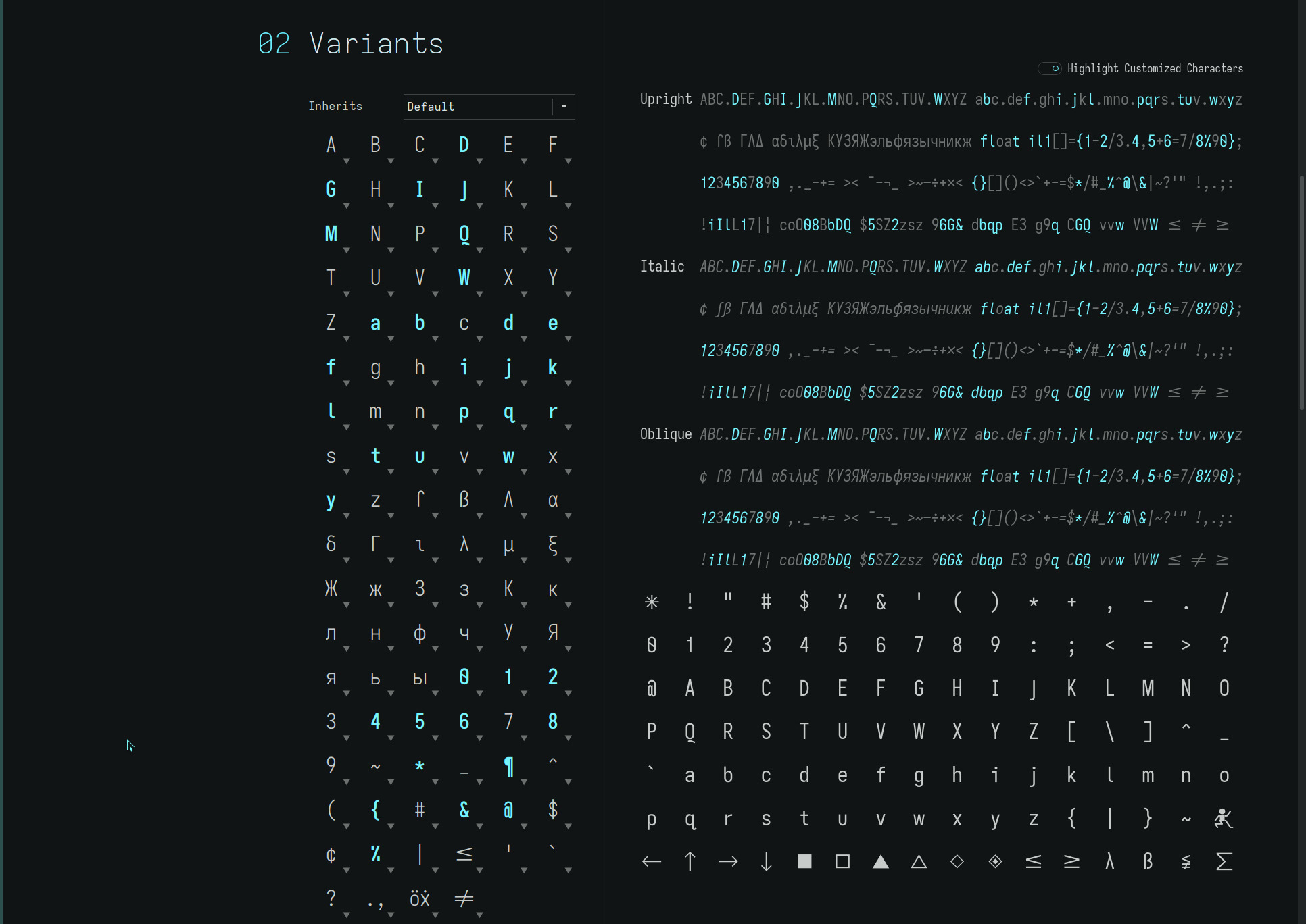
about healinghttp://thedarnedestthing.com/about%20healing2024-04-13T13:50:56-04:002015-03-07T16:15:21-05:00Steven Humhttp://thedarnedestthing.com/

my medicine box is comprised of homeopathics (shamanic elementals), breath/body (rebirthing, emotional body, myofascial tissue, energy) work and shamanism (feather work, tobacco, plant medicines, allies, ceremony).

Much of my work is done through dream time and simple consults—over the phone or visiting. More formal sessions in the manner of table work and remote healing is available as required. Prayer and ceremony complete the commitment to Spirit.

The work is focused on the release of the personal narrative. The story we believe we are. Physical ailments and trauma are often the body’s way of reminding us of the story we would hold on to, and of the suffering that ensues when we resist what is.

]]>
keyboardshttp://thedarnedestthing.com/keyboards2024-04-13T13:50:56-04:002015-03-05T12:51:18-05:00Steven Humhttp://thedarnedestthing.com/

i have lost count of all the keyboards that I have owned and used. Ones I remember..

  • IBM Model-M with buckling springs
  • numerous Logitech rubber dome keyboards
  • Microsoft keyboards including the MS Ergonomic series (which are very comfortable to type on but, unfortunately, use rubber dome keyswitches)
  • Apple Alps keyswitch and wireless chicklet keyboards
  • Matias Tactile Pro with Alps keyswitches

As much as I like the MS ergonomic keyboard designs, there is something about the tactile feel and “clack” of mechanical keys derived from a long affair with manual and electric typewriters, hammering out Gestetner copy for high school publications aeons ago. Today, it’s the traditional rectangular desktop keyboard—with the Colemak keymap layout—that I pound away on.

majestouch 1

the keyboard I have had for a very long time is the tenkeyless Filco Majestouch 1 with Cherry MX Blue mechanical switches.

The Cherry Blues are notoriously loud when the keystrokes are bottomed out on the plate of this hefty keyboard—music to my ears and fine for solitary writing. But if you press lightly without bottoming out the keys, you can hear the subtle click of the keyswitch, characteristic of the Blues. Most of the noise is created at the end of the downstroke where the vector meets the keyboard plate.

o-rings

enter O-rings. I finally got around to taking an hour to clean the keyboard and install these O-ring dampeners.

They cushion the bottom of the keystroke, pamper your fingers and wrist, and leave the MX Blues with just their distinctive “click”. As well, the 0.4mm O-rings shorten the keystroke to just beyond the key’s activation point (where the key registers with the computer), further enhancing the responsiveness of the keyboard.

It is like getting a new and even better (subjectively) keyboard for a pittance—though, if you like bottoming out your keys, it might not be your cup of tea. YMMV with other O-ring thicknesses and hardnesses, and Cherry switch types but the right combo can transform your typing experience.

audio emulation

audible feedback is not just limited to the mechanical sounds produced by the keyboard switches themselves. Keystrokes can be augmented by software. While this may sound excessive, applications like qwertickle can enhance the typing experience by furthering the “typewriter” illusion—obviously, my ingrained fondness of typewriters makes this so.

bspwm can easily be configured to toggle qwertickle to turn typewriter sounds off and on, as well as, volume. The sounds through computer speakers elicit a relaxing rhythm to writing, distinguishing printable characters from space bar, return key and backspace—only with all the advantages of a word processing editor!

The aural interaction with the physical key strokes alters ones perception, making the typing feel more tactile in a pleasing and softer way. All an illusion, of course. But a delight for the fingers to dance to.

poker 2

is a 60% keyboard devoid of separate function and cursor control keys, making it look diminuative and smaller than it actually is—the keycaps are still full size. Function key combinations provide the complete keyset which, at first glance, would appear to be a disadvantage.

However, once the finger memory is established, it is actually, IMO, a more efficient keyboard to type on. Your hands stay on the home row without requiring shifting the hands to the top or right to strike the function row or navigation cluster. In addition, the keyboard is programmable to customize the layout and function of the keys (Colemak layout in this case) providing endless possibilies. Plus, the mouse, when required (and seldomly with a tiling window manager) is closer to the keyboard for easy access.

With ultra light linear Cherry Red key switches—models are available with the complete range of Cherry key switches—and O-rings (0.2mm red) installed, the Poker 2 is a joy to type on with a completely different feel to the Cherry Blue Filco. And the desk has never looked so spacious!

tex aluminium case

the stock ABS Poker 2 case tilts the keyboard in the conventional manner (back to front) but my preference is for a flat, if not inverted tilt. Adding a green Tex aluminium case levels out the keyboard, lowers it and adds mass, as well as, a beautiful anodized finish. Fix a pair of small vinyl bumpers to the front of the case and you have a negative tilting keyboard!

Adding between the keyboard plate/PCB and aluminium base, a run of pliable Weather Shield Crack Seal dampens key vibration, as well as, further adding mass to the keyboard.

Seat a 1/2” (three strands) wide strip between each of the grooved aisles. Aside from the USB and dip switch case cutouts and screw posts, notch the front Crack Seal piece under the space bar to accommodate the small protruding surface mounted component on the PCB (for ease of flush mounting the PCB to the Crack Seal).

Add a layer of tissue paper or thin plastic wrap between the Crack Seal and the PCB to make future disassembly easy—otherwise, the keyboard assembly will need to be pried carefully from the tacky Crack Seal. The easiest way to do so, in this case, is to gently pry up one of the sides with a tape wrapped jewelers screwdriver (to prevent marring the anodized finish), then run a credit card around the edges of the keyboard plate to separate the PCB from the Crack Seal.

Together, the Tex case and Crack Seal, elevate the feel of the Poker 2 keyboard considerably. If you prefer the tilt of the original ABS case, one could line it with Crack Seal, with extra layers to accommodate the keyboard case depth—to similarly dampen and weight it, and save some serious change!

This combo has ended my keyboard search. For now..

]]>
poker 2http://thedarnedestthing.com/poker%2022024-04-13T13:50:56-04:002015-03-02T14:05:35-05:00Steven Humhttp://thedarnedestthing.com/

configuration of the Pn layer allows mapping keyboard and function key combinations to provide the shortcuts necessary to emulate a full 104 key keyboard. Such a setup allows typing with minimal hand movement and actually, IMO, is more efficient to use!

initial setup

the Colemak keyboard layout uses the CapsLock as a backspace key. Also, moving the *nix common grave/tilde to its own key avoids the otherwise necessary Fn + Esc key combination. To do so..

action setting key
Power off  
Dip Switches 1,3,4 off  
Dip Switch 2 on  
Power on  
Fn + right Ctrl    
Caps Lock Backspace  
Pn    
Right Ctrl Fn + Esc `~
Pn    
Fn + right Ctrl    
Fn + right Shift    

Dip switch 2 moves the grave/tilde to the right Ctrl which is convenient for frequent usage. However, the right Ctrl also needs to programmed for the Pn layer, hence, the assignment of Fn + Esc to the right Ctrl.

The Fn + right Ctrl key combination initiates and terminates programming mode. The single Pn key action stores the defined mapping. The Fn + right Shift enables the Pn layer permanently so you do not need to press Pn key to invoke the new mappings.

colemak

is easy enough to obtain in Linux via the keymap settings. Then the qwerty keyboard layout is mapped to Colemak. But you can easily configure the Pn layer to convert the Poker 2 into a Colemak keyboard so it can be used with any computer as such..

action setting
Fn + right Ctrl  
e f
Pn  
r p
Pn  
t g
Pn  
y j
Pn  
u l
Pn  
i u
Pn  
o y
Pn  
p ;
Pn  
s r
Pn  
d s
Pn  
f t
Pn  
g d
Pn  
j n
Pn  
k e
Pn  
l i
Pn  
; o
Pn  
n k
Pn  
Fn + right Ctrl  
Fn + right Shift  

and you now have a Colemak keyboard enabled. Any layout can be defined!

left fn key

a left hand Fn key can be useful for the upper F-key ranges, other Pn layer programming, and avoiding awkward Fn key combinations and finger stretches with the Shift, Ctrl, Win (Super), and Alt keys.

Not surprisingly, the Poker 2 can assign a left hand Fn key. Dip switch 3 turned on turns the Win key into a left hand Fn key, but then the Win key needs to be mapped elsewhere (the right Alt key is an option) or is lost. A solution is to map the Fn key to the CapsLock, preserving the Win key (position). To do so..

action setting
Power off
Dip Switches 2-4 off
Dip Switch 1 on
Power on
Fn + right Ctrl  
Win CapsLock
Pn  
Fn + right Ctrl  
Power off
Dip Switch 2-3 on
Power on
Fn + right Shift  

Done! Dip switch 3 enables the left Fn key, normally to the Win key, but since the Win key is mapped to the CapsLock, the left Fn is now the CapsLock and the Win key remains a Win key. Whew!

Doing so loses the CapsLock as a backspace key above, something which, as a Colemak user, I have come to appreciate—especially with all the inadvertent key presses while acclimating to new ultra light linear Cherry Red key switches!

guifn

enter the GuiFn function key layout which eliminates the need for a left hand Fn key.

GuiFn implements a right hand (activated with thumb on the Fn key) navigation key cluster which is, IMO, more effective than the split left hand Fn + WASD cursor layout—that gamers are used to—and right hand Fn + Home/End/PgUp/PgDn (assigned to the semi-colon, period, quote and slash) keys.

In fact, once your muscle memory is established, it is quicker to use than the dedicated navigation control cluster of a tenkeyless or full keyboard. To configure the Pn layer..

action setting navigation
Fn + right Ctrl    
Fn + ; Fn + a Right
Pn    
Fn + ‘ Fn + s Down
Pn    
Fn + Enter Fn + d Left
Pn    
Fn + [ Fn + w Up
Pn    
Fn + p Fn + ; Home
Pn    
Fn + ] Fn + , End
Pn    
Fn + Backspace Fn + ‘ PgUp
Pn    
Fn + \ Fn + / PgDn
Pn    
Fn + / Fn + Backspace Del
Fn + right Ctrl    
Fn + right Shift    

Flip the Fn key around so it slopes downward (the “Fn” legend will be upside down) as this will feel more natural to the thumb and can be located by feel.

Now the Poker 2 is really beginning to feel customized (just need to add an anodized milled aluminium base!)..

the layouts

with Fn +</span> right Shift enabled..

` Esc 1 2 3 4 5 6 7 8 9 0 - = Backspace Tab Q W F P G J L U Y ; [ ] ` Backspace A R S T D H N E I O ' Enter Shift Z X C V B K M , . / Shift Ctrl Win Alt Space Alt Fn Pn `~

with Fn (thumb) held down..

` Esc F1 F2 F3 F4 F5 F6 F7 F8 F9 F10 F11 F12 PgUp Tab Q W E R T Y U I O Home Up End PgDn` CapsLock A S D F G H J K L Left Down Right Shift Z X C V B N M , . / Shift Ctrl Win Alt Space Alt Fn Pn `~

with Pn held down..

` Esc 1 2 3 4 5 6 7 8 9 0 - = Backspace Tab Q W E R T Y U I O P [ ] ` CapsLock A S D F G H J K L ; ' Enter Shift Z X C V B N M , . / Shift Ctrl Win Alt Space Alt Fn Pn `~

For completeness, all remaining default Poker 2 Fn keys can be programmed to be indifferent to the Fn key to allow modifiers on those keys to work even if the Fn key is held down..

action setting
Fn + right Ctrl  
Fn + w w
Pn  
Fn + a a
Pn  
Fn + s s
Pn  
Fn + d d
Pn  
Fn + z z
Pn  
Fn + x x
Pn  
Fn + c c
Pn  
Fn + v v
Pn  
Fn + b b
Pn  
Fn + r r
Pn  
Fn + y y
Pn  
Fn + f f
Pn  
Fn + g g
Pn  
Fn + h h
Pn  
Fn + n n
Pn  
Fn + m m
Pn  
Fn + , ,
Pn  
Fn + . .
Pn  
Fn + right Ctrl  
Fn + right Shift  

The possibilities are endless with the programmable function layer of the Poker 2. You can easily roll your own..

]]>
2015-02-26http://thedarnedestthing.com/shadowsandlight/2015-02-262024-04-16T10:55:42-04:002015-02-26T00:00:00-05:00Steven Humhttp://thedarnedestthing.com/

a flock of cedar waxwings.

Hundreds of them.

I estimate 300 plus. All perched on the leafless branches of a neighour’s tree. Soaking in the western rays of the sun. Then all taking flight to return and land on the tree ten or so minutes later. Time and time again.

Cedar waxwings.

Spring!

]]>
dmenu2http://thedarnedestthing.com/dmenu22024-04-13T13:50:56-04:002015-02-25T08:43:24-05:00Steven Humhttp://thedarnedestthing.com/

stumbling upon a extensively enhanced fork of a favourite applcation always raises my curiousity. dmenu2 doesn’t disappoint, including the available patches to dmenu plus adding several important UI enhancements.

Of particular interest to me are..

  • vertical positioning of the dmenu prompt
  • background dimming

The first without the latter would have required fine tuning the dmenu colours to obtain a suitable contrast with the applications in the background. But, with dimming—which requires a compositing manager— no changes to the existing dmenu themes are required, which now stand out much more clearly over the darkened background.

dmenu run

It makes dmenu even better IMO..

list mode

passes the list depth for..

#!/bin/sh lines=10 echo $(dwrapper $lines) -l $lines

dmenu wrapper

centering the dmenu prompt..

#!/bin/sh H=24 [[ $* ]] && height=$(( $H * ($@ + 1) )) || height=$H [[ $(pidof compton) ]] && dim='-dim 0.6' theme=green function Y() { case “$@” in left) Y=$(( (1050 - $height) / 2 )) ;; right) Y=$(( (1600 - $height) / 2 )) ;; laptop|*) Y=0 ;; esac } Y=0 case $(cat ~/.windowmanager) in herbstluftwm) if [[ $(xdpyinfo | grep ‘dimensions:’ | grep -oE ‘[0-9]{1,}’ | sed -n 2p) -gt 600 ]]; then focus=$(herbstclient list_monitors | grep ‘[FOCUS]’ | cut -d: -f1) case $focus in 0) Y ‘right’ ;; 1) Y ‘left’ ;; esac fi ;; bspwm) focus=$(bspc query –monitors –monitor focused) case $focus in DVI-0) Y ‘left’ ;; DVI-1) Y ‘right’ ;; esac ;; esac function dmenu() { echo /usr/bin/dmenu -i $dim -y $Y -h $H -fn “Arial-10” -nb “#333” $@ } case $theme in red) dmenu -sb “#d00” -sf “#fff” ;; darkred) dmenu -sb “#b5423f” ;; yellow) dmenu -sb “#ffde1e” -sf “#333” ;; darkyellow) dmenu -sb “#fd0” -sf “#555” ;; green) dmenu -sb “#4E9258” -sf “#fff” ;; darkgreen) dmenu -sb “#080” -sf “#fff” ;; blue) dmenu -sb “#099” ;; darkblue|*) dmenu ;; esac

The screen height is specific to my multihead setup. Dim is only set if the compton compositing manager is running—else the background would be blanked out.

ribbon calculator

is enhanced to store and list each computed result in a variable a..z in the dmenu prompt which can be referenced (by variable name) in subsequent calculations..

#!/bin/sh vars=( $(echo {a..z}) ) for i in {a..z} do eval $i=.. done count=-1 ribbon='Solve' function eqn() { echo $eqn | sed -e ‘s/([a-z])/$\1/g’ -e ‘s/([()])/\\1/g’ -e ‘s/([<>])/../g’ -e ‘s/[$](.)[$]/$\1..$/g’ } while eqn=$($(dwrapper) -noinput -p "$ribbon$error") do [[ $eqn ]] || break if ans=$(calc -pd “$(eval echo $(eqn))”); then if [[ $ans ]]; then if echo $ans | grep -v ‘Error|Warning’; then echo -n “$ans” | xsel -i count=$(( $count + 1 )) [[ $count -gt 25 ]] && count=0 eval ${vars[$count]}=$ans ribbon=”$ribbon $(eval echo ${vars[$count]}=$ans)” unset error else unset ans fi fi else unset ans fi [[ $ans ]] || error=” ?=$eqn” done if [[ $ans ]]; then echo -n “$ans” | xsel -i time=10000 notify “Ctrl-Alt-V” “$ans” fi

The -noinput option suppresses highlighting an empty field produced by the conventional “echo | dmenu..” usage—a very minor visual cleanup.

dmenu ribbon calculator

address book

the script originally listed here has been updated to similarly list the email recipient list as it is built in the dmenu prompt. The relevant code fragments..

... function ribbon() { width=50 if [[ -z $* ]]; then echo elif [[ $(echo $@ | wc -c) -lt $width ]]; then echo “ $@” else echo “ ..$(echo $@ | cut -c $(( $(echo $@ | wc -c) - $width ))-)” fi } while true do address=$(cat $addressbook | sed -e ‘1i[ clipboard ]\n[ rebuild database ]’ | $(dlist) -p “Address$(ribbon $addresses)”) || break case “$address” in ‘[ clipboard ]’) break ;; ‘[ rebuild database ]’) dinit ;; ) address=$(echo $address | sed ‘s/. :: //’) [[ $addresses ]] && addresses=$addresses,$address || addresses=$address ;; esac done ...

dmenu address book

All minor enhancements, inspired by the extended features of dmenu2.

]]>
dmenuhttp://thedarnedestthing.com/dmenu2024-04-13T13:50:56-04:002015-02-24T23:03:02-05:00Steven Humhttp://thedarnedestthing.com/

while tiling window managers are my preferred desktop environment to work in, it is dmenu that is the glue and allows my workflow to be completely keyboard driven.

With simple keybindings defined in the sxhkdrc configuration, dmenu functions can be defined to select from a list and..

  • launch a program
  • restart a systemd process
  • open a man page
  • open a history URL item in your browser of choice
  • ditto a bookmark URL
  • locate and open a file
  • edit a system config file
  • edit a group of project source files
  • return a password
  • return a list of email addresses (readily available in the clipboard)
  • compose an email in your editor of choice
  • add music to a playlist
  • control the playlist music daemon
  • solve a mathematical equation
  • exit system
  • pretty much anything you care to script that can use a pick list!

dmenu is window manager agnostic but appears more aligned with tiling window managers being keyboard driven (versus the mouse driven disposition of stacking window managers).

dmenu

#!/bin/sh $(dwrapper) $(echo "$@" | grep -q '[-]p ' || echo '-p Run') $@

Present a single row of menu items. If no prompt is provided, the standard “Run” prompt is used.

dlist

#!/bin/sh echo $(dwrapper) -l 12

Present a list of menu items, 12 lines deep.

dwrapper

#!/bin/sh echo /usr/bin/dmenu -i -fn 'Arial-10' -sb '#4E9258' -sf '#fff' -nb "#333" -h 22

A dmenu wrapper is created to provide an easy way to enforce a consistent look to all the scripts which call dmenu. I use the Xft patched version of dmenu to have a wider choice of fonts available.

The following scripts illustrate just a few uses of dmenu..

run program

#!/bin/sh cachedir=${XDG_CACHE_HOME:-"$HOME/.cache"} if [[ -d "$cachedir" ]]; then cache=$cachedir/dmenu_run else cache=$HOME/.dmenu_cache fi ( IFS=: if stest -dqr -n “$cache” $PATH; then run=$(stest -flx $PATH | sort -u |sed ‘1iscratchpad\nterm\npseudoframe’ | tee “$cache” | dmenu “$@”) || exit else run=$(dmenu “$@” < “$cache”) || exit fi [[ -n $run ]] && $run )

bspwm terminal applications are conveniently inserted at the top of the list.

restart systemd process

#!/bin/sh cd /usr/lib/systemd/system/ while true do service=$(stest -fl . | sort | sed ‘1i[ list services ]\n[ list-unit-files ]’ | $(dwrapper) -p ‘Restart’) || break case $service in ‘[ list services ]’) /usr/bin/urxvt -title ‘list services’ -e systemctl -t service -a ;; ‘[ list-unit-files ]’) /usr/bin/urxvt -title ‘list-unit-files’ -e systemctl list-unit-files ;; *) sudo systemctl restart $service break ;; esac done

open man page

#!/bin/sh page=$(apropos . \ | cut -d’ ‘ -f1 | sort -d | uniq | sed ‘1iremind\nbspwm’ | $(dwrapper) -p ‘Man Page’ | cut -d’:’ -f3-) [[ $page ]] && apropos . | cut -d' ' -f1 | grep -q "$page" && urxvtc -title "man $page" -e man "$page"

open bookmark url

#!/bin/sh sqldb=~/.local/share/luakit/bookmarks.db query='select title, tags, uri from bookmarks order by tags,title ASC;' uri=$(echo "$query" \ | sqlite3 $sqldb | sed ‘s/[|]/ :: /g’ | $(dlist) -p ‘Bookmark’ | sed ‘s/.* :: .* :: (.*)/\1/’) [[ $uri ]] && dbrowser "$uri"

with selectable browser..

#!/bin/sh function m() { which $@ >/dev/null 2>&1 && echo -n “$@\n” } while browser=$(echo -e \ $(m vimb) $(m chromium) $(m w3m) $(m xombrero) | $(dwrapper) -p ‘Browser’) || exit do case ${browser# } in elinks | w3m) urxvtc -title “$browser” -e $browser $@ ;; chromium | dwb | … | vimb | xombrero) eval $browser $@ ;; *) echo “.. unknown browser: $browser” continue ;; esac exit done

open file

#!/bin/sh while name=$(xsel -o | $(dwrapper) -p 'Find File') || exit do [[ $name ]] || exit list=$(sudo locate -A -e -i $name) [[ $list ]] || continue file=$(echo -e “$list” | $(dlist) -p ‘Open’) || exit echo -n “$file” | xsel -b -i xdg-open “$file” done

edit project files

#!/bin/sh files=$(cat ~/.config/dmenu/edit-list | $(dlist) -p 'Edit' | cut -d':' -f3-) [[ $files ]] && zsh -c "v $files"

where, edit-list is a text file containing single line file specs..

tag... :: [ filename | $(eval) ]...

where,

  • tag is a list of dmenu search tags
  • :: is the tag field separator (as defined by this particular script)
  • filename is a posix filename expression
  • eval is a posix shell expression that evaluates to a list of filenames
  • any number of filename and eval expressions, space separated, can be defined per file spec

with v (vim) script..

#!/usr/bin/zsh SHELL=/bin/sh [[ -z $DISPLAY && $(tty) = /dev/tty* ]] || gui=-g find ~/.vim/backups -size 0 -exec rm -fv {} \; find ~ -name '.viminf*.tmp' -exec rm -fv {} \; if [[ -z $* ]]; then vim $gui /tmp/scratch elif [[ ! -f $1 ]]; then vim $gui $@ elif is_owned $1; then vim $gui $@ else sudo -s vim $gui $@ find ~/.vim/backups -user root -exec sudo chown -v ${USER}:users {} \; fi

With an easily updated edit-list file, common sets of files are readily available for editing with just a few keystrokes.

ribbon calculator

#!/bin/sh vars=( $(echo {a..z}) ) count=-1 ribbon='Solve' while eqn=$(echo | $(dwrapper) -p "$ribbon") do [[ $eqn ]] || exit if ans=$(calc -pd “$(eval echo $(echo $eqn | sed ‘s/([a-z])/$\1/g’))”); then echo -n “$ans” | xsel -i count=$(( $count + 1 )) [[ $count -gt 25 ]] && count=0 eval ${vars[$count]}=$ans ribbon=”$ribbon $(eval echo ${vars[$count]}=$ans)” fi done

dictionary lookup

#!/bin/sh word=$(xsel -o | $(dwrapper) -p 'Lookup Word') || exit while hints=$(dict "$word" 2>&1 >/dev/null | cut -d':' -f2 | xargs -n1 | sort -u -f) do [[ $word ]] || exit [[ $hints ]] || break echo $hints | sed “s/$word *//” | grep -q ‘definitions for found No’ if [[ $? -eq 0 ]]; then word=$($(dwrapper) -p “No definitions found for "$word"”) || exit else word=$(echo -e “$hints” | $(dwrapper) -p ‘Hints’) || exit fi done urxvtc -title "$word" -e sh -c "dict \"$word\" | less"

address book

#!/bin/sh maildir=~/Maildir addressbook=$maildir/addressbook function dinit() { notify “Updating dmenu addressbook cache” “Please be patient..” /usr/bin/vendor_perl/ack –no-filename –ignore-case –no-color ‘^(From|To|Cc|Bcc):’ $maildir | grep ‘@’ | sed -e ‘s/(\xad|\x01)/ /g’ -e ‘s/[,;] */\n/g’ -e ‘s/[”]//g’ -e “s/[’]//g” -e ‘s/<br>//’ -e ‘s/<mailto:[^>]*>//’ -e ‘s/\t/ /g’ -e ‘s/ *$//’ -e ‘s/^ *//’ -e ‘s/ */ /g’ -e ‘s/^To: //I’ -e ‘s/^From: //I’ -e ‘s/^Cc: //I’ -e ‘s/^Bcc: //I’ | grep ‘^[^<].*<.*>$’ | grep -v ‘@.*<’ | grep -iv ‘(^[^a-z]|[=])’ | grep -Piv ‘<thedarnedestthing.com(?!@gmail.com)’ | grep -iv ‘((hello|info)@)’ | grep -iv ‘(announce|automated|confirm|contact|help|invitations|market|news|notification|promo|reply|review|subscribe|welcome)’ | grep -iv ‘(feedspot|github|via linkedin|yahoogroups)’ | sort -f | uniq -i > $addressbook notify “Update of dmenu addressbook cache” “..Complete” } [[ -s $addressbook ]] || dinit while true do address=$(cat $addressbook | sed -e ‘1i[ clipboard ]\n[ rebuild database ]’ | $(dlist) -p ‘Email Address’) || break case “$address” in ‘[ clipboard ]’) break ;; ‘[ rebuild database ]’) dinit ;; *) [[ $addresses ]] && addresses=$addresses,$address || addresses=$address ;; esac done if [[ $addresses ]]; then # echo -n “$addresses” | xclip echo -n “$addresses” | xsel -i time=10000 notify “Ctrl-Alt-V” “$(echo $addresses | sed ‘s/ <\S*>//g’)” fi

with notify popup..

#!/bin/sh [[ $time ]] && expire="--expire-time=$time" case "$#" in 0) echo ‘.. notify “heading” [“line1\nline2..”]’ ;; 1) sudo -u $USER notify-send $expire –icon=task-complete “$1” & ;; 2) sudo -u $USER notify-send $expire –icon=task-complete “$1” “$2” & ;; esac

The address book database is compiled to..

  • exclude major lists correspondence
  • exclude news and announcement items
  • exclude malformed addresses
  • reject unexpected characters
  • restrict addresses to those with a “user name” prefix

E-mail addresses are concatenated and returned in the clipboard and can be pasted into any document or e-mail client.

play music

#!/bin/sh function playlist() { if (( $(mpc playlist | /usr/bin/wc -l) )); then mpc list artist | sort -n | sed -e “1i[ next ]\n[ toggle ]\n[ stop ]” else mpc list artist | sort -n fi } mpc list artist 2>/dev/null || exit while artist=$(playlist | $(dwrapper) -p 'Artist') || exit do case $artist in ‘[ next ]’) mpc play mpc next echo “.. toggling playlist” # exit ;; ‘[ toggle ]’) mpc toggle echo “.. toggling playlist” exit ;; ‘[ stop ]’) mpc stop echo “.. stopping playlist” exit ;; esac [[ $artist = ‘[ next ]’ ]] && exec dmusic more=true while [[ $more ]] do if [[ $(mpc list album artist “$artist” | wc -l) > 1 ]]; then album=$(mpc list album artist “$artist” | sort -n | sed ‘1i[ all ]’ | $(dwrapper) -p ‘Album’) || break else album=$(mpc list album artist “$artist” | sort -n | $(dwrapper) -p ‘Album’ -l 1) || break more= fi if [[ $album = ‘[ all ]’ ]]; then playlist=$(mpc find artist “$artist”) music=”all songs available from $artist” more= else playlist=$(mpc find artist “$artist” album “$album”) music=”$artist :: $album” fi while action=$(echo -e “play\nadd\ninsert” | $(dwrapper) -p ‘Playlist’) || break do case $action in add) echo -e “$playlist” | mpc add >/dev/null echo “.. adding $music to the playlist” ;; insert) echo -e “$playlist” | mpc insert >/dev/null echo “.. inserting $music into the playlist” ;; play) mpc clear >/dev/null echo -e “$playlist” | mpc add >/dev/null echo “.. playlist cleared. Adding $music to the playlist” ;; *) echo “.. invalid action: $action” continue ;; esac break done mpc play >/dev/null done done

What makes dmenu so useful is the ease of calling it in scripts to select a menu item out of a large list of newline separated entries. The search engine facilitates partial matches, refining the list of available entries as you type. It does not require understanding regex pattern matching constructs—in fact, if you are unfamiliar with such, dmenu will astound you with its facility even more!

Typically, items are found with just a few keystrokes which can include unordered space delimited partial words or keystrokes. Its magic needs to be seen to be appreciated.

dmenu. It’s da menu !

]]>
herbstluftwmhttp://thedarnedestthing.com/herbstluftwm2024-04-13T13:50:56-04:002015-02-21T22:31:39-05:00Steven Humhttp://thedarnedestthing.com/

herbstluft is German for “autumn air” and a unique moniker for a tiling window manager. It differs from bspwm which I have been using extensively for quite awhile now, in that, it is a manual tiling window manager (as opposed to dynamic)—which, interestingly, bspwm is derived from.

The term manual is somewhat of a misnomer because herbstluftwm will populate a frame according to the default layout specified for it (vertical, horizontal, max and grid) and a frame, unless otherwise split, will occupy a screen (monitor) by default. Though, as you open windows, especially while in vertical or horizontal layout, it becomes apparent why you need to manage the layout: everything quickly becomes cramped and the window spaces effectively unusable. Grid layout is a more forgiving, especially if you have a large display.

But what makes herbstluftwm interesting is the degree of control one has over the pixel space of one’s physical monitors. Virtual monitor regions can be defined for a single physical screen and, within each, individual frames and sub-frames which contain application windows.

It is, therefore, possible to effect display manipulations at the frame or monitor level, leaving the adjacent frames and monitor regions intact, allowing for a greater degree of screen real estate control. This is something that I did not appreciate as a dynamic tiling window manager user until now.

herbstluftwm has a similar client/server architecture to bspwm (or should I say, bspwm to herbstluftwm) in that it is controlled via a messenging mechanism provided by the herbstclient command. Coming from bspwm, I have really come to appreciate this approach. Hotkeys via keybinds and console commands allow one to manipulate the desktop environment with ease—and test potential keybinds and scripts.

Two particular features that have stood out immediately are the ability to chain commands and lock/unlock screen refreshes. This eliminates the need for many simple scripts and allows for visually smooth screen transitions devoid of intermediate screen actions. Absolutely brilliant! (but my tiling window manager familiarity is limited to four at the moment, so I cannot speak for other window managers).

One of the first things I did was to transcribe my bspwm configuration to herbstluftwm—a quick way to dive under the hood. A lot of my bspwm configuration was unnecessary because herbstluftwm already supported my particular workflow preferences natively.

Two frames with Conky

I implemented a dynamic Conky panel with my original set of rules tailored to herbstluftwm..

  • maintain a fixed default margin around the monitor desktop, adjusting the secondary monitor’s margin to match the visual spacing of the primary monitor (using the pixel ratio between the two)
  • the right padding is dependent on whether the Conky panel is visible or is the default monitor margin
  • with the Conky panel visible, full screen mode fits within the default margins of the desktop
  • with the Conky panel hidden, full screen mode fills the entire screen in the typical fashion as with other window managers
  • the secondary monitor exhibits the typical frame and fullscreen modes

Two frames in full screen

Unlike my bspwm configuration, the inner window gaps are not dynamically adjusted as windows are added or removed, but set to a fixed spacing. This is because windows fill a frame and a wider spacing is used to denote (separate) frame regions. There is all manner of border and background control for windows and frame spaces available to more boldly mark the layout but I prefer to have as simple (distraction free) a presentation as possible and, for today, prefer to use window and frame spacing as a means of layout identification. It works very well visually and has a quietness about it.. sort of like autumn air.

Fullscreen with Conky

Fullscreen

set monitors

is the primary controller called by other scripts for managing the static border of the specified display by setting the effective monitor regions with an easily configurable desktop_margin pixel setting..

#!/bin/sh desktop_margin=70 primary=$(herbstclient list_monitors | grep '^0:' | cut -d' ' -f2) secondary=$(herbstclient list_monitors | grep '^1:' | cut -d' ' -f2) conky_width=$(( $(grep 'maximum_width' ~/.conkyrc | awk '{ print $2 }') + $(grep 'border_outer_margin' ~/.conkyrc | awk '{ print $2 }') * 2 )) frame_gap=$(grep '^hc set frame_gap' ~/.config/herbstluftwm/autostart | awk '{ print $4 }') window_gap=$(grep '^hc set window_gap' ~/.config/herbstluftwm/autostart | awk '{ print $4 }') window_frame=$(( $window_gap + $frame_gap )) margin=$(( $desktop_margin - $window_frame )) window_margin=$(( $window_frame + $margin )) case "$@" in conky) primary=$(( 2560 - $conky_width + $frame_gap - $margin ))x$(( 1600 - $margin\2 ))+$(( 1680 + $margin ))+$margin ;; conkyfullscreen) primary=$(( 2560 - $conky_width - $window_gap - $window_margin ))x$(( 1600 - $window_margin*2 ))+$(( 1680 + $window_margin ))+$window_margin ;; fullframe) primary=$(( 2560 - $margin*2 ))x$(( 1600 - $margin*2 ))+$(( 1680 + $margin ))+$margin ;; fullscreen) primary=2560x1600+1680+0 ;; secondary) margin=$(echo $margin | awk ‘{ print int($1 * 0.25 / 0.282 + 0.5) }’) secondary=$(( 1680 - $margin*2 ))x$(( 1050 - $margin*2 ))+$margin+$margin ;; secondary*fullscreen) secondary=1680x1050+0+0 ;; esac herbstclient set_monitors $primary $secondary

Note the border adjustment for the secondary monitor so that its margin matches the primary monitor margin visually (by the ratio of the monitors’ dot pitches)!

toggle conky

hides and unhides the Conky panel, and sets the necessary primary monitor region..

#!/bin/sh function conky_monitor() { if [[ $(herbstclient attr clients.focus.fullscreen) = true ]]; then set_monitors conky fullscreen else set_monitors conky fi } if [[ $(xrandr | grep '*' | cut -dx -f1 | sort | tail -1) -gt 1024 ]]; then if xdotool search –onlyvisible –classname ‘Conky’ windowunmap; then if [[ $(herbstclient attr clients.focus.fullscreen) = true ]]; then set_monitors fullscreen else set_monitors fullframe fi else if ! xdotool search –classname ‘Conky’ windowmap; then conky -q -c ~/.conkyrc & xdotool search –sync –onlyvisible –classname ‘Conky’ fi if herbstclient list_monitors | grep ‘^0:.*[FOCUS]’; then conky_monitor else herbstclient chain lock . focus_monitor 0 conky_monitor herbstclient chain . focus_monitor 1 . unlock fi fi else xdotool search –onlyvisible –classname ‘Conky’ windowunmap || xdotool search –classname ‘Conky’ windowmap || conky -q -c ~/.conkyrc & fi

Calling toggle_conky and set_monitors secondary during autostart initializes the displays to their monitor margins. Everything it good to go from thereon.

toggle fullscreen

sets the appropriate monitor region for fullscreen and frame based layout modes (as frames define window and frame gaps) for the monitor in focus..

#!/bin/sh herbstclient lock if [[ $(xrandr | grep '*' | cut -dx -f1 | sort | tail -1) -gt 1024 ]]; then if herbstclient list_monitors | grep ‘^0:.*[FOCUS]’; then if xdotool search –onlyvisible –classname ‘Conky’; then if [[ $(herbstclient attr clients.focus.fullscreen) = true ]]; then set_monitors conky else set_monitors conky fullscreen fi else if [[ $(herbstclient attr clients.focus.fullscreen) = true ]]; then set_monitors fullframe else set_monitors fullscreen fi fi else if [[ $(herbstclient attr clients.focus.fullscreen) = true ]]; then set_monitors secondary else set_monitors secondary fullscreen fi fi fi herbstclient chain . fullscreen toggle . unlock

toggle max

allows switching to max layout, returning to the current layout without need for scrolling through the layout schemes (typically vertical, horizontal, max and grid) to hunt for it!. My workflow typically moves between a specific layout for a frame and max..

#!/bin/sh if [[ $(herbstclient attr clients.focus.fullscreen) = true ]]; then toggle_fullscreen else layout=$(herbstclient dump ‘’ ‘@’ | sed ‘s/[ ]* ([^:])./\1/’) tag=/tmp/herbstluftwm:tag:$(herbstclient list_monitors | grep ‘[FOCUS]’ | cut -d’”’ -f2) if $layout != max ; then echo $layout > $tag herbstclient set_layout max elif -f $tag ; then herbstclient set_layout $(cat $tag) rm -f $tag else herbstclient cycle_layout 1 fi fi

Note: if in fullscreen, just toggle out of it!

A persistent state file for the tag containing the current layout is retrieved for restoring the layout. Using /tmp ensures any unused dangling instances are purged—though, purging in the .xinitrc or autostart is good practice.

The keybind layout control is now defined as..

herbstclient keybind Mod1-space spawn toggle_max herbstclient keybind Mod1-Shift-space cycle_layout 1 grid vertical horizontal

conky bits

to display the active tag and window application (offset positioning is specific to the .conkyrc setup)..

${if_match "${exec herbstclient list_monitors | grep '\[FOCUS\]' | cut -d: -f1}" == "1"} ${voffset -211}${font Ubuntu:size=48,weight:normal}${color3}${offset 136}${exec herbstclient list_monitors | grep '\[FOCUS\]' | cut -d'"' -f2}${font Ubuntu:size=16,weight:normal}${color4}${exec herbstclient list_monitors | grep -v '\[FOCUS\]' | cut -d'"' -f2} ${voffset -44} ${font Ubuntu:size=7,weight:normal}${color3}${alignr}${exec herbstclient substitute CLASS clients.focus.class echo CLASS} ${voffset 106} ${else} ${voffset -211}${font Ubuntu:size=48,weight:normal}${color4}${offset 136}${font Ubuntu:size=16,weight:normal}${exec herbstclient list_monitors | grep -v '\[FOCUS\]' | cut -d'"' -f2}${voffset -46}${font Ubuntu:size=48,weight:normal}${color3}${exec herbstclient list_monitors | grep '\[FOCUS\]' | cut -d'"' -f2} ${voffset -162} ${font Ubuntu:size=7,weight:normal}${color3}${alignr}${exec herbstclient substitute CLASS clients.focus.class echo CLASS} ${voffset 106} ${endif}

So I am livin’ in herbstluftwm for now—that, and conditioning myself on my new Poker 2 keyboard—and finding it a delight. Window manager preferences can be a fickle thing amongst the Linux community. The shear choice beckons comparison and biases.

Is herbstluftwm better than bspwm? Both are great tiling window managers. Both are very malleable. Both will stay on my machines. They are both very different and competent window managers and, I am finding myself surprisingly comfortable with manual tiling. I think herbstluftwm’s feature set becomes more self-evident with larger display real estate.

Manual tiling can add a few extra keystrokes here and there. But the benefit is that it is easier to obtain precise placement and control of window objects because the window manager is not deciding that for you.

But sometimes I like to be lazy too..

]]>
herbstluftwm jugglinghttp://thedarnedestthing.com/herbstluftwm%20juggling2024-04-13T13:50:56-04:002015-02-21T14:46:15-05:00Steven Humhttp://thedarnedestthing.com/

the messenging aspect of herbstluftwm via shell scripts and herbstclient allow extending the window manager behaviour. One added benefit is that it is fairly difficult to bork the actual window manager—at least, I haven’t been able to do so. Illegal herbstclient commands just fail gracefully—no harm done. No recompilation required. And you can test out code snippets in a terminal window before committing the code to the autostart or scripts to be spawned.

swap monitors

is implemented to follow (focus) the current tag or retain focus of the current monitor, dependent on whether the monitor tag is pushed in the direction of monitor (switch focus)—corresponding to left/right bracket—or pulled from the adjacent monitor (retain focus)..

#!/bin/sh function swap_to() { swap_monitors=$(herbstclient get swap_monitors_to_get_tag) herbstclient set swap_monitors_to_get_tag 1 if [[ $@ = 0 ]]; then herbstclient chain . lock . focus_monitor 1 . use $tag0 . focus_monitor 0 . use $tag1 . unlock else herbstclient chain . lock . focus_monitor 0 . use $tag1 . focus_monitor 1 . use $tag0 . unlock fi herbstclient set swap_monitors_to_get_tag $swap_monitors } direction=$@ focus=$(herbstclient list_monitors | grep '\[FOCUS\]' | cut -d: -f1) tag0=$(herbstclient list_monitors | grep '^0:' | cut -d'"' -f2) tag1=$(herbstclient list_monitors | grep '^1:' | cut -d'"' -f2) if [[ $focus = $direction ]]; then [[ $focus = 0 ]] && swap_to 0 || swap_to 1 else [[ $focus = 0 ]] && swap_to 1 || swap_to 0 fi

swap_monitors_to_get_tag is set to 1 to enable the tag swap of existing views.

This ultimately saves me potentially one meager keystroke combination— selecting the monitor in focus—and needing to know the monitor tag I wish to swap! Lazy I know but it’s handy. And it is one less thing— the tags in view—to need to track in the back of your head. The keybinds match the left/right position of the monitor placement to the left/right bracket..

herbstclient keybind Mod1-Control-bracketleft spawn swap_monitors 1 herbstclient keybind Mod1-Control-bracketright spawn swap_monitors 0

swap window

is similar in action to swap_monitors but moves a window to the adjacent monitor, following (focus) or retaining focus of the current monitor depending on the direction (left/right bracket) of the window movement..

#!/bin/sh direction=$@ focus=$(herbstclient list_monitors | grep '\[FOCUS\]' | cut -d: -f1) if [[ $focus = $direction ]]; then if [[ $focus = 0 ]]; then herbstclient and . lock . shift_to_monitor 1 . focus_monitor 0 . unlock else herbstclient and . lock . shift_to_monitor 0 . focus_monitor 1 . unlock fi else if [[ $focus = 0 ]]; then herbstclient and . lock . shift_to_monitor 1 . focus_monitor 1 . unlock else herbstclient and . lock . shift_to_monitor 0 . focus_monitor 0 . unlock fi fi

As above, the keybinds match the left/right position of the monitor placement to the left/right bracket..

herbstclient keybind Mod1-Shift-bracketleft spawn swap_window 1 herbstclient keybind Mod1-Shift-bracketright spawn swap_window 0

hide window

is something transcribed from my bspwm customizations. Most often in herbstluftwm, it is simple enough to set the frame layout to max for the window in focus which, effectively hides the other windows in the frame.

But sometimes, especially in grid layout, it is handy to temporarily minimize (hide) a window or two to quickly resize the remaining windows of the frame, keeping them all in view. Rather than follow common tiling window manager convention to move windows to desktop (tag) “0” or an adjacent monitor, a (tick) ‘tag is added to hold and restore windows from..

#!/bin/sh tag=$(herbstclient list_monitors | grep '\[FOCUS\]' | cut -d'"' -f2) if [[ $@ = +1 ]]; then herbstclient dump “‘$tag” || herbstclient add “‘$tag” herbstclient move “‘$tag” else herbstclient dump “‘$tag” && herbstclient chain . lock . use “‘$tag” . move $tag . use $tag . unlock fi

With simple keybinds, any number of windows per tag can be effectively minimized and restored in order..

hc keybind $Mod-m spawn hide_window +1 hc keybind $Mod-Shift-m spawn hide_window -1

Note: the window(s) are restored to the current frame in focus of the tag.

scratchpad

is a persistent terminal that can be toggled (hide/unhide from the tag in focus) or pulled into view from any desktop (tag). Hence, you can open the scratchpad in any tag, switch to another and pull it into view on the new tag in focus—regardless of whether the scratchpad is visible or not.

It is a lightweight implementation and acts like an ordinary window (versus the virtual monitor overlay example provided in the herbstluftwm contributions)..

#!/bin/sh scratchpad=/tmp/herbstluftwm:scratchpad if xdotool search --onlyvisible --classname 'scratchpad'; then if [[ $(herbstclient list_monitors | grep ‘[FOCUS]’ | cut -d’”’ -f2) = $(herbstclient attr clients.$(cat $scratchpad) | grep ‘s - tag’ | awk ‘{ print $5 }’) ]]; then xdotool search –onlyvisible –classname ‘scratchpad’ windowunmap exit fi fi if [[ -f $scratchpad ]]; then if ! herbstclient bring $(cat $scratchpad); then xdotool search –classname ‘scratchpad’ windowmap && exit fi fi if ! xdotool search --classname 'scratchpad' windowmap; then urxvt -title ‘scratchpad’ -name ‘scratchpad’ -pe tabbed & xdotool search –sync –onlyvisible –classname ‘scratchpad’ herbstclient attr clients.focus.winid > $scratchpad fi

I use the scratchpad a lot—the urxvt tabbed perl extension can reduce the need for extra terminal windows and the persistent content is useful throughout a session—seldom using separate terminal windows, so designate the common terminal keybinds as such..

herbstclient keybind Mod1-Return spawn scratchpad herbstclient keybind Mod1-Shift-Return spawn urxvt

which will open the scratchpad on the desktop, unless it is already in view (in which case, it will be hidden). Extra terminals are always available for times it is handy to work with terminals side-by-side.

]]>
herbstluftwm hidinghttp://thedarnedestthing.com/herbstluftwm%20hiding2024-04-13T13:50:56-04:002015-02-21T14:46:15-05:00Steven Humhttp://thedarnedestthing.com/

i find myself using the hide/restore window function outlined here often enough that it merited updating the Conky desktop in some fashion to reflect the presence of hidden windows associated with the desktop in focus. It didn’t take long to decide on simply highlighting the desktop (tag) number!

All windows visible

Note: the desktop (tag) numbers in the top right corner of a normal (no windows hidden) view.

hide window

has been augmented to restore the last or all hidden (moved) windows stored in (tick) ‘tag used to store windows temporarily from tag..

#!/bin/sh function tag() { herbstclient list_monitors | grep ‘[FOCUS]’ | cut -d’”’ -f2 } tag=$(tag) case "$@" in +1) herbstclient dump “‘$tag” || herbstclient add “‘$tag” herbstclient move “‘$tag” ;; -1) if herbstclient dump “‘$tag”; then herbstclient chain . lock . use “‘$tag” winid=$(herbstclient attr clients.focus.winid) herbstclient chain . use $tag . bring $winid . unlock fi ;; 0|*) herbstclient dump “‘$tag” && herbstclient merge_tag “‘$tag” ;; esac

The herbstluftwm autostart keybinds to hide and restore windows..

hc keybind $Mod-m spawn hide_window +1 hc keybind $Mod-Control-m spawn hide_window -1 hc keybind $Mod-Shift-m spawn hide_window 0

The following Conky scripts complete the hidden window notification..

query desktop

returns the desktop tag of the monitor desktop in focus (or not), of the multihead setup..

#!/bin/sh [[ $@ = focus ]] || focus=-v herbstclient list_monitors | grep $focus '\[FOCUS\]' | cut -d'"' -f2

query hidden

returns the “hidden” state of the monitor desktop in focus (or not), of the multihead setup..

#!/bin/sh herbstclient dump "'$(query_desktop $@)" >/dev/null 2>&1 && echo 'hidden'

conky desktop

using the query_hidden script above, highlights the monitor desktop tag, if windows for that tag have been hidden (moved to) in (tick) ‘tag..

${if_match "${exec herbstclient list_monitors | grep '\[FOCUS\]' | cut -d: -f1}" == "1"} ${voffset -211}${font Ubuntu:size=48,weight:normal}${if_match "${exec query_hidden focus}" == "hidden"}${color}${else}${color3}${endif}${offset 136}${exec query_desktop focus}${font Ubuntu:size=16,weight:normal}${if_match "${exec query_hidden}" == "hidden"}${color}${else}${color4}${endif}${exec query_desktop} ${voffset -72} ${else} ${voffset -211}${font Ubuntu:size=48,weight:normal}${if_match "${exec query_hidden}" == "hidden"}${color}${else}${color4}${endif}${offset 136}${font Ubuntu:size=16,weight:normal}${exec query_desktop}${voffset -46}${font Ubuntu:size=48,weight:normal}${if_match "${exec query_hidden focus}" == "hidden"}${color}${else}${color3}${endif}${exec query_desktop focus} ${voffset -249} ${endif} ${font Ubuntu:size=7,weight:normal}${color3}${alignr}${exec herbstclient substitute CLASS clients.focus.class echo CLASS} ${voffset 106}

The offsets are specific to the Conky layout, in this case, the top right corner of the multihead setup.

Window hidden

Note: the highlighted desktop (tag) number in the top right corner indicating hidden windows associated with that tag.

Sometimes it is quicker to hide a window or two temporarily, to free up desktop real estate for working with side by side windows. Other times it is more expedient to manage frames with max view. herbstluftwm doesn’t place any restrictions on your desktop workflow and this hide/restore facility easily bests minimize/show with a mouse (if you are a keyboard junkie)..

]]>
higher light integrationhttp://thedarnedestthing.com/higher%20light%20integration2024-04-13T13:50:56-04:002015-02-20T13:24:36-05:00Steven Humhttp://thedarnedestthing.com/ ]]>unified chakra invocationhttp://thedarnedestthing.com/unified%20chakra%20invocation2024-04-13T13:50:56-04:002015-02-20T12:56:25-05:00Steven Humhttp://thedarnedestthing.com/

I breathe in Light through the center of my heart,

Opening the heart chakra into a beautiful ball of Light,

Allowing myself to expand.


I breathe in Light through the center of my heart,

Allowing the Light to expand

Encompassing my throat chakra and my solar plexus chakra

In one unified field of Light

Within, through and around my body.


I breathe in Light through the center of my heart,

Allowing the Light to expand

Encompassing my brow chakra and my navel chakra

In one unified field of Light

Within, through and around my body.


I breathe in Light through the center of my heart,

Allowing the Light to expand

Encompassing my crown chakra and my base chakra

In one unified field of Light

Within, through and around my body.


I breathe in Light through the center of my heart,

Allowing the Light to expand

Encompassing my Alpha chakra (above my head) and my Omega chakra (below my spine)

In one unified field of Light

Within, through and around my body,

Allowing the Wave of Metatron to resonate between them.


I breathe in Light through the center of my heart,

Allowing the Light to expand

Encompassing my eighth chakra (above my head) and my upper thighs

In one unified field of Light

Within, through and around my body,

Allowing my emotional body to merge with my physical body.


I breathe in Light through the center of my heart,

Allowing the Light to expand

Encompassing my ninth chakra (above my head) and my lower thighs

In one unified field of Light

Within, through and around my body,

Allowing my mental body to merge with my physical body.


I breathe in Light through the center of my heart,

Allowing the Light to expand

Encompassing my tenth chakra (above my head) and my knees

In one unified field of Light

Within, through and around my body,

Allowing my spiritual body to merge with my physical body,

Forming my unified field.


I breathe in Light through the center of my heart,

Allowing the Light to expand

Encompassing my eleventh chakra (above my head) and my upper calves

In one unified field of Light

Within, through and around my body,

Allowing my Oversoul to merge with my unified field.


I breathe in Light through the center of my heart,

Allowing the Light to expand

Encompassing my twelfth chakra (above my head) and my lower calves

In one unified field of Light

Within, through and around my body,

Allowing the Christ Oversoul to merge with my unified field.


I breathe in Light through the center of my heart,

Allowing the Light to expand

Encompassing my thirteenth chakra (above my head) and my feet

In one unified field of Light

Within, through and around my body,

Allowing the I AM Oversoul to merge with my unified field.


I breathe in Light through the center of my heart,

Allowing the Light to expand

Encompassing my fourteenth chakra (above my head) and to below my feet

In one unified field of Light

Within, through and around my body,

Allowing the Source’s Presence to move throughout my unified field.


I breathe in Light through the center of my heart,

And ask that the Highest level of my Spirit radiate forth

From the center of my heart, filling this unified field completely.

Radiating forth throughout this day.

]]>
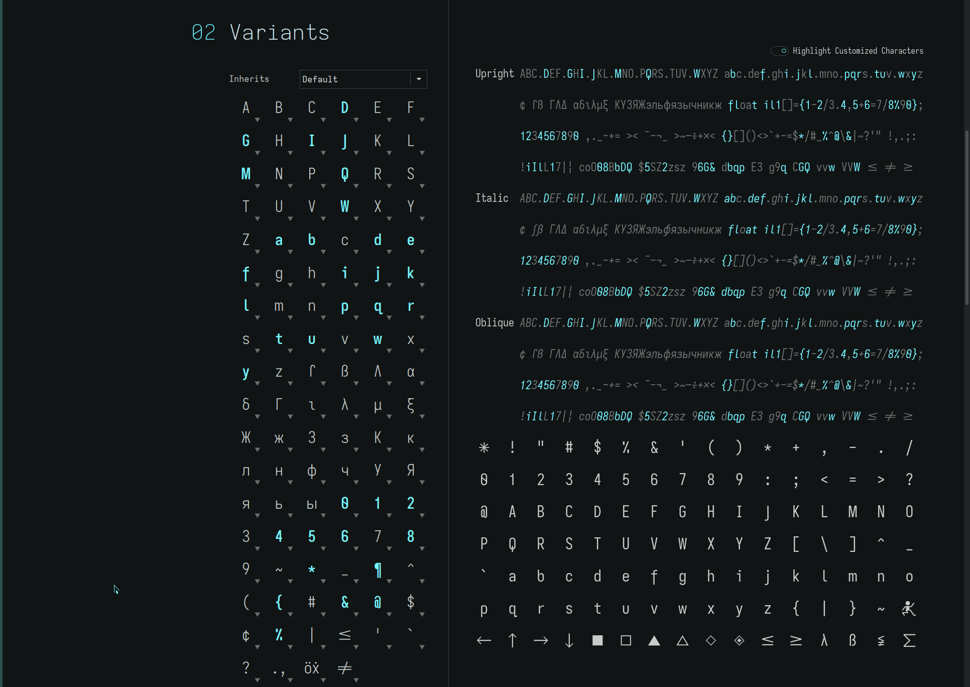
contacthttp://thedarnedestthing.com/contact2024-04-13T13:50:56-04:002015-02-19T20:41:08-05:00Steven Humhttp://thedarnedestthing.com/

you are encouraged to send your comments regarding the darnedest thing. Every effort has been made to make the commenting system as effortless and secure as possible should you have anything to add or ask regarding what is presented here.

Personally directed correspondence is another matter. Unfortunately, my personal computer (email) systems, and communications devices in general, have been known to go on the fritz with alarming frequency. Any one who has known me can attest to that.

So.. if I don’t respond to your email, or do so only after planetary transits, please don’t take it personally.

The comment mechanism is the preferred means of participation as, presumably, it is content on this site that has sparked the response. This will facilitate the comment thread associated with an article, as is common with other web sites.

However, if you must, other personal correspondence or inquiries can be addressed to:

steven hum email:thedarnedestthing.com at gmail dot com

]]>
nowhttp://thedarnedestthing.com/now2024-04-13T13:50:56-04:002015-02-19T20:19:50-05:00Steven Humhttp://thedarnedestthing.com/

everything you have done, every choice, every turn, has led you to this now point.

Nothing holds you back, holds you to the story you believe you are, except the refusal to let go of the past. Who refuses? None other than the story itself – that finely crafted identity full of memories and imaginations given meaning by it.

These unquestioned memories bear the weight of knowledge. Have a continuity only we give to them – and do so, fiercely, to protect the idea they hold of us, without which, would leave us in a quandary as to who we are: that place we dare not look. And so, the idea takes hold – the story persists.

Without a past, you are free. Free to be the embodiment of your Spirit. Free to act without karmic bondage. Free to love.

]]>
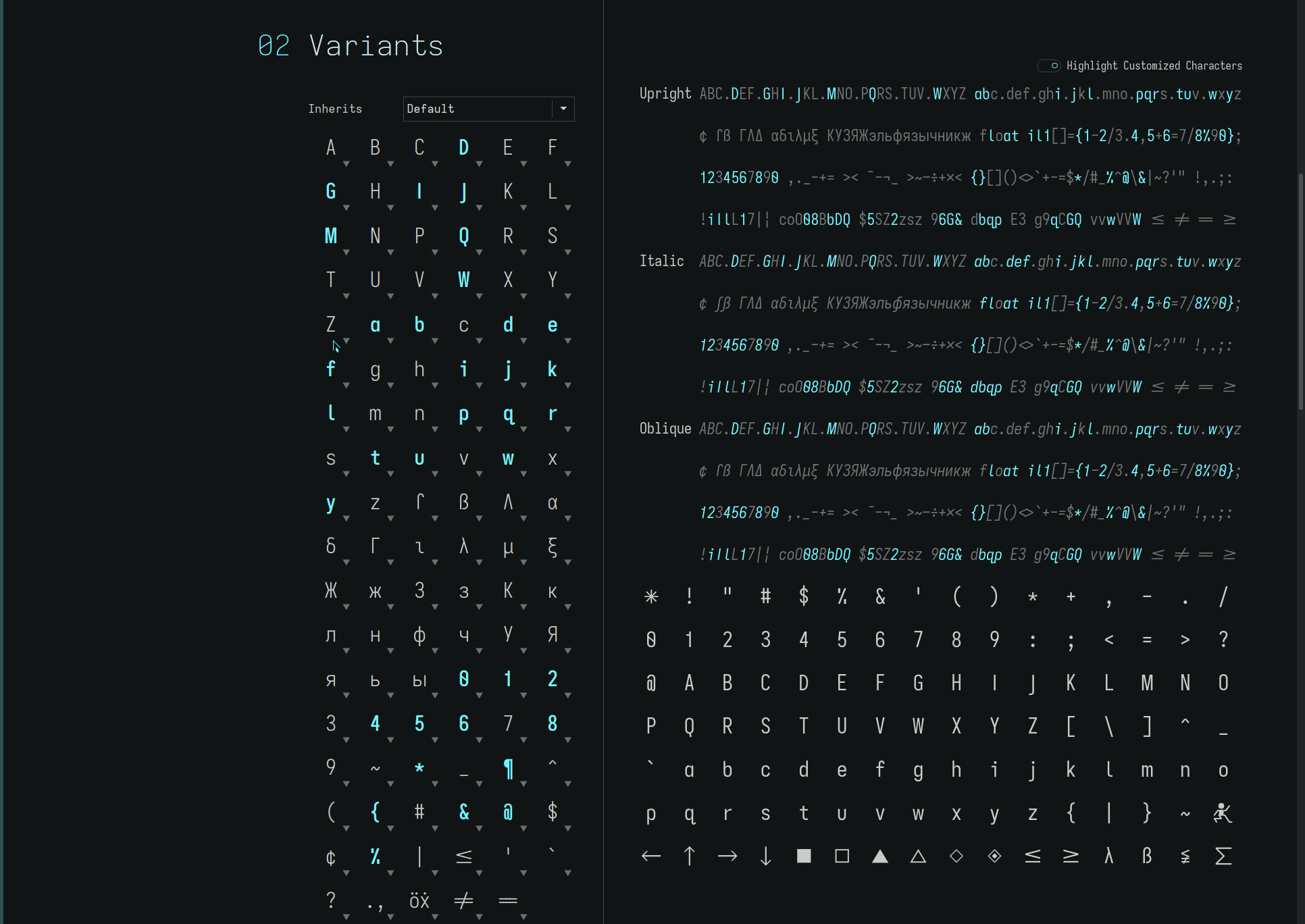
this storyhttp://thedarnedestthing.com/this%20story2024-04-13T13:50:56-04:002015-02-19T20:11:04-05:00Steven Humhttp://thedarnedestthing.com/

is about the ending of it. The ending of all stories and the freedom that comes from it.

How do you know you are in the story? When there is resistance; when there is resistance to what is. Now, this resistance need not be the obvious railing against reality. It can also be the subtle attachment to the comfortable alignment of the story in which you seem to have everything—but are consciously or unconsciously afraid to lose it.

The story is about control. When we are trying to exert our control over what is or keep our illusory sense of having it. Always, though, our stories are pre-occupied with control in the endless pursuit of permanence, immortality, health, material safety, all the things we think we want—but they are the wants of the story.

What we long for, though, is home. We yearn for the connection we think we don’t have, when, in fact, it is the story that separates us from that we seek.

]]>
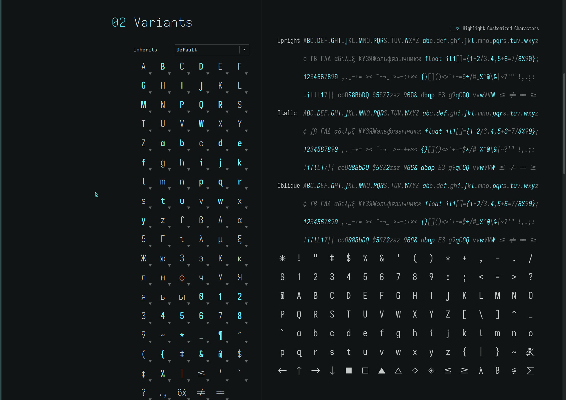
2015-02-19http://thedarnedestthing.com/thedarnedestthing/2015-02-192024-04-16T10:55:42-04:002015-02-19T00:00:00-05:00Steven Humhttp://thedarnedestthing.com/

funny what a toy can bring. I’ve been adapting to a 60% keyboard for a month now and the finger memory has developed to the point that a 80% tenkeyless keyboard feels foreign and awkward. An even bigger collection of keyboards will be gathering dust.

Adding the final bit of personalization to the Poker 2— a svelte milled aluminium case which lowers its height and tilt—and settling on the optimal keyswitch dampeners has made the final updates to the server side software, fun. The fingers want to dance over their new found companions—any excuse will do.

Most changes have been on the vimwiki/Sinatra management side of things—the workflow from which this site is generated. It is not apparent on the production site, but the development site from which everything is pushed now identifies drafts in progress and other file types. The system has expanded beyond the public publication. It is becoming an organic repository of personal content, ideas and lists, as well as, site content—an all encompassing workflow.

Everything, all the incarnations and prototypes, software selections and configurations, have led to here.

]]>
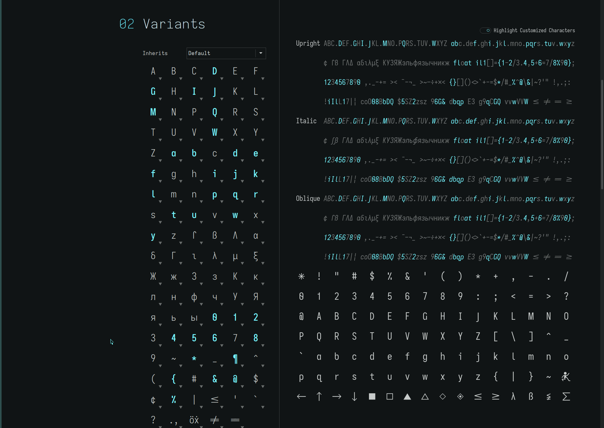
abouthttp://thedarnedestthing.com/about2024-04-13T13:50:56-04:002015-02-17T20:10:38-05:00Steven Humhttp://thedarnedestthing.com/

each thread – the submenu titles below the the darnedest thing— has an about link which describes the thread, its purpose and intent. It is the starting point. And, by design, easily overlooked so as not to get in the way on future visits. A catch-22.

The link is quite simple to identify as it is the first link on the page below the lead in content, titled “about”. The main or home page has a start here link for a global overview.

The broad scope of this site invites clarification. And is an invitation to exploration—from the metaphysical to art to technical. They are all linked, even if it is not obvious—because their source is the same.

So, gloss over the “abouts” to get your bearings. Poke around the site. Your comments are welcome. It is all about connection. Your feedback will ultimately be reflected on this site..

]]>
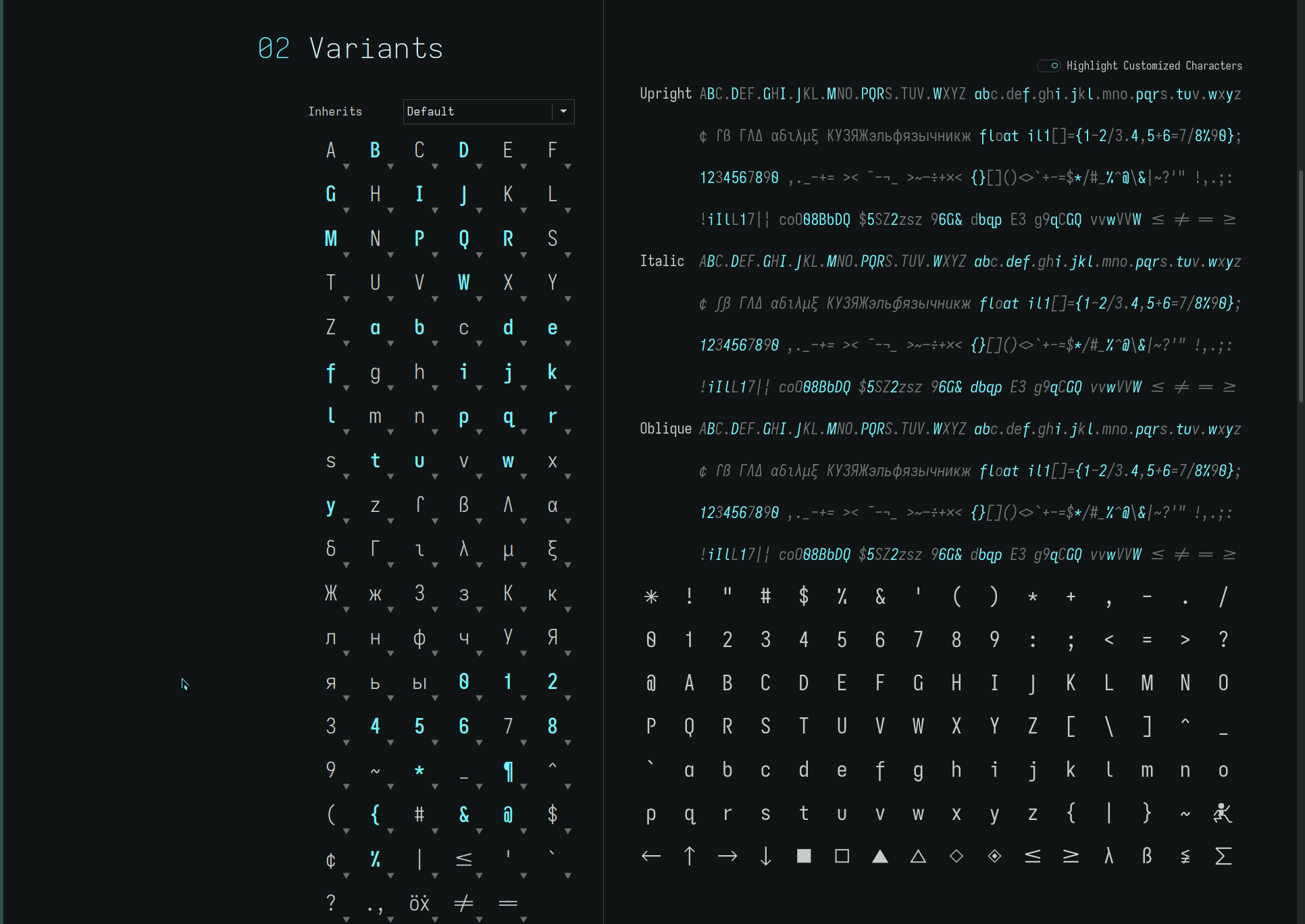
suzanne, -2015http://thedarnedestthing.com/suzanne,%20-20152024-04-13T13:50:56-04:002015-02-17T16:41:06-05:00Steven Humhttp://thedarnedestthing.com/

Suzanne, in Lima,</span> 2008
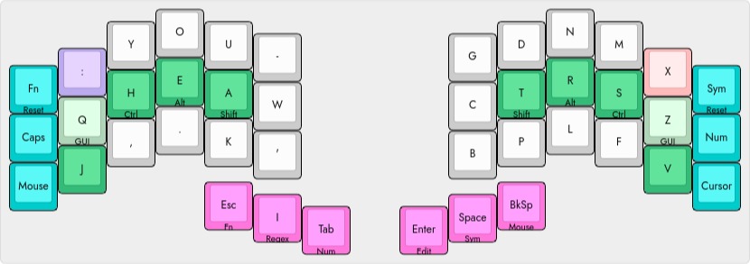
i remember your footsteps
      in front
behind
always beside
me your appreciative
            heart
lighting upon
        everywhere

It was a great honour knowing you, my Raven sister. To witness your courage and perseverance. See you on the other side.

]]>
dotfileshttp://thedarnedestthing.com/dotfiles2024-04-13T13:50:56-04:002015-02-17T14:32:49-05:00Steven Humhttp://thedarnedestthing.com/

finally! The configuration files for the applications discussed on this site are now available at github.

Like much of the colophon material, expect frequent updates as configurations and scripts are fine tuned.. and I hem and haw about what might be of interest to the community at large.

I use GNU stow for managing the configurations of common applications installed across my system. It not only enables organizing configuration files under a single root folder, it also provides a map of the various paths used by an application which can be listed with..

tree ~/dotfiles/application # or ls -lr ~/dotfiles/application

which often include files in $HOME, ~/.config, ~/.local/share etc.

Using Syncthing, it is easy to synchronize these configuration files across machines in real time (well, almost, with little time lag) by simply syncing the root stow (dotfiles) directory on each machine.

Of course, regular snapshots are in order, to recover from that unfortunate edit or file pruning of content within the stow repository (as Syncthing will, more often than not, promote the unintended change before it can be caught)!

]]>
2015-02-15http://thedarnedestthing.com/thedarnedestthing/2015-02-152024-04-16T10:55:42-04:002015-02-15T00:00:00-05:00Steven Humhttp://thedarnedestthing.com/

dotfiles are the big addition to this site. They reside, of course, on github, and have been a long time coming—the recent interest and requests for the bspwm and Conky configurations was the final nudge I needed.

I have been a consumer of github content for a long time and track a lot of packages from there. This change in status to a more participatory one, undoubtedly, will lead to more use of the service—especially as a secondary repository for those important build scripts and server configurations.

One thing that is becoming apparent, is that the comment mechanism may be turning out to be an impediment rather than facilitating exchange—as people have been going out of their way to contact me directly versus using the comment link. I am not sure what to do about that or what people think about the current mechanism.

I do not intend to implement the standard practice of registration (with email address verification) or the more annoying captcha mechanisms which become a deterrent in themselves. Clarifying the security and privacy of individual’s email addresses needs to be reiterated. The original design was to faciliate ease of use, for the user and at the system end—I can vouch for the efficacy of the spam filtering mechanism, without which, has polluted a lot of other web sites.

The next short while should see a lot of activity on the github account as I fine tune what actually needs to be there versus the directory snapshots which originally included deprecated scripts and source code repositories. And this, no doubt, will lead to some rethinking about how the core configurations might be reorganized on my computers..

]]>
readabilityhttp://thedarnedestthing.com/readability2024-04-13T13:50:56-04:002015-02-10T15:55:34-05:00Steven Humhttp://thedarnedestthing.com/

was originally released by arc90 as a Java bookmarklet which reformatted web pages for reading, devoid of the increasingly distracting artefacts adorning web pages. Coined Readability, it spawned similar content applications, such as Readable.

simplyread

is a Javascript from suckless.org which can be integrated into vimb and other browsers—it was intended for surf—to provide similar readability formatting.

The script has been modified to provide the distraction free “look” I prefer and to handle sites I typically use it with (mainly news sites I peruse through RSS feeds). The srstyle CSS assignment is pretty printed to allow easier maintenance..

if(window.content && window.content.document && window.content.document.simplyread_original === undefined) window.content.document.simplyread_original = false; function simplyread(nostyle, nolinks) { function count_p(parenttag) { var n = 0; var c = parenttag.childNodes; for (var i = 0; i < c.length; i++) { if (c[i].tagName == “p” || c[i].tagName == “P”) n++; } return n; } var doc; doc = (document.body === undefined) ? window.content.document : document; if (doc.simplyread_original) { doc.body.innerHTML = doc.simplyread_original; for (var i = 0; i < doc.styleSheets.length; i++) doc.styleSheets[i].disabled = false; doc.simplyread_original = false return 0; } doc.simplyread_original = doc.body.innerHTML; doc.body.innerHTML = doc.body.innerHTML.replace(/<br[^>]>\s<br[^>]*>/g, “<p>”); var biggest_num = 0; var biggest_tag; var t = doc.getElementsByTagName(“*”); for (var i = 0; i < t.length; i++) { var p_num = count_p(t[i]); if (p_num > biggest_num) { biggest_num = p_num; biggest_tag = t[i]; } } if (biggest_num == 0) return 1; var fresh = doc.createElement(“div”); fresh.innerHTML = biggest_tag.innerHTML; fresh.innerHTML = fresh.innerHTML.replace(/<\/?font[^>]*>/g, “”); fresh.innerHTML = fresh.innerHTML.replace(/style=”[^”]*“/g, “”); if(nolinks) fresh.innerHTML = fresh.innerHTML.replace(/<\/?a[^>]*>/g, “”); fresh.innerHTML = fresh.innerHTML.replace(/<\/?span[^>]*>/g, “”); fresh.innerHTML = fresh.innerHTML.replace(/<style[^>]*>/g, “<style media="aural">”); for (var i = 0; i < doc.styleSheets.length; i++) doc.styleSheets[i].disabled = true; srstyle = “* {“ + “ color: #000;” + “ font-family: Arial, sans-serif;” + “}” + “body {“ + “ background: #fdf6e3 none;” + “ font-size: 0.85em;” + “}” + “h1 {“ + “ font-size: 1.85em;” + “ font-weight: normal;” + “ text-align: center;” + “ text-transform: lowercase;” + “}” + “h2,h3,h4 {“ + “ font-weight: bold;” + “}” + “p {“ + “ color: #444;” + “ font-family: Verdana, sans-serif;” + “ line-height: 1.65em;” + “ margin: 0 auto;” + “ padding-bottom: 1.35em;” + “ text-indent: 1.6em;” + “}” + “p a {“ + “ color: #B3431E;” + “ font-family: Verdana, sans-serif;” + “}” + “li {“ + “ padding-bottom: 0.55em;” + “}” + “code {“ + “ color: #4B4D4E;” + “ display: block;” + “ font-family: Inconsolata, monospace;” + “ font-size: 0.85em;” + “ line-height: 1.45em; “ + “ text-indent: 0em;” + “}” + “img {“ + “ display: block;” + “ max-width: 32em;” + “ height: auto;” + “}” + “.caption,.hidden,.image,.photo,.share-help,.sharetools,.story-header,.video,.visually-hidden {“ + “ display: none;” + “}” + “div#sr {“ + “ hyphens: auto;” + “ margin: auto;” + “ padding: 8em;” + “ padding-top: 2em;” + “ text-align: normal;” + “ text-rendering: optimizeLegibility;” + “ width: 32em;” + “}”; doc.body.innerHTML = “<style type="text/css">” + (nostyle ? “” : srstyle) + “</style>” + “<div id="sr">” + “<h1>“+doc.title+”</h1>” + fresh.innerHTML + “</div>”; return 0; }

The srstyle CSS rules are updated as necessary to handle specific sites.

Simplyread cannot handle all web sites—some deviate severely from web page layout conventions—but it is vastly faster than the Readability bookmarklet which must process the web page remotely. Using the keybind in vimb, it is easily accessible and enhances reading web content immensely.

readable

from TastefulWords.com is generated as a single line Java bookmarklet. Inserted into the vimb scripts.js file, it has been pretty printed (formatted) to allow further fine tuning of the display properties to my liking..

function readable() { _readableOptions = { ‘base’: ‘blueprint’, ‘box_width’: ‘32em’, ‘color_background’: ‘#FDF6E3’, ‘color_links’: ‘#99CCFF’, ‘color_text’: ‘#1B1D1E’, ‘custom_css’: ‘h1 { font-weight: normal; text-align: center !important; text-transform: lowercase; } h2,h3,h4 { font-weight: normal; text-align: right !important; text-transform: lowercase; } p { color: #444; padding-bottom: 0.35em ; text-indent: 1.6em; } p a { color: #B3431E; } code { display: block; line-height: 1.45em; margin-left: 1.65em; text-indent: -1.65em; } img { display: block; max-width: 32em; height: auto; }’, ‘text_align’: ‘normal’, ‘text_font_header’: ‘Helvetica, quote(Helvetica Neuve), Arial, Tahoma, sans-serif’, ‘text_font’: ‘Verdana, Geneva, Helvetica Neue, Arial, DejaVu Sans, sans-serif’, ‘text_font_monospace’: ‘Inconsolata’, ‘text_line_height’: ‘1.65em’, ‘text_size’: ‘0.85em’, }; if (document.getElementsByTagName(‘body’).length>0) ; else return; if (window.$readable) { if (window.$readable.bookmarkletTimer) return; } else window.$readable={}; window.$readable.bookmarkletTimer=true; window.$readable.options=_readableOptions; if (window.$readable.bookmarkletClicked) { window.$readable.bookmarkletClicked(); return; } _readableScript=document.createElement(‘script’); _readableScript.setAttribute(‘src’,’http://readable-static.tastefulwords.com/target.js?rand=’+encodeURIComponent(Math.random())); document.getElementsByTagName(‘body’)[0].appendChild(_readableScript); }

Readable is used for web pages which Simplyread does not handle—and there still remain sites that even it cannot fully convert. There is a slight lag time (compared to Simplyread) to reformat a web page due to the server Javascript that must be referenced but it is a small penalty.

With both these scripts defined in my vimb config, most web pages can be read distraction free of all the noise that tends to permeate web site designs these days..

]]>
vimbhttp://thedarnedestthing.com/vimb2024-04-13T13:50:56-04:002015-02-09T12:36:06-05:00Steven Humhttp://thedarnedestthing.com/

minimalist browsers seem to go hand-in-hand with tiling window managers. They are typically lightweight (memory wise), allow keyboard control, maximize viewing real estate by hiding the ubiquitous URL bar and other menu/bookmark bars, and are highly configurable.

vimb came under my radar by happenstance. Up until now, luakit had been my go-to browser since circa 2010. Visually and even operationally, many browsers mimicked luakit, written in various dialects, of which, I have used dwb, surf, hbro, jumanji, uzbl, and most recently, qutebrowser. Some required customization via source language coding in C, Lua, Python, Haskell or shell programming. Others utilized extensive configuration files.

The recent announcement of qutebrowser stirred interest in checking out the web browser landscape. Luakit development has been dormant for a number of years and qutebrowser looked fresh. For a version 0.x release, qutebrowser is remarkably stable. But it still lacks, at this juncture, a lot of features important to me—bookmarks and history recording/searching for one—and the QT5 Webkit which it is based on is still somewhat buggy.

That’s when vimb caught my eye. Inspired by Vimprobable, a browser that takes a modal approach similar to the vim editor, vimb seemed like it could be the upgrade ticket and fit more seamlessly into the vim universe I do so much writing in.

keyboard mappings

first off, my vimb config file maps command mode “:” with the semi-colon (switching the colon and semi-colon)—a convention that is carried over from my vim setup—and a few mappings for opening bookmarks (and bookmarks with a slash tag prefix for quick launches)! Keymaps for tab control (below) and readability Javascripts complete the keybinds..

nnoremap ; : nnoremap : ; nnoremap b :open ! nnoremap B :tabopen ! nnoremap d :quit<CR> nnoremap D :quit!<CR> nnoremap O :tabopen nnoremap t :open !/ nnoremap T :tabopen !/ nnoremap gt :sh! xdotool key --window $VIMB_XID ctrl+shift+l<CR><Esc> nnoremap gT :sh! xdotool key --window $VIMB_XID ctrl+shift+h<CR><Esc> nnoremap 1gt :sh! xdotool key --window $VIMB_XID ctrl+1<CR><Esc> nnoremap 2gt :sh! xdotool key --window $VIMB_XID ctrl+2<CR><Esc> ... nnoremap 9gt :sh! xdotool key --window $VIMB_XID ctrl+9<CR><Esc> nnoremap 0gt :sh! xdotool key --window $VIMB_XID ctrl+0<CR><Esc> nnoremap q :eval! simplyread()<CR> nnoremap Q :eval! readable()<CR>
Bookmark searching is similar to history searching. Type the search terms and press tab to reveal the results of the search. By creating specifically formatted bookmark tags that can guarantee a single search result, oft used web pages can be fetched with just a few keystrokes to pull from the bookmark file..

http://8tracks.com/ 8tracks internet radio | Free music playlists | Best app for music music 8tracks /8t http://localhost:32400/web/index.html#!/dashboard Plex Media Manager manager media plex server /pl http://localhost:631/ Home - CUPS 2.0.1 cups printing /cu http://localhost:8000/tt-rss/#f=-3&c=0 (30068) Tiny Tiny RSS tt-rss ttrss /tt http://localhost:8080/ Syncthing | luna syncthing /sy ... https://aur.archlinux.org/ AUR (en) - Home archlinux aur database /au https://mail.google.com/mail/u/0/#inbox Inbox (419) - sdothum@gmail.com - Gmail gmail /gm http://songza.com/ Songza - Listen to Music Curated by Music Experts songza music /za https://www.archlinux.org/news/ Arch Linux - News arch linux news /ar http://thedarnedestthing.com/the%20darnedest%20thing the darnedest thing the darnedest thing tdt vps /TD

The use of the forward slash “/” for the two letter tag may not be the best tag character to use, but it can be changed at a later date easily enough.

settings

some vimb behaviors and settings are enabled to customize the look and feel of the browser—the way I like it—whose descriptions and many other settings can be found here..

set download-path=/net/downloads/http set editor-command="gvim -f" set fontsize=12px set history-max-items=99999 set input-autohide=true set input-bg-normal=#464f52 set input-fg-normal=#fdf6e3 set home-page=https://www.archlinux.org/ set smooth-scrolling=true set spacial-navigation=true set spell-checking=true set statusbar=false set webinspector=true

shortcuts

vimb allows defining search engine associations with simple acronyms after the “:open” and “:tabopen” commands, of which, a few(!) are listed to give an idea of how nimble the browser can become as a tool..

shortcut-default du shortcut-add ab=https://bbs.archlinux.org/search.php?action=search&author=&forums=&search_in=0&sort_by=0&sort_dir=DESC&show_as=topics&keywords=$0 shortcut-add al=http://www.allmusic.com/search/all/$0 shortcut-add ar=https://duckduckgo.com/?q=arch%20linux%20$0 shortcut-add au=https://aur.archlinux.org/packages/?O=0&C=0&SeB=nd&outdated=&SB=n&SO=a&PP=50&do_Search=Go&K=$0 shortcut-add aw=https://wiki.archlinux.org/index.php?title=Special:Search&search=$0 shortcut-add di=http://dictionary.reference.com/browse/$0 shortcut-add du=https://duckduckgo.com/?q=$0&ia=images shortcut-add gi=https://github.com/search?q=$0 shortcut-add go=https://encrypted.google.com/search?q=$0 ... shortcut-add ha=http://www.haskell.org/hoogle/?hoogle=$0 shortcut-add im=http://www.imdb.com/find?s=all&q=$0 shortcut-add ja=http://www.jango.com/music/$0 shortcut-add mr=http://www.mrqe.com/search?q=$0 shortcut-add re=https://duckduckgo.com/?q=review%20$0 shortcut-add ro=http://www.rottentomatoes.com/search/?search=$0 shortcut-add wi=http://en.wikipedia.org/w/index.php?title=Special:Search&search=$0 shortcut-add wo=http://www.wolframalpha.com/input/?i=$0 shortcut-add yo=http://www.youtube.com/results?search_query=$0 shortcut-add za=http://songza.com/search/?q=$0

The acronyms—I happen to like two letter assignments— followed by any number of search terms couldn’t be any easier!

vimb wrapper

tabs are not natively built into vimb which may seem like a huge drawback—though, there are instances in which such behaviour may be preferable for security. A URL :tabopen or passed to vimb or link Control-clicked will, by default, open a new instance (window) of vimb.

But there are means to emulate the browser tabs common to other browsers and to open URLs in a common vimb window. This requires tabbed and sockets..

#!/bin/sh histfile=~/.config/vimb/history histsize=1000 function prune_history() { work=$(mktemp) [[ -f $histfile.vimb ]] || touch $histfile.vimb cat $histfile.vimb $histfile > $work head -$(( $(cat $work | wc -l) - $histsize )) $work > $histfile.vimb tail -$histsize $work > $histfile } if xdotool search -classname 'VimbT'; then echo “;tabopen $@<CR>” | socat - unix-connect:$(grep ‘socket’ /tmp/vimb.socket) else [[ $(hostname) = luna ]] && prune_history tabbed -f -n ‘VimbT’ -ps+1 -t ‘#B3431E’ -T ‘#FFFFFF’ -u ‘#464F52’ -U ‘#AAAAAA’ /usr/bin/vimb –socket –dump –embed > /tmp/vimb.socket fi

There is a lot going on here. First, prune_history was written to keep the history available to the browser to a reasonable size. This is done purely for performance reasons—an excessively large history file slows down vimb history searches and quiting, something I discovered after porting over my 30K luakit history to vimb! My vimb configuration is shared across computers via syncthing so only the primary workstation triggers pruning the history. dmenu is used to access the older (pruned) history records (see below).

On first launch, the history is pruned and tabbed invokes vimb which dumps the socket information for persistent access. Subsequent calls to vimb connect to vimb via its socket.

Note: that the URL command passed to vimb is with a (semi-colon) ;tabopen (not a colon)! This is because of the colon and semi-colon keybinds above which swap the colon and semi-colon keys!

Now, all external calls to vimb from any source, via the vimb wrapper, will open the URL in a new tab! Unlike most browsers which typically divide the tab space available by the number of opened tabs until the tabs themselves become unusably truncated, tabbed maintains a minimum tab width with automatic scroll indicators, maximizing the active tab width where possible—quite novel and effective!

javascripts

vimb loads the scripts.js file on every page load. This allows inserting userscripts to be triggered on page events—I haven’t tried this myself but it should be possible for the available events that vimb is able to trap—and mapping user defined actions to keys.

Any number of functions can be placed in the scripts.js file for reference in the vimb config file. Distraction free scripts are defined in the config keymaps above.

history

dmenu is used to allow searching the entire browser history (current plus pruned) which, combined with the socket connection, provides seamless history reference..

#!/bin/sh filter='ERROR:|localhost|luakit:|Page not found|[Ss]earch' case $BROWSER in luakit) sqldb=~/.local/share/luakit/history.db query=”select datetime(last_visit,’unixepoch’), title, uri from history order by last_visit DESC;” uri=$(echo “$query” | sqlite3 $sqldb | egrep -v “$filter” | sed ‘s/[|]/ :: /g’ | $(dlist) -p ‘Web History:’ | sed -r ‘s/.* :: .* :: (.)/\1/’) ;; vimb|) histfile=~/.config/vimb/history uri=$(tac $histfile $histfile.vimb | egrep -v “$filter” | sed “s/\t/ :: /g” | $(dlist) -p ‘Web History:’ | sed -r ‘s/(.) :: ./\1/’) ;; esac [[ $uri ]] && dbrowser "$uri"

The dbrowser script allows opening the selected URL with any browser which is useful for the rare web site not rendered properly by WebKitGTK.

defaults

last, but not least, the shell environment should set the default browser and path (if not already set) it can be found in..

export BROWSER=vimb export PATH=$HOME/bin:/usr/bin:$PATH

and for URxvt terminal users, URLs on the console screen can be opened with..

URxvt*perl-ext-common: default,matcher URxvt*url-launcher: vimb

vimb: similar in many ways to luakit and other minimalistic browsers I use and difficult to differentiate by look between them. One of the great features I find with vimb (and surf), is that refreshing a page does not “home” the web page which is extremely useful for tweaking style sheets or previewing web content changes—which I do a lot.

For all its nimbleness, it is not without its “quirks”, if they can be called that. For instance, because “tabs” are essentially overlapped instances of vimb occupying a single window, history undo can seem limited—only the last page closed is “remembered”, not all closed “tabs”, nor is the go back/forward history for that restored page available. It can be a bit disorienting if comprehensive history undo is something relied upon extensively in your browser workflow—though, every web page visited can be found in vimb’s history search. It may become more intuitive and less unsettling in time—and less problematic when I am just surfing and not tinkering with vimb itself.

Qutebrowser (and lispkit) remains on the horizon. But vimb with its “vim-ness” in configuration and use make it very powerful and familiar—and the browser I currently find myself exploring and using.

]]>
2015-02-09http://thedarnedestthing.com/thedarnedestthing/2015-02-092024-04-16T10:55:42-04:002015-02-09T00:00:00-05:00Steven Humhttp://thedarnedestthing.com/

dates. Dates. DATES: the articles’. They get updated a lot on this site because I tend to go back and correct/amend material that has been written in an attempt to keep the content current and, as best as I can, accurate. In a way, it is too easy to amend the content that feeds this site, causing the chronology of the web pages to get shuffled.

This pertains to the colophon mainly but I revise the prose a lot too. A long history with words, how they sound and look on paper (screen nowadays), elicits constant revision. In the quest to be clear, to communicate and touch. Something whose roots took hold back in the days of manual typewriters, black and red ribbon and white-out.

It’s a bit of a dilemma. Retaining the original submission date guarantees chronological order. But using the last modification date tracks the currency of the content. The site favours the later.

Of course, the answer lies between: the Sinatra application could be made to track both dates across multiple servers but that would be avoidance of the need at hand.. to set out what I intended to do so many years ago: write!

I’ve done enough tweaking and upgrades to the servers the past several months..

]]>
2015-02-09http://thedarnedestthing.com/colophon/2015-02-092024-04-16T10:55:42-04:002015-02-09T00:00:00-05:00Steven Humhttp://thedarnedestthing.com/

the browser landscape has been somewhat active of late, with the demise of dwb (the author embarking on a new browser) and the entry of qutebrowser—a PyQt Webkit browser not using the traditional WebKitGtk+ library—and lispkit. Luakit has been my go to browser for some five years but has not seen much development the past few.

Fresh with the transition to herbstluftwm, vimb caught my eye after giving qutebrowser a good spin for a couple weeks—it’s not quite there yet and will deserve another good look down the road. vimb is not without its limitations but its vim-like pedigree made it so easy to use and configure—ridiculously simple for a vim user—I’ve found myself using it.. a lot.

It made me rethink my approach to a lot of my browser workflow—in particular, my shortcuts. My configuration of vimb feels more seamless and concise—all of which could be ported back to luakit or qutebrowser for consistency —which is a testament to the design of vimb. If you like the modal command environment of vim, then vimb may be your ticket as a complementary browser.

]]>
2015-01-26http://thedarnedestthing.com/colophon/2015-01-262024-04-16T10:55:42-04:002015-01-26T00:00:00-05:00Steven Humhttp://thedarnedestthing.com/

lots of minor tweaks have been made to the content and presentation of the colophon. Most notably, the code snippets are now, I hope, more legible and better formatted (in particular, line wrap is no longer by word for a clearer presentation). I still do not present code in the typical scrolling code box, largely because my preference is to be able to see all the code at a glance—as it is, familiarity makes corrections difficult to catch and frequent typos would escape me if hidden from view.

The big new thing has been working with herbstluftwm. Having referenced it in the bspwm writeups but having never really taken it for a lengthy spin, I decided sooner rather than later to give it a good look.. despite my remarks after my last bspwm writeup.

My workflow segued with herbstluftwm better than I could have imagined—and it took less scripting (than bspwm) to do so. This is not a knock against bspwm—that window manager still rocks! But for now, I am driving with herbstluftwm. Both herbstluftwm and bspwm’s shell oriented configurations have me sold, providing both ease and power.

As stated on the home page, it’s now time to refocus on what this site was originally intended to serve..

]]>
2015-01-25http://thedarnedestthing.com/thedarnedestthing/2015-01-252024-04-16T10:55:42-04:002015-01-25T00:00:00-05:00Steven Humhttp://thedarnedestthing.com/

changes continue. Lots of them, both hardware and software. New Poker 2 keyboard, stabilized overclocked motherboard.. and, not least of which, a new window manager, herbstluftwm.

The look of the colophon section, in particular, has changed significantly, for anyone perusing code. I still eschew the convention of scrolling code block windows, just because I like to see all the code at a glance (so I can catch typos)—but, hopefully, it is better formatted and highlighted now.

The result of all these changes is that corrections and amendments have been made to the site. As stated elsewhere, the nature of the site engine is that any amendments to content update the chronological order of information presented by the site. Sometimes, material will be pushed out, and amended for a time afterwards—not exactly how a publication works normally, but this whole site is probably the furthest from normal..

The many small editing changes, in particular, to the colophon section has resulted in many articles’ chronological order being altered, even for minor alterations—there is a mechanism built into the site to accommodate such actions but forgot to take a snapshot, doh! So anyone following the coding side of things, spot the changes, if you can— there were no coding corrections, though..

So, that’s it. There was a bit of push to get some technical content written up, more to test the site changes, than anything. I hope to return to the primary purpose of the site, the nature of our collective story..

]]>
bspwm framedhttp://thedarnedestthing.com/bspwm%20framed2024-04-13T13:50:56-04:002015-01-15T09:28:48-05:00Steven Humhttp://thedarnedestthing.com/

bspwm, by definition, implementing a binary space partitioning scheme does not manage frames per se like other tiling window managers such as herbstluftwm.

While there is a lot of merit in the dynamic gaps described here which grow the windows towards the edge of the screen (monitor) while shrinking the window_gap as windows are added to the desktop, I find I prefer that the windows stay bounded within a fixed margin (a la frame) around the desktop as the window_gap is dynamically adjusted—there is less visual jitter to my eyes if the outer edges remain fixed maintaining a static desktop border. It’s purely a cosmetic preference which the luxury of a 30” monitor affords.

Two window desktop

Five window desktop, resized window_gap

So the rules I wanted to apply are..

  • maintain a fixed default margin around the monitor desktop
  • the right_padding is dependent on whether the Conky panel is visible or is the default monitor margin
  • dynamically adjust the inner window_gap as windows are added or removed from the desktop, maintaining the default monitor margin
  • with the Conky panel visible, full screen mode fits within the margins (pseudo frame) of the desktop
  • with the Conky panel hidden, full screen mode fills the entire screen

Additional niceties thrown in are..

  • allow toggling dynamic window gaps which, if off, sets the window_gap to 1 pixel (just my preference over a zero value)
  • remember whether dynamic window gaps are on or off, between bspwm sessions (persistence)

desktop margin

in pixels is set with a simple script that allows various parts of this bspwm configuration to access. As a script, it allows real-time adjustments of the value to fine tune the window_gap and margin control of the desktop. The value is the outer margin or container for the windows and the window_gap for two windows..

#!/bin/sh echo 90

conky padding

the conky_padding script is modified to accommodate the new monitor padding requirements in monocle mode..

#!/bin/sh maximum_width=$(grep 'maximum_width' ~/.conkyrc | cut -d' ' -f2) border_margin=$(grep 'border_outer_margin' ~/.conkyrc | cut -d' ' -f2) function shadow() { if pidof compton >/dev/null; then R=$(grep ‘shadow-radius’ ~/.compton.conf | sed ‘s/.([0-9]);/\1/’) X=$(grep ‘shadow-offset-x’ ~/.compton.conf | sed ‘s/.([0-9]);/\1/’) echo $(( $R ** 2 - $X ** 2 + 2 )) else echo 0 fi } function tiled() { D=$(bspc query –tree –monitor DVI-1 | grep ‘T - *’ | awk ‘{ print $1; }’) G=$(bspc config –desktop $D window_gap) echo $(( $maximum_width + $border_margin * 2 - $G + 2 + $(shadow) )) } function monocle() { echo $(( $maximum_width + $border_margin * 2 + $(shadow) )) } function desktop() { if [[ $(bspc query –monitors –monitor focused) = DVI-0 ]]; then bspc query –tree –monitor last | grep $’^\t[0-9].*’ | sed ‘s/\t([0-9]) .*/\1/’ else bspc query –desktops –desktop focused fi } if xdotool search --onlyvisible --classname 'Conky'; then if bspc query –tree –monitor DVI-1 | grep -q ‘ M - *’; then P=$(desktop_margin) bspc config -m DVI-1 top_padding $P bspc config -m DVI-1 left_padding $P bspc config -m DVI-1 bottom_padding $P bspc config -m DVI-1 right_padding $(monocle) else bspc config -m DVI-1 right_padding $(tiled) fi else if bspc query –tree –monitor DVI-1 | grep -q ‘ M - *’; then bspc config -m DVI-1 top_padding 0 bspc config -m DVI-1 left_padding 0 bspc config -m DVI-1 bottom_padding 0 bspc config -m DVI-1 right_padding 0 else bspc config -m DVI-1 right_padding $(( $(desktop_margin) - $(bspc config –desktop $(desktop) window_gap) )) fi fi

The shadow function is just an attempt at calculating a shadow width compensation value for the window_gap—which somewhat superfluous (over kill) given the desktop margin can be set to any desirable value.

Five window desktop, no conky

window gap

the window_gap script is modified to maintain a fixed desktop margin or frame for the windows as the window_gap is adjusted for new or removed windows—reducing the monitor padding in tiled mode or simply applying the default desktop margin in monocle mode..

#!/bin/sh mode='linear 20' # mode='binary' function linear() { [[ $M = DVI-1 ]] && factor=$@ || factor=$(dotpitch $@) echo $(( ($margin + $factor) - ($windows - 1) * $factor )) } function binary() { echo $(( ($margin * 2) / (2 ** ($windows -1)) )) } function dotpitch() { echo $@ | awk ‘{ print int($1 * 0.25 / 0.282 + 0.5) }’ } function window_gap() { margin=$(desktop_margin) M=$(bspc query –monitors –desktop focused) [[ $M = DVI-1 ]] || margin=$(dotpitch $margin) windows=$(bspc query –desktop focused –windows | wc -l) G=$($mode) [[ $G -lt 1 || ! -f ~/.config/bspwm/!window_gap ]] && G=1 if bspc query –tree –monitor $M | grep -q ‘ T - *’; then bspc config –desktop focused window_gap $G P=$(( $margin - $G )) [[ $P -lt 0 ]] && P=0 else P=$(desktop_margin) fi [[ $M = DVI-1 ]] || P=$(dotpitch $P) bspc config -m $M top_padding $P bspc config -m $M left_padding $P bspc config -m $M bottom_padding $P [[ $M = DVI-1 ]] || bspc config -m $M right_padding $P conky_padding } case $@ in –daemon) bspc control –subscribe | while read line do window_gap done ;; *) window_gap ;; esac

To enable the dynamic window_gap management, the window_gap script is invoked in daemon mode by the bspwmrc startup. sxkhdrc maps a key to invoke it manually for toggling the dynamic window_gap management on and off using a simple file named “!window_gap” as a state indicator.

A dot pitch adjustment using the dot pitch ratio of the two monitors in this multihead setup is applied to the window_gap and monitor margin of the secondary monitor to maintain visually equal spacing of the windows! This is very anal..

Full screen, with conky

Full screen, no conky

toggle dynamic window gap

switches between no window_gap (which in my configuration sets the window_gap to 1 versus 0) and dynamic window_gap.

alt + g [[ -f ~/.config/bspwm/!window_gap ]] && rm -f ~/.config/bspwm/!window_gap || touch ~/.config/bspwm/!window_gap; window_gap

The side-effect of the persistent !window_gap file is that the last state is available to the bspwm session at startup to set the initial desktops window_gap.

toggle compositing shadows

shadow effects adorning spread out windows via compton, a standalone compositing manager, can be toggled on and off. conky_padding is invoked as it performs a minor (and ridiculous) adjustment to the right_padding to compensate for the shadow effect.

alt + ctrl + super + backslash if pidof compton; then killall compton; rm -f ~/.compton; else touch ~/.compton; compton; while ! pidof compton; do sleep 0.1s; done; fi; conky_padding

Wait for compton to load before testing conky_padding.

session startup

on bspwm startup, note the last window_gap state and fire up the daemon process..

[[ -f ~/.config/bspwm/!window_gap ]] && window_gap=$(desktop_margin) || window_gap=1 bspc config window_gap $window_gap ... window_gap --daemon &

That’s about it for bspwm for me. It fits my workflow and aesthetic. And there is a real elegance to its messaging implementation with sxhkd and being able to control it from the command line any time one wishes.

True frames via herbstluftwm are possibly something that might entice an investigation, especially since, its client/server design utilizing shell scripting is very similar to bspwm. Frames would bring a different window management behaviour and probably more predictable tiling placement (since herbstluftwm is a manual tiling window manager), albeit, at the cost of requiring more scripting to achieve some of the behaviour which comes naturally to bspwm which satisfies my general workflow—utilizing the full range of available desktops with typically no more than four windows in each.

But it could be enlightening to find out when time permits..

]]>
bspwm gymhttp://thedarnedestthing.com/bspwm%20gym2024-04-13T13:50:56-04:002015-01-13T13:31:38-05:00Steven Humhttp://thedarnedestthing.com/

the messenging aspect of bspwm via shell scripts and keyboard handler allow a lot of clever desktop gymnastics. One added benefit is that it is fairly difficult to bork the actual window manager. Illegal bspc commands just fail gracefully—no harm done. No recompilation required. And you can test out code snippets in a terminal window before committing the code to your config files.

dynamic window gaps

as more windows are opened or closed, shrinking and expanding the window_gap between them manages the visible content in a pleasing organic way (versus what quickly appears as an unnaturally large window_gap as individual windows get significantly smaller and squeezed within a fixed desktop border). When I saw an xmonad layout with this behavior, I had to have it in bspwm..

#!/bin/sh function linear() { echo “($X + $@) - ($W - 1) * $@” | bc } function binary() { echo “($X * 2) / (2 ($W -1))” | bc } function pitch() { echo “$X * 0.25 / 0.282” | bc } function resolution() { echo “$X * 1680 / 2560” | bc } bspc control --subscribe | while read line; do X=94 [[ $(bspc query –monitors –desktop focused) = DVI-1 ]] || X=$(pitch) # alternatively X=$(resolution) W=$(bspc query –desktop focused –windows | wc -l) G=$(binary) # alternatively G=$(linear 10) [[ $G -lt 1 ]] && G=1 bspc config –desktop focused window_gap $G conky-padding done

The trick here is to launch the bspwm session loop script at the end of the bspwmrc configuration (in my case, just before the autostart to populate all the desktop windows). By polling the bspwm status via “bspc control”, desktop/window focus can be tracked and the appropriate window_gap calculated.

As additional windows are opened, desktop real estate (area) extends towards the edges of the screen to accommodate them—in this case a simple binary calculation is applied (versus a linear step). For a multihead setup with differing display panels, the two window gap for the primary monitor (94, in this case) is arbitrarily adjusted for the secondary monitor by pitch ratio to maintain visually identical gaps between the two differing LCD panels—an alternate resolution ratio function tightens up the gaps for the smaller (lower resolution) display providing a different visual balance. It’s all a matter of personal preference!

pseudo frame

tiling always maximizes utilization of the desktop area so that all applications are visible. To create empty space on the desktop a window can be placed in a pseudo_tile which floats the application window within the tile creating what looks like an empty border around the window (as long as the tile is larger than the application window).

Alternatively, empty tiles can be created with an invisible application, in this case, an invisible terminal (which is coupled with the bspwmrc rule “border=false”)..

alt + shift + o urxvtc -shading 100 -title 'pseudoframe' -name 'pseudoframe' -e sh -c 'tput civis; sleep 365d'

The terminal cursor is hidden and the application persists effectively for an indeterminate amount of time. There is probably a native application out there that accomplishes this but this is how I’ve implemented the placeholder function.

Desktop with pseudo frame

Sometimes when working in distraction free mode, a single application window can be too large (on a 30” monitor). Creating an empty tile is easier than resizing a floating window. Of course, just opening an empty terminal would accomplish the same thing, albeit, not have as much eye candy effect, making a tiler look like a stacking window manager!

default layout

bspwm balance, preselect and window edge push/pull actions permit custom window placement and sizing, overriding the default binary space partitioning layout.

To restore the default binary space layout after several manual tiling actions, this script recreates all tiles on the desktop using the default split ratio à la xmonad. The current window in focus will occupy the largest tile..

alt + shift + e D=$(bspc query –desktops –desktop focused); W=$(bspc query –windows –window focused); bspc desktop –rename $D'; bspc monitor –add-desktops $D; for i in $(bspc query –windows –desktop $D'); do bspc window $i –to-desktop $D; done; bspc desktop $D –flip vertical; bspc desktop $D –equalize; bspc desktop $D –focus; bspc window $W –focus; bspc window –swap biggest; bspc desktop $D\' --remove

hide selected window

it is easy enough to move windows to another desktop to mimic minimizing windows (to free up desktop tiling real estate). Desktop “0” is often used for such purposes or, in a multihead environment, you can move the window to the adjacent desktop (monitor). But what if you want to simulate minimizing windows from multiple desktops to restore them later without needing to remember and manually move them from desktop “0”..

alt + shift + m D=$(bspc query –desktops –desktop focused); W=$(bspc query –windows –window focused); bspc query –desktops | grep -q “‘$D” || bspc monitor –add-desktops '$D; bspc window $W --to-desktop \'$D

unhide selected desktop windows

the answer to the above is to use bspwm’s ability to create desktops on the fly using the tick mark in this case (or whatever scheme you want to label your desktops with) for ‘desktop name..

super + alt + shift + m D=$(bspc query –desktops –desktop focused); if bspc query –desktops | grep -q “‘$D”; then for i in $(bspc query –windows –desktop '$D); do bspc window $i –to-desktop $D; break; done; bspc window $i –focus; bspc window –swap biggest; (( $(bspc query –windows –desktop '$D | wc -l) )) || bspc desktop '$D –remove; fi

The stock bspwm status bar panel automatically shows the ‘desktop name when windows have been hidden. How cool is that! To simply restore all the minimized windows belonging to the desktop..

super + shift + m D=$(bspc query –desktops –desktop focused); if bspc query –desktops | grep -q “‘$D”; then for i in $(bspc query –windows –desktop '$D); do bspc window $i –to-desktop $D; bspc window $i –focus; bspc window –swap biggest; done; bspc desktop '$D –remove; fi

wait for

applications launched by autostart follow the default binary space partitioning scheme for the desktop, with each successive application opened occupying the maximum window.

The order views become visible to bspwm is application load time dependent (independent of the launch order), so waiting for an application’s visibility provides a means of controlling which application opens last to occupy the maximum window..

#!/bin/sh start=$SECONDS [[ $2 ]] && cutoff=$2 || cutoff=10 while ! bspc query -T | grep $1; do sleep 0.1s [[ $(( $SECONDS - $start )) -gt $cutoff ]] && exit 1 done exit 0

e.g. waitfor ‘RSS’ && luakit

The script self terminates after a predetermined amount of time, in case the referenced application was never launched or failed to open—which the subsequent action can be conditionally dependent on.

presel

the applications belonging to a desktop may not benefit from the default maximum window. The presel script below is a means of preselecting an application window side (up, down, left, right) for opening the next application in, allowing splitting of an application window frame..

#!/bin/sh if waitfor $1 $3; then bspc window $(bspc query -T | grep $1 | awk ‘{ print $4; }’) –focus bspc window –presel $2 fi

e.g. presel ‘Pavucontrol’ ‘down’ && xfce4-mixer

Some amount of tweaking the launch order of applications may be necessary to achieve the desired layout positions.

Combined with bspc rules, bspwm can open up commonly used applications, initializing the desktops the same way every time a bspwm session is started—however your workflow requires!

]]>
bspwm not barhttp://thedarnedestthing.com/bspwm%20not%20bar2024-04-13T13:50:56-04:002015-01-13T13:30:57-05:00Steven Humhttp://thedarnedestthing.com/

one of bspwm’s alluring features is the gymnastics it can perform with simple shell scripts.

Status bars identifying the desktop in focus and displaying system information are common amongst tiling window managers because desktop information managers like conky would typically be hidden by opened tiles. Thus, in order to provide persistent visual system information, a panel area is reserved on the screen, usually positioned at the top (xmonad) or bottom (notion) of the display.

Status bars typically have their content confined to a single row of textual information with as small a font as is readable. The oft displayed system stats (cpu utilization, temperature, network status, weather forecast, etc.) can create a certain amount of visual noise as it is updated—which conflicts with my overall preference for distraction free work (wandering eyes are always checking the state of the system).

Enter bspwm’s dynamic display management.

Unadorned desktop

Desktop, with conky panel

Instead of packing a lot of system information into a single horizontal status bar, I use a vertical conky panel in all its graphical glory whose visibility can be toggled on and off with all the window spaces adjusted accordingly! System information at my finger tips, otherwise, an elegant distraction free desktop when writing.

In this case, the graphical conky panel occupies some screen real estate on the right hand side of the primary monitor, but on a 30” cinema display, its impact is negligible. The visual graphs provide much more information at a glance without needing to read the values they represent—a picture is worth a thousand words.

desktop padding rules

what makes this configuration different from the original conky panel implementation described here, is that some fine tuning of the window placement is done to provide a more visually appealing balance with the transparency mode of the conky panel.

In particular, when the conky panel is visible:

  • Full screen mode only occupies the remaining screen real estate to the right of the cony panel, as opposed to, filling the entire physical display with the conky panel covering the right hand content of the window.
  • In tiled mode, the right hand window_gap is effectively 0 (relative to the left edge of the conky panel), which is achieved by adjusting the display’s right_padding a window_gap to the right of the left edge of the conky panel! The calculation is better understood below in the shell script..

conky-padding

#!/bin/sh maximum_width=$(grep 'maximum_width' ~/.conkyrc | cut -d' ' -f2) border_margin=$(grep 'border_outer_margin' ~/.conkyrc | cut -d' ' -f2) function shadow() { pidof compton >/dev/null && echo 24 || echo 0 } function tiled() { D=$(bspc query –tree –monitor DVI-1 | grep ‘T - *’ | awk ‘{print $1}’) G=$(bspc config –desktop $D window_gap) echo “$maximum_width + $border_margin * 2 - $G + 2 + $(shadow)” | bc } function monocle() { echo “$maximum_width + $border_margin * 2 + $(shadow)” | bc } if xdotool search --onlyvisible --classname 'Conky'; then if bspc query –tree –monitor DVI-1 | grep -q ‘ M - *’; then bspc config -m DVI-1 right_padding $(monocle) else bspc config -m DVI-1 right_padding $(tiled) fi else bspc config -m DVI-1 right_padding 0 fi

A two pixel adjustment is made in the tiling calculation—it is just something that was determined through pixel peeping. If a compositing manager is detected, the right_padding is further adjusted so conky does not to cover the shadow effect of the adjacent window!

The new desktop padding rules are enforced when the conky panel is toggled or the window gaps are adjusted!

smart conky panel

alt + backslash if [[ $(xrandr | grep ‘*’ | cut -dx -f1 | sort | tail -1) -gt 1024 ]]; then if xdotool search –onlyvisible –classname ‘Conky’ windowunmap; then bspc config -m DVI-1 right_padding 0; else if ! xdotool search –classname ‘Conky’ windowmap; then conky -q -c ~/.conkyrc & xdotool search –sync –onlyvisible –classname ‘Conky’; fi; fi; conky-padding; else xdotool search –onlyvisible –classname ‘Conky’ windowunmap || xdotool search –classname ‘Conky’ windowmap || conky -q -c ~/.conkyrc & fi

The netbook screen with its small 1024x600 display is exempt from the dynamic padding rules—an arbitrary decision to not shrink tiled windows on a display that small.

Conky panel, on top of 1024x600 window

overlapping conky panel

alt + shift + backslash xdotool search –onlyvisible –classname ‘Conky’ windowunmap \ || xdotool search –classname ‘Conky’ windowmap \ || conky -q -c ~/.conkyrc &

reset conky panel

alt + ctrl + shift + backslash killall conky && conky -q -c ~/.conkyrc & conky-padding

conky bits

the .conkyrc configuration file displays the names of the visible desktops of the multihead setup in the top right corner of the panel. The active desktop is indicated by the larger font of the left/right desktop number pair—the offsets are specific to the conky width, margin and font—with the name of the active application in focus below..

${if_match "${exec bspc query -M -m focused}" == "DVI-0"} ${voffset -213}${font Ubuntu:size=48,weight:normal}${color5}${offset 136}${exec bspc query -D -d focused}${font Ubuntu:size=16,weight:normal}${color4}${exec bspc query -T -m last|grep $'^\t*[0-9].*\*'|sed 's/\t\([0-9]\) .*/\1/'} ${voffset -72} ${else} ${voffset -213}${font Ubuntu:size=48,weight:normal}${color4}${offset 136}${font Ubuntu:size=16,weight:normal}${exec bspc query -T -m last|grep $'^\t*[0-9].*\*'|sed 's/\t\([0-9]\) .*/\1/'}${voffset -46}${font Ubuntu:size=48,weight:normal}${color5}${exec bspc query -D -d focused} ${voffset -249} ${endif} ${font Ubuntu:size=7,weight:normal}${color3}${alignr}${exec [[ $(bspc query -T | grep "$(bspc query -W -w)" | wc -l) -eq 1 ]] && (bspc query -T | grep "$(bspc query -W -w)" | awk '{ print $3; }') || echo} ${voffset 106}

The clock and circular graphs are based on the conky lua functions from the popular GNOME-LOOK conky_grey and conky_orange conky configurations.

Experimenting with the window_gap on the desktop system called attention to the visual gap between the application windows and the conky panel. Conky transparency made the window_gap appear larger on the right side of the display which led to creating the conky-padding script to tuck the right window_gap under the conky panel while respecting the dynamic window_gap!

status bar

i still use bspwm’s conventional status bar (which, of course, I have configured so that it can also be toggled on and off!) on my netbook and secondary monitor. It is darkly themed, at the bottom of the screen, containing only the active application title, desktop and date/time indicator. It is minimalist to the extreme for status bars but augments the conky panel with the list of available desktops per monitor, including desktops containing hidden windows.

Call me a nut bar..

]]>
bspwmhttp://thedarnedestthing.com/bspwm2024-04-13T13:50:56-04:002015-01-11T13:12:02-05:00Steven Humhttp://thedarnedestthing.com/

bspwm is a tiling window manager whose messenging architecture accommodates window management gymnastics via sxhkd (or any other keyboard handler) and shell scripting versus the native language customizations which would be required with other tiling window managers, such as notion (lua) and xmonad (haskell), two tiling window managers I have used extensively in the past. Each has their own unique qualities and strengths.

bspwm is somewhat unique in that there is no default configuration— though, there is a complete sample sxhkdrc configuration file providing the usual window manager operations to get you started. Anyone familiar with shell scripting can quickly tailor bspwm via bspc commands to fit one’s workflow.

The following sxhkdrc code snippets illustrate some ways the behaviour of bspwm can be tailored in a dual monitor multihead environment.

the scratchpad

is a terminal application whose visibility is toggled via xdotool. Many common terminal applications such as xterm, urxvt and terminator, allow setting their classname for identification by “bspc query –tree”.

VTE terminals such as roxterm do not permit changing the classname of the application, providing the role name instead, in compliance with GTK naming policy. Unfortunately, bspwm does not use the role window attribute. For such terminals, the grep for classname “scratchpad” in the scripts that follow, should be replaced with “grep ‘{term}.*—–s–’” where {term} is the terminal application name, as a means of identifying the sticky scratchpad. To add a bspwm rule for such terminals, an “external_rules_command” script needs to trap the window role or title (in this example) and echo the desired bspwm window property..

#!/bin/sh title=$(xwinfo -n $1) case "$title" in scratchpad) echo “sticky=true” ;; esac

By default, a sticky scratchpad visible on a desktop, will switch monitors if the desktop is swapped with the other monitor. As per my personal UI policy, the scratchpad when opened, occupies the main (biggest) window. I used to configure the scratchpad like most tiling managers do, as a floating window, but as I prefer a sizeable window to work in, a floating window often hides desktop content I am interested in. Having a sticky normal terminal window and attaching tmux via byobu to the scratchpad made it so much more useful that I rarely find need to open new terminal windows.

focus desktop

bspwm by default assigns desktops to monitors, so when desktops are switched, the associated monitor also receives focus. This can be a preferable workflow where it is desirable to open specific applications on specific monitors—such as, always opening an image editor on the highest resolution monitor.

I prefer to be able to focus any desktop on the currently focused monitor à la xmonad. If the requested desktop is the sole desktop for a monitor, the monitor desktops are swapped, as a monitor must have at least one desktop.

alt + {1-9,0} D={1-9,0}; M=$(bspc query –monitors –desktop $D); if [[ $(bspc query –desktops –monitor $M | wc -l) -gt 1 ]]; then if [[ $(bspc query –desktops –desktop focused) != $D ]]; then bspc desktop $D –to-monitor focused; bspc desktop $D –focus; fi; elif [[ $(bspc query –monitors –monitor focused) != $M ]]; then bspc desktop DVI-0:focused –swap DVI-1:focused; fi

send selected window to desktop

the UI work flow policy I prefer is to have window actions focus and place the window in the main (biggest) window on the target desktop. Most tiling window managers place the new window in the current active window of that desktop, which ever one it may be—all the more difficult to remember when the desktop is hidden!

As focusing a window necessarily raises the desktop it is on, the current desktop must be restored. If the target desktop resides on the opposite monitor, focus must be returned to the original monitor, as well!

alt + shift + {1-9,0} D={1-9,0}; M=$(bspc query –monitors –monitor focused); N=$(bspc query –monitors –desktop $D); W=$(bspc query –windows –window focused); [[ $M != $N ]] && bspc monitor $N –focus; E=$(bspc query –desktops –desktop focused); bspc window $W –to-desktop $D; bspc window $W –focus; bspc window –swap biggest; bspc desktop $E –focus; [[ $M != $N ]] && bspc monitor $M --focus

swap windows

whilst retaining focus of the current window frame and desktop.

alt + apostrophe M=$(bspc query –monitors –window last); bspc window –swap last; [[ $M = $(bspc query --monitors --monitor focused) ]] && bspc window --focus last

swap monitor desktops

bspwm implements a swap monitor action (kudos to the developer for accommodating so many user requests) but I like to be able to retain or swap monitor focus as well, depending on the direction of the hotkey relative to the monitor which has focus—essentially, if the key action points to the opposite monitor, swap the desktop moving the focus with the desktop, else retain focus on the current monitor whilst cycling the desktop!

Sounds more complicated than it is but is a thing of beauty and illustrates how malleable bspwm is.

alt + shift + bracket{left,right} S=$(bspc query –tree | grep ‘scratchpad’); xdotool search –onlyvisible –classname ‘scratchpad’ windowunmap; M=$(bspc query –monitors –monitor focused); bspc desktop DVI-0:focused –swap DVI-1:focused; [[ -z $S ]] || xdotool search –classname ‘scratchpad’ windowmap; [[ $M = DVI-{1,0} ]] && bspc monitor --focus last

send selected window to monitor

is similar to sending a selected window to a specific desktop but doesn’t require knowing which desktop is showing on the opposite monitor. As above, if the key action points to the opposite monitor, the window retains focus, else the current desktop retains focus!

alt + ctrl + bracket{left,right} D=DVI-{0,1}; M=$(bspc query –monitors –monitor focused); W=$(bspc query –windows –window focused); S=$(bspc query –tree | grep ‘scratchpad’ | grep $W); bspc monitor $D –focus; if [[ -z $S ]]; then bspc window $W –to-desktop $(bspc query –desktops –desktop focused); bspc window $W –focus; else xdotool search –onlyvisible –classname ‘scratchpad’ windowunmap; xdotool search –classname ‘scratchpad’ windowmap; fi; bspc window –swap biggest; [[ $M = $D ]] && bspc monitor $D --focus

toggle scratchpad

hide the scratchpad or popup the scratchpad terminal window on the current desktop.

alt + o if ! xdotool search –onlyvisible –classname ‘scratchpad’ windowunmap; then if ! xdotool search –classname ‘scratchpad’ windowmap; then urxvt -title ‘scratchpad’ -name ‘scratchpad’ -e byobu; bspc window –swap biggest; fi; fi

toggle conky panel

tiling window managers are commonly configured to show desktop information and the requisite nerdy system stats in a horizontal status line. bspwm also supports a status line facility but creating a vertical conky “dock” in .conkyrc with..

own_window_type dock own_window_hints sticky,above

that can be toggled on the side of the monitor provides a distraction free desktop when desired versus a continually updating status line at the top or bottom of the screen (whilst saving precious screen real estate on laptop displays) and allows using conky in all its graphical glory!

Desktop with conky panel

Being able to display a conky panel above the desktop windows via xdotool eliminates the need to run conky on the desktop background with a compositor (to make the desktop windows transparent and the video demands that entails) and makes the system information available on demand (plus, not all applications support transparency).

A bspwm window rule that sets “fullscreen=true” should be used with “fullscreen=true lower=true”, else the conky panel will subsequently be hidden (below the desktop windows). Sometimes the conky panel will be hidden depending on whether it is visible at the time a fullscreen window is opened (a bspwm conflict with the conky panel window hints?)—raising conky resets its visibility within bspwm.

If the screen display width is sufficient which, in this case, is arbitrarily set to anything more than my trusty netbook, the monitor padding is toggled to automatically adjust all the visible windows on the monitor (versus displaying Conky above the current windows)— pretty slick! My netbook is exempt because its screen width already limits the usefulness of multiple windows.

alt + backslash if [[ $(xrandr | grep ‘*’ | cut -dx -f1 | sort | tail -1) -gt 1024 ]]; then if xdotool search –onlyvisible –classname ‘Conky’ windowunmap; then bspc config -m DVI-1 right_padding 0; else bspc config -m DVI-1 right_padding $CONKY_WIDTH; xdotool search –classname ‘Conky’ windowmap || conky -q -c ~/.config/conky/conkyrc.$(hostname) & fi; else xdotool search –onlyvisible –classname ‘Conky’ windowunmap || xdotool search –classname ‘Conky’ windowmap || conky -q -c ~/.config/conky/conkyrc.$(hostname) & fi alt + ctrl + backslash bspc config -m DVI-1 right_padding $CONKY_WIDTH; raise Conky

The CONKY_WIDTH env variable is simply set in the .xinitrc for convenience to hold the desired padding value, in this case, the actual “maximum_width” setting in my conkyrc file, automatically updating the value if it is changed:

export CONKY_WIDTH=$(grep 'maximum_width' ~/.config/conky/conkyrc.$(hostname) | cut -d' ' -f2)

The xdotool raise script..

#!/usr/bin/xdotool search --onlyvisible --classname $1 windowraise %@

package defaults

of course, the default keybindings that come with bspwm are quite usable out of the box. Anyone familiar with tiling window managers should have no difficulty acquainting themselves with them. I have normalized the key assignments to provide a preferred and consistent UI behaviour between tiling window managers—a good way to dive into a window manager and ease switching between them.

My search for tiling window managers, while incomplete, may have ended with bspwm.

]]>
urxvthttp://thedarnedestthing.com/urxvt2024-04-13T13:50:56-04:002015-01-06T17:37:58-05:00Steven Humhttp://thedarnedestthing.com/

after having used gnome-terminal, terminator, xfce4-terminal, roxterm, lxterm, sakura and a host of xterm variants, I have finally settled on URxvt. I had toyed superficially with it over the years but never got it working to my liking—largely due to laziness and the seductive ease other terminal emulators provided for font management and window transparency.

Configuring the standard pop-up scratchpad for various tiling window managers often entailed using different terminal emulators to obtain the behaviour required—some didn’t allow geometry control, others, ease of window identication (such as, setting the WM_CLASS), etc.

Finally, I decided to give URxvt a more serious look. Having done so, I wonder how I ever overlooked the fine grained control one has over the
display and the daemon mode it can be run in providing the smallest memory footprint—especially given the number of CLI (text based) applications I run.

It took installing the “patched” version of URxvt to end my terminal emulator hunt, allowing proper display of the UTF-8 font glyphs in my ZSH prompt (most important! :-) Prior to that, XFT fonts were improperly spaced and I was not fond of the default monospaced bitmapped font. If you don’t have need for special UTF-8 characters, the “letterSpace -1” setting should suffice for correcting most XFT font spacing with a vanilla URxvt install.

basic .Xresources

there are a plethora of .Xresources that can be defined for URxvt, but these suffice for my purposes..

! Settings URxvt*buffered: true ! double buffer for xtf URxvt*hold: false ! kill window on shell exit URxvt*loginShell: true ! to load shell profiles URxvt*print-pipe: cat > $HOME/tmp/$(echo urxvt.dump.$(date +'%s')) URxvt*saveLines: 9999 ! non-tmux window scroll back ! Text URxvt*colorUL: yellow URxvt*font: xft:Inconsolata-dz:size=12 URxvt*internalBorder: 6 ! pixels from frame edge ! URxvt*letterSpace: -1 ! xft adjustment (for vanilla urxvt) URxvt*lineSpace: 4 ! pixels between lines for added readability URxvt*underlineColor: yellow ! UI URxvt*fading: 30 ! % brightness reduction on focus loss URxvt*mapAlert: true ! de-iconify on bell alert URxvt*scrollBar: false ! maximize usable line width URxvt*shading: 40 ! darken background transparency 60% URxvt*transparent: true URxvt*visualBell: true ! blink window on bell ! Scrolling URxvt*scrollTtyKeypress: true ! scroll to bottom on keypress URxvt*scrollTtyOutput: false ! do not scroll to bottom on output URxvt*scrollWithBuffer: false ! do not use scrollback buffer URxvt*skipScroll: true ! favour scroll speed over listing all lines ! Enable left mouse click url launcher URxvt*matcher.button: 1 URxvt*perl-ext: URxvt*perl-ext-common: default,matcher URxvt*url-launcher: luakit

xterm keymaps

of course, it wasn’t just font management that kept dissuading me from using URxvt every time I poked at it. Its default keymappings were sufficiently different from standard XTerm which was problematic for some applications.

This table from the web solved this serious dilemma..

! Act more like XTerm :-) URxvt*termName: xterm-256color ! Normal URxvt*keysym.Home: \033OH URxvt*keysym.End: \033OF URxvt*keysym.F1: \033OP URxvt*keysym.F2: \033OQ URxvt*keysym.F3: \033OR URxvt*keysym.F4: \033OS ! Shift ! paste conflict ! URxvt*keysym.S-Insert: \033[2;2~ URxvt*keysym.S-Delete: \033[3;2~ URxvt*keysym.S-Home: \033[1;2H URxvt*keysym.S-End: \033[1;2F ! scrolling conflict ! URxvt*keysym.S-Page_Up: \033[5;2~ ! URxvt*keysym.S-Page_Down: \033[6;2~ URxvt*keysym.S-F1: \033[1;2P URxvt*keysym.S-F2: \033[1;2Q URxvt*keysym.S-F3: \033[1;2R URxvt*keysym.S-F4: \033[1;2S URxvt*keysym.S-F5: \033[15;2~ URxvt*keysym.S-F6: \033[17;2~ URxvt*keysym.S-F7: \033[18;2~ URxvt*keysym.S-F8: \033[19;2~ URxvt*keysym.S-F9: \033[20;2~ URxvt*keysym.S-F10: \033[21;2~ URxvt*keysym.S-F11: \033[23;2~ URxvt*keysym.S-F12: \033[24;2~ ! Tab navigation conflict (only when using tabs) URxvt*keysym.S-Up: \033[1;2A URxvt*keysym.S-Down: \033[1;2B URxvt*keysym.S-Right: \033[1;2C URxvt*keysym.S-Left: \033[1;2D ! Alt URxvt*keysym.M-Insert: \033[2;3~ URxvt*keysym.M-Delete: \033[3;3~ URxvt*keysym.M-Home: \033[1;3H URxvt*keysym.M-End: \033[1;3F URxvt*keysym.M-Page_Up: \033[5;3~ URxvt*keysym.M-Page_Down: \033[6;3~ URxvt*keysym.M-F1: \033[1;3P URxvt*keysym.M-F2: \033[1;3Q URxvt*keysym.M-F3: \033[1;3R URxvt*keysym.M-F4: \033[1;3S URxvt*keysym.M-F5: \033[15;3~ URxvt*keysym.M-F6: \033[17;3~ URxvt*keysym.M-F7: \033[18;3~ URxvt*keysym.M-F8: \033[19;3~ URxvt*keysym.M-F9: \033[20;3~ URxvt*keysym.M-F10: \033[21;3~ URxvt*keysym.M-F11: \033[23;3~ URxvt*keysym.M-F12: \033[24;3~ URxvt*keysym.M-Up: \033[1;3A URxvt*keysym.M-Down: \033[1;3B URxvt*keysym.M-Right: \033[1;3C URxvt*keysym.M-Left: \033[1;3D ! Shift+Alt URxvt*keysym.S-M-F1: \033[1;4P URxvt*keysym.S-M-F2: \033[1;4Q URxvt*keysym.S-M-F3: \033[1;4R URxvt*keysym.S-M-F4: \033[1;4S URxvt*keysym.S-M-F5: \033[15;4~ URxvt*keysym.S-M-F6: \033[17;4~ URxvt*keysym.S-M-F7: \033[18;4~ URxvt*keysym.S-M-F8: \033[19;4~ URxvt*keysym.S-M-F9: \033[20;4~ URxvt*keysym.S-M-F10: \033[21;4~ URxvt*keysym.S-M-F11: \033[23;4~ URxvt*keysym.S-M-F12: \033[24;4~ URxvt*keysym.S-M-Insert: \033[2;4~ URxvt*keysym.S-M-Delete: \033[3;4~ URxvt*keysym.S-M-Home: \033[1;4H URxvt*keysym.S-M-End: \033[1;4F URxvt*keysym.S-M-Page_Up: \033[5;4~ URxvt*keysym.S-M-Page_Down: \033[6;4~ URxvt*keysym.S-M-Up: \033[1;4A URxvt*keysym.S-M-Down: \033[1;4B URxvt*keysym.S-M-Right: \033[1;4C URxvt*keysym.S-M-Left: \033[1;4D ! Control URxvt*keysym.C-F1: \033[1;5P URxvt*keysym.C-F2: \033[1;5Q URxvt*keysym.C-F3: \033[1;5R URxvt*keysym.C-F4: \033[1;5S URxvt*keysym.C-F5: \033[15;5~ URxvt*keysym.C-F6: \033[17;5~ URxvt*keysym.C-F7: \033[18;5~ URxvt*keysym.C-F8: \033[19;5~ URxvt*keysym.C-F9: \033[20;5~ URxvt*keysym.C-F10: \033[21;5~ URxvt*keysym.C-F11: \033[23;5~ URxvt*keysym.C-F12: \033[24;5~ URxvt*keysym.C-Insert: \033[2;5~ URxvt*keysym.C-Delete: \033[3;5~ URxvt*keysym.C-Home: \033[1;5H URxvt*keysym.C-End: \033[1;5F URxvt*keysym.C-Page_Up: \033[5;5~ URxvt*keysym.C-Page_Down: \033[6;5~ URxvt*keysym.C-Up: \033[1;5A URxvt*keysym.C-Down: \033[1;5B URxvt*keysym.C-Right: \033[1;5C URxvt*keysym.C-Left: \033[1;5D ! Shift+Control URxvt*keysym.S-C-F1: \033[1;6P URxvt*keysym.S-C-F2: \033[1;6Q URxvt*keysym.S-C-F3: \033[1;6R URxvt*keysym.S-C-F4: \033[1;6S URxvt*keysym.S-C-F5: \033[15;6~ URxvt*keysym.S-C-F6: \033[17;6~ URxvt*keysym.S-C-F7: \033[18;6~ URxvt*keysym.S-C-F8: \033[19;6~ URxvt*keysym.S-C-F9: \033[20;6~ URxvt*keysym.S-C-F10: \033[21;6~ URxvt*keysym.S-C-F11: \033[23;6~ URxvt*keysym.S-C-F12: \033[24;6~ URxvt*keysym.S-C-Insert: \033[2;6~ URxvt*keysym.S-C-Delete: \033[3;6~ URxvt*keysym.S-C-Home: \033[1;6H URxvt*keysym.S-C-End: \033[1;6F URxvt*keysym.S-C-Page_Up: \033[5;6~ URxvt*keysym.S-C-Page_Down: \033[6;6~ URxvt*keysym.S-C-Up: \033[1;6A URxvt*keysym.S-C-Down: \033[1;6B URxvt*keysym.S-C-Right: \033[1;6C URxvt*keysym.S-C-Left: \033[1;6D ! Alt+Control URxvt*keysym.M-C-F1: \033[1;7P URxvt*keysym.M-C-F2: \033[1;7Q URxvt*keysym.M-C-F3: \033[1;7R URxvt*keysym.M-C-F4: \033[1;7S URxvt*keysym.M-C-F5: \033[15;7~ URxvt*keysym.M-C-F6: \033[17;7~ URxvt*keysym.M-C-F7: \033[18;7~ URxvt*keysym.M-C-F8: \033[19;7~ URxvt*keysym.M-C-F9: \033[20;7~ URxvt*keysym.M-C-F10: \033[21;7~ URxvt*keysym.M-C-F11: \033[23;7~ URxvt*keysym.M-C-F12: \033[24;7~ URxvt*keysym.M-C-Insert: \033[2;7~ URxvt*keysym.M-C-Delete: \033[3;7~ URxvt*keysym.M-C-Home: \033[1;7H URxvt*keysym.M-C-End: \033[1;7F URxvt*keysym.M-C-Page_Up: \033[5;7~ URxvt*keysym.M-C-Page_Down: \033[6;7~ URxvt*keysym.M-C-Up: \033[1;7A URxvt*keysym.M-C-Down: \033[1;7B URxvt*keysym.M-C-Right: \033[1;7C URxvt*keysym.M-C-Left: \033[1;7D ! Shift+Alt+Control URxvt*keysym.S-M-C-F1: \033[1;8P URxvt*keysym.S-M-C-F2: \033[1;8Q URxvt*keysym.S-M-C-F3: \033[1;8R URxvt*keysym.S-M-C-F4: \033[1;8S URxvt*keysym.S-M-C-F5: \033[15;8~ URxvt*keysym.S-M-C-F6: \033[17;8~ URxvt*keysym.S-M-C-F7: \033[18;8~ URxvt*keysym.S-M-C-F8: \033[19;8~ URxvt*keysym.S-M-C-F9: \033[20;8~ URxvt*keysym.S-M-C-F10: \033[21;8~ URxvt*keysym.S-M-C-F11: \033[23;8~ URxvt*keysym.S-M-C-F12: \033[24;8~ URxvt*keysym.S-M-C-Insert: \033[2;8~ URxvt*keysym.S-M-C-Delete: \033[3;8~ URxvt*keysym.S-M-C-Home: \033[1;8H URxvt*keysym.S-M-C-End: \033[1;8F URxvt*keysym.S-M-C-Page_Up: \033[5;8~ URxvt*keysym.S-M-C-Page_Down: \033[6;8~ URxvt*keysym.S-M-C-Up: \033[1;8A URxvt*keysym.S-M-C-Down: \033[1;8B URxvt*keysym.S-M-C-Right: \033[1;8C URxvt*keysym.S-M-C-Left: \033[1;8D

colour theme

finally, of course, theming URxvt with a colour pallet that suits your desktop is mandatory!

! color scheme URxvt*background: [90]#131d24 URxvt*foreground: #eeeeee URxvt*cursorColor: #eeeeee ! black URxvt.color0: #101010 URxvt.color8: #565656 ! red URxvt.color1: #bd4a4a URxvt.color9: #cc6666 ! green URxvt.color2: #778800 URxvt.color10: #88aa22 ! yellow URxvt.color3: #e8ae5b URxvt.color11: #ffd965 ! blue URxvt.color4: #3a526b URxvt.color12: #66aabb ! magenta URxvt.color5: #ff5879 URxvt.color13: #f26b9e ! cyan URxvt.color6: #72ad8c URxvt.color14: #9fe3bc ! white URxvt.color7: #fdf6e3 URxvt.color15: #c3c2c5

reload .Xresources

changes made to your ~/.Xresources file can be reloaded in your current X11 session with..

xrdb -merge ~/.Xresources

caveat

a caveat of running URxvt in client/server mode is that, if the daemon dies, all existing terminal clients will be lost—however, I have not experienced any such failures. A simple URxvt wrapper script automatically launches the server daemon if it is not already running..

#!/bin/sh export SHELL=/usr/bin/zsh urxvtc $@ if [ $? -eq 2 ]; then urxvtd -q -o -f urxvtc $@ fi

]]>
mpd and pulseaudiohttp://thedarnedestthing.com/mpd%20and%20pulseaudio2024-04-13T13:50:56-04:002015-01-05T10:27:29-05:00Steven Humhttp://thedarnedestthing.com/

mpd is a great music player daemon, especially when used with the ncmpcpp client. By default, mpd is installed under user mpd which prevents playing simutaneous audio streams within PulseAudio.

To enable playing multiple concurrent audio streams with PulseAudio..

cp /etc/mpd.conf ~/.mpdconf

And edit the following in ~/.mpdconf..

music_directory "/net/media/music" playlist_directory "~/.mpd/playlists" db_file "~/.mpd/tag_cache" log_file "~/tmp/mpd.log" pid_file "~/.mpd/pid" state_file "~/.mpd/state" sticker_file "~/.mpd/sticker.sql" #user "mpd" # default to current user auto_update "yes" follow_outside_symlinks "yes" follow_inside_symlinks "yes" audio_output { type “pulse” name “My MPD PulseAudio Output” }

Disable the mpd systemd (or corresponding init.d) service and launch locally for the user with..

# sudo /etc/init.d/mpd stop # sudo update-rc.d -f mpd remove sudo systemctl stop mpd.service sudo systemctl disable mpd.service mpd &

]]>
haskellhttp://thedarnedestthing.com/haskell2024-04-13T13:50:56-04:002015-01-05T10:18:05-05:00Steven Humhttp://thedarnedestthing.com/

there are expressive programming languages. And then there are beautiful ones. Haskell, a pure functional programming language, is such a language with its mathematical eloquence.

Transitioning from imperative languages to Haskell can entail more than a brain cramp—the purity of the language lacks the common control structures that give imperative languages their familiar linear organization: the learning curve is steep. Instead, the syntax is equational, the mathematical roots of the language being very apparent. It’s a difficult journey across the landscape of lazy evaluation, static typing, functors, monoids and monads, but worth it just for the insightful possibilities and the exercise of seeing in terms of equations versus sequential operations.

The functional pattern matching is reminiscent of object oriented message dispatching which, with the power of its type declaratives, can create solutions that read very much like a domain specific language. It takes awhile to grok the power of static typing, type classes and instances, which lie at the heart of the language and facilitate such eloquent solutions.

Haskell is way beyond my ken—though, I have been fine tuning my Xmonad desktop environment which is written in Haskell as a means of immersing myself in its delightful power. It is used in academia for esoteric problem domains. I love the Ruby programming language. But there is a hypnotically alluring quality to Haskell’s mathematical form, which sings the language of the universe.

type class hiearchy

class subclass of prelude instances
Show   All Prelude types
Read   All except IO, (->)
Bounded   Int, Char, Bool, (), Ordering, tuples
Eq   All except IO, (->)
Enum   (), Bool, Char, Ordering, Int, Integer, Float, Double
Ord Eq All except (->), IO, IOError
Ix Ord Int, Integer, Char, Bool, Enum, tuples
Num Eq Int, Integer, Float, Double
Real Ord, Num Int, Integer, Float, Double
Fractional Num Float, Double
Integral Enum, Real Int, Integer
RealFrac Real Float, Double
Floating Fractional Float, Double
RealFloat RealFrac, Floating Float, Double
Functor   IO, [], Maybe
Monad   IO, [], Maybe
MonadPlus Monad IO, [], Maybe

Note: Haskell type classes are not to be confused with object oriented class specifications

functors

class Functor f where fmap :: (a -> b) -> f a -> f b

prelude

instance Functor [] where fmap = map instance Functor Maybe where fmap f (Just x) = Just (f x) fmap f Nothing = Nothing instance Functor (Either a) where fmap f (Right x) = Right (f x) fmap f (Left x) = Left x

functor laws

fmap id = id fmap (f . g) = fmap f . fmap g

applicative functors

class (Functor f) => Applicative f where pure :: a -> f a (<*>) :: f (a -> b) -> f a -> f b (<$>) :: (a -> b) -> f a -> f b f <$> x = fmap f x

control.applicative

instance Applicative Maybe where pure = Just Nothing <*> _ = Nothing (Just f) <*> something = fmap f something instance Applicative [] where pure x = [x] fs <*> xs = [f x | f <- fs, x <- xs] instance Applicative IO where pure = return a <*> b = do f <- a x <- b return (f x) instance Applicative ((->) r) where pure x = (_ -> x) f <*> g = \x -> f x (g x)

applicative functor laws

pure id <*> v = v pure (.) <*> u <*> v <*> w = u <*> (v <*> w) pure f <*> pure x = pure (f x) u <*> pure y = pure ($ y) <*> u

monoids

class Monoid m where mempty :: m mappend :: m -> m -> m mconcat :: [m] -> m mconcat = foldr mappend mempty

data.monoid

instance Monoid [a] where mempty = [] mappend = (++) newtype Any = Any { getAny :: Bool } deriving (Eq, Ord, Read, Show, Bounded) instance Monoid Any where mempty = Any False Any x `mappend` Any y = Any (x || y) newtype All = All { getAll :: Bool } deriving (Eq, Ord, Read, Show, Bounded) instance Monoid All where mempty = All True All x `mappend` All y = All (x && y) instance Monoid Ordering where mempty = EQ LT `mappend` _ = LT EQ `mappend` y = y GT `mappend` _ = GT instance Monoid a => Monoid (Maybe a) where mempty = Nothing Nothing `mappend` m = m m `mappend` Nothing = m Just m1 `mappend` Just m2 = Just (m1 `mappend` m2)

monoid laws

mempty `mappend` x = x x `mappend` mempty = x (x `mappend` y) `mappend` z = x `mappend` (y `mappend` z)

monads

class (Applicative m) => Monad m where return :: a -> m a (»=) :: m a -> (a -> m b) -> m b (») :: m a -> m b -> m b x » y = x »= _ -> y fail :: String -> m a fail msg = error msg

Note: the class constraint Applicative m is not part of the formal definition of the monad class—it is inferred. return is equivalent to pure of applicative functors.

control.monad

instance Monad Maybe where return x = Just x Nothing »= f = Nothing Just x »= f = f x fail _ = Nothing instance Monad [] where return x = [x] xs »= f = concat (map f xs) fail _ = []

monad laws

Left Identity: return x >>= f = f x Right Identity: m >>= return = m Associativity: (m >>= f) >>= g = m >>= (\x -> f x >>= g)

do notation

foo :: IO () foo = ... >>= (\x -> … » … »= (\y -> ... (.. x .. y)))

can be expressed with Haskell’s syntactic sugar as..

foo :: IO () foo = do x <- … y <- … ... (.. x .. y)

which is just different syntax for chaining monadic values. In effect, monads sequence operations to simulate stateful or imperative computations.

]]>
btrfshttp://thedarnedestthing.com/btrfs2024-04-13T13:50:56-04:002015-01-05T10:15:52-05:00Steven Humhttp://thedarnedestthing.com/

after using ZFS for some time, a recent move from Debian Sid to Arch Linux prompted a look at btrfs. While not as mature or robust as ZFS, along with a different approach to RAID implementation, btrfs is availble in the Linux kernel which allows easy installation of a btrfs /root and eliminates the need to rebuild the ZFS module for every Linux kernel release.

Snapshots should facilitate recovery from a system update gone awry— though, its “experimental” status means you are still living on the edge. But that is why I’m on Arch at the moment!

I prefer to create my file systems (and references in the /etc/fstab) using the disk LABELs, as system reboots can reassign the /dev/sd? device names if hard disks or external devices like USB flash drives are attached or removed between boot cycles.

simple volume

for a single volume..

mkfs.btrfs -f -L <label> <device> mkfs.btrfs -f -L Downloads /dev/disk/by-id/ata-Samsung_SSD_840_EVO_120GB_S1D5NSADA26536P

with subvolumes

striped boot volume with subvolumes and snapshot directory (see fstab)..

mkfs.btrfs -f -L <label> -d raid0 <device> <device>.. btrfs subvolume create <path> mkfs.btrfs -f -L Archlinux -d raid0 /dev/sda2 /dev/sdb mkdir -pv /mnt/btrfs-root/__snapshot mkdir -pv /mnt/btrfs-root/__current btrfs subvolume create /mnt/btrfs-root/__current/ROOT btrfs subvolume create /mnt/btrfs-root/__current/home btrfs subvolume create /mnt/btrfs-root/__current/opt btrfs subvolume create /mnt/btrfs-root/__current/srv btrfs subvolume create /mnt/btrfs-root/__current/var

In this setup, two SSD’s, a 128GB Samsung EVO Pro and a 120GB Samsung EVO are used. An 8GB swap is allocated in /dev/sda1, hence, striping /dev/sda2 and /dev/sdb. As quick as SSD’s are singly, striping two yields even greater performance!

multi-disk pool

use full space of all volumes with raid1 mirrored metadata..

mkfs.btrfs -f -L <label> -m raid1 -d single <device> <device>.. mkfs.btrfs -f -L Archive -m raid1 -d single /dev/disk/by-id/ata-WD_My_Book_1105_WU2Q10098319 /dev/disk/by-id/ata-WDC_WD10EARX-00N0YB0_WD-WCC0T0755003

raid1

mirror of data and metadata..

mkfs.btrfs -f -L <label> -d raid1 <device> <device>.. mkfs.btrfs -f -L Media -d raid1 /dev/disk/by-id/ata-WDC_WD30EFRX-68EUZN0_WD-WMC4N0820795 /dev/disk/by-id/ata-WDC_WD30EFRX-68AX9N0_WD-WMC1T2857955

raid0

striped data with raid1 mirrored metadata..

mkfs.btrfs -f -L <label> -m raid1 -d raid0 <device> <device>.. mkfs.btrfs -f -L Photos -m raid1 -d raid0 /dev/disk/by-id/ata-SAMSUNG_HD103SJ_S246JDWZ105420 /dev/disk/by-id/ata-ST1000DM005_HD103SJ_S246J9EC314043 /dev/disk/by-id/ata-SAMSUNG_HD103SJ_S246JDWZ105419

fstab

with /var/lib binding onto /ROOT subvolume to include /var/lib/pacman for snapshots..

LABEL=Archlinux / btrfs rw,nodev,noatime,ssd,compress=lzo,space_cache,autodefrag,inode_cache,discard,subvol=__current/ROOT 0 0 LABEL=Archlinux /home btrfs rw,nodev,noatime,ssd,compress=lzo,space_cache,autodefrag,inode_cache,discard,subvol=__current/home 0 0 LABEL=Archlinux /opt btrfs rw,nodev,noatime,ssd,compress=lzo,space_cache,autodefrag,inode_cache,discard,subvol=__current/opt 0 0 LABEL=Archlinux /srv btrfs rw,nodev,noatime,ssd,compress=lzo,space_cache,autodefrag,inode_cache,discard,subvol=__current/srv 0 0 LABEL=Archlinux /var btrfs rw,nodev,noexec,noatime,ssd,compress=lzo,space_cache,autodefrag,inode_cache,discard,subvol=__current/var 0 0 LABEL=Archlinux /run/btrfs-root btrfs rw,nodev,nosuid,noexec,noatime,ssd,compress=lzo,space_cache,autodefrag,inode_cache,discard 0 0 # bind /var/lib onto the ROOT subvolume so snapshots of ROOT include /var/lib/pacman /run/btrfs-root/__current/ROOT/var/lib /var/lib none bind 0 0 LABEL=Downloads /net/downloads btrfs rw,nodev,noexec,autodefrag,noatime,space_cache0 0 LABEL=Media /net/media btrfs rw,nodev,noexec,autodefrag,noatime,space_cache0 0 LABEL=Photos /net/photos btrfs rw,nodev,noexec,autodefrag,noatime,space_cache0 0 LABEL=Archive /net/archive btrfs rw,nodev,noexec,autodefrag,noatime,space_cache0 0

listing

filesystem LABELs and UUIDs assigned during mkfs.btrfs can be listed with..

btrfs filesystem show --all-devices

Whole volumes can be used by btrfs without the need to partition the drives, after which, subvolumes (akin to logical volumes of LVM) can be defined, creating additional (and optional) mount points. There is much more to btrfs with data compression, defragmentation, quotas, etc.

Butter FS. What’s not to like? Yum!

]]>
nginx proxyhttp://thedarnedestthing.com/nginx%20proxy2024-04-13T13:50:56-04:002015-01-05T08:18:23-05:00Steven Humhttp://thedarnedestthing.com/

Sinatra web applications require a proxy configuration with the Nginx HTTP server. The configuration spec for this site is set up as follows..

server { server_name thedarnedestthing.com; proxy_set_header X_Real_IP $remote_addr; proxy_set_header X_Forwarded_For $proxy_add_x_forwarded_for; proxy_set_header Host $http_host; proxy_redirect off; location / { try_files $uri @proxy; } location @proxy { proxy_pass http://sinatra.myweb; } } upstream sinatra.myweb { server 127.0.0.1:4567; }

This setup has been superceded with the usage of Nginx with Passenger

]]>
nginx passengerhttp://thedarnedestthing.com/nginx%20passenger2024-04-13T13:50:56-04:002015-01-05T08:14:03-05:00Steven Humhttp://thedarnedestthing.com/

this site now uses the Nginx HTTP server with the Phusion Passenger application server. This simplifies the Nginx configuration considerably whilst adding the deployment benefits of Phusion Passenger, notably, being able to promote site wide enhancements without needing to restart the Nginx HTTP server.

Adding Phusion Passenger to an existing Ruby/Gems environment couldn’t be simpler..

gem install passenger passenger-install-nginx-module

This particular web site follows the default convention for deploying Sinatra applications. The Nginx proxy configuration is now reduced to..

server { listen 80; server_name thedarnedestthing.com; root /srv/www/thedarnedestthing.com/application/public; passenger_enabled on; }

The only oddity along the way I discovered with the migration to Phusion Passenger was that inline Slim HTML templates no longer appeared to work and required that template specifications reside in the standard application/views folder. Not a bad thing, but it did have me scratching my head for awhile.

]]>
virtualbox 4.2http://thedarnedestthing.com/virtualbox%204.22024-04-13T13:50:56-04:002015-01-05T08:09:35-05:00Steven Humhttp://thedarnedestthing.com/

as of this writing, has not been merged into the official Debian repositories but is required if you want to run Windows 8, which the “guest additions” for, are still somewhat short of full OpenGL video support which prevents usage of some applications like Nik HDR Pro 2 and Color Efex Pro 4 photo software (which need to be able to identify specific video cards, unfortunately).

Not being available through the Debian repositories, there can be a problem with the virtualbox USB initialization for guest OS access. The script /usr/share/virtualbox/VBoxCreateUSBNode.sh cannot be found by udev on my LVM configuration because the /usr filesystem is not yet mounted. To circumvent this startup error so the shell script is visible from the root filesystem at boot..

cp /usr/share/virtualbox/VBoxCreateUSBNode.sh /root umount /usr/local umount /usr mkdir -p /usr/share/virtualbox mv /root/VBoxCreateUSBNode.sh /usr/share/virtualbox/

Another irritant is that the vboxdrv module appears not to load at boot which then requires the following to be executed prior to launching a guest OS for the first time..

/etc/init.d/vboxdrv setup

To avoid this after every reboot..

echo >>/etc/modules # ensure a linefeed terminates file echo vboxdrv >>/etc/modules

]]>
tt-rss and postgresqlhttp://thedarnedestthing.com/tt-rss%20and%20postgresql2024-04-13T13:50:56-04:002015-01-04T22:35:21-05:00Steven Humhttp://thedarnedestthing.com/

when Google killed its Google Reader service, the hunt for an alternate aggregator service began. I and everyone else who were used to Google’s free service were now scrambling to other providers, many whose servers were not prepared for the influx of new users. Further service disruptions and performance constraints eventually led to the idea of hosting my own aggregator and be done with it.

Tiny Tiny RSS, or tt-rss, to the rescue. Relatively straight forward to install with several useful plugin extensions and skinning to boot. When I consider all the hours spent repeatedly customizing CSS templates for Google Reader to get the clean look and layout I prefer, every time Google altered their service, I wonder how it took me so long to find tt-rss which betters what I was trying to replace!

I use tt-rss with PostgreSQL. Version upgrades to PostgreSQL are to be expected on Debian Sid, requiring that the database be migrated, if you want to keep your Sid install current.

back up the database

Before updating the PostgreSQL packages..

su - postgres pg_dumpall > dump.sql exit # make a safe copy of the data cp ~postgres/dump.sql $HOME/

Exporting the tt-rss OPML data might not be a bad idea to do at this time as well.

update postgresql

sudo apt-get purge postgresql-<old.version> sudo apt-get install postgresql-<new.version> # backup client authentication file and change socket authentication method sudo cp /etc/postgresql/<new.version>/main/pg_hba.conf /etc/postgresql/<new.version>/main/pg_hba.conf.dist sudo sed -i 's/^\(local *all *all *\) peer/\1 md5/' /etc/postgresql/<new.version>/main/pg_hba.conf

Purging the old version of PostgreSQL will also remove the old database.

restore the database

su - postgres psql < dump.sql exit # remove copies of the data sudo rm ~postgres/dump.sql $HOME/dump.sql

gotchas

If a Debian distribution upgrade is made, upgrading PostgreSQL before the above steps are taken—it happens—a second PostgreSQL instance will be created utilizing a different port. kill the newer instance (as stopping the PostgreSQL service will terminate both server instances)..

ps -ef | grep postgresql sudo kill <newer.pid>

Backup the data and then purge the older PostgreSQL package (which will stop the remaining PostgreSQL instance and remove its associated database).

Restore the default PostgreSQL port configuration (which the existing tt-rss configuration references) and restart the upgraded PostgreSQL server..

sudo sed -i 's/port = 543./port = 5432/' /etc/postgresql/<new.version>/main/postgresql.conf sudo /etc/init.d/postgresql start

Restore the database and you are ready to go!

]]>
colemakhttp://thedarnedestthing.com/colemak2024-04-13T13:50:56-04:002015-01-04T22:34:12-05:00Steven Humhttp://thedarnedestthing.com/

configuration settings for..

debian linux

reboot after modifying..

sed -i 's/XKBVARIANT=""/XKBVARIANT="colemak"/' /etc/default/keyboard

windows 8

install Colemak for Windows. Then..

  • open Control Panel → Clock, Language, and Region → Language → Advanced Settings

    • under “Override for Windows display language”
      • choose “Use language list (recommended)”
      • click “Apply language settings to the welcome screen…”
      • under “Administrative” tab
        • click “Copy settings”
    • under “Override for default input method”
      • select “Colemak…”
]]>
btrfs checkhttp://thedarnedestthing.com/btrfs%20check2024-04-13T13:50:56-04:002015-01-04T18:10:45-05:00Steven Humhttp://thedarnedestthing.com/

btrfs is not yet fully production ready, missing the auto repair functionality that most Linux users are familiar with other filesystems, such as, ext4. A kernel panic (not uncommon when tinkering with overclocking a system) can result in a number of (subsequent) “btrfs check” warning messages on the partition. These can be alarming but my experience thus far has been that these errors are benign.

The errors I have encountered appear to be more problematic for root partitions, in that, I have not encountered this problem with non-root btrfs partitions (probably the luck of the draw that no disk writes were in progress).

directory errors

unresolved ref dir #.. index #.. maxlen #.. name ... filetype #.. [errors](errors) #.., no dir item, no dir index

can show up on a “btrfs check”. It appears to be a benign message, as a scrub of the volume in question yields no errors. This condition can go undetected for a long time unless one routinely checks the boot volume after a system crash.

This has been repairable by mounting the volume—“btrfs check” cannot be run on a mounted volume—finding the file referenced by name (often one associated with a daemon or server process) and performing the following steps..

  • backup the referenced file e.g. cp file file.save
  • move the referenced file e.g. mv file file.tmp
  • umount the partition
  • run “btrfs check /path”
  • run “btrfs check –repair /path” if necessary
  • run “btrfs check /path” which should now be free of errors if all went well
  • mount the filesystem
  • restore file from file.save

cache errors

cache and super generation don't match

error is often produced after a “btrfs check –repair”. It appears to be a benign error message and can be repaired (removed) by..

  • changing “space_cache” to “clear_cache” in /etc/fstab
  • rebooting and allowing for clear_cache to complete
  • restoring “space_cache” in /etc/fstab
  • rebooting
]]>
2015-01-02http://thedarnedestthing.com/colophon/2015-01-022024-04-16T10:55:42-04:002015-01-02T00:00:00-05:00Steven Humhttp://thedarnedestthing.com/

it has been a meandering route to this place—starting out as a proof of concept with shell scripts cobbled together to massage vimwiki text files into html, to Ruby scripts and then to a Ruby Sinatra web application. Hardware upgrades, water cooling, overclocking.. all made the journey interesting.

This section is as much a repository of notes about the system this site is built from as anything. It is my humble contribution back to the internet community which has served me at every turn when I have tripped over a technical problem—both hardware and software. It is a constant source of learning.

There is still much to document. And to explore. The search for the ultimate user interface is a never ending personal one. Saving keystrokes may seem like a needless exercise but it’s probably as close to any amount of “control” that is achievable—which, ironically, is what this site set out to explore in the nature of our being.

]]>
2015-01-02http://thedarnedestthing.com/thedarnedestthing/2015-01-022024-04-16T10:55:42-04:002015-01-02T00:00:00-05:00Steven Humhttp://thedarnedestthing.com/

new year. New hardware. Lots of changes under the hood which only the very familiar will notice. The main change aside from presenting photo galleries on the site instead of using photo site hosting services is enabling journaling (blogging) per subject thread.

The original site design enforced a single consolidated blog on the home page. This is might be normal practice but this is not a typical site—containing a breadth of material from metaphysical to technical content. The thinking is that separating the potential blog entries to their respective subject threads (menu items at the top) might better serve the audience. Well, that’s the theory..

The main home page for the site will host summary information about the site activity and general news about it—essentially becoming simply a spring board to the remainder of the site. This is definitely not a “best practices” approach to web site design.

But there have never been any illusions about what this site is about or for. It is not about expanding reach, obtaining hits. It is simply about documenting this search for truth, and service towards that. It also just so happens to share images and thoughts, all related—and even technical notes which are so representative of the meta-content of the internet.

I am hoping it will give me a little focus too and inspire more written content that might not otherwise warrant a “topic” heading with the original web site structure.

So this is it. No more changes that I can think of for now. No more avoidance! It has been its own story several years in the making..

]]>
serviceshttp://thedarnedestthing.com/services2024-04-13T13:50:56-04:002014-12-30T13:19:46-05:00Steven Humhttp://thedarnedestthing.com/

“If you meet the Buddha on the road, kill him.”

Linji Yixuan, 9th century

]]>