laft font
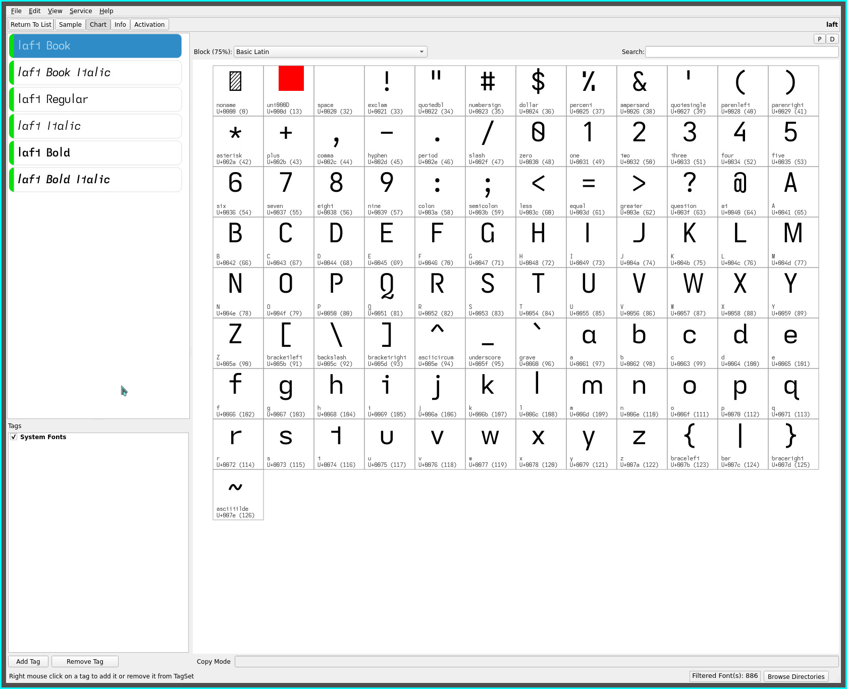
just as the luft font had established itself as my favourite ereading font, version 33.x of the Iosevka font introduced an angled “top-cut” single storey lower case a in three glyph variants—serifless, serifed and tailed, leading into its introduction with the laft font.
The angled top-cut glyph is significantly more distinguishable than the standard serifless single storey a, at least to these eyes—due, i suspect, to the asymmetry of the glyph’s vertical bar—with its more distinct angled outline (perceptible even at small font sizes) contrasting what would otherwise be two competing symmetrical glyph shapes with the o character.
The “tailed” flair adds further distinction from the o glyph, as well as, offering a pleasant visual “flow” characteristic to the font—most noticeable with the grammatic article “a”.
from lift & luft
while past fonts have previously leaned dominantly towards serifless glyph shapes, the laft font relaxes this constraint with the judicious use of serifs, tails and turns—reintroducing common monospaced source code (and past font) glyph shapes (while still adhering to non-mirrored glyph shapes for improved dyslexic readability). In particular..
- the tailed lower case d—similarly replicating the visual flow of the single storey a
- the toothless corner lower case b—departing from the toothless rounded glyph towards the more common toothed outline (sans corner)
- the eared serifless lower case p—a return to its classic shape (all while still preserving non-mirrored b d p q outlines)
- the straight-turn lower case y—enhancing the “flow” characteristic of laft with added visual distinctiveness from the v..

The distinctive glyph set of the lift, luft and laft fonts (from common font designs)..
| letter | lift font | luft font | laft font |
|---|---|---|---|
| B P R | open | open | open |
| G | toothed-hookless | toothed-hookless | toothed-hookless |
| Q | open-swash | open-swash | open-swash |
| I (eye) | serifed | serifless | serifless |
| J | hook | flat-hook | flat-hook |
| a | double-storey toothless-corner |
double-storey toothless-corner |
single-storey top-cut-tailed |
| b | toothless-rounded | toothless-rounded | toothless-corner |
| d | toothed | toothed | tailed |
| f | extended | extended | extended |
| l (el) | extended | extended | extended |
| m | earless-rounded | earless-rounded | earless-rounded |
| p | earless-corner | earless-corner | eared |
| q | hook-tailed | hook-tailed | hook-tailed |
| t | asymmetric (reversed) | asymmetric (reversed) | asymmetric (reversed) |
| u | toothless-rounded | toothless-rounded | toothless-rounded |
| y | straight | straight | straight-turn |
readability

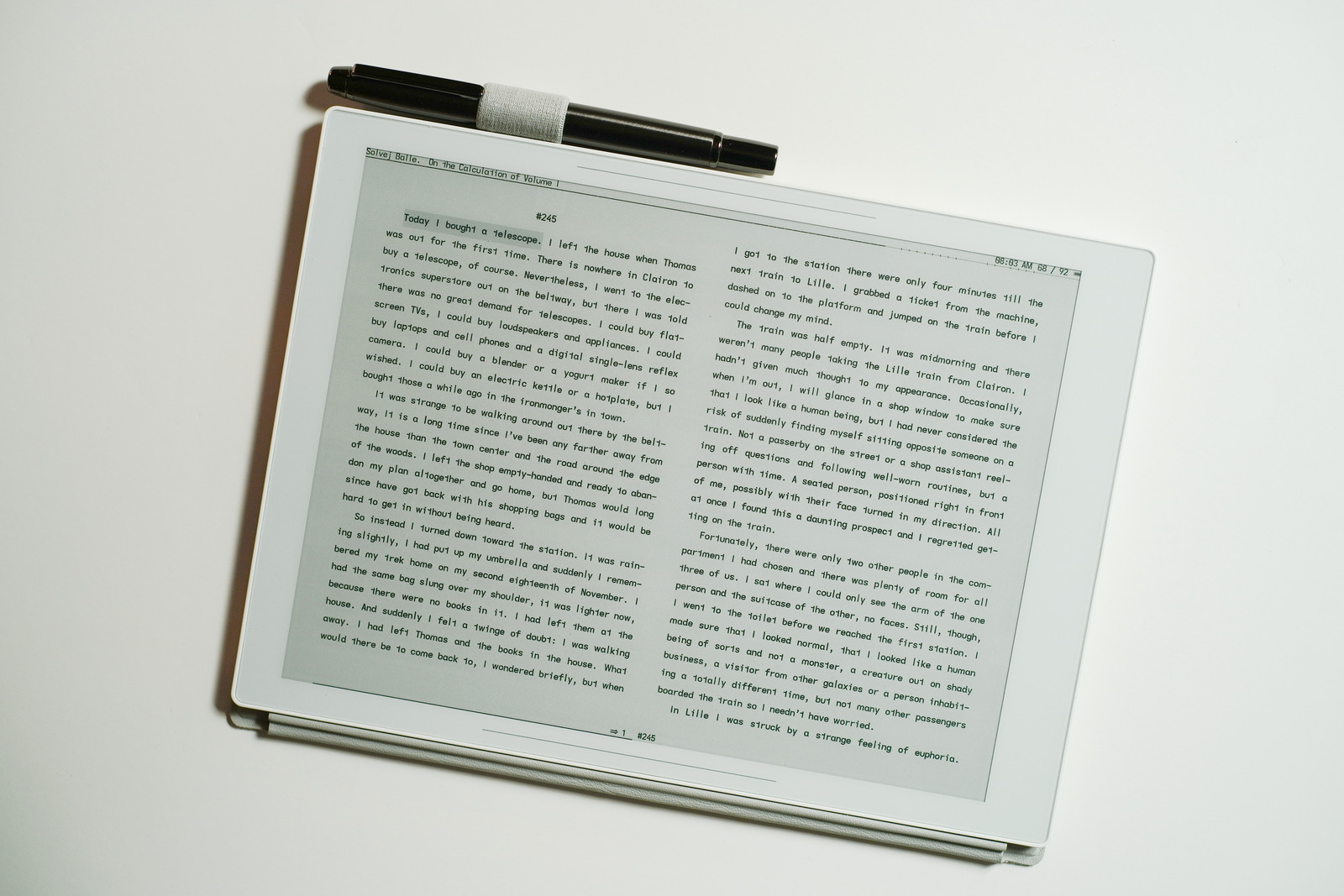
On 300 PPI eink screens, even at small font sizes, this top-cut font is highly legible—much more so than previous font sets with the serifless single storey a. The double storey luft and lift fonts still remain more legible but the added air the single storey a imparts to the page—with its third most common letter frequency and with the frequent “ea” bigram—is a refreshing reading alternative.
| typeface | rank | readability aid | readability penalty | visual air |
|---|---|---|---|---|
| lift | 1 | double-storey a, serifed I (eye) |
||
| luft | 2 | double-storey a | serifless I (eye) | |
| laft | 3 | straight-turn y | single-storey a, serifless I (eye) |
increased |
My current KOReader layout setup displaces the luft font with the new laft font for its decreased visual page density (increased air) as my default font—the luxury of good visual acuity (knock on wood!). As always, YMMV :-)
lait font
further, for those whose vision require maximum readability..

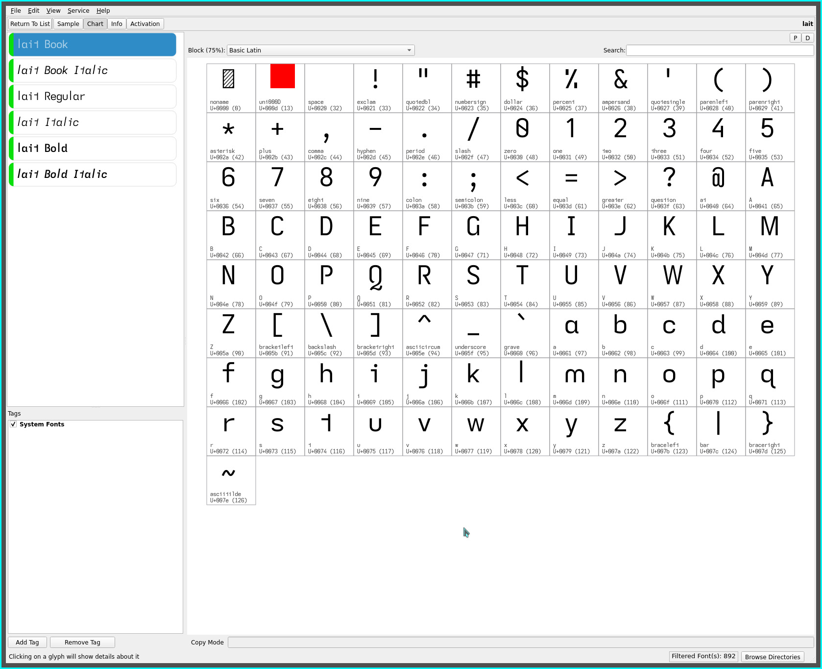
is the lait font variant with..
- the serifed capital I (for dyslexic contrast to the serifless lower case l (el))
- the tailed double storey lower case a (for visual differentiation from the lower case o)
- the serifed flat-hook lower case j (the serif punctuating the floating “dot”)
- the serifless hook capital J (a nod to the Atkinson Hyperlegible Font)
lajt font
while the laft font with its single storey lower case a quickly established itself as my go to ereading font upon its introduction—the tailed a and d adding a pleasing flair and flow to the glyph set—i recognize that i am in a minority when it comes to this single storey glyph.
For those much preferring the more common double storey glyph..

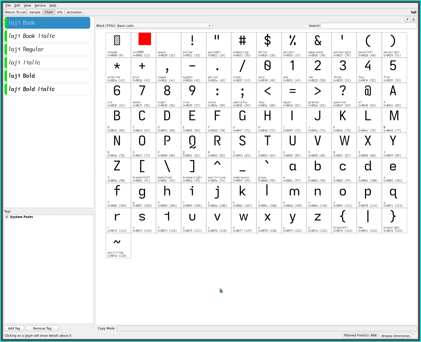
is the lajt font variant with..
- the tailed double storey lower case a (from the lait font)
- the descending serifless capital J (with its added descending flare)
This font was created well after the lait font—finding myself oft relishing the change up from the single storey a but preferring the serifless capital I with the extended serifless lower case l combination for reading (despite the ubiquitous use of the serifed capital I for coding).
Much to my surprise, i have grown attached to the tailed lower case a (and d and its impact to the non-mirrored dyslexic glyph set), in contrast to the prior established toothless corner glyph of the earlier font sets which, while providing more “air” around the base of the glyph, lacks the hinted flow of the tailed version. Expanding the cell width of the tailed glyph remedies adjacent glyph tightness for the best of both worlds—the lajt font quickly establishing itself as a favourite ereader font.
The single storey glyph while presenting more air is more youthful—for lack of a descriptor—whereas, the double storey a feels more established (in every sense of the word). The lajt font is an compelling font to read with.
repos
This font may be found on OneDrive.