the darnedest thing
like the normalization of keyboard layouts across the various matrix and split keyboards used..

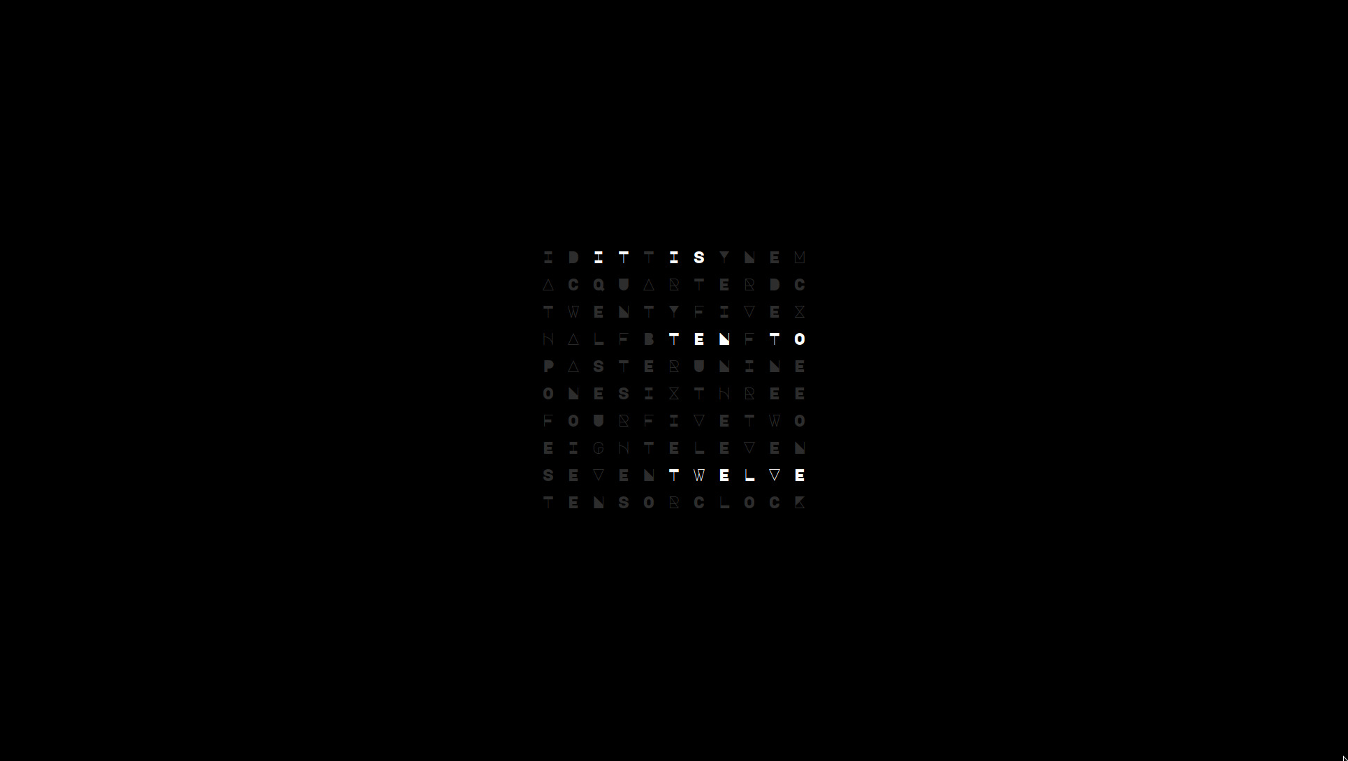
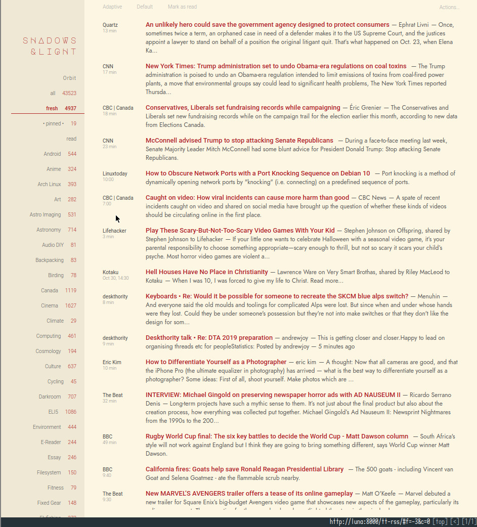
qcocktwo’s Major Mono Display font eventually made its way to the Tiny Tiny RSS banner theme..

and from there to this site, transforming the traditional large font URL banner to a much less obtrusive (both visually and in line height) geometric typeface with thin square monotype capitalized headings—all contrarian to conventional web layout design wisdom.
These are unlikely to be the last changes ever—though, it feels pretty close to that. The banner impression no longer shouts its presence. It never was about standing out amongst the chatter of the web or vying for attention. And this site certainly was never about convention.
But about renewal..