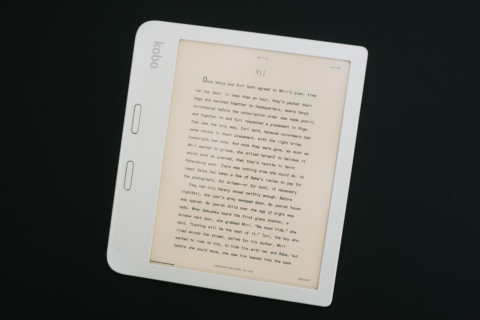
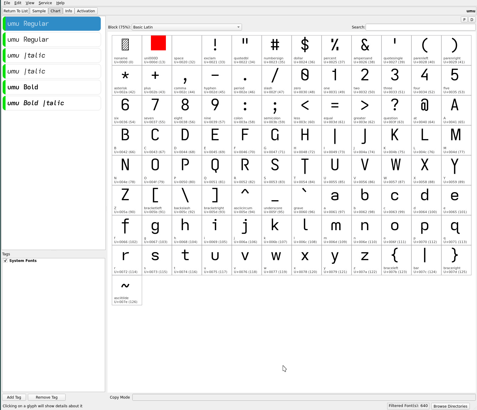
umu font
a grail font perhaps? As always, just when i think i am finally done..

The toothless double-storey lower case a of the mu font font and the single-storey a of the upsilon font produce two very distinctive fonts, the latter being the visually more “open” or less dense of the two—especially at small font sizes with its very open single-storey a.
While i generally gravitate towards lean open sans serif typefaces—settling on the descending caps fonts, Iota and Ypsilon, with their single-storey a—i found with this last generation of typefaces, a growing preference for the mu font with its toothless double-storey a—visually adding air to text (when contrasted with the common toothed a) on top of its added readability. So much so, much to my surprise, i found myself more often than not, returning to it after starting reading with the upsilon font.
The symmetry of the descending capitals I T Y (complementing the J) have turned out to be more than a novelty. So, adding the toothless double-storey a of the mu font to the upsilon glyph set merges these two distinct typefaces to create the umu font—its name an intentional (symmetrical) amalgam of the two..

The descending capitals of umu add a subtle flare to fiction material (which i find pleasing). It takes a bit of getting used to but its added readability—now equal to mu’s ranking—with the toothless double-storey a eases the transition.
As always, YMMV.
repos
The current ereader fonts may be found on OneDrive.