ypsilon
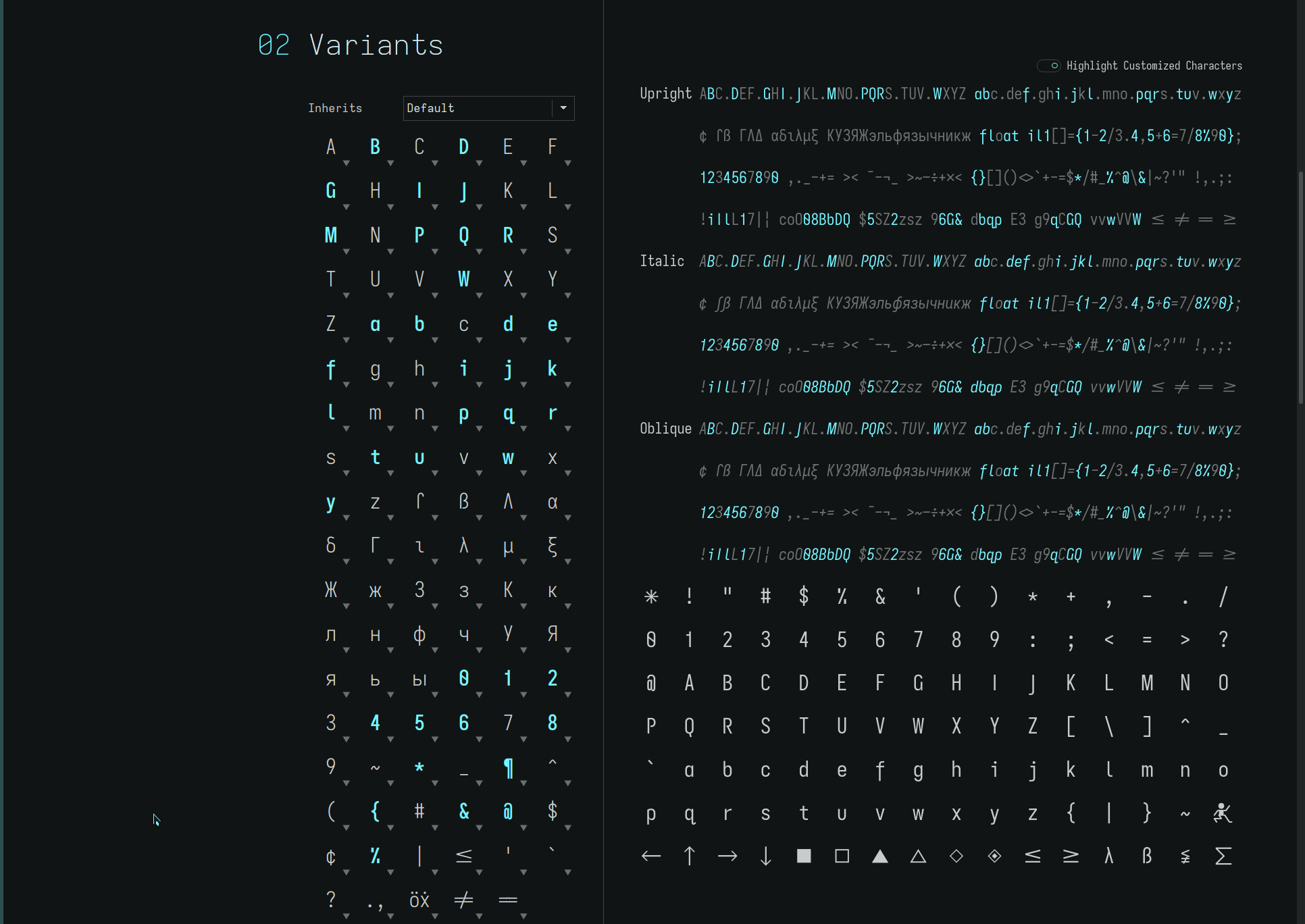
from the Iota font springs the Ypsilon font..

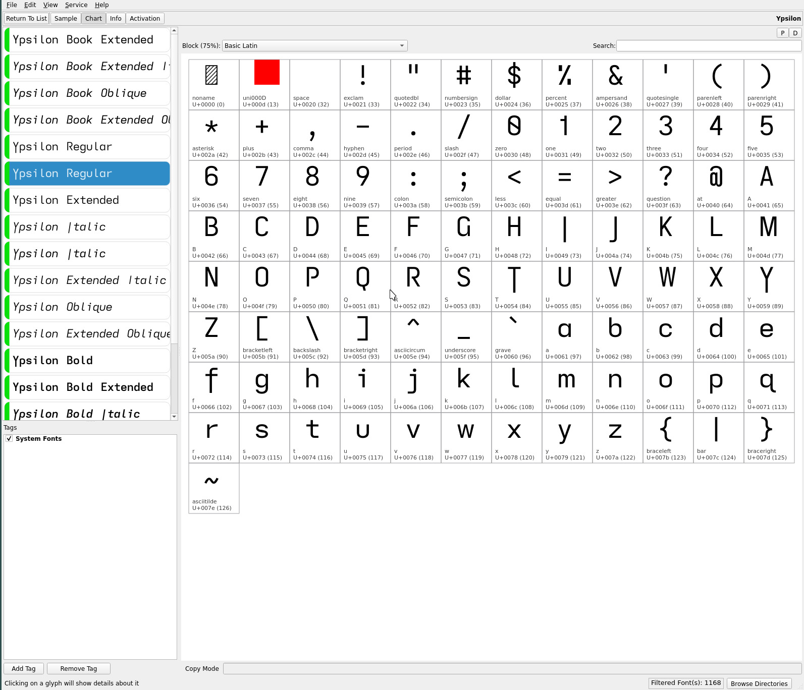
which is its fraternal twin (or complement) with descenders applied to the vertical center strokes of the upper case T and Y—more easily discerned with fontmatrix**..

**The Iosevka font web page does not display the glyphs which are modified with fontforge for these ereader typefaces (not having access to Ypsilon generated typeface. The capital T and Y in the fontmatrix screenshot outline masks where the descending strokes are applied and do not affect the actual font rendering.
Except for these two glyph changes, the remainder of the font is identical to its progenitor. With the added glyphs with descenders—upper case I J Q T Y and lower case f j p q y—the font becomes more visually balanced in the vertical plane (if not, uniquely so).
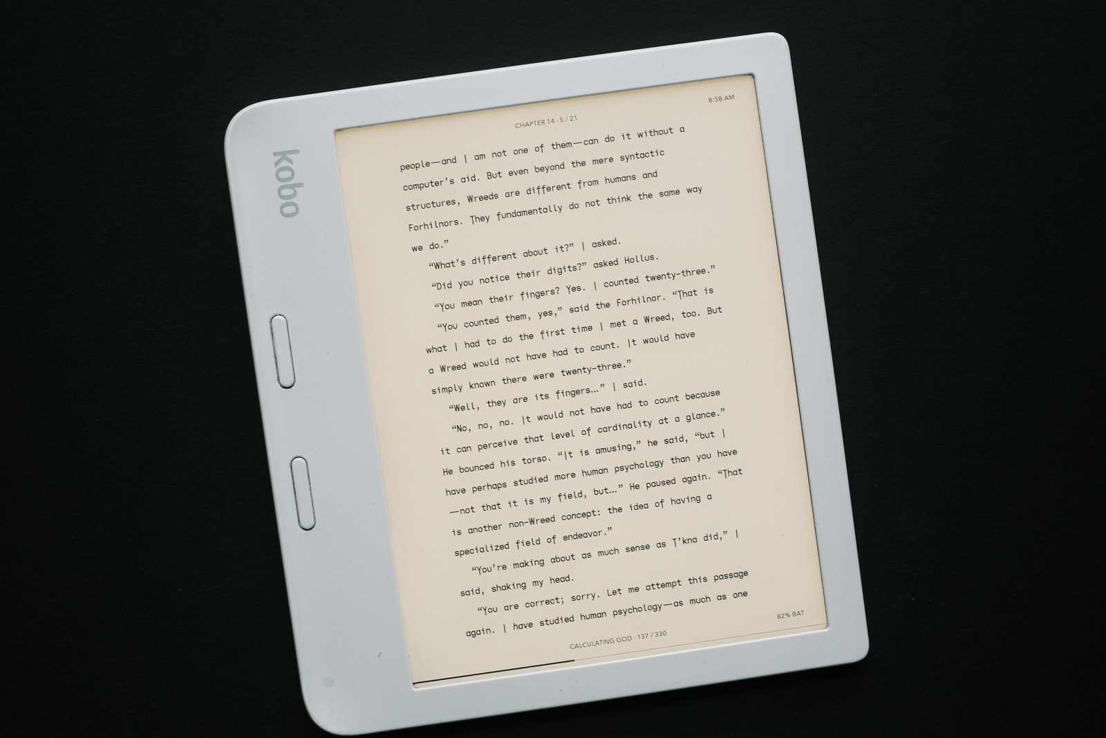
The descending capitals I J T Y—especially the frequent T—alter the character of the printed page, rendering a less formal but punctuated or rhythmic voice to the text*** (at least, when it comes to familiarity).

A bit of a toss for me personally between the Ypsilon and Iota typefaces, but i have been reading with Ypsilon exclusively for a couple weeks now.. and really like it (so much so, this site’s body text currently uses it) for its unique flair.
***Experiments
with descenders applied to the upper case F and P, surprisingly—since their lower case glyphs have descenders—feel disproportionate (to
my eyes) with their off center
descenders emphasizing their
asymmetry.
repos
The Ypsilon font may be found on OneDrive under the font-trio + Ypsilon folder within the Kindle and Kobo folders. The other minor font changes to the emdash and ellipsis are also to be found in this folder.