iota

typograffic has been my favourite font of late.. the culmination of two years of font experimentation—beginning innocently with a monospaced facsimile of the Atkinson Hyperlegible Font (for coding) and expanding into (too) numerous variants as an ereader font with a dyslexic focus—arriving at a very unique and satisfying contemporary ereader font (in my humble opinion).
Save for the short-serifed capital I (inherited from the Atkinson font), typograffic is a clean sans serif typeface. Highly readable at small font sizes on ereaders.
typograffic—with its glyph choices to create a unique and contemporary signature—appeared to be my grail font, there being no other Iosevka glyph variations to increase dyslexic readability and general legibility (IMO). Arriving at a final pair of typefaces—articulate and typograffic—all that was missing (from a personal preference) was a typeface variant with a serifless capital I.
Most of the typefaces produced on this site for distribution have been produced with both the serifed and serifless capital I. Its omission in typograffic (and articulate) was determined by the serifed glyph’s superior legibility. The serifless capital I—at small font sizes in particular—lacks visual distinctiveness in words also containing the lower case l and a few other all caps instances, its readability muddied without inline context.
Enter the..
descending capital i
to uniquely distinguish the glyph from adjacent letters—especially the lower case L—by extending its stroke length.
With fontforge..
# descending serifless capital I
Open(<iota.ttf>);
Select(0u007c);
Copy();
Select(0u0049);
Paste();
Transform(100,0,0,105.75,0,0);
Move(0,-55);
Generate(<iota.ttf>);
..replace the capital I with Bar, lengthening it (to match the vertical length of the descending capital J) and then adjusting its vertical position downwards to align with the tops of capital letters. (The Bar glyph remains distinct with its shorter stroke length and centered position, though, should not be encountered with most ebooks in general).
Note: the vertical positioning is set to render the desired
alignment of the glyph by the font rendering engine for small body text
(and not for large capitalized headings). Edit: this has been
corrected with the latest iterations of these fonts—see mu font.
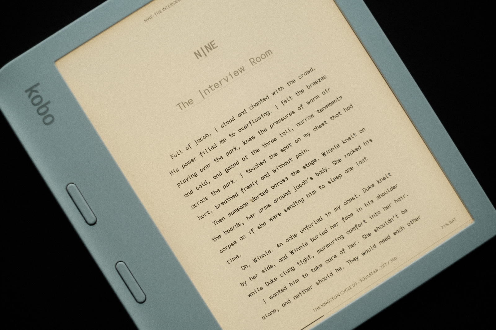
iota
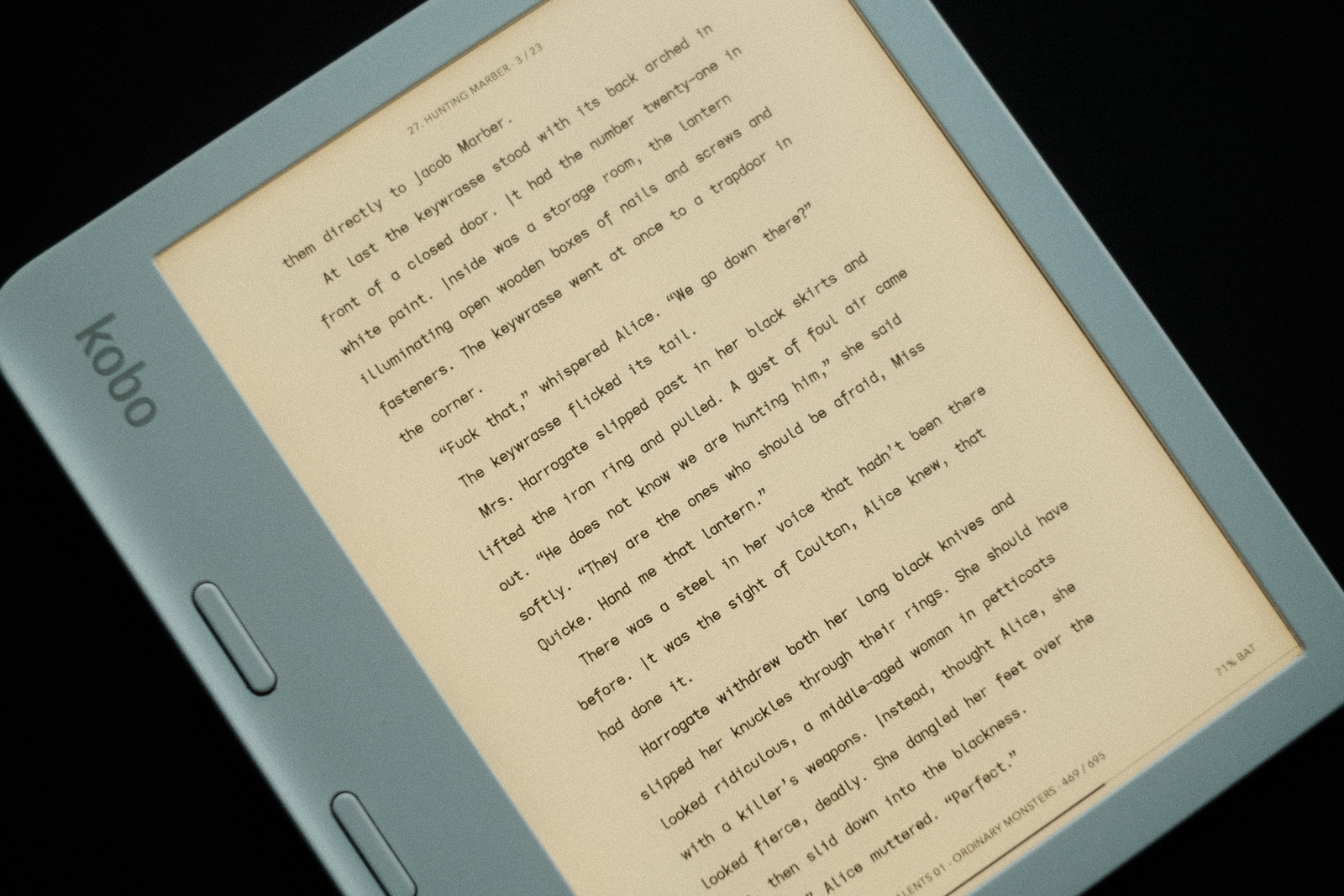
The new iota variant of typograffic with a serifless capital I..

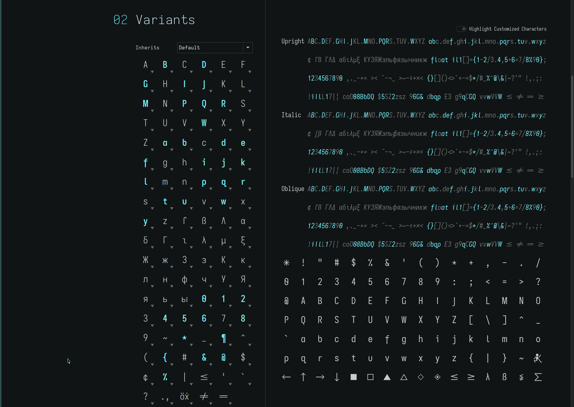
Note: the capital I in the font file is the length of the descending capital J (and lower case f) as seen below..

Serendipity would have the font name reflect the seemingly trivial change (from typograffic) with this distinctly unique(?) glyph. For many ebooks one might be hard pressed to note the difference between the two fonts but for first person narratives it can be striking.
i don’t expect everyone to find themselves being drawn to this new font, the serifed capital I being the most familiar and comfortable for the vast majority. And it can look odd—unfamiliar—initially within all caps headings—though i quite like the effect in the example at the top of the page.
i am not aware of any other font (within my font space) using a descending glyph shape for the upper case I. But i like it (perhaps for that and) for the added air it imparts to the typeface—yet without appearing isolated from adjacent glyphs—and its distinctiveness as the leading capital in words and sentences.
typograffic, articulate and now iota—three very striking yet highly legible typefaces to satisfy one’s ereading mood and visual needs. As always, YMMV.
repos
iota may be found in the opencaps folders of the quasi mono repos.