quasimono
the Iosevka font is the source from which all monospaced fonts on this site have been created from. It is one of the most actively maintained fonts available today, whose source code origins have been further expanded to cover a variety of applications beyond coding.
Update: The elementary font has been restored to the more
conventional glyph set (without the open upper case letters which now
define the new eloquence typeface).
Update: The articulate font has been added as a serif complement to
the geometric eloquence font.
Update: The typograffic font has been added to the repos,
adopting grotesk’s extended lower case f, elementary’s single
storey a,
eloquence’s open capitals and articulate’s toothed/serifed flourishes.
Update: To further differentiate the articulate font from
typograffic, the single-storey lower case a has been reverted
back to
double-storey.
catching up
up until now, all Monolexic fonts have been created with Iosevka version 10.x. This was due to minor, albeit visible, changes in subsequent releases which altered the overall proportion of the font—a compression of the character xHeight and ascenders/descenders, in particular. Obviously, i remained an outlier with regards to these evolving changes.
Iosevka has undergone several major releases—currently at version 16.x! In order to stay abreast with Iosevka’s ongoing development to capitalize on its expanding feature set, it was necessary to replicate the output of version 10.x. After many iterations, the following private-build-plans.toml parameters produced the desired results..
...
[buildPlans.<family>.widths.normal]
shape = 600
...
[buildPlans.<family>.metric-override]
# metric-override adjustments
leading = '1250'
sb = 'default_sb * 0.7500'
cap = 'default_cap + 40'
xHeight = '530'
ascender = '775'
...
From a pure monospaced perspective, there is little to be gained with the latest Iosevka releases for the Monolexic fonts—aside from some new glyphs—but..
quasi-proportional
release 11.x saw the introduction of a quasi-proportional width for the M W glyphs whilst retaining the monospaced cell width for all other characters including the narrow lower case i j and l, effectively maintaining the overall monospaced feel and air of the typeface.
The subtle relaxing (widening) of the cell width for the M and W characters adds much needed separation to the letters’ vertical strokes eliminating their “squished” and darkened appearance. While affecting only four glyphs—two upper and lower case—the overall effect renders a uniform “air” and character contrast whilst preserving the even visual cadence of a monospaced font.
It is IMO a major upgrade to the pure monospaced fonts—so much so, these changes have been promoted to this site’s Monolexic web font variants.
The differences can be seen when compared to the fixed cell width (source code) character exhibits below..
M and m
W and w
hence "quasimono"
common glyphs
the Monolexic fonts tweak the glyph shapes of the Atkinson Hyperlegible Font..
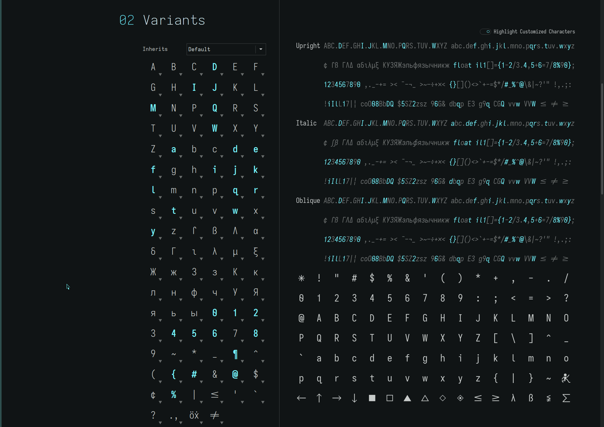
adding a few capital letter flourishes and removing identically shaped lower case characters, notably..
| upper case | from hyperlegible shape | to dyslexic shape |
|---|---|---|
| J | serifless | descending-flat-hook-serifless |
| lower case | from hyperlegible shape | to dyslexic shape |
|---|---|---|
| b | toothed | toothless-rounded |
| d | toothed-serifless | |
| p | eared | earless-corner |
| q | hook-tailed (mapped glyph*) | |
| n | straight | |
| u | toothed | toothless-rounded |
The descending upper case J is an aesthetic choice—complementing its descending lower case letter. This technically violates the “avoid similar shapes” dyslexic rule but.. a J is a j—descenders (and dyslexic adjustments!) a signature of these fonts.
The Atkinson Hyperlegible Font is unique in its use of the hook-tailed lower case q. Most sans serif fonts use identically shaped glyphs for the lower case b d p q. The increased legibility is apparent with words containing multiples of these letters or n u—the visual cortex is not “triggered” by similarly shaped letters.
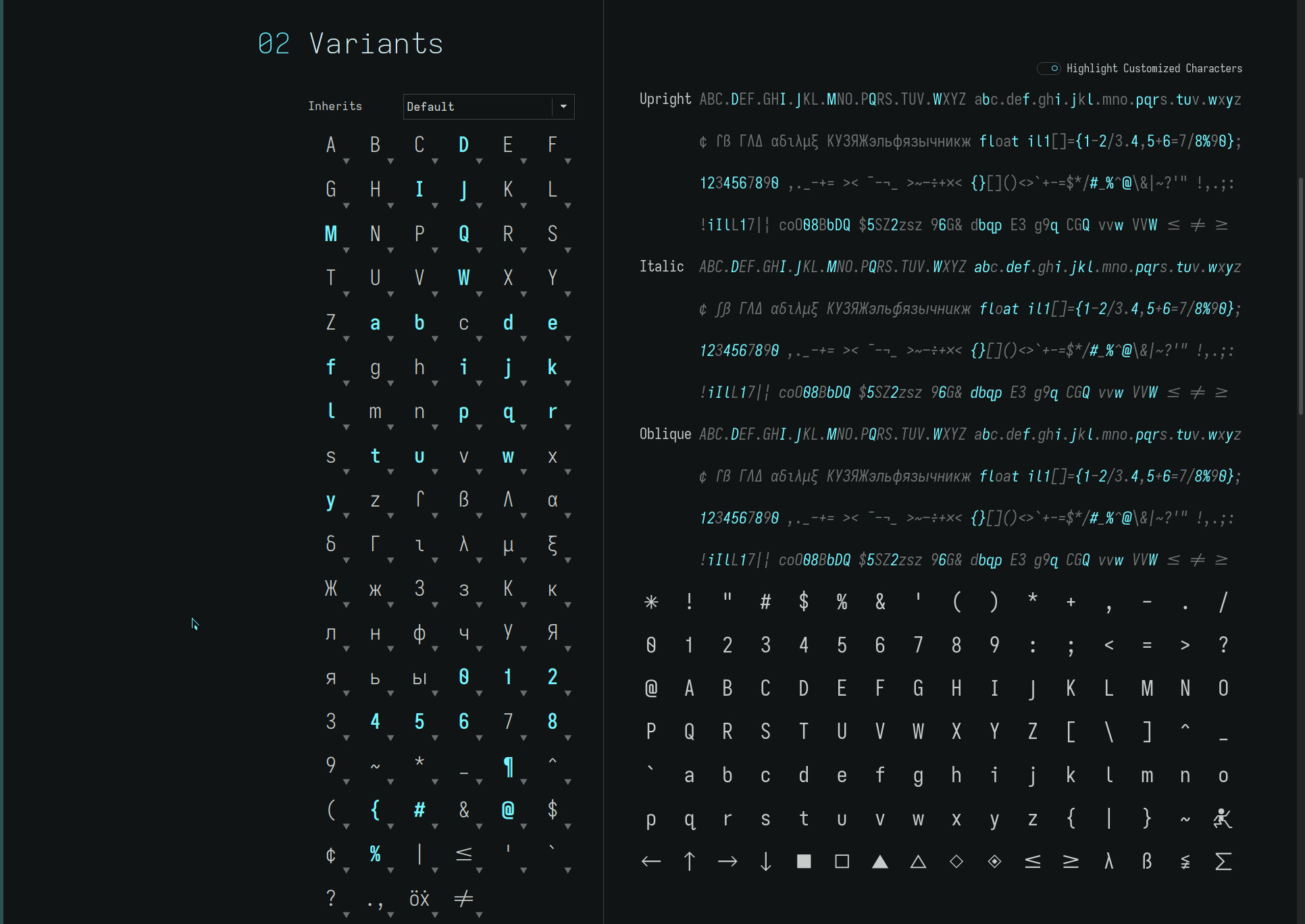
*Note: hook-tailed glyph U+024b—the glyph shape used by the Atkinson Hyperlegible Font—is mapped to lower case q (supplanting the diagonal-tailed q shown in the exhibits).
unique glyphs
the following typefaces—each with their own “character”—are built upon the dyslexia tuned hyperlegible glyph base set above. Each typeface reflects a progressive “improvement”—personal aesthetic.. or mood—upon the hyperlegible glyphs, driving towards letter “openness” and clarity with modernist flourishes.
The dyslexic font—quasi-proportional of Monolexic—differs with..
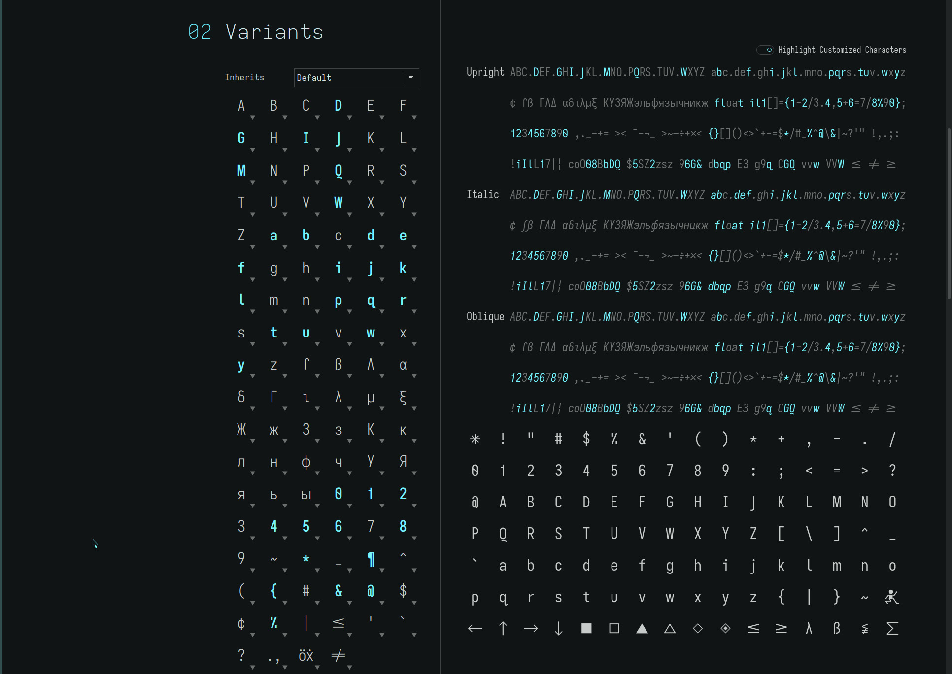
| upper case | from hyperlegible shape | to dyslexic shape |
|---|---|---|
| G | toothed-serifless-hooked | toothless-rounded-serifless-hooked |
| Q | crossing | detached-bend-tailed |
the grotesk font—quasi-proportional of Unolexic—differs with..
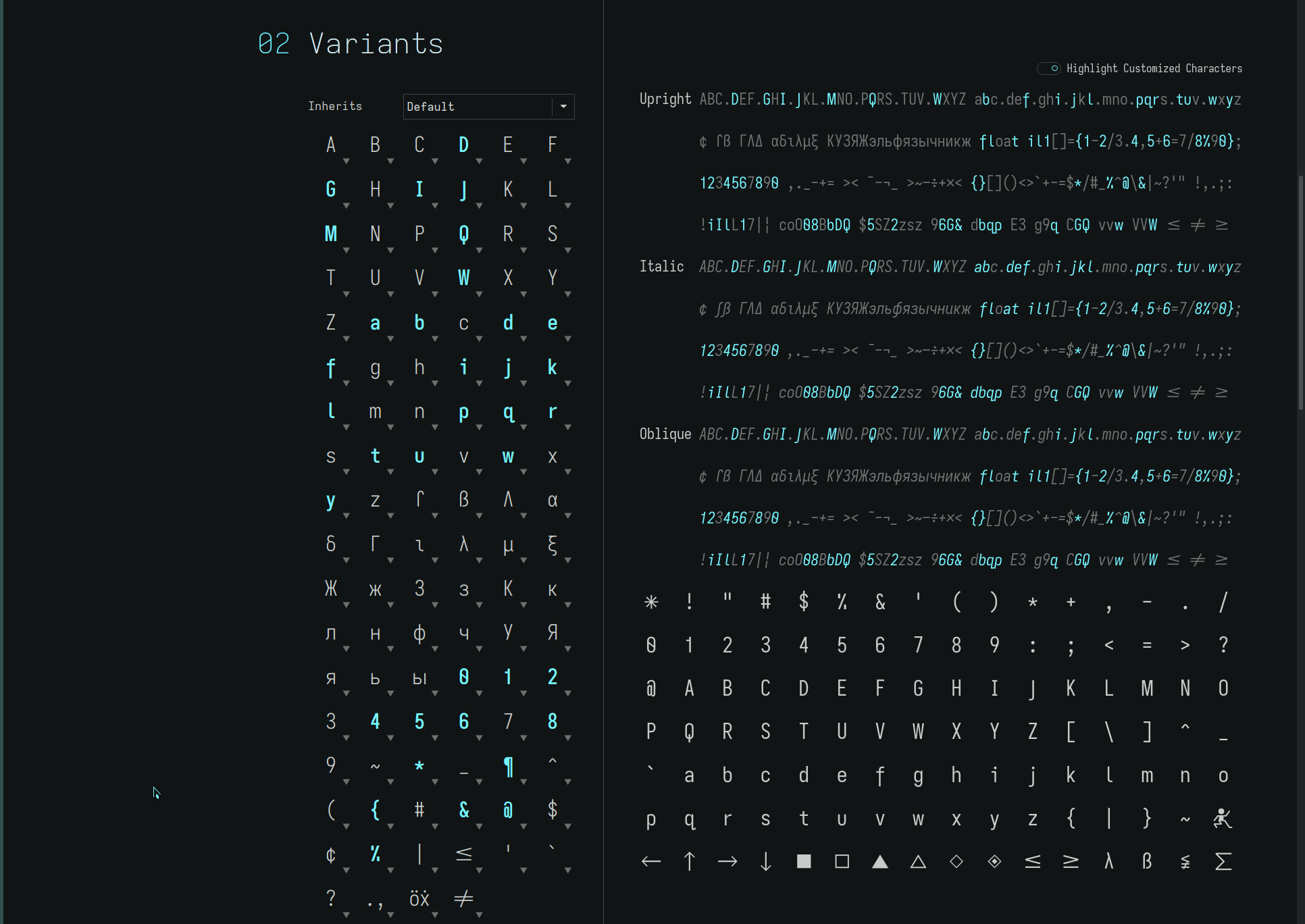
| upper case | from hyperlegible shape | to dyslexic shape |
|---|---|---|
| G | toothed-serifless-hooked | toothless-rounded-serifless-hooked |
| Q | crossing | vertical-crossing |
| lower case | from hyperlegible shape | to dyslexic shape |
|---|---|---|
| f | flat-hook-crossbar-at-x-height | flat-hook-extended-crossbar-at-x-height |
the elementary font—quasi-proportional of Geolexic—differs with..
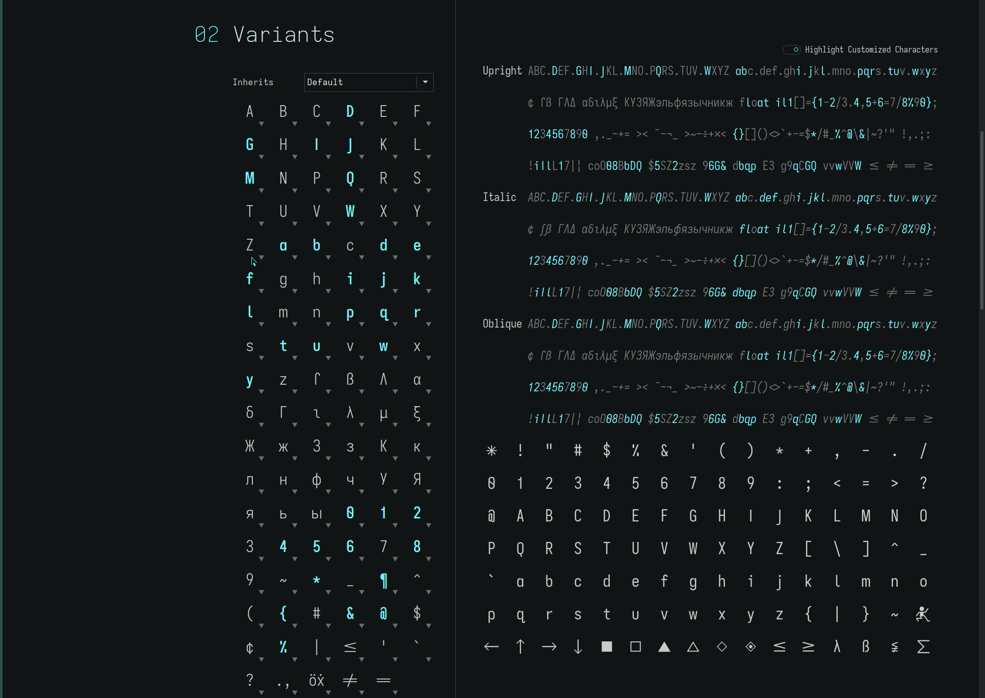
| upper case | from hyperlegible shape | to dyslexic shape |
|---|---|---|
| G | toothed-serifless-hooked | toothless-corner-serifless-hooked |
| Q | crossing | straight |
| lower case | from hyperlegible shape | to dyslexic shape |
|---|---|---|
| a | double-storey-serifless | single-storey-serifless |
the eloquence font—quasi-proportional of Geolexic (elementary variant)—differs with..
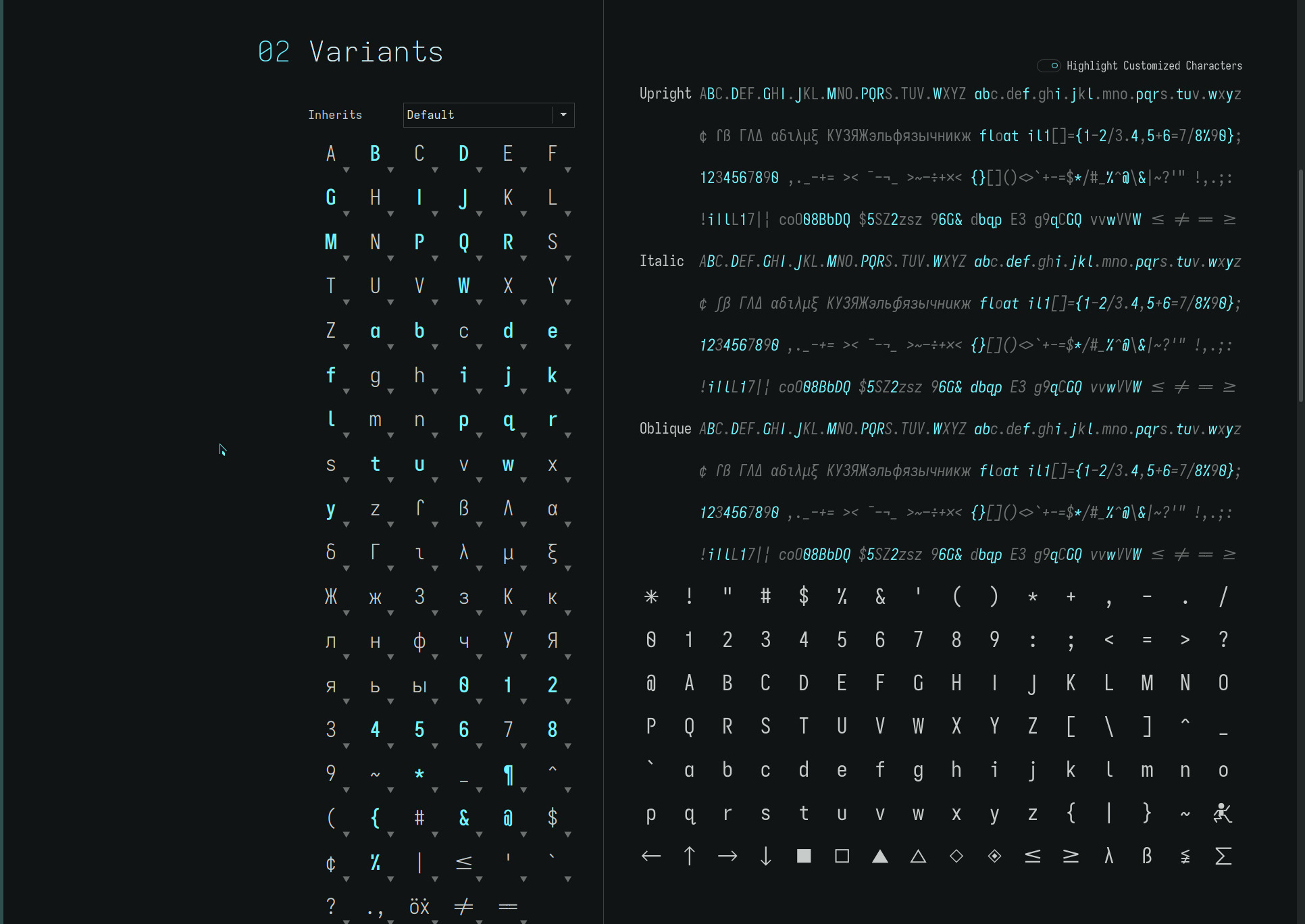
| upper case | from hyperlegible shape | to dyslexic shape |
|---|---|---|
| B | standard-serifless | standard-interrupted-serifless |
| G | toothed-serifless-hooked | toothless-corner-serifless-hookless |
| J | descending-flat-hook-serifless | descending-serifless |
| P | closed | open |
| Q | crossing | straight |
| R | straight | straight-open |
| lower case | from hyperlegible shape | to dyslexic shape |
|---|---|---|
| a | double-storey-serifless | single-storey-serifless |
The eloquence font differs from the base glyph set—which mirrors upper and lower case glyphs where possible—with a rounded descending-serifless capital J, further accentuating its geometric character and distinguishing it from its lower case glyph.
the articulate font—quasi-proportional of Geolexic (elementary variant)—differs with..
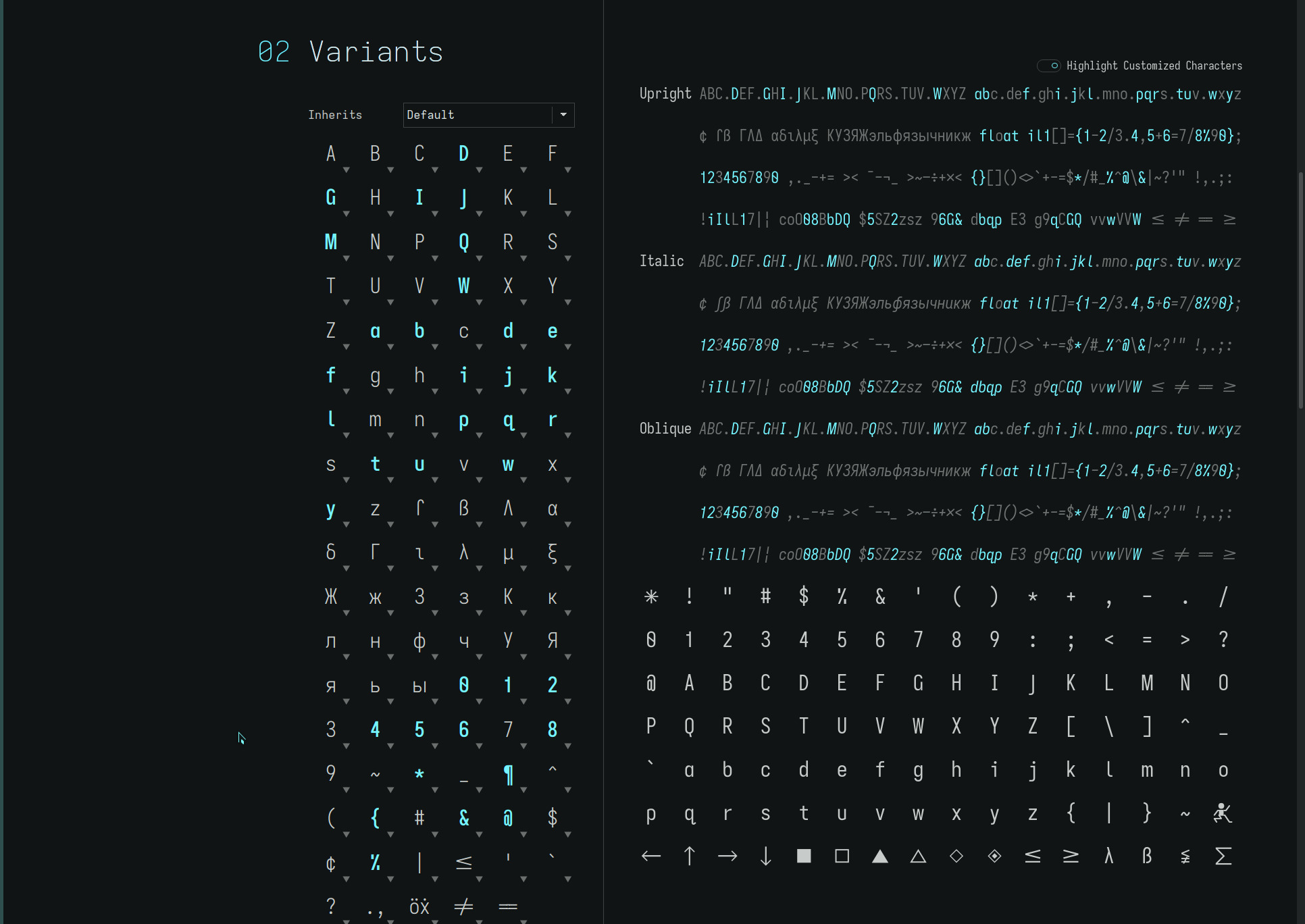
| upper case | from hyperlegible shape | to dyslexic shape |
|---|---|---|
| G | toothed-serifless-hooked | toothed-serifless-hookless |
| Q | crossing | straight |
| lower case | from hyperlegible shape | to dyslexic shape |
|---|---|---|
| a | double-storey-serifless | |
| j | flat-hook-serifless | flat-hook-serifed |
The articulate font is essentially the ielementary font (with the serifed capital I) adding a toothed-hookless capital G—acknowledging my “open” glyph leanings—and serifed lower case j to “fill” in its side bearing from adjacent letters and further distinguish it from its upper case glyph—whose striking economy i still quite like.
With these subtle glyph differences from the eloquence font—notably, the toothed capital G, flat-hook capital J, and the serifed capital I and lower case j—the articulate font presents a distinctly different feel to its geometric counterpart with an increased legibility as a bonus.
Update: The single-storey lower case a has been replaced
with the double-storey glyph to more visibly differentiate the typeface from typograffic—these are now my two default typefaces on my ereaders.
typograffic
fuses the most unique “character” attributes of its progenitors (above) to yield an open typeface rooted in grotesque yet, with its dyslexic focus, built upon a unique set of asymmetric lower case glyph shapes (atypical of grotesque)!
typograffic differs from the base dyslexic glyph set with..
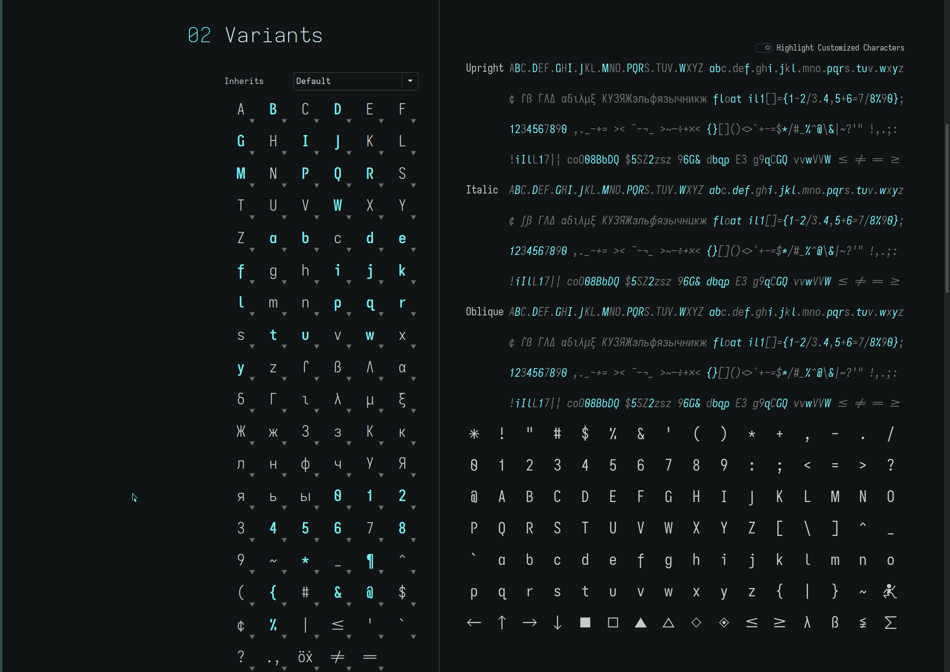
| upper case | from hyperlegible shape | to dyslexic shape |
|---|---|---|
| B | standard-serifless | standard-interrupted-serifless |
| G | toothed-serifless-hooked | toothed-serifless-hookless |
| P | closed | open |
| Q | crossing | straight |
| R | straight | straight-open |
| lower case | from hyperlegible shape | to dyslexic shape |
|---|---|---|
| a | double-storey-serifless | single-storey-serifless |
| f | flat-hook-crossbar-at-x-height | flat-hook-extended-crossbar-at-x-height |
| j | flat-hook-serifless | flat-hook-serifed |
As its namesake (phonetically) infers, the lyrical expressiveness of this unique font with its modernist flourishes holds true to its dyslexic foundation for visual character and word clarity.
space character
the distinctly named non-*lexic quasi-proportional font families all apply a 1.3333x cell width to the Space character, yielding a relaxed visual word density whilst still providing a distinct word separation emphasis.
Setting the Space character to the cell width of the quasi-proportional capital M yields a more familiar visual page density—this has little to no impact on the ebook page count but may appeal to those who prefer tighter text. The 1.3333x spacing makes words “pop” more with its marginally wider cell width. YMMV.
For maximum dyslexic word separation, the more popular glyph set of the dyslexic font is also available with the 2x spacing of the Monolexic fonts, hence..
| font* | space |
|---|---|
| dyslexic | 2x, 1.3333x, M |
| grotesk | 1.3333x, M |
| elementary | 1.3333x, M |
| eloquence | 1.3333x, M |
*An “i” prefix to the font names designate font sets with a serifed capital I. It’s confusing, i know.. but hopefully those following these fonts will find the repo organisation abundantly clear :)
line spacing
for the two dominant ereader platforms on the market—Kindle and Kobo—two sets of fonts have been generated with differing leading (line height).
1250 leading is the default but due to Kindle’s limited three line spacing choices—which i find too tight even at maximum—a set of fonts has been generated with 1875 leading to obtain the line spacing i prefer to read by on my Kindle Oasis. (The FONT_RAMP file in the repos also is needed to overcome Kindle’s coarse font control and obtain the small font size i read at.)
The Kobo has a very wide and granular line spacing control. However, i further customized it via kobopatch with a line spacing range heavily favouring large spacing for the small font sizes i read at—this makes for much easier finger highlighting accuracy as well as providing the visual air between lines.
Which leading font set you use is dependent on your personal preferences—either may be used with any device. (If i didn’t own a Kindle, the default 1250 leading would have been the only choice!)
repos
The new ereader fonts may be found on OneDrive. As always, YMMV.
update
in order to get the Kindle to render the quasimono fonts identically (as far a pixel peeping allows) to the Kobo which has been my daily driver and whose versions of the fonts look better (to these eyes), the following private-build-plans.toml parameters were adjusted to..
...
[buildPlans.<family>.widths.normal]
shape = 576
...
[buildPlans.<family>.metric-override]
# metric-override adjustments
leading = '1250 * 1.5'
sb = 'default_sb * 0.6450'
cap = 'default_cap + 40'
xHeight = '530'
ascender = '775'
...
Oddly, the shape (cell width) needed to be reduced to produce the desired results, illustrating just how differently the font rendering engines of the two platforms are—at least, with regards to these generated fonts. (i have not examined other typefaces.)
The FONT_RAMP file was also adjusted accordingly to be able to render the small font sizes i read at..
5.435 5.706 5.978 6.250 6.576 6.902 7.282 7.609 7.989 8.424 8.804 9.293 9.728 10.217
As for the Kobo.. i have been reading with the eloquence font of late. Blessed thus far with acute vision, the single-storey lower case a and straight capital Q render an airy typeface, further stylized with its toothless capital G and open capitals B P R—the beauty of being able to roll your own font :)