monolegible
i have been living with my mock up of a monospaced Atkinson Hyperlegible font now for some weeks. First, by simply substituting the Iosevka character variants that most closely matched their Hyperlegible counterparts, then a much lengthier concerted effort to tailor their individual shapes as closely as possible—the ascenders and descenders, their heights and roundness.
The end result has been quite satisfying and has exceeded all my expectations and, until an official monospaced font variant is released, if ever, will remain the default font for my development and writing environment for the foreseeable future. It’s that delicious—okay, i am a font nutter.
But it did not remain solely on my Linux desktops for long..
kindle

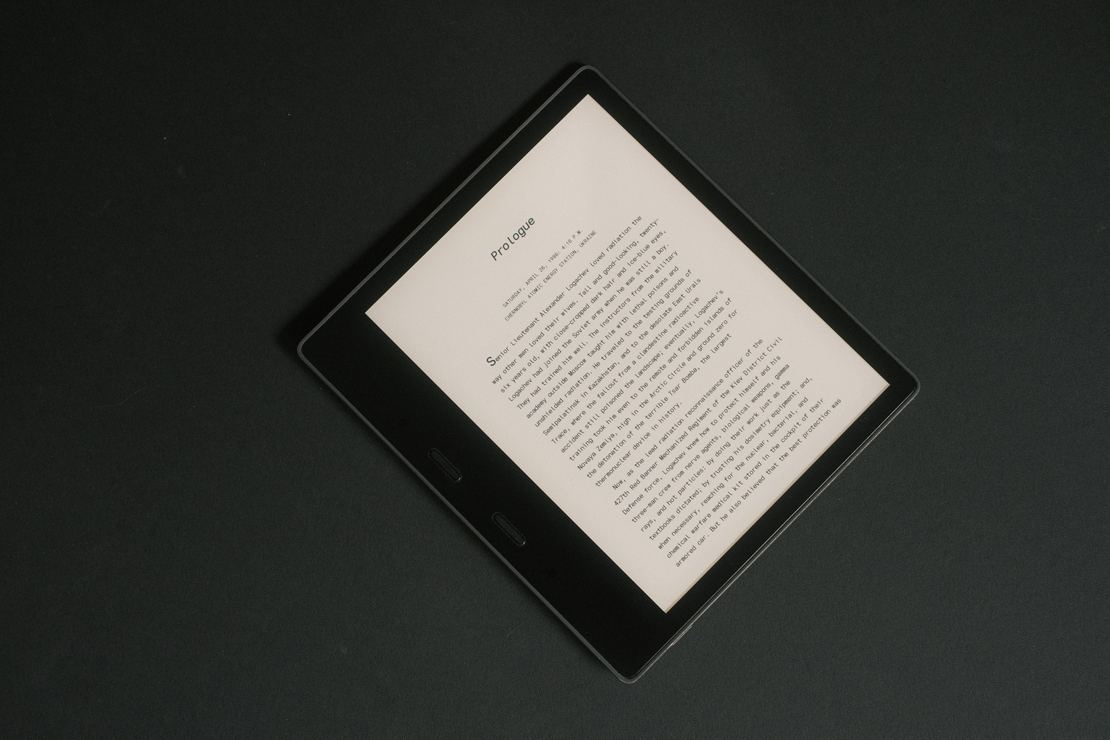
Portrait, font size 3, bold 3
i had tried previous versions of Iosevka on my Kindle Oasis but found the half cell width density of my coding oriented fonts.. well, flatly technical looking and not engaging for immersive reading. What a change this font presents with its extended width!
Tiempos Text and the Atkinson Hyperlegible fonts still remain my all time favourite serif and sans serif fonts on the Kindle. But these past weeks i have found myself continually returning to this monospaced font.
There is no doubt the Atkinson font is the easiest on the eyes. It imparts the sensation that it is making one read faster (whether you intend to or not!), like running down an incline effortlessly. But this monospaced variant has a charm that is very visually pleasing to my eyes—the fixed cell width giving the letters a uniform geometric presentation.
With a monospaced font one would expect to lose significant word density on the page but this is easily rectified with its incredible legibility at even the smallest font sizes, a trait it holds in common with the Atkinson font. Of course, if you prefer your reading material fully justified, then proportional fonts are the way to go.
But if you have a fondness for typewriters and old manuscripts—i am dating myself here—and left justification, or simply are drawn to fonts that breathe on a page with a subtle airiness around the characters and words, then this may be right up your alley. And with the right line spacing and margins, it feels very much like reading the “draft” of a novel—part of the allure, no doubt, that keeps me returning to it.
font weight
after some time with “Monolegible” on the Kindle, i decided i preferred the “book” weight of the font. It was possible to more closely match the contrast level of the Atkinson Hyperlegible font, the original “regular” font being either a shade lighter or darker on my Oasis—yes, i am that anal, but it also just felt a touch better which should be no surprise from its heritage. Unfortunately there is no means to customize the boldness increments as there is the font sizes to get a match.
Copying over the “book” weights of the font are easy enough, however, their font names effectively disable the “bold” fonts—their being associated with the “regular” and “italic” font names. Enter ttx to convert fonts to XML and back..
fonts='*-book *-bookitalic *-bold *-bolditalic'
for i in $fonts ;do
file=$i.ttf
ttx $file
done
sed -i -e 's/iosevka Book Version/iosevka Regular Version/' \
-e 's/iosevka[ -]Book/iosevka/' \
-e 's/Book/Regular/' \
*-book.ttx
sed -i -e 's/iosevka Book Italic Version/iosevka Italic Version/' \
-e 's/iosevka[ -]Book/iosevka/' \
-e 's/Book Italic/Italic/' \
*-bookitalic.ttx
for i in $fonts ;do
file=$i.ttx
ttx $file
done
and rename the “book” fonts as “regular” and “italic” to inherit the “bold” font references.
character tweaks
the capital M of the book weight appears heavier (to my eyes at least) than the remaining character set—this is purely an optical illusion particular to the flat-bottom M and its narrow spacing between the vertical and angled strokes, despite having the same stroke width as the other characters.
Replacing the book weighted character with its “regular” weighted version—and its ever so slightly thinner stroke width—gives its strokes more breathing room to create the balanced contrast (illusion) on the eink page..
echo "
Open(\$2);
Select(0u004d);
Copy();
Open(\$1);
Select(0u004d);
Paste();
Generate(\$1);
" >/tmp/fontforge.script
for i in *book*#1.ttf ;do
ditto M $i
case $i in
*italic*) file=*-italic.ttf ;;
* ) file=*regular.ttf ;;
esac
fontforge --script /tmp/fontforge.script $i $file
done
Did i mention anal somewhere?
The final adjustment replaces the standard Em dash which closely resembles the Dash due to the fixed width constraint of the monospaced font with the broken or (single character faux) 2 Em dash..
echo "
Open(\$1);
Select(0u268b);
Copy();
Select(0u2014);
Paste();
Generate(\$1);
" >/tmp/fontforge.script
for i in *#1.ttf ;do
ditto emdash $i
fontforge --script /tmp/fontforge.script $i
done
And voila! A font i find myself reading with more and more.
During the hunt for a matching lower case tailed q to match the Atkinson Hyperlegible font, the author of Iosevka stated that “Iosevka is NOT a typeface targeting dyslexia, low-vision legibility, or anti-tampering”. Despite that claim and Iosevka’s focus as perhaps the most powerful coding font platform there is, i think Iosevka manages to address those issues as well as any monospaced font can with the character variants it provides..
Producing IMO a most beautiful monospaced font for both coding, writing and.. reading.
finishing touches
after some time with the above changes, two characters in particular begged for adjustment: the Em dash and the Ellipsis, both which felt too compressed with their single cell width. Breaking the monospaced rule..
The monospaced broken Em dash has been replaced with a double cell width Dash. This is far more legible, providing greater separation of the following clause as well as a longer stroke to differentiate it from the Hyphen. The Dash is used in place of lengthening the Em dash to provide more side bearing spacing to its adjacent characters.
Similarly, the Ellipsis is also enlarged to a double cell width to give the “dots” more breathing room (and match the size of the Period). This transformation requires adjusting the dots’ resultant weight (size) and position..
echo "
Open(\$1);
Select(0u2012);
Copy();
Select(0u2014);
Paste();
Transform(200,0,0,100,100,0);
Select(0u2026);
Transform(200,0,0,200,100,0);
ChangeWeight(-100);
Move(0,-40);
Generate(\$1);
" >/tmp/fontforge.script
for i in *#1.ttf ;do
ditto emdash $i
fontforge --script /tmp/fontforge.script $i
done
Lastly, an alternate capital Q variant breaks with the Atkinson Hyperlegible font character matching. The “crossing” Q while legible feels similarly compressed (especially at small font sizes) with its crossing diagonal stroke—due to the monospaced cell width preventing a circular shape. In its place, the “detached-tailed” Q feels more rounded (and open), despite the enclosing shapes being identical for both—purely a personal aesthetic choice..
[buildPlans.iosevka-custom.variants.design]
capital_q = "detached-tailed"
...
..see Iosevka Hyperlegible.
These last few modifications have firmly established this font as my favourite font to read by. If you are a fan of monospaced fonts—though, technically this font is no longer a monospaced font with its double width character substitutions—and eink readers, this highly legible sans serif font may be worth your look. And those with dyslexia may find its monospaced “spacing” particularly appealing..
font size

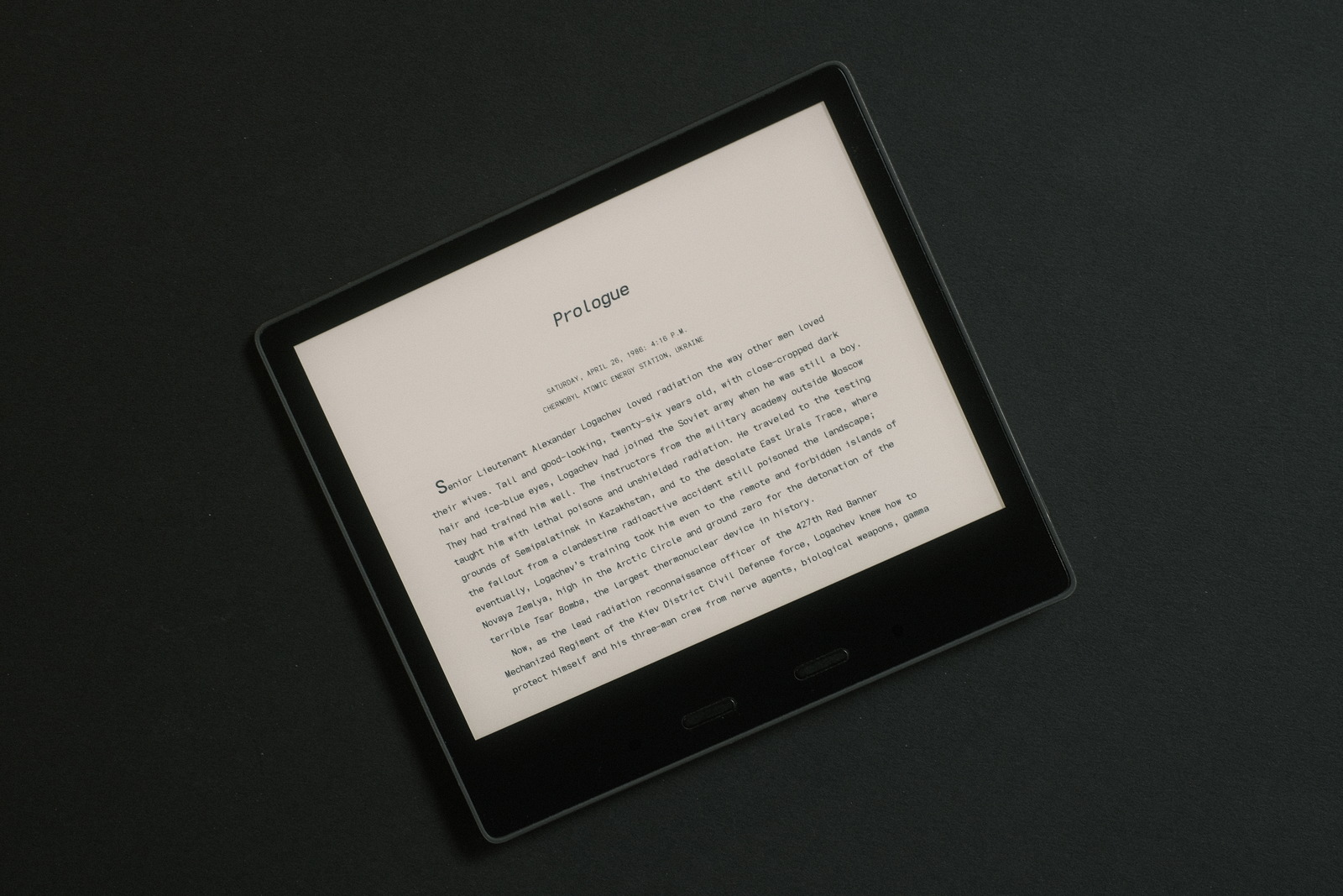
Landscape, font size 4, bold 3
not needing the range of font sizes the Kindle defaults set (with no FONT_RAMP defined), i apply these FONT_RAMP values for a more granular font size control (with setting 6 equivalent to the default setting 1)..
5.46 5.72 5.98 6.29 6.60 6.96 7.28 7.64 8.06 8.42 8.89 9.30 9.77 10.24
i like small fonts!
The legibility and appeal of the extended width characters beckoned trialing as a coding font (omitting the double width character and font weight tweaks). It works staggeringly well.. to these eyes. Who knew code could look so good!
epilogue
i have been living with this monospaced font now for several months. The FONT_RAMP settings have proved optimal (for my extra small font size preferences). The only change to my Kindle setup is the addition of a font family containing the crossing capital Q i originally started with—i select it occasionally when the mood dictates, though, my aesthetic still leans towards the more open presentation of the detached tailed Q.
The Atkinson Hyperlegible and Tiempos Text fonts still reside on my device but switching to them always prompts quickly switching back, despite the beauty of these fonts. There is something additionally easing to the way i process text that is particular to monospaced “spacing”—perhaps from years of staring at code or akin to reading draft.
Programmers may prefer the serif variants of some letters common to their favourite coding fonts, notably the lower case l—whose the extra stroke i find diminishes the “air” surrounding the letter. Personal aesthetics and those of the Atkinson font again trump these variant choices. The balance of classic geometric and subtle serif character variants (in line with the Atkinson Hyperlegible font objectives) renders an exceedingly clean typeface that i don’t foresee being displaced on my Kindle (or desktop for that matter) anytime soon.
‧ ‧ • ‧ ‧
to further heighten the “draft” look, leading has been increased to 1.5x (tweaked below, see note) to achieve something akin to double spacing at the maximum line space setting of the Kindle. This shifts the line spacing for the font effectively from 1 2 3 (the three settings minimum, middle and maximum) to 2 3 4 providing three usable settings—at 1.25x leading the minimum line space setting was too tight for my tastes.
One benefit of double line spacing is wrong word highlighting is now a thing of the past. This was seldom an issue with the former maximum line space setting but now provides an even more generous touch zone above and below words for more relaxed finger placement—tapping for dictionary lookup and dragging for highlighting passages.
Note: Kindle font names are normally listed in their own typeface as a visual aid for font selection. Fonts with a line spacing greater than 1.4185x (for Iosevka) are listed in the default Kindle Bookerly font rather than their own typeface—something that took a bit of hand wringing to figure out! Otherwise, the font displays properly for the book content. (The font in use has ultimately been generated at this setting to preserve its font name typeface—while satisfying the double spacing effect. YMMV.)