quasilegible
a quasi-proportional spaced Iosevka typeface. This option has been available for the last several major versions of the font but i did not get the impression that all character variants were available—possibly due to an incomplete or incorrect configuration on my part with earlier attempts.
With version 10.x all the character variants used with my Monolegible font work simply by configuring..
[buildPlans.iosevka-custom]
family = 'iosevka-custom'
spacing = 'quasi-proportional'
...
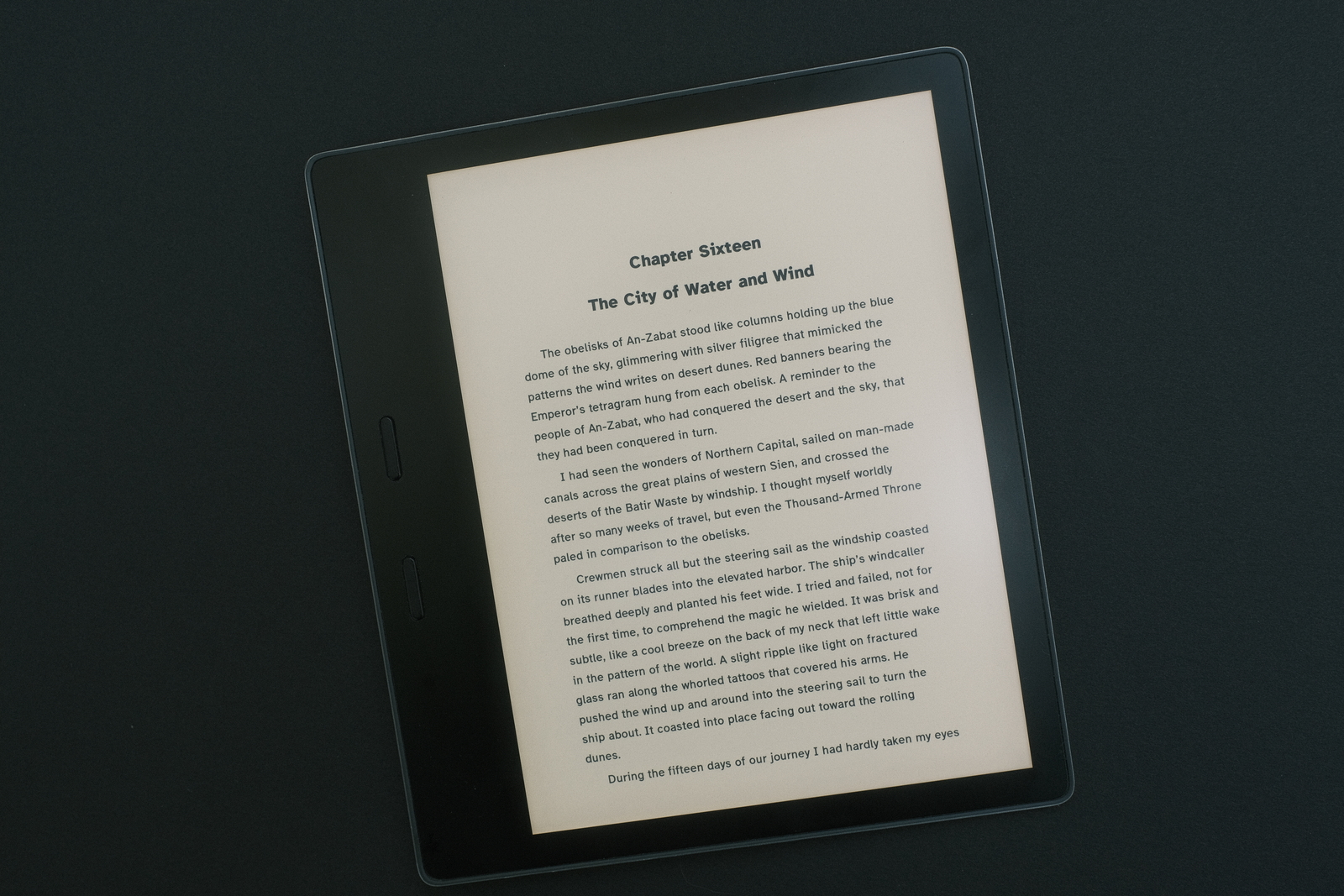
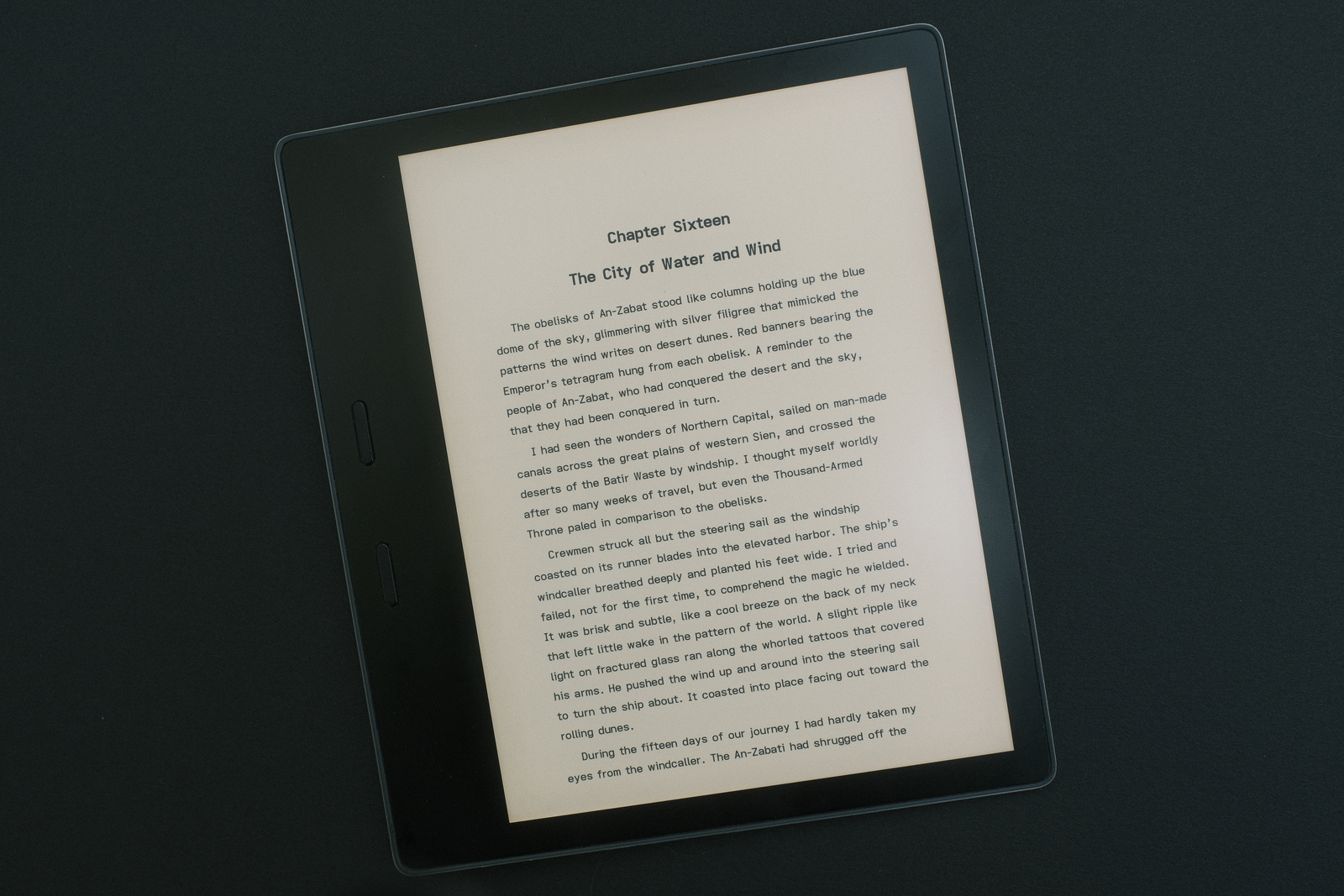
Compared to the Atkinson Hyperlegible Font, the differences between these typefaces are apparent (more so directly with the eink device than these images can convey)..
atkinson hyperlegible

is a beautiful grotesque sans serif font with a slightly thicker stroke, more rounded geometric shapes—especially the (square character cell) capitals—proportional character cell widths and kerning—which maintains a very uniform spacing between the character strokes of adjacent letters.
The characters of words themselves have a bit more breathing space between each letter but the displayed page overall appears denser—a function of stroke thickness, word and line spacing.
quasilegible

has an overall appearance between the Monolegible—retaining its character variant shapes—and the Atkinson Hyperlegible fonts with its quasi-proportional (side bearing) spacing. Save for the M and W whose cell widths are increased, cell widths are noticeably narrowed for the lower case i and l, and to a lesser extent the f, j, r and t—whose hooks and tails are reduced. Lack of kerning can be seen on close inspection but it is not as obvious as Monolegible’s with its monospace cell width.
The thin stroke remains but the “draft” like quality is somewhat lessened due to the loss of the columnar spacing—increasing the line spacing restores it somewhat—and the diminished blockiness of the narrower character shapes. Interestingly, the font size displays smaller than its Monolegible counterpart at the same Kindle font size setting.
comparing
the two fonts one notices immediately the rounder more geometric shapes of the Atkinson Hyperlegible Font, especially with the capitals, and the heavier stroke (at its configured font setting)—unfortunately, the font scaling of Kindle’s rendering engine does not facilitate comparison of fonts by point size. The Quasilegible font’s monospaced heritage shows clearly with its more upright fixed rectangular cell width capitals (save for the I, M and W).
With the Atkinson Hyperlegible Font’s kerned proportional characters, Quasilegible requires a slightly smaller font size to achieve the same word density per page—lacking kerning and a limited set of proportional characters.
This particular customization of Iosevka—shape (cell width), side bearing and leading (line height)—yields a slightly flatter (x-height) looking font with tighter character spacing yet greater spacing between words and lines. The overall effect is a very pleasing legibility. YMMV.
‧ ‧ • ‧ ‧
Font preferences are a very personal aesthetic.
If i were to summarize the major difference between these two fonts (for me), i would say the Quasilegible font produces a different reading cadence to the Atkinson Hyperlegible Font. This i attribute to the slightly more pronounced visual word spacing which makes each word stand out—a result of the tighter side bearing spacing (despite the lack of kerning) and fixed extended cell width Space character. It is a strange perception (and perhaps only exists with my particular vision!) but i quite like it.
For the past four months i have been using the Monolegible font exclusively, preferring the very readable proof or draft like quality it imparts. This hybrid font the past few days has been getting a good look. For those finding monospaced fonts too radical for daily reading, this font may hit the sweet spot.
final thoughts
i like to set up my Kindle Oasis with small font sizes—probably smaller than what most users would consider but doing so allows for maximized content combined with page margins to produce that printed page look.
Playing with various settings to widen character cells and side bearing spacing, i find i always return to Monolegible’s ebook configuration settings to retain that “word” emphasis and separation.
What is clear (albeit untested) is that at very small font settings, eink resolutions below 300 PPI are probably less than optimal (grainy) to resolve the current narrow side bearing spacing between characters to maintain clearly defined letter separation—the shapes of the (Atkinson variant) characters requiring some degree of breathing room to maintain their designed legibility.
i surmise Quasilegible would look even better on a higher resolution eink screen should the technology ever evolve so—and am definitely looking forward to the next generation of ereaders using E Ink’s 300 PPI On-Cell Touch ePaper with its claim of a 30% increase in the contrast ratio.
As for the moniker Quasilegible.. not perhaps the best word blend :o
‧ ‧ • ‧ ‧
It was easy to set the Quasilegible font as the default font for the past several weeks on my Kindle. It is a beautiful sans serif font and a good complement to the Monolegible font, presenting at a glance the familiar polish of the printed page. It retains much of the elegance of the Atkinson Hyperlegible Font while having its own distinct character—due to its narrower overall cell width (and side bearing) and wider word spacing. i like it a lot.
As stated elsewhere, font selection is very much a personal aesthetic. Reading mood plays very much into this (for me).
At the same (middle) line spacing i tend to prefer Quasilegible. To further distinguish the draft quality Monolegible imparts, i now set it to maximum line spacing—which emphasizes its unassuming simplicity and the focus it renders to content.
Two font settings, two reading feels—not unsurprisingly, having worked so closely with both these two fonts. YMMV.
files
**The FONT_RAMP file has been adjusted to provide a better step selection for the smaller font sizes. Default Kindle font size 1 is now font size 6!—the above images were produced with Atkinson Hyperlegible at font size 6 (maximum line spacing) and Quasilegible at font size 4 (middle line spacing).