monolexic
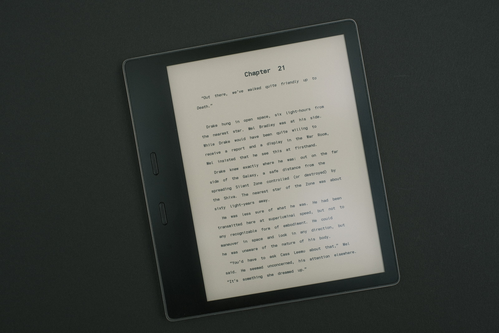
a recent thread on reddit piqued my interest and made me ponder how the Monolegible font might be improved for the ereader.
The Kindle already comes bundled with the OpenDyslexlic font which, like many so-called dyslexic fonts, is not a font i could ever see myself using. In fact, i personally find the font yields the opposite effect for me—and not being dyslexic i can’t speak to its efficacy for the condition. This largely stems from the irregular strokes (thickness) and character shapes which rub up against my personal aesthetic for elegant geometric shapes.
Part of my reading pleasure is derived from the inviting nature beautiful fonts impart on the printed page. This affliction is not owned singularly by me as can be seen by the recurring requests for favourite fonts on the Kindle subreddit. Underlying the choices i surmise are the legibility and readability a font imparts to the content being consumed.
Using the Monolegible font as the starting point, enter..
monolexic

a more relaxed monospaced font, with a wider cell width (shape) and more breathing room between letters (side bearing), and increased line height (leading—retaining that previously added to Monolegible to provide double spacing at Kindle’s maximum line space setting).
The font retains the Atkinson Hyperlegible Font character variants with three minor changes..
- The lower case d inherits a “tail” to not mirror the b or rotated p—at huge font sizes, the Atkinson font displays a hint of an outward arc at the bottom of the right stroke but looks straight otherwise.
- The lower case b loses the “tooth” of the left stroke to not mirror the p—this change also improves separation from leading characters.
- The lower case u loses the “tooth” of the right stroke to not mirror a rotated n—similar to above, this change improves separation from trailing characters.
The Iosevka configuration file..
[buildPlans.eMonolexic]
...
[buildPlans.eMonolexic.variants]
b = 'toothless-corner'
d = 'tailed-serifless'
u = 'toothless-rounded'
capital-i = 'short-serifed' # **
...
[buildPlans.eMonolexic.widths.normal]
shape=600
...
[buildPlans.eMonolexic.metric-override]
leading = 'default_leading * 1.4185'
sb = 'default_sb * 0.6500'
...
Finally, and importantly IMO, word separation is increased by lengthening the Space character using fontforge..
Select(0u0020);
Transform(200,0,0,100,0,0);
Doubling the width of the Space character retains the columnar alignment of a monospaced character set. i personally find this exaggerated word separation beneficial which, while odd at first glance and would seem to counter reading cadence, disappears upon actual reading.
‧ ‧ • ‧ ‧
**The capital I has been changed from the common wide serif of coding fonts to a more polished short-serif. This aligns more closely with the Atkinson Hyperlegible font.
usage
i like this font.. a lot. The added breathing room of the text and increased word separation render effortless reading.
For maximum legibility and readability, line spacing should likely be increased on the ereader—maximum Kindle setting yields double space. Text must be left justified to maintain fixed character and word spacing. If your device supports it, a touch of warm light to ease eye strain wouldn’t hurt either—pro tip: reading with blue-light cancelling glasses achieves a similar effect.
For myself, i use my own FONT_RAMP (font size) settings that allow a suitably small font for my usage. Dyslexia probably demands larger font sizes which the default Kindle settings should suffice.
The font retains the visual cadence that monospaced fonts possess which i surmise is a reason that “draft” copy format is traditionally double spaced monospaced text.
i have tested the font as a night time “tired” eyes reading font and it is quite agreeable. So much so, i haven’t at the moment gone back to my previous go to Monolegible font. YMMV.
‧ ‧ • ‧ ‧
It has been a good exercise to examine the shape relationships between characters. Several of the changes have been so visually effective, especially for narrower side bearing, that they have been incorporated in my other Iosevka font sets to further improve their legibility.