chocofi wi
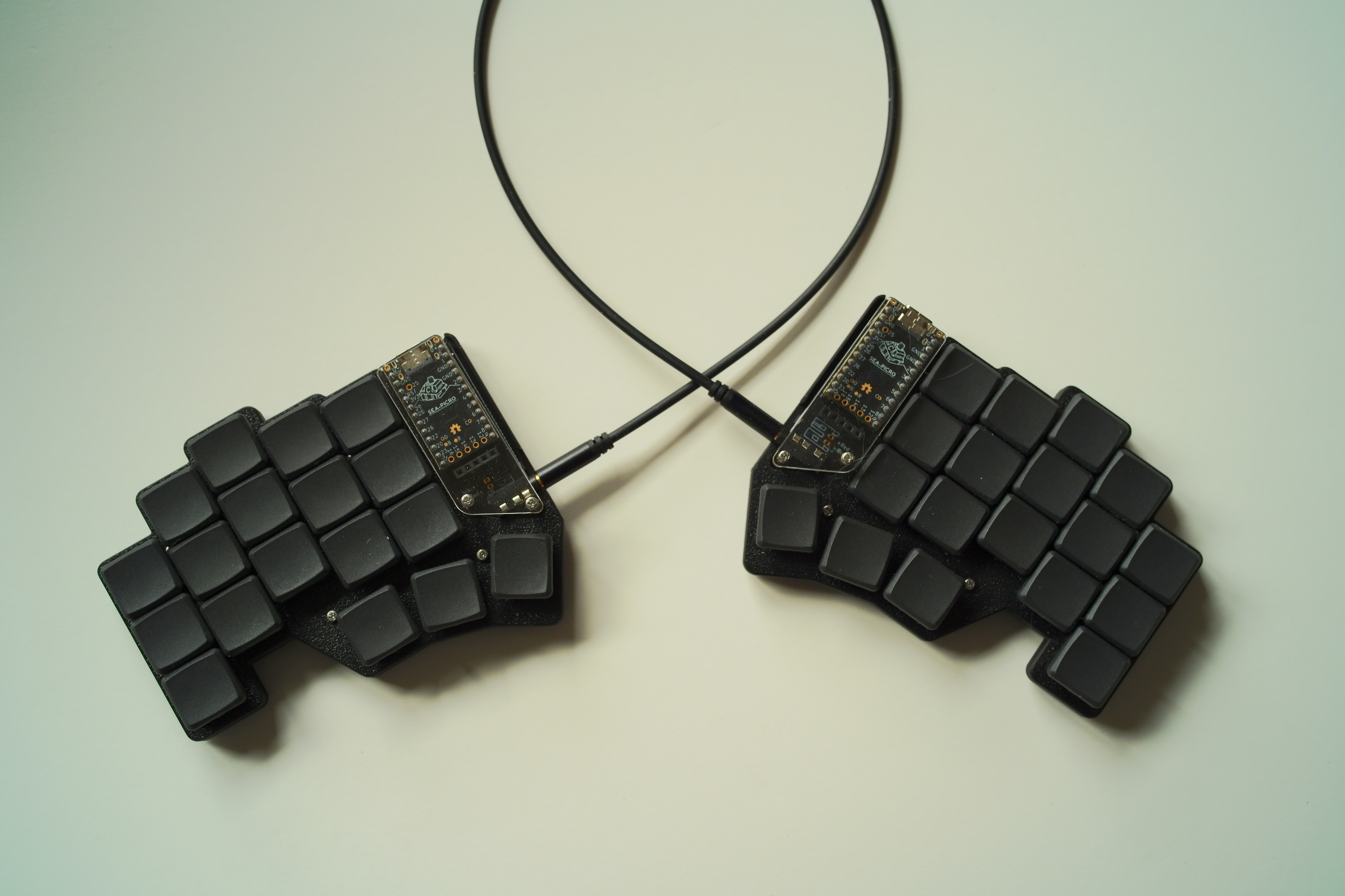
since Covid the diminutive Georgi keyboard had been my daily driver. Not as a steno keyboard for which it had been designed (and upon which i dabbled with Plover) but as a standard keyboard, albeit with my highly tuned beakl wi layout.
What made this combo unique was not only the minimal finger travel of the beakl layout itself, but the significant gain from the chorded use of just two horizontal rows of keys to achieve a fully functioning keyboard.
Recent developments—one Georgi keyboard toasted by a winter static discharge and its backup now showing early signs of imminent failure (occasional freezing)—prompted skowering for potential 2x6+3 or 2x5+3 split keyboard replacements, to no axail (gboard heavy industries having been shuttered until further notice for awhile now).
Enter the 3x5+3 chocofi from beekeeb.com. i selected this particular 36 key keyboard because i had already built numerous Corne and Chimera keyboards so felt this a good starting point replacement.
Why not pull out one of my many pre-Georgi split keyboards? They were all Cherry keyswitch based keyboards and i intended to continue using a chorded minimal travel layout with low profile Choc keyswitches and flat MKB keycaps. The recently released 20g Linear “Nocturnal” keyswitches would be close enough to the modded 15g keyswitches of the Georgi—ultra light keyswitches are necessary for effective chording with a light uniform feel.
With the (firmware) chording engine updated to handle a 36 (upto 64) key keyboard, the chocofi with..
beakl wi
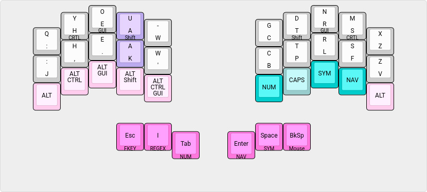
| chord | output |
|---|---|
| q y | qu |
| , . | ; |
| LShift Tab | Tab (autorepeat) |
| LShift Space | Space (autorepeat) |
| LShift Backspace | Backspace (autorepeat) |
| Space Backspace | Del (autorepeat) |
Some chords have been removed and added since Georgi’s original implementation of beakl wi, as workflow and usage refinements dictated—easy enough to do via the visually oriented json file specification for the keyboard with the chording engine parser.
Notably, the Q has been moved to the top row (from earlier BEAKL Wi layouts) facilitating the ring+middle finger Q Y chord to produce QU—the ring finger extension adopted from Georgi usage.
With the “extra” finger row of the chocofi, the left Alt key modifier combinations are specific to my windowchef desktop management workflow which use these modifiers heavily with the number pad and right hand cursor movement keys (eliminating Georgi’s former pinkie finger modifier combinations—as always, looking for ways to avoid pinkie finger usage). This is an example of a keyboard layout being tailored to one’s particular workflow. The right hand layer toggles provide thumb free access to their associated layers—more of a use of the extra available keys than a pressing need :-)
Because the Tab, Space and Backspace keys are also layer toggles, the Shift chords provide autorepeat functionality when needed.
shift chords
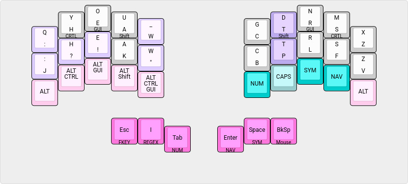
| chord | output |
|---|---|
| Shift : | ; (semicolon) |
| Shift , | ? |
| Shift . | ! |
| Shift - | _ (underscore) |
| Shift ‘ | ” (double quote) |
Shift chords are also configured for all the alphabetic letters. This eliminates the necessity of pressing the home row modifier and alpha in sequence to capitalize the letter. Note: Depending on one’s typing speed and form, removing this section (from the json spec) may be necessary to avoid triggering unwanted capitalization.
leader capitalization
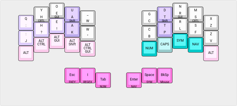
| chord | output |
|---|---|
| : Space | ”: “ + one_shot_shift |
| , Space | ”, “ + one_shot_shift |
| . Space | ”. “ + one_shot_shift |
| Shift : Space | ”; “ + one_shot_shift |
| Shift , Space | ”? “ + one_shot_shift |
| Shift . Space | ”! “ + one_shot_shift |
| Shift Space | ” “ + one_shot_shift |
| : Enter | : <enter> + one_shot_shift |
| , Enter | , <enter> + one_shot_shift |
| . Enter | . <enter> + one_shot_shift |
| Shift : Enter | ; <enter> + one_shot_shift |
| Shift , Enter | ? <enter> + one_shot_shift |
| Shift . Enter | ! <enter> + one_shot_shift |
| Shift Enter | <enter> + one_shot_shift |
These punctation chords provide an efficient means of capitalizing the next letter for long form writing—the thumb chord being more statically available than the home row modifier.
symbols and regex
symbol layer
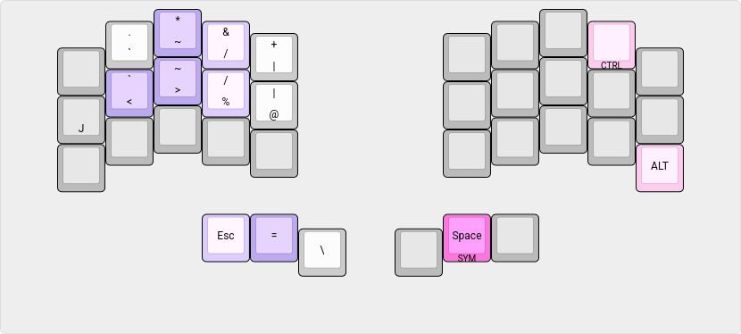
| chord | output |
|---|---|
| J < | <- |
| > % | -> |
| Esc = | != |
| * & | ” AND “ (for boolean queries) |
| ~ / | ~/ |
regex layer
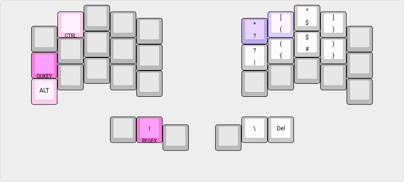
| chord | output |
|---|---|
| * [ | .* |
combined symbol / regex layer
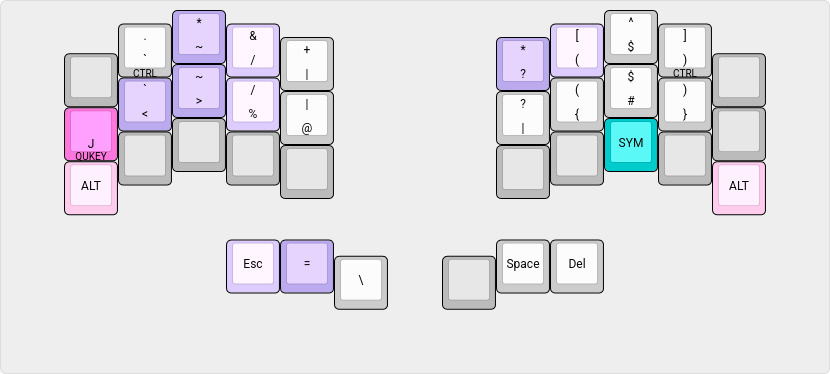
it is seldom that i switch to the togglable symbol/regex layer, as i find it takes more thought to create complex regular expressions than to use the thumb layer access to these symbol sets. But it is defined for the day i become a Zen regex master!
numbers
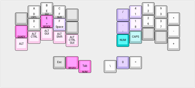
| chord | output |
|---|---|
| / 4 | : |
| , 8 | ; |
| Space 0 | 0x |
| toggle | action |
|---|---|
| Caps | Upper case HEX (retoggle to disable CapsLock on exiting layer) |
The number keypad is ordered by statistical frequency of the digit and optimized for finger movement.. hence, it’s radical departure from the standard “adding machine” keypad ordering common to keyboards offering a numeric keypad.
Note also the full pinkie column usage for the mathematical operators. This is oriented for light numeric data entry input versus heavy touch typing of serious amounts of data.
The regex layer for the () [] {} bracket pairs is normally accessed by holding down the > “greater than” key. For conformity to the main beakl layer, when the number layer is toggled on, the regex layer is also togglable from the thumb key.
function keys
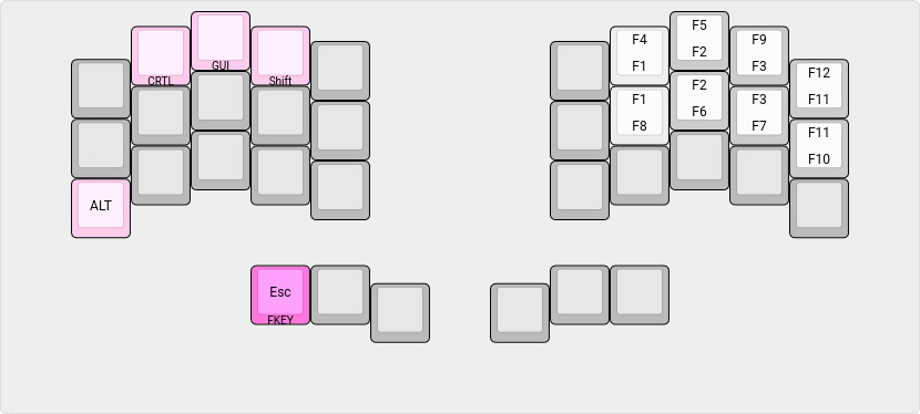
The function keys are arranged (mapped) to the number layer keypad order (to avoid finger memory confusion).
quickey layer
QUICKEY raises access to a quick editing input layer overlay for the symbol/regex and number layers..
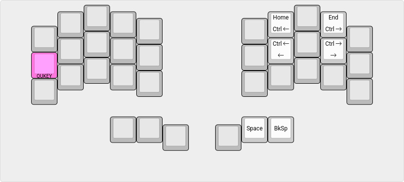
| chord | output |
|---|---|
| Space Backspace | Del |
shortcuts and cursor / mouse
shortcuts / cursor keys
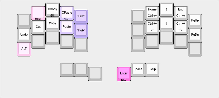
| chord | output |
|---|---|
| XPaste Private | Compile time string |
| Paste Public | Compile time string |
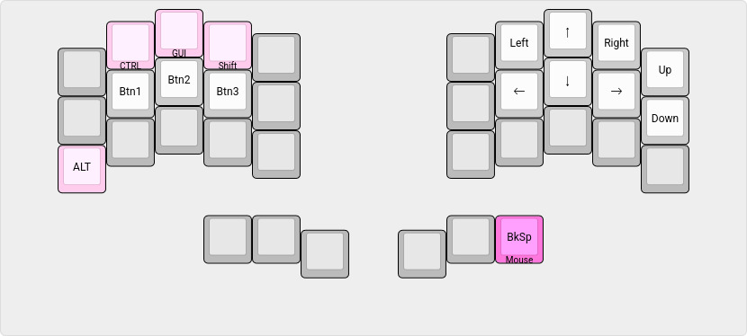
mouse navigation
‧ ‧ • ‧ ‧
Moving from the Georgi steno keyboard to the Chocofi will take some time to acclimate to the different stagger of the finger rows—the Georgi having almost no stagger for steno typing.
However, the thumb to home row position (between the top and middle finger rows) is comparable, so does not feel out of place and should facilitate a short adjustment period. The 20g linear keyswitches do not feel appreciably stiffer than the Georgi’s 15g keyswitches—thankfully, i don’t feel at the moment compelled to swap out the springs for lighter ones :-)
With the extra finger row, already i am wondering.. do i want to try lowing the pinkie finger characters one more stagger? :-o (It would not take much effort to adjust the json template to know :-)
Edit: See Chocofi Wi Stagger for an alternate staggered
pinkie finger layout.
Edit: See Chocofi Wi Hybrid for a further refinement of
the pinkie finger layout.
related
gotham font
while a descendent of the singspiel font, the gotham font is a return to a more traditional visual presentation with fewer flares whilst continuing this site’s focus on the improved dyslexic legibility and readability.
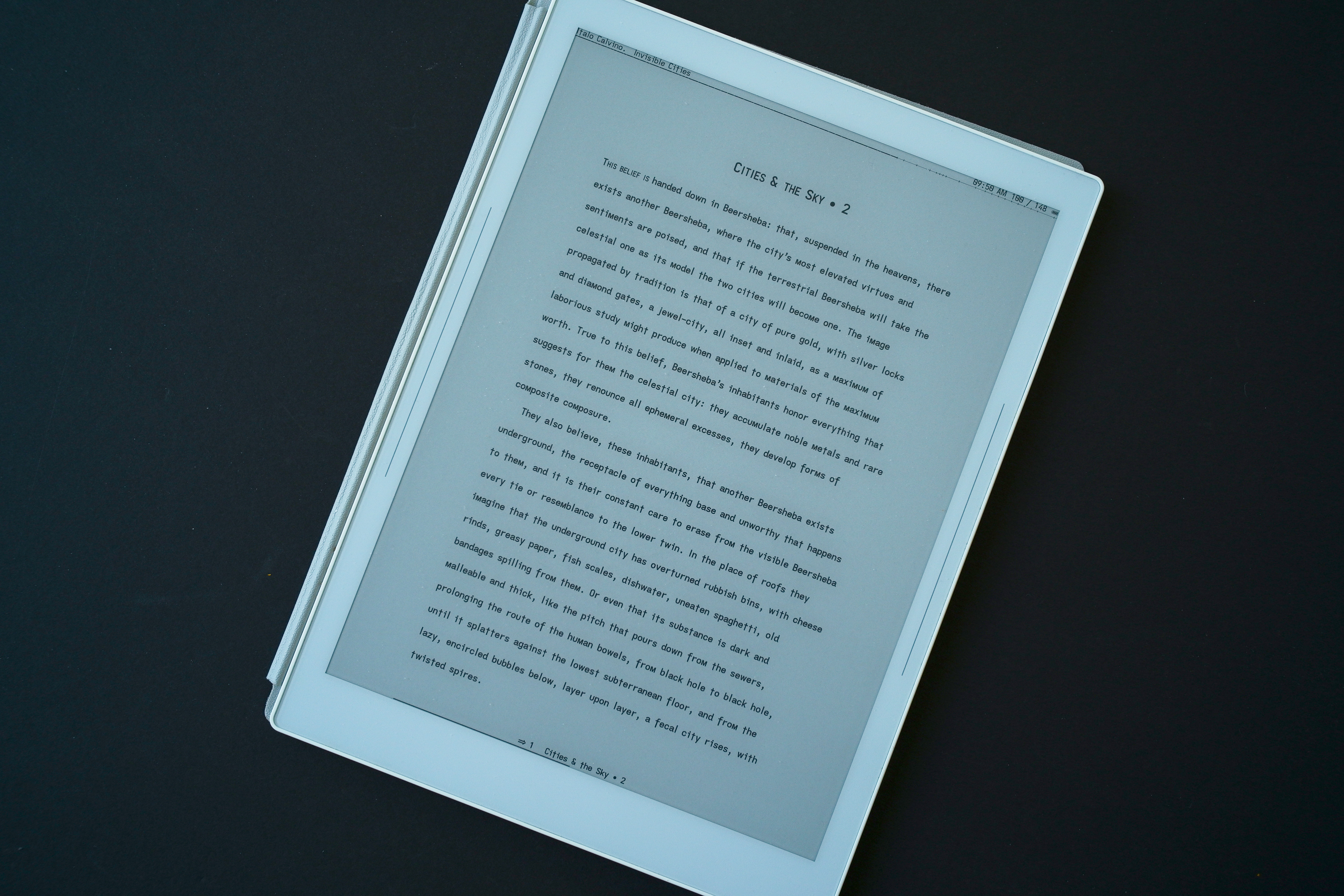
straight m
With yet another simple unconventional glyph shape change—replacing the familiar rounded double arch (shoulder) lower case m (singspiel’s earless-corner, notwithstanding) with an angular flat-bottomed m (very much a small cap)—the lower case m now stands out more distinctly from the very common shouldered n..

This unconventional glyph choice is a striking contrast—despite the commonality of matching x-height characters to their capitals with the c o s u v w x and z—to the pervasive rounded arched m. Its vertical sides and angled strokes (legs) render—despite its narrower cell width—more distinctly than the familiar triple stemmed arched glyph (which becomes apparent with words containing both the m and n, and even more so when doublets of either letters are present).
The arched m does visually “flow” more pleasingly (personal aesthetic) than the angular straight m, though, the latter does offset this loss with its tighter cell width and added non-mirrored distinctiveness from the eared n.
As for the font’s name, the straight m compliments the font’s unique ascenders (and descenders), adding to the printed line’s “skyline”. “Goth”ic emphasizes its sans serif leanings (albeit, subtly tuned for dyslexia and visual flow)—it remains an exceptionally “clean” typeface.
cross t, baseline f and serifless capital J
also differing from the singspiel font are stem length reductions to the cross t, and extended f and capital J to the baseline rendering a classic typeface glyph profile.
The cross t glyph loses its descender in favour of a regular non-extended cross t—the neck being lengthened to add weight to its presence.
These glyph changes to more traditional shapes produce a tonal shift from singspiel’s lyrical form to a more Gothic or architectural presentation with its flatter more neutral outline.
gothos font
for maximum dyslexic readability, the serifed capital I and the (re-introduced) hook-toothed capital G are available with the gothos font. This font adds the fully extended f for maximum distinction.
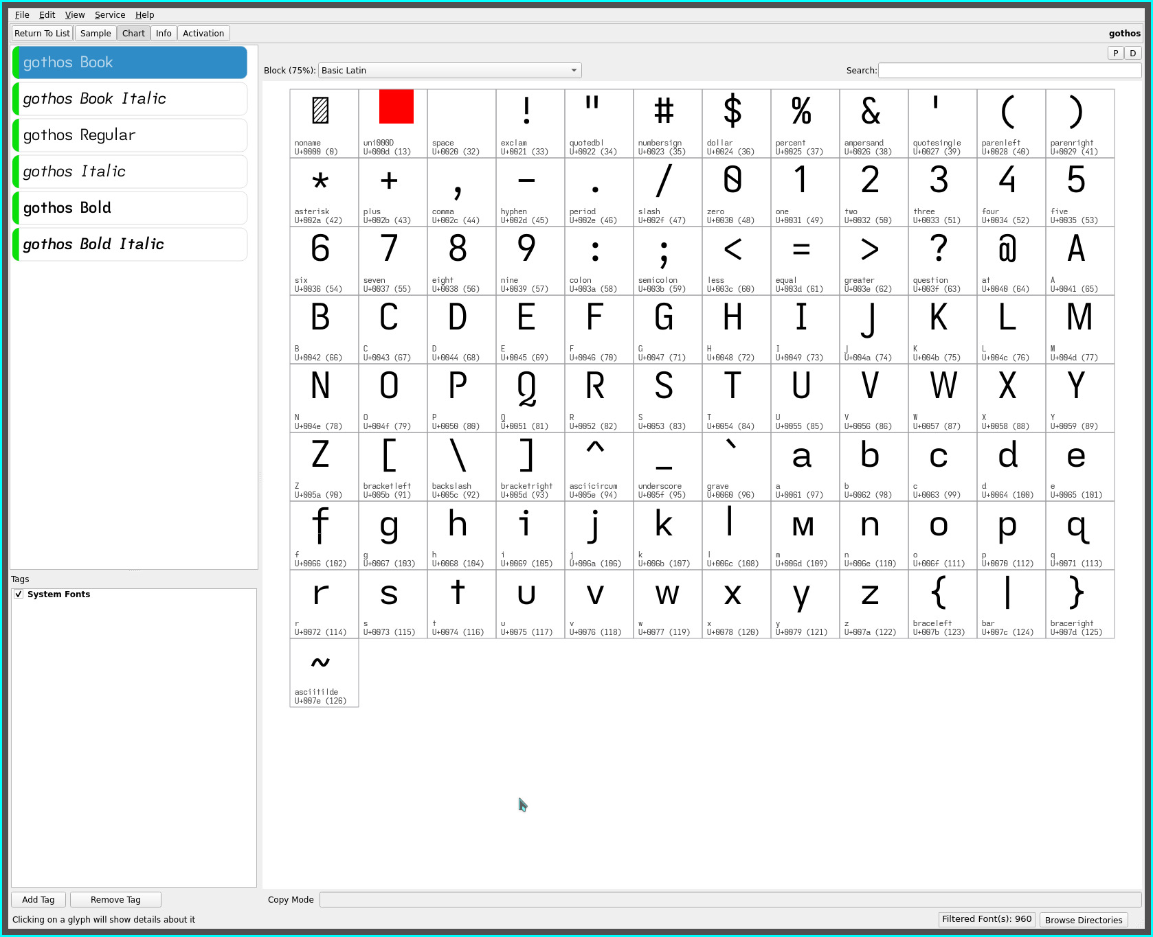
IMO the gotham and gothos fonts improve even upon their predecessors for dyslexic readability—the singspiel/songspiel and grotesque/groteske fonts—with the addition of the angular straight m.
The serifed and hook-toothed capitals of the gothos font along with its non-mirrored glyph sets elevate its dyslexic legibility (beyond even such fonts as the Atkinson Hyperlegible font, IMO) while adding the relaxed visual reading cadence of the non-kerned (pseudo monospaced) glyph spacing of the fonts representative of this site. All while keeping with an overall clean sans serif typeface feel.
‧ ‧ • ‧ ‧
The gotham font has found its place in my reading (font) rotation—notably with the singspiel and grotesque fonts, completing my font trio—offering a visual change up for these eyes and, importantly, maintaining a similar word page density for the KOReader layout i impose on my content consumption.
The more i read with it, the more this typeface comes to the fore. Only with words containing a leading m did the glyph shape initially feel odd (against a lifetime’s familiarity to the arched m). Within words, the glyph visually renders naturally with increased legibility (especially with words also containing a n or a doublet).
As always, YMMV.
repos
This font may be found on OneDrive.