gotham font
while a descendent of the singspiel font, the gotham font is a return to a more traditional visual presentation with fewer flares whilst continuing this site’s focus on the improved dyslexic legibility and readability.

straight m
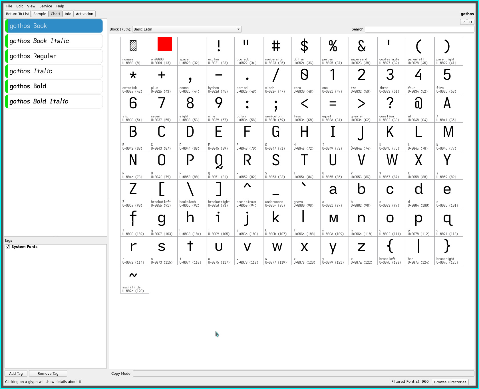
With yet another simple unconventional glyph shape change—replacing the familiar rounded double arch (shoulder) lower case m (singspiel’s earless-corner, notwithstanding) with an angular flat-bottomed m (very much a small cap)—the lower case m now stands out more distinctly from the very common shouldered n..

This unconventional glyph choice is a striking contrast—despite the commonality of matching x-height characters to their capitals with the c o s u v w x and z—to the pervasive rounded arched m. Its vertical sides and angled strokes (legs) render—despite its narrower cell width—more distinctly than the familiar triple stemmed arched glyph (which becomes apparent with words containing both the m and n, and even more so when doublets of either letters are present).
The arched m does visually “flow” more pleasingly (personal aesthetic) than the angular straight m, though, the latter does offset this loss with its tighter cell width and added non-mirrored distinctiveness from the eared n.
As for the font’s name, the straight m compliments the font’s unique ascenders (and descenders), adding to the printed line’s “skyline”. “Goth”ic emphasizes its sans serif leanings (albeit, subtly tuned for dyslexia and visual flow)—it remains an exceptionally “clean” typeface.
cross t, baseline f and serifless capital J
also differing from the singspiel font are stem length reductions to the cross t, and extended f and capital J to the baseline rendering a classic typeface glyph profile.
The cross t glyph loses its descender in favour of a regular non-extended cross t—the neck being lengthened to add weight to its presence.
These glyph changes to more traditional shapes produce a tonal shift from singspiel’s lyrical form to a more Gothic or architectural presentation with its flatter more neutral outline.
gothos font
for maximum dyslexic readability, the serifed capital I and the (re-introduced) hook-toothed capital G are available with the gothos font. This font adds the fully extended f for maximum distinction.

IMO the gotham and gothos fonts improve even upon their predecessors for dyslexic readability—the singspiel/songspiel and grotesque/groteske fonts—with the addition of the angular straight m.
The serifed and hook-toothed capitals of the gothos font along with its non-mirrored glyph sets elevate its dyslexic legibility (beyond even such fonts as the Atkinson Hyperlegible font, IMO) while adding the relaxed visual reading cadence of the non-kerned (pseudo monospaced) glyph spacing of the fonts representative of this site. All while keeping with an overall clean sans serif typeface feel.
‧ ‧ • ‧ ‧
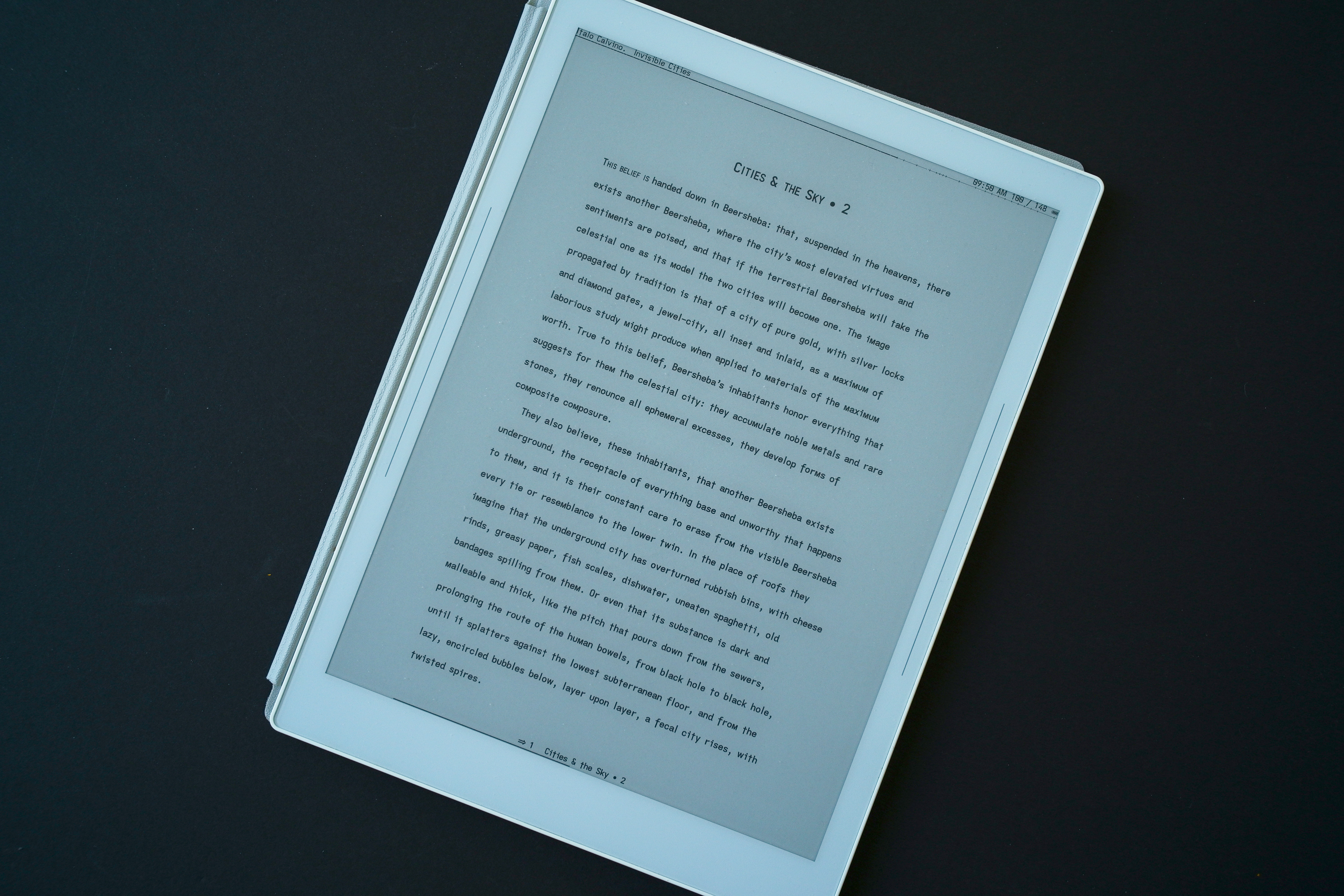
The gotham font has found its place in my reading (font) rotation—notably with the singspiel and grotesque fonts, completing my font trio—offering a visual change up for these eyes and, importantly, maintaining a similar word page density for the KOReader layout i impose on my content consumption.
The more i read with it, the more this typeface comes to the fore. Only with words containing a leading m did the glyph shape initially feel odd (against a lifetime’s familiarity to the arched m). Within words, the glyph visually renders naturally with increased legibility (especially with words also containing a n or a doublet).
As always, YMMV.
repos
This font may be found on OneDrive.
